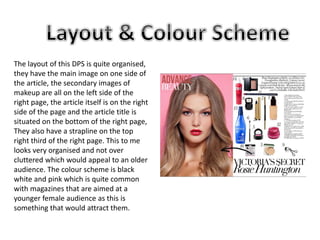
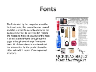
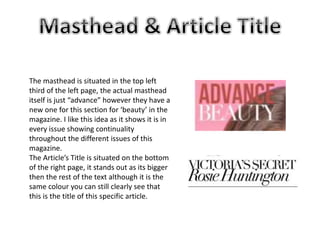
This document analyzes a double-page magazine spread targeted at females aged 17-25. It summarizes that the color scheme, main image, layout, fonts, and article title indicate this target audience. The main image takes up the left page and features a model in natural lighting meant to inspire the audience. The layout is organized with the main image on one side and secondary makeup images and article on the other. The fonts are basic and plain for readability. Color scheme and masthead placement also appeal to younger female readers.