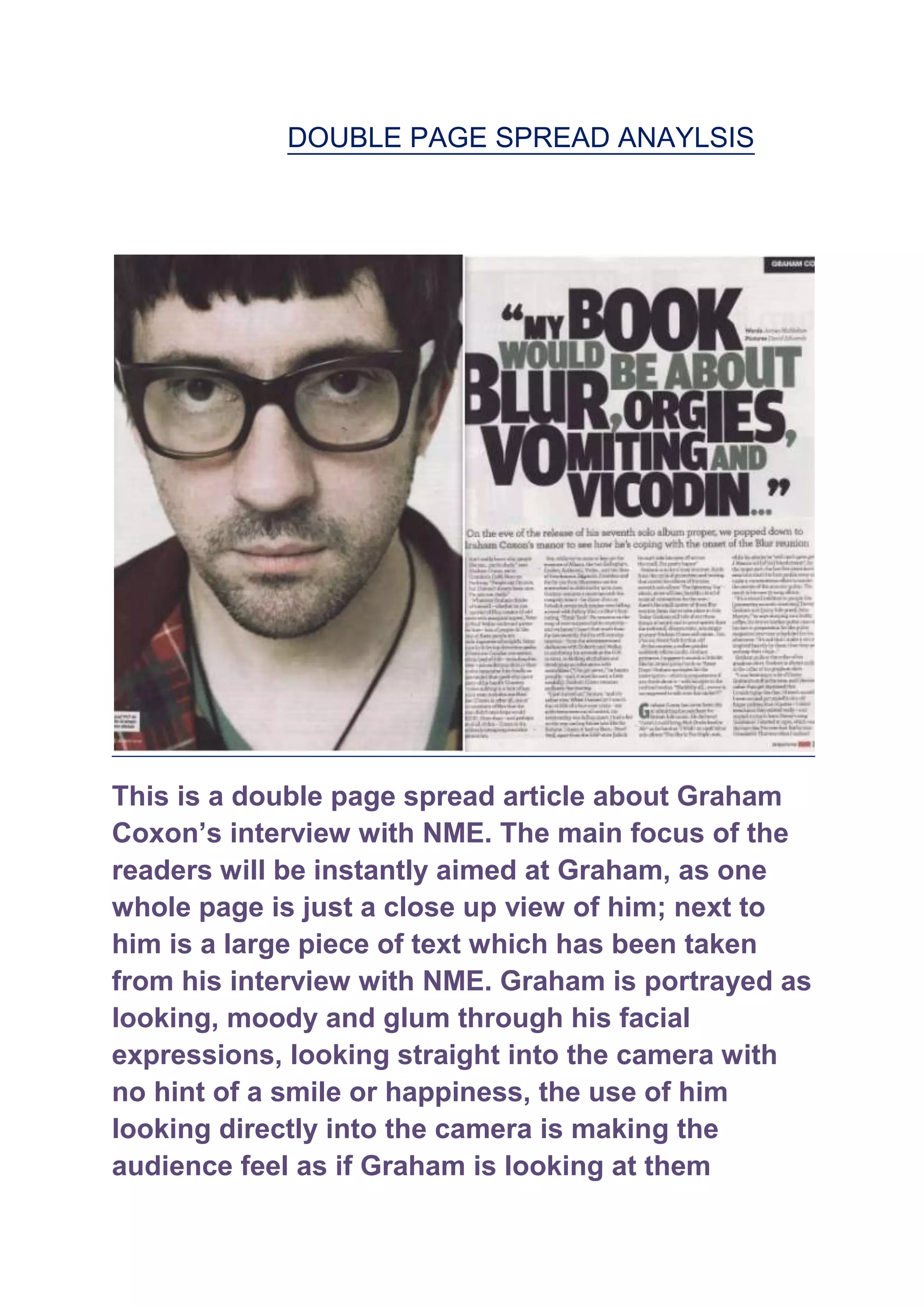
DOUBLE PAGE SPREAD ANAYLSIS


This is a double page spread article about Graham
Coxon‟s interview with NME. The main focus of the
readers will be instantly aimed at Graham, as one
whole page is just a close up view of him; next to
him is a large piece of text which has been taken
from his interview with NME. Graham is portrayed as
looking, moody and glum through his facial
expressions, looking straight into the camera with
no hint of a smile or happiness, the use of him
looking directly into the camera is making the
audience feel as if Graham is looking at them
directly which makes the article seem more personal
and he‟s actually talking to them, as soon as readers
would turn the page they would be welcomed with a
extremely close up shot of Graham behind a white
background, so all they can focus on is his face
which brings the reader in more as they will feel
hypnotised by the use of the white background. The
colouring of what Graham is wearing is portrayed
into the article itself as it‟s all focused around dark
and dull colours, which is a representation of his
“rock” personality. The text has colours in a shade
of vomit, which coordinates with what is actually
being written in the snippet of the information, its
collided with black colours in front of the purity of
white to stand out and make the readers get into the
dark mindset to read the article. The way the words
are written in a sense of being small and large and a
bit all over the place not in a neat straight lines,
gives the type of theme of “sex, drugs and rock „n‟
roll” which is basically what the text on the page is
subtly saying, but with more integrity, this is perfect
for the target audience, as this is exactly the type of
mode of address they would be interested in, the
whole theme of orgies and vomiting and Blur, a well
known indie rock band, if this being a sell line on a
front cover will draw the audience in straight away
as the magazine is catering and talking the language
and using their interests to apply to something
which they will be entertained by. The whole theme
of the article is gloomy and dark, which with these
not completely dark but on the verge, do have a type
of homely feel to them instead of being greeted with
loud and colourful pictures which the reader may be
used to. The font used in this article is commonly
used throughout many of NME‟s articles and sell
lines, this produces the idea of “brand identity” it
allows the reader to recognise where this article
would be produced from if they ever saw it. Also, the
whole layout of the article is very commonly, “NME”
with the extremely close up shot of Graham on one
whole page of the article shows NME is dedicating
these few pages to him, which shows loyalty and
commitment. NME is very loyal to who they produce
into their articles, such as Oasis and the Arctic
Monkeys. The design of the layout almost directs
the reader where to go next, first they view the
picture, then they see the snippet of text then they
move onto the main features of the article, at this
point they are unaware they are doing so, but NME
has just directed them into the stages of reading the
article they have produced, which will lead to them
getting gripped and then moving on to the next page
etc.

Double page spread anaylsis

  • 1.
    DOUBLE PAGE SPREADANAYLSIS This is a double page spread article about Graham Coxon‟s interview with NME. The main focus of the readers will be instantly aimed at Graham, as one whole page is just a close up view of him; next to him is a large piece of text which has been taken from his interview with NME. Graham is portrayed as looking, moody and glum through his facial expressions, looking straight into the camera with no hint of a smile or happiness, the use of him looking directly into the camera is making the audience feel as if Graham is looking at them
  • 2.
    directly which makesthe article seem more personal and he‟s actually talking to them, as soon as readers would turn the page they would be welcomed with a extremely close up shot of Graham behind a white background, so all they can focus on is his face which brings the reader in more as they will feel hypnotised by the use of the white background. The colouring of what Graham is wearing is portrayed into the article itself as it‟s all focused around dark and dull colours, which is a representation of his “rock” personality. The text has colours in a shade of vomit, which coordinates with what is actually being written in the snippet of the information, its collided with black colours in front of the purity of white to stand out and make the readers get into the dark mindset to read the article. The way the words are written in a sense of being small and large and a bit all over the place not in a neat straight lines, gives the type of theme of “sex, drugs and rock „n‟ roll” which is basically what the text on the page is subtly saying, but with more integrity, this is perfect for the target audience, as this is exactly the type of mode of address they would be interested in, the whole theme of orgies and vomiting and Blur, a well known indie rock band, if this being a sell line on a front cover will draw the audience in straight away as the magazine is catering and talking the language and using their interests to apply to something which they will be entertained by. The whole theme
  • 3.
    of the articleis gloomy and dark, which with these not completely dark but on the verge, do have a type of homely feel to them instead of being greeted with loud and colourful pictures which the reader may be used to. The font used in this article is commonly used throughout many of NME‟s articles and sell lines, this produces the idea of “brand identity” it allows the reader to recognise where this article would be produced from if they ever saw it. Also, the whole layout of the article is very commonly, “NME” with the extremely close up shot of Graham on one whole page of the article shows NME is dedicating these few pages to him, which shows loyalty and commitment. NME is very loyal to who they produce into their articles, such as Oasis and the Arctic Monkeys. The design of the layout almost directs the reader where to go next, first they view the picture, then they see the snippet of text then they move onto the main features of the article, at this point they are unaware they are doing so, but NME has just directed them into the stages of reading the article they have produced, which will lead to them getting gripped and then moving on to the next page etc.