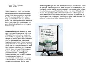
The document analyzes a billboard advertisement for the Metro newspaper. It uses only white and green colors to make the text and images stand out. The large text is positioned in the top left primary optical area to grab attention. Below is an image of the Metro newspaper, the second main focus. The positioning of the bold text above and the recognizable image below makes the advertisement simple yet effective at clearly communicating the brand and message.