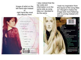
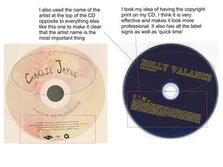
The artist took inspiration from the layout and design of other album covers, curving the song titles and placing the barcode and information on the same side as the song titles. They also placed the artist name on the left side instead of the right like most pop albums. They included the copyright print and label signs to look more professional. The artist name is placed at the top opposite other elements to make it the most prominent feature, and the album title is designed like a tattoo similar to another album cover.