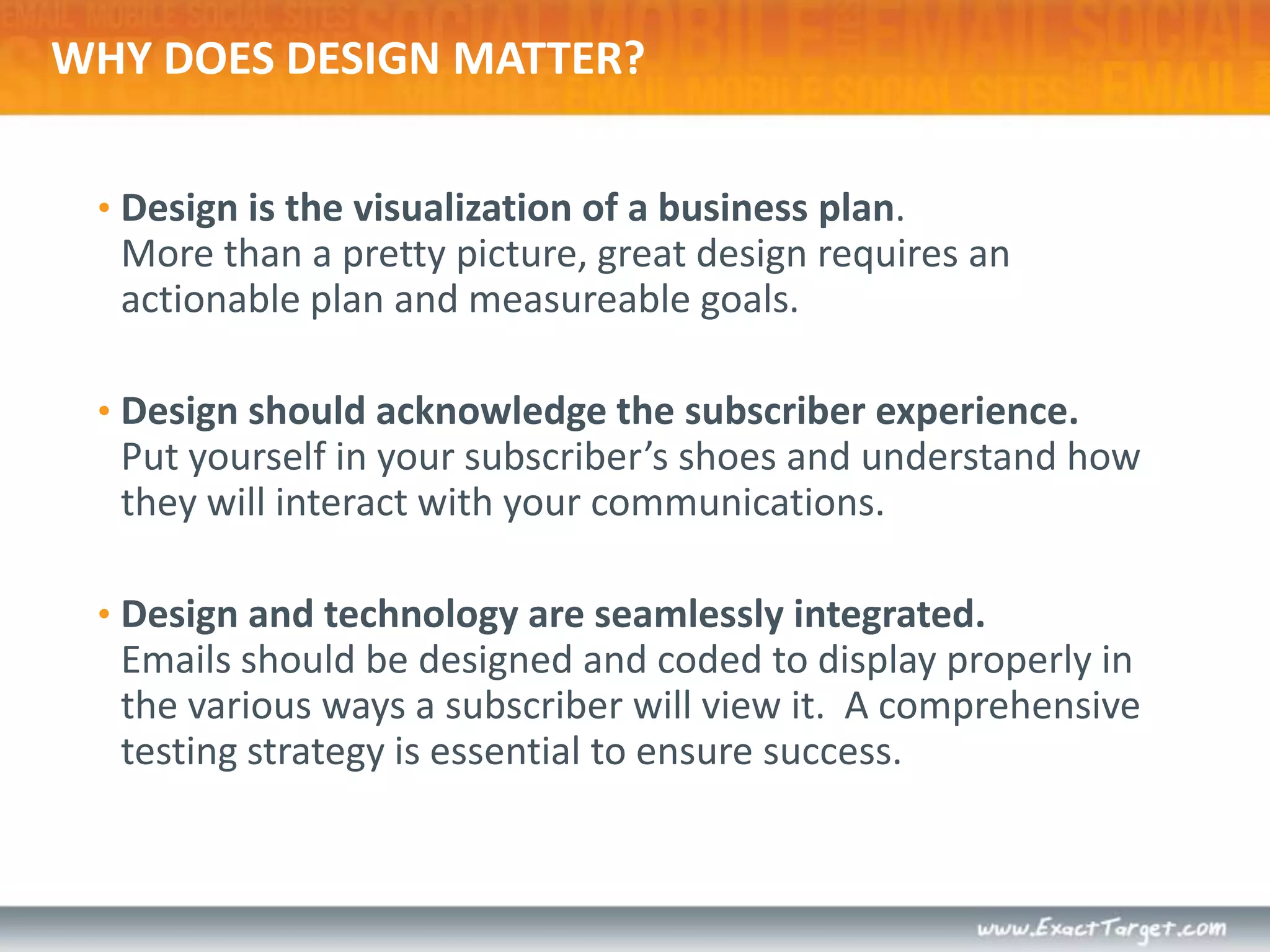
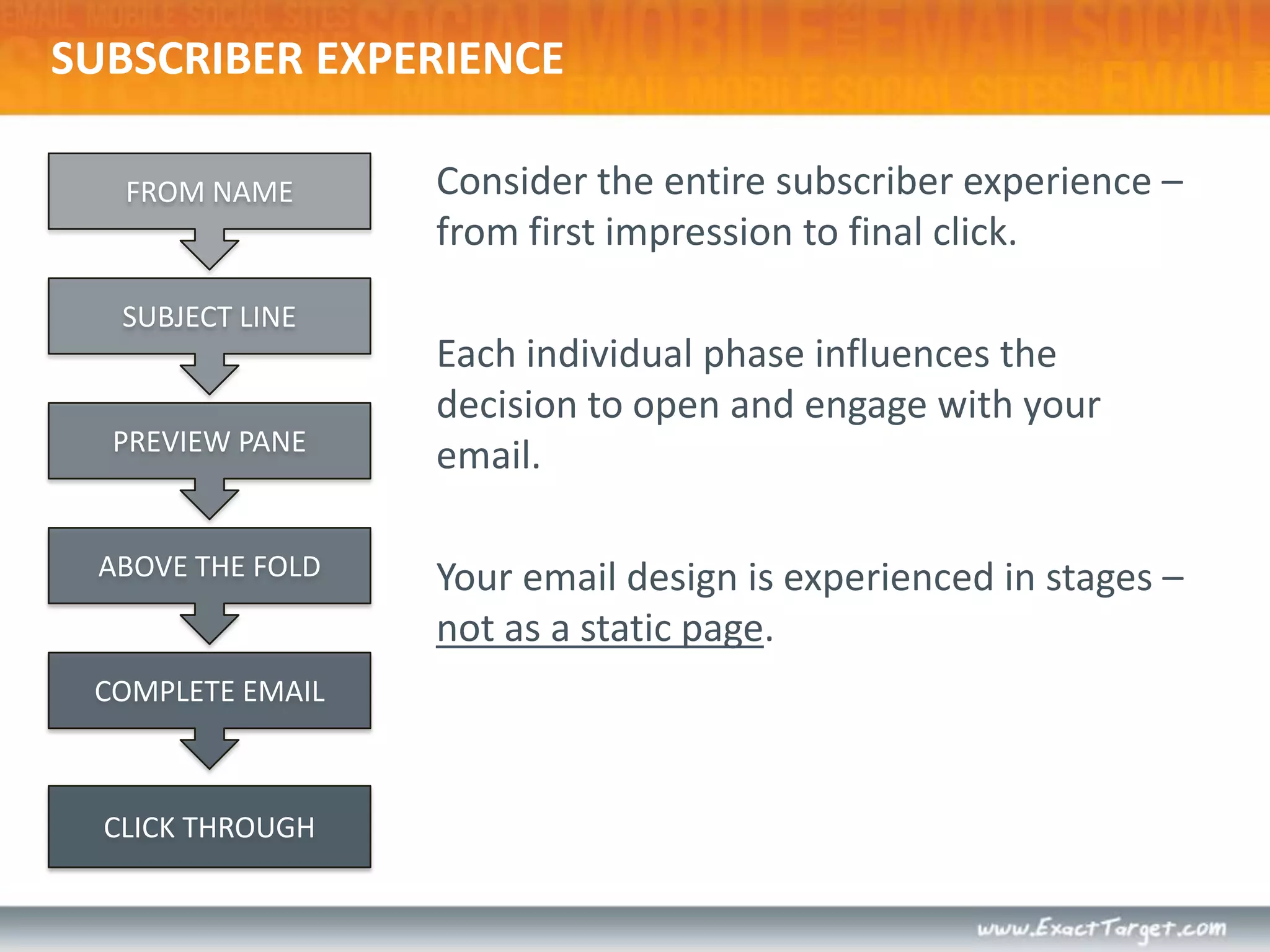
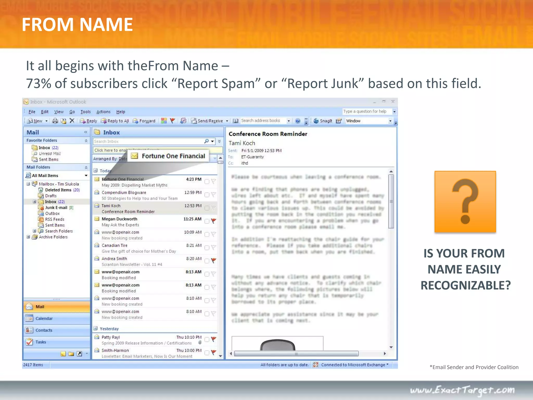
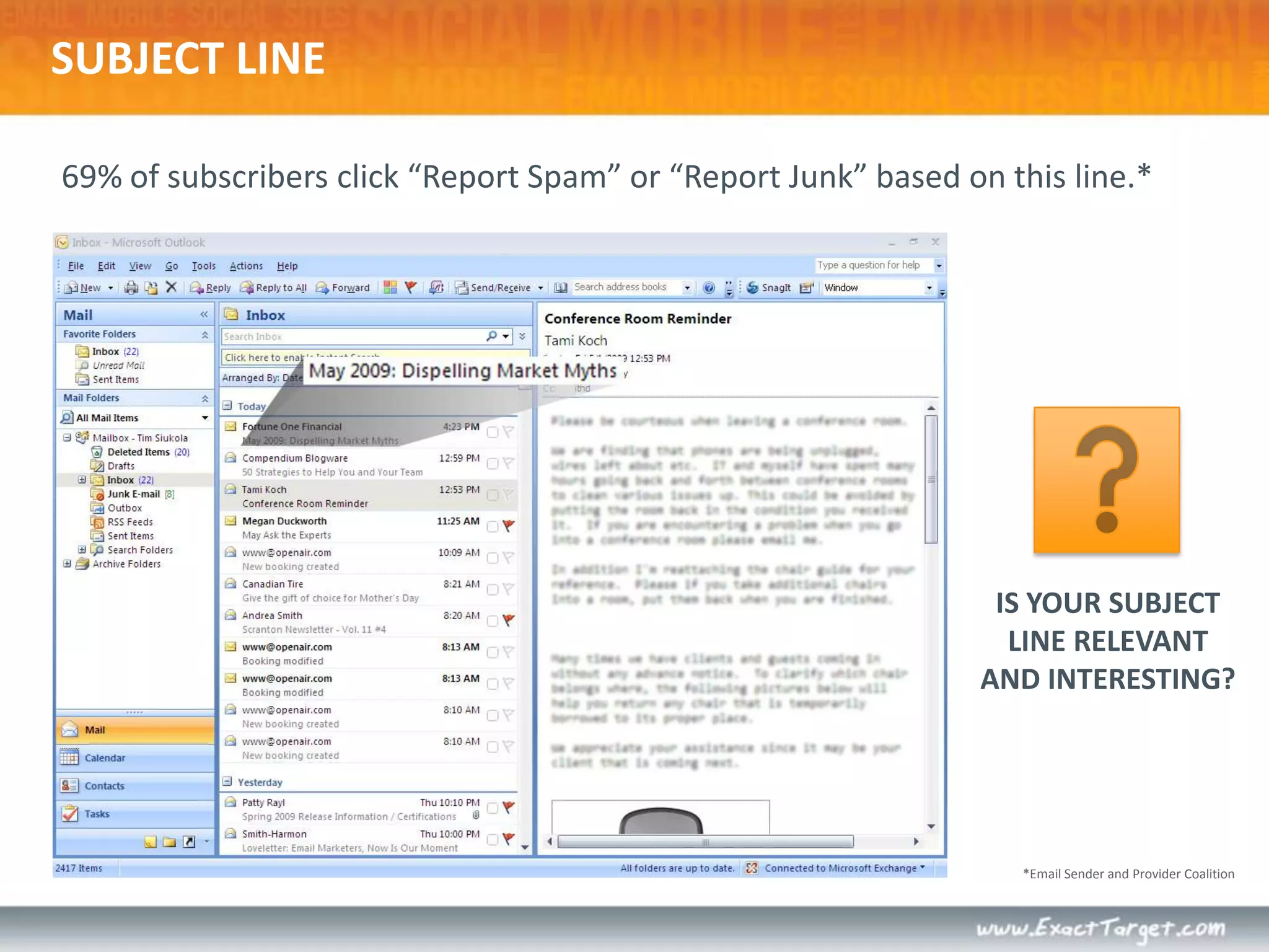
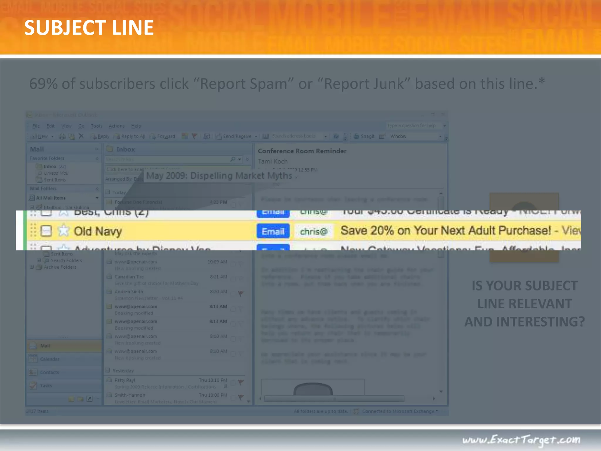
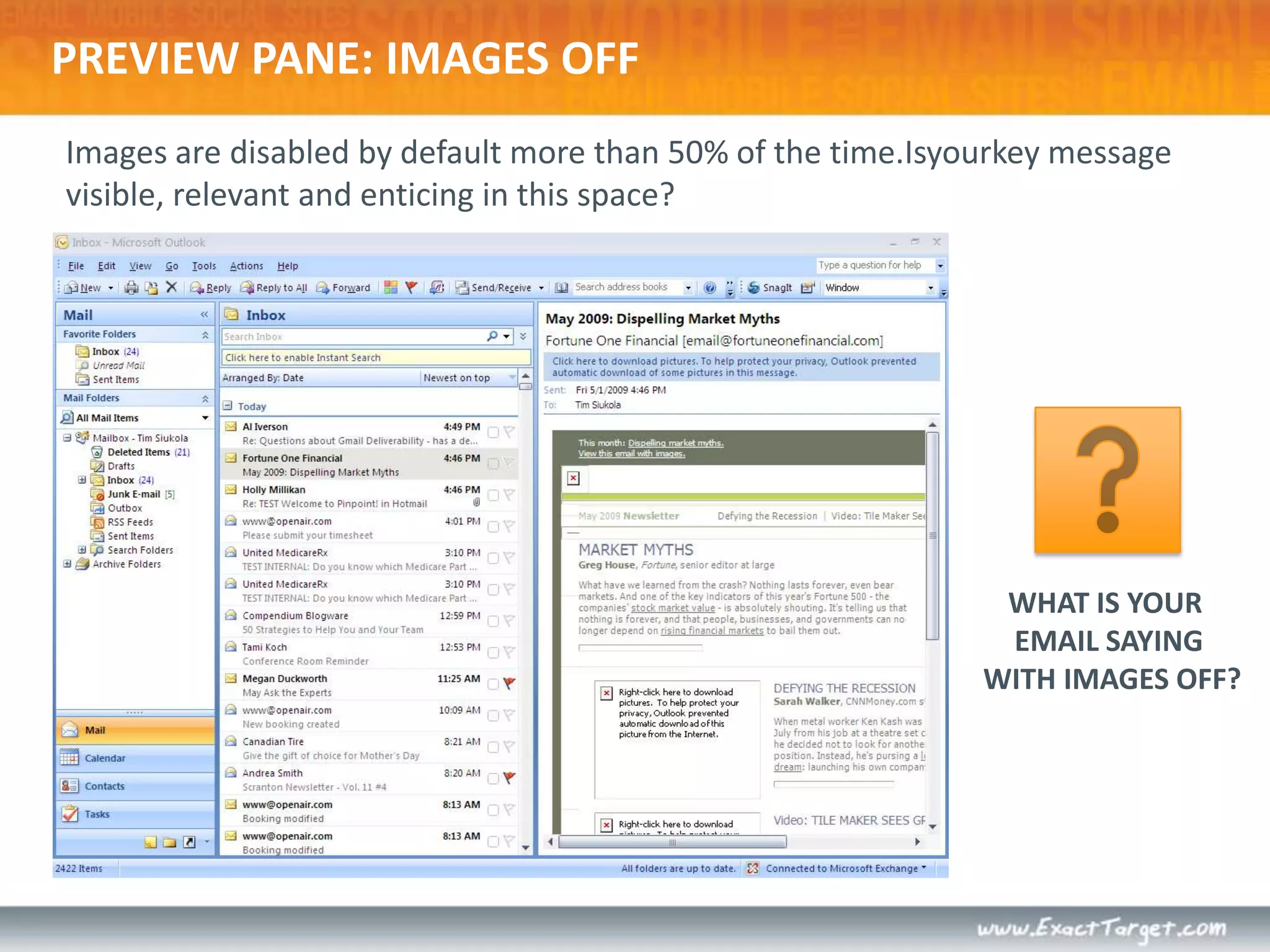
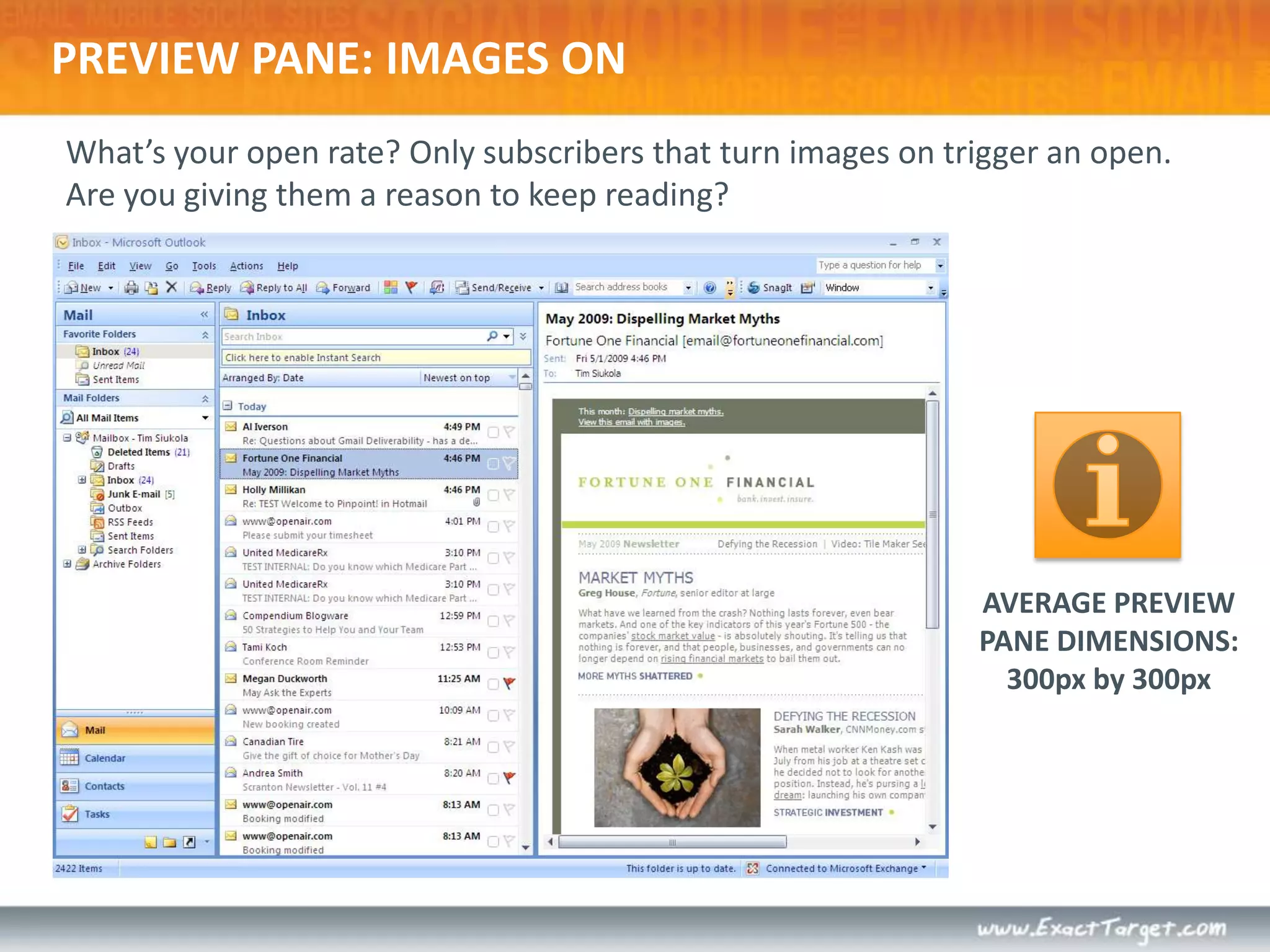
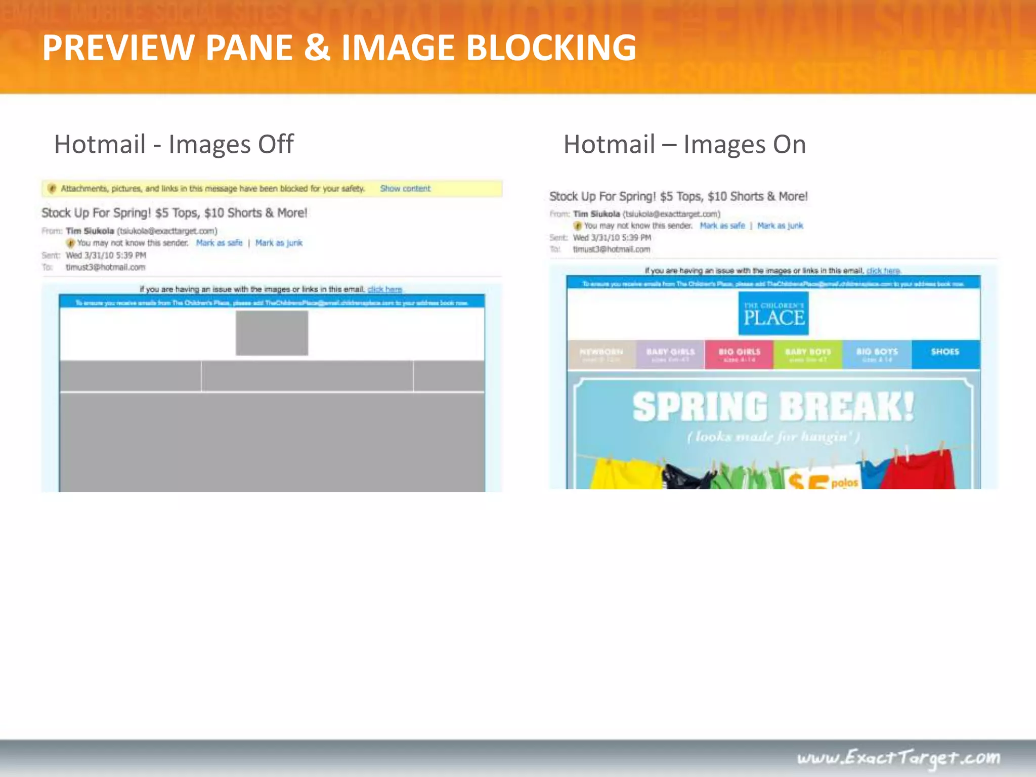
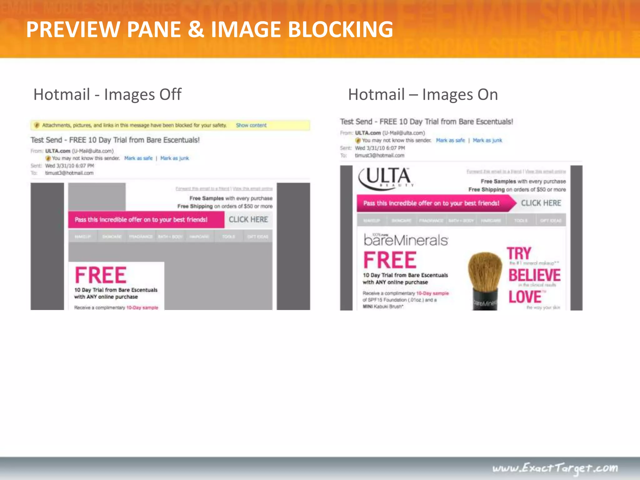
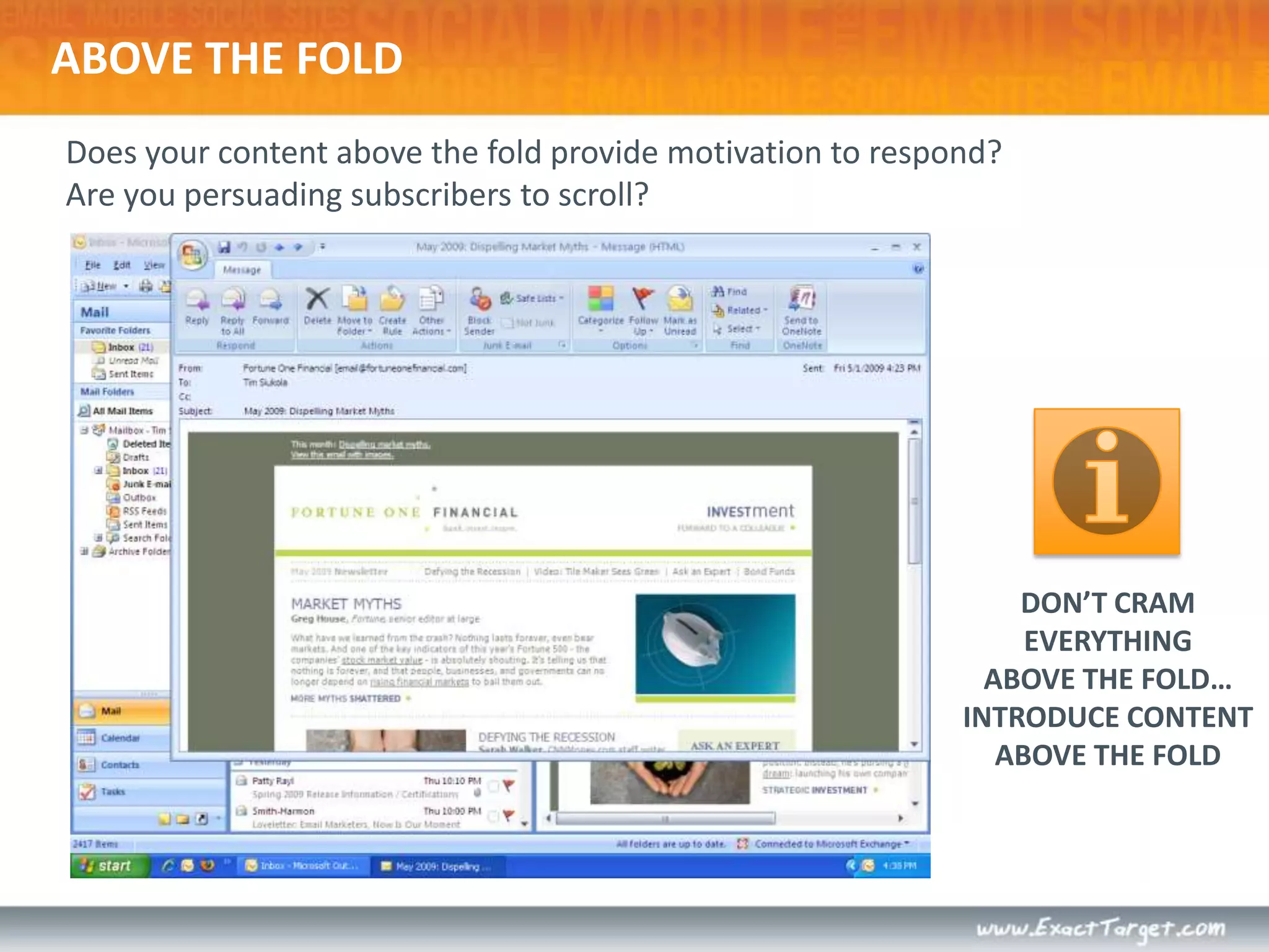
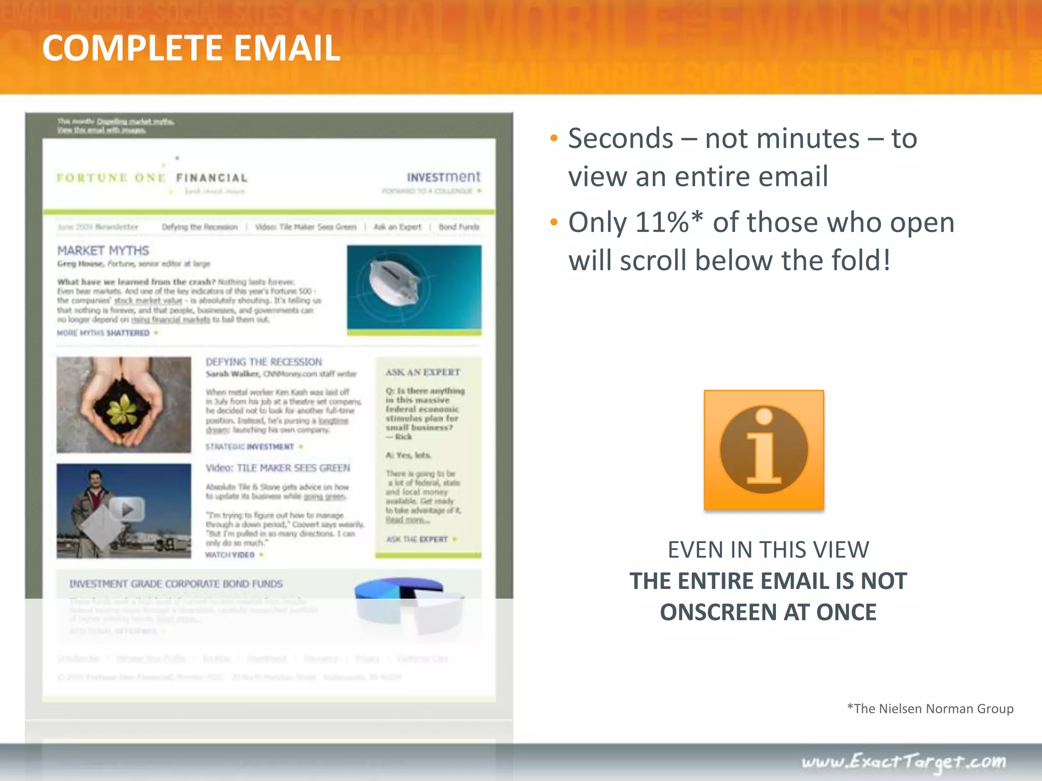
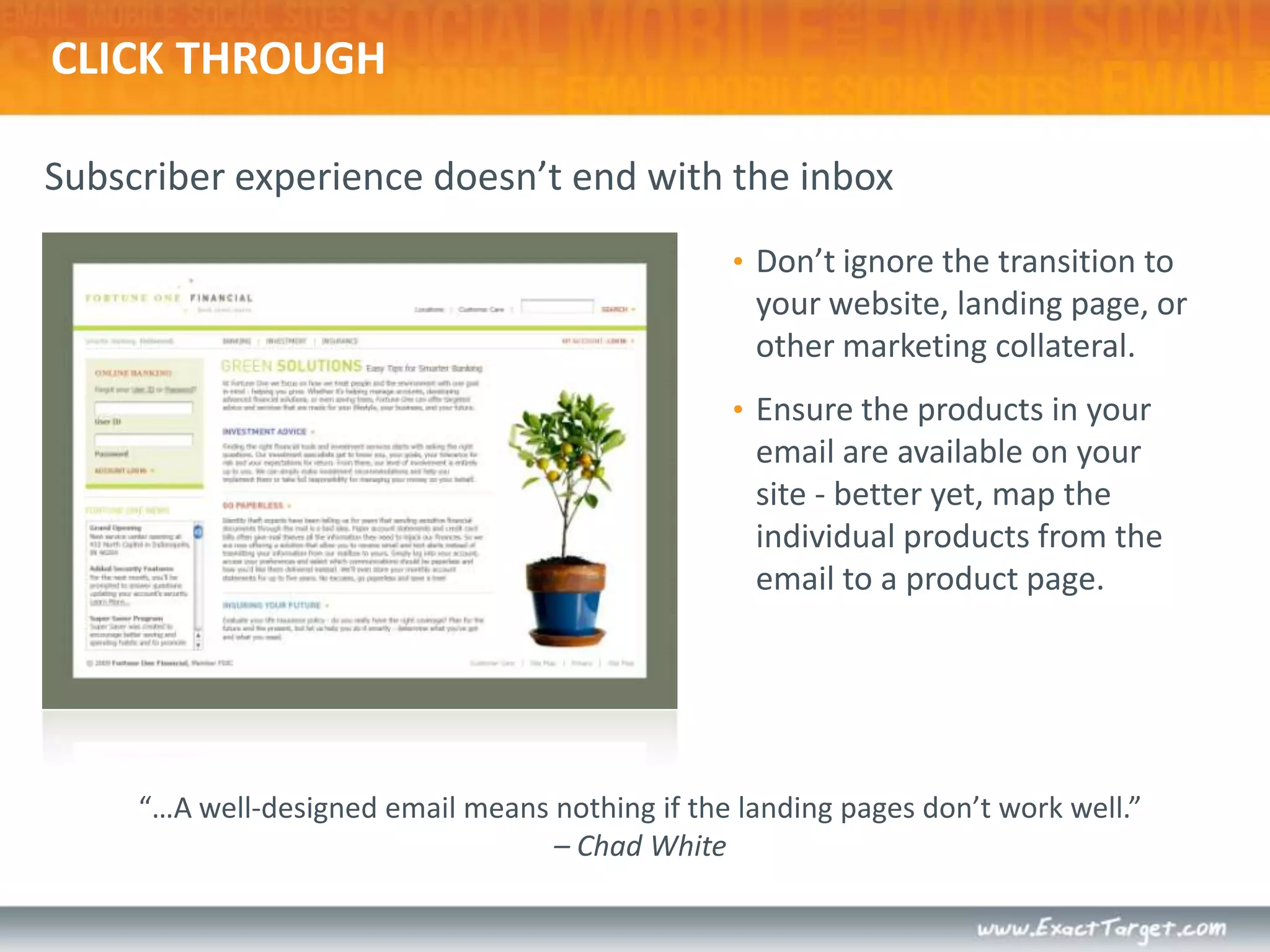
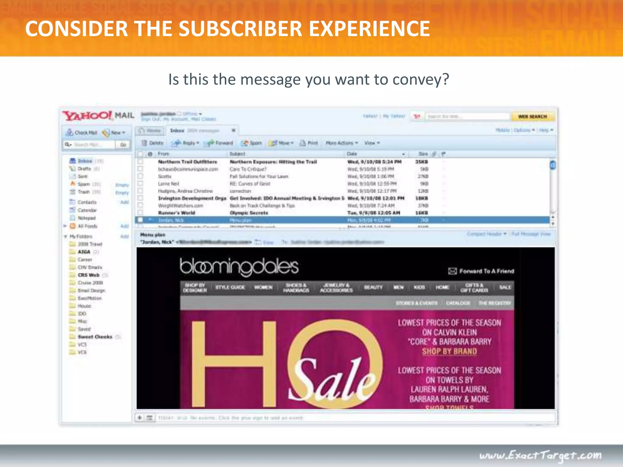
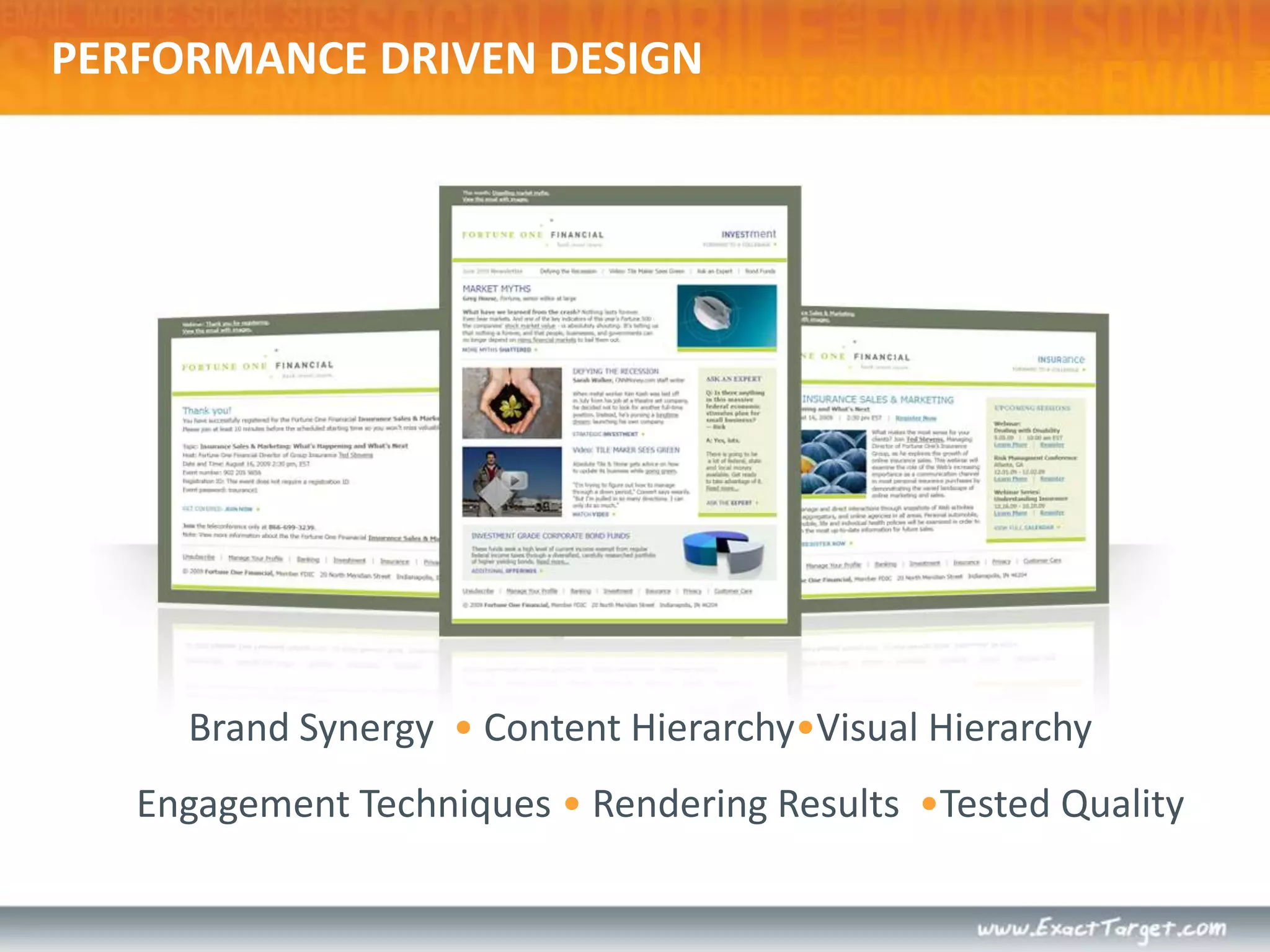
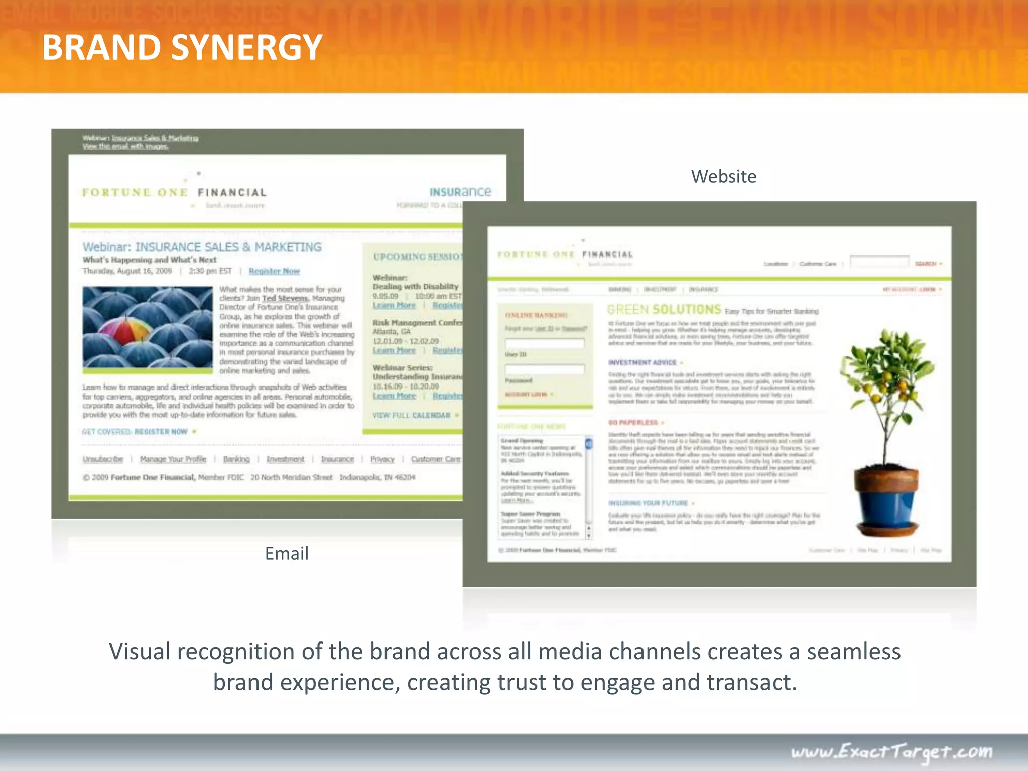
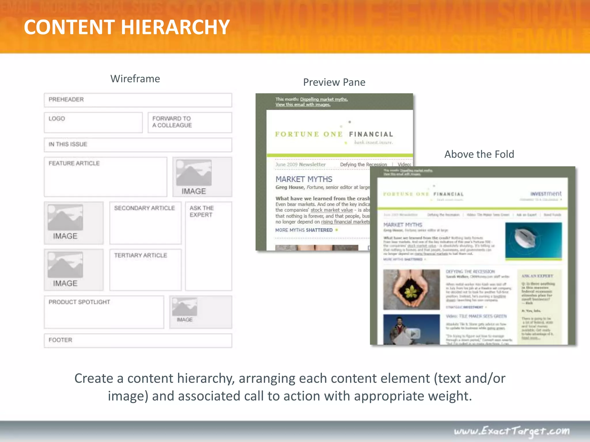
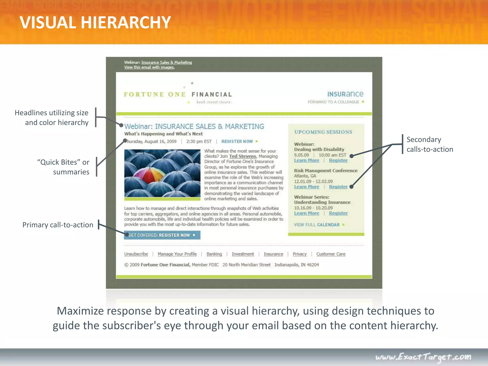
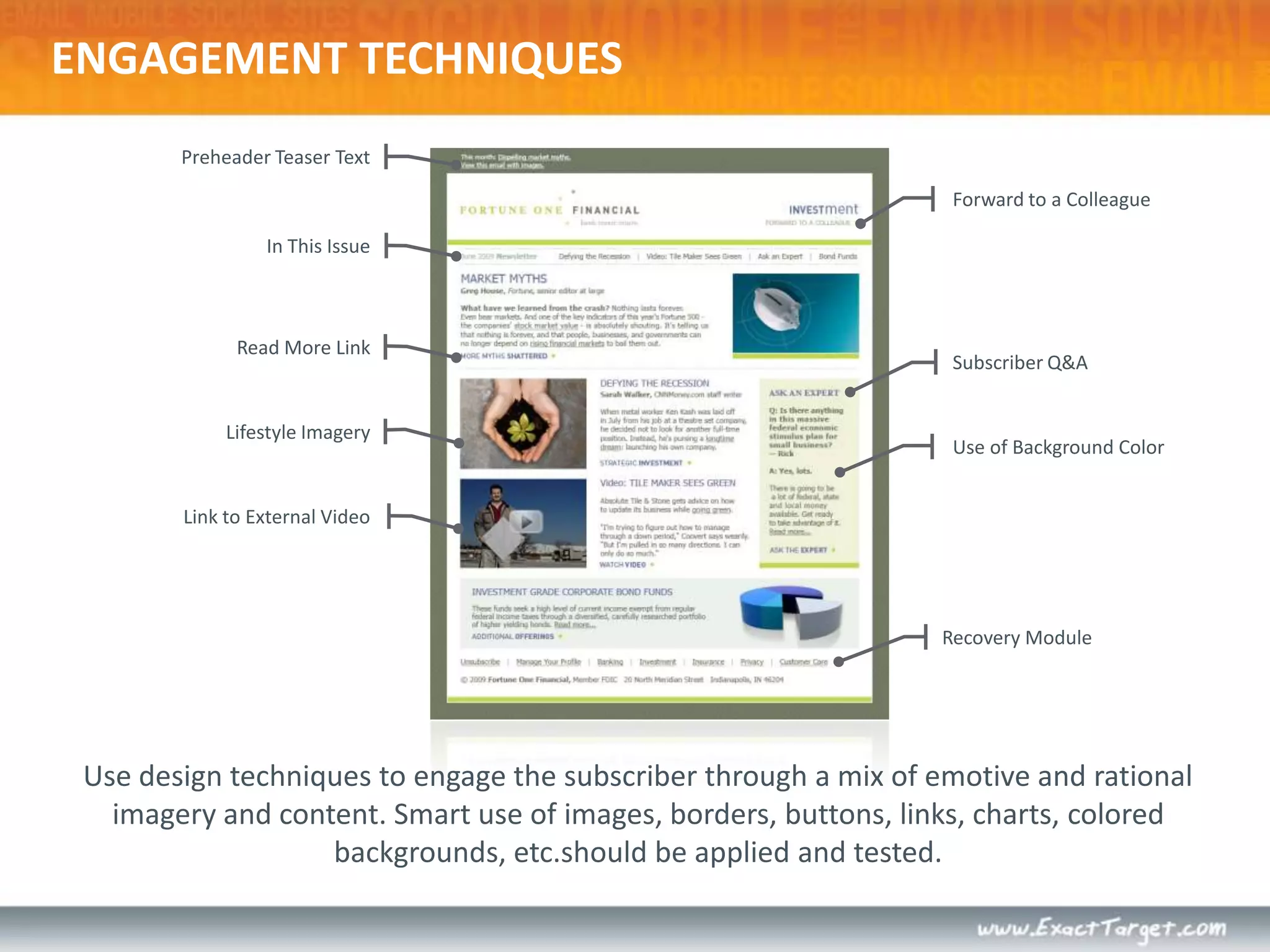
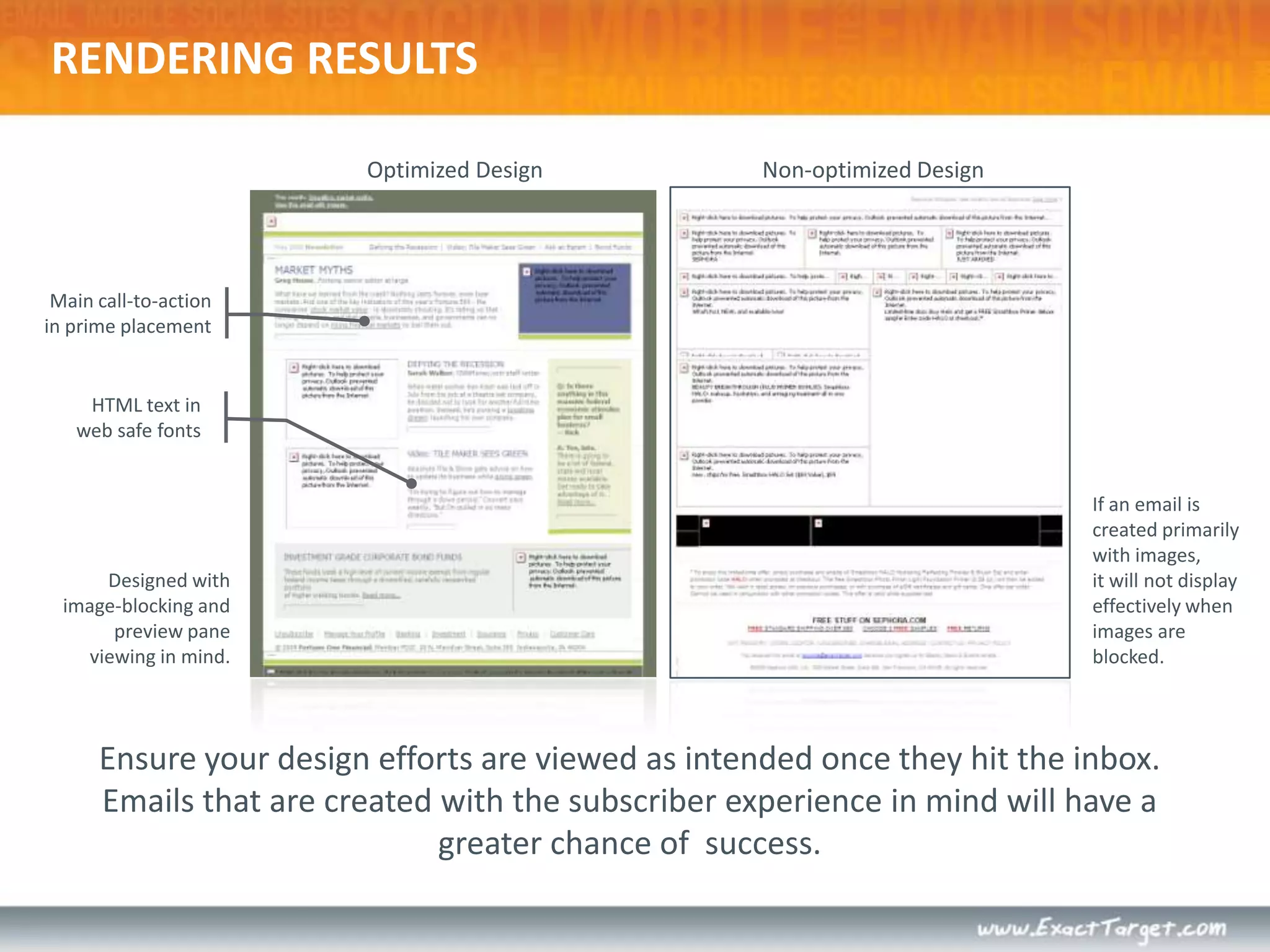
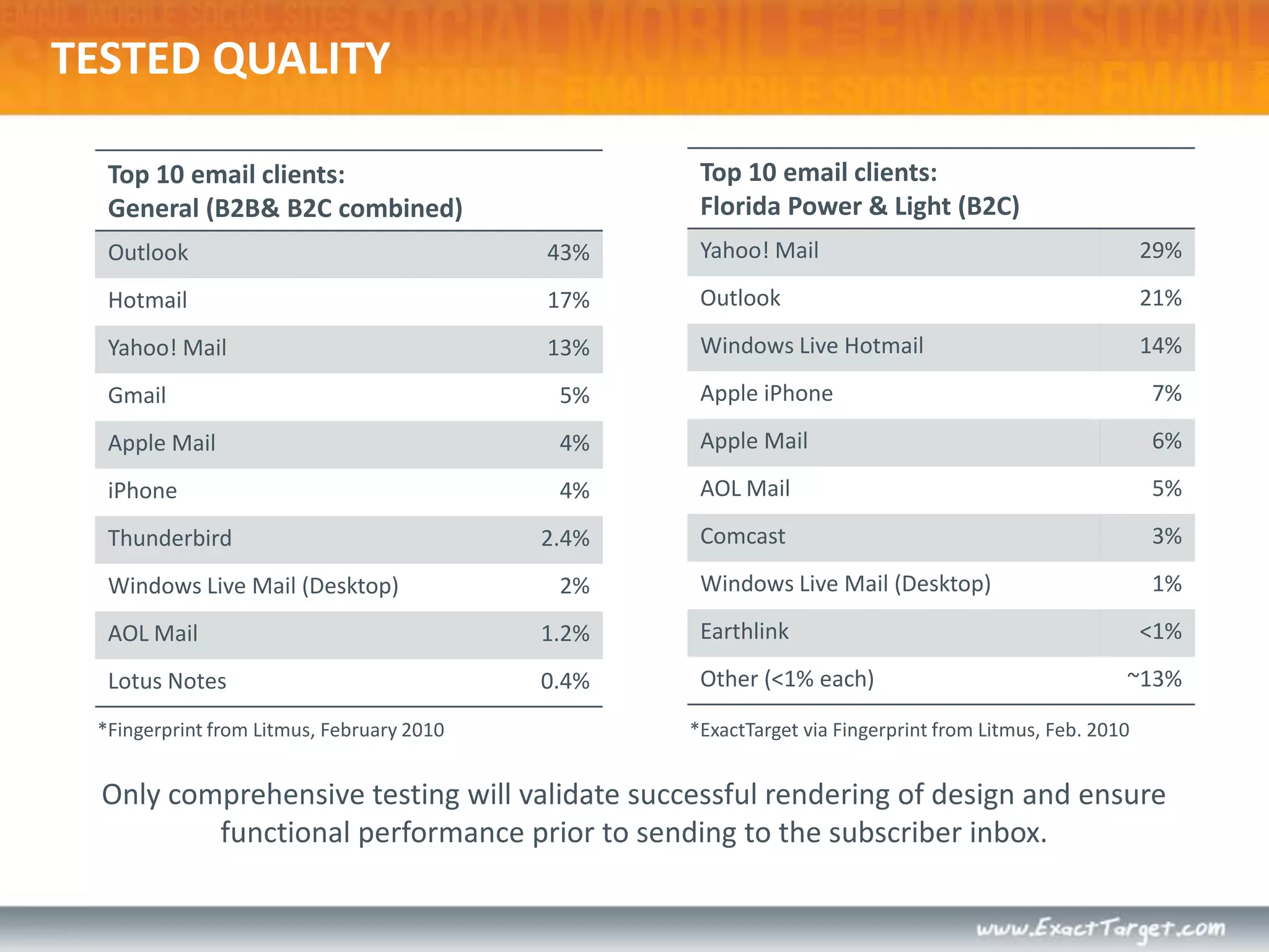
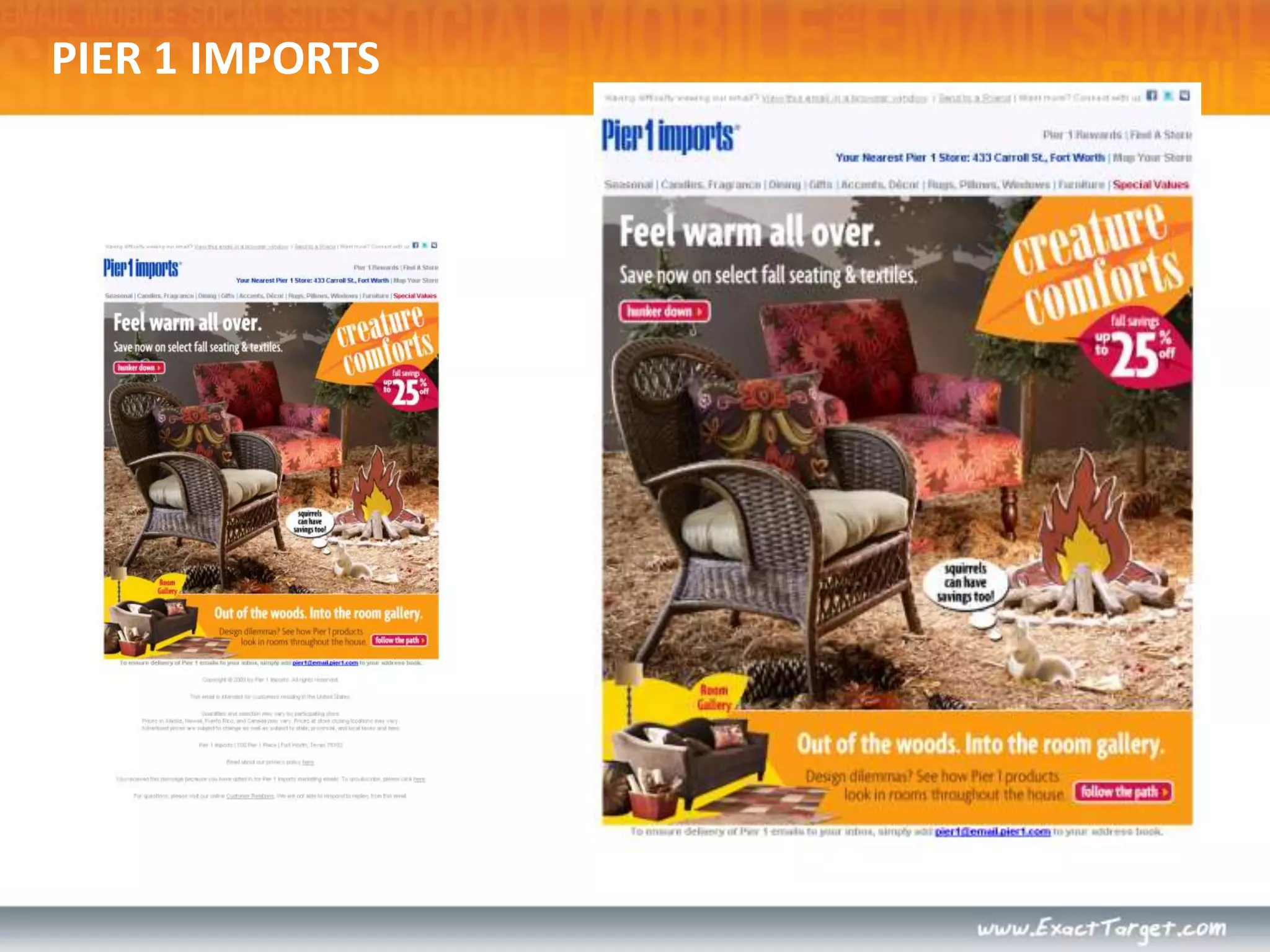
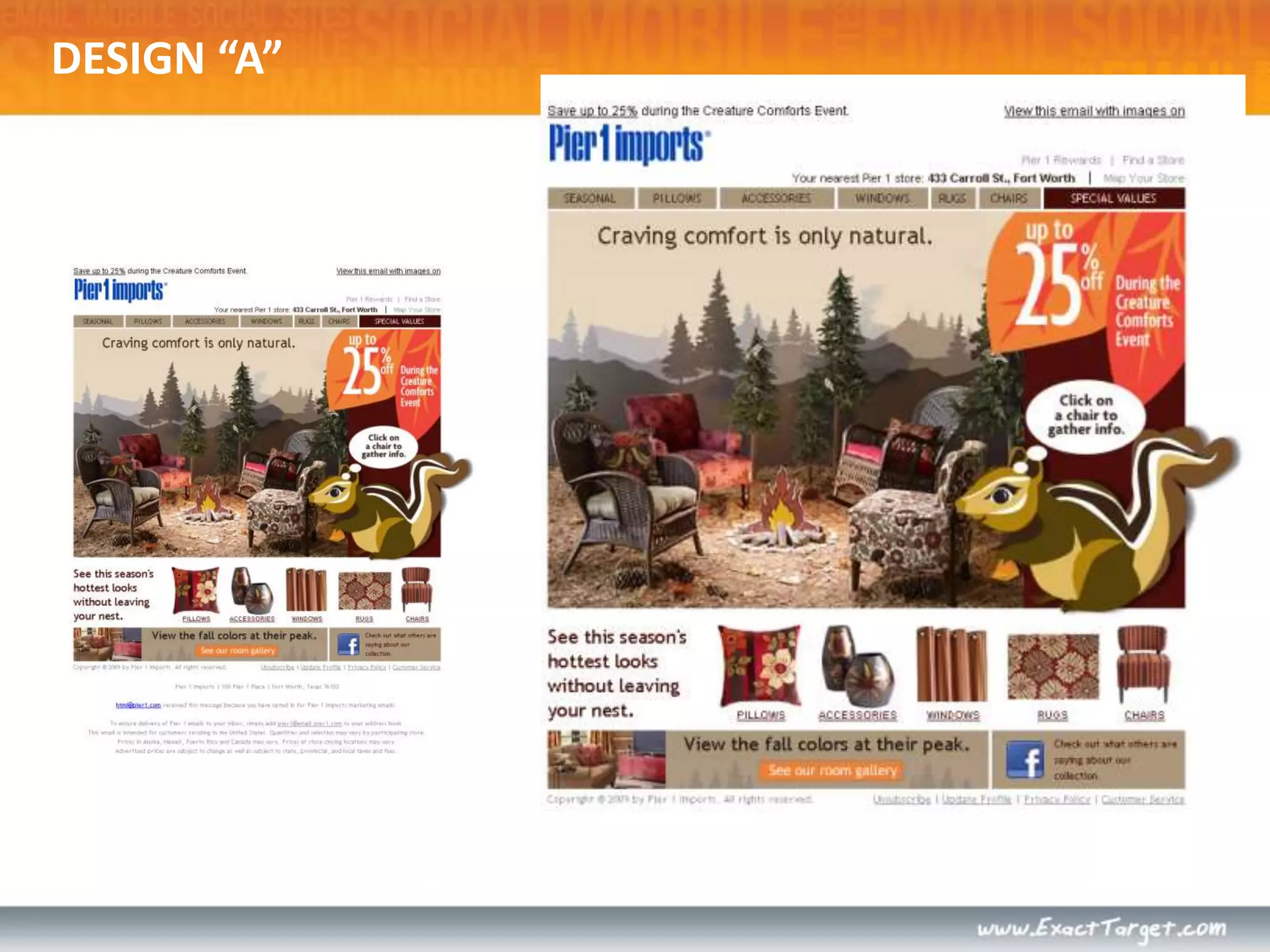
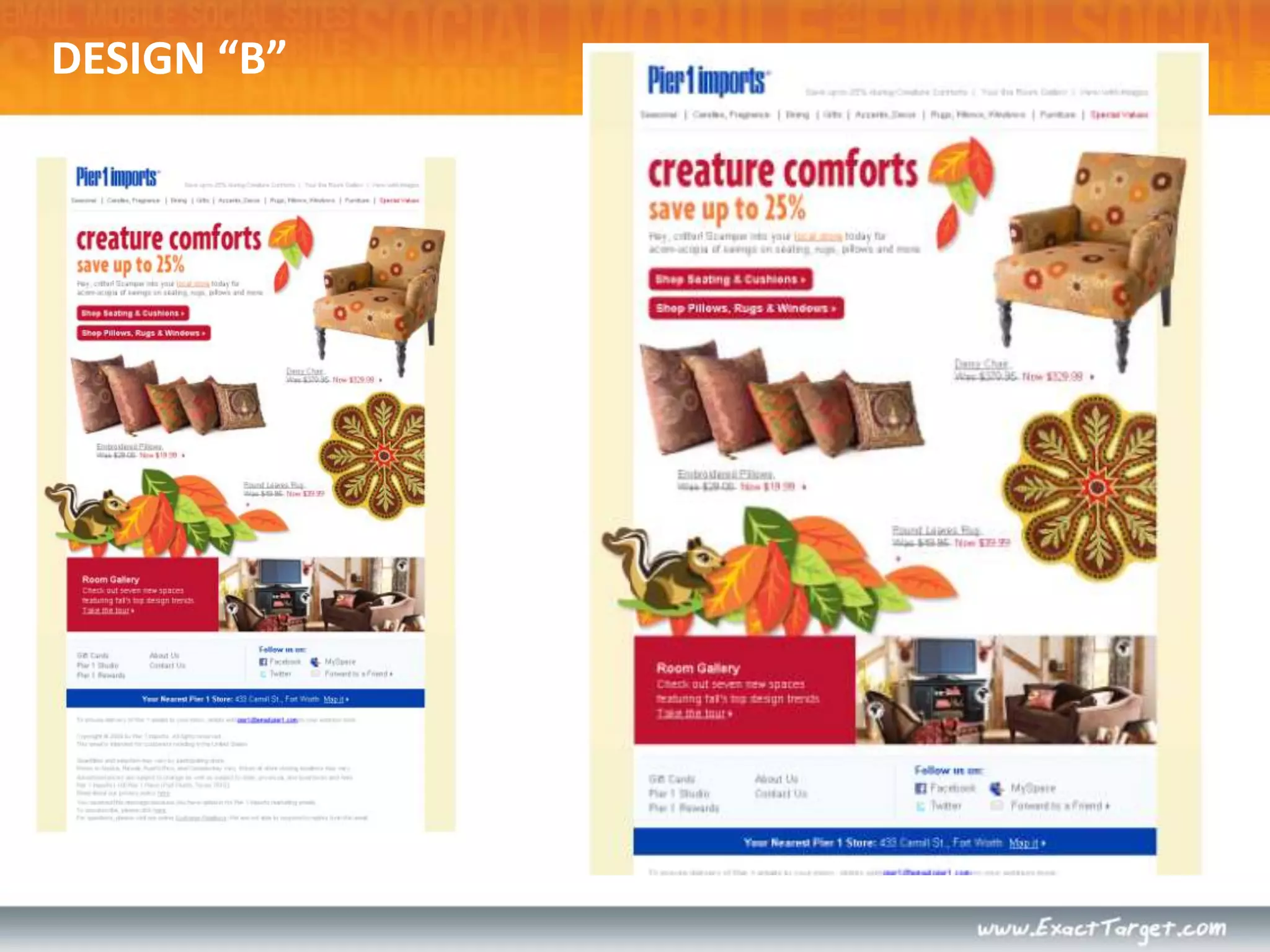
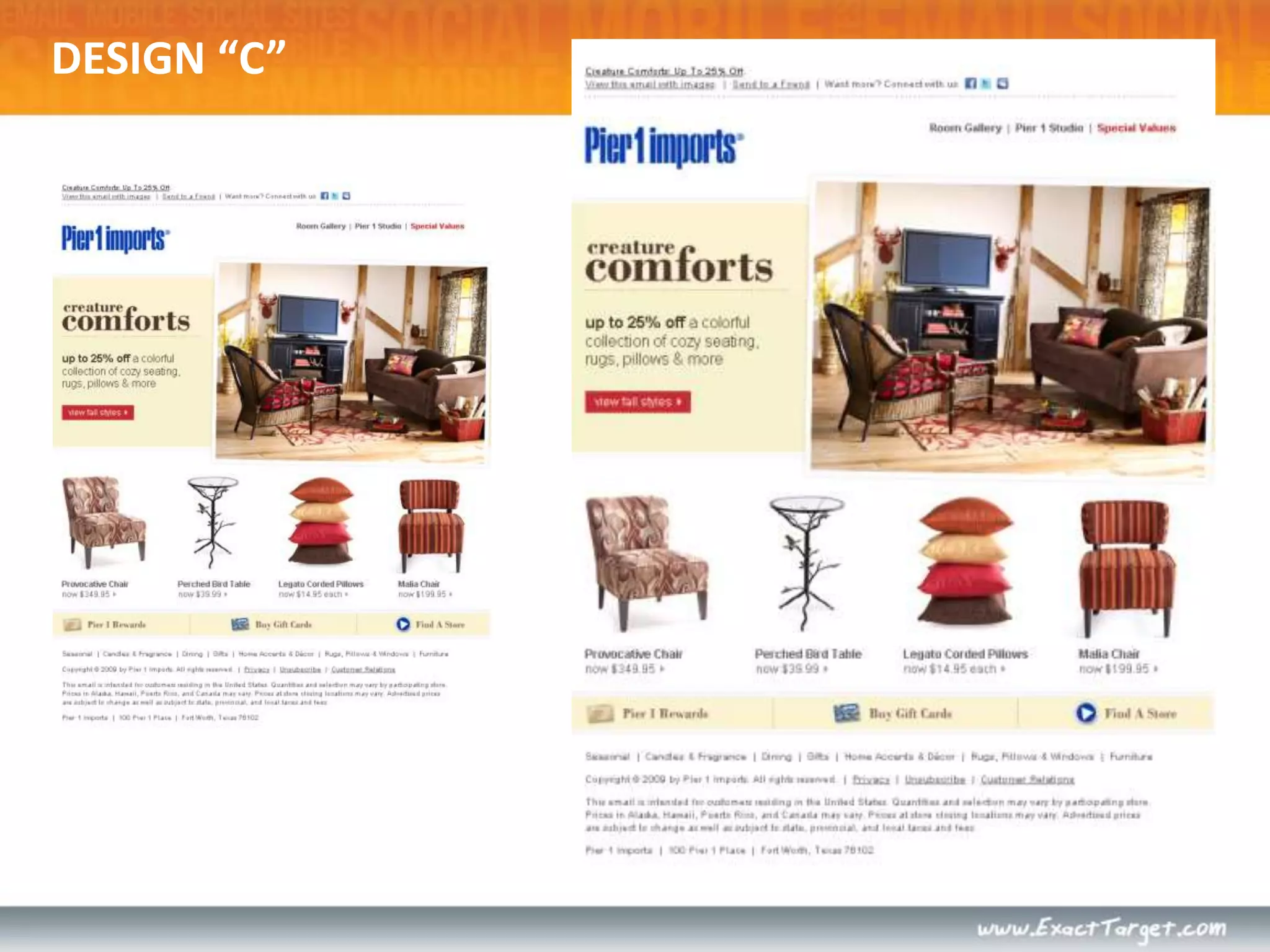
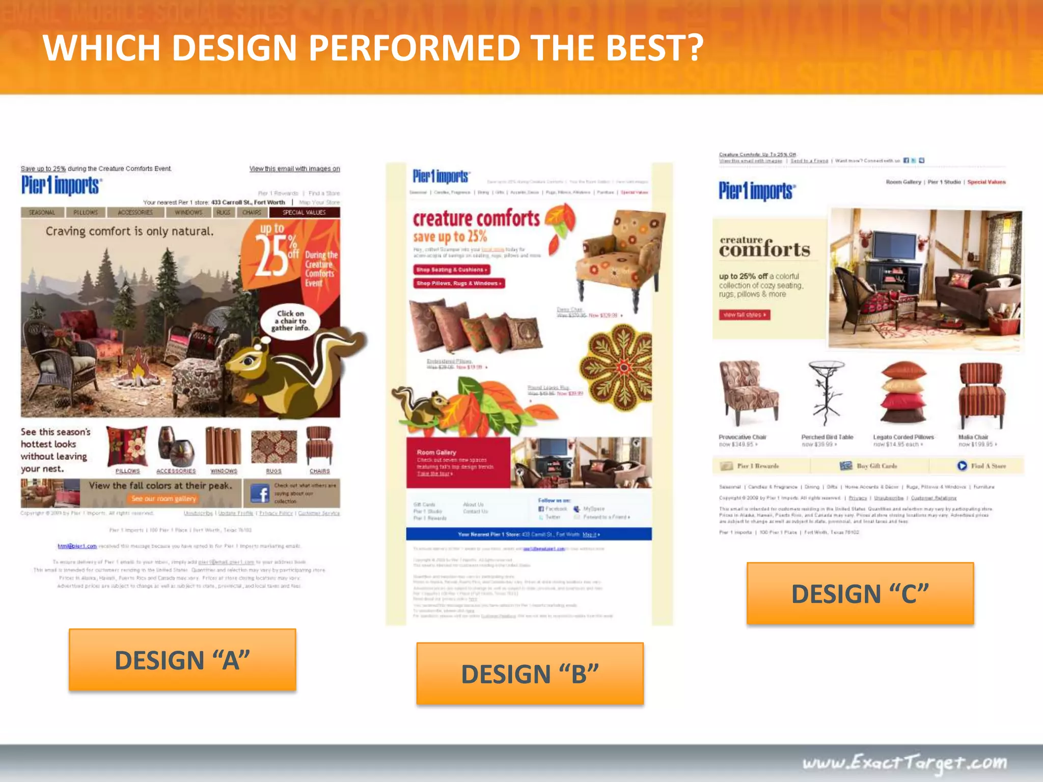
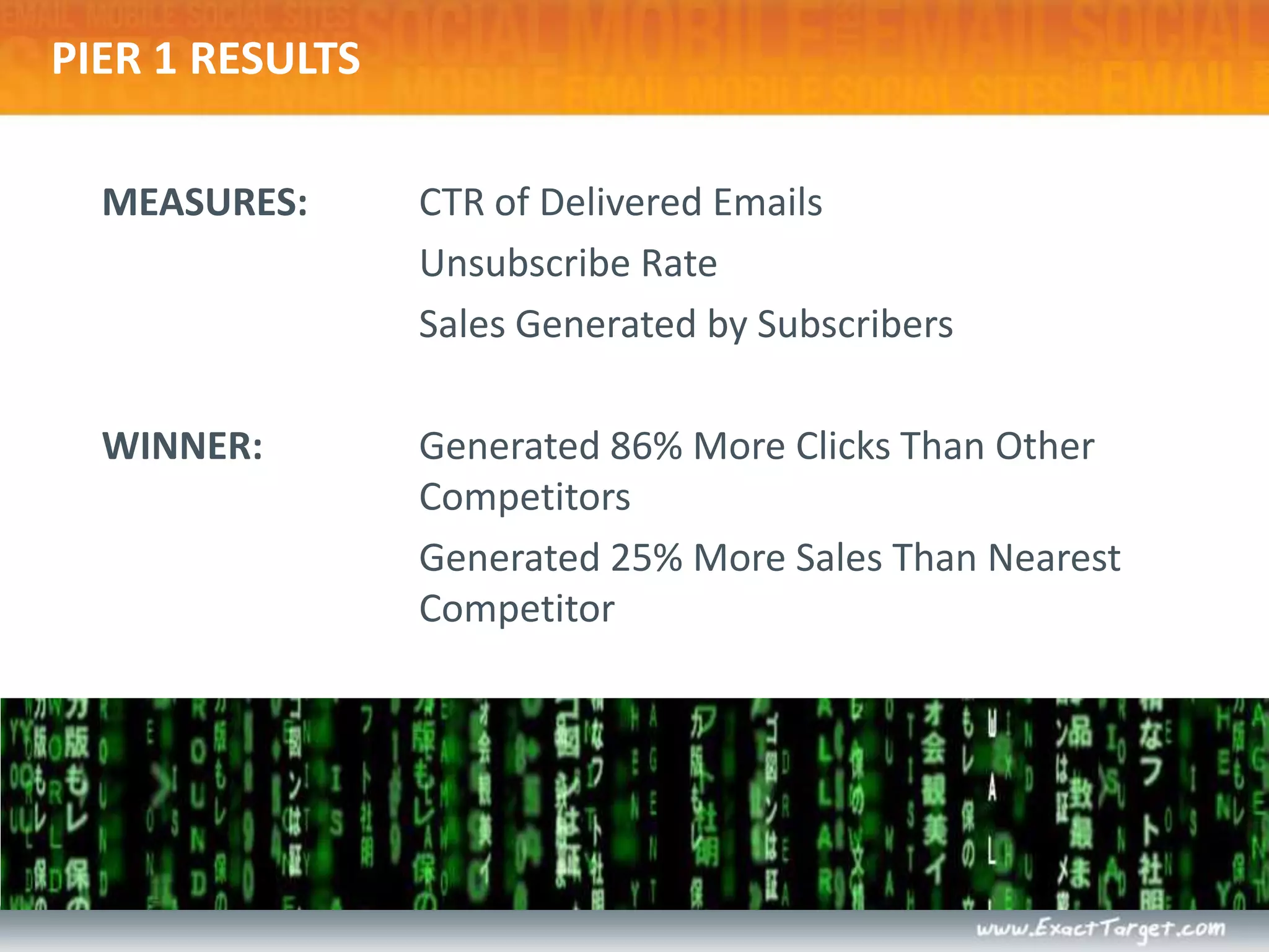
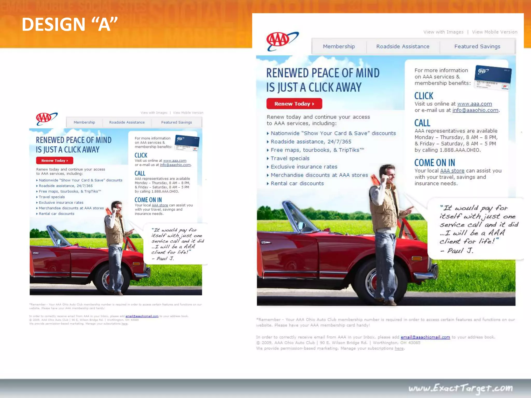
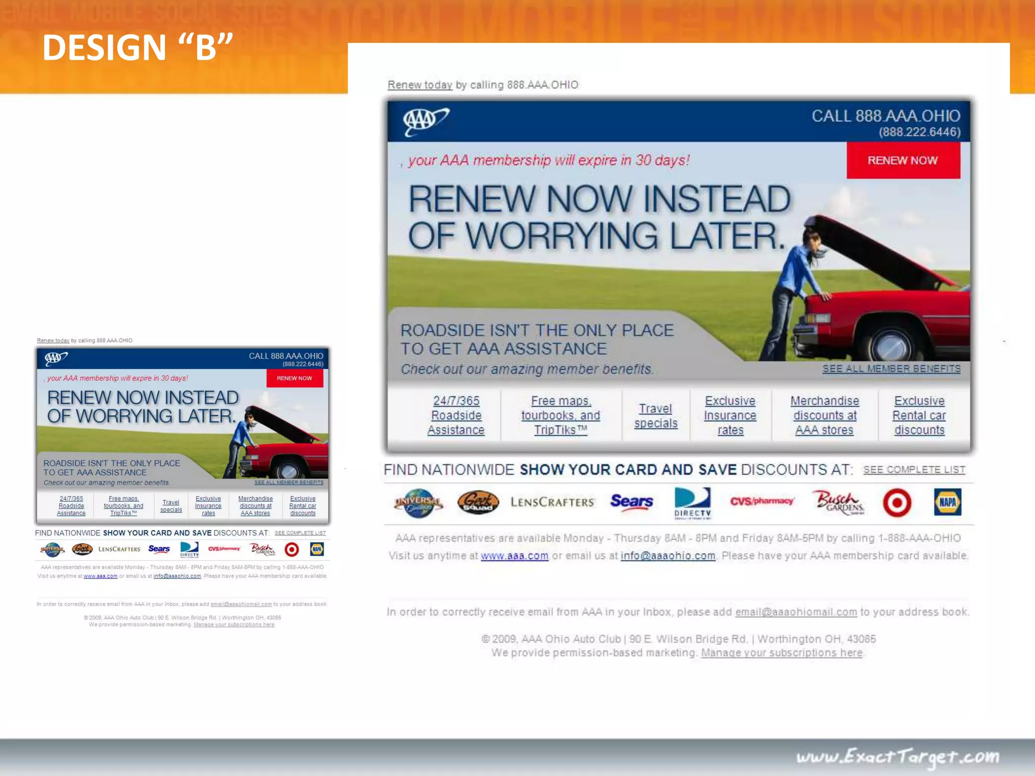
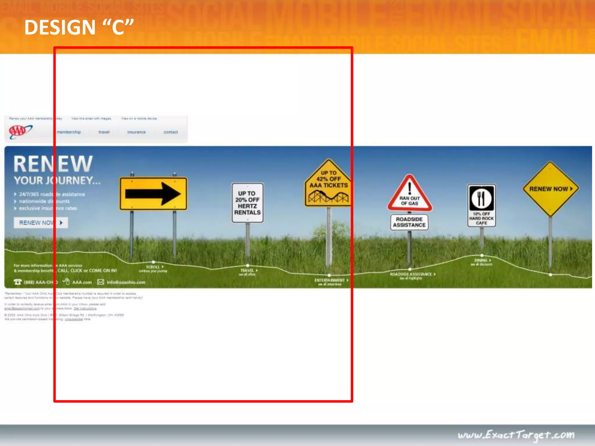
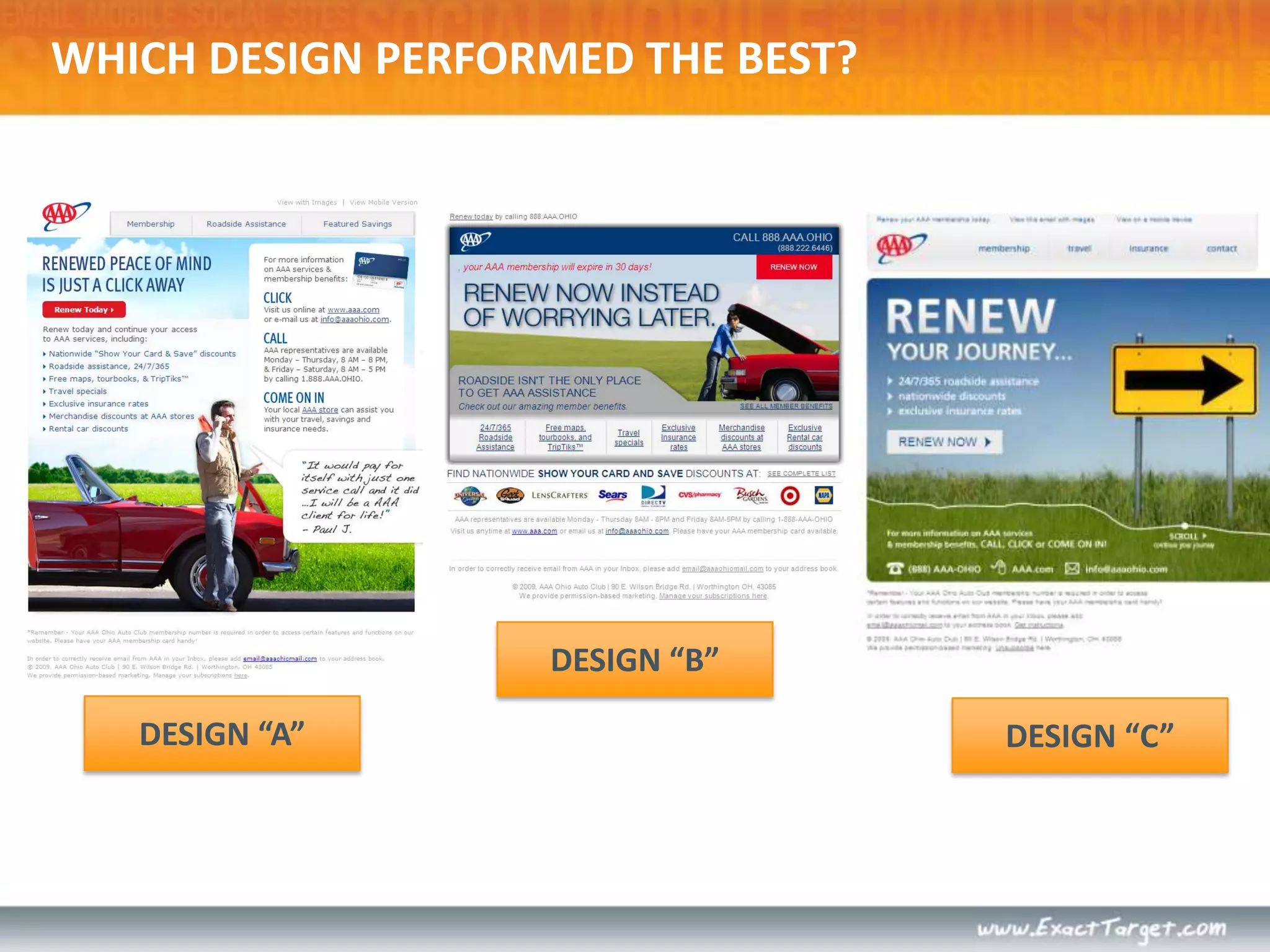
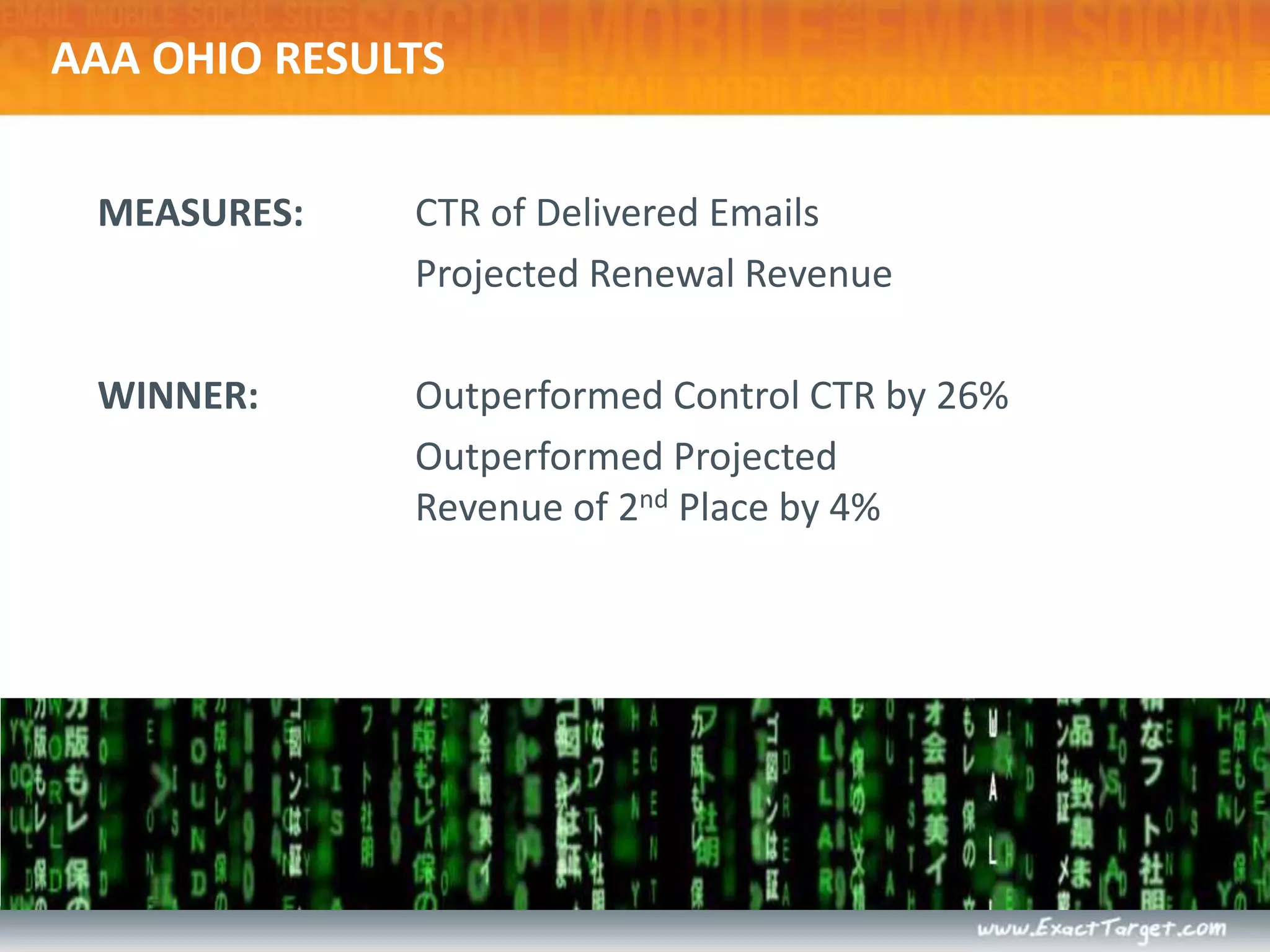
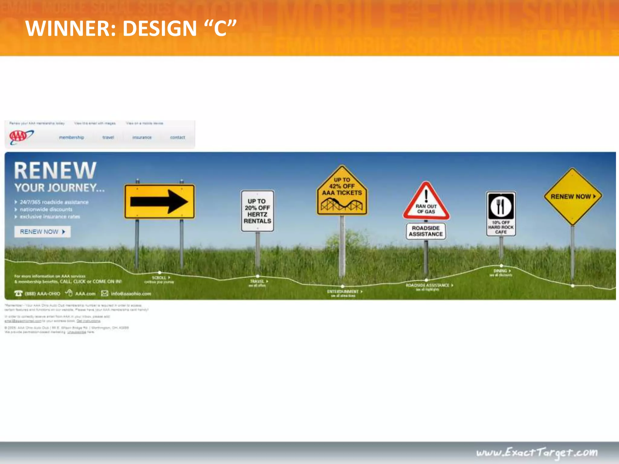
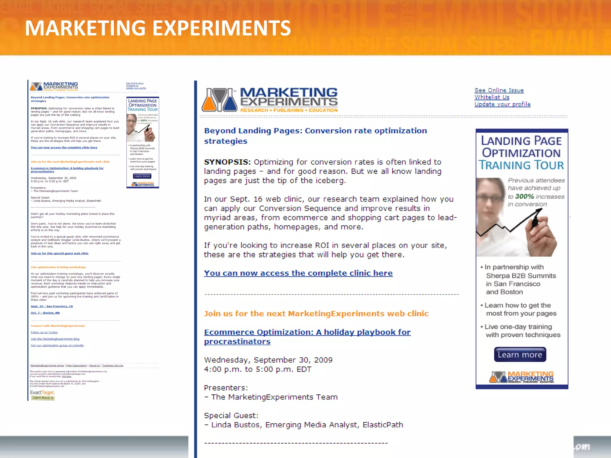
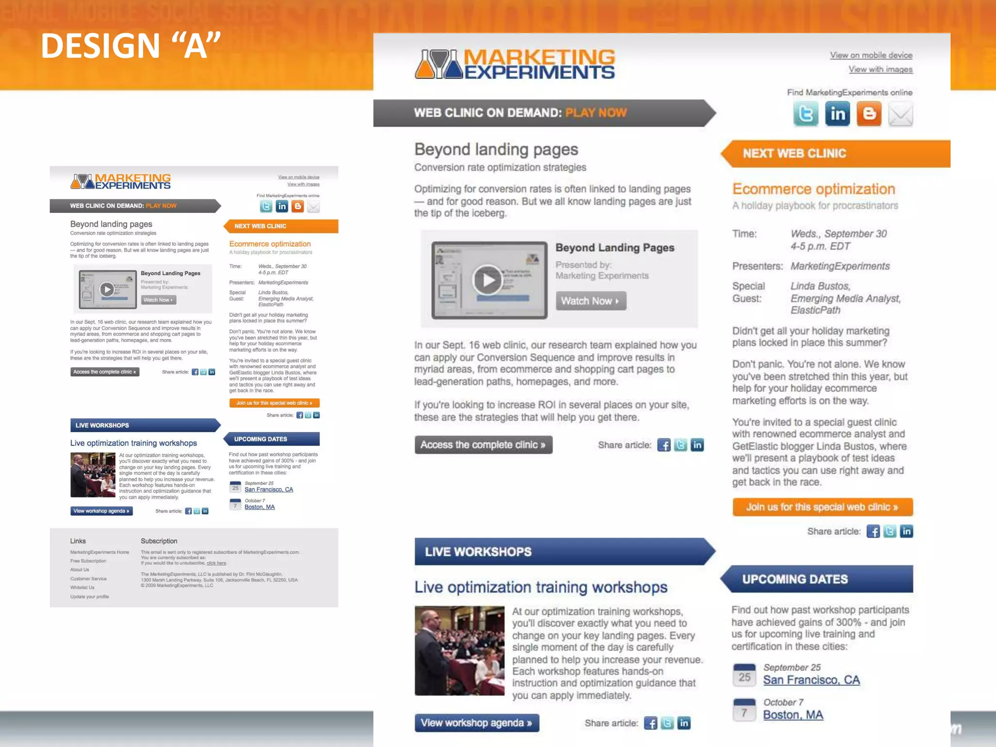
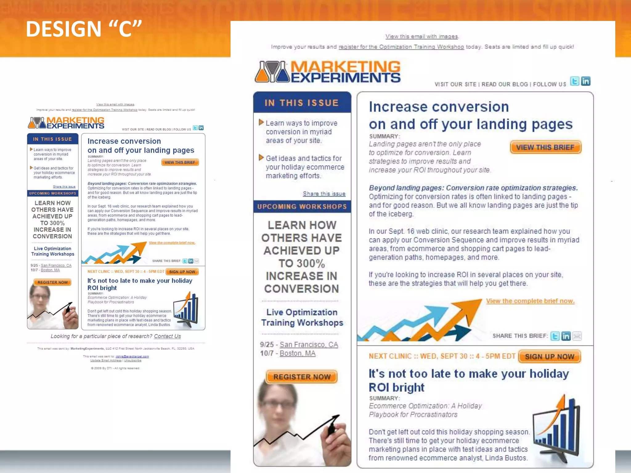
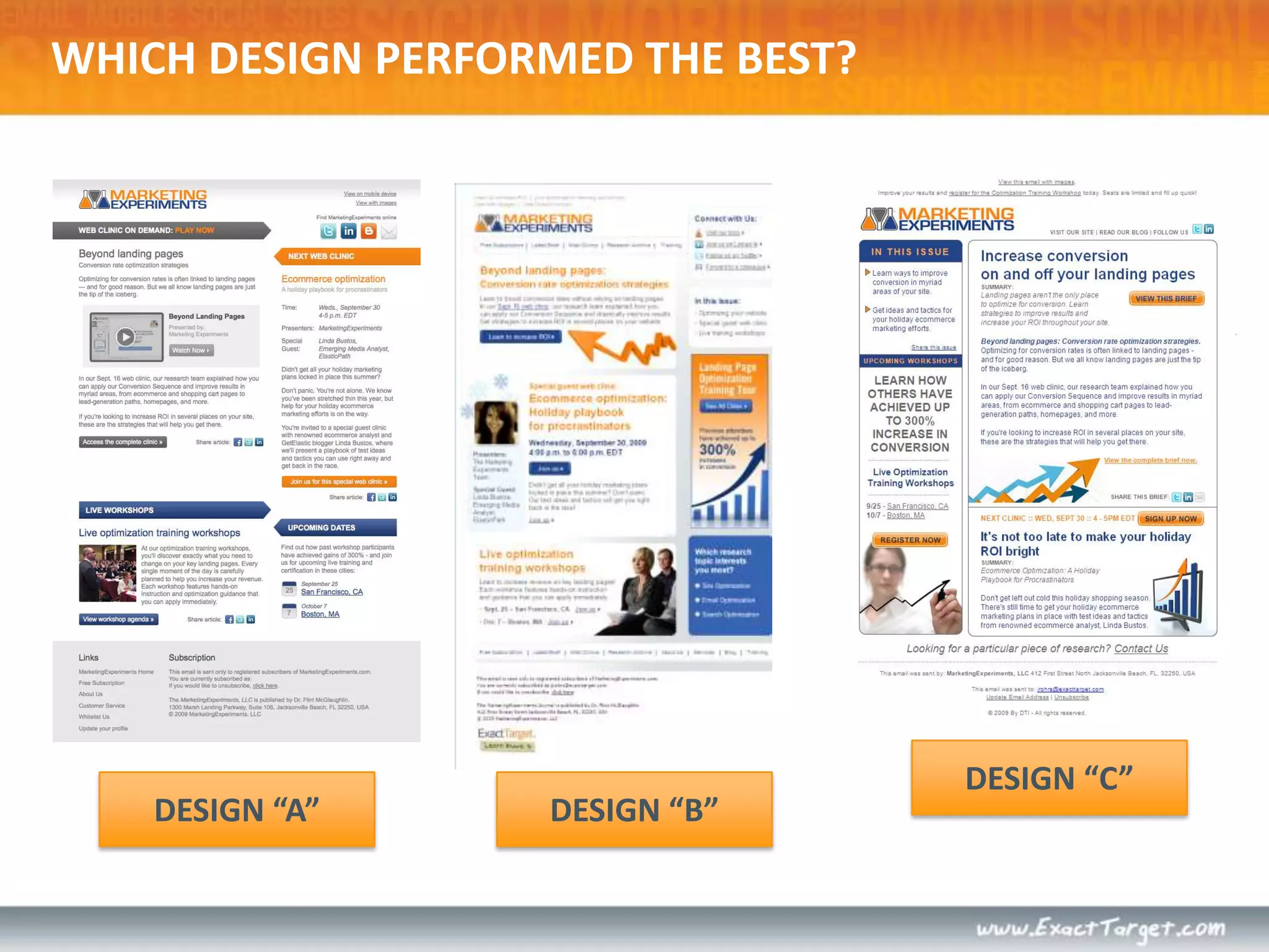
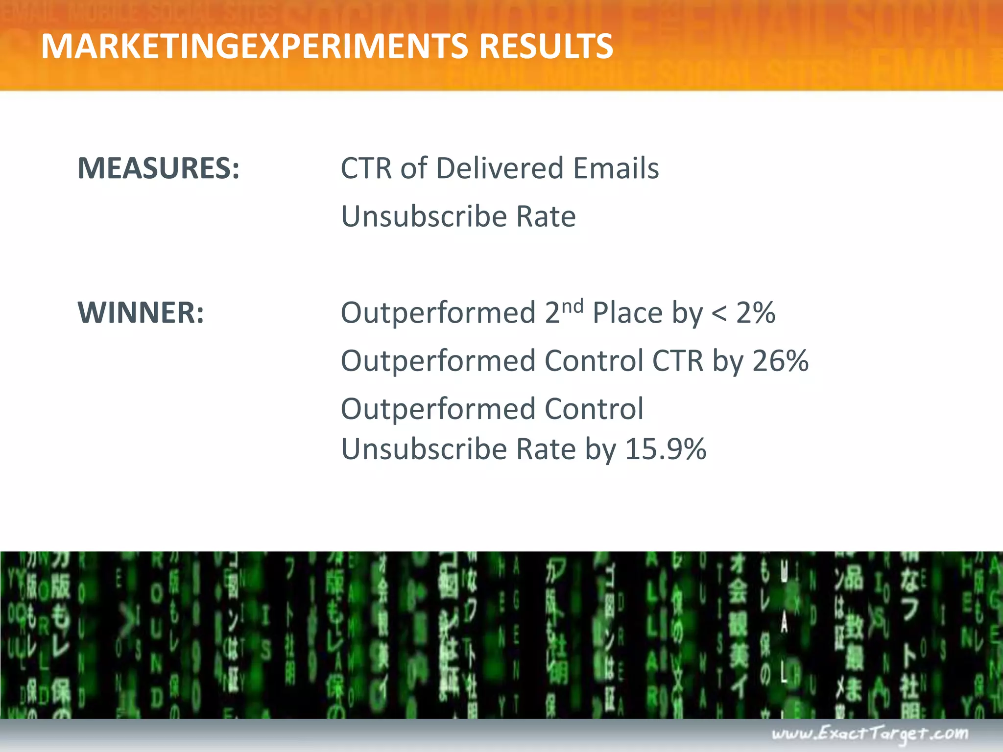
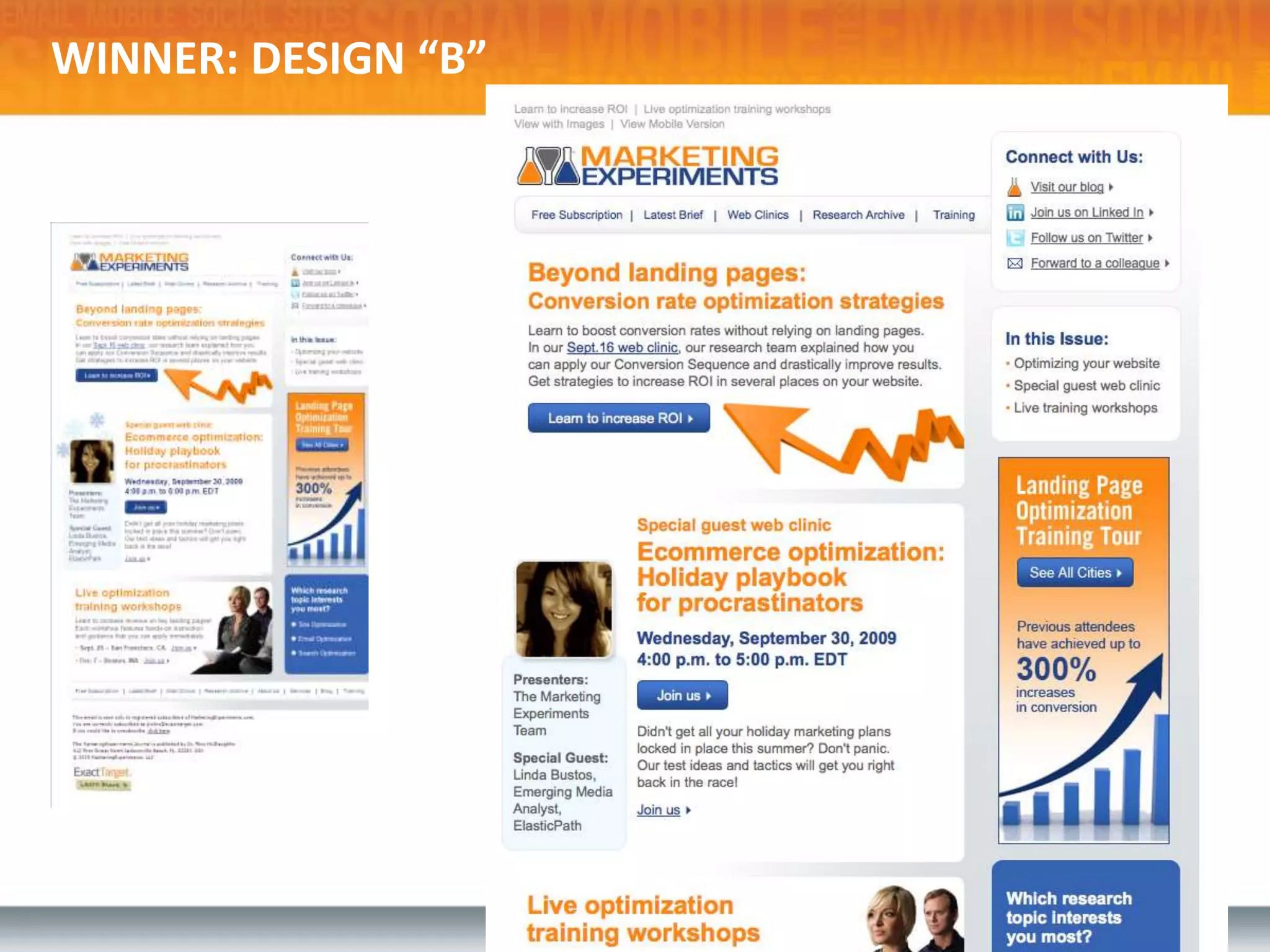
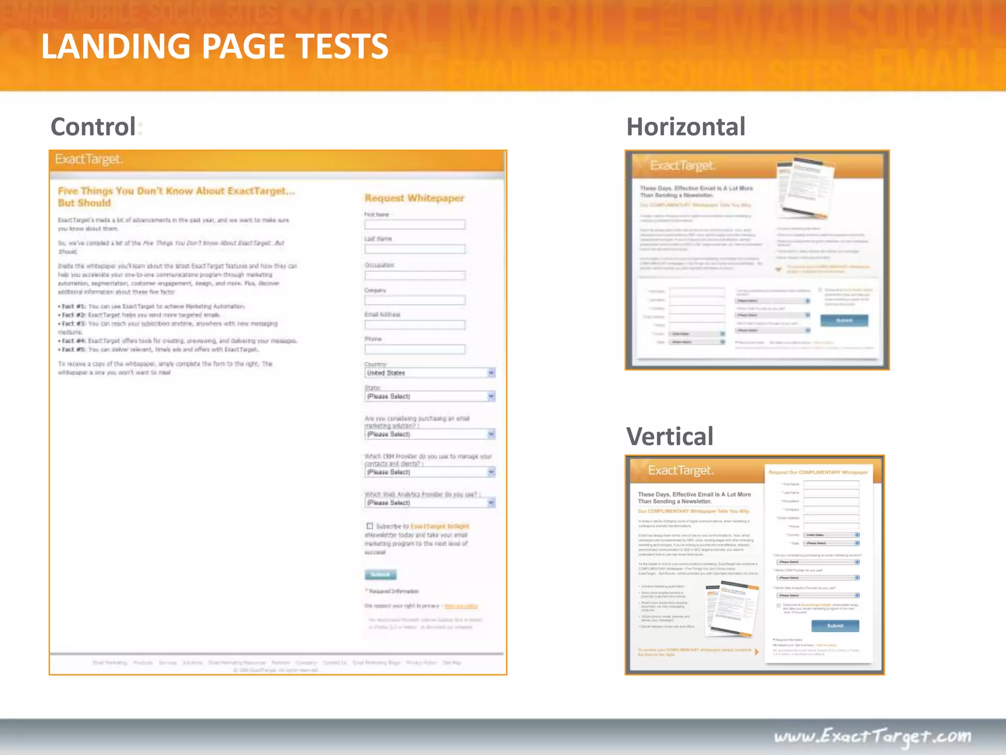
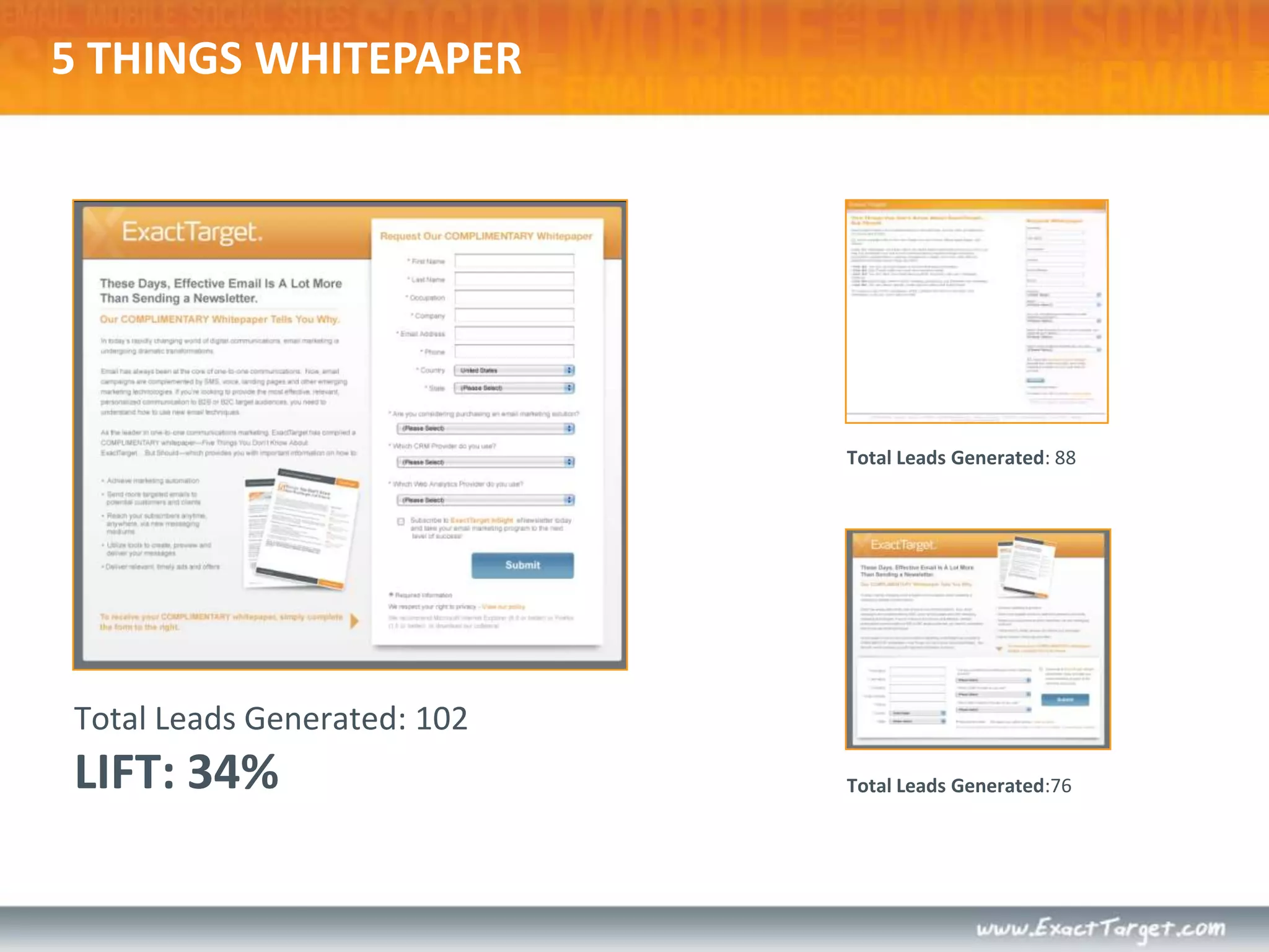
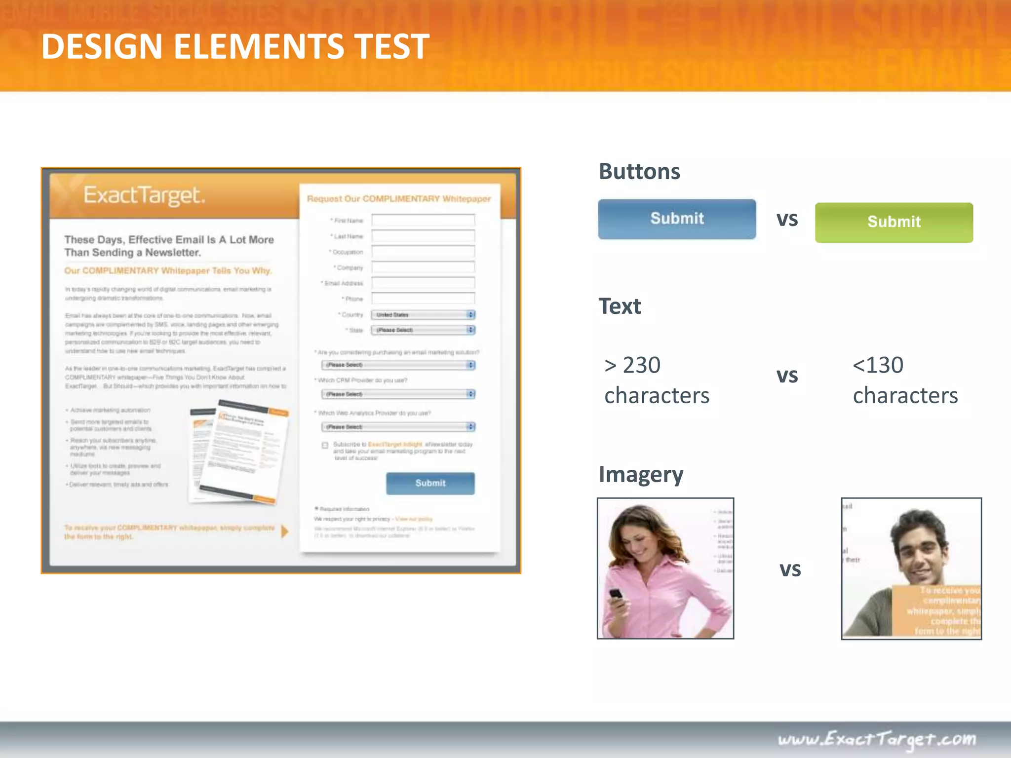
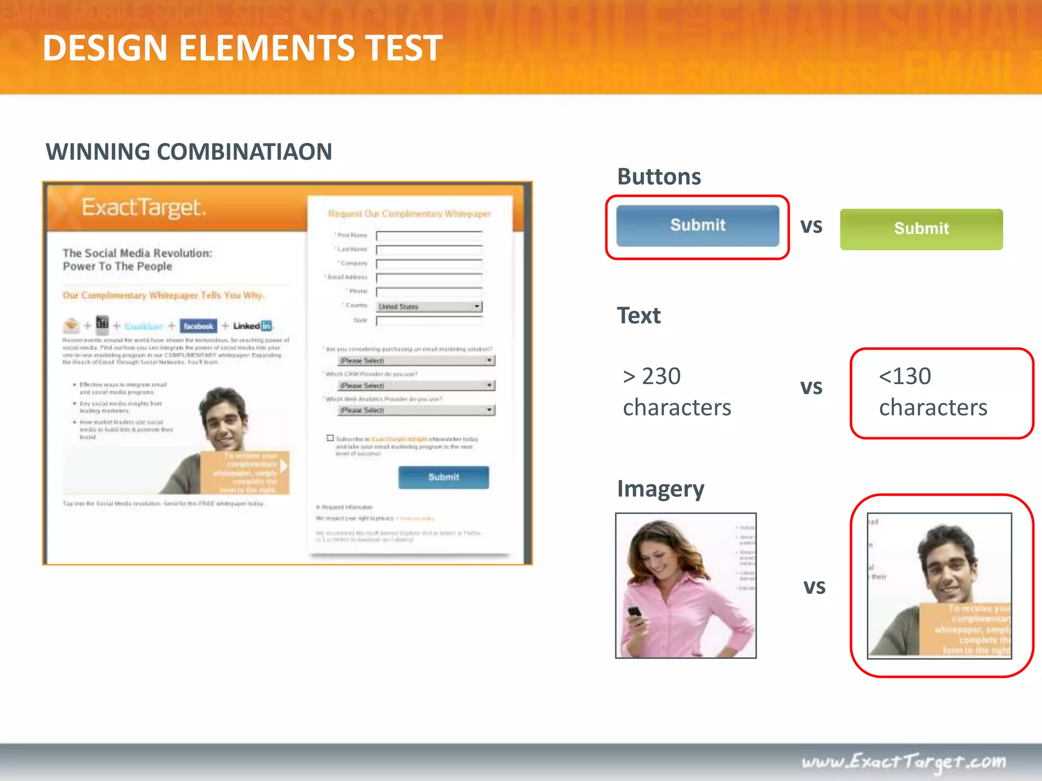
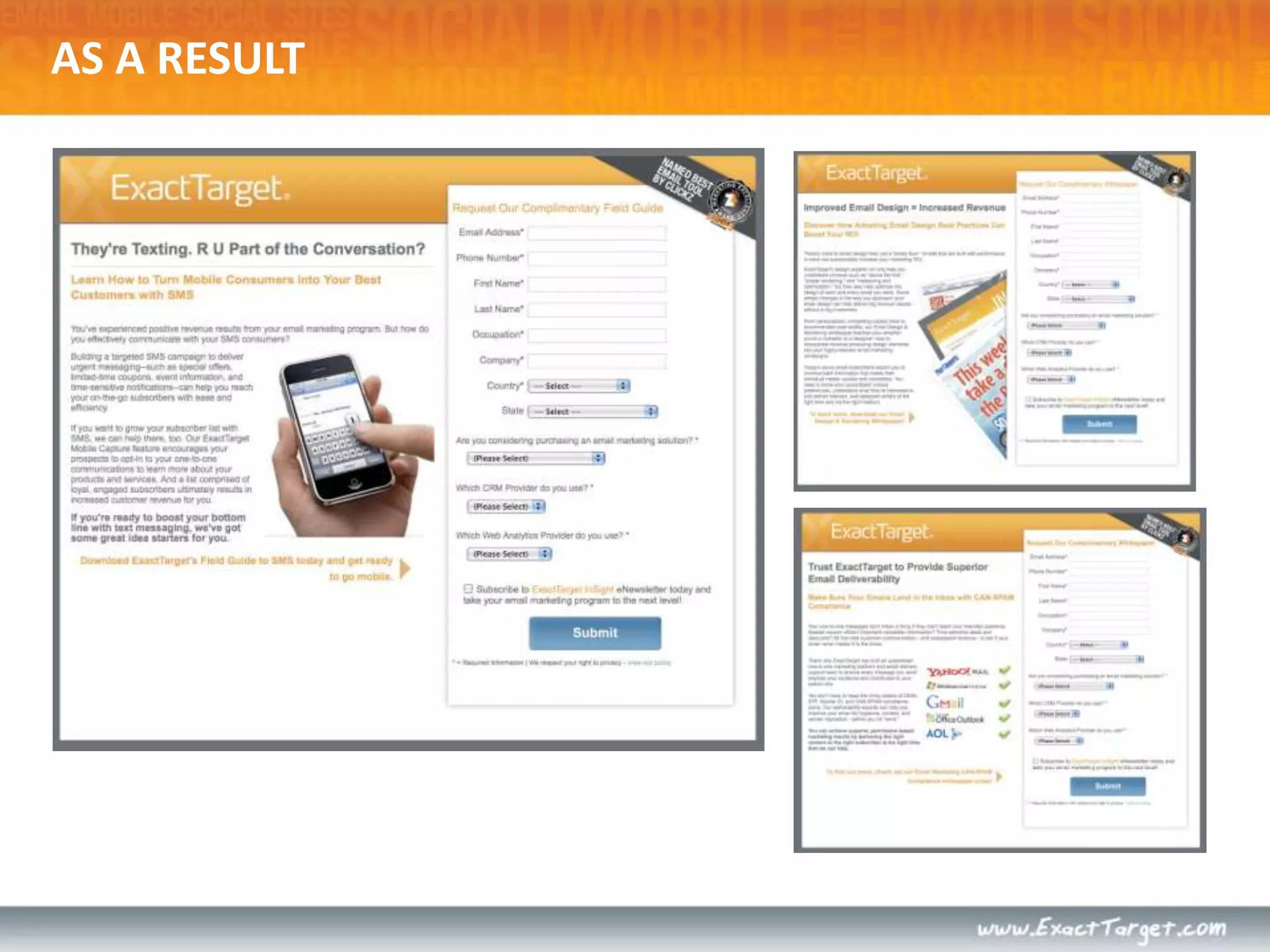
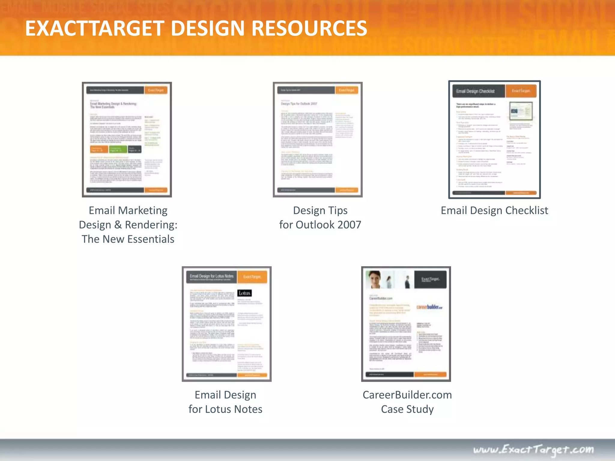
DESIGN FOR YOUR SUBSCRIBERSTips and Tricks to Increase Email Marketing ROI
LET’S TALK ABOUT…Subscriber ExperiencePerformance-Driven DesignCode MattersThe Mobile InboxLanding PagesTest, test, TEST!Resources
WHY DOES DESIGN MATTER?Design is the visualization of a business plan. More than a pretty picture, great design requires an actionable plan and measureable goals. Design should acknowledge the subscriber experience.Put yourself in your subscriber’s shoes and understand how they will interact with your communications.Design and technology are seamlessly integrated.Emails should be designed and coded to display properly in the various ways a subscriber will view it.  A comprehensive testing strategy is essential to ensure success.
SUBSCRIBER EXPERIENCEConsider the entire subscriber experience –  from first impression to final click.Each individual phase influences the decision to open and engage with your email.Your email design is experienced in stages – not as a static page.FROM NAMESUBJECT LINEPREVIEW PANEABOVE THE FOLDCOMPLETE EMAILCLICK THROUGH
It all begins with theFrom Name – 73% of subscribers click “Report Spam” or “Report Junk” based on this field.*Email Sender and Provider CoalitionFROM NAMEIS YOUR FROM NAME EASILY RECOGNIZABLE?
SUBJECT LINE69% of subscribers click “Report Spam” or “Report Junk” based on this line.*IS YOUR SUBJECT LINE RELEVANT AND INTERESTING?*Email Sender and Provider Coalition
SUBJECT LINE69% of subscribers click “Report Spam” or “Report Junk” based on this line.*IS YOUR SUBJECT LINE RELEVANT AND INTERESTING?
Images are disabled by default more than 50% of the time.Isyourkey message visible, relevant and enticing in this space?PREVIEW PANE: IMAGES OFFWHAT IS YOUR EMAIL SAYING WITH IMAGES OFF?
PREVIEW PANE: IMAGES ONWhat’s your open rate? Only subscribers that turn images on trigger an open.Are you giving them a reason to keep reading? AVERAGE PREVIEWPANE DIMENSIONS:300px by 300px
PREVIEW PANE & IMAGE BLOCKINGHotmail - Images OffHotmail – Images On
ABOVE THE FOLDDoes your content above the fold provide motivation to respond?  Are you persuading subscribers to scroll?DON’T CRAMEVERYTHINGABOVE THE FOLD…INTRODUCE CONTENTABOVE THE FOLD
COMPLETE EMAILSeconds – not minutes – to view an entire emailOnly 11%* of those who open will scroll below the fold!EVEN IN THIS VIEWTHE ENTIRE EMAIL IS NOT ONSCREEN AT ONCE*The Nielsen Norman Group
Subscriber experience doesn’t end with the inboxCLICK THROUGHDon’t ignore the transition to your website, landing page, or other marketing collateral. Ensure the products in your email are available on your site - better yet, map the individual products from the email to a product page.“…A well-designed email means nothing if the landing pages don’t work well.” – Chad White
CONSIDER THE SUBSCRIBER EXPERIENCEIs this the message you want to convey?
Brand Synergy  • Content Hierarchy•Visual Hierarchy Engagement Techniques • Rendering Results  •Tested QualityPERFORMANCE DRIVEN DESIGN
WebsiteEmailVisual recognition of the brand across all media channels creates a seamless brand experience, creating trust to engage and transact.BRAND SYNERGY
WireframePreview PaneAbove the FoldCreate a content hierarchy, arranging each content element (text and/or image) and associated call to action with appropriate weight.CONTENT HIERARCHY
Headlines utilizing size and color hierarchySecondary calls-to-actionPrimary call-to-actionMaximize response by creating a visual hierarchy, using design techniques to guide the subscriber's eye through your email based on the content hierarchy.VISUAL HIERARCHY“Quick Bites” or summaries
Preheader Teaser Text  Forward to a ColleagueIn This IssueRead More LinkSubscriber Q&ALifestyle ImageryUse of Background ColorLink to External VideoRecovery ModuleUse design techniques to engage the subscriber through a mix of emotive and rational imagery and content. Smart use of images, borders, buttons, links, charts, colored backgrounds, etc.should be applied and tested.ENGAGEMENT TECHNIQUES
Optimized DesignNon-optimized DesignMain call-to-action in prime placement HTML text in web safe fonts If an email is created primarily with images,it will not display effectively when images are blocked.Designed with image-blocking and preview pane viewing in mind.Ensure your design efforts are viewed as intended once they hit the inbox. Emails that are created with the subscriber experience in mind will have a greater chance of  success.RENDERING RESULTS
*Fingerprint from Litmus, February 2010Only comprehensive testing will validate successful rendering of design and ensure functional performance prior to sending to the subscriber inbox.TESTED QUALITY*ExactTarget via Fingerprint from Litmus, Feb. 2010
NEWSLETTER DESIGN CONSIDERATIONSInclude a Table of Contents or In This Issue Section
Include a 3-4 sentence teaser for articles with a “Read More” link instead of including the full article
Introduce your main call-to-action within the preview pane and other important content above the fold
Develop a visual hierarchy for headings, subheading, and body copy for easy scan-ability
Use images selectively to eye track to engagement areasPOSTCARD DESIGN CONSIDERATIONSYour message should have a singular focus; don’t let your postcard become a newsletter
Make that message the Hero in your design
Introduce your main call-to-action within the preview pane and other important content above the fold
Consider the placement and inclusion of secondary messaging that supports your main focusTRANSACTIONAL DESIGN CONSIDERATIONSPosition content front and center; keep it simple
Don’t include too much cross-sell information (follow the 70/30 rule)
Use a higher text to image ratio
Use font colors and sizes to create a visual hierarchy
Send a branded HTML email instead of Plain TextCODE MATTERS!HTML for email is different than HTML for the webModern web design utilizes CSS (cascading style sheets) for layout. However, due to inconsistent CSS support, HTML tables must be used for email layout. CODE LIKE IT’S 1999!No standards exist for displaying HTML in email.Proper syntax still counts – use a validator to check for general errors.Beware of:Forms, surveys, search barsJavascriptVideo/flashAnimated .gifsBackground images
THE MOBILE INBOXSmartphone users use mobile email primarily for triage
There are no standards in place for displaying emails on smartphones
Most mobile devices display a “stripped down” version of the HTML portion of an email, NOT the plain-text version
Optimizing your emails with HTML text in web-safe fonts will benefit smartphone users as well
Consider including a link in your email to view a mobile friendly version of your email
One-column designs hold up best on mobile devicesLANDING PAGE TIPSLeverage web analytics to design for your audienceMonitor Resolution, Browser, User behavior
LANDING PAGE TIPSContinuity – graphics, offers, headlines, imagery, dataSet expectations, and follow through accordinglyKeep forms simpleHonest, clear, concise copy – use bullets!Avoid extra elements (navigation, sidebars, images…)Don’t be afraid to re-state valueUse seals!Same rules of email apply to landing pages
EXTREME MAKEOVER:EMAIL DESIGN EDITION
PIER 1 IMPORTS
DESIGN “A”
DESIGN “B”
DESIGN “C”
DESIGN “C”DESIGN “A”DESIGN “B”WHICH DESIGN PERFORMED THE BEST?
PIER 1 RESULTSMEASURES: 	CTR of Delivered Emails	Unsubscribe Rate	Sales Generated by SubscribersWINNER:	Generated 86% More Clicks Than Other Competitors	Generated 25% More Sales Than Nearest Competitor
WINNER: DESIGN “A”BUT…
AAA OHIO
DESIGN “A”
DESIGN “B”
DESIGN “C”
DESIGN “B”DESIGN “A”DESIGN “C”WHICH DESIGN PERFORMED THE BEST?
AAA OHIO RESULTSMEASURES: 	CTR of Delivered Emails	Projected Renewal RevenueWINNER:	Outperformed Control CTR by 26%	Outperformed ProjectedRevenue of 2nd Place by 4%
WINNER: DESIGN “C”
MARKETING EXPERIMENTS
DESIGN “A”
DESIGN “B”
DESIGN “C”
DESIGN “C”DESIGN “A”DESIGN “B”WHICH DESIGN PERFORMED THE BEST?

Design for Your Subscribers

  • 1.
    DESIGN FOR YOURSUBSCRIBERSTips and Tricks to Increase Email Marketing ROI
  • 2.
    LET’S TALK ABOUT…SubscriberExperiencePerformance-Driven DesignCode MattersThe Mobile InboxLanding PagesTest, test, TEST!Resources
  • 3.
    WHY DOES DESIGNMATTER?Design is the visualization of a business plan. More than a pretty picture, great design requires an actionable plan and measureable goals. Design should acknowledge the subscriber experience.Put yourself in your subscriber’s shoes and understand how they will interact with your communications.Design and technology are seamlessly integrated.Emails should be designed and coded to display properly in the various ways a subscriber will view it. A comprehensive testing strategy is essential to ensure success.
  • 4.
    SUBSCRIBER EXPERIENCEConsider theentire subscriber experience – from first impression to final click.Each individual phase influences the decision to open and engage with your email.Your email design is experienced in stages – not as a static page.FROM NAMESUBJECT LINEPREVIEW PANEABOVE THE FOLDCOMPLETE EMAILCLICK THROUGH
  • 5.
    It all beginswith theFrom Name – 73% of subscribers click “Report Spam” or “Report Junk” based on this field.*Email Sender and Provider CoalitionFROM NAMEIS YOUR FROM NAME EASILY RECOGNIZABLE?
  • 6.
    SUBJECT LINE69% ofsubscribers click “Report Spam” or “Report Junk” based on this line.*IS YOUR SUBJECT LINE RELEVANT AND INTERESTING?*Email Sender and Provider Coalition
  • 7.
    SUBJECT LINE69% ofsubscribers click “Report Spam” or “Report Junk” based on this line.*IS YOUR SUBJECT LINE RELEVANT AND INTERESTING?
  • 8.
    Images are disabledby default more than 50% of the time.Isyourkey message visible, relevant and enticing in this space?PREVIEW PANE: IMAGES OFFWHAT IS YOUR EMAIL SAYING WITH IMAGES OFF?
  • 9.
    PREVIEW PANE: IMAGESONWhat’s your open rate? Only subscribers that turn images on trigger an open.Are you giving them a reason to keep reading? AVERAGE PREVIEWPANE DIMENSIONS:300px by 300px
  • 10.
    PREVIEW PANE &IMAGE BLOCKINGHotmail - Images OffHotmail – Images On
  • 11.
    PREVIEW PANE &IMAGE BLOCKINGHotmail - Images OffHotmail – Images On
  • 12.
    ABOVE THE FOLDDoesyour content above the fold provide motivation to respond? Are you persuading subscribers to scroll?DON’T CRAMEVERYTHINGABOVE THE FOLD…INTRODUCE CONTENTABOVE THE FOLD
  • 13.
    COMPLETE EMAILSeconds –not minutes – to view an entire emailOnly 11%* of those who open will scroll below the fold!EVEN IN THIS VIEWTHE ENTIRE EMAIL IS NOT ONSCREEN AT ONCE*The Nielsen Norman Group
  • 14.
    Subscriber experience doesn’tend with the inboxCLICK THROUGHDon’t ignore the transition to your website, landing page, or other marketing collateral. Ensure the products in your email are available on your site - better yet, map the individual products from the email to a product page.“…A well-designed email means nothing if the landing pages don’t work well.” – Chad White
  • 15.
    CONSIDER THE SUBSCRIBEREXPERIENCEIs this the message you want to convey?
  • 16.
    Brand Synergy • Content Hierarchy•Visual Hierarchy Engagement Techniques • Rendering Results •Tested QualityPERFORMANCE DRIVEN DESIGN
  • 17.
    WebsiteEmailVisual recognition ofthe brand across all media channels creates a seamless brand experience, creating trust to engage and transact.BRAND SYNERGY
  • 18.
    WireframePreview PaneAbove theFoldCreate a content hierarchy, arranging each content element (text and/or image) and associated call to action with appropriate weight.CONTENT HIERARCHY
  • 19.
    Headlines utilizing sizeand color hierarchySecondary calls-to-actionPrimary call-to-actionMaximize response by creating a visual hierarchy, using design techniques to guide the subscriber's eye through your email based on the content hierarchy.VISUAL HIERARCHY“Quick Bites” or summaries
  • 20.
    Preheader Teaser Text Forward to a ColleagueIn This IssueRead More LinkSubscriber Q&ALifestyle ImageryUse of Background ColorLink to External VideoRecovery ModuleUse design techniques to engage the subscriber through a mix of emotive and rational imagery and content. Smart use of images, borders, buttons, links, charts, colored backgrounds, etc.should be applied and tested.ENGAGEMENT TECHNIQUES
  • 21.
    Optimized DesignNon-optimized DesignMaincall-to-action in prime placement HTML text in web safe fonts If an email is created primarily with images,it will not display effectively when images are blocked.Designed with image-blocking and preview pane viewing in mind.Ensure your design efforts are viewed as intended once they hit the inbox. Emails that are created with the subscriber experience in mind will have a greater chance of success.RENDERING RESULTS
  • 22.
    *Fingerprint from Litmus,February 2010Only comprehensive testing will validate successful rendering of design and ensure functional performance prior to sending to the subscriber inbox.TESTED QUALITY*ExactTarget via Fingerprint from Litmus, Feb. 2010
  • 23.
    NEWSLETTER DESIGN CONSIDERATIONSIncludea Table of Contents or In This Issue Section
  • 24.
    Include a 3-4sentence teaser for articles with a “Read More” link instead of including the full article
  • 25.
    Introduce your maincall-to-action within the preview pane and other important content above the fold
  • 26.
    Develop a visualhierarchy for headings, subheading, and body copy for easy scan-ability
  • 27.
    Use images selectivelyto eye track to engagement areasPOSTCARD DESIGN CONSIDERATIONSYour message should have a singular focus; don’t let your postcard become a newsletter
  • 28.
    Make that messagethe Hero in your design
  • 29.
    Introduce your maincall-to-action within the preview pane and other important content above the fold
  • 30.
    Consider the placementand inclusion of secondary messaging that supports your main focusTRANSACTIONAL DESIGN CONSIDERATIONSPosition content front and center; keep it simple
  • 31.
    Don’t include toomuch cross-sell information (follow the 70/30 rule)
  • 32.
    Use a highertext to image ratio
  • 33.
    Use font colorsand sizes to create a visual hierarchy
  • 34.
    Send a brandedHTML email instead of Plain TextCODE MATTERS!HTML for email is different than HTML for the webModern web design utilizes CSS (cascading style sheets) for layout. However, due to inconsistent CSS support, HTML tables must be used for email layout. CODE LIKE IT’S 1999!No standards exist for displaying HTML in email.Proper syntax still counts – use a validator to check for general errors.Beware of:Forms, surveys, search barsJavascriptVideo/flashAnimated .gifsBackground images
  • 35.
    THE MOBILE INBOXSmartphoneusers use mobile email primarily for triage
  • 36.
    There are nostandards in place for displaying emails on smartphones
  • 37.
    Most mobile devicesdisplay a “stripped down” version of the HTML portion of an email, NOT the plain-text version
  • 38.
    Optimizing your emailswith HTML text in web-safe fonts will benefit smartphone users as well
  • 39.
    Consider including alink in your email to view a mobile friendly version of your email
  • 40.
    One-column designs holdup best on mobile devicesLANDING PAGE TIPSLeverage web analytics to design for your audienceMonitor Resolution, Browser, User behavior
  • 41.
    LANDING PAGE TIPSContinuity– graphics, offers, headlines, imagery, dataSet expectations, and follow through accordinglyKeep forms simpleHonest, clear, concise copy – use bullets!Avoid extra elements (navigation, sidebars, images…)Don’t be afraid to re-state valueUse seals!Same rules of email apply to landing pages
  • 42.
  • 43.
  • 44.
  • 45.
  • 46.
  • 47.
    DESIGN “C”DESIGN “A”DESIGN“B”WHICH DESIGN PERFORMED THE BEST?
  • 48.
    PIER 1 RESULTSMEASURES: CTR of Delivered Emails Unsubscribe Rate Sales Generated by SubscribersWINNER: Generated 86% More Clicks Than Other Competitors Generated 25% More Sales Than Nearest Competitor
  • 49.
  • 50.
  • 51.
  • 52.
  • 53.
  • 54.
    DESIGN “B”DESIGN “A”DESIGN“C”WHICH DESIGN PERFORMED THE BEST?
  • 55.
    AAA OHIO RESULTSMEASURES: CTR of Delivered Emails Projected Renewal RevenueWINNER: Outperformed Control CTR by 26% Outperformed ProjectedRevenue of 2nd Place by 4%
  • 56.
  • 57.
  • 58.
  • 59.
  • 60.
  • 61.
    DESIGN “C”DESIGN “A”DESIGN“B”WHICH DESIGN PERFORMED THE BEST?
  • 62.
    MARKETINGEXPERIMENTS RESULTSMEASURES: CTRof Delivered Emails Unsubscribe RateWINNER: Outperformed 2nd Place by < 2% Outperformed Control CTR by 26% Outperformed ControlUnsubscribe Rate by 15.9%
  • 63.
  • 64.
  • 65.
    5 THINGS WHITEPAPERTotalLeads Generated: 88Total Leads Generated: 102LIFT: 34% Total Leads Generated:76
  • 66.
    DESIGN ELEMENTS TESTButtonsvsText>230 characters< 130 charactersvsImageryvs
  • 67.
    WINNING COMBINATIAONDESIGN ELEMENTSTESTButtonsvsText> 230 characters< 130 charactersvsImageryvs
  • 68.
  • 69.
    Subject LinesSender LinesPersonalizationListSegmentationGreeting Text—ContentGreeting Text—StyleBody Text—ContentBody Text—Style Closing Text—Content Closing Text—Style 11. Images12. Offer / Promotions13. Response Buttons14. Day / Time Sent15. Color 16. Coupons17. Pricing 18. Free Trial 19 HTML vs. Text-Only20. Unsubscribe21. Taglines22. Creative23. Press mentions 24. Store Locations25. Phone Numbers26. Animations 27. Charts28. Strikeouts 29. Signatures30. Testimonials31. Celebrities32. Polls / Surveys33. Call to Action34. Sound35. Numbering36. Themes37. Discounts38. Refer a Friend39. Click to Talk40. Email Sign-up 100s of Potential “Success Factors”TEST, TEST, TEST!Insights gained from testing may be applied to ALL Marketing Channels (TV, Radio, Print, Tradeshows, Web, Email & Search)
  • 70.
  • 71.
    EXACTTARGET DESIGN RESOURCESDesignTipsfor Outlook 2007Email MarketingDesign & Rendering: The New EssentialsEmail Design ChecklistEmail Designfor Lotus NotesCareerBuilder.comCase Study
  • 72.
    EXACTTARGET DESIGN RESOURCESDesignTeam BlogNew posts weekly!blog.exacttarget.comMarketingExperimentsMaximize Agency ROIthrough testingDesign Team Tweets@ETDesigntwitter.com/etdesign
  • 73.

Editor's Notes

  • #6 A subscriber’s inbox is a noisy place, filled with the clutter of messages, folders and other distractions. Definition of Spam not only extends to relevance, but also to subscriber expectations surrounding frequency. Think carefully about the subscriber’s relationship with the from name you choose, whether it’s your company name, a business unit, or a sales representative.“A message from the John…” Story – From name was too long in gmail!
  • #7 Old Navy sent out an email with the subject line “20% off all adult purchases”SO – what’s the best subject line? TEST. Do a simple A/B split testing static vs. changing, promo vs. info, etc.
  • #8 Old Navy sent out an email with the subject line “20% off all adult purchases”SO – what’s the best subject line? TEST. Do a simple A/B split testing static vs. changing, promo vs. info, etc.
  • #9 You don’t have to fit every call to action, copy block, and button here! In this space, create an experience subscribers want to continue.
  • #10 ET tracks opens this way.
  • #15 “…A well-designed email means nothing if the landing pages don’t work well.” – Chad White
  • #16 And if they want to view more…is it for the right reasons?
  • #21 Keep imagery consistent with your brand.
  • #22 Keep in mind that the design to the right ISN’T necessarily a bad design – it’s poorly optimized. However, optimization is the first step of email design that the subscriber experiences.
  • #23 *Data collected from over 250 million email recipients using our Fingerprint analysis tool.
  • #27 1. Introduce presenters + attendees2. Overview of what we’ll cover.Overview of HTML vs. CSSCode for email not the same as code for webHTML is a markup language that is universally CSS is a style sheet whose form is separated from its contentPut yourself in the customer’s shoes when talking to them – the beautiful, efficient world of building websites with CSS doesn’t apply here.W3C puts together rough standards. These standards don’t exist for email.Proper syntax still counts – opening and closing tags
  • #53 Our first PPC test – we were seeing whether a horizontal form or a vertical form was better.
  • #54 In the end we saw a 34% on the vertical form.
  • #55 So we took that test and decided to test a few other elements on the page. The button color, # of characters for text and the imagery.
  • #56 Results: Blue button, shorter copy and the gentleman.
  • #57 As a result, we have implemented across all our PPC pages, a vertical form, blue button, certain imagery and shorter copy.
  • #60 How our expertise in performance-driven design increased conversions by 88%