
Recommended
More Related Content
What's hot
What's hot (20)
Viewers also liked
Viewers also liked (16)
Similar to Days Of Future Past
Similar to Days Of Future Past (20)
More from keirasmedia
More from keirasmedia (20)
Recently uploaded
Recently uploaded (20)
Days Of Future Past
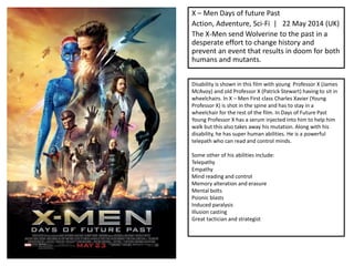
- 1. X – Men Days of future Past Action, Adventure, Sci-Fi | 22 May 2014 (UK) The X-Men send Wolverine to the past in a desperate effort to change history and prevent an event that results in doom for both humans and mutants. Disability is shown in this film with young Professor X (James McAvoy) and old Professor X (Patrick Stewart) having to sit in wheelchairs. In X – Men First class Charles Xavier (Young Professor X) is shot in the spine and has to stay in a wheelchair for the rest of the film. In Days of Future Past Young Professor X has a serum injected into him to help him walk but this also takes away his mutation. Along with his disability, he has super human abilities. He is a powerful telepath who can read and control minds. Some other of his abilities include: Telepathy Empathy Mind reading and control Memory alteration and erasure Mental bolts Psionic blasts Induced paralysis Illusion casting Great tactician and strategist
- 2. This poster does contain the main features of a main poster. It shows most all of the main characters in the film and they are wearing their costumes from previous films to help the audience recognise them and so they now what the film will be like. There is no tagline of the film or the actors names but you can recognise most of the actors in the poster so there was no real need to the names to be on the front. If someone couldn’t recognise an actor in the poster then they could research the film on IMDB or another website like that. This could be a good thing because it will make the audience find out more information at the plot or the actors, it could lead them onto other X – Men films or other films that the actors have been in. this could benefit many people. The poster uses bold font and bright colours to attract the audience and to make them want to look at the poster for a longer time than usual. The bright colours could help the audience understand more about what the film will be about. Half of the background is orange and red, like fire colours and the other half is misty blue. The different colours used in the background could connote different types of war, one that is nuclear (the fiery background) and a less violent type of war (the blue background). The release date on the poster is bold and red which shows that the creator of the poster wanted that to catch the audiences attention. The release date is very important for people who work in films because it is the time that people can see the final version of the film and the views and the public opinions start to spread. There aren't really any symbols used but you could say that the characters are symbols themselves, then the audience would need to have foreknowledge to understand who the characters are and why they look so different. The landmarks in the background don’t show much and they audience wouldn’t need any previous knowledge, the background objects are new to the film and the audience wouldn’t have any knowledge to know what they objects are used for. The main figures used in this poster are the main characters, the explosion, the landmark on fire and the flying objects in the background. The figures are represented photographically and graphically. The graphics are the background objects and the characters in the foreground are presented photographically. The characters need to be photos and not illustrations so the audience can see who the actors are behind the costumes, since there are not actors name son the film you need to see the actors faces to see who is in the film. The messages are mainly visual since there in no tagline of actors names on the poster. The poster is very visual, your eyes are drawn to the bigger sized characters in the middle of the poster, then to the bold title underneath. Under the title is has the names of the producers, screenwriters, directors etc. This writing does help the audience to understand the movie more, if they know the director before then they will know what sort of film its going to be.
- 3. There are a few different genres in this film, they are: Action Adventure Sci-Fi Thriller I think the intended audience is anyone who likes any of these genres, there are lots of people who like this genre film. The film is also a Marvel film and many people what a film just because it is Marvel even if they don’t like the hero in it. Some people will watch this film because of the actors are in it, they include: Hugh Jackman James McAvoy Michael Fassbender Halle Berry Evan Peters Nicholas Hoult Patrick Stewart Sir Ian McKellan These are very famous actors who have been in big blockbuster films, these actors are used as a USP. This poster promises action, fighting but also will contain mystery and alien objects. Since there are many different genres there are different gratifications promised in the poster. Attention is gained with the use of bright colours, the actors are in their most recognisable costumes and you can see who the actors are without looking too hard. Some of the actors are hard to recognise but if you have watched the previous films then you can tell who it is. There are 3 different taglines for the film, they are: His past. Our future. Every hero, every power will unite. The future begins. These taglines are used to intrigue the audience. There is no humour or pun in them, they just explain what the film is about. I think the taglines are good because they are straight to the point, you don’t have to work out what they're trying to say.