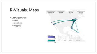
A progression from fundamental charts to more advanced ways to look at data. We end with Custom Visuals and R Visuals that extend this visualization platform.
This document provides an overview of Tableau, a data visualization tool. It discusses what Tableau is, how it allows users to transform raw data into understandable visual formats without coding. It also covers the benefits of data visualization for decision making, customer relationships, and performance. The document outlines Tableau's product suite, advantages like handling large data and mobile support, disadvantages like report scheduling. It provides requirements for Tableau Desktop and Server and considers Tableau alternatives.
Bound Tech is a top institute that provides hands-on Tableau training taught by experienced trainers using real-world scenarios and examples. The training covers fundamental concepts, advanced concepts, and job-oriented skills over 50-60 hours. Students learn how to rapidly analyze data, create dashboards and reports, and share analytics using features of Tableau. The course also provides skills needed for roles like business analyst, data scientist, and Tableau developer.
Power BI has become a product with a ton of exciting features. This presentation will give an overview of some of them, including Power BI Desktop, Power BI service, what’s new, integration with other services, Power BI premium, and administration.
How to Improve Data Analysis Through Visualization in TableauEdureka!
Data Visualization using Tableau will allow one to gain an edge over the other analysts and let you present the data in a much better and insightful manner. It would be easier for the learners to immediately implement it in their workplace and create a real-time dashboard for their management using one of the most sought-after tools.
Hariharan Rajendran gave a presentation on Power BI to CPBIG. He discussed Power BI's products and services, pricing, data modeling capabilities, and security features. Power BI is a cloud-based data analysis tool that allows interactive visualization of data from a wide range of sources. It includes Power BI Service, Power BI Desktop, and mobile apps. Data can be imported or queried directly from sources. Power BI offers both free and paid Pro subscriptions.
BI: new of the buzz words that everyone is talking about but what is it? How can it be used to make a impact in my organization? How do I get started? In this session, we will talk about it and show you a live example in Office 365's SharePoint Online.
Objectives/Outcomes: In this session, participants will learn:
1. What is BI
2. What is Microsoft's Power BI
3. Case Studies
4. How can I get it
This document provides an overview and introduction to Tableau. It outlines the basic steps for connecting to different data sources, building initial views, and creating dashboards. The document covers prerequisites, an introduction to the Tableau workspace, demo instructions for connecting to sample data files and modifying data connections, and includes lab exercises for readers to practice the concepts. The goal is to help readers understand the basics of visualizing and exploring data using Tableau.
Data Visualisation & Analytics with Tableau (Beginner) - by Maria KoumandrakiOutreach Digital
This document outlines a 7 step process for creating data visualizations in Tableau. It includes an agenda, descriptions of each step, and demos. The 7 steps are: 1) Connecting to data, 2) Cleaning and preparing data, 3) Creating initial visualizations using Show Me or drag and drop, 4) Editing visualizations, 5) Analyzing data and creating additional visualizations, 6) Creating interactive dashboards, and 7) Sharing visualizations. The presenter leads attendees through examples on air pollution data and life expectancy data to demonstrate the process.
Power BI Dashboard | Microsoft Power BI Tutorial | Data Visualization | EdurekaEdureka!
This Edureka Power BI Dashboard Tutorial will take you through step by step creation of Power BI dashboard. It helps you learn different functionalities present in Power BI tool with a demo on superstore dataset. You will learn how to create a Power BI dashboard by taking out multiple insights from superstore dataset and representing them visually.
The slide deck from data and analytics workshop for HR professionals. Presented in @hrtechgroup event in Microsoft Vancouver. The workshop was built around the HR sample partner data set
https://docs.microsoft.com/en-us/power-bi/sample-human-resources
This document provides an overview of Visual Analytics Session 3. It discusses data joining and blending in Tableau. Specifically, it explains why joining or blending data is necessary when data comes from multiple sources. It then describes the different types of data joins in Tableau - inner joins, left joins, right joins, and outer joins. An example is provided to demonstrate an inner join using a primary key to connect related data between two tables. The goal is to understand how to connect different but related data sources in Tableau using common keys or variables.
This document provides an introduction to Power BI, a business intelligence tool for data visualization. It discusses how Power BI helps organizations make more data-driven decisions by combining business analytics, data mining, visualization and infrastructure. Key features of Power BI include rich dashboards, report publishing, no constraints on memory or speed, and no need for technical support. Power BI consists of desktop, service and mobile app components and allows users to connect to data, model and format it, create visualizations, and publish reports.
Tableau - Learning Objectives for Data, Graphs, Filters, Dashboards and Advan...Srinath Reddy
Step-1 Tableau Introduction
Step-2 Connecting to Data
Step-3 Building basic views
Step-4 Data manipulations and Calculated fields
Step-5 Tableau Dashboards
Step-6 Advanced Data Options
Step-7 Advanced graph Options
This document provides an overview of Tableau, a data visualization software. It outlines the agenda for the presentation, which will cover connecting to data, visual analytics with Tableau, dashboards and stories, calculations, and mapping capabilities. Tableau allows users to connect to various data sources, transform raw data into interactive visualizations, and share dashboards or publish them online. It is a leading tool for data analysis and visualization.
This document discusses Power BI, a Microsoft tool for data visualization and analytics. It covers what Power BI is, its components like Power Query, Power Pivot, and Power View. It also discusses the building blocks of Power BI like datasets, reports, dashboards and tiles. The document demonstrates how to install Power BI and introduces some key concepts like DAX and different types of visualizations. It aims to provide an overview of Power BI, its capabilities and how to use some of its main features.
Tableau provides self-service business intelligence software that allows users to easily connect to various data sources, perform analysis and visualization, and share insights. Their flagship products include Tableau Desktop for analysis and dashboard creation, Tableau Server for publishing to the web, and Tableau Reader for viewing reports. Tableau uses an in-memory data engine for fast query performance on large datasets and supports a variety of visualizations and charts that can be customized using their "Show Me" feature.
Power BI is a cloud-based business analytics service that allows users to bring their data together and gain insights. It provides a single view of critical business data through live dashboards and rich interactive reports. Gartner has positioned Microsoft as a leader in business intelligence and analytics platforms for nine consecutive years based on its vision. The demo showcases how to create a Power BI account, import and transform different data sources to build a data model, create reports and columns/measures, and publish reports to the web.
An overview of the different sets of functionality of Tableau solution suite, and how it can address the many facets of a comprehensive data mining solution.
This document provides tips for creating effective visualizations in Tableau, focusing on techniques for making visualizations useful, beautiful, and interactive. It discusses best practices such as asking a question to define the purpose of a visualization, choosing appropriate visual types, using dashboards to show multiple perspectives, and formatting visualizations for clarity and readability. Interactive features like filters, actions, and hyperlinks are also covered to help users understand and explore the data.
This document provides an overview and instructions for using Tableau software for data visualization and analysis. It describes Tableau as a tool for simplifying data into understandable formats via dashboards and worksheets. Steps are outlined for connecting a CSV file on demographic data to Tableau, creating a map visualization showing populations by state in India, and differences between live and extract connections. Basic concepts like dimensions, measures, and different methods for creating visualizations through drag and drop or double clicking are also summarized.
This document provides information about Tableau, a data visualization software. It discusses Tableau's prerequisites, products, and architecture. Tableau allows users to easily connect to various data sources and transform data into interactive visualizations and dashboards. Key Tableau concepts covered include data sources, worksheets, dashboards, stories, filters, marks, color and size properties. The document also explains Tableau's desktop and server products, and the stages of importing data, analyzing it, and sharing results.
DAX and Power BI Training - 004 Power QueryWill Harvey
I this session we are introducing Power Query for Excel, the data sources you can connect to, and the transformations you can apply. We also introduce more advanced topics of writing your own M functions.
Interactive data visualization products focused on business intelligence. Data Visualization and Communication. Tableau is considered a leader in the field of data discovery.
Tableau products are designed and built to meet the critical needs of the digital forensic community world-wide.
This document provides an overview and agenda for a Power BI Advanced training course. The course objectives are outlined, which include understanding data modeling concepts, calculated columns and measures, and evaluation contexts in DAX. The agenda lists the modules to be covered, including data modeling best practices, modeling scenarios, and DAX. Housekeeping items are provided, instructing participants to send questions to Sami and mute their lines. It is noted the session will be recorded.
This document provides an overview of Tableau, a business intelligence software for data visualization and analytics. It outlines the 7 key steps to get insights from data quickly using Tableau: 1) connect to a data source, 2) manage the data, 3) create visualizations, 4) edit visualizations, 5) create additional visualizations, 6) build interactive dashboards, and 7) share visualizations. Tableau offers an easy and fast way to transform data into interactive visuals that help users identify patterns and trends to inform business decisions.
This document provides an overview of Microsoft Power BI, including its history, key features, and capabilities. It describes how Power BI allows users to connect to various data sources, perform data transformation using Power Query, build interactive reports with Power View and Power Pivot, and create visualizations and dashboards to share insights. The document also discusses Power BI Desktop, the Power BI service, and how to publish reports and dashboards to the web for sharing.
Summary of all tools and microsoft power biOmar Khan
This document introduces Microsoft Power BI and its tools for data visualization and reporting. It discusses how Power BI can support large data volumes, automated web reporting, and increased efficiency. Power BI tools like Power Pivot, Power View and Excel enable ad-hoc analysis, dashboards, and standard report automation from data marts and beyond Excel limits. Power BI solutions can be deployed on SharePoint for collaboration and on mobile devices.
In the Wizard of Oz, Toto pulls back the green curtain to expose that the Wizard of Oz is a fraud. We can peep behind the 'green curtain' of the data visualisation to learn how to 'poke holes' in the data that you are given, both in business and in everyday news headlines.
In order to explode the myths in the data that surrounds us every day, it is a little known secret that there are hidden patterns in the data chaos that surrounds us. Deviations from these patterns highlight invention, bias, anomalies and even deliberate fraud.
You can use both R and Power BI data visualisation combined with timeless data analysis and patterns such as Benford's Law to reveal or conceal efforts to distort the numbers, and question the veracity of the data.
You'll need courage, heart and wisdom to analyse data, since truthful data doesn't necessarily give easy answers!
PLOTCON NYC: Get Your Point Across: The Art of Choosing the Right Visualizati...Plotly
Why does one decide to visualize data? And once they have decided to visualize their data, how do they know the best way to tell their story? To answer these questions, this talk will focus on the iterative design process, visualization fundamentals, and storytelling techniques. We will then anchor these principles in effective visualization examples.
Of particular importance is the ability and willingness to refine and redefine your objectives as you determine the right visualization for you (or your client/audience). This talk will walk through a Datascope client case study in order to convey the importance of a flexible and collaborative process when approaching data visualization problems in order to deliver the best end result.
The audience will walk away armed with helpful visualization techniques and an understanding of the iterative design process.
Riga Power BI Meetup #14 - Datu analīze ar RAldis Ērglis
R ir programmēšanas valoda izveidota priekš statistikas analīzes. Tā nav ļoti līdzīga parastām programmēšanas valodām, jo ir veidota speciāli datu apstrādei.
Mūsdienās, datu analītiķim ir jāzina R vismaz pamata līmenī. Šajā meetup būs ieskats R valodā un R izmantošanas iespējas Power BI, jo kā zināms R ir integrēts Power BI.
Šī ir Riga Power BI meetup pasākuma prezentācija:
https://www.meetup.com/Riga-Power-BI-Meetup/
Digital Pragmatism with Business Intelligence, Big Data and Data VisualisationJen Stirrup
Contact details:
Jen.Stirrup@datarelish.com
In a world where the HiPPO’s (Highest Paid Person’s Opinion) is final, how can we use technology to drive the organisation towards data-driven decision making as part of their organizational DNA? R provides a range of functionality in machine learning, but we need to expose its richness in a world where it is made accessible to decision makers. Using Data Storytelling with R, we can imprint data in the culture of the organization by making it easily accessible to everyone, including decision makers. Together, the insights and process of machine learning are combined with data visualisation to help organisations derive value and insights from big and little data.
This slide deck explains in a comprehensive way what Power BI is, how the Power BI architecture looks like and what the usage scenarios are for using Power BI and related tools
Session 1 of Introduction to R for Data Science, Data Science Serbia in cooperation with Startit, Belgrade, lecturers: ing Branko Kovač and dr Goran S. Milovanović
Presented to The Ottawa IT Community Meetup Group (Ottawa SQL - PASS Chapter) on Thursday September 19
Powerful Self-Service BI in Excel 2013 - Data search and discovery with Power Query (formerly "Data Explorer"), analyzing and modeling with Power Pivot, visualizing and exploring with Power View and Power Map (formerly codename "GeoFlow")
Power BI is a self-service business intelligence tool that allows users to analyze data and create reports and visualizations. It includes components for data discovery, analysis, and visualization both on-premises using Excel and in the cloud using the Power BI service. The tool integrates with Office 365 and allows users to discover, visualize, and share insights from data.
SQL Server 2016 Discovery Day - Data Visualization using R and Power BIAnil Maharjan
This document outlines a presentation on data visualization using R and Power BI. The agenda includes an introduction to Power BI and R, the Power BI products and architecture, using the Power BI Desktop with R, navigation and visualization in Power BI with R. There will be demonstrations of connecting R to Power BI to create visualizations and insights. The speaker's contact information is provided at the end for questions.
London Tableau User Group November 2017 Presentation - How To Build Tableau T...Russell Spangler
Russell Spangler is a senior business intelligence manager at Amazon with over 6 years of experience using Tableau. He won the 2016 Iron Viz "Food Fight" competition with a visualization featuring custom polygons depicting sushi pieces. For his Tiger VIZ, he created a custom polygon tiger and used basic charts like area charts, dual-axis maps and bar graphs alongside custom icons to tell the story in a clean and impactful design. Russell emphasizes finding time for passion projects to challenge skills, develop creativity, and gain recognition in the data visualization community through competitions like Iron Viz.
Data visualization is a graphical tool used to visualize information in an elegant way and help understand complex data in a simpler manner. The document discusses different types of charts for data visualization including line charts, column charts, pie charts, area charts, and others. It provides examples of charts like line charts which use straight line segments and data points, pie charts which divide a circle proportionally, and candlestick charts.
Data visualization is the representation of data through use of common graphi...samarpeetnandanwar21
Data and information visualization (data viz/vis or info viz/vis)[2] is the practice of designing and creating easy-to-communicate and easy-to-understand graphic or visual representations of a large amount[3] of complex quantitative and qualitative data and information with the help of static, dynamic or interactive visual items. Typically based on data and information collected from a certain domain of expertise, these visualizations are intended for a broader audience to help them visually explore and discover, quickly understand, interpret and gain important insights into otherwise difficult-to-identify structures, relationships, correlations, local and global patterns, trends, variations, constancy, clusters, outliers and unusual groupings within data (exploratory visualization).[4][5][6] When intended for the general public (mass communication) to convey a concise version of known, specific information in a clear and engaging manner (presentational or explanatory visualization),[4] it is typically called information graphics.
Data visualization is concerned with visually presenting sets of primarily quantitative raw data in a schematic form. The visual formats used in data visualization include tables, charts and graphs (e.g. pie charts, bar charts, line charts, area charts, cone charts, pyramid charts, donut charts, histograms, spectrograms, cohort charts, waterfall charts, funnel charts, bullet graphs, etc.), diagrams, plots (e.g. scatter plots, distribution plots, box-and-whisker plots), geospatial maps (such as proportional symbol maps, choropleth maps, isopleth maps and heat maps), figures, correlation matrices, percentage gauges, etc., which sometimes can be combined in a dashboard.
This document provides an overview and comparison of PowerBI and Tableau for data visualization. It discusses getting data from various sources, modeling the data through exploration, cleaning, transformation and formatting, creating different types of visualizations like bar charts, line charts, maps and more. It also covers features like filtering, dashboards, publishing/sharing, analytics and official tutorials for learning more. The document is intended to introduce the two platforms for advanced data science students and help answer any additional questions about PowerBI and Tableau.
The document discusses data visualization and analytics. It defines data visualization as the graphical representation of information and data using visual elements like charts and graphs. This provides an accessible way to see trends, outliers, and patterns in data. Data visualization sits at the intersection of analysis and visual storytelling, helping make data understandable and informing decisions. The document also covers types of visualizations, examples, tools for data visualization like Tableau and Excel, and factors to consider when choosing analytics tools.
Unit III covers data visualization. It discusses how data visualization tools are needed to analyze and understand large amounts of data. Effective data visualization presents conclusions, chooses appropriate graph types, and ensures visuals accurately reflect numbers to prevent misinterpretations. History of data visualization is discussed using Napoleon's 1812 march as an example. Advantages of data visualization include easily sharing information and exploring opportunities, while disadvantages can include biased information and losing core messages.
This session will show some useful data visualisation tips and how they can be used in Oracle Business Intelligence and Data Visualization Cloud Services
Kibana is a highly customizable dashboarding and visualization platform that allows users to perform flexible analytics and visualization of real-time streaming data through an intuitive interface. It allows users to easily create various chart types like bar charts, line plots, scatter plots, histograms, and pie charts to better understand large volumes of data. Some of its key features include customizable dashboards with components like time pickers, queries, filters, charts and tables for sharing and embedding insights.
Seattle DAA - Data Visualization - Russell Spangler December 2019 Russell Spangler
I presented at the Seattle DAA conference on Microsoft's conference. Presentation goes over principals and tips of data visualization and talks about inspiration on how to build awesome visuals!
The document provides an overview of getting started with Tableau, including connecting to data sources, using dimensions and measures to structure views, creating charts and dashboards, and using filters. It explains how to build visualizations by dragging fields to the rows, columns, and marks cards and introduces more advanced topics like data blending and calculations.
This document provides an overview of DAX (Data Analysis Expressions) and how it can be used for data analysis in Power BI and Analysis Services Tabular models. It discusses key DAX concepts like calculated columns, calculated measures, and filter context. It also covers common DAX functions and how to work with dates in DAX. The document provides examples of how to define security and write DAX queries against the BI Semantic Model.
This document provides an overview of best practices for creating compelling Power BI reports through storytelling with data. It discusses choosing the appropriate visualizations depending on the audience and data, using color and design principles to avoid clutter, and prompting the audience with the next steps. Key tips include using simple text, tables, line graphs and bar charts to tell stories with data, avoiding overused visuals like pie charts, and providing context through bookmarks and a help section. The target audience is analysts and decision-makers who need to present data to prompt action.
This document discusses different methods for presenting data, including textual, tabular, and graphical presentation. Tabular presentation organizes data into rows and columns in a table. Textual presentation uses statements and numbers to describe data. Graphical presentation shows variations and relationships of data using visual formats like bar graphs, line graphs, and pie charts. Each method has advantages - tables provide concise information while graphs attract attention and enable quick comprehension of quantitative data relationships.
Data visualization is a technique used to communicate data through visual representations such as charts, graphs, and maps. It allows patterns, trends, and correlations in data to be recognized more easily than text-based representations. The history of data visualization dates back to 1160 BC with the Turin Papyrus Map, though it has evolved significantly with modern tools going beyond standard charts. Data visualization has advantages like faster comprehension and understanding connections, but also disadvantages like different interpretations among users and a false sense of understanding without explanations. It has applications in business, science, and many other domains.
This document provides an overview of data visualization and Tableau software. It defines data visualization as visually representing data to help convey information and insights. It then discusses different types of data visualization techniques like graphs, diagrams, timelines and more. The document also introduces Tableau software, describing it as a tool for interactive data visualization and dashboard creation. It outlines Tableau's features, workspace, different chart types, and provides steps for performing basic data analysis and visualization in Tableau Public.
This document discusses creating charts from D3JS using JSON data. It explains that data visualization is a good way to represent, understand, and summarize large amounts of data from sources like JSON files, SQL databases, CSV files, and flat files. The goal is to create a library of D3 charts by using data from sources like a datamarket place and Power Pivot/Power Query to generate bar, pie, and line charts for applications.
PowerBI importance of power bi in data analytics fieldshubham299785
This document provides an overview and introduction to Power BI. It discusses the three core areas of Power BI - data preparation and analysis using Power BI Desktop, visualization of data, and collaboration and sharing of results. It outlines the different components of the Power BI toolset including Power BI Desktop, Power BI Service, and the Power BI mobile app. The document then provides guidance on how to get the most out of the accompanying course, including watching videos, working through exercises, using available resources, and participating in the question and answer section.
1. The document discusses various data visualization techniques including tables, charts like scatter plots, line charts and bar charts, and advanced visualizations like parallel coordinate plots and treemaps.
2. It explains best practices for table and chart design including minimizing non-data ink and aligning text and numbers.
3. Data dashboards are described as visualization tools that automatically update metrics and convey key performance indicators to users through techniques like size, position and color.
Similar to Data Visualization Techniques in Power BI (20)
Build applications with generative AI on Google CloudMárton Kodok
We will explore Vertex AI - Model Garden powered experiences, we are going to learn more about the integration of these generative AI APIs. We are going to see in action what the Gemini family of generative models are for developers to build and deploy AI-driven applications. Vertex AI includes a suite of foundation models, these are referred to as the PaLM and Gemini family of generative ai models, and they come in different versions. We are going to cover how to use via API to: - execute prompts in text and chat - cover multimodal use cases with image prompts. - finetune and distill to improve knowledge domains - run function calls with foundation models to optimize them for specific tasks. At the end of the session, developers will understand how to innovate with generative AI and develop apps using the generative ai industry trends.
Orchestrating the Future: Navigating Today's Data Workflow Challenges with Ai...Kaxil Naik
Navigating today's data landscape isn't just about managing workflows; it's about strategically propelling your business forward. Apache Airflow has stood out as the benchmark in this arena, driving data orchestration forward since its early days. As we dive into the complexities of our current data-rich environment, where the sheer volume of information and its timely, accurate processing are crucial for AI and ML applications, the role of Airflow has never been more critical.
In my journey as the Senior Engineering Director and a pivotal member of Apache Airflow's Project Management Committee (PMC), I've witnessed Airflow transform data handling, making agility and insight the norm in an ever-evolving digital space. At Astronomer, our collaboration with leading AI & ML teams worldwide has not only tested but also proven Airflow's mettle in delivering data reliably and efficiently—data that now powers not just insights but core business functions.
This session is a deep dive into the essence of Airflow's success. We'll trace its evolution from a budding project to the backbone of data orchestration it is today, constantly adapting to meet the next wave of data challenges, including those brought on by Generative AI. It's this forward-thinking adaptability that keeps Airflow at the forefront of innovation, ready for whatever comes next.
The ever-growing demands of AI and ML applications have ushered in an era where sophisticated data management isn't a luxury—it's a necessity. Airflow's innate flexibility and scalability are what makes it indispensable in managing the intricate workflows of today, especially those involving Large Language Models (LLMs).
This talk isn't just a rundown of Airflow's features; it's about harnessing these capabilities to turn your data workflows into a strategic asset. Together, we'll explore how Airflow remains at the cutting edge of data orchestration, ensuring your organization is not just keeping pace but setting the pace in a data-driven future.
Session in https://budapestdata.hu/2024/04/kaxil-naik-astronomer-io/ | https://dataml24.sessionize.com/session/667627
The Ipsos - AI - Monitor 2024 Report.pdfSocial Samosa
According to Ipsos AI Monitor's 2024 report, 65% Indians said that products and services using AI have profoundly changed their daily life in the past 3-5 years.
Learn SQL from basic queries to Advance queriesmanishkhaire30
Dive into the world of data analysis with our comprehensive guide on mastering SQL! This presentation offers a practical approach to learning SQL, focusing on real-world applications and hands-on practice. Whether you're a beginner or looking to sharpen your skills, this guide provides the tools you need to extract, analyze, and interpret data effectively.
Key Highlights:
Foundations of SQL: Understand the basics of SQL, including data retrieval, filtering, and aggregation.
Advanced Queries: Learn to craft complex queries to uncover deep insights from your data.
Data Trends and Patterns: Discover how to identify and interpret trends and patterns in your datasets.
Practical Examples: Follow step-by-step examples to apply SQL techniques in real-world scenarios.
Actionable Insights: Gain the skills to derive actionable insights that drive informed decision-making.
Join us on this journey to enhance your data analysis capabilities and unlock the full potential of SQL. Perfect for data enthusiasts, analysts, and anyone eager to harness the power of data!
#DataAnalysis #SQL #LearningSQL #DataInsights #DataScience #Analytics
"Financial Odyssey: Navigating Past Performance Through Diverse Analytical Lens"sameer shah
Embark on a captivating financial journey with 'Financial Odyssey,' our hackathon project. Delve deep into the past performance of two companies as we employ an array of financial statement analysis techniques. From ratio analysis to trend analysis, uncover insights crucial for informed decision-making in the dynamic world of finance."
Global Situational Awareness of A.I. and where its headedvikram sood
You can see the future first in San Francisco.
Over the past year, the talk of the town has shifted from $10 billion compute clusters to $100 billion clusters to trillion-dollar clusters. Every six months another zero is added to the boardroom plans. Behind the scenes, there’s a fierce scramble to secure every power contract still available for the rest of the decade, every voltage transformer that can possibly be procured. American big business is gearing up to pour trillions of dollars into a long-unseen mobilization of American industrial might. By the end of the decade, American electricity production will have grown tens of percent; from the shale fields of Pennsylvania to the solar farms of Nevada, hundreds of millions of GPUs will hum.
The AGI race has begun. We are building machines that can think and reason. By 2025/26, these machines will outpace college graduates. By the end of the decade, they will be smarter than you or I; we will have superintelligence, in the true sense of the word. Along the way, national security forces not seen in half a century will be un-leashed, and before long, The Project will be on. If we’re lucky, we’ll be in an all-out race with the CCP; if we’re unlucky, an all-out war.
Everyone is now talking about AI, but few have the faintest glimmer of what is about to hit them. Nvidia analysts still think 2024 might be close to the peak. Mainstream pundits are stuck on the wilful blindness of “it’s just predicting the next word”. They see only hype and business-as-usual; at most they entertain another internet-scale technological change.
Before long, the world will wake up. But right now, there are perhaps a few hundred people, most of them in San Francisco and the AI labs, that have situational awareness. Through whatever peculiar forces of fate, I have found myself amongst them. A few years ago, these people were derided as crazy—but they trusted the trendlines, which allowed them to correctly predict the AI advances of the past few years. Whether these people are also right about the next few years remains to be seen. But these are very smart people—the smartest people I have ever met—and they are the ones building this technology. Perhaps they will be an odd footnote in history, or perhaps they will go down in history like Szilard and Oppenheimer and Teller. If they are seeing the future even close to correctly, we are in for a wild ride.
Let me tell you what we see.
Open Source Contributions to Postgres: The Basics POSETTE 2024ElizabethGarrettChri
Postgres is the most advanced open-source database in the world and it's supported by a community, not a single company. So how does this work? How does code actually get into Postgres? I recently had a patch submitted and committed and I want to share what I learned in that process. I’ll give you an overview of Postgres versions and how the underlying project codebase functions. I’ll also show you the process for submitting a patch and getting that tested and committed.
Beyond the Basics of A/B Tests: Highly Innovative Experimentation Tactics You...Aggregage
This webinar will explore cutting-edge, less familiar but powerful experimentation methodologies which address well-known limitations of standard A/B Testing. Designed for data and product leaders, this session aims to inspire the embrace of innovative approaches and provide insights into the frontiers of experimentation!
ViewShift: Hassle-free Dynamic Policy Enforcement for Every Data LakeWalaa Eldin Moustafa
Dynamic policy enforcement is becoming an increasingly important topic in today’s world where data privacy and compliance is a top priority for companies, individuals, and regulators alike. In these slides, we discuss how LinkedIn implements a powerful dynamic policy enforcement engine, called ViewShift, and integrates it within its data lake. We show the query engine architecture and how catalog implementations can automatically route table resolutions to compliance-enforcing SQL views. Such views have a set of very interesting properties: (1) They are auto-generated from declarative data annotations. (2) They respect user-level consent and preferences (3) They are context-aware, encoding a different set of transformations for different use cases (4) They are portable; while the SQL logic is only implemented in one SQL dialect, it is accessible in all engines.
#SQL #Views #Privacy #Compliance #DataLake
STATATHON: Unleashing the Power of Statistics in a 48-Hour Knowledge Extravag...sameer shah
"Join us for STATATHON, a dynamic 2-day event dedicated to exploring statistical knowledge and its real-world applications. From theory to practice, participants engage in intensive learning sessions, workshops, and challenges, fostering a deeper understanding of statistical methodologies and their significance in various fields."
End-to-end pipeline agility - Berlin Buzzwords 2024Lars Albertsson
We describe how we achieve high change agility in data engineering by eliminating the fear of breaking downstream data pipelines through end-to-end pipeline testing, and by using schema metaprogramming to safely eliminate boilerplate involved in changes that affect whole pipelines.
A quick poll on agility in changing pipelines from end to end indicated a huge span in capabilities. For the question "How long time does it take for all downstream pipelines to be adapted to an upstream change," the median response was 6 months, but some respondents could do it in less than a day. When quantitative data engineering differences between the best and worst are measured, the span is often 100x-1000x, sometimes even more.
A long time ago, we suffered at Spotify from fear of changing pipelines due to not knowing what the impact might be downstream. We made plans for a technical solution to test pipelines end-to-end to mitigate that fear, but the effort failed for cultural reasons. We eventually solved this challenge, but in a different context. In this presentation we will describe how we test full pipelines effectively by manipulating workflow orchestration, which enables us to make changes in pipelines without fear of breaking downstream.
Making schema changes that affect many jobs also involves a lot of toil and boilerplate. Using schema-on-read mitigates some of it, but has drawbacks since it makes it more difficult to detect errors early. We will describe how we have rejected this tradeoff by applying schema metaprogramming, eliminating boilerplate but keeping the protection of static typing, thereby further improving agility to quickly modify data pipelines without fear.
3. Agenda
• Create DataVisualizations
• Write DAX columns and measures
• Tie it all together on Report or
Dashboard
3 ROUNDS
Get more advanced with each Viz
Workout
Of The
Day
5. Vizzes in Action: Column Charts
• Comparitive Analysis by Category
• Snaz it up:
• Tooltips
• Color Saturation
• Legend (i.e. Color Encoding)
• Reference Line
• Manual
• Data-Driven (see Combo Charts)
6. Vizzes in Action: Bar Charts
• Comparitive Analysis by Category
• Snaz it up:
• Tooltips
• Color Saturation
• Legend (i.e. Color Encoding)
• Manual Reference Line
7. Vizzes in Action: Line Charts
• Trend data over time
• Enhance:
• Time Categories
• Drill-down
• Data Labels
• Area Graphs
19. Resources
• Download Power BI Desktop, Gateways, Mobile
• https://powerbi.microsoft.com/en-us/downloads/
• Updates to the Power BI service:
• https://powerbi.microsoft.com/en-us/documentation/powerbi-service-whats-new/
• Updates to Power BI Desktop (last month's + archive):
• https://powerbi.microsoft.com/en-us/documentation/powerbi-desktop-latest-update/
• https://powerbi.microsoft.com/en-us/documentation/powerbi-desktop-latest-update-
archive/
• Quick DAX Calculation Reference:
https://github.com/aabundez/MSBITraining/blob/master/DAX/Demo%20Calculati
ons.dax