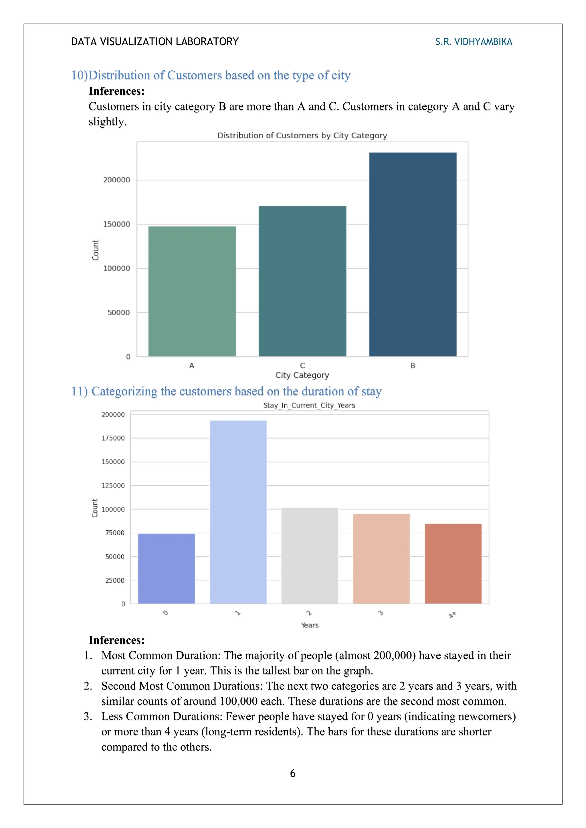
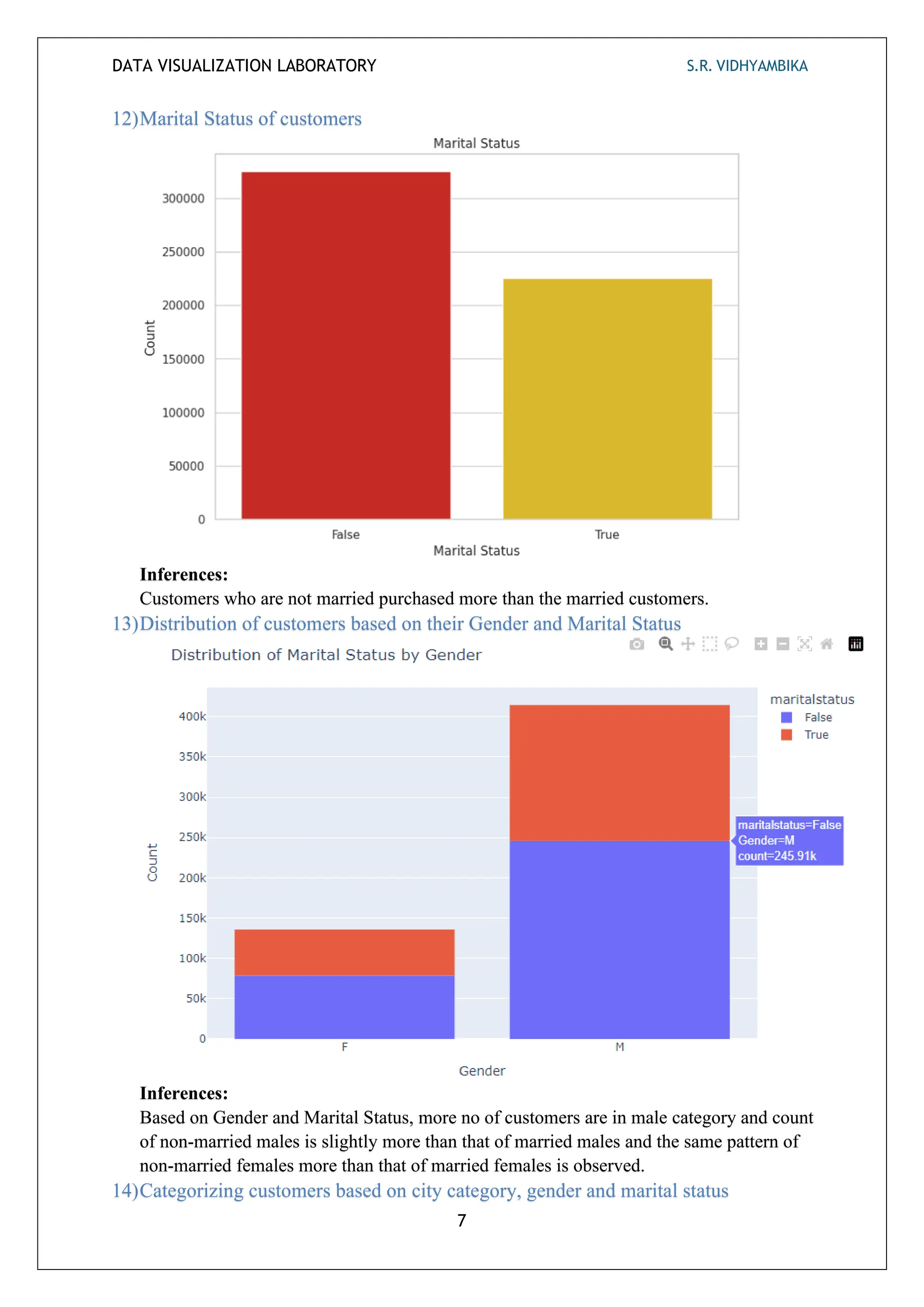
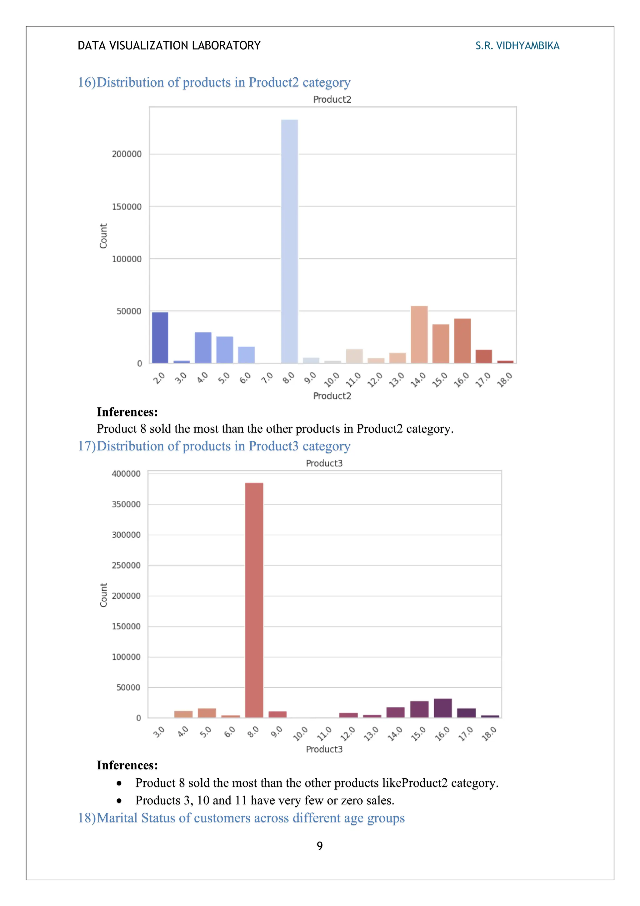
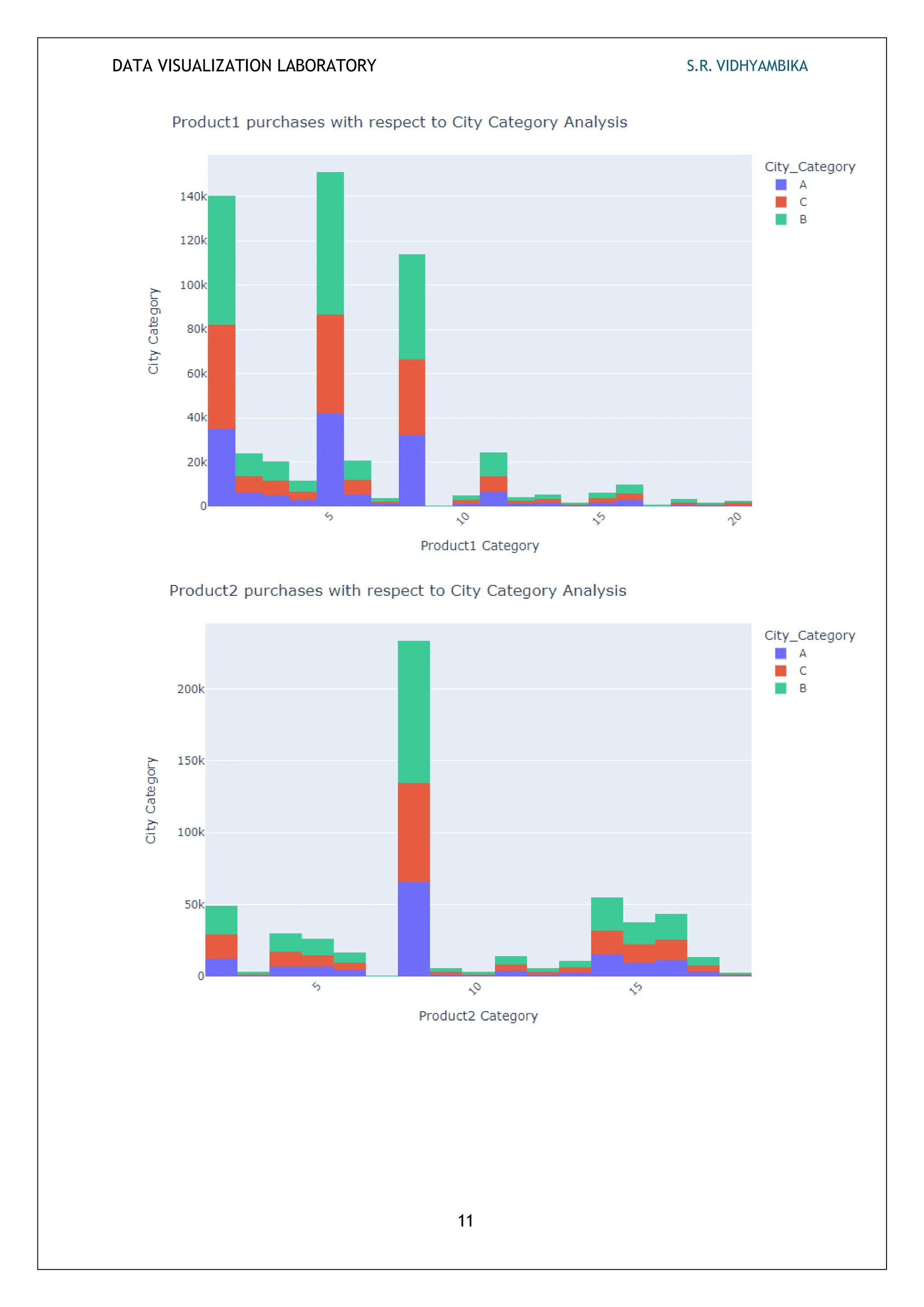
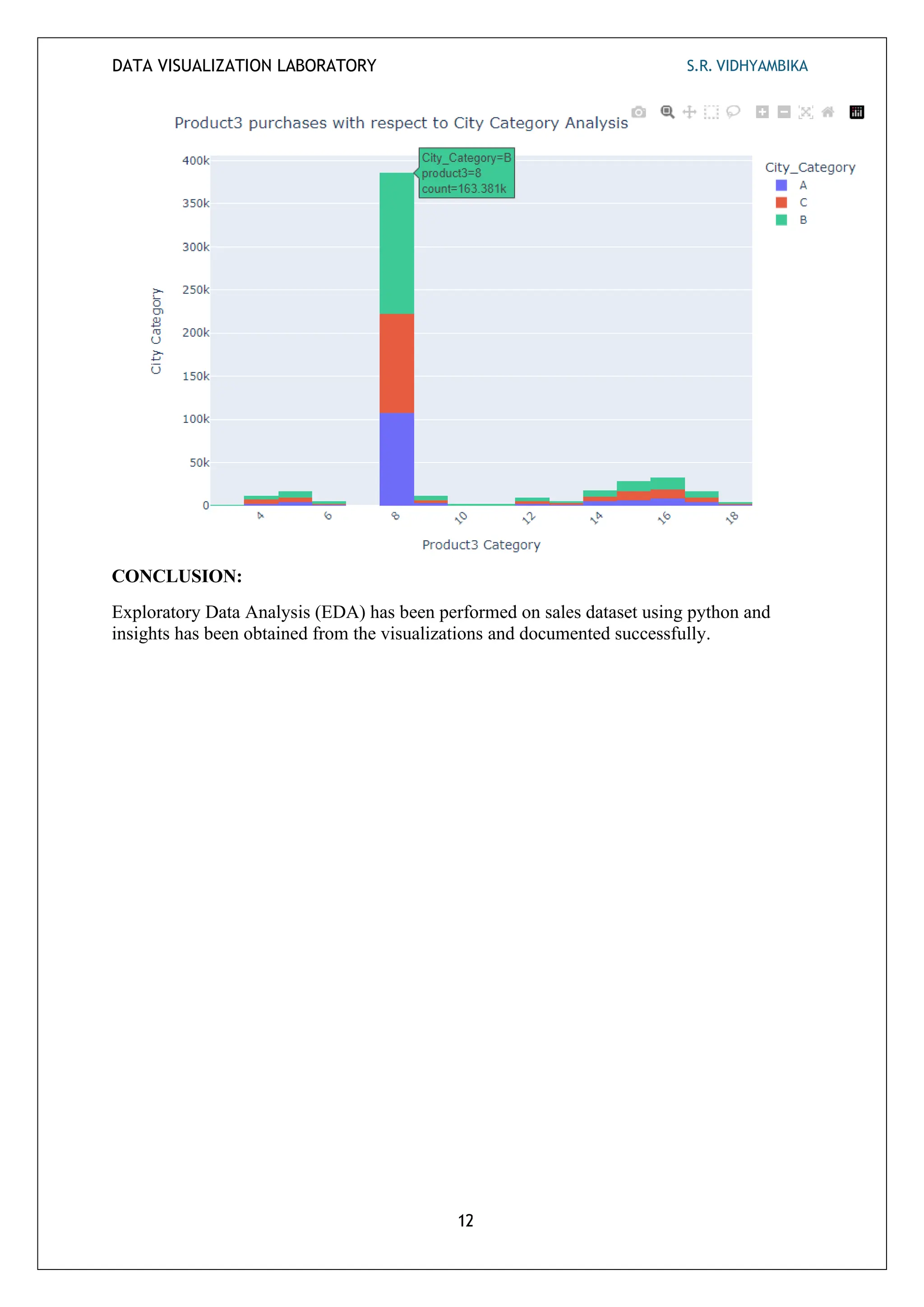
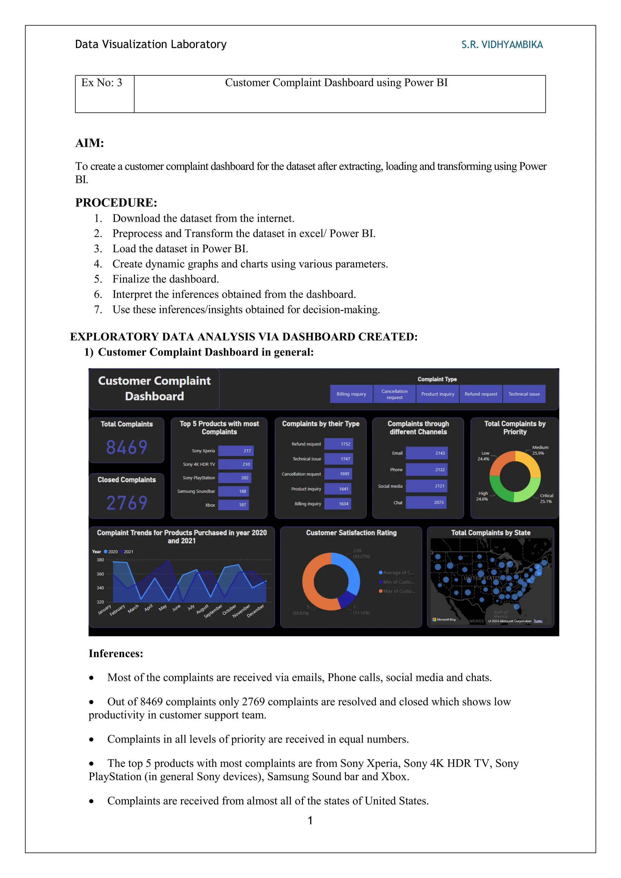
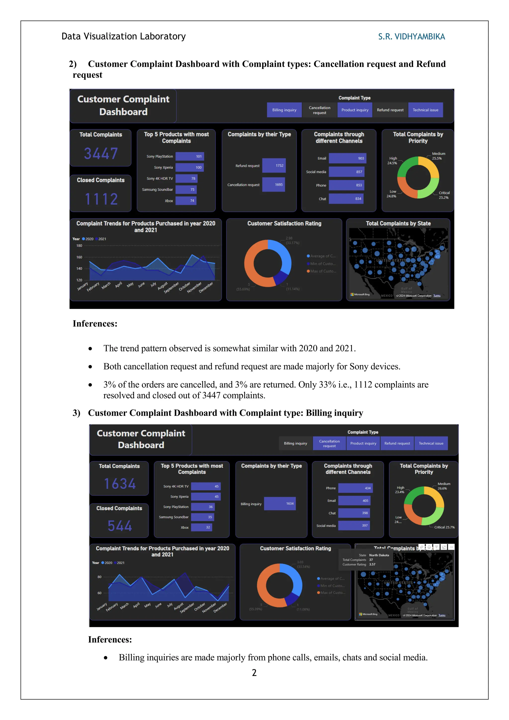
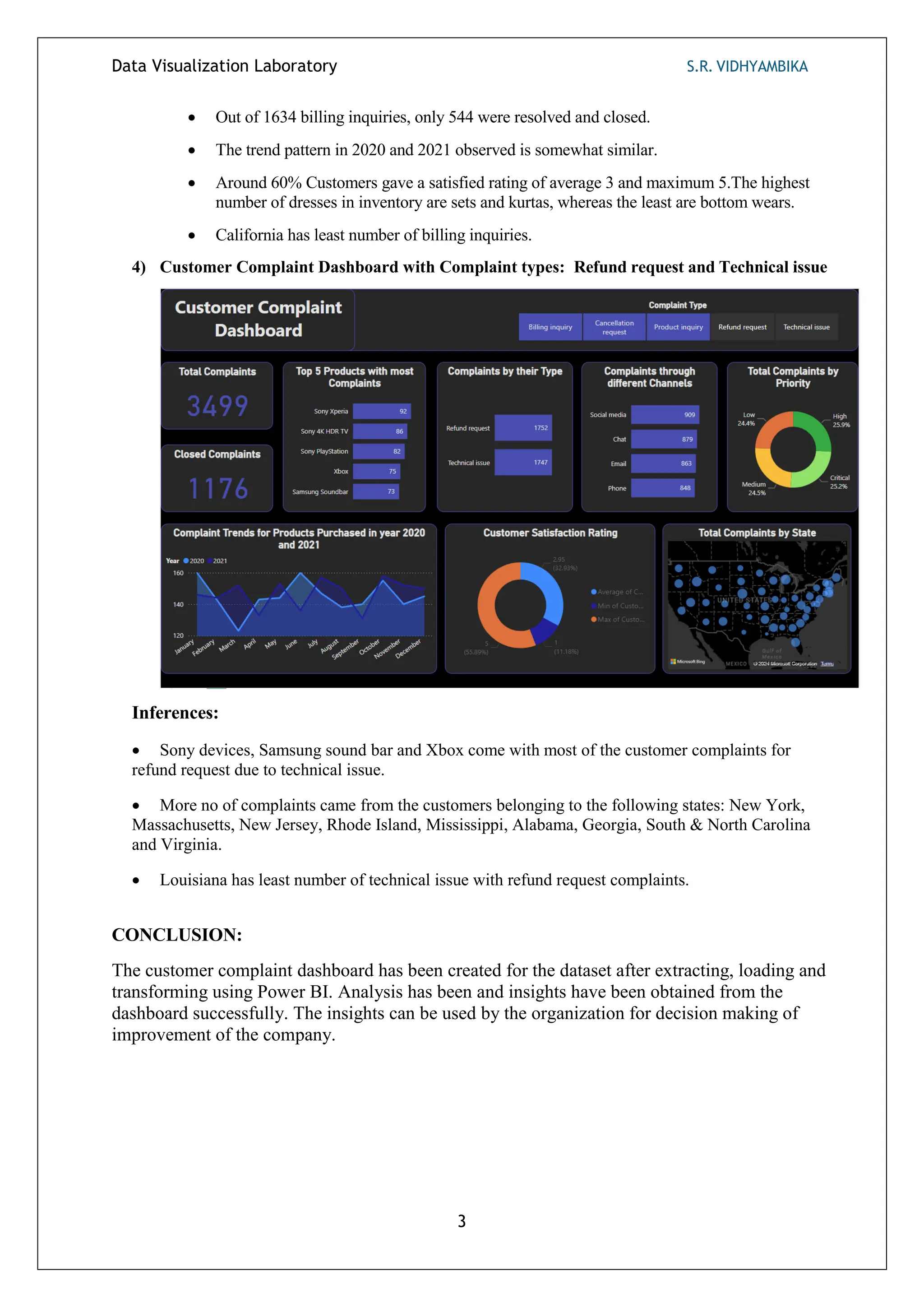
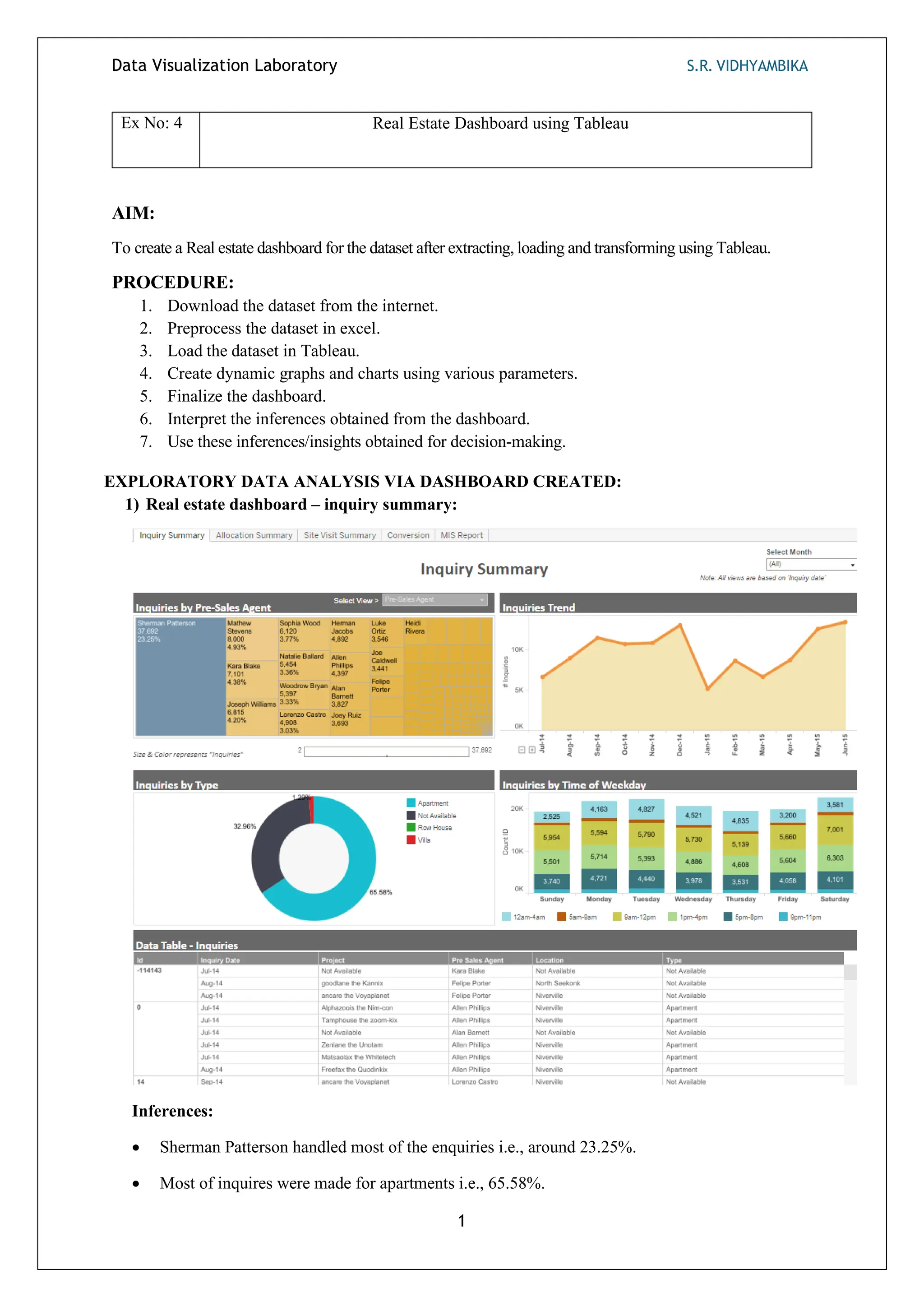
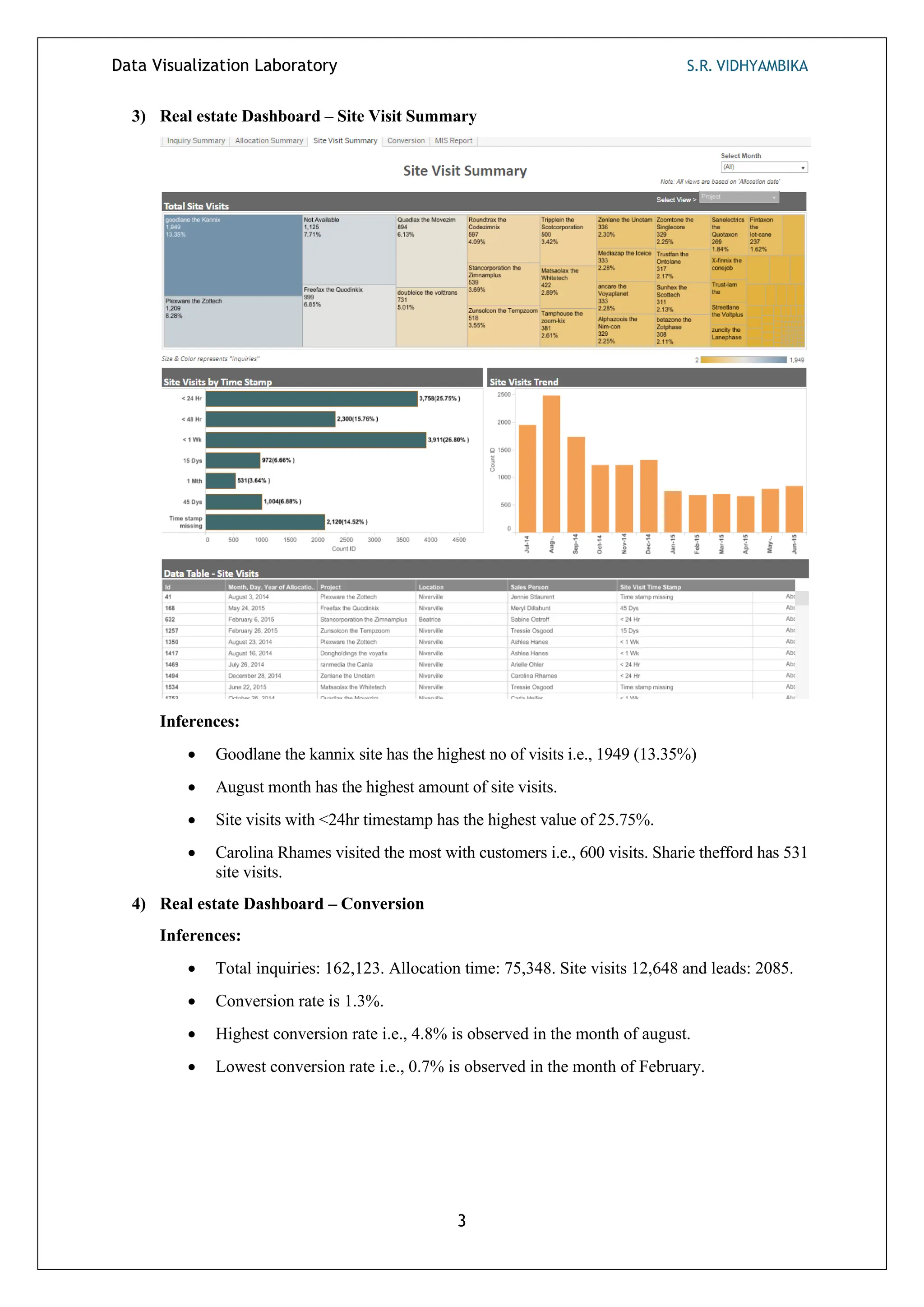
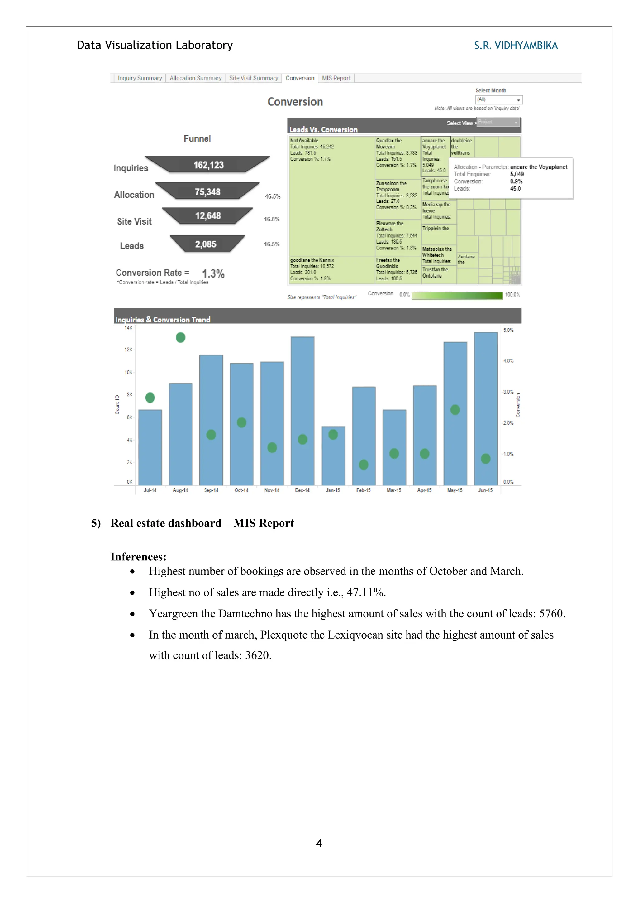
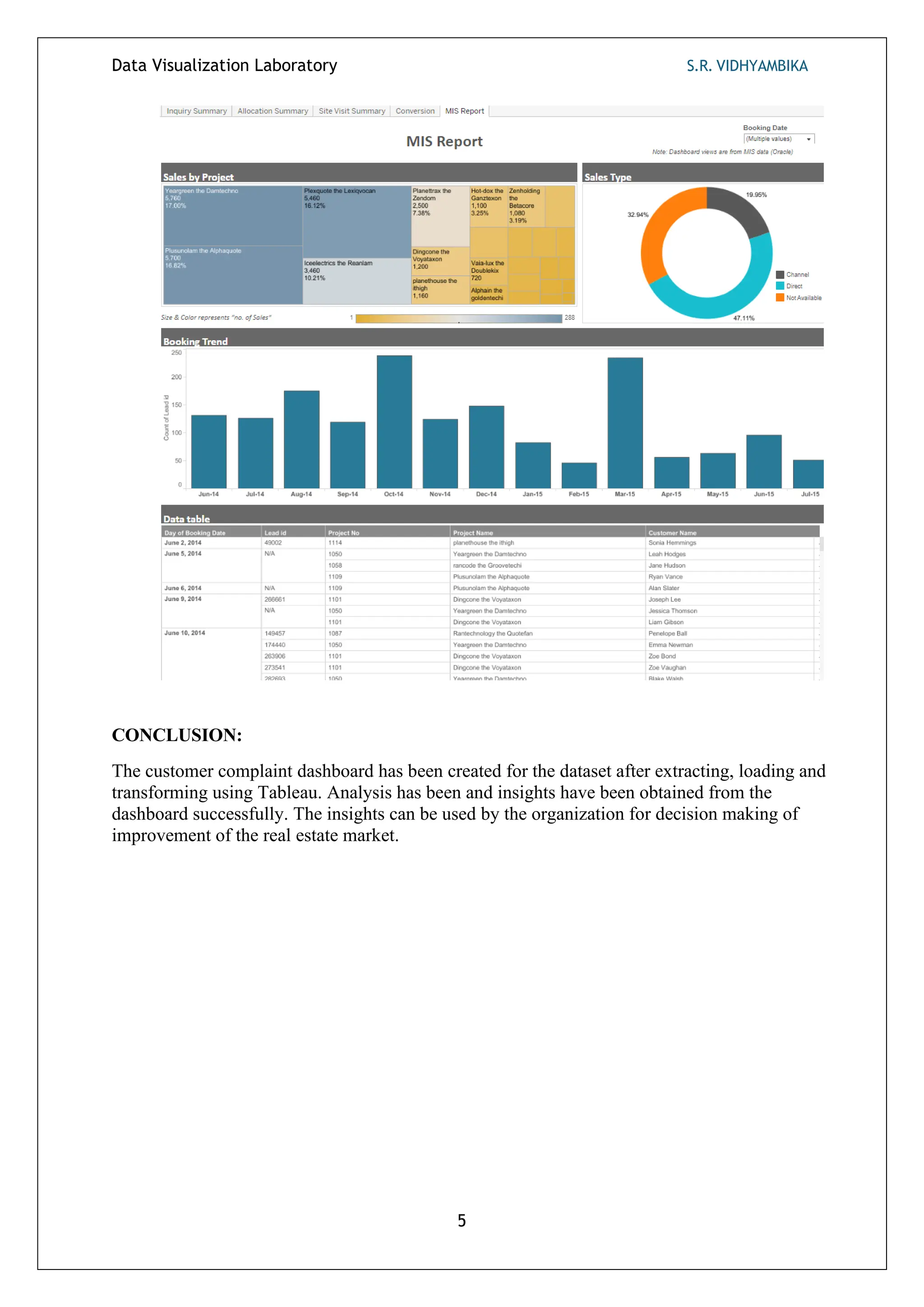
Data Visualization Laboratory S.R. VIDHYAMBIKA
1
Ex No: 1 Exploratory Data Analysis (EDA) for Excel Dataset
AIM:
To download and analyze dataset and generate insights for decision-making.
PROCEDURE:
1. Download the vrinda store dataset from the internet.
2. Load the dataset in Excel.
3. Create graphs and charts using various parameters.
4. Interpret the inferences obtained from each graph in the analysis.
5. Use these inferences/insights obtained for decision-making.
EXPLORATORY DATA ANALYSIS:
1) Comparison of Orders and Sales by Month
Inferences:
• The highest sales, accompanied with most no of orders, are observed in the month of February.
• Conversely, the lowest sales, despite a good number of orders, are observed in the month of
November.
2) Order Status Distribution as Percentages
Data Visualization Laboratory S.R. VIDHYAMBIKA
2
Inferences:
• 92% of the orders are delivered to the customers.
• 3% of the orders are cancelled, and 3% are returned.
• For 2% of the orders, the money is refunded to the customers.
3) Dress Inventory Quantity Based on Dress Type
Inferences:
• The highest number of dresses in inventory are sets and kurtas, whereas the least are
bottom wears.
4) Sales Distribution Across Age Categories
Inferences:
• In analyzing sales across age categories, it's evident that purchasing behavior varies among
different demographics.
• Middle-aged individuals generate the highest amount of sales compared to young adults and
seniors.
5) Distribution of total items sold in various shops
Data Visualization Laboratory S.R. VIDHYAMBIKA
3
Inferences:
• Amazon has the highest number of units sold followed by Myntra and Flipkart.
• Meesho and Nalli have similar no of purchases.
6) Top 5 states with highest sales
Inferences:
• Maharashtra has the highest sales across all outlets in the India with a yearly turnover of
2.99 Million rupees.
Data Visualization Laboratory S.R. VIDHYAMBIKA
4
• Karnataka has second highest sales with turnover of 2.65 Million rupees.
• Uttar Pradesh has third highest sales with turnover of 2.10 Million rupees.
• Telegana and Tamilnadu has a turnover of 1.71 and 1.68 Million rupees.
7) Distribution of units sold with respect to cloth size
Inferences:
• Medium (M) and Large (L) sizes get sold the most.
• 4XL and 5XL sizes get sold the least.
• Business Strategies: Having more varieties of dresses in M and L will boost the sales
across all stores in india.
8) Business to business sales vs Individual sales analysis
Inferences:
• Around 99% of sales are sold to individuals and only 1% are sold business to business.
9) Total sales based on Age group and Gender
Data Visualization Laboratory S.R. VIDHYAMBIKA
5
Inferences:
• Female customers especially middle-aged buy more dresses and generate more sales than
males.
• Senior customers purchase less especially senior males.
10) Total orders based on Age group and Gender
Inferences:
Women especially Middle-Aged place more no of orders than males thus generating high sales.
11) Bottom 5 states with low volume
Inferences:
• New Delhi has the lowest sales followed by Mizoram and Ladakh.
• Darba and Nagar & Meghalaya has the 4th
lowest and 5th
lowest sales.
Data Visualization Laboratory S.R. VIDHYAMBIKA
6
CONCLUSION:
Dataset has been downloaded and exploratory data analysis has been performed and insights have been
gathered from data as inferences for decision-making.
DATA VISUALIZATION LABORATORY S.R. VIDHYAMBIKA
1
Ex No: 2 Exploratory Data Analysis (EDA) Using Python
AIM:
To perform Exploratory Data Analysis (EDA) on a dataset using python and generate insights.
PROCEDURE:
1. Import the required libraries and packages.
2. Download the sales dataset from Kaggle.
3. Load the dataset in Google Colab.
4. Get the summary and information about the dataset.
5. Count the data types of data available using the value_counts().
6. Get the shape of the dataset.
7. Preprocess the data
• Rename the column names.
• Handle null values.
• Aggregate the ages into groups.
• Change the marital status value in numerical to Boolean.
8. Analyse the data using various parameters in the dataset.
9. Create interactive and non – interactive graphs and bar charts accordingly.
10. Interpret the inferences obtained from the analysis and use it in decision-making.
EDA:
1) Heatmaps generated before and after handling null values:
Inferences:
• Null values are present in the columns/features: product category 2 and product
category 3.
2) Purchase Distribution
Inferences:
Density of purchase distribution is concentrated between 5000 and 10000 purchases.
DATA VISUALIZATION LABORATORY S.R. VIDHYAMBIKA
2
3) Total customers in each gender
Inferences:
The number of male customers is way more than the females with a difference of around
27000 i.e., 50.62%.
4) Distribution of customer age categories
Inferences:
1. Largest Customer Group: The age group 26-35 contains the highest number of customers.
This segment represents the largest share of the customer base.
2. Youth and Middle-Aged Customers: The 18-25 and 36-45 age groups also have significant
customer representation, although slightly lower than the 26-35 group.
3. Decreasing Trend: As age increases beyond 45, the number of customers declines. The 55+
age category has the fewest customers.
4. Strategic Implications: Businesses targeting younger and middle-aged demographics
should focus on the 18-45 age range, which constitutes the majority of their customer base.
DATA VISUALIZATION LABORATORY S.R. VIDHYAMBIKA
3
5) Comparison of no of Purchases with respect to different age groups
Inferences:
1. Consistent Purchasing: Across different age groups, the number of purchases remains fairly
consistent. Each age category makes between 8,000 to 10,000 purchases.
2. No Significant Variation: There isn’t a substantial difference in purchasing behavior from
one age group to another based on this data. Whether young or middle-aged, customers
exhibit similar buying patterns.
6) Gender Vs no of Purchases made – An analysis
Inferences:
1. Balanced Purchasing: The number of purchases made by females (F) and males (M) is
DATA VISUALIZATION LABORATORY S.R. VIDHYAMBIKA
4
nearly equal. Both genders exhibit similar buying patterns.
2. Similar Purchase Levels: Each gender group makes approximately 8,000 to
10,000 purchases, with males slightly edging out females.
3. Strategic Implications: Businesses can tailor marketing strategies without significant
gender-specific variations, as both male and female customers contribute equally to the
purchase volume.
7) City Category Distribution by Gender
Inferences:
In each city, number of purchases made by a man is way more than that of a female (twice or
more the no of purchases made by a female).
8) Distribution of customers with respect to Age and Gender
Inferences:
• Male Dominance in 26-35 Age Group: The most significant observation is the
DATA VISUALIZATION LABORATORY S.R. VIDHYAMBIKA
5
substantial number of males in the 26-35 age group. This category stands out with a
notably higher count compared to other age segments.
• Even Female Distribution: In contrast, females are more evenly distributed across
age groups. The 51-55 and 55+ categories have a noticeable female presence.
9) Distribution of customers based on Occupations
Inferences:
• The majority of the customers belong to occupation 4, 0 and 7.
• Least amount of customers belong to the occupation 8.
DATA VISUALIZATION LABORATORY S.R. VIDHYAMBIKA
6
10)Distribution of Customers based on the type of city
Inferences:
Customers in city category B are more than A and C. Customers in category A and C vary
slightly.
11) Categorizing the customers based on the duration of stay
Inferences:
1. Most Common Duration: The majority of people (almost 200,000) have stayed in their
current city for 1 year. This is the tallest bar on the graph.
2. Second Most Common Durations: The next two categories are 2 years and 3 years, with
similar counts of around 100,000 each. These durations are the second most common.
3. Less Common Durations: Fewer people have stayed for 0 years (indicating newcomers)
or more than 4 years (long-term residents). The bars for these durations are shorter
compared to the others.
DATA VISUALIZATION LABORATORY S.R. VIDHYAMBIKA
7
12)Marital Status of customers
Inferences:
Customers who are not married purchased more than the married customers.
13)Distribution of customers based on their Gender and Marital Status
Inferences:
Based on Gender and Marital Status, more no of customers are in male category and count
of non-married males is slightly more than that of married males and the same pattern of
non-married females more than that of married females is observed.
14)Categorizing customers based on city category, gender and marital status
DATA VISUALIZATION LABORATORY S.R. VIDHYAMBIKA
8
Inferences:
The no of customers is the highest in City category B which predominantly has non -
married male customers.
15)Distribution of products in Product1 category
Inferences:
Products 1,5 and 8 are mostly sold than other products in Product1 category.
DATA VISUALIZATION LABORATORY S.R. VIDHYAMBIKA
9
16)Distribution of products in Product2 category
Inferences:
Product 8 sold the most than the other products in Product2 category.
17)Distribution of products in Product3 category
Inferences:
• Product 8 sold the most than the other products likeProduct2 category.
• Products 3, 10 and 11 have very few or zero sales.
18)Marital Status of customers across different age groups
DATA VISUALIZATION LABORATORY S.R. VIDHYAMBIKA
10
Inferences:
• 0-17: Most individuals in this age group are unmarried (blue bar).
• 18-25: Similar to the previous group, the majority are unmarried.
• 26-35: The number of married individuals (red bar) starts to increase.
• 36-45: The trend continues, with more married individuals.
• 46-50: The count of married individuals remains high.
• 51-55: Still a significant number of married individuals.
• 55+: The largest group of married individuals is in this age category.
• As age increases, the proportion of married individuals tends to rise.
• The graph reflects the common life trajectory where people are more likely to marry as
they get older.
19)Product Purchases with respect to the type of cities
Inferences:
• Products 1,5,8 are the ones mostly sold in product 1 category and customers from
city B purchase these products slightly higher than cities A and C.
• Product 8 is mostly sold in product 2 and product 3 categories.
• In all the product categories, customers from City B purchase slightly more than A
and C.
• Least sold products in product 1 category are: 9 and 16.
• Least sold product in product 2 category is: 6.
• Least sold products in product 3 category are: 1,2,3,7,8 and 11.
• Total no of purchases in product 3 category is more than product 1 and 2 categories.
DATA VISUALIZATION LABORATORY S.R. VIDHYAMBIKA
11
DATA VISUALIZATION LABORATORY S.R. VIDHYAMBIKA
12
CONCLUSION:
Exploratory Data Analysis (EDA) has been performed on sales dataset using python and
insights has been obtained from the visualizations and documented successfully.
Data Visualization Laboratory S.R. VIDHYAMBIKA
1
Ex No: 3 Customer Complaint Dashboard using Power BI
AIM:
To create a customer complaint dashboard for the dataset after extracting, loading and transforming using Power
BI.
PROCEDURE:
1. Download the dataset from the internet.
2. Preprocess and Transform the dataset in excel/ Power BI.
3. Load the dataset in Power BI.
4. Create dynamic graphs and charts using various parameters.
5. Finalize the dashboard.
6. Interpret the inferences obtained from the dashboard.
7. Use these inferences/insights obtained for decision-making.
EXPLORATORY DATA ANALYSIS VIA DASHBOARD CREATED:
1) Customer Complaint Dashboard in general:
Inferences:
 Most of the complaints are received via emails, Phone calls, social media and chats.
 Out of 8469 complaints only 2769 complaints are resolved and closed which shows low
productivity in customer support team.
 Complaints in all levels of priority are received in equal numbers.
 The top 5 products with most complaints are from Sony Xperia, Sony 4K HDR TV, Sony
PlayStation (in general Sony devices), Samsung Sound bar and Xbox.
 Complaints are received from almost all of the states of United States.
Data Visualization Laboratory S.R. VIDHYAMBIKA
2
2) Customer Complaint Dashboard with Complaint types: Cancellation request and Refund
request
Inferences:
 The trend pattern observed is somewhat similar with 2020 and 2021.
 Both cancellation request and refund request are made majorly for Sony devices.
 3% of the orders are cancelled, and 3% are returned. Only 33% i.e., 1112 complaints are
resolved and closed out of 3447 complaints.
3) Customer Complaint Dashboard with Complaint type: Billing inquiry
Inferences:
 Billing inquiries are made majorly from phone calls, emails, chats and social media.
Data Visualization Laboratory S.R. VIDHYAMBIKA
3
 Out of 1634 billing inquiries, only 544 were resolved and closed.
 The trend pattern in 2020 and 2021 observed is somewhat similar.
 Around 60% Customers gave a satisfied rating of average 3 and maximum 5.The highest
number of dresses in inventory are sets and kurtas, whereas the least are bottom wears.
 California has least number of billing inquiries.
4) Customer Complaint Dashboard with Complaint types: Refund request and Technical issue
Inferences:
 Sony devices, Samsung sound bar and Xbox come with most of the customer complaints for
refund request due to technical issue.
 More no of complaints came from the customers belonging to the following states: New York,
Massachusetts, New Jersey, Rhode Island, Mississippi, Alabama, Georgia, South & North Carolina
and Virginia.
 Louisiana has least number of technical issue with refund request complaints.
CONCLUSION:
The customer complaint dashboard has been created for the dataset after extracting, loading and
transforming using Power BI. Analysis has been and insights have been obtained from the
dashboard successfully. The insights can be used by the organization for decision making of
improvement of the company.
Data Visualization Laboratory S.R. VIDHYAMBIKA
1
Ex No: 4 Real Estate Dashboard using Tableau
AIM:
To create a Real estate dashboard for the dataset after extracting, loading and transforming using Tableau.
PROCEDURE:
1. Download the dataset from the internet.
2. Preprocess the dataset in excel.
3. Load the dataset in Tableau.
4. Create dynamic graphs and charts using various parameters.
5. Finalize the dashboard.
6. Interpret the inferences obtained from the dashboard.
7. Use these inferences/insights obtained for decision-making.
EXPLORATORY DATA ANALYSIS VIA DASHBOARD CREATED:
1) Real estate dashboard – inquiry summary:
Inferences:
• Sherman Patterson handled most of the enquiries i.e., around 23.25%.
• Most of inquires were made for apartments i.e., 65.58%.
Data Visualization Laboratory S.R. VIDHYAMBIKA
2
• All days have similar number of enquiries but Saturday and Tuesday have the highest amount of
inquiries.
• December and June have the highest amount of inquires as it is a vacation time.
2) Real estate Dashboard – Allocation time:
Inferences:
• The Average allocation time for an enquiry is 3.63 days.
• Same day allocation has the highest no of allocations by days.
• Average number of queries each day is 4.5k.
• Sharie thefford has highest no of allocated inquires i.e., 2172.
Data Visualization Laboratory S.R. VIDHYAMBIKA
3
3) Real estate Dashboard – Site Visit Summary
Inferences:
• Goodlane the kannix site has the highest no of visits i.e., 1949 (13.35%)
• August month has the highest amount of site visits.
• Site visits with <24hr timestamp has the highest value of 25.75%.
• Carolina Rhames visited the most with customers i.e., 600 visits. Sharie thefford has 531
site visits.
4) Real estate Dashboard – Conversion
Inferences:
• Total inquiries: 162,123. Allocation time: 75,348. Site visits 12,648 and leads: 2085.
• Conversion rate is 1.3%.
• Highest conversion rate i.e., 4.8% is observed in the month of august.
• Lowest conversion rate i.e., 0.7% is observed in the month of February.
Data Visualization Laboratory S.R. VIDHYAMBIKA
4
5) Real estate dashboard – MIS Report
Inferences:
• Highest number of bookings are observed in the months of October and March.
• Highest no of sales are made directly i.e., 47.11%.
• Yeargreen the Damtechno has the highest amount of sales with the count of leads: 5760.
• In the month of march, Plexquote the Lexiqvocan site had the highest amount of sales
with count of leads: 3620.
Data Visualization Laboratory S.R. VIDHYAMBIKA
5
CONCLUSION:
The customer complaint dashboard has been created for the dataset after extracting, loading and
transforming using Tableau. Analysis has been and insights have been obtained from the
dashboard successfully. The insights can be used by the organization for decision making of
improvement of the real estate market.
Data Visualization Laboratory S.R. VIDHYAMBIKA
1
Ex No: 5 Weather Dashboard using Grafana
AIM:
To create a weather dashboard for the dataset using visualizations which varies based on user selected locations.
PROCEDURE:
1. Load the datasource and dataset.
2. Create visualizations like line graphs, bar graphs for the data using the visualizations available.
3. Finalize the dashboard.
4. Interpret the inferences obtained from the dashboard.
5. Use these inferences/insights obtained for decision-making.
EXPLORATORY DATA ANALYSIS VIA DASHBOARD CREATED:
1) Weather dashboard with location as New Delhi:
Data Visualization Laboratory S.R. VIDHYAMBIKA
2
Inferences:
• The current temperature observed is 42°C.
• The line graph contains 3 lines: a blue line for predicted temperature, a yellow line for
perceived temperature, and a green line for the actual temperature observed today and over the
past 3 days.
• The range of predicted temperature is 40°C – 45°C, whereas the actual temperature ranges
between 30°C – 50°C.
• The location of New Delhi is marked on the global map using a marker.
• The humidity line graph contains 2 lines: a yellow dotted line for predicted humidity and a
green continuous curve for actual humidity.
• The range of predicted humidity over the four days varies between 9 – 20, whereas actual
humidity ranges between 10 - 50.
• Sky conditions such as mist and overcast are shown for each time interval.
• The wind speed over the last 6 hours is 13 km/hr.
2) Weather Dashboard with location as Paris:
Data Visualization Laboratory S.R. VIDHYAMBIKA
3
Inferences:
• Predicted temperature over the 4 days lies between 15°C – 17°C, whereas the actual
temperature ranges between 9°C - 25°C.
• We know that temperature is inversely proportional to humidity, so as the temperature is low,
i.e., 20°C, humidity is at 53%, and humidity ranges between 50% - 100% over the 4 days.
• Wind speed over the last 6 hours is 9 km/hr, and wind direction is at East (E).
• In precipitation and humidity, perceived values vary drastically from the actual values.
• Sky conditions vary, i.e., sunny, partly cloudy, at various time intervals.
• Forecasted temperature is 16.2°C, humidity is 75%, precipitation is 2.4 mm, and the UV index
is 6.
3) Weather Dashboard with location as Sydney:
Inferences:
• As the temperature is very lower i.e., 13 degree Celsius, the humidity is very high i.e.,
88%H.
Data Visualization Laboratory S.R. VIDHYAMBIKA
4
• Predicted values vary drastically with actual values in terms of temperature but are closer in
terms of humidity.
• Wind direction is varying from North to West for last 6 hrs.
•
Sky condition is clear in the after noon.
CONCLUSION:
The weather has been created for the dataset using data source in Grafana. Analysis has been
and insights have been obtained from the dashboard successfully. The insights can be used by
the organization for decision making of improvement of the company.

Data visualisation laboratory report/manual

  • 1.
    Data Visualization LaboratoryS.R. VIDHYAMBIKA 1 Ex No: 1 Exploratory Data Analysis (EDA) for Excel Dataset AIM: To download and analyze dataset and generate insights for decision-making. PROCEDURE: 1. Download the vrinda store dataset from the internet. 2. Load the dataset in Excel. 3. Create graphs and charts using various parameters. 4. Interpret the inferences obtained from each graph in the analysis. 5. Use these inferences/insights obtained for decision-making. EXPLORATORY DATA ANALYSIS: 1) Comparison of Orders and Sales by Month Inferences: • The highest sales, accompanied with most no of orders, are observed in the month of February. • Conversely, the lowest sales, despite a good number of orders, are observed in the month of November. 2) Order Status Distribution as Percentages
  • 2.
    Data Visualization LaboratoryS.R. VIDHYAMBIKA 2 Inferences: • 92% of the orders are delivered to the customers. • 3% of the orders are cancelled, and 3% are returned. • For 2% of the orders, the money is refunded to the customers. 3) Dress Inventory Quantity Based on Dress Type Inferences: • The highest number of dresses in inventory are sets and kurtas, whereas the least are bottom wears. 4) Sales Distribution Across Age Categories Inferences: • In analyzing sales across age categories, it's evident that purchasing behavior varies among different demographics. • Middle-aged individuals generate the highest amount of sales compared to young adults and seniors. 5) Distribution of total items sold in various shops
  • 3.
    Data Visualization LaboratoryS.R. VIDHYAMBIKA 3 Inferences: • Amazon has the highest number of units sold followed by Myntra and Flipkart. • Meesho and Nalli have similar no of purchases. 6) Top 5 states with highest sales Inferences: • Maharashtra has the highest sales across all outlets in the India with a yearly turnover of 2.99 Million rupees.
  • 4.
    Data Visualization LaboratoryS.R. VIDHYAMBIKA 4 • Karnataka has second highest sales with turnover of 2.65 Million rupees. • Uttar Pradesh has third highest sales with turnover of 2.10 Million rupees. • Telegana and Tamilnadu has a turnover of 1.71 and 1.68 Million rupees. 7) Distribution of units sold with respect to cloth size Inferences: • Medium (M) and Large (L) sizes get sold the most. • 4XL and 5XL sizes get sold the least. • Business Strategies: Having more varieties of dresses in M and L will boost the sales across all stores in india. 8) Business to business sales vs Individual sales analysis Inferences: • Around 99% of sales are sold to individuals and only 1% are sold business to business. 9) Total sales based on Age group and Gender
  • 5.
    Data Visualization LaboratoryS.R. VIDHYAMBIKA 5 Inferences: • Female customers especially middle-aged buy more dresses and generate more sales than males. • Senior customers purchase less especially senior males. 10) Total orders based on Age group and Gender Inferences: Women especially Middle-Aged place more no of orders than males thus generating high sales. 11) Bottom 5 states with low volume Inferences: • New Delhi has the lowest sales followed by Mizoram and Ladakh. • Darba and Nagar & Meghalaya has the 4th lowest and 5th lowest sales.
  • 6.
    Data Visualization LaboratoryS.R. VIDHYAMBIKA 6 CONCLUSION: Dataset has been downloaded and exploratory data analysis has been performed and insights have been gathered from data as inferences for decision-making.
  • 7.
    DATA VISUALIZATION LABORATORYS.R. VIDHYAMBIKA 1 Ex No: 2 Exploratory Data Analysis (EDA) Using Python AIM: To perform Exploratory Data Analysis (EDA) on a dataset using python and generate insights. PROCEDURE: 1. Import the required libraries and packages. 2. Download the sales dataset from Kaggle. 3. Load the dataset in Google Colab. 4. Get the summary and information about the dataset. 5. Count the data types of data available using the value_counts(). 6. Get the shape of the dataset. 7. Preprocess the data • Rename the column names. • Handle null values. • Aggregate the ages into groups. • Change the marital status value in numerical to Boolean. 8. Analyse the data using various parameters in the dataset. 9. Create interactive and non – interactive graphs and bar charts accordingly. 10. Interpret the inferences obtained from the analysis and use it in decision-making. EDA: 1) Heatmaps generated before and after handling null values: Inferences: • Null values are present in the columns/features: product category 2 and product category 3. 2) Purchase Distribution Inferences: Density of purchase distribution is concentrated between 5000 and 10000 purchases.
  • 8.
    DATA VISUALIZATION LABORATORYS.R. VIDHYAMBIKA 2 3) Total customers in each gender Inferences: The number of male customers is way more than the females with a difference of around 27000 i.e., 50.62%. 4) Distribution of customer age categories Inferences: 1. Largest Customer Group: The age group 26-35 contains the highest number of customers. This segment represents the largest share of the customer base. 2. Youth and Middle-Aged Customers: The 18-25 and 36-45 age groups also have significant customer representation, although slightly lower than the 26-35 group. 3. Decreasing Trend: As age increases beyond 45, the number of customers declines. The 55+ age category has the fewest customers. 4. Strategic Implications: Businesses targeting younger and middle-aged demographics should focus on the 18-45 age range, which constitutes the majority of their customer base.
  • 9.
    DATA VISUALIZATION LABORATORYS.R. VIDHYAMBIKA 3 5) Comparison of no of Purchases with respect to different age groups Inferences: 1. Consistent Purchasing: Across different age groups, the number of purchases remains fairly consistent. Each age category makes between 8,000 to 10,000 purchases. 2. No Significant Variation: There isn’t a substantial difference in purchasing behavior from one age group to another based on this data. Whether young or middle-aged, customers exhibit similar buying patterns. 6) Gender Vs no of Purchases made – An analysis Inferences: 1. Balanced Purchasing: The number of purchases made by females (F) and males (M) is
  • 10.
    DATA VISUALIZATION LABORATORYS.R. VIDHYAMBIKA 4 nearly equal. Both genders exhibit similar buying patterns. 2. Similar Purchase Levels: Each gender group makes approximately 8,000 to 10,000 purchases, with males slightly edging out females. 3. Strategic Implications: Businesses can tailor marketing strategies without significant gender-specific variations, as both male and female customers contribute equally to the purchase volume. 7) City Category Distribution by Gender Inferences: In each city, number of purchases made by a man is way more than that of a female (twice or more the no of purchases made by a female). 8) Distribution of customers with respect to Age and Gender Inferences: • Male Dominance in 26-35 Age Group: The most significant observation is the
  • 11.
    DATA VISUALIZATION LABORATORYS.R. VIDHYAMBIKA 5 substantial number of males in the 26-35 age group. This category stands out with a notably higher count compared to other age segments. • Even Female Distribution: In contrast, females are more evenly distributed across age groups. The 51-55 and 55+ categories have a noticeable female presence. 9) Distribution of customers based on Occupations Inferences: • The majority of the customers belong to occupation 4, 0 and 7. • Least amount of customers belong to the occupation 8.
  • 12.
    DATA VISUALIZATION LABORATORYS.R. VIDHYAMBIKA 6 10)Distribution of Customers based on the type of city Inferences: Customers in city category B are more than A and C. Customers in category A and C vary slightly. 11) Categorizing the customers based on the duration of stay Inferences: 1. Most Common Duration: The majority of people (almost 200,000) have stayed in their current city for 1 year. This is the tallest bar on the graph. 2. Second Most Common Durations: The next two categories are 2 years and 3 years, with similar counts of around 100,000 each. These durations are the second most common. 3. Less Common Durations: Fewer people have stayed for 0 years (indicating newcomers) or more than 4 years (long-term residents). The bars for these durations are shorter compared to the others.
  • 13.
    DATA VISUALIZATION LABORATORYS.R. VIDHYAMBIKA 7 12)Marital Status of customers Inferences: Customers who are not married purchased more than the married customers. 13)Distribution of customers based on their Gender and Marital Status Inferences: Based on Gender and Marital Status, more no of customers are in male category and count of non-married males is slightly more than that of married males and the same pattern of non-married females more than that of married females is observed. 14)Categorizing customers based on city category, gender and marital status
  • 14.
    DATA VISUALIZATION LABORATORYS.R. VIDHYAMBIKA 8 Inferences: The no of customers is the highest in City category B which predominantly has non - married male customers. 15)Distribution of products in Product1 category Inferences: Products 1,5 and 8 are mostly sold than other products in Product1 category.
  • 15.
    DATA VISUALIZATION LABORATORYS.R. VIDHYAMBIKA 9 16)Distribution of products in Product2 category Inferences: Product 8 sold the most than the other products in Product2 category. 17)Distribution of products in Product3 category Inferences: • Product 8 sold the most than the other products likeProduct2 category. • Products 3, 10 and 11 have very few or zero sales. 18)Marital Status of customers across different age groups
  • 16.
    DATA VISUALIZATION LABORATORYS.R. VIDHYAMBIKA 10 Inferences: • 0-17: Most individuals in this age group are unmarried (blue bar). • 18-25: Similar to the previous group, the majority are unmarried. • 26-35: The number of married individuals (red bar) starts to increase. • 36-45: The trend continues, with more married individuals. • 46-50: The count of married individuals remains high. • 51-55: Still a significant number of married individuals. • 55+: The largest group of married individuals is in this age category. • As age increases, the proportion of married individuals tends to rise. • The graph reflects the common life trajectory where people are more likely to marry as they get older. 19)Product Purchases with respect to the type of cities Inferences: • Products 1,5,8 are the ones mostly sold in product 1 category and customers from city B purchase these products slightly higher than cities A and C. • Product 8 is mostly sold in product 2 and product 3 categories. • In all the product categories, customers from City B purchase slightly more than A and C. • Least sold products in product 1 category are: 9 and 16. • Least sold product in product 2 category is: 6. • Least sold products in product 3 category are: 1,2,3,7,8 and 11. • Total no of purchases in product 3 category is more than product 1 and 2 categories.
  • 17.
    DATA VISUALIZATION LABORATORYS.R. VIDHYAMBIKA 11
  • 18.
    DATA VISUALIZATION LABORATORYS.R. VIDHYAMBIKA 12 CONCLUSION: Exploratory Data Analysis (EDA) has been performed on sales dataset using python and insights has been obtained from the visualizations and documented successfully.
  • 19.
    Data Visualization LaboratoryS.R. VIDHYAMBIKA 1 Ex No: 3 Customer Complaint Dashboard using Power BI AIM: To create a customer complaint dashboard for the dataset after extracting, loading and transforming using Power BI. PROCEDURE: 1. Download the dataset from the internet. 2. Preprocess and Transform the dataset in excel/ Power BI. 3. Load the dataset in Power BI. 4. Create dynamic graphs and charts using various parameters. 5. Finalize the dashboard. 6. Interpret the inferences obtained from the dashboard. 7. Use these inferences/insights obtained for decision-making. EXPLORATORY DATA ANALYSIS VIA DASHBOARD CREATED: 1) Customer Complaint Dashboard in general: Inferences:  Most of the complaints are received via emails, Phone calls, social media and chats.  Out of 8469 complaints only 2769 complaints are resolved and closed which shows low productivity in customer support team.  Complaints in all levels of priority are received in equal numbers.  The top 5 products with most complaints are from Sony Xperia, Sony 4K HDR TV, Sony PlayStation (in general Sony devices), Samsung Sound bar and Xbox.  Complaints are received from almost all of the states of United States.
  • 20.
    Data Visualization LaboratoryS.R. VIDHYAMBIKA 2 2) Customer Complaint Dashboard with Complaint types: Cancellation request and Refund request Inferences:  The trend pattern observed is somewhat similar with 2020 and 2021.  Both cancellation request and refund request are made majorly for Sony devices.  3% of the orders are cancelled, and 3% are returned. Only 33% i.e., 1112 complaints are resolved and closed out of 3447 complaints. 3) Customer Complaint Dashboard with Complaint type: Billing inquiry Inferences:  Billing inquiries are made majorly from phone calls, emails, chats and social media.
  • 21.
    Data Visualization LaboratoryS.R. VIDHYAMBIKA 3  Out of 1634 billing inquiries, only 544 were resolved and closed.  The trend pattern in 2020 and 2021 observed is somewhat similar.  Around 60% Customers gave a satisfied rating of average 3 and maximum 5.The highest number of dresses in inventory are sets and kurtas, whereas the least are bottom wears.  California has least number of billing inquiries. 4) Customer Complaint Dashboard with Complaint types: Refund request and Technical issue Inferences:  Sony devices, Samsung sound bar and Xbox come with most of the customer complaints for refund request due to technical issue.  More no of complaints came from the customers belonging to the following states: New York, Massachusetts, New Jersey, Rhode Island, Mississippi, Alabama, Georgia, South & North Carolina and Virginia.  Louisiana has least number of technical issue with refund request complaints. CONCLUSION: The customer complaint dashboard has been created for the dataset after extracting, loading and transforming using Power BI. Analysis has been and insights have been obtained from the dashboard successfully. The insights can be used by the organization for decision making of improvement of the company.
  • 22.
    Data Visualization LaboratoryS.R. VIDHYAMBIKA 1 Ex No: 4 Real Estate Dashboard using Tableau AIM: To create a Real estate dashboard for the dataset after extracting, loading and transforming using Tableau. PROCEDURE: 1. Download the dataset from the internet. 2. Preprocess the dataset in excel. 3. Load the dataset in Tableau. 4. Create dynamic graphs and charts using various parameters. 5. Finalize the dashboard. 6. Interpret the inferences obtained from the dashboard. 7. Use these inferences/insights obtained for decision-making. EXPLORATORY DATA ANALYSIS VIA DASHBOARD CREATED: 1) Real estate dashboard – inquiry summary: Inferences: • Sherman Patterson handled most of the enquiries i.e., around 23.25%. • Most of inquires were made for apartments i.e., 65.58%.
  • 23.
    Data Visualization LaboratoryS.R. VIDHYAMBIKA 2 • All days have similar number of enquiries but Saturday and Tuesday have the highest amount of inquiries. • December and June have the highest amount of inquires as it is a vacation time. 2) Real estate Dashboard – Allocation time: Inferences: • The Average allocation time for an enquiry is 3.63 days. • Same day allocation has the highest no of allocations by days. • Average number of queries each day is 4.5k. • Sharie thefford has highest no of allocated inquires i.e., 2172.
  • 24.
    Data Visualization LaboratoryS.R. VIDHYAMBIKA 3 3) Real estate Dashboard – Site Visit Summary Inferences: • Goodlane the kannix site has the highest no of visits i.e., 1949 (13.35%) • August month has the highest amount of site visits. • Site visits with <24hr timestamp has the highest value of 25.75%. • Carolina Rhames visited the most with customers i.e., 600 visits. Sharie thefford has 531 site visits. 4) Real estate Dashboard – Conversion Inferences: • Total inquiries: 162,123. Allocation time: 75,348. Site visits 12,648 and leads: 2085. • Conversion rate is 1.3%. • Highest conversion rate i.e., 4.8% is observed in the month of august. • Lowest conversion rate i.e., 0.7% is observed in the month of February.
  • 25.
    Data Visualization LaboratoryS.R. VIDHYAMBIKA 4 5) Real estate dashboard – MIS Report Inferences: • Highest number of bookings are observed in the months of October and March. • Highest no of sales are made directly i.e., 47.11%. • Yeargreen the Damtechno has the highest amount of sales with the count of leads: 5760. • In the month of march, Plexquote the Lexiqvocan site had the highest amount of sales with count of leads: 3620.
  • 26.
    Data Visualization LaboratoryS.R. VIDHYAMBIKA 5 CONCLUSION: The customer complaint dashboard has been created for the dataset after extracting, loading and transforming using Tableau. Analysis has been and insights have been obtained from the dashboard successfully. The insights can be used by the organization for decision making of improvement of the real estate market.
  • 27.
    Data Visualization LaboratoryS.R. VIDHYAMBIKA 1 Ex No: 5 Weather Dashboard using Grafana AIM: To create a weather dashboard for the dataset using visualizations which varies based on user selected locations. PROCEDURE: 1. Load the datasource and dataset. 2. Create visualizations like line graphs, bar graphs for the data using the visualizations available. 3. Finalize the dashboard. 4. Interpret the inferences obtained from the dashboard. 5. Use these inferences/insights obtained for decision-making. EXPLORATORY DATA ANALYSIS VIA DASHBOARD CREATED: 1) Weather dashboard with location as New Delhi:
  • 28.
    Data Visualization LaboratoryS.R. VIDHYAMBIKA 2 Inferences: • The current temperature observed is 42°C. • The line graph contains 3 lines: a blue line for predicted temperature, a yellow line for perceived temperature, and a green line for the actual temperature observed today and over the past 3 days. • The range of predicted temperature is 40°C – 45°C, whereas the actual temperature ranges between 30°C – 50°C. • The location of New Delhi is marked on the global map using a marker. • The humidity line graph contains 2 lines: a yellow dotted line for predicted humidity and a green continuous curve for actual humidity. • The range of predicted humidity over the four days varies between 9 – 20, whereas actual humidity ranges between 10 - 50. • Sky conditions such as mist and overcast are shown for each time interval. • The wind speed over the last 6 hours is 13 km/hr. 2) Weather Dashboard with location as Paris:
  • 29.
    Data Visualization LaboratoryS.R. VIDHYAMBIKA 3 Inferences: • Predicted temperature over the 4 days lies between 15°C – 17°C, whereas the actual temperature ranges between 9°C - 25°C. • We know that temperature is inversely proportional to humidity, so as the temperature is low, i.e., 20°C, humidity is at 53%, and humidity ranges between 50% - 100% over the 4 days. • Wind speed over the last 6 hours is 9 km/hr, and wind direction is at East (E). • In precipitation and humidity, perceived values vary drastically from the actual values. • Sky conditions vary, i.e., sunny, partly cloudy, at various time intervals. • Forecasted temperature is 16.2°C, humidity is 75%, precipitation is 2.4 mm, and the UV index is 6. 3) Weather Dashboard with location as Sydney: Inferences: • As the temperature is very lower i.e., 13 degree Celsius, the humidity is very high i.e., 88%H.
  • 30.
    Data Visualization LaboratoryS.R. VIDHYAMBIKA 4 • Predicted values vary drastically with actual values in terms of temperature but are closer in terms of humidity. • Wind direction is varying from North to West for last 6 hrs. • Sky condition is clear in the after noon. CONCLUSION: The weather has been created for the dataset using data source in Grafana. Analysis has been and insights have been obtained from the dashboard successfully. The insights can be used by the organization for decision making of improvement of the company.