The document presents the data analytics lifecycle, outlining six phases: discovery, data preparation, model planning, model building, communication of results, and operationalization, which are crucial for data science projects. It emphasizes the need for thorough planning and collaboration among various roles, including business users, project sponsors, and data scientists, to ensure project success. Additionally, the document briefly discusses the application of time series analysis, particularly focusing on ARIMA models and the Box-Jenkins methodology for forecasting and modeling underlying structures in sequential data.


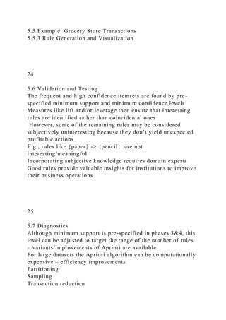
![production forecasts
29
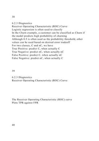
8.2 ARIMA Model
8.2.5 Building and Evaluating an ARIMA Model
library (forecast )
gas__prod_input <- as. data . f rame ( r ead.csv ( "c: / data/
gas__prod. csv")
gas__prod <- ts (gas__prod_input[ , 2])
plot (gas _prod, xlab = "Time (months) ", ylab = "Gas oline
production (mi llions of barrels ) " )
30
8.2 ARIMA Model
8.2.5 Building and Evaluating an ARIMA Model
Comparing Fitted Time Series Models
The arima () function in Ruses Maximum Likelihood Estimation
(MLE) to estimate the model coefficients. In the R output for an
ARIMA model, the log-likelihood (logLl value is provided. The
values of the model coefficients are determined such that the
value of the log likelihood function is maximized. Based on the
log L value, the R output provides several measures that are
useful for comparing the appropriateness of one fitted model
against another fitted model.
AIC (Akaike Information Criterion)
A ICc (Akaike Information Criterion, corrected)
BIC (Bayesian Information Criterion)](https://image.slidesharecdn.com/datascienceandbigdataanalyticschapter2dataana-221226172621-e7ee88db/85/DATA-SCIENCE-AND-BIG-DATA-ANALYTICSCHAPTER-2-DATA-ANA-docx-36-320.jpg)


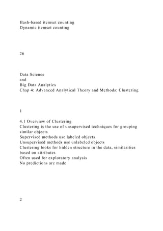
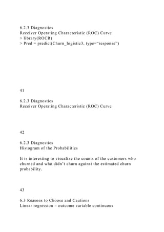
![15
7.1 Decision Trees
7.1.5 Decision Trees in R
# install packages rpart,rpart.plot
# put this code into Rstudio source and execute lines via
Ctrl/Enter
library("rpart")
library("rpart.plot")
setwd("c:/data/rstudiofiles/")
banktrain <- read.table("bank-
sample.csv",header=TRUE,sep=",")
## drop a few columns to simplify the tree
drops<-c("age", "balance", "day", "campaign", "pdays",
"previous", "month")
banktrain <- banktrain [,!(names(banktrain) %in% drops)]
summary(banktrain)
# Make a simple decision tree by only keeping the categorical
variables
fit <- rpart(subscribed ~ job + marital + education + default +
housing + loan + contact +
poutcome,method="class",data=banktrain,control=rpart.control(
minsplit=1),
parms=list(split='information'))
summary(fit)
# Plot the tree
rpart.plot(fit, type=4, extra=2, clip.right.labs=FALSE, varlen=0,
faclen=3)
16
7.2 Naïve Bayes](https://image.slidesharecdn.com/datascienceandbigdataanalyticschapter2dataana-221226172621-e7ee88db/85/DATA-SCIENCE-AND-BIG-DATA-ANALYTICSCHAPTER-2-DATA-ANA-docx-45-320.jpg)


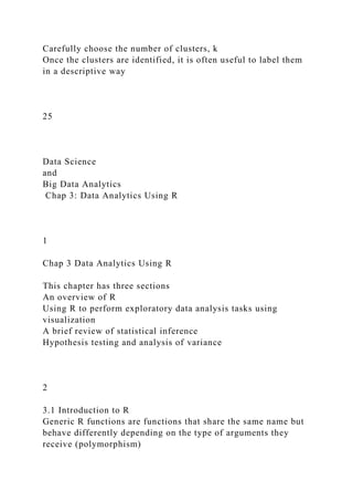
![Handles high-dimensional data efficiently
Often competitive with other learning algorithms
Reasonably resistant to overfitting
Naïve Bayes disadvantages
Assumes variables are conditionally independent
Therefore, sensitive to double counting correlated variables
In its simplest form, used only for categorical variables
24
7.2 Naïve Bayes
7.2.5 Naïve Bayes in R
This section explores two methods of using the naïve Bayes
Classifier
Manually compute probabilities from scratch
Tedious with many R calculations
Use naïve Bayes function from e1071 package
Much easier – starts on page 222
Example: subscribing to term deposit
25
7.2 Naïve Bayes
7.2.5 Naïve Bayes in R
Get data and e1071 package
> setwd("c:/data/rstudio/chapter07")
> sample<-read.table("sample1.csv",header=TRUE,sep=",")
> traindata<-as.data.frame(sample[1:14,])
> testdata<-as.data.frame(sample[15,])
> traindata #lists train data
> testdata #lists test data, no Enrolls variable](https://image.slidesharecdn.com/datascienceandbigdataanalyticschapter2dataana-221226172621-e7ee88db/85/DATA-SCIENCE-AND-BIG-DATA-ANALYTICSCHAPTER-2-DATA-ANA-docx-49-320.jpg)

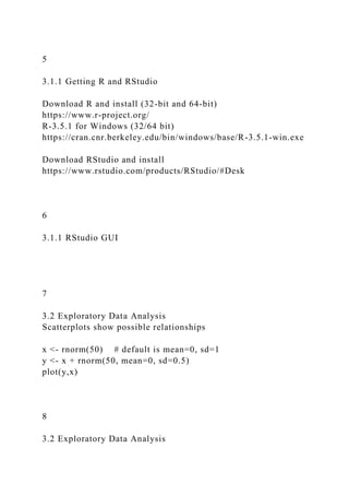
![> banktrain<-read.table("bank-
sample.csv",header=TRUE,sep=",")
> drops<-
c("balance","day","campaign","pdays","previous","month")
> banktrain<-banktrain[,!(names(banktrain) %in% drops)]
> banktest<-read.table("bank-sample-
test.csv",header=TRUE,sep=",")
> banktest<-banktest[,!(names(banktest) %in% drops)]
> nb_model<-naiveBayes(subscribed~.,data=banktrain)
> nb_prediction<-predict(nb_model,banktest[,-
ncol(banktest)],type='raw')
> score<-nb_prediction[,c("yes")]
> actual_class<-banktest$subscribed=='yes'
> pred<-prediction(score,actual_class) # code problem
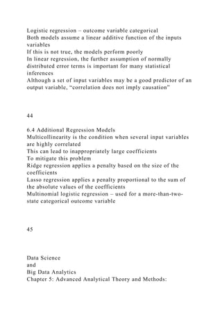
7.3 Diagnostics of Classifiers
32
ROC curve: good for evaluating binary detection
Bank marketing: 2000 training set + 100 test set
7.3 Diagnostics of Classifiers
33
7.4 Additional Classification Methods
Ensemble methods that use multiple models
Bagging: bootstrap method that uses repeated sampling with
replacement](https://image.slidesharecdn.com/datascienceandbigdataanalyticschapter2dataana-221226172621-e7ee88db/85/DATA-SCIENCE-AND-BIG-DATA-ANALYTICSCHAPTER-2-DATA-ANA-docx-52-320.jpg)


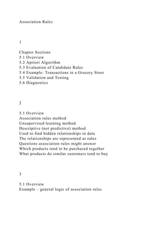
![11
Normality assumption with one input variable
E.g., for x=8, E(y)~20 but varies 15-25
6.1.2 Model Description
With Normally Distributed Errors
12
6.1.2 Model Description
Example in R
Be sure to get publisher's R downloads:
http://www.wiley.com/WileyCDA/WileyTitle/productCd-
111887613X.html
> income_input = as.data.frame(read.csv(“c:/data/income.csv”))
> income_input[1:10,]
> summary(income_input)
> library(lattice)
> splom(~income_input[c(2:5)], groups=NULL,](https://image.slidesharecdn.com/datascienceandbigdataanalyticschapter2dataana-221226172621-e7ee88db/85/DATA-SCIENCE-AND-BIG-DATA-ANALYTICSCHAPTER-2-DATA-ANA-docx-58-320.jpg)


![apply
Class of dataset Groceries is transactions, containing 3 slots
transactionInfo # data frame with vectors having
length of transactions
itemInfo # data frame storing item labels
data # binary evidence matrix of
labels in transactions
> [email protected][1:10,]
> apply([email protected][,10:20],2,function(r)
paste([email protected][r,"labels"],collapse=", "))
21
6.1.3 Diagnostics
Evaluating the Linearity Assumption
Income as a quadratic function of Age
22
6.1.3 Diagnostics
Evaluating the Residuals](https://image.slidesharecdn.com/datascienceandbigdataanalyticschapter2dataana-221226172621-e7ee88db/85/DATA-SCIENCE-AND-BIG-DATA-ANALYTICSCHAPTER-2-DATA-ANA-docx-63-320.jpg)


![5.5 Example: Grocery Store Transactions
5.5.1 The Groceries Dataset
Packages -> Install -> arules, arulesViz # don’t
enter next line
> install.packages(c("arules", "arulesViz")) # appears on
console
> library('arules')
> library('arulesViz')
> data(Groceries)
> summary(Groceries) # indicates 9835 rows
Class of dataset Groceries is transactions, containing 3 slots
transactionInfo # data frame with vectors having
length of transactions
itemInfo # data frame storing item labels
data # binary evidence matrix of
labels in transactions
> [email protected]itemInfo[1:10,]
> apply([email protected][,10:20],2,function(r)
paste([email protected][r,"labels"],collapse=", "))
14
5.5 Example: Grocery Store Transactions
5.5.2 Frequent Itemset Generation
To illustrate the Apriori algorithm, the code below does each
iteration separately.
Assume minimum support threshold = 0.02 (0.02 * 9853 = 198
items), get 122 itemsets total
First, get itemsets of length 1](https://image.slidesharecdn.com/datascienceandbigdataanalyticschapter2dataana-221226172621-e7ee88db/85/DATA-SCIENCE-AND-BIG-DATA-ANALYTICSCHAPTER-2-DATA-ANA-docx-79-320.jpg)
![target="rules"))
> summary(rules) # finds 2918 rules
> plot(rules) # displays scatterplot
The scatterplot shows that the highest lift occurs at a low
support and a low confidence.
16
5.5 Example: Grocery Store Transactions
5.5.3 Rule Generation and Visualization
> plot(rules)
17
5.5 Example: Grocery Store Transactions
5.5.3 Rule Generation and Visualization
Get scatterplot matrix to compare the support, confidence, and
lift of the 2918 rules
> plot([email protected]) # displays scatterplot matrix
Lift is proportional to confidence with several linear groupings.
Note that Lift = Confidence/Support(Y), so when support of Y
remains the same, lift is proportional to confidence and the
slope of the linear trend is the reciprocal of Support(Y).](https://image.slidesharecdn.com/datascienceandbigdataanalyticschapter2dataana-221226172621-e7ee88db/85/DATA-SCIENCE-AND-BIG-DATA-ANALYTICSCHAPTER-2-DATA-ANA-docx-81-320.jpg)
![18
5.5 Example: Grocery Store Transactions
5.5.3 Rule Generation and Visualization
> plot(rules)
19
5.5 Example: Grocery Store Transactions
5.5.3 Rule Generation and Visualization
Compute the 1/Support(Y) which is the slope
> slope<-
sort(round([email protected]$lift/[email protected]$confidence,2
))
Display the number of times each slope appears in dataset
> unlist(lapply(split(slope,f=slope),length))
Display the top 10 rules sorted by lift
> inspect(head(sort(rules,by="lift"),10))
Rule {Instant food products, soda} -> {hamburger meat}
has the highest lift of 19 (page 154)
20
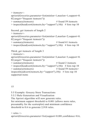
5.5 Example: Grocery Store Transactions
5.5.3 Rule Generation and Visualization
Find the rules with confidence above 0.9
> confidentRules<-rules[quality(rules)$confidence>0.9]
> confidentRules # set of 127 rules
Plot a matrix-based visualization of the LHS v RHS of rules
>
plot(confidentRules,method="matrix",measure=c("lift","confide](https://image.slidesharecdn.com/datascienceandbigdataanalyticschapter2dataana-221226172621-e7ee88db/85/DATA-SCIENCE-AND-BIG-DATA-ANALYTICSCHAPTER-2-DATA-ANA-docx-82-320.jpg)