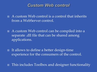
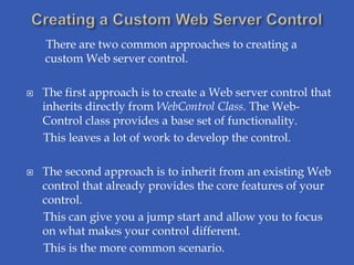
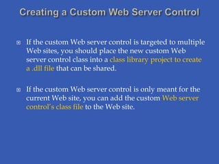
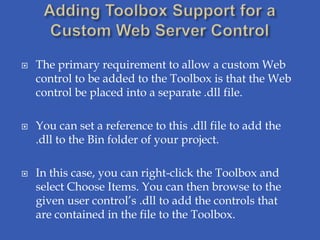
A custom web control is a control that inherits from a WebServer control and can be compiled into a .dll file and shared among applications. There are two approaches to creating one - inheriting directly from the WebControl class or inheriting from an existing control. A composite control contains other controls and handles their events.
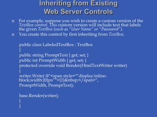
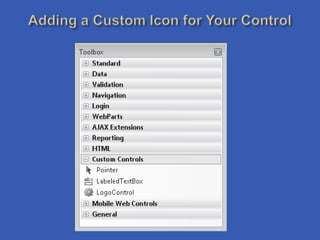
![ You can add your own custom icon through an
attribute called ToolboxBitmap of the System.Drawing
namespace.
This attribute specifies a bitmap that is 16 × 16 pixels in
size.
[ToolboxBitmap(typeof(LabeledTextBox),
“MyUserControls.LabeledTextBox.bmp”)]
public class LabeledTextBox : TextBox](https://image.slidesharecdn.com/customcontrols-120215055946-phpapp01/85/Custom-controls-11-320.jpg)
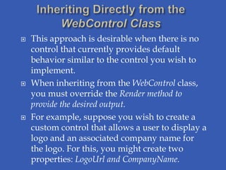
![ A default property is accessed without actually
specifying a property.
You set the default property for your control through
the DefaultProperty attribute class in the
System.ComponentModel namespace.
Apply this attribute at the class level.
Simply pass the name of one of your properties to this
attribute.
[DefaultProperty(“PromptText”)]
public class LabeledTextBox : TextBox](https://image.slidesharecdn.com/customcontrols-120215055946-phpapp01/85/Custom-controls-13-320.jpg)
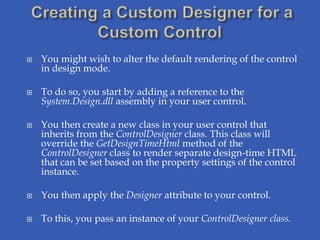
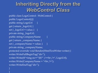
![[Designer(“MyUserControls.LabeledTextBoxDesigner, MyUserControls”)]
public class LabeledTextBoxDesigner : ControlDesigner
{
private LabeledTextBox _labeledTextBoxControl;
public override string GetDesignTimeHtml()
{
if (_labeledTextBoxControl.PromptText.Trim().Length == 0)
return "<div style='color: Gray'>[Define PromptText]</div>";
else
return base.GetDesignTimeHtml();
}
public override void Initialize(IComponent component)
{
_labeledTextBoxControl = (LabeledTextBox)component;
base.Initialize(component);
return;
}}](https://image.slidesharecdn.com/customcontrols-120215055946-phpapp01/85/Custom-controls-16-320.jpg)