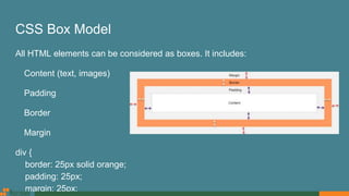
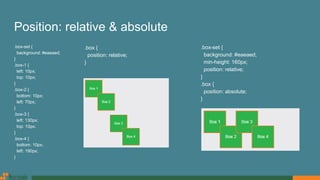
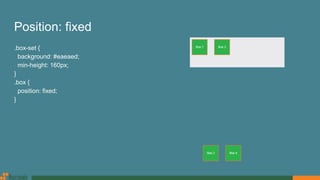
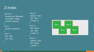
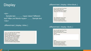
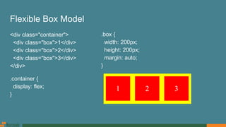
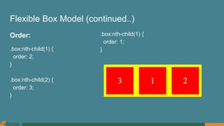
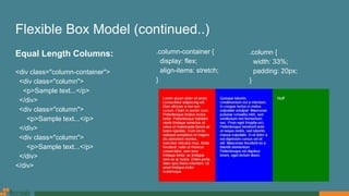
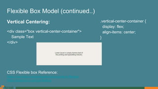
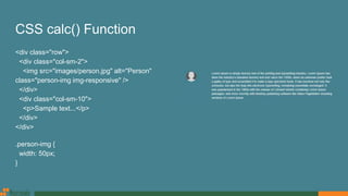
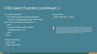
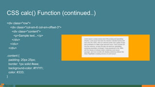
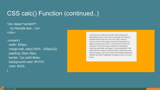
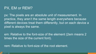
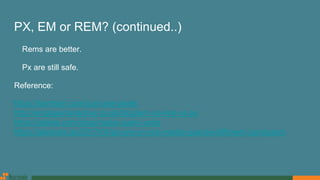
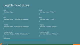
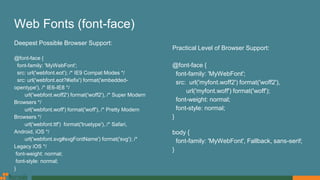
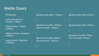
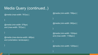
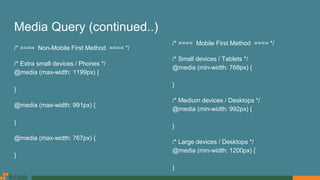
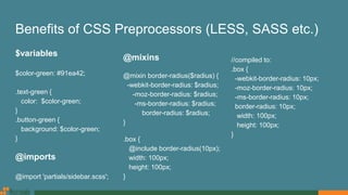
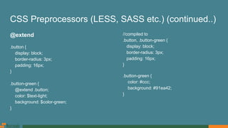
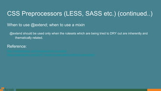
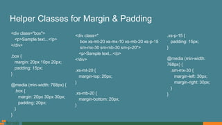
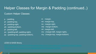
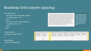
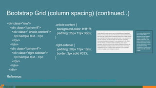
SlideShare a Scribd company logo
CSS for Developers
MD. Sayyedul Islam
Software Engineer
Nascenia Ltd.
CSS Box Model
All HTML elements can be considered as boxes. It includes:
Content (text, images)
Padding
Border
Margin
div {
border: 25px solid orange;
padding: 25px;
margin: 25px;
CSS3 Box Sizing
By default, the width and height of an element is calculated like this:
width + padding + border = actual width of an element
height + padding + border = actual height of an element
.div1 {
width: 300px;
height: 100px;
border: 1px solid blue;
padding: 20px;
}
Calculated width: 300(original width) + 40(padding-left: 20 + padding-right: 20) + 2(border-left: 1 + border-
right: 1) = 342px
Calculated height: 100(original height) + 40(padding-top: 20 + padding-bottom: 20) + 2(border-top: 1 +
border-bottom: 1) = 142px
CSS3 Box Sizing (continued..)
.div2 {
width: 300px;
height: 100px;
border: 1px solid blue;
padding: 20px;
box-sizing: border-box;
}
Make it global:
* {
-webkit-box-sizing: border-box;
-moz-box-sizing: border-box;
box-sizing: border-box;
}
:after, :before {
-webkit-box-sizing: border-box;
-moz-box-sizing: border-box;
box-sizing: border-box;
}
Float & Clear
<div class="box-section">
<div class="box pull-left">Div 1</div>
<div class="box pull-left">Div 2</div>
</div>
.box {
width: 50%;
height: 100px;
padding: 20px;
}
.pull-left {
float: left;
}
.box-section {
padding: 20px;
background: orange;
}
Float & Clear (continued..)
Solution 1:
<div class="box-section">
<div class="box pull-left">Div 1</div>
<div class="box pull-left">Div 2</div>
<div class="clear"></div>
</div>
.clear {
clear: both;
}
Solution 2 (better):
<div class="box-section clearfix">
<div class="box pull-left">Div 1</div>
<div class="box pull-left">Div 2</div>
</div>
.clearfix:before,
.clearfix:after {
display: table;
content: " ";
}
.clearfix:after {
clear: both;
}
Float & Clear (continued..)
CSS Pseudo-elements
A CSS pseudo-element is used to style
specified parts of an element.
Some pseudo-elements are:
:first-letter
:first-line
:selection
:before
:after
<h1>This is a heading</h1>
h1:before {
content: url('smiley.gif');
}
<ul>
<li><a href=”#”>Home</a></li>
<li><a href=”#”>About Us</a></li>
<li><a href=”#”>Contact</a></li>
</ul>
li:after {
content: '/';
}
CSS Pseudo-classes
A pseudo-class is used to define a special state of an element.
Some pseudo-classes are:
:hover
:focus
:first-child
:last-of-type
:not(selector)
:nth-child(n)
:nth-of-type(n)
The Difference Between :nth-child and :nth-of-type
<section>
<h1>Words</h1>
<p>One</p>
<p>Two</p> <!-- Want this one -->
<p>Three</p>
<p>Four</p>
</section>
:nth-child(n) - p:nth-child(2)
Selects every <p> element that is the second child of its
parent
:nth-of-type(n) - p:nth-of-type(2)
Selects every <p> element that is the second <p>
element of its parent
p:nth-child(2) { color: red; }
p:nth-of-type(2) { color: red; }
Some CSS Selectors
<div id="container">
<ul>
<li> List Item
<ul>
<li> Child </li>
</ul>
</li>
<li> List Item </li>
</ul>
</div>
#container ul {
border: 1px solid white;
}
#container > ul {
border: 1px solid white;
}
The difference between the standard X Y and X > Y is
that the latter will only select direct children.
Some CSS Selectors (continued..)
ul + p {
color: red;
}
X + Y will select only the element that is placed
immediately after the former element.
ul ~ p {
color: red;
}
X ~ Y will select, referring to our example above,
any p elements, as long as they follow a ul
Position
Mainly, there are 4 values:
Static: Default value. Elements render in order, as they appear in the document
flow
Relative: The element is positioned relative to its normal position
Absolute: The element is positioned directly in relation to their containing
parent whom is relatively or absolutely positioned.
Fixed: The element is positioned relative to the browser window
Position: static
Considering this HTML:
<div class="box-set">
<div class="box box-1">Box 1</div>
<div class="box box-2">Box 2</div>
<div class="box box-3">Box 3</div>
<div class="box box-4">Box 4</div>
</div>
CSS:
.box-set {
background: #eaeaed;
position: static;
}
.box {
position: static;
}
Position: relative & absolute
.box-set {
background: #eaeaed;
}
.box-1 {
left: 10px;
top: 10px;
}
.box-2 {
bottom: 10px;
left: 70px;
}
.box-3 {
left: 130px;
top: 10px;
}
.box-4 {
bottom: 10px;
left: 190px;
}
.box-set {
background: #eaeaed;
min-height: 160px;
position: relative;
}
.box {
position: absolute;
}
.box {
position: relative;
}
Position: fixed
.box-set {
background: #eaeaed;
min-height: 160px;
}
.box {
position: fixed;
}
Z-Index
.box-set {
background: #eaeaed;
min-height: 160px;
position: relative;
}
.box {
position: absolute;
}
.box-1 {
left: 10px;
top: 10px;
}
.box-2 {
bottom: 10px;
left: 70px;
z-index: 3;
}
.box-3 {
left: 130px;
top: 10px;
z-index: 2;
}
.box-4 {
bottom: 10px;
left: 190px;
z-index: 1;
}
Display
<div>
Sample text………... <span class="different-
text">Max und Moritz</span> …….. Sample text
</div>
.different-text { display: inline; }
.different-text { display: inline-block; }
.different-text { display: block; }
Flexible Box Model
<div class="container">
<div class="box">1</div>
<div class="box">2</div>
<div class="box">3</div>
</div>
.container {
display: flex;
}
.box {
width: 200px;
height: 200px;
margin: auto;
}
Flexible Box Model (continued..)
Order:
.box:nth-child(1) {
order: 2;
}
.box:nth-child(2) {
order: 3;
}
.box:nth-child(1) {
order: 1;
}
Flexible Box Model (continued..)
Equal Length Columns:
<div class="column-container">
<div class="column">
<p>Sample text...</p>
</div>
<div class="column">
<p>Sample text...</p>
</div>
<div class="column">
<p>Sample text...</p>
</div>
</div>
.column-container {
display: flex;
align-items: stretch;
}
.column {
width: 33%;
padding: 20px;
}
Flexible Box Model (continued..)
Vertical Centering:
<div class="box vertical-center-container">
Sample Text
</div>
CSS Flexible box Reference:
https://css-tricks.com/snippets/css/a-guide-to-flexbox
https://paulund.co.uk/css-flexbox
.vertical-center-container {
display: flex;
align-items: center;
}
CSS calc() Function
<div class="row">
<div class="col-sm-2">
<img src="images/person.jpg" alt="Person"
class="person-img img-responsive" />
</div>
<div class="col-sm-10">
<p>Sample text...</p>
</div>
</div>
.person-img {
width: 50px;
}
CSS calc() Function (continued..)
<div class="clearfix">
<div class="person-img-block pull-left">
<img src="images/person.jpg" alt="Person"
class="person-img img-responsive" />
</div>
<div class="person-info pull-left">
<p>Sample text...</p>
</div>
</div>
.person-img-block {
width: 50px;
margin-right: 20px;
}
.person-info {
width: calc(100% - 70px);
}
CSS calc() Function (continued..)
<div class="row">
<div class="col-sm-6 col-sm-offset-3">
<div class="content">
<p>Sample text...</p>
</div>
</div>
</div>
.content {
padding: 20px 25px;
border: 1px solid #eee;
background-color: #f1f1f1;
color: #333;
}
CSS calc() Function (continued..)
<div class="content">
<p>Sample text...</p>
</div>
.content {
width: 500px;
margin-left: calc((100% - 500px)/2);
padding: 20px 30px;
border: 1px solid #eee;
background-color: #f1f1f1;
color: #333;
}
PX, EM or REM?
px: The pixels are an absolute unit of measurement. In
practice, they aren’t the same length everywhere because
different devices treat them differently, but on each device a
pixel is always the same.
em: Relative to the font-size of the element (2em means 2
times the size of the current font).
rem: Relative to font-size of the root element.
PX, EM or REM? (continued..)
Rems are better.
Px are still safe.
Reference:
https://benfrain.com/just-use-pixels
http://engageinteractive.co.uk/blog/em-vs-rem-vs-px
https://zellwk.com/blog/media-query-units
https://alastairc.ac/2017/04/px-em-or-rem-media-queries-different-conclusion
Legible Font Sizes
body {
font-size: 16px;
}
h2 {
font-size: 32px; /* 200% of the baseline */
}
.large {
font-size: 20px; /* 125% of the baseline */
}
.medium-small {
font-size: 13.6px; /* 85% of the baseline */
}
body {
font-size: 1rem; /* 16px */
}
h2 {
font-size: 2rem; /* 32px */
}
.large {
font-size: 1.25rem; /* 20px */
}
.medium-small {
font-size: 0.85rem; /* 13.6px */
}
Reference:
https://developers.google.com/speed/docs/insights/UseLegibleFontSizes
Web Fonts (font-face)
Deepest Possible Browser Support:
@font-face {
font-family: 'MyWebFont';
src: url('webfont.eot'); /* IE9 Compat Modes */
src: url('webfont.eot?#iefix') format('embedded-
opentype'), /* IE6-IE8 */
url('webfont.woff2') format('woff2'), /* Super Modern
Browsers */
url('webfont.woff') format('woff'), /* Pretty Modern
Browsers */
url('webfont.ttf') format('truetype'), /* Safari,
Android, iOS */
url('webfont.svg#svgFontName') format('svg'); /*
Legacy iOS */
font-weight: normal;
font-style: normal;
}
Practical Level of Browser Support:
@font-face {
font-family: 'MyWebFont';
src: url('myfont.woff2') format('woff2'),
url('myfont.woff') format('woff');
font-weight: normal;
font-style: normal;
}
body {
font-family: 'MyWebFont', Fallback, sans-serif;
}
Web Fonts (font-face) (continued..)
<p>All of us have been through the dreaded
experience of <strong>sleepless
nights</strong> before the exam day.</p>
body {
font-family: 'Roboto-Regular';
}
strong {
font-family: 'Roboto-Bold';
}
Correct Way:
b, strong {
font-family: 'Roboto-Bold';
font-weight: normal;
}
Google Web Fonts
<link
href="https://fonts.googleapis.com/css?family=Open+Sans:400,400i,600,600i,700"
rel="stylesheet">
body {
font-family: 'Open Sans', sans-serif;
font-weight: 400;
}
.semibold {
font-weight: 600;
}
b, strong, .bold {
font-weight: 700;
}
i {
font-style: italic;
font-weight: 400;
}
.semibold-italic {
font-style: italic;
font-weight: 600;
}
Media Query
@media (max-width: 1199px) {
}
@media (min-width: 1025px)
and (max-width: 1199px) {
}
@media (min-width: 992px)
and (max-width: 1024px) {
}
@media (max-width: 991px) {
}
@media (max-width: 767px) {
}
@media (min-width: 576px)
and (max-width: 767px) {
}
Breakpoints:
Extra small devices /
Phones: (<768px)
Small devices / Tablets:
(≥768px)
Medium devices / Desktops:
(≥992px)
Large devices / Desktops:
(≥1200px)
Mobile First Design
Media Query (continued..)
@media (max-width: 767px) {
}
@media (min-width: 576px)
and (max-width: 767px) {
}
@media (max-device-width: 480px)
and (orientation: landscape) {
}
@media (min-width: 768px) {
}
@media (min-width: 992px) {
}
@media (min-width: 1024px)
and (max-width: 1199px) {
}
@media (min-width: 1200px) {
}
Media Query (continued..)
/* ==== Non-Mobile First Method ==== */
/* Extra small devices / Phones */
@media (max-width: 1199px) {
}
@media (max-width: 991px) {
}
@media (max-width: 767px) {
}
/* ==== Mobile First Method ==== */
/* Small devices / Tablets */
@media (min-width: 768px) {
}
/* Medium devices / Desktops */
@media (min-width: 992px) {
}
/* Large devices / Desktops */
@media (min-width: 1200px) {
}
Benefits of CSS Preprocessors (LESS, SASS etc.)
$variables
$color-green: #91ea42;
.text-green {
color: $color-green;
}
.button-green {
background: $color-green;
}
@imports
@import 'partials/sidebar.scss';
@mixins
@mixin border-radius($radius) {
-webkit-border-radius: $radius;
-moz-border-radius: $radius;
-ms-border-radius: $radius;
border-radius: $radius;
}
.box {
@include border-radius(10px);
width: 100px;
height: 100px;
}
//compiled to:
.box {
-webkit-border-radius: 10px;
-moz-border-radius: 10px;
-ms-border-radius: 10px;
border-radius: 10px;
width: 100px;
height: 100px;
}
CSS Preprocessors (LESS, SASS etc.) (continued..)
@extend
.button {
display: block;
border-radius: 3px;
padding: 16px;
}
.button-green {
@extend .button;
color: $text-light;
background: $color-green;
}
//compiled to
.button, .button-green {
display: block;
border-radius: 3px;
padding: 16px;
}
.button-green {
color: #ccc;
background: #91ea42;
}
CSS Preprocessors (LESS, SASS etc.) (continued..)
When to use @extend; when to use a mixin
@extend should be used only when the rulesets which are being tried to DRY out are inherently and
thematically related.
Reference:
http://vanseodesign.com/css/sass-mixin-or-extend
https://csswizardry.com/2014/11/when-to-use-extend-when-to-use-a-mixin
Helper Classes for Margin & Padding
<div class="box">
<p>Sample text...</p>
</div>
.box {
margin: 20px 10px 20px;
padding: 15px;
}
@media (min-width: 768px) {
.box {
margin: 20px 30px 30px;
padding: 20px;
}
}
<div class="
box xs-mt-20 xs-mx-10 xs-mb-20 xs-p-15
sm-mx-30 sm-mb-30 sm-p-20">
<p>Sample text...</p>
</div>
.xs-mt-20 {
margin-top: 20px;
}
.xs-mb-20 {
margin-bottom: 20px;
}
.xs-p-15 {
padding: 15px;
}
@media (min-width:
768px) {
.sm-mx-30 {
margin-left: 30px;
margin-right: 30px;
}
}
Helper Classes for Margin & Padding (continued..)
LESS & SASS library
http://aslanbakan.com/en/blog/less-space-responsive-css-margin-and-padding-helper-classes
https://gist.github.com/jimujing/a1fe8ae825b63f0846a0edaff9e260d4
Custom Helper Classes:
p : padding,
pt : padding-top,
pr : padding-right,
pb : padding-bottom,
pl : padding-left,
px : (padding-left, padding-right),
py : (padding-top, padding-bottom),
m : margin,
mt : margin-top,
mr : margin-right,
mb : margin-bottom,
ml : margin-left,
mx : (margin-left, margin-right),
my : (margin-top, margin-bottom)
Bootstrap Grid (column spacing)
<div class="row">
<div class="col-sm-8 article-content">
<p>Sample text...</p>
</div>
<div class="col-sm-4 right-sidebar">
<p>Sample text...</p>
</div>
</div>
.article-content {
background-color: #f1f1f1;
}
.right-sidebar {
border: 3px solid #333;
}
Bootstrap Grid (column spacing) (continued..)
<div class="row">
<div class="col-sm-8">
<div class=" article-content">
<p>Sample text...</p>
</div>
</div>
<div class="col-sm-4">
<div class="right-sidebar">
<p>Sample text...</p>
</div>
</div>
</div>
.article-content {
background-color: #f1f1f1;
padding: 25px 15px 30px;
}
.right-sidebar {
padding: 20px 15px 10px;
border: 3px solid #333;
}
Reference:
http://www.helloerik.com/the-subtle-magic-behind-why-the-bootstrap-3-grid-works
CSS Reset
Documentation:
https://github.com/shannonmoeller/reset-css
gem: https://github.com/adamstac/meyer-reset
Overwriting reset.css & adding custom css:
body {
font-size: 16px;
line-height: 1.2;
}
* {
-webkit-box-sizing: border-box;
-moz-box-sizing: border-box;
box-sizing: border-box;
}
:after, :before {
-webkit-box-sizing: border-box;
-moz-box-sizing: border-box;
box-sizing: border-box;
}
N.B. If we use framework like bootstrap, we won’t need that reset.css or custom reset. But, we should set
base font & line-height at boddy according to google developer’s guide.
Thank You!

More Related Content

What's hot

Haste (Same Language, Multiple Platforms) and Tagless Final Style (Same Synta...
Haste (Same Language, Multiple Platforms) and Tagless Final Style (Same Synta...Haste (Same Language, Multiple Platforms) and Tagless Final Style (Same Synta...
Haste (Same Language, Multiple Platforms) and Tagless Final Style (Same Synta...
takeoutweight
 
Gradient effect for ie 7
Gradient effect for ie 7Gradient effect for ie 7
Gradient effect for ie 7
rccsaikat
 
Implementing a many-to-many Relationship with Slick
Implementing a many-to-many Relationship with SlickImplementing a many-to-many Relationship with Slick
Implementing a many-to-many Relationship with Slick
Hermann Hueck
 
Working With JQuery Part1
Working With JQuery Part1Working With JQuery Part1
Working With JQuery Part1
saydin_soft
 
Introductionto fp with groovy
Introductionto fp with groovyIntroductionto fp with groovy
Introductionto fp with groovy
Isuru Samaraweera
 
7 Habits For a More Functional Swift
7 Habits For a More Functional Swift7 Habits For a More Functional Swift
7 Habits For a More Functional Swift
Jason Larsen
 
Traversals for all ocasions
Traversals for all ocasionsTraversals for all ocasions
Traversals for all ocasions
Luka Jacobowitz
 
LINQ Internals - STLDODN
LINQ Internals - STLDODNLINQ Internals - STLDODN
LINQ Internals - STLDODN
Keith Dahlby
 
Computational Social Science, Lecture 09: Data Wrangling
Computational Social Science, Lecture 09: Data WranglingComputational Social Science, Lecture 09: Data Wrangling
Computational Social Science, Lecture 09: Data Wrangling
jakehofman
 
ProgrammingwithGOLang
ProgrammingwithGOLangProgrammingwithGOLang
ProgrammingwithGOLang
Shishir Dwivedi
 
Groovy unleashed
Groovy unleashed Groovy unleashed
Groovy unleashed
Isuru Samaraweera
 
Model-View-Update, and Beyond!
Model-View-Update, and Beyond!Model-View-Update, and Beyond!
Model-View-Update, and Beyond!
Simon Fowler
 
Swift에서 꼬리재귀 사용기 (Tail Recursion)
Swift에서 꼬리재귀 사용기 (Tail Recursion)Swift에서 꼬리재귀 사용기 (Tail Recursion)
Swift에서 꼬리재귀 사용기 (Tail Recursion)
진성 오
 
Fs2 - Crash Course
Fs2 - Crash CourseFs2 - Crash Course
Fs2 - Crash Course
Lukasz Byczynski
 
Regex - Regular Expression Basics
Regex - Regular Expression BasicsRegex - Regular Expression Basics
Regex - Regular Expression Basics
Eterna Han Tsai
 
DBIx-DataModel v2.0 in detail
DBIx-DataModel v2.0 in detail DBIx-DataModel v2.0 in detail
DBIx-DataModel v2.0 in detail
Laurent Dami
 
(안드로이드 개발자를 위한) 오픈소스 라이브러리 사용 가이드
(안드로이드 개발자를 위한) 오픈소스 라이브러리 사용 가이드(안드로이드 개발자를 위한) 오픈소스 라이브러리 사용 가이드
(안드로이드 개발자를 위한) 오픈소스 라이브러리 사용 가이드
Taeho Kim
 
Hive function-cheat-sheet
Hive function-cheat-sheetHive function-cheat-sheet
Hive function-cheat-sheet
Dr. Volkan OBAN
 
레진코믹스가 코틀린으로 간 까닭은?
레진코믹스가 코틀린으로 간 까닭은?레진코믹스가 코틀린으로 간 까닭은?
레진코믹스가 코틀린으로 간 까닭은?
Taeho Kim
 
Type safe embedded domain-specific languages
Type safe embedded domain-specific languagesType safe embedded domain-specific languages
Type safe embedded domain-specific languages
Arthur Xavier
 

What's hot (20)

Haste (Same Language, Multiple Platforms) and Tagless Final Style (Same Synta...
Haste (Same Language, Multiple Platforms) and Tagless Final Style (Same Synta...Haste (Same Language, Multiple Platforms) and Tagless Final Style (Same Synta...
Haste (Same Language, Multiple Platforms) and Tagless Final Style (Same Synta...
 
Gradient effect for ie 7
Gradient effect for ie 7Gradient effect for ie 7
Gradient effect for ie 7
 
Implementing a many-to-many Relationship with Slick
Implementing a many-to-many Relationship with SlickImplementing a many-to-many Relationship with Slick
Implementing a many-to-many Relationship with Slick
 
Working With JQuery Part1
Working With JQuery Part1Working With JQuery Part1
Working With JQuery Part1
 
Introductionto fp with groovy
Introductionto fp with groovyIntroductionto fp with groovy
Introductionto fp with groovy
 
7 Habits For a More Functional Swift
7 Habits For a More Functional Swift7 Habits For a More Functional Swift
7 Habits For a More Functional Swift
 
Traversals for all ocasions
Traversals for all ocasionsTraversals for all ocasions
Traversals for all ocasions
 
LINQ Internals - STLDODN
LINQ Internals - STLDODNLINQ Internals - STLDODN
LINQ Internals - STLDODN
 
Computational Social Science, Lecture 09: Data Wrangling
Computational Social Science, Lecture 09: Data WranglingComputational Social Science, Lecture 09: Data Wrangling
Computational Social Science, Lecture 09: Data Wrangling
 
ProgrammingwithGOLang
ProgrammingwithGOLangProgrammingwithGOLang
ProgrammingwithGOLang
 
Groovy unleashed
Groovy unleashed Groovy unleashed
Groovy unleashed
 
Model-View-Update, and Beyond!
Model-View-Update, and Beyond!Model-View-Update, and Beyond!
Model-View-Update, and Beyond!
 
Swift에서 꼬리재귀 사용기 (Tail Recursion)
Swift에서 꼬리재귀 사용기 (Tail Recursion)Swift에서 꼬리재귀 사용기 (Tail Recursion)
Swift에서 꼬리재귀 사용기 (Tail Recursion)
 
Fs2 - Crash Course
Fs2 - Crash CourseFs2 - Crash Course
Fs2 - Crash Course
 
Regex - Regular Expression Basics
Regex - Regular Expression BasicsRegex - Regular Expression Basics
Regex - Regular Expression Basics
 
DBIx-DataModel v2.0 in detail
DBIx-DataModel v2.0 in detail DBIx-DataModel v2.0 in detail
DBIx-DataModel v2.0 in detail
 
(안드로이드 개발자를 위한) 오픈소스 라이브러리 사용 가이드
(안드로이드 개발자를 위한) 오픈소스 라이브러리 사용 가이드(안드로이드 개발자를 위한) 오픈소스 라이브러리 사용 가이드
(안드로이드 개발자를 위한) 오픈소스 라이브러리 사용 가이드
 
Hive function-cheat-sheet
Hive function-cheat-sheetHive function-cheat-sheet
Hive function-cheat-sheet
 
레진코믹스가 코틀린으로 간 까닭은?
레진코믹스가 코틀린으로 간 까닭은?레진코믹스가 코틀린으로 간 까닭은?
레진코믹스가 코틀린으로 간 까닭은?
 
Type safe embedded domain-specific languages
Type safe embedded domain-specific languagesType safe embedded domain-specific languages
Type safe embedded domain-specific languages
 

Similar to CSS for Developers

Oocss & progressive css3 selectors
Oocss & progressive css3 selectorsOocss & progressive css3 selectors
Oocss & progressive css3 selectors
daniel_sternlicht
 
Prototyping w/HTML5 and CSS3
Prototyping w/HTML5 and CSS3Prototyping w/HTML5 and CSS3
Prototyping w/HTML5 and CSS3
Todd Zaki Warfel
 
Exam 70 480 CSS3 at Jinal Desai .NET
Exam 70 480 CSS3 at Jinal Desai .NETExam 70 480 CSS3 at Jinal Desai .NET
Exam 70 480 CSS3 at Jinal Desai .NET
jinaldesailive
 
5. Web Technology CSS Advanced
5. Web Technology CSS Advanced 5. Web Technology CSS Advanced
5. Web Technology CSS Advanced
Jyoti Yadav
 
Cascading Style Sheets - Part 01
Cascading Style Sheets - Part 01Cascading Style Sheets - Part 01
Cascading Style Sheets - Part 01
Hatem Mahmoud
 
CSS Basics
CSS BasicsCSS Basics
CSS Basics
WordPress Memphis
 
Software programming tools for creating/managing CSS files
Software programming tools for creating/managing CSS filesSoftware programming tools for creating/managing CSS files
Software programming tools for creating/managing CSS files
Dinu Suman
 
CSS3 and Selectors
CSS3 and SelectorsCSS3 and Selectors
CSS3 and Selectors
Rachel Andrew
 
Start your app the better way with Styled System
Start your app the better way with Styled SystemStart your app the better way with Styled System
Start your app the better way with Styled System
Hsin-Hao Tang
 
Tmx9
Tmx9Tmx9
Accelerated Stylesheets
Accelerated StylesheetsAccelerated Stylesheets
Accelerated Stylesheets
Wynn Netherland
 
html
htmlhtml
The road to &lt;> styled-components: CSS in component-based systems by Max S...
The road to &lt;> styled-components: CSS in component-based systems by Max S...The road to &lt;> styled-components: CSS in component-based systems by Max S...
The road to &lt;> styled-components: CSS in component-based systems by Max S...
React London 2017
 
Getting Started with Sass & Compass
Getting Started with Sass & CompassGetting Started with Sass & Compass
Getting Started with Sass & Compass
Rob Davarnia
 
CSS Cascade Style Sheet
CSS Cascade Style SheetCSS Cascade Style Sheet
CSS Cascade Style Sheet
Adeel Rasheed
 
Core CSS3
Core CSS3Core CSS3
Core CSS3
Rachel Andrew
 
Css class-02
Css class-02Css class-02
Css class-02
Md Ali Hossain
 
Braces to Pixels - CSS Day 2016
Braces to Pixels - CSS Day 2016Braces to Pixels - CSS Day 2016
Braces to Pixels - CSS Day 2016
Greg Whitworth
 
DotNetNuke World CSS3
DotNetNuke World CSS3DotNetNuke World CSS3
DotNetNuke World CSS3
gravityworksdd
 
BloggingWithStyle_2008
BloggingWithStyle_2008BloggingWithStyle_2008
BloggingWithStyle_2008
tutorialsruby
 

Similar to CSS for Developers (20)

Oocss & progressive css3 selectors
Oocss & progressive css3 selectorsOocss & progressive css3 selectors
Oocss & progressive css3 selectors
 
Prototyping w/HTML5 and CSS3
Prototyping w/HTML5 and CSS3Prototyping w/HTML5 and CSS3
Prototyping w/HTML5 and CSS3
 
Exam 70 480 CSS3 at Jinal Desai .NET
Exam 70 480 CSS3 at Jinal Desai .NETExam 70 480 CSS3 at Jinal Desai .NET
Exam 70 480 CSS3 at Jinal Desai .NET
 
5. Web Technology CSS Advanced
5. Web Technology CSS Advanced 5. Web Technology CSS Advanced
5. Web Technology CSS Advanced
 
Cascading Style Sheets - Part 01
Cascading Style Sheets - Part 01Cascading Style Sheets - Part 01
Cascading Style Sheets - Part 01
 
CSS Basics
CSS BasicsCSS Basics
CSS Basics
 
Software programming tools for creating/managing CSS files
Software programming tools for creating/managing CSS filesSoftware programming tools for creating/managing CSS files
Software programming tools for creating/managing CSS files
 
CSS3 and Selectors
CSS3 and SelectorsCSS3 and Selectors
CSS3 and Selectors
 
Start your app the better way with Styled System
Start your app the better way with Styled SystemStart your app the better way with Styled System
Start your app the better way with Styled System
 
Tmx9
Tmx9Tmx9
Tmx9
 
Accelerated Stylesheets
Accelerated StylesheetsAccelerated Stylesheets
Accelerated Stylesheets
 
html
htmlhtml
html
 
The road to &lt;> styled-components: CSS in component-based systems by Max S...
The road to &lt;> styled-components: CSS in component-based systems by Max S...The road to &lt;> styled-components: CSS in component-based systems by Max S...
The road to &lt;> styled-components: CSS in component-based systems by Max S...
 
Getting Started with Sass & Compass
Getting Started with Sass & CompassGetting Started with Sass & Compass
Getting Started with Sass & Compass
 
CSS Cascade Style Sheet
CSS Cascade Style SheetCSS Cascade Style Sheet
CSS Cascade Style Sheet
 
Core CSS3
Core CSS3Core CSS3
Core CSS3
 
Css class-02
Css class-02Css class-02
Css class-02
 
Braces to Pixels - CSS Day 2016
Braces to Pixels - CSS Day 2016Braces to Pixels - CSS Day 2016
Braces to Pixels - CSS Day 2016
 
DotNetNuke World CSS3
DotNetNuke World CSS3DotNetNuke World CSS3
DotNetNuke World CSS3
 
BloggingWithStyle_2008
BloggingWithStyle_2008BloggingWithStyle_2008
BloggingWithStyle_2008
 

More from Nascenia IT

AI Tools for Productivity: Exploring Prompt Engineering and Key Features
AI Tools for Productivity: Exploring Prompt Engineering and Key FeaturesAI Tools for Productivity: Exploring Prompt Engineering and Key Features
AI Tools for Productivity: Exploring Prompt Engineering and Key Features
Nascenia IT
 
Introduction to basic data analytics tools
Introduction to basic data analytics toolsIntroduction to basic data analytics tools
Introduction to basic data analytics tools
Nascenia IT
 
Communication workshop in nascenia
Communication workshop in nasceniaCommunication workshop in nascenia
Communication workshop in nascenia
Nascenia IT
 
The Art of Statistical Deception
The Art of Statistical DeceptionThe Art of Statistical Deception
The Art of Statistical Deception
Nascenia IT
 
করোনায় কী করি!
করোনায় কী করি!করোনায় কী করি!
করোনায় কী করি!
Nascenia IT
 
GDPR compliance expectations from the development team
GDPR compliance expectations from the development teamGDPR compliance expectations from the development team
GDPR compliance expectations from the development team
Nascenia IT
 
Writing Clean Code
Writing Clean CodeWriting Clean Code
Writing Clean Code
Nascenia IT
 
History & Introduction of Neural Network and use of it in Computer Vision
History & Introduction of Neural Network and use of it in Computer VisionHistory & Introduction of Neural Network and use of it in Computer Vision
History & Introduction of Neural Network and use of it in Computer Vision
Nascenia IT
 
Ruby on Rails: Coding Guideline
Ruby on Rails: Coding GuidelineRuby on Rails: Coding Guideline
Ruby on Rails: Coding Guideline
Nascenia IT
 
iphone 11 new features
iphone 11 new featuresiphone 11 new features
iphone 11 new features
Nascenia IT
 
Software quality assurance and cyber security
Software quality assurance and cyber securitySoftware quality assurance and cyber security
Software quality assurance and cyber security
Nascenia IT
 
Job Market Scenario For Freshers
Job Market Scenario For Freshers Job Market Scenario For Freshers
Job Market Scenario For Freshers
Nascenia IT
 
Modern Frontend Technologies (BEM, Retina)
Modern Frontend Technologies (BEM, Retina)Modern Frontend Technologies (BEM, Retina)
Modern Frontend Technologies (BEM, Retina)
Nascenia IT
 
Big commerce app development
Big commerce app developmentBig commerce app development
Big commerce app development
Nascenia IT
 
Integrating QuickBooks Desktop with Rails Application
Integrating QuickBooks Desktop with Rails ApplicationIntegrating QuickBooks Desktop with Rails Application
Integrating QuickBooks Desktop with Rails Application
Nascenia IT
 
Shopify
ShopifyShopify
Shopify
Nascenia IT
 
TypeScript: Basic Features and Compilation Guide
TypeScript: Basic Features and Compilation GuideTypeScript: Basic Features and Compilation Guide
TypeScript: Basic Features and Compilation Guide
Nascenia IT
 
Clean code
Clean codeClean code
Clean code
Nascenia IT
 
Ruby conf 2016 - Secrets of Testing Rails 5 Apps
Ruby conf 2016 - Secrets of Testing Rails 5 AppsRuby conf 2016 - Secrets of Testing Rails 5 Apps
Ruby conf 2016 - Secrets of Testing Rails 5 Apps
Nascenia IT
 
COREXIT: Microsoft’s new cross platform framework
COREXIT: Microsoft’s new cross platform frameworkCOREXIT: Microsoft’s new cross platform framework
COREXIT: Microsoft’s new cross platform framework
Nascenia IT
 

More from Nascenia IT (20)

AI Tools for Productivity: Exploring Prompt Engineering and Key Features
AI Tools for Productivity: Exploring Prompt Engineering and Key FeaturesAI Tools for Productivity: Exploring Prompt Engineering and Key Features
AI Tools for Productivity: Exploring Prompt Engineering and Key Features
 
Introduction to basic data analytics tools
Introduction to basic data analytics toolsIntroduction to basic data analytics tools
Introduction to basic data analytics tools
 
Communication workshop in nascenia
Communication workshop in nasceniaCommunication workshop in nascenia
Communication workshop in nascenia
 
The Art of Statistical Deception
The Art of Statistical DeceptionThe Art of Statistical Deception
The Art of Statistical Deception
 
করোনায় কী করি!
করোনায় কী করি!করোনায় কী করি!
করোনায় কী করি!
 
GDPR compliance expectations from the development team
GDPR compliance expectations from the development teamGDPR compliance expectations from the development team
GDPR compliance expectations from the development team
 
Writing Clean Code
Writing Clean CodeWriting Clean Code
Writing Clean Code
 
History & Introduction of Neural Network and use of it in Computer Vision
History & Introduction of Neural Network and use of it in Computer VisionHistory & Introduction of Neural Network and use of it in Computer Vision
History & Introduction of Neural Network and use of it in Computer Vision
 
Ruby on Rails: Coding Guideline
Ruby on Rails: Coding GuidelineRuby on Rails: Coding Guideline
Ruby on Rails: Coding Guideline
 
iphone 11 new features
iphone 11 new featuresiphone 11 new features
iphone 11 new features
 
Software quality assurance and cyber security
Software quality assurance and cyber securitySoftware quality assurance and cyber security
Software quality assurance and cyber security
 
Job Market Scenario For Freshers
Job Market Scenario For Freshers Job Market Scenario For Freshers
Job Market Scenario For Freshers
 
Modern Frontend Technologies (BEM, Retina)
Modern Frontend Technologies (BEM, Retina)Modern Frontend Technologies (BEM, Retina)
Modern Frontend Technologies (BEM, Retina)
 
Big commerce app development
Big commerce app developmentBig commerce app development
Big commerce app development
 
Integrating QuickBooks Desktop with Rails Application
Integrating QuickBooks Desktop with Rails ApplicationIntegrating QuickBooks Desktop with Rails Application
Integrating QuickBooks Desktop with Rails Application
 
Shopify
ShopifyShopify
Shopify
 
TypeScript: Basic Features and Compilation Guide
TypeScript: Basic Features and Compilation GuideTypeScript: Basic Features and Compilation Guide
TypeScript: Basic Features and Compilation Guide
 
Clean code
Clean codeClean code
Clean code
 
Ruby conf 2016 - Secrets of Testing Rails 5 Apps
Ruby conf 2016 - Secrets of Testing Rails 5 AppsRuby conf 2016 - Secrets of Testing Rails 5 Apps
Ruby conf 2016 - Secrets of Testing Rails 5 Apps
 
COREXIT: Microsoft’s new cross platform framework
COREXIT: Microsoft’s new cross platform frameworkCOREXIT: Microsoft’s new cross platform framework
COREXIT: Microsoft’s new cross platform framework
 

Recently uploaded

A Sighting of filterA in Typelevel Rite of Passage
A Sighting of filterA in Typelevel Rite of PassageA Sighting of filterA in Typelevel Rite of Passage
A Sighting of filterA in Typelevel Rite of Passage
Philip Schwarz
 
Enterprise Resource Planning System in Telangana
Enterprise Resource Planning System in TelanganaEnterprise Resource Planning System in Telangana
Enterprise Resource Planning System in Telangana
NYGGS Automation Suite
 
APIs for Browser Automation (MoT Meetup 2024)
APIs for Browser Automation (MoT Meetup 2024)APIs for Browser Automation (MoT Meetup 2024)
APIs for Browser Automation (MoT Meetup 2024)
Boni García
 
Launch Your Streaming Platforms in Minutes
Launch Your Streaming Platforms in MinutesLaunch Your Streaming Platforms in Minutes
Launch Your Streaming Platforms in Minutes
Roshan Dwivedi
 
GOING AOT WITH GRAALVM FOR SPRING BOOT (SPRING IO)
GOING AOT WITH GRAALVM FOR  SPRING BOOT (SPRING IO)GOING AOT WITH GRAALVM FOR  SPRING BOOT (SPRING IO)
GOING AOT WITH GRAALVM FOR SPRING BOOT (SPRING IO)
Alina Yurenko
 
Artificia Intellicence and XPath Extension Functions
Artificia Intellicence and XPath Extension FunctionsArtificia Intellicence and XPath Extension Functions
Artificia Intellicence and XPath Extension Functions
Octavian Nadolu
 
Fundamentals of Programming and Language Processors
Fundamentals of Programming and Language ProcessorsFundamentals of Programming and Language Processors
Fundamentals of Programming and Language Processors
Rakesh Kumar R
 
Neo4j - Product Vision and Knowledge Graphs - GraphSummit Paris
Neo4j - Product Vision and Knowledge Graphs - GraphSummit ParisNeo4j - Product Vision and Knowledge Graphs - GraphSummit Paris
Neo4j - Product Vision and Knowledge Graphs - GraphSummit Paris
Neo4j
 
Utilocate provides Smarter, Better, Faster, Safer Locate Ticket Management
Utilocate provides Smarter, Better, Faster, Safer Locate Ticket ManagementUtilocate provides Smarter, Better, Faster, Safer Locate Ticket Management
Utilocate provides Smarter, Better, Faster, Safer Locate Ticket Management
Utilocate
 
Top Features to Include in Your Winzo Clone App for Business Growth (4).pptx
Top Features to Include in Your Winzo Clone App for Business Growth (4).pptxTop Features to Include in Your Winzo Clone App for Business Growth (4).pptx
Top Features to Include in Your Winzo Clone App for Business Growth (4).pptx
rickgrimesss22
 
A Study of Variable-Role-based Feature Enrichment in Neural Models of Code
A Study of Variable-Role-based Feature Enrichment in Neural Models of CodeA Study of Variable-Role-based Feature Enrichment in Neural Models of Code
A Study of Variable-Role-based Feature Enrichment in Neural Models of Code
Aftab Hussain
 
Why Mobile App Regression Testing is Critical for Sustained Success_ A Detail...
Why Mobile App Regression Testing is Critical for Sustained Success_ A Detail...Why Mobile App Regression Testing is Critical for Sustained Success_ A Detail...
Why Mobile App Regression Testing is Critical for Sustained Success_ A Detail...
kalichargn70th171
 
Cracking the code review at SpringIO 2024
Cracking the code review at SpringIO 2024Cracking the code review at SpringIO 2024
Cracking the code review at SpringIO 2024
Paco van Beckhoven
 
Hand Rolled Applicative User Validation Code Kata
Hand Rolled Applicative User ValidationCode KataHand Rolled Applicative User ValidationCode Kata
Hand Rolled Applicative User Validation Code Kata
Philip Schwarz
 
Neo4j - Product Vision and Knowledge Graphs - GraphSummit Paris
Neo4j - Product Vision and Knowledge Graphs - GraphSummit ParisNeo4j - Product Vision and Knowledge Graphs - GraphSummit Paris
Neo4j - Product Vision and Knowledge Graphs - GraphSummit Paris
Neo4j
 
Vitthal Shirke Java Microservices Resume.pdf
Vitthal Shirke Java Microservices Resume.pdfVitthal Shirke Java Microservices Resume.pdf
Vitthal Shirke Java Microservices Resume.pdf
Vitthal Shirke
 
Energy consumption of Database Management - Florina Jonuzi
Energy consumption of Database Management - Florina JonuziEnergy consumption of Database Management - Florina Jonuzi
Energy consumption of Database Management - Florina Jonuzi
Green Software Development
 
Need for Speed: Removing speed bumps from your Symfony projects ⚡️
Need for Speed: Removing speed bumps from your Symfony projects ⚡️Need for Speed: Removing speed bumps from your Symfony projects ⚡️
Need for Speed: Removing speed bumps from your Symfony projects ⚡️
Łukasz Chruściel
 
Codeigniter VS Cakephp Which is Better for Web Development.pdf
Codeigniter VS Cakephp Which is Better for Web Development.pdfCodeigniter VS Cakephp Which is Better for Web Development.pdf
Codeigniter VS Cakephp Which is Better for Web Development.pdf
Semiosis Software Private Limited
 
What is Augmented Reality Image Tracking
What is Augmented Reality Image TrackingWhat is Augmented Reality Image Tracking
What is Augmented Reality Image Tracking
pavan998932
 

Recently uploaded (20)

A Sighting of filterA in Typelevel Rite of Passage
A Sighting of filterA in Typelevel Rite of PassageA Sighting of filterA in Typelevel Rite of Passage
A Sighting of filterA in Typelevel Rite of Passage
 
Enterprise Resource Planning System in Telangana
Enterprise Resource Planning System in TelanganaEnterprise Resource Planning System in Telangana
Enterprise Resource Planning System in Telangana
 
APIs for Browser Automation (MoT Meetup 2024)
APIs for Browser Automation (MoT Meetup 2024)APIs for Browser Automation (MoT Meetup 2024)
APIs for Browser Automation (MoT Meetup 2024)
 
Launch Your Streaming Platforms in Minutes
Launch Your Streaming Platforms in MinutesLaunch Your Streaming Platforms in Minutes
Launch Your Streaming Platforms in Minutes
 
GOING AOT WITH GRAALVM FOR SPRING BOOT (SPRING IO)
GOING AOT WITH GRAALVM FOR  SPRING BOOT (SPRING IO)GOING AOT WITH GRAALVM FOR  SPRING BOOT (SPRING IO)
GOING AOT WITH GRAALVM FOR SPRING BOOT (SPRING IO)
 
Artificia Intellicence and XPath Extension Functions
Artificia Intellicence and XPath Extension FunctionsArtificia Intellicence and XPath Extension Functions
Artificia Intellicence and XPath Extension Functions
 
Fundamentals of Programming and Language Processors
Fundamentals of Programming and Language ProcessorsFundamentals of Programming and Language Processors
Fundamentals of Programming and Language Processors
 
Neo4j - Product Vision and Knowledge Graphs - GraphSummit Paris
Neo4j - Product Vision and Knowledge Graphs - GraphSummit ParisNeo4j - Product Vision and Knowledge Graphs - GraphSummit Paris
Neo4j - Product Vision and Knowledge Graphs - GraphSummit Paris
 
Utilocate provides Smarter, Better, Faster, Safer Locate Ticket Management
Utilocate provides Smarter, Better, Faster, Safer Locate Ticket ManagementUtilocate provides Smarter, Better, Faster, Safer Locate Ticket Management
Utilocate provides Smarter, Better, Faster, Safer Locate Ticket Management
 
Top Features to Include in Your Winzo Clone App for Business Growth (4).pptx
Top Features to Include in Your Winzo Clone App for Business Growth (4).pptxTop Features to Include in Your Winzo Clone App for Business Growth (4).pptx
Top Features to Include in Your Winzo Clone App for Business Growth (4).pptx
 
A Study of Variable-Role-based Feature Enrichment in Neural Models of Code
A Study of Variable-Role-based Feature Enrichment in Neural Models of CodeA Study of Variable-Role-based Feature Enrichment in Neural Models of Code
A Study of Variable-Role-based Feature Enrichment in Neural Models of Code
 
Why Mobile App Regression Testing is Critical for Sustained Success_ A Detail...
Why Mobile App Regression Testing is Critical for Sustained Success_ A Detail...Why Mobile App Regression Testing is Critical for Sustained Success_ A Detail...
Why Mobile App Regression Testing is Critical for Sustained Success_ A Detail...
 
Cracking the code review at SpringIO 2024
Cracking the code review at SpringIO 2024Cracking the code review at SpringIO 2024
Cracking the code review at SpringIO 2024
 
Hand Rolled Applicative User Validation Code Kata
Hand Rolled Applicative User ValidationCode KataHand Rolled Applicative User ValidationCode Kata
Hand Rolled Applicative User Validation Code Kata
 
Neo4j - Product Vision and Knowledge Graphs - GraphSummit Paris
Neo4j - Product Vision and Knowledge Graphs - GraphSummit ParisNeo4j - Product Vision and Knowledge Graphs - GraphSummit Paris
Neo4j - Product Vision and Knowledge Graphs - GraphSummit Paris
 
Vitthal Shirke Java Microservices Resume.pdf
Vitthal Shirke Java Microservices Resume.pdfVitthal Shirke Java Microservices Resume.pdf
Vitthal Shirke Java Microservices Resume.pdf
 
Energy consumption of Database Management - Florina Jonuzi
Energy consumption of Database Management - Florina JonuziEnergy consumption of Database Management - Florina Jonuzi
Energy consumption of Database Management - Florina Jonuzi
 
Need for Speed: Removing speed bumps from your Symfony projects ⚡️
Need for Speed: Removing speed bumps from your Symfony projects ⚡️Need for Speed: Removing speed bumps from your Symfony projects ⚡️
Need for Speed: Removing speed bumps from your Symfony projects ⚡️
 
Codeigniter VS Cakephp Which is Better for Web Development.pdf
Codeigniter VS Cakephp Which is Better for Web Development.pdfCodeigniter VS Cakephp Which is Better for Web Development.pdf
Codeigniter VS Cakephp Which is Better for Web Development.pdf
 
What is Augmented Reality Image Tracking
What is Augmented Reality Image TrackingWhat is Augmented Reality Image Tracking
What is Augmented Reality Image Tracking
 

CSS for Developers

  • 1. CSS for Developers MD. Sayyedul Islam Software Engineer Nascenia Ltd.
  • 2. CSS Box Model All HTML elements can be considered as boxes. It includes: Content (text, images) Padding Border Margin div { border: 25px solid orange; padding: 25px; margin: 25px;
  • 3. CSS3 Box Sizing By default, the width and height of an element is calculated like this: width + padding + border = actual width of an element height + padding + border = actual height of an element .div1 { width: 300px; height: 100px; border: 1px solid blue; padding: 20px; } Calculated width: 300(original width) + 40(padding-left: 20 + padding-right: 20) + 2(border-left: 1 + border- right: 1) = 342px Calculated height: 100(original height) + 40(padding-top: 20 + padding-bottom: 20) + 2(border-top: 1 + border-bottom: 1) = 142px
  • 4. CSS3 Box Sizing (continued..) .div2 { width: 300px; height: 100px; border: 1px solid blue; padding: 20px; box-sizing: border-box; } Make it global: * { -webkit-box-sizing: border-box; -moz-box-sizing: border-box; box-sizing: border-box; } :after, :before { -webkit-box-sizing: border-box; -moz-box-sizing: border-box; box-sizing: border-box; }
  • 5. Float & Clear <div class="box-section"> <div class="box pull-left">Div 1</div> <div class="box pull-left">Div 2</div> </div> .box { width: 50%; height: 100px; padding: 20px; } .pull-left { float: left; } .box-section { padding: 20px; background: orange; }
  • 6. Float & Clear (continued..) Solution 1: <div class="box-section"> <div class="box pull-left">Div 1</div> <div class="box pull-left">Div 2</div> <div class="clear"></div> </div> .clear { clear: both; } Solution 2 (better): <div class="box-section clearfix"> <div class="box pull-left">Div 1</div> <div class="box pull-left">Div 2</div> </div> .clearfix:before, .clearfix:after { display: table; content: " "; } .clearfix:after { clear: both; }
  • 7. Float & Clear (continued..)
  • 8. CSS Pseudo-elements A CSS pseudo-element is used to style specified parts of an element. Some pseudo-elements are: :first-letter :first-line :selection :before :after <h1>This is a heading</h1> h1:before { content: url('smiley.gif'); } <ul> <li><a href=”#”>Home</a></li> <li><a href=”#”>About Us</a></li> <li><a href=”#”>Contact</a></li> </ul> li:after { content: '/'; }
  • 9. CSS Pseudo-classes A pseudo-class is used to define a special state of an element. Some pseudo-classes are: :hover :focus :first-child :last-of-type :not(selector) :nth-child(n) :nth-of-type(n)
  • 10. The Difference Between :nth-child and :nth-of-type <section> <h1>Words</h1> <p>One</p> <p>Two</p> <!-- Want this one --> <p>Three</p> <p>Four</p> </section> :nth-child(n) - p:nth-child(2) Selects every <p> element that is the second child of its parent :nth-of-type(n) - p:nth-of-type(2) Selects every <p> element that is the second <p> element of its parent p:nth-child(2) { color: red; } p:nth-of-type(2) { color: red; }
  • 11. Some CSS Selectors <div id="container"> <ul> <li> List Item <ul> <li> Child </li> </ul> </li> <li> List Item </li> <li> List Item </li> <li> List Item </li> </ul> </div> #container ul { border: 1px solid white; } #container > ul { border: 1px solid white; } The difference between the standard X Y and X > Y is that the latter will only select direct children.
  • 12. Some CSS Selectors (continued..) ul + p { color: red; } X + Y will select only the element that is placed immediately after the former element. ul ~ p { color: red; } X ~ Y will select, referring to our example above, any p elements, as long as they follow a ul
  • 13. Position Mainly, there are 4 values: Static: Default value. Elements render in order, as they appear in the document flow Relative: The element is positioned relative to its normal position Absolute: The element is positioned directly in relation to their containing parent whom is relatively or absolutely positioned. Fixed: The element is positioned relative to the browser window
  • 14. Position: static Considering this HTML: <div class="box-set"> <div class="box box-1">Box 1</div> <div class="box box-2">Box 2</div> <div class="box box-3">Box 3</div> <div class="box box-4">Box 4</div> </div> CSS: .box-set { background: #eaeaed; position: static; } .box { position: static; }
  • 15. Position: relative & absolute .box-set { background: #eaeaed; } .box-1 { left: 10px; top: 10px; } .box-2 { bottom: 10px; left: 70px; } .box-3 { left: 130px; top: 10px; } .box-4 { bottom: 10px; left: 190px; } .box-set { background: #eaeaed; min-height: 160px; position: relative; } .box { position: absolute; } .box { position: relative; }
  • 16. Position: fixed .box-set { background: #eaeaed; min-height: 160px; } .box { position: fixed; }
  • 17. Z-Index .box-set { background: #eaeaed; min-height: 160px; position: relative; } .box { position: absolute; } .box-1 { left: 10px; top: 10px; } .box-2 { bottom: 10px; left: 70px; z-index: 3; } .box-3 { left: 130px; top: 10px; z-index: 2; } .box-4 { bottom: 10px; left: 190px; z-index: 1; }
  • 18. Display <div> Sample text………... <span class="different- text">Max und Moritz</span> …….. Sample text </div> .different-text { display: inline; } .different-text { display: inline-block; } .different-text { display: block; }
  • 19. Flexible Box Model <div class="container"> <div class="box">1</div> <div class="box">2</div> <div class="box">3</div> </div> .container { display: flex; } .box { width: 200px; height: 200px; margin: auto; }
  • 20. Flexible Box Model (continued..) Order: .box:nth-child(1) { order: 2; } .box:nth-child(2) { order: 3; } .box:nth-child(1) { order: 1; }
  • 21. Flexible Box Model (continued..) Equal Length Columns: <div class="column-container"> <div class="column"> <p>Sample text...</p> </div> <div class="column"> <p>Sample text...</p> </div> <div class="column"> <p>Sample text...</p> </div> </div> .column-container { display: flex; align-items: stretch; } .column { width: 33%; padding: 20px; }
  • 22. Flexible Box Model (continued..) Vertical Centering: <div class="box vertical-center-container"> Sample Text </div> CSS Flexible box Reference: https://css-tricks.com/snippets/css/a-guide-to-flexbox https://paulund.co.uk/css-flexbox .vertical-center-container { display: flex; align-items: center; }
  • 23. CSS calc() Function <div class="row"> <div class="col-sm-2"> <img src="images/person.jpg" alt="Person" class="person-img img-responsive" /> </div> <div class="col-sm-10"> <p>Sample text...</p> </div> </div> .person-img { width: 50px; }
  • 24. CSS calc() Function (continued..) <div class="clearfix"> <div class="person-img-block pull-left"> <img src="images/person.jpg" alt="Person" class="person-img img-responsive" /> </div> <div class="person-info pull-left"> <p>Sample text...</p> </div> </div> .person-img-block { width: 50px; margin-right: 20px; } .person-info { width: calc(100% - 70px); }
  • 25. CSS calc() Function (continued..) <div class="row"> <div class="col-sm-6 col-sm-offset-3"> <div class="content"> <p>Sample text...</p> </div> </div> </div> .content { padding: 20px 25px; border: 1px solid #eee; background-color: #f1f1f1; color: #333; }
  • 26. CSS calc() Function (continued..) <div class="content"> <p>Sample text...</p> </div> .content { width: 500px; margin-left: calc((100% - 500px)/2); padding: 20px 30px; border: 1px solid #eee; background-color: #f1f1f1; color: #333; }
  • 27. PX, EM or REM? px: The pixels are an absolute unit of measurement. In practice, they aren’t the same length everywhere because different devices treat them differently, but on each device a pixel is always the same. em: Relative to the font-size of the element (2em means 2 times the size of the current font). rem: Relative to font-size of the root element.
  • 28. PX, EM or REM? (continued..) Rems are better. Px are still safe. Reference: https://benfrain.com/just-use-pixels http://engageinteractive.co.uk/blog/em-vs-rem-vs-px https://zellwk.com/blog/media-query-units https://alastairc.ac/2017/04/px-em-or-rem-media-queries-different-conclusion
  • 29. Legible Font Sizes body { font-size: 16px; } h2 { font-size: 32px; /* 200% of the baseline */ } .large { font-size: 20px; /* 125% of the baseline */ } .medium-small { font-size: 13.6px; /* 85% of the baseline */ } body { font-size: 1rem; /* 16px */ } h2 { font-size: 2rem; /* 32px */ } .large { font-size: 1.25rem; /* 20px */ } .medium-small { font-size: 0.85rem; /* 13.6px */ } Reference: https://developers.google.com/speed/docs/insights/UseLegibleFontSizes
  • 30. Web Fonts (font-face) Deepest Possible Browser Support: @font-face { font-family: 'MyWebFont'; src: url('webfont.eot'); /* IE9 Compat Modes */ src: url('webfont.eot?#iefix') format('embedded- opentype'), /* IE6-IE8 */ url('webfont.woff2') format('woff2'), /* Super Modern Browsers */ url('webfont.woff') format('woff'), /* Pretty Modern Browsers */ url('webfont.ttf') format('truetype'), /* Safari, Android, iOS */ url('webfont.svg#svgFontName') format('svg'); /* Legacy iOS */ font-weight: normal; font-style: normal; } Practical Level of Browser Support: @font-face { font-family: 'MyWebFont'; src: url('myfont.woff2') format('woff2'), url('myfont.woff') format('woff'); font-weight: normal; font-style: normal; } body { font-family: 'MyWebFont', Fallback, sans-serif; }
  • 31. Web Fonts (font-face) (continued..) <p>All of us have been through the dreaded experience of <strong>sleepless nights</strong> before the exam day.</p> body { font-family: 'Roboto-Regular'; } strong { font-family: 'Roboto-Bold'; } Correct Way: b, strong { font-family: 'Roboto-Bold'; font-weight: normal; }
  • 32. Google Web Fonts <link href="https://fonts.googleapis.com/css?family=Open+Sans:400,400i,600,600i,700" rel="stylesheet"> body { font-family: 'Open Sans', sans-serif; font-weight: 400; } .semibold { font-weight: 600; } b, strong, .bold { font-weight: 700; } i { font-style: italic; font-weight: 400; } .semibold-italic { font-style: italic; font-weight: 600; }
  • 33. Media Query @media (max-width: 1199px) { } @media (min-width: 1025px) and (max-width: 1199px) { } @media (min-width: 992px) and (max-width: 1024px) { } @media (max-width: 991px) { } @media (max-width: 767px) { } @media (min-width: 576px) and (max-width: 767px) { } Breakpoints: Extra small devices / Phones: (<768px) Small devices / Tablets: (≥768px) Medium devices / Desktops: (≥992px) Large devices / Desktops: (≥1200px)
  • 35. Media Query (continued..) @media (max-width: 767px) { } @media (min-width: 576px) and (max-width: 767px) { } @media (max-device-width: 480px) and (orientation: landscape) { } @media (min-width: 768px) { } @media (min-width: 992px) { } @media (min-width: 1024px) and (max-width: 1199px) { } @media (min-width: 1200px) { }
  • 36. Media Query (continued..) /* ==== Non-Mobile First Method ==== */ /* Extra small devices / Phones */ @media (max-width: 1199px) { } @media (max-width: 991px) { } @media (max-width: 767px) { } /* ==== Mobile First Method ==== */ /* Small devices / Tablets */ @media (min-width: 768px) { } /* Medium devices / Desktops */ @media (min-width: 992px) { } /* Large devices / Desktops */ @media (min-width: 1200px) { }
  • 37. Benefits of CSS Preprocessors (LESS, SASS etc.) $variables $color-green: #91ea42; .text-green { color: $color-green; } .button-green { background: $color-green; } @imports @import 'partials/sidebar.scss'; @mixins @mixin border-radius($radius) { -webkit-border-radius: $radius; -moz-border-radius: $radius; -ms-border-radius: $radius; border-radius: $radius; } .box { @include border-radius(10px); width: 100px; height: 100px; } //compiled to: .box { -webkit-border-radius: 10px; -moz-border-radius: 10px; -ms-border-radius: 10px; border-radius: 10px; width: 100px; height: 100px; }
  • 38. CSS Preprocessors (LESS, SASS etc.) (continued..) @extend .button { display: block; border-radius: 3px; padding: 16px; } .button-green { @extend .button; color: $text-light; background: $color-green; } //compiled to .button, .button-green { display: block; border-radius: 3px; padding: 16px; } .button-green { color: #ccc; background: #91ea42; }
  • 39. CSS Preprocessors (LESS, SASS etc.) (continued..) When to use @extend; when to use a mixin @extend should be used only when the rulesets which are being tried to DRY out are inherently and thematically related. Reference: http://vanseodesign.com/css/sass-mixin-or-extend https://csswizardry.com/2014/11/when-to-use-extend-when-to-use-a-mixin
  • 40. Helper Classes for Margin & Padding <div class="box"> <p>Sample text...</p> </div> .box { margin: 20px 10px 20px; padding: 15px; } @media (min-width: 768px) { .box { margin: 20px 30px 30px; padding: 20px; } } <div class=" box xs-mt-20 xs-mx-10 xs-mb-20 xs-p-15 sm-mx-30 sm-mb-30 sm-p-20"> <p>Sample text...</p> </div> .xs-mt-20 { margin-top: 20px; } .xs-mb-20 { margin-bottom: 20px; } .xs-p-15 { padding: 15px; } @media (min-width: 768px) { .sm-mx-30 { margin-left: 30px; margin-right: 30px; } }
  • 41. Helper Classes for Margin & Padding (continued..) LESS & SASS library http://aslanbakan.com/en/blog/less-space-responsive-css-margin-and-padding-helper-classes https://gist.github.com/jimujing/a1fe8ae825b63f0846a0edaff9e260d4 Custom Helper Classes: p : padding, pt : padding-top, pr : padding-right, pb : padding-bottom, pl : padding-left, px : (padding-left, padding-right), py : (padding-top, padding-bottom), m : margin, mt : margin-top, mr : margin-right, mb : margin-bottom, ml : margin-left, mx : (margin-left, margin-right), my : (margin-top, margin-bottom)
  • 42. Bootstrap Grid (column spacing) <div class="row"> <div class="col-sm-8 article-content"> <p>Sample text...</p> </div> <div class="col-sm-4 right-sidebar"> <p>Sample text...</p> </div> </div> .article-content { background-color: #f1f1f1; } .right-sidebar { border: 3px solid #333; }
  • 43. Bootstrap Grid (column spacing) (continued..) <div class="row"> <div class="col-sm-8"> <div class=" article-content"> <p>Sample text...</p> </div> </div> <div class="col-sm-4"> <div class="right-sidebar"> <p>Sample text...</p> </div> </div> </div> .article-content { background-color: #f1f1f1; padding: 25px 15px 30px; } .right-sidebar { padding: 20px 15px 10px; border: 3px solid #333; } Reference: http://www.helloerik.com/the-subtle-magic-behind-why-the-bootstrap-3-grid-works
  • 44. CSS Reset Documentation: https://github.com/shannonmoeller/reset-css gem: https://github.com/adamstac/meyer-reset Overwriting reset.css & adding custom css: body { font-size: 16px; line-height: 1.2; } * { -webkit-box-sizing: border-box; -moz-box-sizing: border-box; box-sizing: border-box; } :after, :before { -webkit-box-sizing: border-box; -moz-box-sizing: border-box; box-sizing: border-box; } N.B. If we use framework like bootstrap, we won’t need that reset.css or custom reset. But, we should set base font & line-height at boddy according to google developer’s guide.

Editor's Notes

  1. The CSS3 box-sizing property allows us to include the padding and border in an element's total width and height.
  2. The ::before pseudo-element can be used to insert some content before the content of an element. The ::after pseudo-element can be used to insert some content after the content of an element. The ::selection pseudo-element matches the portion of an element that is selected by a user.
  3. :first-child - p:first-child Selects every <p> elements that is the first child of its parent :first-of-type - p:first-of-type Selects every <p> element that is the first <p> element of its parent :nth-child(n) - p:nth-child(2) Selects every <p> element that is the second child of its parent :nth-last-child(n) - p:nth-last-child(2) Selects every <p> element that is the second child of its parent, counting from the last child :nth-last-of-type(n) - p:nth-last-of-type(2) Selects every <p> element that is the second <p> element of its parent, counting from the last child :nth-of-type(n) - p:nth-of-type(2) Selects every <p> element that is the second <p> element of its parent
  4. Elements with display:inline-block are like display:inline elements, but they can have a width and a height. That means that we can use an inline-block element as a block while flowing it within text or other elements.
  5. The + and - operators must always be surrounded by whitespace. The operand of calc(50% -8px) for instance will be parsed as a percentage followed by a negative length, an invalid expression, while the operand of calc(50% - 8px) is a percentage followed by a minus sign and a length. Even further, calc(8px + -50%) is treated as a length followed by a plus sign and a negative percentage. The * and / operators do not require whitespace, but adding it for consistency is allowed, and recommended.
  6. @import: CSS @import makes another http request to fetch another stylesheet, while a Preprocessor @import grabs the content from inside our imported file and includes it within the compiled stylesheet. This means only one http request, allowing us to create partials and organize our css just that little bit better without any downsides!