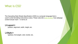
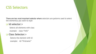
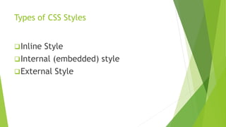
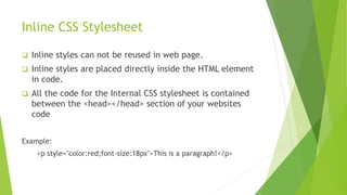
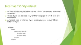
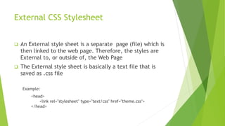
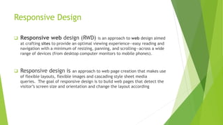
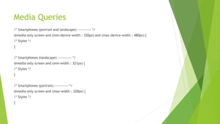
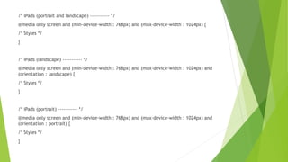
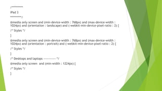
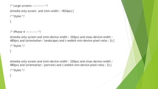
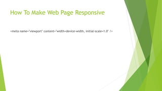
CSS is a computer language used to write formatting rules that tell a web browser how webpage content should look in terms of layout and style. There are different types of CSS stylesheets including inline, internal, and external stylesheets. Responsive design is an approach to web design that makes pages adapt to different screen sizes using flexible layouts, images, and media queries in CSS. Media queries allow CSS rules to be applied conditionally based on characteristics of the device viewing the site.
2. What is CSS?
The Cascading Style Sheets Specification (CSS) is a computer language that is
used to write formatting instructions (rules). These rules tell a web browser how webpage
content should ‘look’— in terms of:
Layout:>
position, alignment, width, height, etc.
Style:>
typeface, font-weight, color, border, etc.
3. CSS Selectors
There are two most important selector where selectors are patterns used to select
the element(s) you want to style
Id selector:>
Selects all elements with class
example: class=“Info”
Class Selector:>
Selects the element with id
example: id=“firstname”
5. Inline CSS Stylesheet
Inline styles can not be reused in web page.
Inline styles are placed directly inside the HTML element
in code.
All the code for the Internal CSS stylesheet is contained
between the <head></head> section of your websites
code
Example:
<p style="color:red;font-size:18px">This is a paragraph!</p>
6. Internal CSS Stylesheet
Internal Styles are placed inside the <head> section of a particular
web page.
These styles can be used only for the web page in which they are
embedded.
Advanced used of internal styles unless you need to override an
External Style.
Example:
<head>
<style type="text/css">
h1 {color:blue;}
h2 {color:red;}
</style>
</head>
7. External CSS Stylesheet
An External style sheet is a separate page (file) which is
then linked to the web page. Therefore, the styles are
External to, or outside of, the Web Page
The External style sheet is basically a text file that is
saved as .css file
Example:
<head>
<link rel="stylesheet" type="text/css" href="theme.css">
</head>
8. Responsive Design
Responsive web design (RWD) is an approach to web design aimed
at crafting sites to provide an optimal viewing experience—easy reading and
navigation with a minimum of resizing, panning, and scrolling—across a wide
range of devices (from desktop computer monitors to mobile phones).
Responsive design is an approach to web page creation that makes use
of flexible layouts, flexible images and cascading style sheet media
queries. The goal of responsive design is to build web pages that detect the
visitor’s screen size and orientation and change the layout according
9. Media Queries
/* Smartphones (portrait and landscape) ----------- */
@media only screen and (min-device-width : 320px) and (max-device-width : 480px) {
/* Styles */
}
/* Smartphones (landscape) ----------- */
@media only screen and (min-width : 321px) {
/* Styles */
}
/* Smartphones (portrait) ----------- */
@media only screen and (max-width : 320px) {
/* Styles */
}
10. /* iPads (portrait and landscape) ----------- */
@media only screen and (min-device-width : 768px) and (max-device-width : 1024px) {
/* Styles */
}
/* iPads (landscape) ----------- */
@media only screen and (min-device-width : 768px) and (max-device-width : 1024px) and
(orientation : landscape) {
/* Styles */
}
/* iPads (portrait) ----------- */
@media only screen and (min-device-width : 768px) and (max-device-width : 1024px) and
(orientation : portrait) {
/* Styles */
}
11. /**********
iPad 3
**********/
@media only screen and (min-device-width : 768px) and (max-device-width :
1024px) and (orientation : landscape) and (-webkit-min-device-pixel-ratio : 2) {
/* Styles */
}
@media only screen and (min-device-width : 768px) and (max-device-width :
1024px) and (orientation : portrait) and (-webkit-min-device-pixel-ratio : 2) {
/* Styles */
}
/* Desktops and laptops ----------- */
@media only screen and (min-width : 1224px) {
/* Styles */
}
12. /* Large screens ----------- */
@media only screen and (min-width : 1824px) {
/* Styles */
}
/* iPhone 4 ----------- */
@media only screen and (min-device-width : 320px) and (max-device-width :
480px) and (orientation : landscape) and (-webkit-min-device-pixel-ratio : 2) {
/* Styles */
}
@media only screen and (min-device-width : 320px) and (max-device-width :
480px) and (orientation : portrait) and (-webkit-min-device-pixel-ratio : 2) {
/* Styles */
}
13. How To Make Web Page Responsive
<meta name="viewport" content="width=device-width, initial-scale=1.0" />