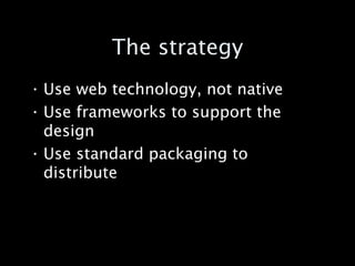
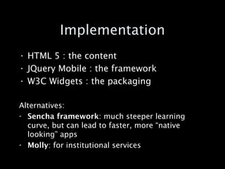
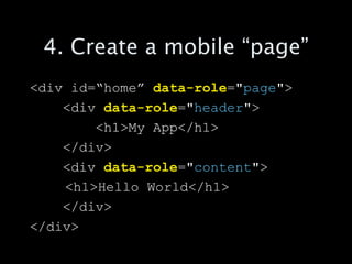
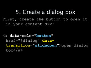
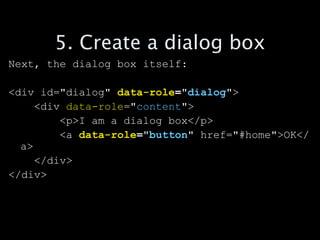
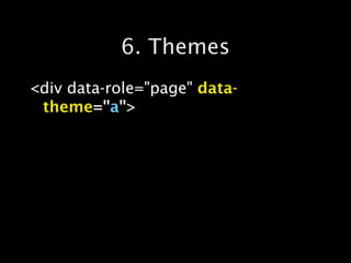
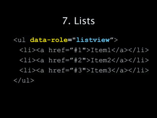
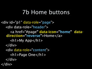
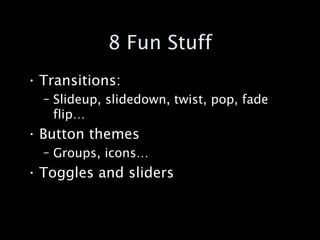
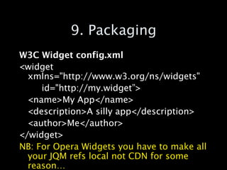
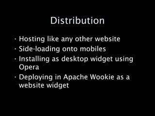
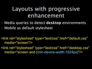
Building cross-platform mobile web applications
The strategy Use web technology, not native Use frameworks to support the design Use standard packaging to distribute
Implementation HTML 5 : the content JQuery Mobile : the framework W3C Widgets : the packaging Alternatives: Sencha framework : much steeper learning curve, but can lead to faster, more “native looking” apps Molly : for institutional services
Web Apps vs Websites “ There isn't a line you can draw and say that things on this side are "web pages" and on that side they're "apps." It’s more of a common-sense definition: Google Docs is an app, Wikipedia is not. If I had to define one factor, it would be how long do you go between page loads? In an app, you may work for an hour or more before reloading the page.” - Zachary Kessin
1. Start with a basic page skeleton <!DOCTYPE html> <html> <head>  </head> <body> </body> </html>
2. Add the viewport tag The  viewport  meta tag hints to mobile browsers how your site/application should be rendered. It is ignored by desktop browsers <meta name=&quot;viewport&quot; content=&quot;width=device-width, initial-scale=1, maximum-scale=1&quot;>
3. Include JQuery Mobile Copy and paste from:  http://jquerymobile.com/download/ <link rel=&quot;stylesheet&quot; href=&quot;http://code.jquery.com/mobile/1.0b1/jquery.mobile-1.0b1.min.css&quot; /> <script src=&quot;http://code.jquery.com/jquery-1.6.1.min.js&quot;></script> <script src=&quot;http://code.jquery.com/mobile/1.0b1/jquery.mobile-1.0b1.min.js&quot;></script>
4. Create a mobile “page” <div id=“home”  data-role =&quot; page &quot;> <div  data-role =&quot; header &quot;> <h1>My App</h1> </div> <div  data-role =&quot; content &quot;> <h1>Hello World</h1> </div> </div>
5. Create a dialog box First, create the button to open it in your content div: <a  data-role=&quot; button &quot;  href=&quot;#dialog&quot;  data- transition =&quot; slidedown &quot; >open dialog box</a>
5. Create a dialog box Next, the dialog box itself: <div id=&quot;dialog&quot;  data-role =&quot; dialog &quot; > <div  data-role =&quot; content &quot;> <p>I am a dialog box</p> <a  data-role =&quot; button &quot;  href=&quot;#home&quot;>OK</a> </div> </div>
OK, lets try it out
http://jisc.cetis.ac.uk/publications/
6. Themes <div data-role=&quot;page&quot;  data-theme =&quot; a &quot; >
7. Lists <ul  data-role =&quot; listview ” > <li><a href=”#1&quot;>Item1</a></li> <li><a href=”#2&quot;>Item2</a></li> <li><a href=”#3&quot;>Item3</a></li> </ul>
7b Home buttons <div id=&quot;p1&quot;  data-role =&quot; page &quot;> <div data-role=&quot; header &quot;> <a href=&quot;#page &quot;   data-icon =&quot; home &quot;   data-direction =&quot; reverse &quot; >Home</a> <h1>My App</h1> </div> <div  data-role =&quot; content &quot;> <h1>Page One</h1> </div> </div>
8 Fun Stuff Transitions: Slideup, slidedown, twist, pop, fade flip… Button themes Groups, icons… Toggles and sliders
9. Packaging W3C Widget config.xml <widget xmlns=&quot;http://www.w3.org/ns/widgets&quot;  id=&quot;http://my.widget”> <name>My App</name> <description>A silly app</description> <author>Me</author> </widget> NB: For Opera Widgets you have to make all your JQM refs local not CDN for some reason…
Distribution Hosting like any other website Side-loading onto mobiles Installing as desktop widget using Opera Deploying in Apache Wookie as a website widget
Layouts with progressive enhancement Media queries to detect  desktop  environments Mobile as default stylesheet <link rel=&quot;stylesheet&quot; type=&quot;text/css&quot; href=&quot;default.css&quot; media=&quot;screen&quot;/>  <link rel=&quot;stylesheet&quot; type=&quot;text/css&quot; href=&quot;desktop.css&quot; media=&quot;screen and ( min-device-width:1024px )&quot;/>

Creating mobile web apps

  • 1.
  • 2.
    The strategy Useweb technology, not native Use frameworks to support the design Use standard packaging to distribute
  • 3.
    Implementation HTML 5: the content JQuery Mobile : the framework W3C Widgets : the packaging Alternatives: Sencha framework : much steeper learning curve, but can lead to faster, more “native looking” apps Molly : for institutional services
  • 4.
    Web Apps vsWebsites “ There isn't a line you can draw and say that things on this side are &quot;web pages&quot; and on that side they're &quot;apps.&quot; It’s more of a common-sense definition: Google Docs is an app, Wikipedia is not. If I had to define one factor, it would be how long do you go between page loads? In an app, you may work for an hour or more before reloading the page.” - Zachary Kessin
  • 5.
    1. Start witha basic page skeleton <!DOCTYPE html> <html> <head> </head> <body> </body> </html>
  • 6.
    2. Add theviewport tag The viewport meta tag hints to mobile browsers how your site/application should be rendered. It is ignored by desktop browsers <meta name=&quot;viewport&quot; content=&quot;width=device-width, initial-scale=1, maximum-scale=1&quot;>
  • 7.
    3. Include JQueryMobile Copy and paste from: http://jquerymobile.com/download/ <link rel=&quot;stylesheet&quot; href=&quot;http://code.jquery.com/mobile/1.0b1/jquery.mobile-1.0b1.min.css&quot; /> <script src=&quot;http://code.jquery.com/jquery-1.6.1.min.js&quot;></script> <script src=&quot;http://code.jquery.com/mobile/1.0b1/jquery.mobile-1.0b1.min.js&quot;></script>
  • 8.
    4. Create amobile “page” <div id=“home” data-role =&quot; page &quot;> <div data-role =&quot; header &quot;> <h1>My App</h1> </div> <div data-role =&quot; content &quot;> <h1>Hello World</h1> </div> </div>
  • 9.
    5. Create adialog box First, create the button to open it in your content div: <a data-role=&quot; button &quot; href=&quot;#dialog&quot; data- transition =&quot; slidedown &quot; >open dialog box</a>
  • 10.
    5. Create adialog box Next, the dialog box itself: <div id=&quot;dialog&quot; data-role =&quot; dialog &quot; > <div data-role =&quot; content &quot;> <p>I am a dialog box</p> <a data-role =&quot; button &quot; href=&quot;#home&quot;>OK</a> </div> </div>
  • 11.
  • 12.
  • 13.
    6. Themes <divdata-role=&quot;page&quot; data-theme =&quot; a &quot; >
  • 14.
    7. Lists <ul data-role =&quot; listview ” > <li><a href=”#1&quot;>Item1</a></li> <li><a href=”#2&quot;>Item2</a></li> <li><a href=”#3&quot;>Item3</a></li> </ul>
  • 15.
    7b Home buttons<div id=&quot;p1&quot; data-role =&quot; page &quot;> <div data-role=&quot; header &quot;> <a href=&quot;#page &quot; data-icon =&quot; home &quot; data-direction =&quot; reverse &quot; >Home</a> <h1>My App</h1> </div> <div data-role =&quot; content &quot;> <h1>Page One</h1> </div> </div>
  • 16.
    8 Fun StuffTransitions: Slideup, slidedown, twist, pop, fade flip… Button themes Groups, icons… Toggles and sliders
  • 17.
    9. Packaging W3CWidget config.xml <widget xmlns=&quot;http://www.w3.org/ns/widgets&quot; id=&quot;http://my.widget”> <name>My App</name> <description>A silly app</description> <author>Me</author> </widget> NB: For Opera Widgets you have to make all your JQM refs local not CDN for some reason…
  • 18.
    Distribution Hosting likeany other website Side-loading onto mobiles Installing as desktop widget using Opera Deploying in Apache Wookie as a website widget
  • 19.
    Layouts with progressiveenhancement Media queries to detect desktop environments Mobile as default stylesheet <link rel=&quot;stylesheet&quot; type=&quot;text/css&quot; href=&quot;default.css&quot; media=&quot;screen&quot;/> <link rel=&quot;stylesheet&quot; type=&quot;text/css&quot; href=&quot;desktop.css&quot; media=&quot;screen and ( min-device-width:1024px )&quot;/>