CONVENTIONS
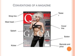
CONVENTIONS OF A MAGAZINE

                                    Tease
   Strap line                       r


Mast head

                                      Cover
                                      line
     Splash


                                            Button


                                     Barcode and
      Kicker
                                     price
CONVENTIONS OF A MUSIC VIDEO

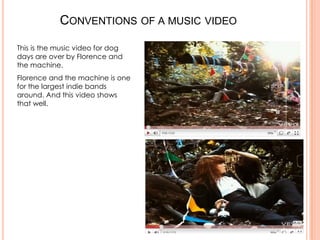
This is the music video for dog
days are over by Florence and
the machine.
Florence and the machine is one
for the largest indie bands
around. And this video shows
that well.
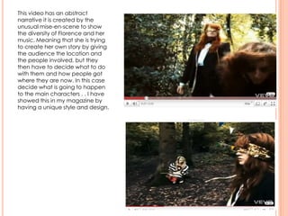
This video has an abstract
narrative it is created by the
unusual mise-en-scene to show
the diversity of Florence and her
music. Meaning that she is trying
to create her own story by giving
the audience the location and
the people involved, but they
then have to decide what to do
with them and how people got
where they are now. In this case
decide what is going to happen
to the main characters . . I have
showed this in my magazine by
having a unique style and design.
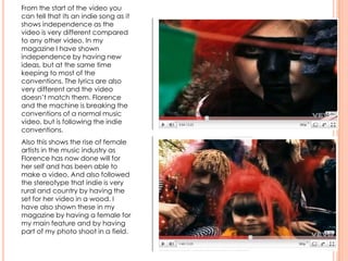
From the start of the video you
can tell that its an indie song as it
shows independence as the
video is very different compared
to any other video. In my
magazine I have shown
independence by having new
ideas, but at the same time
keeping to most of the
conventions. The lyrics are also
very different and the video
doesn’t match them. Florence
and the machine is breaking the
conventions of a normal music
video, but is following the indie
conventions.
Also this shows the rise of female
artists in the music industry as
Florence has now done will for
her self and has been able to
make a video. And also followed
the stereotype that indie is very
rural and country by having the
set for her video in a wood. I
have also shown these in my
magazine by having a female for
my main feature and by having
part of my photo shoot in a field.
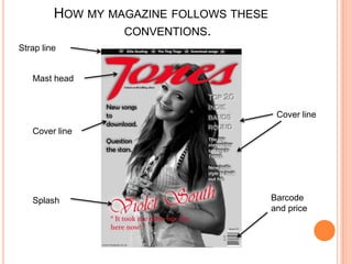
HOW MY MAGAZINE FOLLOWS THESE
                  CONVENTIONS.
Strap line


   Mast head


                                          Cover line
   Cover line


   Splash                                Barcode
                                         and price
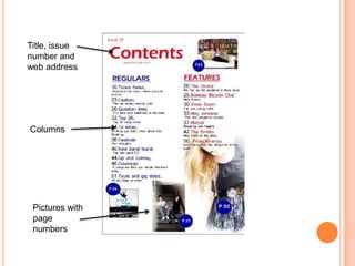
Title, issue
number and
web address


Columns


 Pictures with
 page
 numbers
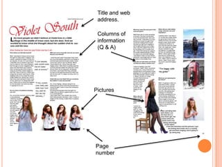
Title and web
 address.

 Columns of
 information
 (Q & A)


Pictures


Page
number
Conventions
 In my magazine I have tried to use all the conventions that most
  magazines use. The only conventions I didn’t use was a kicker and a
  button, I didn’t us these because I didn’t feel they where needed and I
  also wanted to keep my front cover simple and having all the different
  forms of presentations would have been to much. I followed the
  conventions of having a barcode and price, large mast head, a strap
  line a cover line and a picture of my main feature.
 The conventions of a contents page are having regulars and features
  which I have followed, this I felt was very important and necessary so
  people can easily tell what is inside the magazine. I also had small
  pictures of other people featured in my magazine to get people
  interested and it is quick for them to see who else is inside.
 The conventions for a double page are that there tends to be one
  page with writing and the other pictures or a large picture with writing
  down the side but for my magazine I decided to mix the pictures and
  writing. I followed these as you have to have them other wise it
  wouldn’t been a double page spread, and its people always like to
  look at picture of there favourite artist.
Forms
   For the forms I made sure that my mast head and the picture on
    my front cover where the main things that you saw when you
    first looked that the magazine and all my writing for my cover line
    is clear and readable. Also another form is to have a contents
    page/s, I have one page for my contents page as my magazine
    isn’t massive and I don’t think I would have been able to fill two
    pages but on my page I have regulars and features with pictures
    which is what is needed from a magazine contents page. For my
    double page spread I made sure that I have enough information
    and also pictures to draw the reader to the article. And I made
    sure that I didn’t have too much writing so they wouldn’t get
    board and to keep them reading.

Conventions 1

  • 1.
  • 2.
    CONVENTIONS OF AMAGAZINE Tease Strap line r Mast head Cover line Splash Button Barcode and Kicker price
  • 3.
    CONVENTIONS OF AMUSIC VIDEO This is the music video for dog days are over by Florence and the machine. Florence and the machine is one for the largest indie bands around. And this video shows that well.
  • 4.
    This video hasan abstract narrative it is created by the unusual mise-en-scene to show the diversity of Florence and her music. Meaning that she is trying to create her own story by giving the audience the location and the people involved, but they then have to decide what to do with them and how people got where they are now. In this case decide what is going to happen to the main characters . . I have showed this in my magazine by having a unique style and design.
  • 5.
    From the startof the video you can tell that its an indie song as it shows independence as the video is very different compared to any other video. In my magazine I have shown independence by having new ideas, but at the same time keeping to most of the conventions. The lyrics are also very different and the video doesn’t match them. Florence and the machine is breaking the conventions of a normal music video, but is following the indie conventions. Also this shows the rise of female artists in the music industry as Florence has now done will for her self and has been able to make a video. And also followed the stereotype that indie is very rural and country by having the set for her video in a wood. I have also shown these in my magazine by having a female for my main feature and by having part of my photo shoot in a field.
  • 6.
    HOW MY MAGAZINEFOLLOWS THESE CONVENTIONS. Strap line Mast head Cover line Cover line Splash Barcode and price
  • 7.
    Title, issue number and webaddress Columns Pictures with page numbers
  • 8.
    Title and web address. Columns of information (Q & A) Pictures Page number
  • 9.
    Conventions  In mymagazine I have tried to use all the conventions that most magazines use. The only conventions I didn’t use was a kicker and a button, I didn’t us these because I didn’t feel they where needed and I also wanted to keep my front cover simple and having all the different forms of presentations would have been to much. I followed the conventions of having a barcode and price, large mast head, a strap line a cover line and a picture of my main feature.  The conventions of a contents page are having regulars and features which I have followed, this I felt was very important and necessary so people can easily tell what is inside the magazine. I also had small pictures of other people featured in my magazine to get people interested and it is quick for them to see who else is inside.  The conventions for a double page are that there tends to be one page with writing and the other pictures or a large picture with writing down the side but for my magazine I decided to mix the pictures and writing. I followed these as you have to have them other wise it wouldn’t been a double page spread, and its people always like to look at picture of there favourite artist.
  • 10.
    Forms  For the forms I made sure that my mast head and the picture on my front cover where the main things that you saw when you first looked that the magazine and all my writing for my cover line is clear and readable. Also another form is to have a contents page/s, I have one page for my contents page as my magazine isn’t massive and I don’t think I would have been able to fill two pages but on my page I have regulars and features with pictures which is what is needed from a magazine contents page. For my double page spread I made sure that I have enough information and also pictures to draw the reader to the article. And I made sure that I didn’t have too much writing so they wouldn’t get board and to keep them reading.