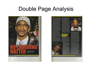
2. This is a Double Page Spread from Hip Hop Weekly Magazine, the main feature of
the double Page spread is an image of a Popular Hip Hop artist/Actor and Comedian
known as Katt Williams, this large image dominates the whole of the left page of the
double-Page article. The image is a medium shot as the magazine company want the
audience to focus on Katt Williams face and clothing which reveals something about
his personal life to the audience who will decide to carry on reading. I see through
Katt Williams mise en scene that he is addressed as a counter-type toward most Hip
Hop artists, due to him wearing a black suit, a white shirt and a multi-coloured tie, the
black suit connotes formality and elegance but also a sense of grief, which is related
to the article. The white shirt however counter types the black by connoting an
element of innocence and positive attitude, which relates to his facial expression. He
is also wearing a white hat this then moves him away from the formal approach but
towards the traditional style of Hip Hop which connotes his music life still being apart
of his private life. He is also wearing earrings in both ears which connotes his
traditional music life of Hip Hop as bling is seen as a major element of Hip Hop. The
glasses he is wearing portray that he is a celebrity and that he wants some privacy
away from his music life. The background is a low key lighting which represents
something bad and sinister, by connoting what the article is about. There are also
smaller photos situated on the larger images these show images related to the article,
however these images are smaller and are located on the article to prove the news
on the article is real.
3. The right page is filled with the gathering of text and two fairly small images;
the text is structured and aligned in three equal columns with the one image
in the top right corner and the other in the bottom left corner, both which are
images of Katt Williams. The headline is large and situated on the main
image which spells ‘No laughing Matter’, this portrays the opposite to what
is shown in the image. The headline is in a sans serif typography which
connotes a modern concept which is through-out the magazine. The colour
of the headline is red which stimulates the audience to the double-page
article and image in the background, this also connotes the theme of the
magazine which is used to grab attention. The typography used in the three
columns is small with the modern font which is used through-out the
magazine which also connotes Hip Hop as being modern, the typography
however influences the audience to read on as the images placed around it
show pictures of Katt Williams looking toward the audience. There is also a
drop capitol which begins the article this is coloured in red to stimulate the
audience and so they dont lose attention from the article, the red is used to
carry the attention from the Headline towards the main article and letting the
audience know where to begin reading.
4. The background of the Right Page on the double-page article is black which
again continues the element of something bad and sinister, this is to connote
what the article is about and to keep the white text standing out on the dark
background. The strap line spells ‘Katt has ties to the Hip Hop Community’, this
portrays the connection of this article with Hip Hop, this is created as the
magazine is based on Hip Hop news therefore it is put in the centre of the page
above a new piece of text which is relating the article to Hip Hop and showing
what effect this article has in the Hip Hop world, this is also in a yellow font to
stand out to the audience and so the audience do not miss this part of the article.
There is also a page number ’47′ and Masthead ‘Hip Hip Weekly’ at the bottom
of the right page, these are both small and located out of the way as these are
not seen as important this is because the audience only care about what they
want to read and therefore use the number to locate the article they would like to
read, they are also both presented in the colour white to match the text above.
There is also a little space kept between each column this is to concentrate the
audience on what they are reading and so the article looks short.