
Recommended
More Related Content
What's hot
What's hot (20)
Viewers also liked
Similar to Contents page analysis 2
Similar to Contents page analysis 2 (20)
More from tomsnaith2
More from tomsnaith2 (12)
Contents page analysis 2
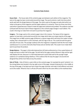
- 1. Tom Sanith Contents Page Analysis House Style - The house style of this contents page vary between each edition of the magazine. The text on the page has been constructed around the image. The word contents is split into three which works well with the design balance of the page. The colors used on the page are quite dark which can relate to the genre of the magazine and the target audience it is aimed at. There are three main fonts used which is good because it doesn’t make the page look cluttered and jumbled. The audience may feel confused with the house style of these magazines as the contents page changes in each edition. This could in the long run make them not want to purchase the magazine. Imagery – The image used on this contents page is key in this instance. The layout of the magazine appears to have been constructed around the one image which takes up a large majority of the page. The image from an NME contents page of Rihanna is a great image which will entice the reader to keep reading. She is dressed well in a shirt and heels, with her legs in the air. This could link with her genre and style of music also. The younger audience who this magazine is targeted at will like the main image used because it is a current artist who they’ll know and are familiar with. This could in turn make them want to purchase the product. Design Balance – The page is informally balanced but still looks professional as it has a good balance of image and teat on either half of the page. The left half of the page contains Rihanna’s legs and the right side displays the text. Because it is informally balanced it could relate well to the younger target audience as it symbolizes being rebellious. If the audience like the way the page is structured and designed they will be more likely to buy the product. Rule of Thirds – Rule of thirds is used a little on this contents page. For example the word ‘contents’ is in the strong fallow zone located in the top right corner of the page. Instead of placing this in the middle at the top of the page, it has been put here to give the page character and make it look different and stand out to the reader. Rihanna’s face is off also off center which has the same effect as the masthead does.
- 2. Tom Sanith