Download to read offline

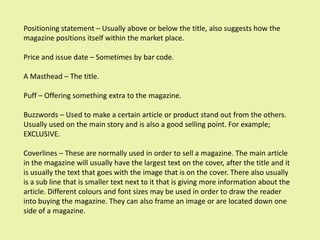
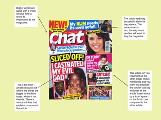
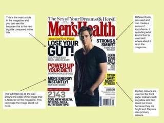
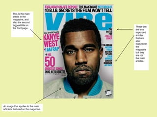

The document discusses codes and conventions used on magazine front covers, including: 1) Positioning statements, price, issue dates, mastheads, puffs, buzzwords, and coverlines are used to attract readers and sell magazines. Larger text and images are used for the main story. 2) Color, font size, and placement are used strategically to emphasize importance and grab attention. Red and bigger fonts indicate greater significance. 3) Different magazines use different conventions based on target audience. Women's magazines use colors like pink; men's magazines use black and appear more serious. Music magazines attract both genders with mixed colors. Proper font size and spacing help readability.