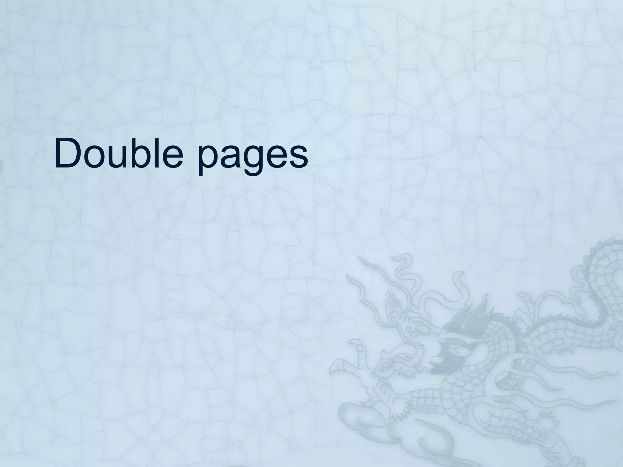
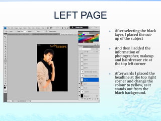
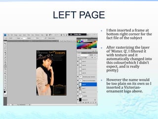
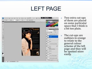
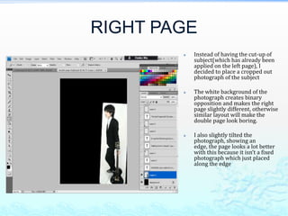
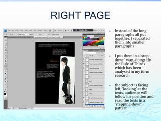
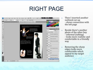
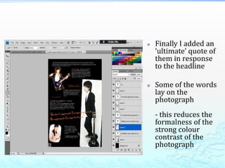
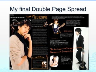
Double pages
LEFT PAGE
               After selecting the black
                layer, I placed the cut-
                up of the subject

               And then I added the
                information of
                photographer, makeup
                and hairdresser etc at
                the top left corner

               Afterwards I placed the
                headline at the top right
                corner and change the
                colour to yellow, as it
                stands out from the
                black background.
LEFT PAGE
           I then inserted a frame at
            bottom right corner for the
            fact file of the subject

           After rasterizing the layer
            of ‘Mister. Q’, I filtered it
            with texture and it
            automatically changed into
            this colour(which I didn’t
            expect, and is really
            pretty)

           However the name would
            be too plain on its own so I
            inserted a Victorian-
            ornament logo above.
LEFT PAGE
               I inserted all of the
                texts with reference
                on my final draft(and
                it’s just what I
                expect!)

               The subtitles are
                quotes in orange
                colour

               The colour scheme is
                simple in order to
                prevent the focus
                from being dragged
                away
LEFT PAGE
           Two extra cut-ups
            of them are placed
            on some particular
            space that I think is
            a bit too plain.

           The cut-ups are
            outlines in orange
            to relate to the
            general colour
            scheme of the left
            page and they will
            be spotted more
            easily.
RIGHT PAGE
           Instead of having the cut-up of
            subject(which has already been
            applied on the left page), I
            decided to place a cropped out
            photograph of the subject

           The white background of the
            photograph creates binary
            opposition and makes the right
            page slightly different, otherwise
            similar layout will make the
            double page look boring.

           I also slightly tilted the
            photograph, showing an
            edge, the page looks a lot better
            with this because it isn’t a fixed
            photograph which just placed
            along the edge
RIGHT PAGE
            Instead of the long
             paragraphs all put
             together, I separated
             them into smaller
             paragraphs

            I put them in a ‘step-
             down’ way, alongside
             the Rule of Thirds
             which has been
             analysed in my form
             research

            the subject is facing
             left, ‘looking’ at the
             texts, audience will
             follow his position and
             read the texts in a
             ‘stepping-down’
             pattern
RIGHT PAGE
            Then I inserted another
             outlined cut-up
             - shows connection with
             the left page

            Beside there’s another
             photo of the other boy
             - informal (talking)
             - looks more realistic and
             comfortable in a friendly
             way

            Removing the sharp
             edges looks more
             comfortable which
             appeal to my target
             audience
   Finally I added an
    ‘ultimate’ quote of
    them in response
    to the headline

   Some of the words
    lay on the
    photograph
    - this reduces the
    formalness of the
    strong colour
    contrast of the
    photograph
My final Double Page Spread

Construction of double pages

  • 1.
  • 2.
    LEFT PAGE  After selecting the black layer, I placed the cut- up of the subject  And then I added the information of photographer, makeup and hairdresser etc at the top left corner  Afterwards I placed the headline at the top right corner and change the colour to yellow, as it stands out from the black background.
  • 3.
    LEFT PAGE  I then inserted a frame at bottom right corner for the fact file of the subject  After rasterizing the layer of ‘Mister. Q’, I filtered it with texture and it automatically changed into this colour(which I didn’t expect, and is really pretty)  However the name would be too plain on its own so I inserted a Victorian- ornament logo above.
  • 4.
    LEFT PAGE  I inserted all of the texts with reference on my final draft(and it’s just what I expect!)  The subtitles are quotes in orange colour  The colour scheme is simple in order to prevent the focus from being dragged away
  • 5.
    LEFT PAGE  Two extra cut-ups of them are placed on some particular space that I think is a bit too plain.  The cut-ups are outlines in orange to relate to the general colour scheme of the left page and they will be spotted more easily.
  • 6.
    RIGHT PAGE  Instead of having the cut-up of subject(which has already been applied on the left page), I decided to place a cropped out photograph of the subject  The white background of the photograph creates binary opposition and makes the right page slightly different, otherwise similar layout will make the double page look boring.  I also slightly tilted the photograph, showing an edge, the page looks a lot better with this because it isn’t a fixed photograph which just placed along the edge
  • 7.
    RIGHT PAGE  Instead of the long paragraphs all put together, I separated them into smaller paragraphs  I put them in a ‘step- down’ way, alongside the Rule of Thirds which has been analysed in my form research  the subject is facing left, ‘looking’ at the texts, audience will follow his position and read the texts in a ‘stepping-down’ pattern
  • 8.
    RIGHT PAGE  Then I inserted another outlined cut-up - shows connection with the left page  Beside there’s another photo of the other boy - informal (talking) - looks more realistic and comfortable in a friendly way  Removing the sharp edges looks more comfortable which appeal to my target audience
  • 9.
    Finally I added an ‘ultimate’ quote of them in response to the headline  Some of the words lay on the photograph - this reduces the formalness of the strong colour contrast of the photograph
  • 10.
    My final DoublePage Spread