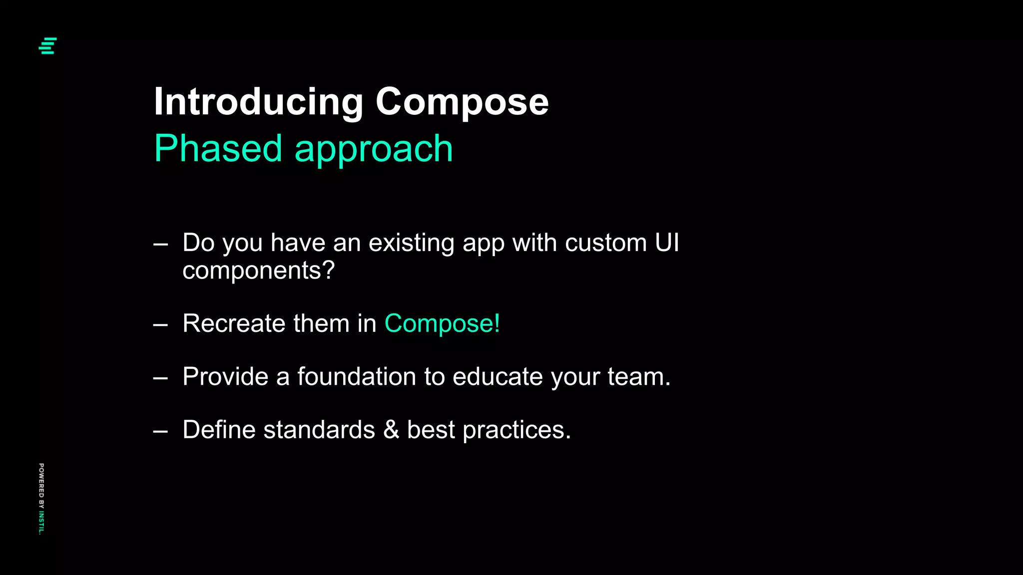
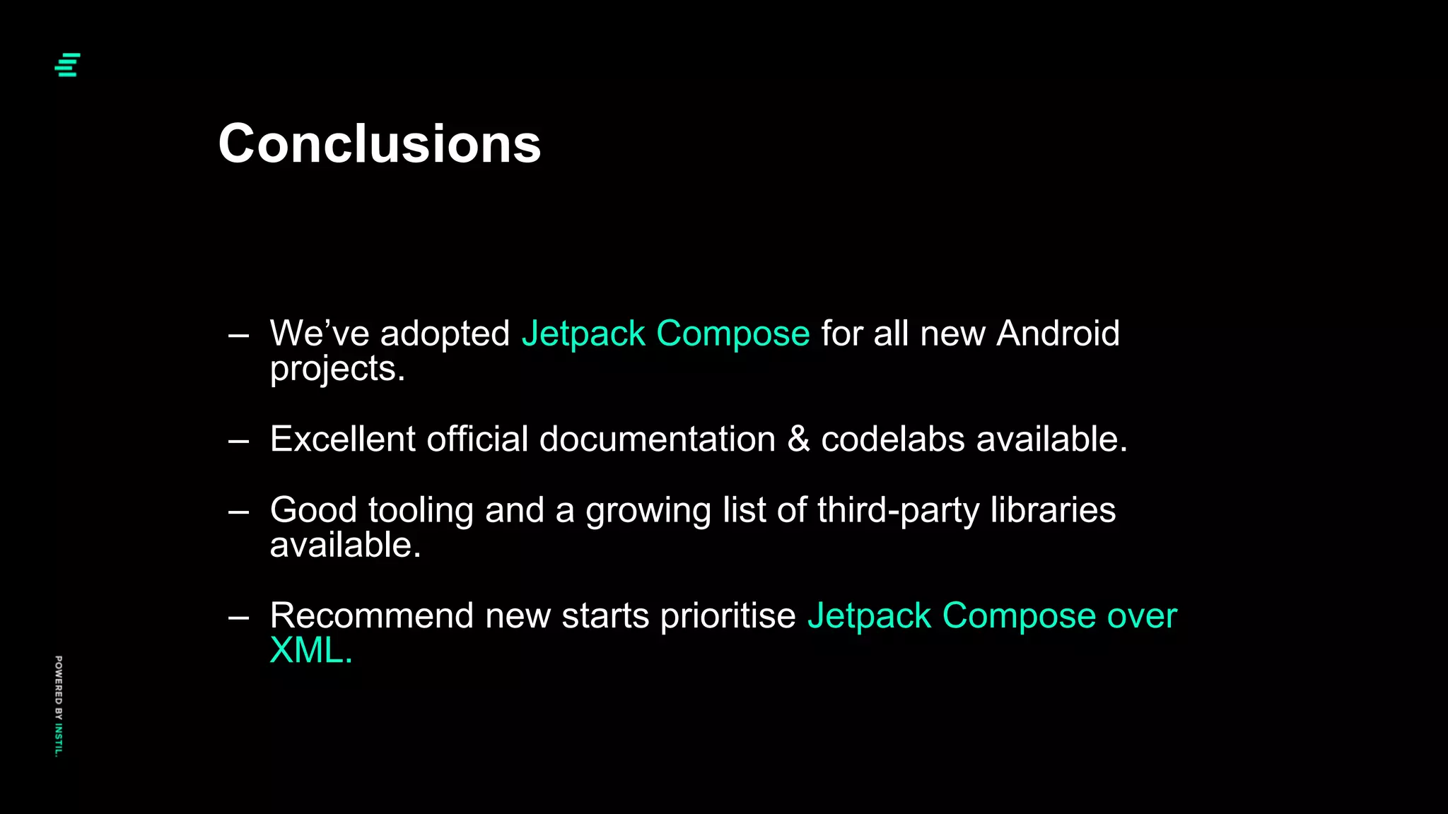
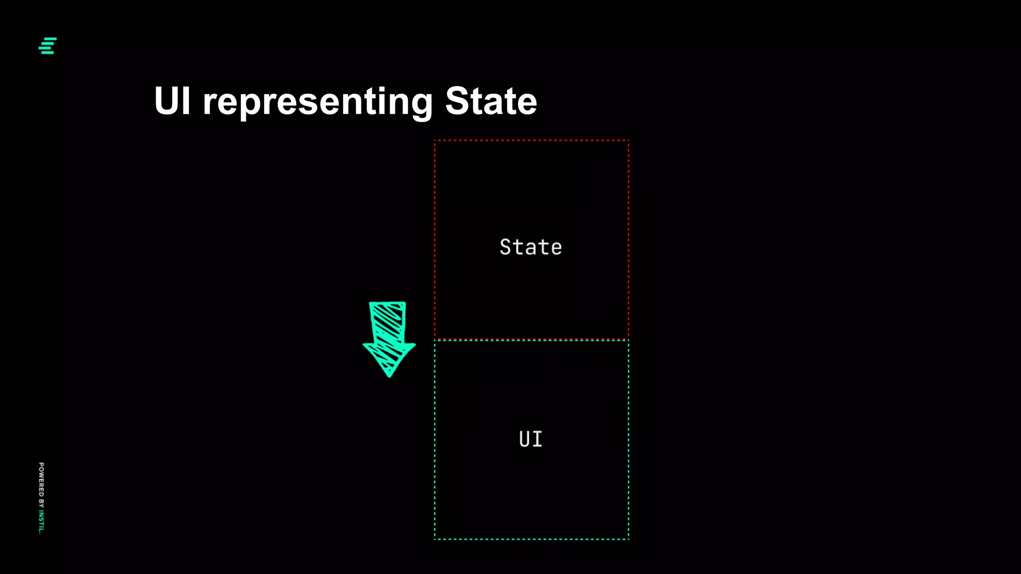
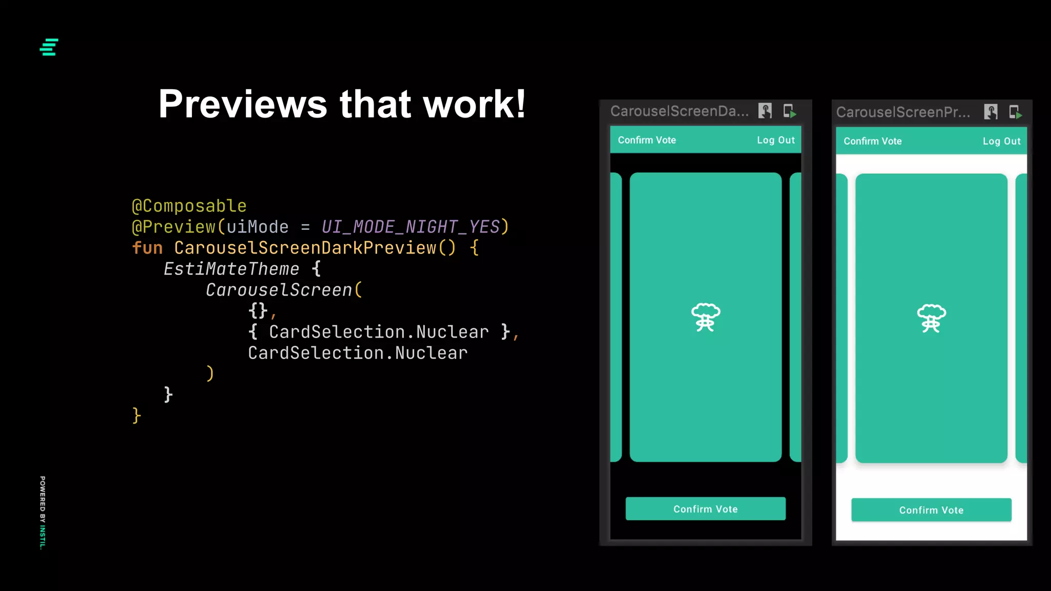
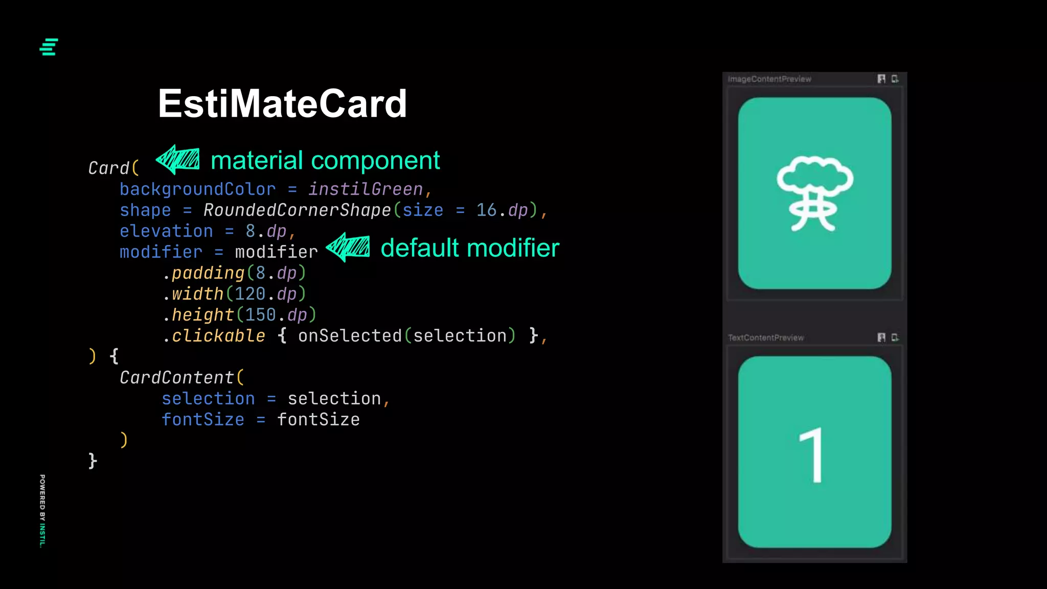
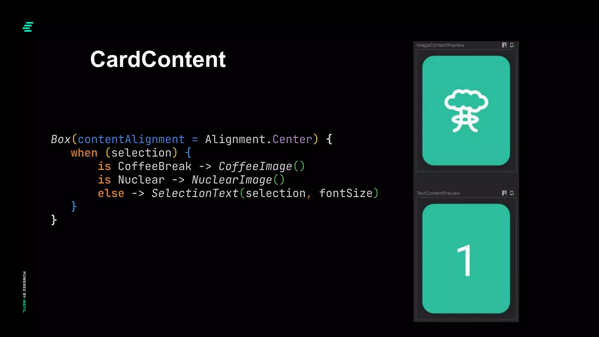
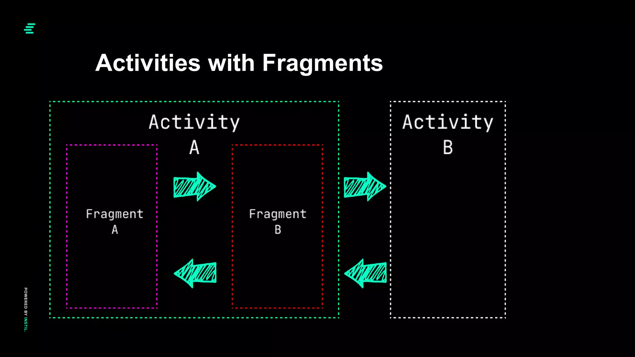
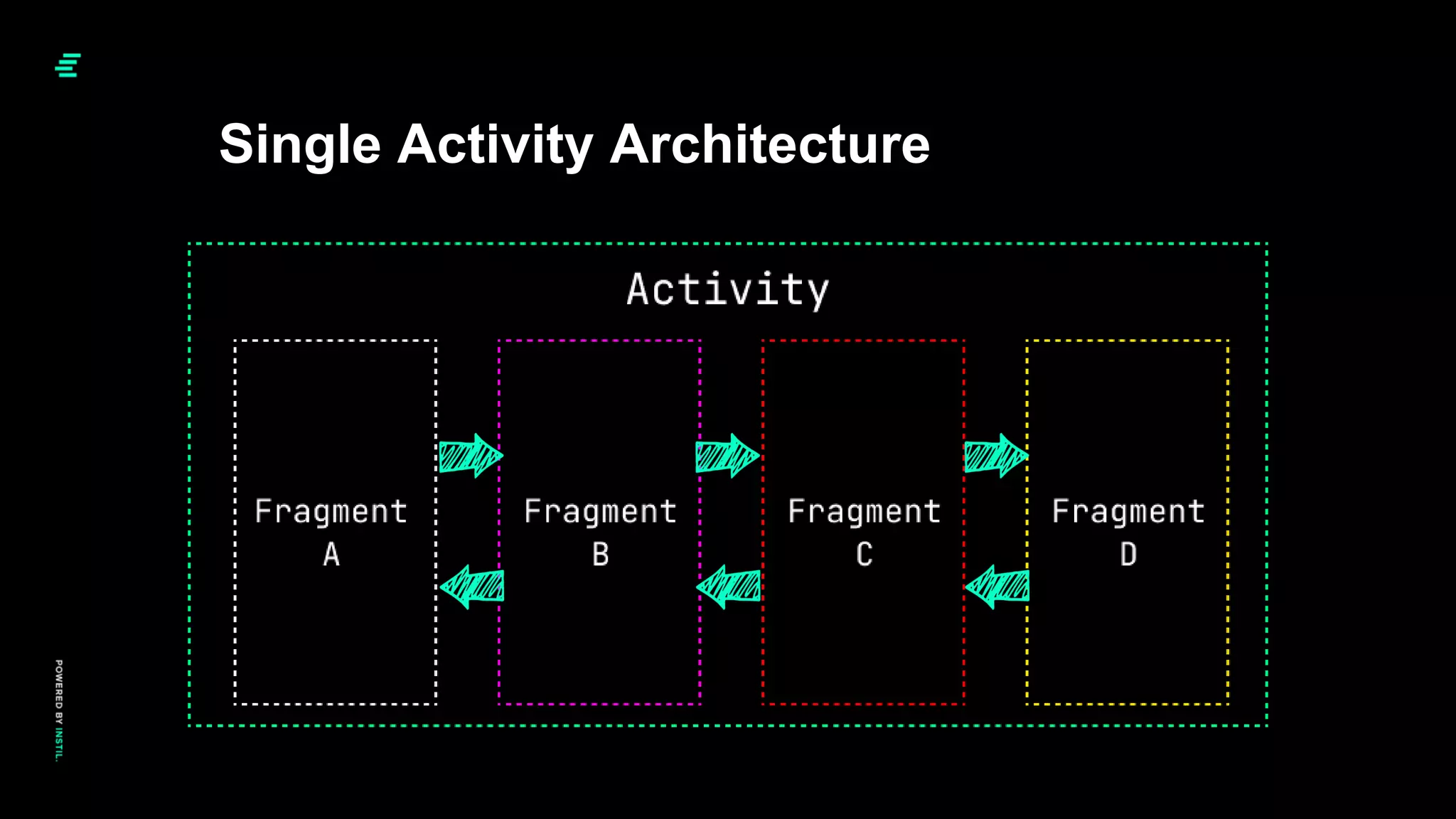
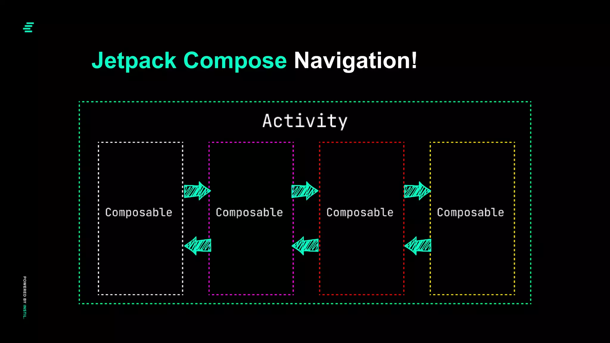
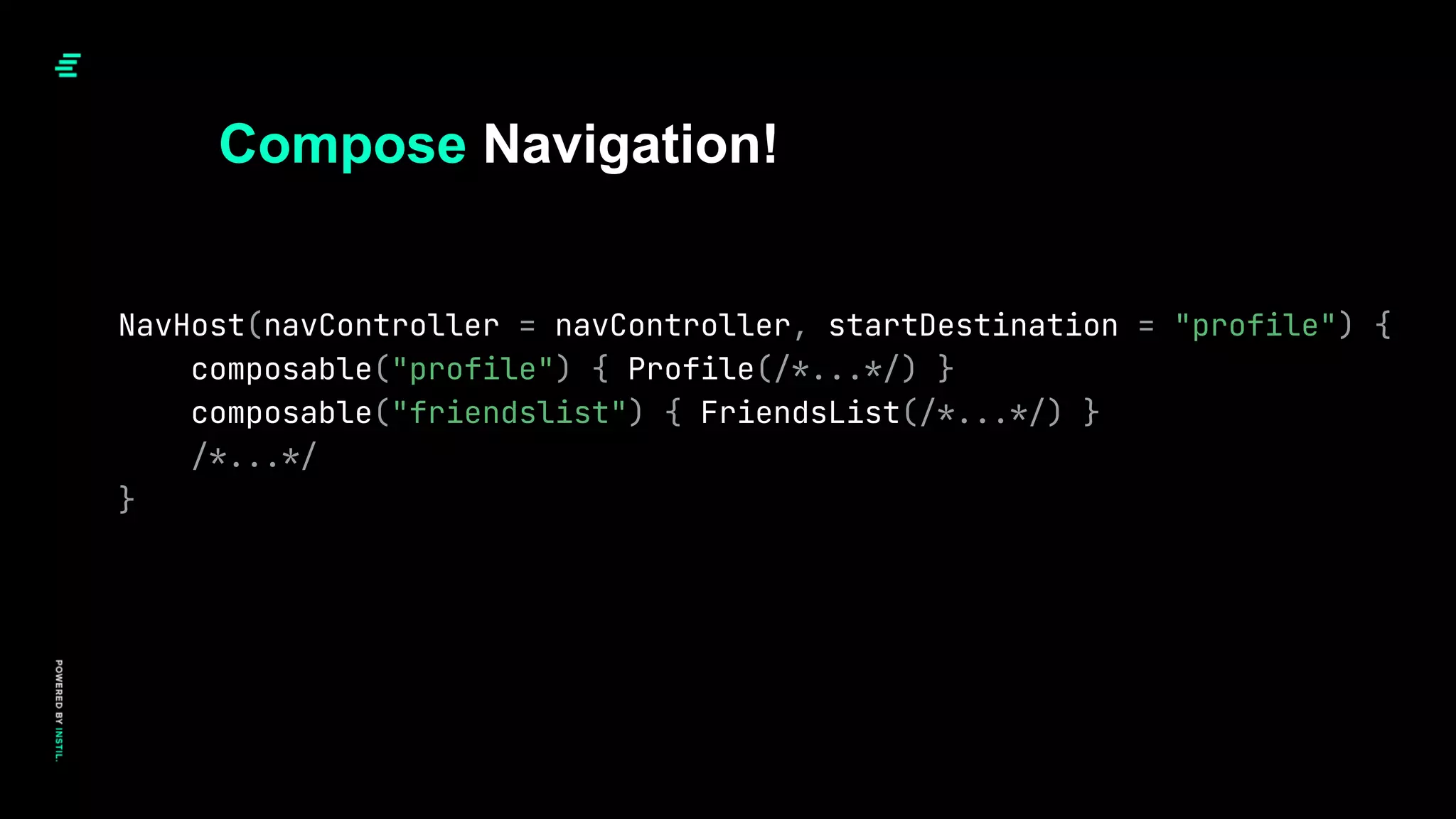
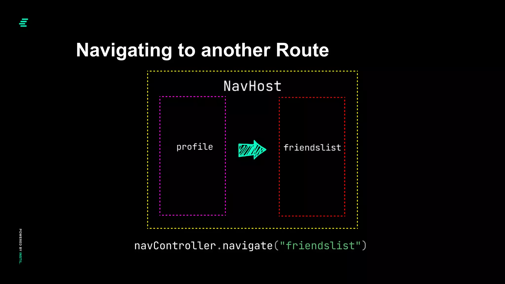
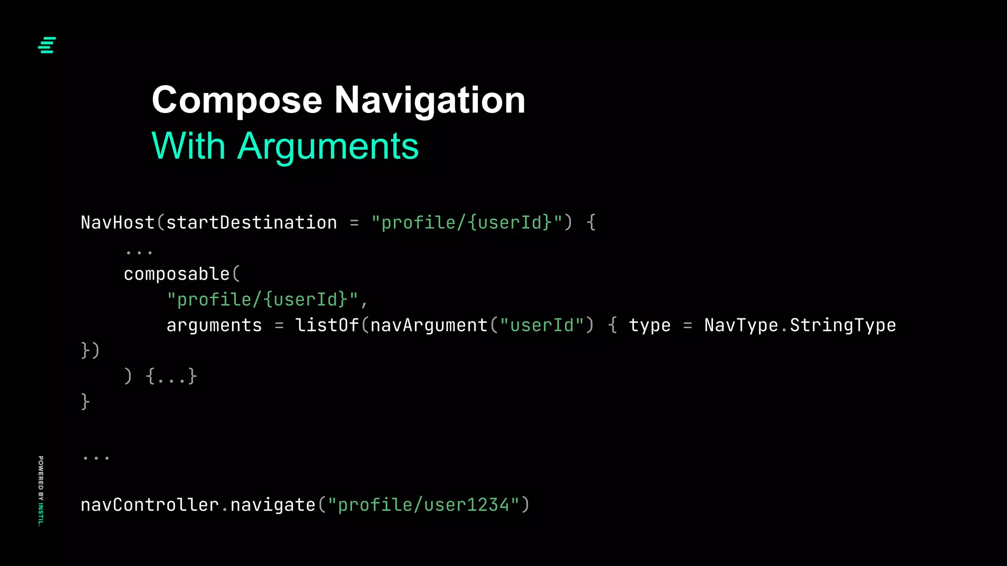
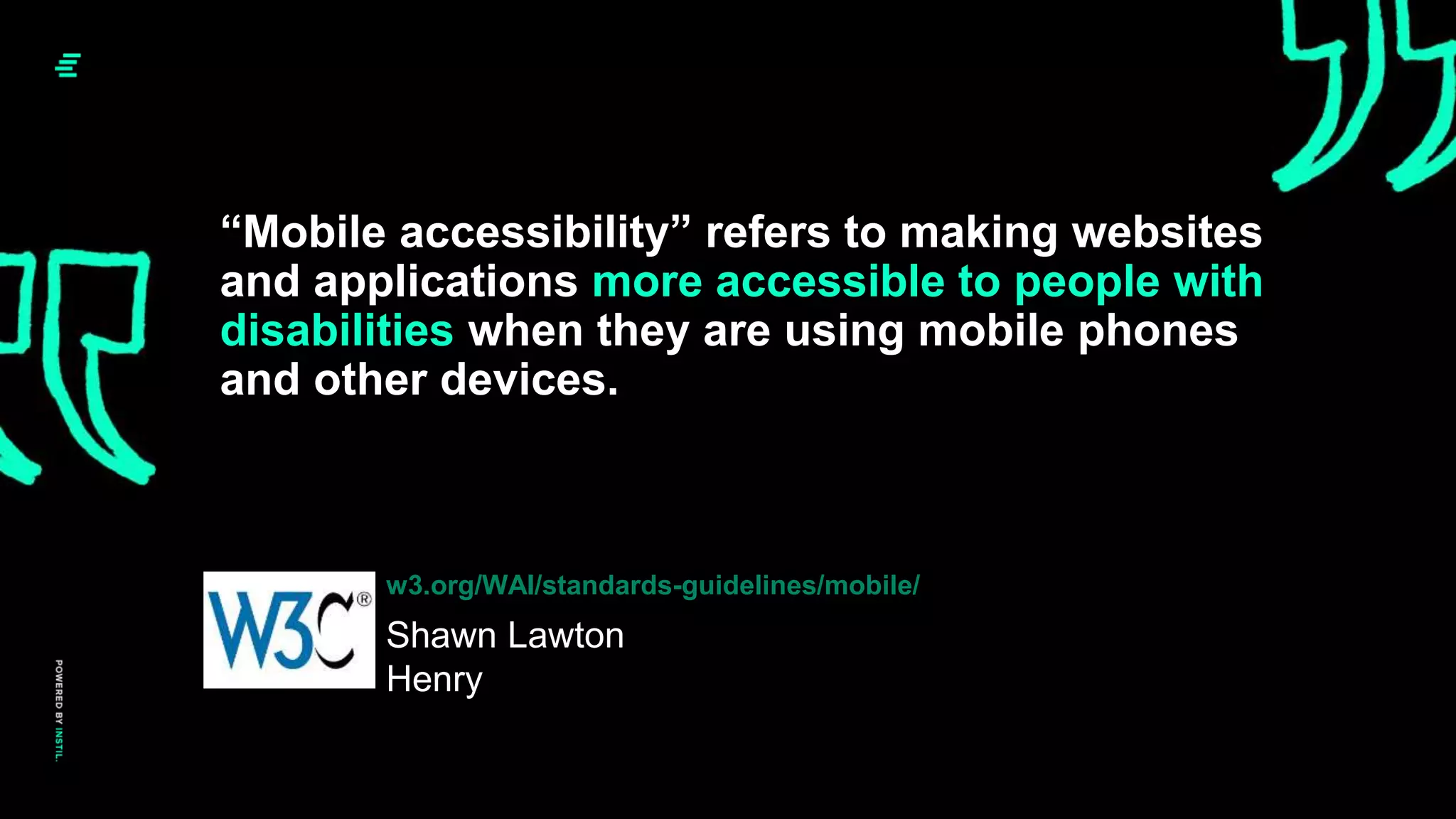
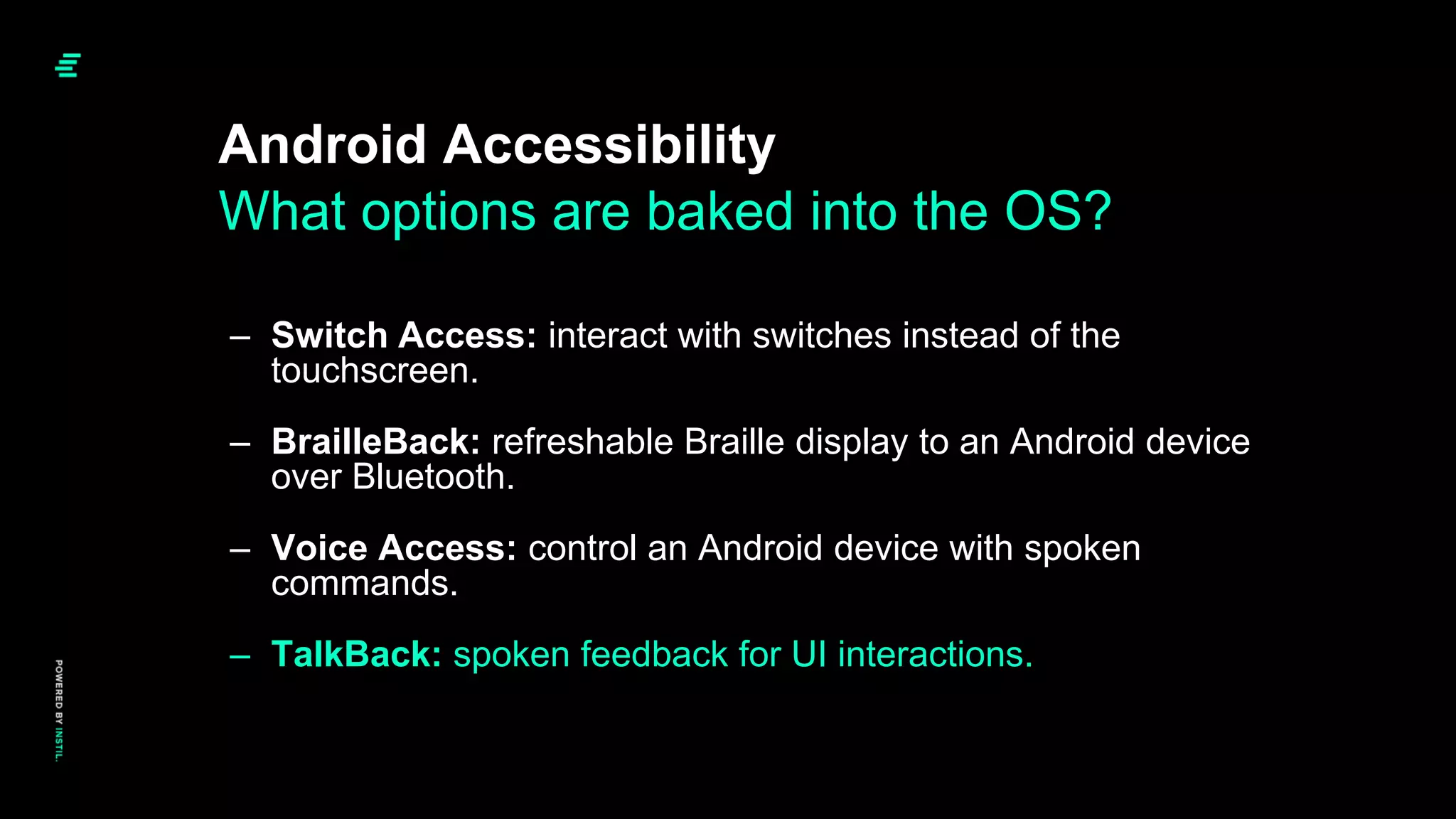
The document presents a comprehensive overview of Jetpack Compose, focusing on its implementation in Android UI development, including navigation, accessibility, and testing techniques. It outlines a historical context of Android UI evolution and demonstrates practical coding examples for using Compose effectively in app development. The emphasis is on adopting Jetpack Compose for new projects due to its advantages in modern UI design and functionality.


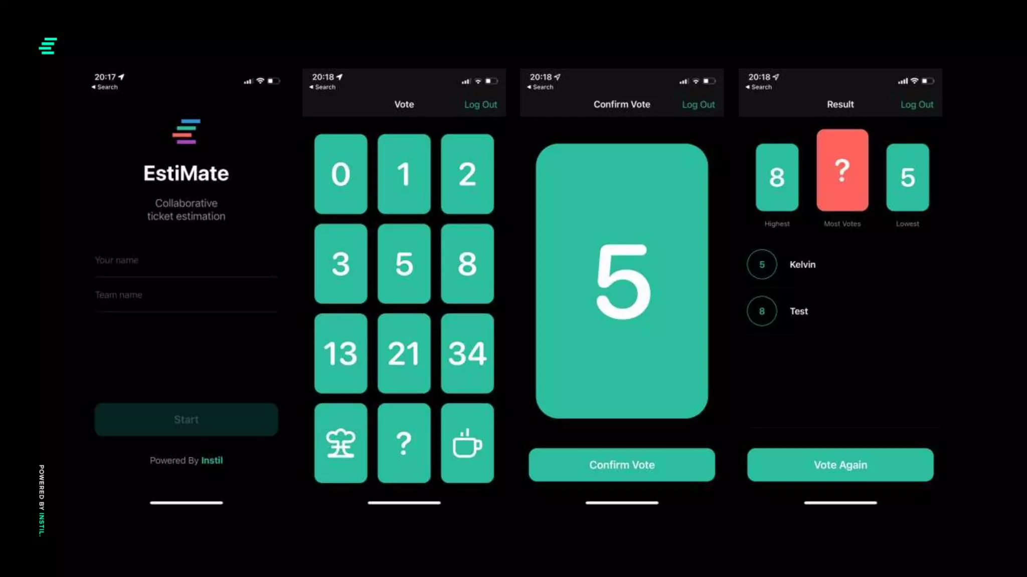
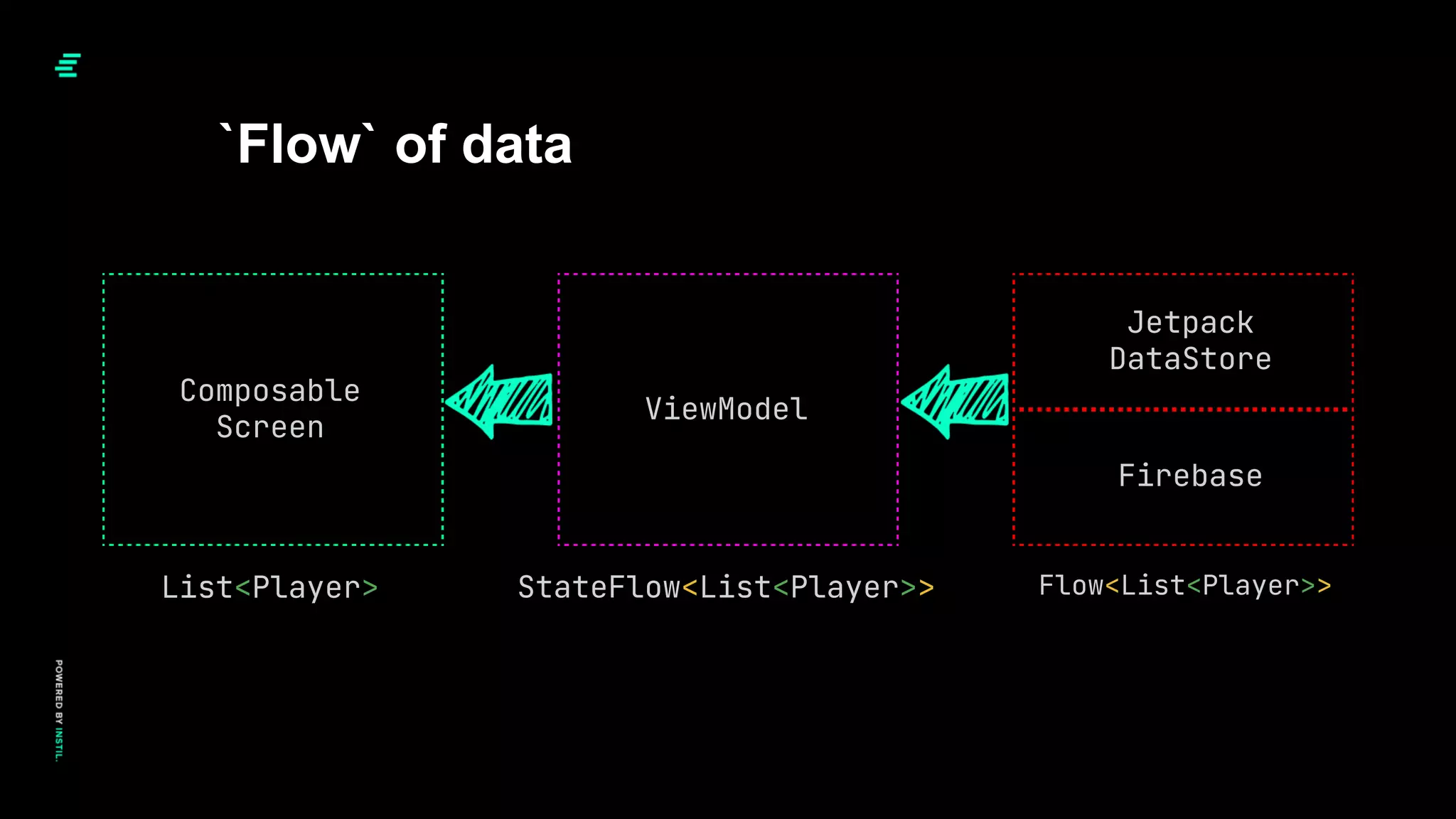
![val votedPlayers: List<Player> by viewModel.players.collectAsState()
...
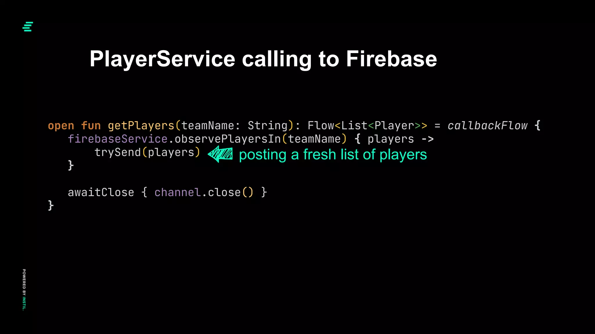
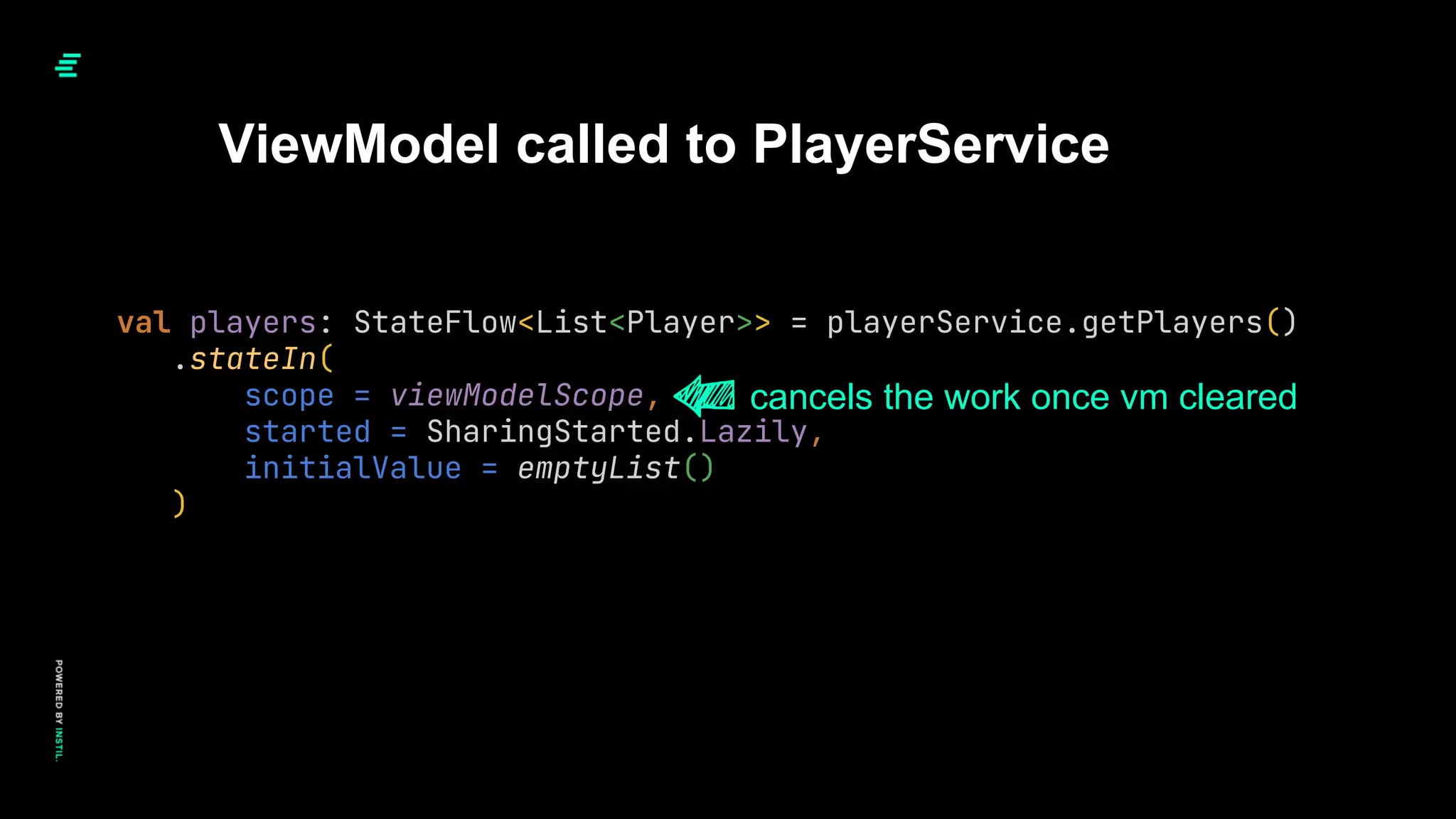
Composable calling to ViewModel
LazyColumn(modifier = Modifier.fillMaxWidth()) {
items(votedPlayers.size) { index ->
UserVoteItem(votedPlayers[index])
}
}
composable per list item
listOf(
Player(CardSelection.Five, "Kelvin"),
Player(CardSelection.Three, "Garth")
)](https://image.slidesharecdn.com/composeinpractice-cme-sept2022-220916155553-f682172a/75/Compose-In-Practice-28-2048.jpg)


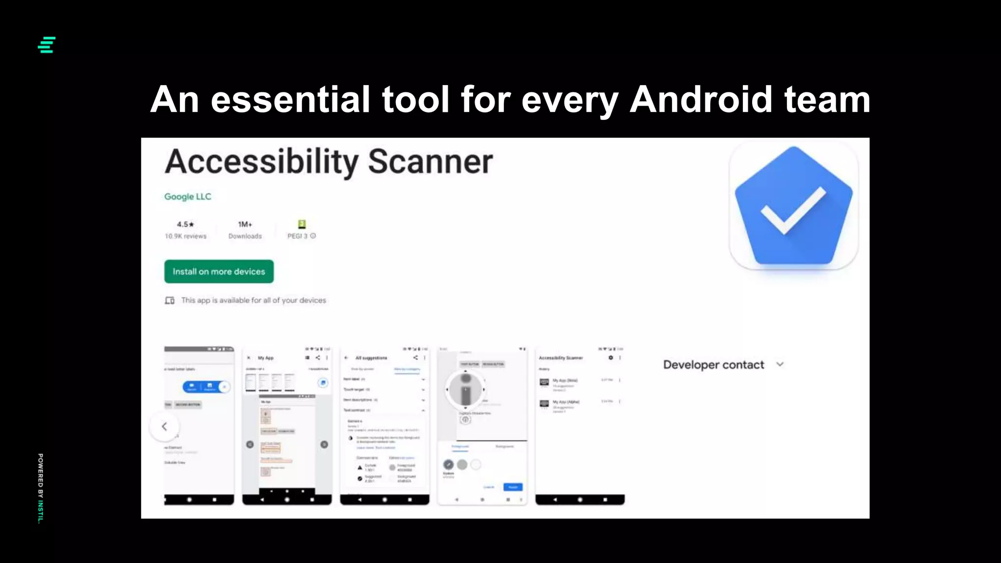

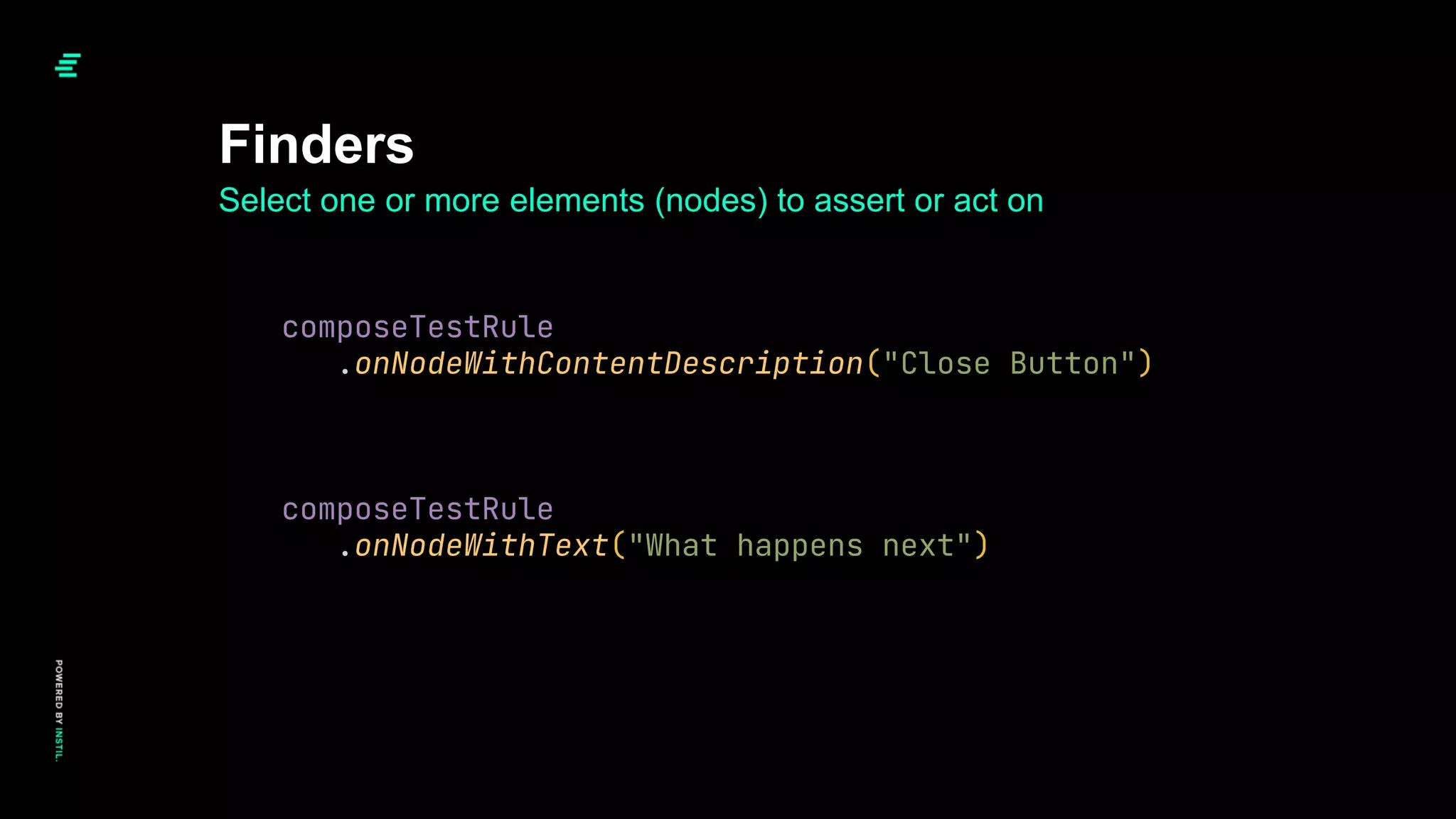
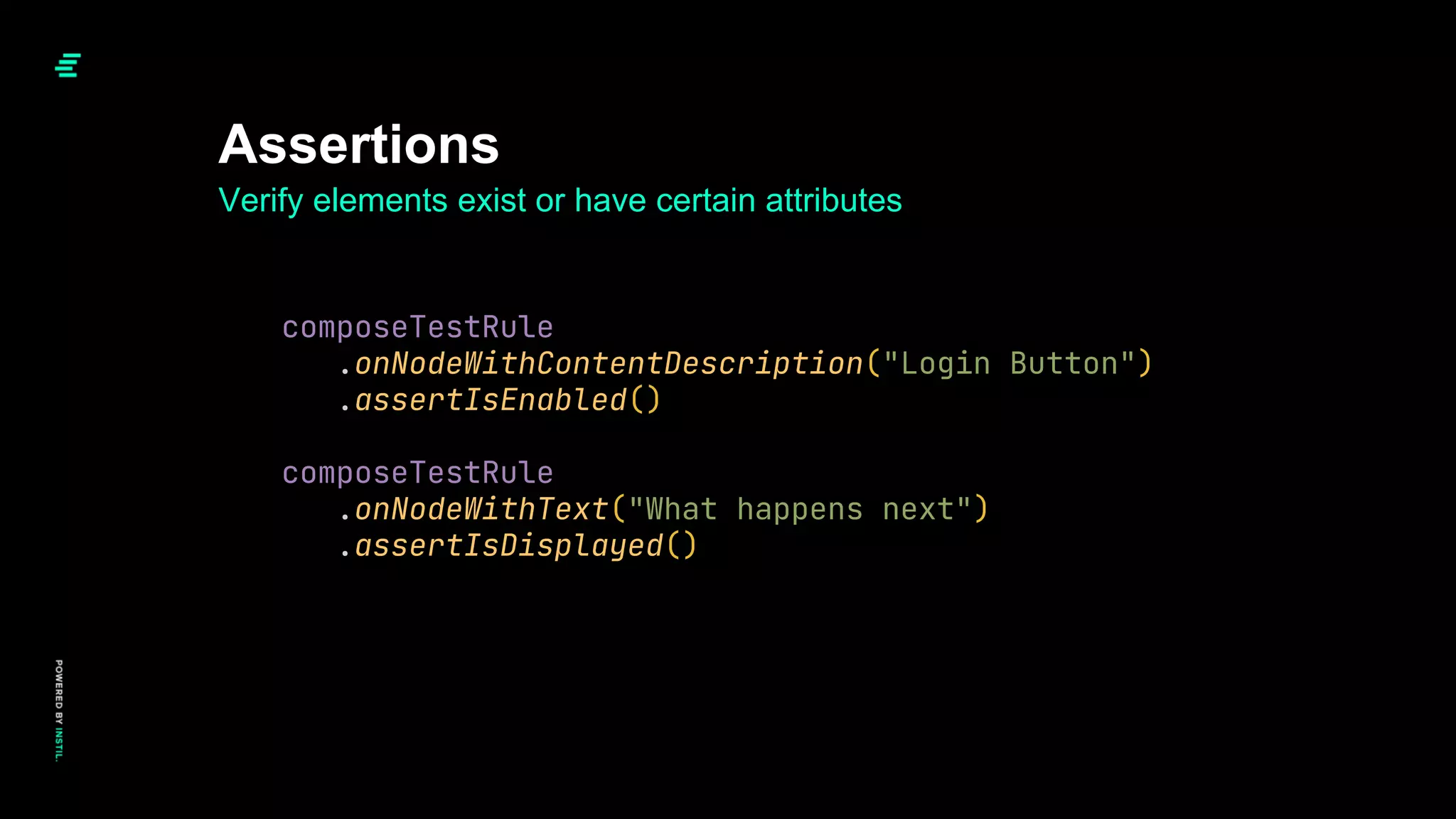
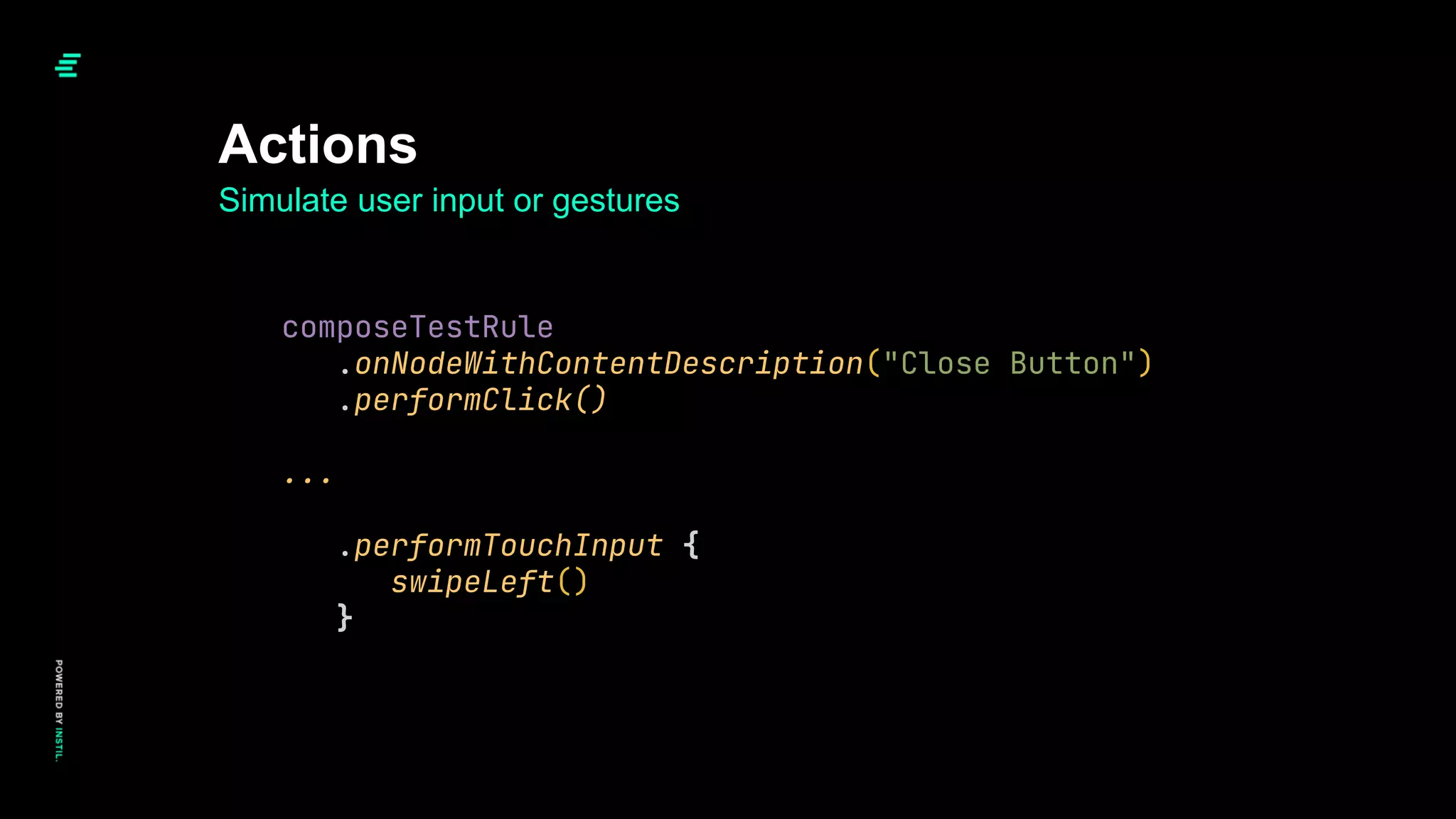
![Finders - Debug Logging
Node #1 at (l=0.0, t=54.0, r=720.0, b=1436.0)px
|-Node #2 at (l=70.0, t=54.0, r=650.0, b=1436.0)px
ContentDescription = '[VyPops Permissions Page]'
|-Node #3 at (l=70.0, t=75.0, r=112.0, b=117.0)px
| Role = 'Button'
| Focused = 'false'
| ContentDescription = '[Close Button]'
| Actions = [OnClick]
| MergeDescendants = 'true'
|-Node #6 at (l=229.0, t=194.0, r=492.0, b=303.0)px
| ContentDescription = '[Vypr Logo]'
| Role = 'Image'
|-Node #7 at (l=91.0, t=687.0, r=133.0, b=729.0)px
| ContentDescription = '[Record Audio Tick]'
| Role = 'Image'
|-Node #8 at (l=147.0, t=684.0, r=615.0, b=731.0)px
| Text = '[Microphone access granted]'
| Actions = [GetTextLayoutResult]
|-Node #9 at (l=125.0, t=762.0, r=167.0, b=804.0)px
| ContentDescription = '[Camera Tick]'
| Role = 'Image'
|-Node #10 at (l=181.0, t=759.0, r=582.0, b=806.0)px
| Text = '[Camera access granted]'
| Actions = [GetTextLayoutResult]
|-Node #11 at (l=84.0, t=1275.0, r=636.0, b=1366.0)px
Text = '[VyPops needs access to both your camera and microphone.]'
Actions = [GetTextLayoutResult]
Node #1 at (l=0.0, t=54.0, r=720.0, b=1436.0)px
|-Node #2 at (l=70.0, t=54.0, r=650.0, b=1436.0)px
ContentDescription = '[VyPops Permissions Page]'
|-Node #3 at (l=70.0, t=75.0, r=112.0, b=117.0)px
| Role = 'Button'
| Focused = 'false'
| Actions = [OnClick]
| MergeDescendants = 'true'
| |-Node #5 at (l=70.0, t=75.0, r=112.0, b=117.0)px
| ContentDescription = '[Close Button]'
| Role = 'Image'
|-Node #6 at (l=229.0, t=194.0, r=492.0, b=303.0)px
| ContentDescription = '[Vypr Logo]'
| Role = 'Image'
|-Node #7 at (l=91.0, t=687.0, r=133.0, b=729.0)px
| ContentDescription = '[Record Audio Tick]'
| Role = 'Image'
|-Node #8 at (l=147.0, t=684.0, r=615.0, b=731.0)px
| Text = '[Microphone access granted]'
| Actions = [GetTextLayoutResult]
|-Node #9 at (l=125.0, t=762.0, r=167.0, b=804.0)px
| ContentDescription = '[Camera Tick]'
| Role = 'Image'
|-Node #10 at (l=181.0, t=759.0, r=582.0, b=806.0)px
| Text = '[Camera access granted]'
| Actions = [GetTextLayoutResult]
|-Node #11 at (l=84.0, t=1275.0, r=636.0, b=1366.0)px
Text = '[VyPops needs access to both your camera and microphone.]'
Actions = [GetTextLayoutResult]](https://image.slidesharecdn.com/composeinpractice-cme-sept2022-220916155553-f682172a/75/Compose-In-Practice-76-2048.jpg)