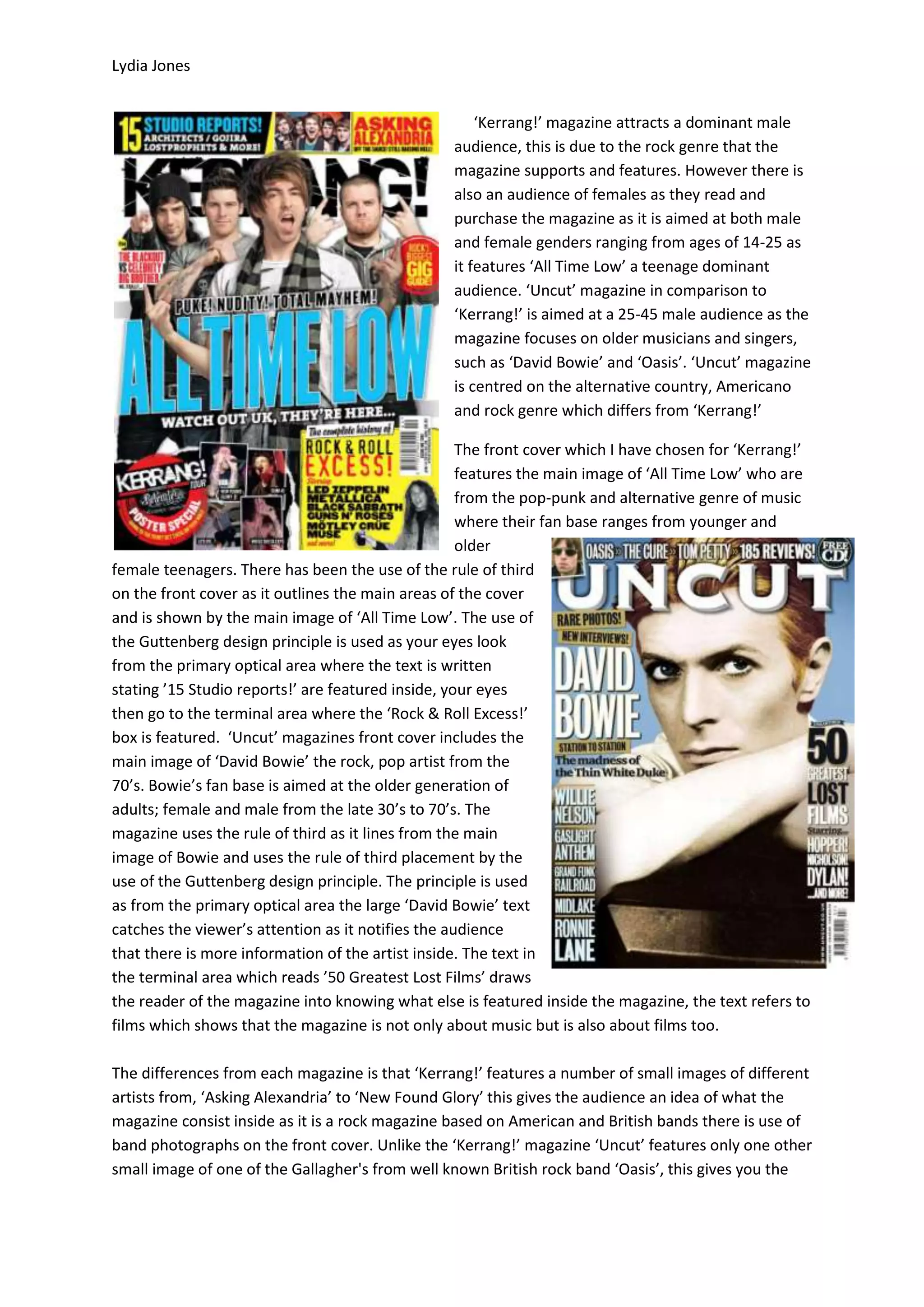
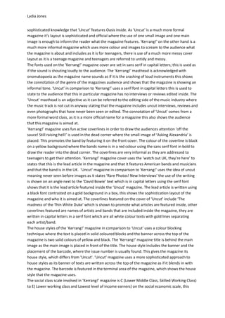
Lydia Jones


                                                     ‘Kerrang!’ magazine attracts a dominant male
                                                 audience, this is due to the rock genre that the
                                                 magazine supports and features. However there is
                                                 also an audience of females as they read and
                                                 purchase the magazine as it is aimed at both male
                                                 and female genders ranging from ages of 14-25 as
                                                 it features ‘All Time Low’ a teenage dominant
                                                 audience. ‘Uncut’ magazine in comparison to
                                                 ‘Kerrang!’ is aimed at a 25-45 male audience as the
                                                 magazine focuses on older musicians and singers,
                                                 such as ‘David Bowie’ and ‘Oasis’. ‘Uncut’ magazine
                                                 is centred on the alternative country, Americano
                                                 and rock genre which differs from ‘Kerrang!’

                                                    The front cover which I have chosen for ‘Kerrang!’
                                                    features the main image of ‘All Time Low’ who are
                                                    from the pop-punk and alternative genre of music
                                                    where their fan base ranges from younger and
                                                    older
female teenagers. There has been the use of the rule of third
on the front cover as it outlines the main areas of the cover
and is shown by the main image of ‘All Time Low’. The use of
the Guttenberg design principle is used as your eyes look
from the primary optical area where the text is written
stating ’15 Studio reports!’ are featured inside, your eyes
then go to the terminal area where the ‘Rock & Roll Excess!’
box is featured. ‘Uncut’ magazines front cover includes the
main image of ‘David Bowie’ the rock, pop artist from the
70’s. Bowie’s fan base is aimed at the older generation of
adults; female and male from the late 30’s to 70’s. The
magazine uses the rule of third as it lines from the main
image of Bowie and uses the rule of third placement by the
use of the Guttenberg design principle. The principle is used
as from the primary optical area the large ‘David Bowie’ text
catches the viewer’s attention as it notifies the audience
that there is more information of the artist inside. The text in
the terminal area which reads ’50 Greatest Lost Films’ draws
the reader of the magazine into knowing what else is featured inside the magazine, the text refers to
films which shows that the magazine is not only about music but is also about films too.

The differences from each magazine is that ‘Kerrang!’ features a number of small images of different
artists from, ‘Asking Alexandria’ to ‘New Found Glory’ this gives the audience an idea of what the
magazine consist inside as it is a rock magazine based on American and British bands there is use of
band photographs on the front cover. Unlike the ‘Kerrang!’ magazine ‘Uncut’ features only one other
small image of one of the Gallagher's from well known British rock band ‘Oasis’, this gives you the
Lydia Jones


sophisticated knowledge that ‘Uncut’ features Oasis inside. As ‘Uncut’ is a much more formal
magazine it’s layout is sophisticated and official where the use of one small image and one main
image is enough to inform the reader what the magazine features. ‘Kerrang!’ on the other hand is a
much more informal magazine which uses more colour and images to scream to the audience what
the magazine is about and includes as it is for teenagers, there is use of a much more messy cover
layout as it is a teenage magazine and teenagers are referred to untidy and messy.
The fonts used on the ‘Kerrang!’ magazine cover are set in sans serif in capital letters; this is used as
if the sound is shouting loudly to the audience. The ‘Kerrang!’ masthead is acknowledged with
onomatopoeia as the magazine name sounds as if it is the crashing of loud instruments this shows
the connotation of the genre of the magazines audience and shows that the magazine is showing an
informal tone. ‘Uncut’ in comparison to ‘Kerrang!’ uses a serif font in capital letters this is used to
state to the audience that this in particular magazine has no interviews or reviews edited inside. The
‘Uncut’ masthead is an adjective as it can be referred to the editing side of the music industry where
the music track is not cut in anyway stating that the magazine includes uncut interviews, reviews and
even photographs that have never been seen or edited. The connotation of ‘Uncut’ comes from a
more formal word class, as it is a more official name for a magazine this also shows the audience
that this magazine is aimed at.
‘Kerrang!’ magazine uses fun active coverlines in order to draw the audiences attention ‘off the
sauce! Still raising hell!’ is used in the dead corner where the small image of ‘Asking Alexandria’ is
placed. This promotes the band by featuring it on the front cover. The colour of the coverline is black
on a yellow background where the bands name is in a red colour using the sans serif font in bold to
draw the reader into the dead corner. The coverlines are very informal as they are addressed to
teenagers to get their attention. ‘Kerrang!’ magazine cover uses the ‘watch out UK, they’re here’ to
states that this is the lead article in the magazine and that it features American bands and musicians
and that the band is in the UK. ‘Uncut’ magazine in comparison to ‘Kerrang!’ uses the idea of uncut
meaning never seen before images as it states ‘Rare Photos! New Interviews’ the use of the writing
is shown on an angle next to the ‘David Bowie’ text which is in capital letters using the serif font
shows that it is the lead article featured inside the ‘Uncut’ magazine. The lead article is written using
a black font contrasted on a gold background in a box, this shows the sophistication layout of the
magazine and who it is aimed at. The coverlines featured on the cover of ‘Uncut’ include ‘The
madness of the Thin White Duke’ which is shown to promote what articles are featured inside, other
coverlines featured are names of artists and bands that are included inside the magazine, they are
written in capital letters in a serif font which are all white colour texts with gold lines separating
each artist/band.
The house styles of the ‘Kerrang!’ magazine in comparison to ‘Uncut’ uses a colour blocking
technique where the text is placed in solid coloured blocks and the banner across the top of the
magazine is two solid colours of yellow and black. The ‘Kerrang!’ magazine title is behind the main
image as the main image is placed in front of the title. The house style includes the banner and the
placement of the barcode, where the issue number is usually found. This gives the magazine its
house style, which differs from ‘Uncut’. ‘Uncut’ magazine uses a more sophisticated approach to
house styles as its banner of texts are written across the top of the magazine as if it blends in with
the magazine. The barcode is featured in the terminal area of the magazine, which shows the house
style that the magazine uses.
The social class scale involved in ‘Kerrang!’ magazine is C (Lower Middle Class, Skilled Working Class)
to E( Lower working class and Lowest level of income earners) on the social economic scale, this
Lydia Jones


ranges the working class and students to be a part of the audience who purchase the music
magazine. The social class of ‘Q’ magazine in comparison to ‘Kerrang!’ ranges from B (Middle Class)
to E (all apart from Upper Class) on the social economic scale.

Comparrison of magazines

  • 1.
    Lydia Jones ‘Kerrang!’ magazine attracts a dominant male audience, this is due to the rock genre that the magazine supports and features. However there is also an audience of females as they read and purchase the magazine as it is aimed at both male and female genders ranging from ages of 14-25 as it features ‘All Time Low’ a teenage dominant audience. ‘Uncut’ magazine in comparison to ‘Kerrang!’ is aimed at a 25-45 male audience as the magazine focuses on older musicians and singers, such as ‘David Bowie’ and ‘Oasis’. ‘Uncut’ magazine is centred on the alternative country, Americano and rock genre which differs from ‘Kerrang!’ The front cover which I have chosen for ‘Kerrang!’ features the main image of ‘All Time Low’ who are from the pop-punk and alternative genre of music where their fan base ranges from younger and older female teenagers. There has been the use of the rule of third on the front cover as it outlines the main areas of the cover and is shown by the main image of ‘All Time Low’. The use of the Guttenberg design principle is used as your eyes look from the primary optical area where the text is written stating ’15 Studio reports!’ are featured inside, your eyes then go to the terminal area where the ‘Rock & Roll Excess!’ box is featured. ‘Uncut’ magazines front cover includes the main image of ‘David Bowie’ the rock, pop artist from the 70’s. Bowie’s fan base is aimed at the older generation of adults; female and male from the late 30’s to 70’s. The magazine uses the rule of third as it lines from the main image of Bowie and uses the rule of third placement by the use of the Guttenberg design principle. The principle is used as from the primary optical area the large ‘David Bowie’ text catches the viewer’s attention as it notifies the audience that there is more information of the artist inside. The text in the terminal area which reads ’50 Greatest Lost Films’ draws the reader of the magazine into knowing what else is featured inside the magazine, the text refers to films which shows that the magazine is not only about music but is also about films too. The differences from each magazine is that ‘Kerrang!’ features a number of small images of different artists from, ‘Asking Alexandria’ to ‘New Found Glory’ this gives the audience an idea of what the magazine consist inside as it is a rock magazine based on American and British bands there is use of band photographs on the front cover. Unlike the ‘Kerrang!’ magazine ‘Uncut’ features only one other small image of one of the Gallagher's from well known British rock band ‘Oasis’, this gives you the
  • 2.
    Lydia Jones sophisticated knowledgethat ‘Uncut’ features Oasis inside. As ‘Uncut’ is a much more formal magazine it’s layout is sophisticated and official where the use of one small image and one main image is enough to inform the reader what the magazine features. ‘Kerrang!’ on the other hand is a much more informal magazine which uses more colour and images to scream to the audience what the magazine is about and includes as it is for teenagers, there is use of a much more messy cover layout as it is a teenage magazine and teenagers are referred to untidy and messy. The fonts used on the ‘Kerrang!’ magazine cover are set in sans serif in capital letters; this is used as if the sound is shouting loudly to the audience. The ‘Kerrang!’ masthead is acknowledged with onomatopoeia as the magazine name sounds as if it is the crashing of loud instruments this shows the connotation of the genre of the magazines audience and shows that the magazine is showing an informal tone. ‘Uncut’ in comparison to ‘Kerrang!’ uses a serif font in capital letters this is used to state to the audience that this in particular magazine has no interviews or reviews edited inside. The ‘Uncut’ masthead is an adjective as it can be referred to the editing side of the music industry where the music track is not cut in anyway stating that the magazine includes uncut interviews, reviews and even photographs that have never been seen or edited. The connotation of ‘Uncut’ comes from a more formal word class, as it is a more official name for a magazine this also shows the audience that this magazine is aimed at. ‘Kerrang!’ magazine uses fun active coverlines in order to draw the audiences attention ‘off the sauce! Still raising hell!’ is used in the dead corner where the small image of ‘Asking Alexandria’ is placed. This promotes the band by featuring it on the front cover. The colour of the coverline is black on a yellow background where the bands name is in a red colour using the sans serif font in bold to draw the reader into the dead corner. The coverlines are very informal as they are addressed to teenagers to get their attention. ‘Kerrang!’ magazine cover uses the ‘watch out UK, they’re here’ to states that this is the lead article in the magazine and that it features American bands and musicians and that the band is in the UK. ‘Uncut’ magazine in comparison to ‘Kerrang!’ uses the idea of uncut meaning never seen before images as it states ‘Rare Photos! New Interviews’ the use of the writing is shown on an angle next to the ‘David Bowie’ text which is in capital letters using the serif font shows that it is the lead article featured inside the ‘Uncut’ magazine. The lead article is written using a black font contrasted on a gold background in a box, this shows the sophistication layout of the magazine and who it is aimed at. The coverlines featured on the cover of ‘Uncut’ include ‘The madness of the Thin White Duke’ which is shown to promote what articles are featured inside, other coverlines featured are names of artists and bands that are included inside the magazine, they are written in capital letters in a serif font which are all white colour texts with gold lines separating each artist/band. The house styles of the ‘Kerrang!’ magazine in comparison to ‘Uncut’ uses a colour blocking technique where the text is placed in solid coloured blocks and the banner across the top of the magazine is two solid colours of yellow and black. The ‘Kerrang!’ magazine title is behind the main image as the main image is placed in front of the title. The house style includes the banner and the placement of the barcode, where the issue number is usually found. This gives the magazine its house style, which differs from ‘Uncut’. ‘Uncut’ magazine uses a more sophisticated approach to house styles as its banner of texts are written across the top of the magazine as if it blends in with the magazine. The barcode is featured in the terminal area of the magazine, which shows the house style that the magazine uses. The social class scale involved in ‘Kerrang!’ magazine is C (Lower Middle Class, Skilled Working Class) to E( Lower working class and Lowest level of income earners) on the social economic scale, this
  • 3.
    Lydia Jones ranges theworking class and students to be a part of the audience who purchase the music magazine. The social class of ‘Q’ magazine in comparison to ‘Kerrang!’ ranges from B (Middle Class) to E (all apart from Upper Class) on the social economic scale.