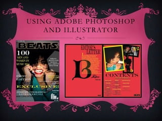
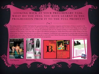
NAA OBLIKAI LARYEA
      Media Evaluation
I N W H A T WA Y S D O E S Y O U R M E D I A P R O D U C T
 USE, DEVELOP OR CHALLENGE FORMS AND
 CONVENTIONS OF REAL MEDIA PRODUCTS?

To create my magazine ‘BEATS’ I had researched two magazines Vibe and ‘Q’, both very
different genres I also paid attention to different conventions using magazines aimed at a similar
age group of people I had chosen as my target audience the things they had in common as well
as the fact that they were aimed for older people was that they had both had a professional
mature look to them which was what I had aimed to create with my ‘BEATS’ magazine. I had
looked at the layout and conventions for each magazine e.g. Puffs, Buzz words, Slogans and
House style taking note of where images and text were laid out on the front cover of each
magazine. What I had noticed about each magazine was that VIBE had changed the colour of
their title block to go with the current theme of the magazine where as Q had kept theirs the
same a repeated consistency which stood out to me because it shows the age it’s aimed at, and
unlike VIBE a majority of Q magazine
Q MAGAZINE
                  House font stays consistent, this
                                                              Q’s audience would be people of the
                  would infer a more mature level             older generation listening to genre’s
                  of reading also the colour theme
                  has minimal colours, which isn’t            of music such as indie , rock etc. Q
                  too confusing.                              is a magazine that is bimonthly but
                                                              over the years many have said it has
                                                              outdated, my looking at the magazine
                                                              I would want to feed off it. Q
                                                              magazine is also well known for the
                                                              images used on their front
                                  Central image, Noel
                                  Gallagher a member of the
                                                              cover, usually a extreme close up
                                  band Oasis which also are   view of the artist, making a
                                  middle aged men,.
                                                              statement.


Anchorage text
VIBE MAGAZINE
       Slogan


                                            Vibe is a bi-monthly magazine that features the
                                            genre of Hip Hop and R’n’B. aimed at more of
                           Title Block      the younger generation Vibe’s cover image are
                                            usually younger singers, rappers or music
                                            moguls, usually of the black origin who sing or
                                            rap to R’n’B and Hip Hop. They are famous for
                                            the artist they have featured in the magazine.
                     Cover Lines            Looking at both Vibe and Q magazine I had
                                            then come up with the conclusion to create a
                                            magazine for those of the age of 21-25 years of
                                            age as they don’t have magazine that reach out
                         House Style
                                            to them. It would have been a mature
                                            magazine, having a sophisticated layout and font
                                            and provide information that they would prefer
                                            to read.

                            Central Image


Anchorage text
H OW D O E S YO U R M E D I A P RO D U C T
               R E P R E S E N T PA R T I C U L A R S O C I A L
                                 G RO U P S ?
My magazine is aimed at both genders aged between 21-25, they would
then read about artists they listened to when they were younger with it
being more likely for them to listen to them now. By involving celebrities
that have been around for over a decade e.g. ‘Jay-Z lives it up in Vegas’ my
audience would know that it would be a magazine for them. My age group
would be interested in the latest fashion, and music the same way teenagers
would but BEATS would be looking into more mature way of bringing it
forward to them, by using a simple layout and sophisticated language. My
central image would be something to catch the eye of the audience, they
way I have edited my image adding an edge to my artist, having anchorage
text ‘life in het limelight’ would suggest that she is new to the scene, and once
they read the article and seeing that she has been influenced by people such
as Diana Ross you would have been the J-lo of their generation they would
want to hear her and buy the magazine for more musical updates. My
magazine would be £1.50 and it would come out semi-monthly, I chose a
reasonable price for my audience to want to buy it twice a month. My
contents and feature article have a consistent colour theme and
layout, keeping things neat and easy to read
W H AT K I N D O F M E D I A
     I N S T I T U T I O N M I G H T D I S T R I BU T E
     YO U R M E D I A P RO D U C T A N D W H Y ?
Bauer are Europe's biggest privately owned publishing groups, owning over 300 magazines in 15 different countries worldwide and are
also on TV and Radio. They have covered magazines like GRAZIA and Radio wise Bauer have planted many more radio stations
including KISS FM and Magic, Bauer Media is a sister company of H Bauer Publishing, publisher of the UK's biggest TV listings, Take a
Break and Bella. With them being so broad within the media industry, I chose them with the basic knowledge I know from doing my
independent research and with them creating such successful magazines and their target audiences vary widely from Bella which is a
magazine for mid twenty’s to mid thirties to Kiss FM that play music of nearly every genre aimed at all ages and both genders. By taking
on BEATS Bauer have the chance of creating a music magazine for an older audience so they would have a variety of magazines that cater
for the older audience of the U.K. so I would use them knowing that they know how to distribute to the right audience's.
W H O WO U L D B E T H E AU D I E N C E
          F O R YO U R M E D I A P RO D U C T ?
The audience of my media product would be male and female aged 21-
25. I had chosen these ages simply because when I had created a survey a
majority of my participants were people within that age. The chances of
my magazine being successful would be pretty high seeing as I can base
my magazine around artists who are of the R’n’B and Hip Hop genre and
also because they are artists who came about when my target audience
were teenagers and so they would’ve been into that sort of music as it is.
They had chosen magazines that engage them to want to read more and
get to know what is going on within the celebrity world. I chose to use
this age group seeing as they are more likely to buy a magazine at the
price of £1.50 where as teenagers are more likely to be reading things on
the internet. My magazine will be semi-monthly seeing as something is
always happening within the R’n’B culture e.g. a new song being out or
wars within the industries. I had asked people around England and
Scotland to answer my survey and by that I will be able to sell my
magazine around Great Britain.
H OW D I D YO U AT T R AC T / A D D R E S S
         YO U R AU D I E N C E ?
I had attracted by placing a ‘famous’ celebrity on the front page alongside with puffs involving famous people. I had included not only things to do with just
listening to music but also with the latest music TV programmes and celebrities living their everyday life. I included the fact that it’s the first edition implying
        that it will be providing a lot of what the audience expect as well. When thinking of typical conventions of a magazine you apply theses to it:

                                                                  Central image(long or medium shots)

                                                               Puffs/Cells lines/Cover lines – Mini articles

                                                           House style(consistent colour scheme - 4 and font)

                                                                         Title Block/Master head

                                              Buzz word (short snappy words to catch the reader’s eye e.g. FREE CD!)

                                                       Slogan / Banner – At the top of the page, Above the title

                                                                                 Barcode

                                                                                   Price

                                                                                  Layout

                                                                              Images/Pictures

                                                               Secondary images other images on the page

When I had thought and applied all of these to my magazine I had then related thought of relating it to the genre more and the audience. I had to come up
  with subtle but bright colours which connote R’n’B and Hip Hop as both are very different but very similar. With one genre being loud and full of bass
  whilst the other subtle and smooth . My central image is an extreme close up with aggression, the artist is wearing the latest trends in both clothing and
                                                         make-up inferring that it is a modern magazine.
W H AT H AV E YO U L E A R N T A B O U T
T E C H N O L O G Y F RO M T H E P RO C E S S O F
   C O N S T R U C T I N G T H I S P RO D U C T ?

  Since starting my Magazine, I had also learnt how to use Adobe Photoshop and Adobe
  Illustrator. Learning how to use Photoshop made images clearer and skin more flawless
  and cropping backgrounds out by uses tools like (Spot healer, Saturation, Contrast, Blur, Magic
  wand, Healing brush tool and also using different tools which elaborated from the Filter icon) by
  using Adobe Illustrator, I was able to add different fonts, move them around and have them go
  diagonal, vertical or even horizontal. I was able to add shapes to my magazine by using the
  Rectangle tool, I was able to add circles and other shapes also by changing the strokes which I
  had done for the cover magazine behind the puffs and I had used rectangles for behind the title
  for my feature article. I had also learnt about using Blogger to upload my coursework and
  Monkey Survey which enabled me to ask questions and receive answers from my target audience.
EXAMPLES OF ADOBE
   PHOTOSHOP


         By using Adobe Photoshop I was able to create different effects
                  on my models the images below I had used:

                                  Spot Healer
                           Render Lightening Effects
                                Sharpening Tool
                                      Grain
         With some of the effects used I had also experimented with the
         Contrast and Saturation of the Images to create different effects.
USING ADOBE PHOTOSHOP
    AND ILLUSTRATOR
L O O K I N G BAC K AT YO U R P R E L I M I N A RY TA S K ,
   W H A T D O Y O U F E E L Y O U H AV E L E A R N T I N T H E
   PROGRESSION FROM IT TO THE FULL PRODUCT?

Not taking media as a GCSE I had lacked the general knowledge of creating a magazine and the basics of what is needed etc. By
creating a magazine and doing research on other magazines as my preliminary task I was able to look at how things are put together
and how things catch the audience’s eyes. Though my preliminary task was very amateur looking at it and comparing it to my Final
magazine for this project I have been able to explore with different techniques in Adobe Photoshop and to think outside of the box
when it came to where I had placed my conventions of a magazine. Looking back and comparing my contents page and front cover
alongside my feature page I had improved by being able to work with both Adobe Photoshop and Adobe Illustrator picking up both
rather quickly I had picked up the pro’s and con’s of each programme.


Final Magazine            Preliminary Task                             Final Magazine            Preliminary Task

Naa oblikai laryea

  • 1.
    NAA OBLIKAI LARYEA Media Evaluation
  • 2.
    I N WH A T WA Y S D O E S Y O U R M E D I A P R O D U C T USE, DEVELOP OR CHALLENGE FORMS AND CONVENTIONS OF REAL MEDIA PRODUCTS? To create my magazine ‘BEATS’ I had researched two magazines Vibe and ‘Q’, both very different genres I also paid attention to different conventions using magazines aimed at a similar age group of people I had chosen as my target audience the things they had in common as well as the fact that they were aimed for older people was that they had both had a professional mature look to them which was what I had aimed to create with my ‘BEATS’ magazine. I had looked at the layout and conventions for each magazine e.g. Puffs, Buzz words, Slogans and House style taking note of where images and text were laid out on the front cover of each magazine. What I had noticed about each magazine was that VIBE had changed the colour of their title block to go with the current theme of the magazine where as Q had kept theirs the same a repeated consistency which stood out to me because it shows the age it’s aimed at, and unlike VIBE a majority of Q magazine
  • 3.
    Q MAGAZINE House font stays consistent, this Q’s audience would be people of the would infer a more mature level older generation listening to genre’s of reading also the colour theme has minimal colours, which isn’t of music such as indie , rock etc. Q too confusing. is a magazine that is bimonthly but over the years many have said it has outdated, my looking at the magazine I would want to feed off it. Q magazine is also well known for the images used on their front Central image, Noel Gallagher a member of the cover, usually a extreme close up band Oasis which also are view of the artist, making a middle aged men,. statement. Anchorage text
  • 4.
    VIBE MAGAZINE Slogan Vibe is a bi-monthly magazine that features the genre of Hip Hop and R’n’B. aimed at more of Title Block the younger generation Vibe’s cover image are usually younger singers, rappers or music moguls, usually of the black origin who sing or rap to R’n’B and Hip Hop. They are famous for the artist they have featured in the magazine. Cover Lines Looking at both Vibe and Q magazine I had then come up with the conclusion to create a magazine for those of the age of 21-25 years of age as they don’t have magazine that reach out House Style to them. It would have been a mature magazine, having a sophisticated layout and font and provide information that they would prefer to read. Central Image Anchorage text
  • 5.
    H OW DO E S YO U R M E D I A P RO D U C T R E P R E S E N T PA R T I C U L A R S O C I A L G RO U P S ? My magazine is aimed at both genders aged between 21-25, they would then read about artists they listened to when they were younger with it being more likely for them to listen to them now. By involving celebrities that have been around for over a decade e.g. ‘Jay-Z lives it up in Vegas’ my audience would know that it would be a magazine for them. My age group would be interested in the latest fashion, and music the same way teenagers would but BEATS would be looking into more mature way of bringing it forward to them, by using a simple layout and sophisticated language. My central image would be something to catch the eye of the audience, they way I have edited my image adding an edge to my artist, having anchorage text ‘life in het limelight’ would suggest that she is new to the scene, and once they read the article and seeing that she has been influenced by people such as Diana Ross you would have been the J-lo of their generation they would want to hear her and buy the magazine for more musical updates. My magazine would be £1.50 and it would come out semi-monthly, I chose a reasonable price for my audience to want to buy it twice a month. My contents and feature article have a consistent colour theme and layout, keeping things neat and easy to read
  • 6.
    W H ATK I N D O F M E D I A I N S T I T U T I O N M I G H T D I S T R I BU T E YO U R M E D I A P RO D U C T A N D W H Y ? Bauer are Europe's biggest privately owned publishing groups, owning over 300 magazines in 15 different countries worldwide and are also on TV and Radio. They have covered magazines like GRAZIA and Radio wise Bauer have planted many more radio stations including KISS FM and Magic, Bauer Media is a sister company of H Bauer Publishing, publisher of the UK's biggest TV listings, Take a Break and Bella. With them being so broad within the media industry, I chose them with the basic knowledge I know from doing my independent research and with them creating such successful magazines and their target audiences vary widely from Bella which is a magazine for mid twenty’s to mid thirties to Kiss FM that play music of nearly every genre aimed at all ages and both genders. By taking on BEATS Bauer have the chance of creating a music magazine for an older audience so they would have a variety of magazines that cater for the older audience of the U.K. so I would use them knowing that they know how to distribute to the right audience's.
  • 7.
    W H OWO U L D B E T H E AU D I E N C E F O R YO U R M E D I A P RO D U C T ? The audience of my media product would be male and female aged 21- 25. I had chosen these ages simply because when I had created a survey a majority of my participants were people within that age. The chances of my magazine being successful would be pretty high seeing as I can base my magazine around artists who are of the R’n’B and Hip Hop genre and also because they are artists who came about when my target audience were teenagers and so they would’ve been into that sort of music as it is. They had chosen magazines that engage them to want to read more and get to know what is going on within the celebrity world. I chose to use this age group seeing as they are more likely to buy a magazine at the price of £1.50 where as teenagers are more likely to be reading things on the internet. My magazine will be semi-monthly seeing as something is always happening within the R’n’B culture e.g. a new song being out or wars within the industries. I had asked people around England and Scotland to answer my survey and by that I will be able to sell my magazine around Great Britain.
  • 8.
    H OW DI D YO U AT T R AC T / A D D R E S S YO U R AU D I E N C E ? I had attracted by placing a ‘famous’ celebrity on the front page alongside with puffs involving famous people. I had included not only things to do with just listening to music but also with the latest music TV programmes and celebrities living their everyday life. I included the fact that it’s the first edition implying that it will be providing a lot of what the audience expect as well. When thinking of typical conventions of a magazine you apply theses to it:  Central image(long or medium shots)  Puffs/Cells lines/Cover lines – Mini articles  House style(consistent colour scheme - 4 and font)  Title Block/Master head  Buzz word (short snappy words to catch the reader’s eye e.g. FREE CD!)  Slogan / Banner – At the top of the page, Above the title  Barcode  Price  Layout  Images/Pictures  Secondary images other images on the page When I had thought and applied all of these to my magazine I had then related thought of relating it to the genre more and the audience. I had to come up with subtle but bright colours which connote R’n’B and Hip Hop as both are very different but very similar. With one genre being loud and full of bass whilst the other subtle and smooth . My central image is an extreme close up with aggression, the artist is wearing the latest trends in both clothing and make-up inferring that it is a modern magazine.
  • 9.
    W H ATH AV E YO U L E A R N T A B O U T T E C H N O L O G Y F RO M T H E P RO C E S S O F C O N S T R U C T I N G T H I S P RO D U C T ? Since starting my Magazine, I had also learnt how to use Adobe Photoshop and Adobe Illustrator. Learning how to use Photoshop made images clearer and skin more flawless and cropping backgrounds out by uses tools like (Spot healer, Saturation, Contrast, Blur, Magic wand, Healing brush tool and also using different tools which elaborated from the Filter icon) by using Adobe Illustrator, I was able to add different fonts, move them around and have them go diagonal, vertical or even horizontal. I was able to add shapes to my magazine by using the Rectangle tool, I was able to add circles and other shapes also by changing the strokes which I had done for the cover magazine behind the puffs and I had used rectangles for behind the title for my feature article. I had also learnt about using Blogger to upload my coursework and Monkey Survey which enabled me to ask questions and receive answers from my target audience.
  • 10.
    EXAMPLES OF ADOBE PHOTOSHOP By using Adobe Photoshop I was able to create different effects on my models the images below I had used:  Spot Healer  Render Lightening Effects  Sharpening Tool  Grain With some of the effects used I had also experimented with the Contrast and Saturation of the Images to create different effects.
  • 11.
    USING ADOBE PHOTOSHOP AND ILLUSTRATOR
  • 12.
    L O OK I N G BAC K AT YO U R P R E L I M I N A RY TA S K , W H A T D O Y O U F E E L Y O U H AV E L E A R N T I N T H E PROGRESSION FROM IT TO THE FULL PRODUCT? Not taking media as a GCSE I had lacked the general knowledge of creating a magazine and the basics of what is needed etc. By creating a magazine and doing research on other magazines as my preliminary task I was able to look at how things are put together and how things catch the audience’s eyes. Though my preliminary task was very amateur looking at it and comparing it to my Final magazine for this project I have been able to explore with different techniques in Adobe Photoshop and to think outside of the box when it came to where I had placed my conventions of a magazine. Looking back and comparing my contents page and front cover alongside my feature page I had improved by being able to work with both Adobe Photoshop and Adobe Illustrator picking up both rather quickly I had picked up the pro’s and con’s of each programme. Final Magazine Preliminary Task Final Magazine Preliminary Task