2. 1
Table of Contents
Overview
Logo Design
Type Specifications
Color Specifications
Logo Usage
Stationary Items
Rationale
2
3
4
4
5
6-7
8
3. 2
Overview
The Upper Crust Bakery was started in 1892, and
is well known for its fresh baked goods made
from generations of family recipes from France.
The Upper Crust bakes its items fresh daily using
local products, in order to create the finest
quality bakery items and desserts.
When you are in the Upper Crust Bakery, you
are transported to Paris. The smell of the fresh
baked breads, muffins, and pastries welcomes
each customer, for the best bakery experience
in town.
4. 3
Logo Design
Logo in Color
Logo in Black and White
bakeryUPPERCRUST
UPPERCRUST
bakery
6. 5
Logo Usage
bakeryUPPERCRUST
DO: Use only the correct colors and type faces.
UPPERCRUST
bakery
DO: Use the black & white version if needed on a white background.
DO: Use a white version of the logo, only on a dark background.
bakeryUPPERCRUST
DONT: Stretch or compress the logo, scale it proportionality.
DONT: Use the black version of the logo on a dark background.
UPPERCRUST
bakery
DONT: Use any unofficial colors in the logo.
DONT: Add a stroke to the logo.
UPPERCRUST
bakery
DONT: Rotate the logo.
UPPER CRUST
bakery
bakeryUPPERCRUST
bakeryUPPERCRUST
9. 8
Rationale
The Upper Crust Bakery was in need of a logo that represented its business that makes
local, fresh baked goods in a “straight from Paris” atmosphere. The bakery, which is both
classic and elegant, also needed a logo that would attract an audience from a wide age
range, and reflect the utmost quality of their bakery items.
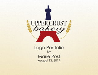
The Eiffel tower in the logo represents “the essence of Paris” that the Upper Crust desired,
and the wheat symbols framing it show that the business is a bakery, without tying it down
to one baked good. The wheat also helps frame the text of the logo, giving it balance.
The font for the title “Upper Crust” is an elegant serif font titled Bondi 72 SmallCaps Book,
which is in all caps to ensure the name of the bakery is easy to read whether scaled up or
down. This type is contrasted with the calligraphy font Behind Script for the word “bakery”,
that fills to space neatly beneath the words “Upper Crust”. The two fonts compliment each
other and represent the modern elegance of the client.
The colors that were chosen are a simple dark red, white, and deep blue combination,
which match colors of the French flag in order to transport the client’s customers to France.
A golden color was also used for the wheat to represent freshness and soften the other
stronger colors.
The final design is simple enough to appeal to a wide audience, ages 21-65, while also
catching their eye and telling them a lot about the brand simply from the logo. The fonts
are elegant, modern, and easy to read. The symbols also reflect freshness, quality, Paris,
and a “historically established” feeling through the French flag colors, smooth lines, and soft
shapes. The logo is scalable on all types of media, as represented in the stationery items.
Together, its fonts, colors, and shapes work as one to represent the client in a uniform way.