2. 2
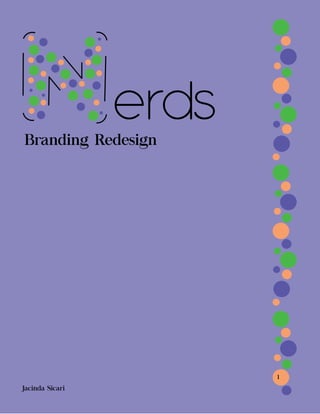
Table of Contents
Product Plan
Swatches
Logo Style Guide
Packaging
Advertisement
Page 3
Page 4
Page 5
Page 6
Page 7
3. 3
Product Plan
Product: Nerds Candy
Target Audience: Kids ages 10-15 years old.
Nerds was invented back in 1983 by a man named Angelo Fraggos.
They were first manufactured and sold through Wonka. Now they are
sold through the brand Nestle. Only two years after its creation it was
recognized as “Candy of the Year” by the National Candy Wholesalers
Association.
The goal of this redesign is to keep people interested in nerds. Often
we only see the candy during holidays such as Halloween and Valentines
Day. We want to makes sure that people are looking to eat nerds all year
round. By redesigning the product we make it look fun and colorful, while
still having a look that everyone will want to grab. By creating a cohesive
color scheme the product look put together and clean. Unlike before in
which it would have several different colors on several different boxes. Now
the product look uniform and hopefully more recognizable.
The goal for this product it to make its packaging not only stand
out, but be memorable. This is done through the new color scheme. People
will remember these colors and it will catch their eye as they walk past.
The ability to catch the customers eye is important because we want to
make sure that they are constantly seeing our product and that our product
stands out among the rest.
4. 4
Swatches
CMYK: 0, 35, 57, 4
RGB: 246, 159, 107
Hex: f69f6b
CMYK: 60, 0, 61, 28
RGB: 74, 184, 72
Hex:4ab848
CMYK: 46, 48, 0, 35
RGB: 90, 87, 166
Hex: 5a57a6
The colors used are supposed create a fun feeling when looking at them.
Since this is a candy the colors are bright, while still creating a cohesive
color scheme. The orange is eye catching a draws and draws attention to the
packaging, While the green is still bright it isn’t to over bearing. The last
color is the purple which is a little bit darker and completes the color scheme.
The purple is used both at 100% and 55% opacity in order to create a cohesive
color scheme.
Color Reasoning
5. 5
Logo Style Guide
erds
erds
erds
Colors Used
Font
Logo Variants
Logo Use
Antipasto
When using this logo it is best used on light
colors or with the opacity turned down on
darker colors. This will make sure that the
logo and individual colors stand out.