Contents
• Organizing data
–FREQUENCY DISTRIBUTIONS
• Graphical forms
– HISTOGRAM,
– FREQUENCY POLYGONS and
– OGIVES
• Other types of Graphs
– BAR GRAPH
– PARETO CHARTS
– TIME SERIES GRAPH
– PIE GRAPH
– STEM AND LEAF PLOT
STAB 2004 Biometry & Experimental Design
3.
[GOALS]
After completing thischapter, YOU
should be able to:
• Organize DATA using a frequency distribution
• Represent data in frequency distributions graphically using
histograms, frequency polygons and ogives
• Represent data using bar graphs, Pareto charts, time series
graphs, and pie chart
• Draw and interpret a stem and leaf plot
STAB 2004 Biometry & Experimental Design
4.
Data Presentation/Illustration
• Thefirst step in DATA analysis
– Once DATA has been collected, DATA should always be
illustrated
• Suitable DATA illustrations are based on data types
– May just be in table form
– Or can be converted into some kind of illustrations/figures
– Commonly known as graphs?
SUMMARY OF A LARGE DATA SETS
STAB 2004 Biometry & Experimental Design
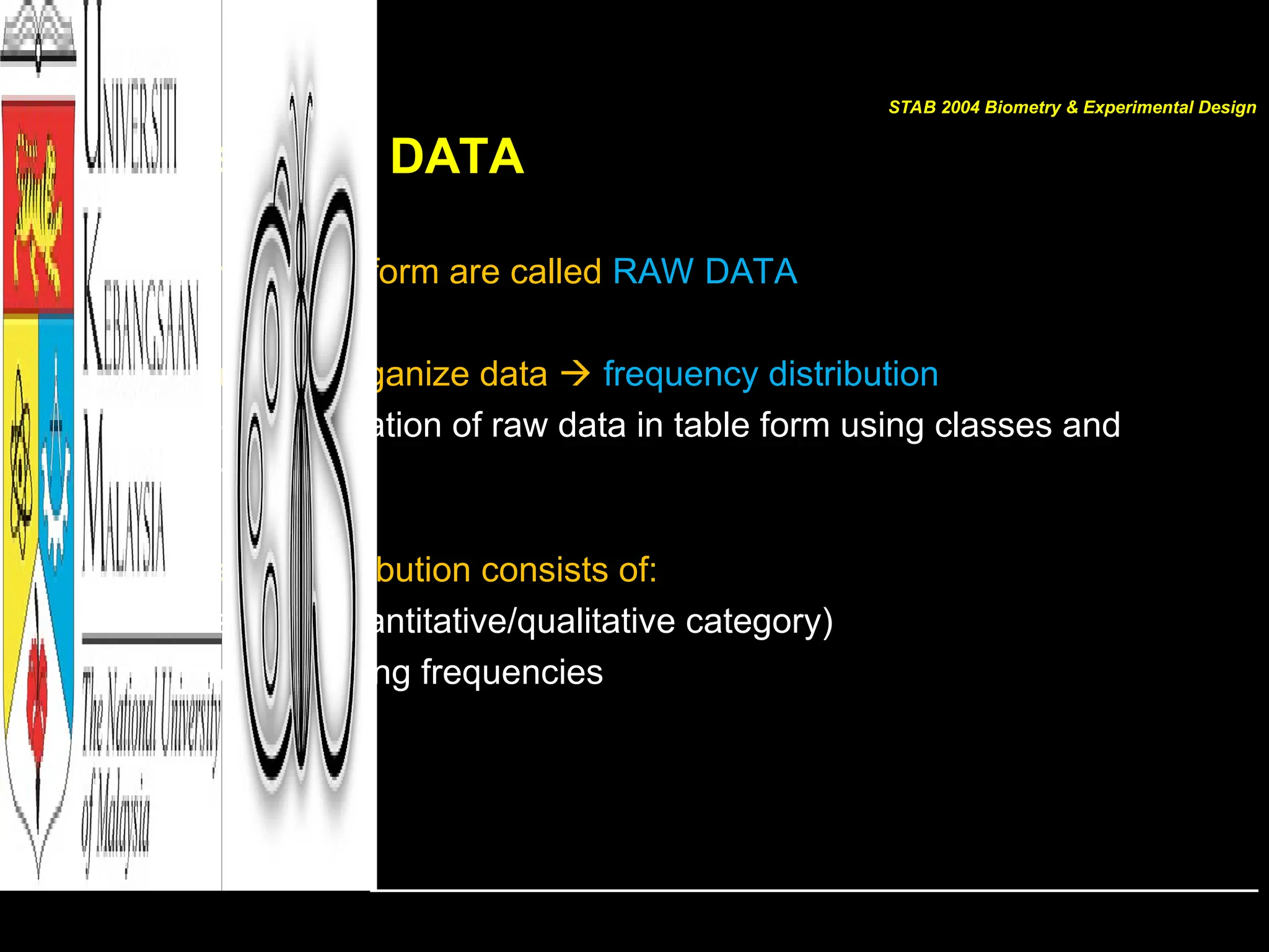
Organizing DATA
• Datain original form are called RAW DATA
• Researchers organize data frequency distribution
– The organization of raw data in table form using classes and
frequencies
• Frequency distribution consists of:
– Classes (quantitative/qualitative category)
– Corresponding frequencies
STAB 2004 Biometry & Experimental Design
7.
Organizing DATA
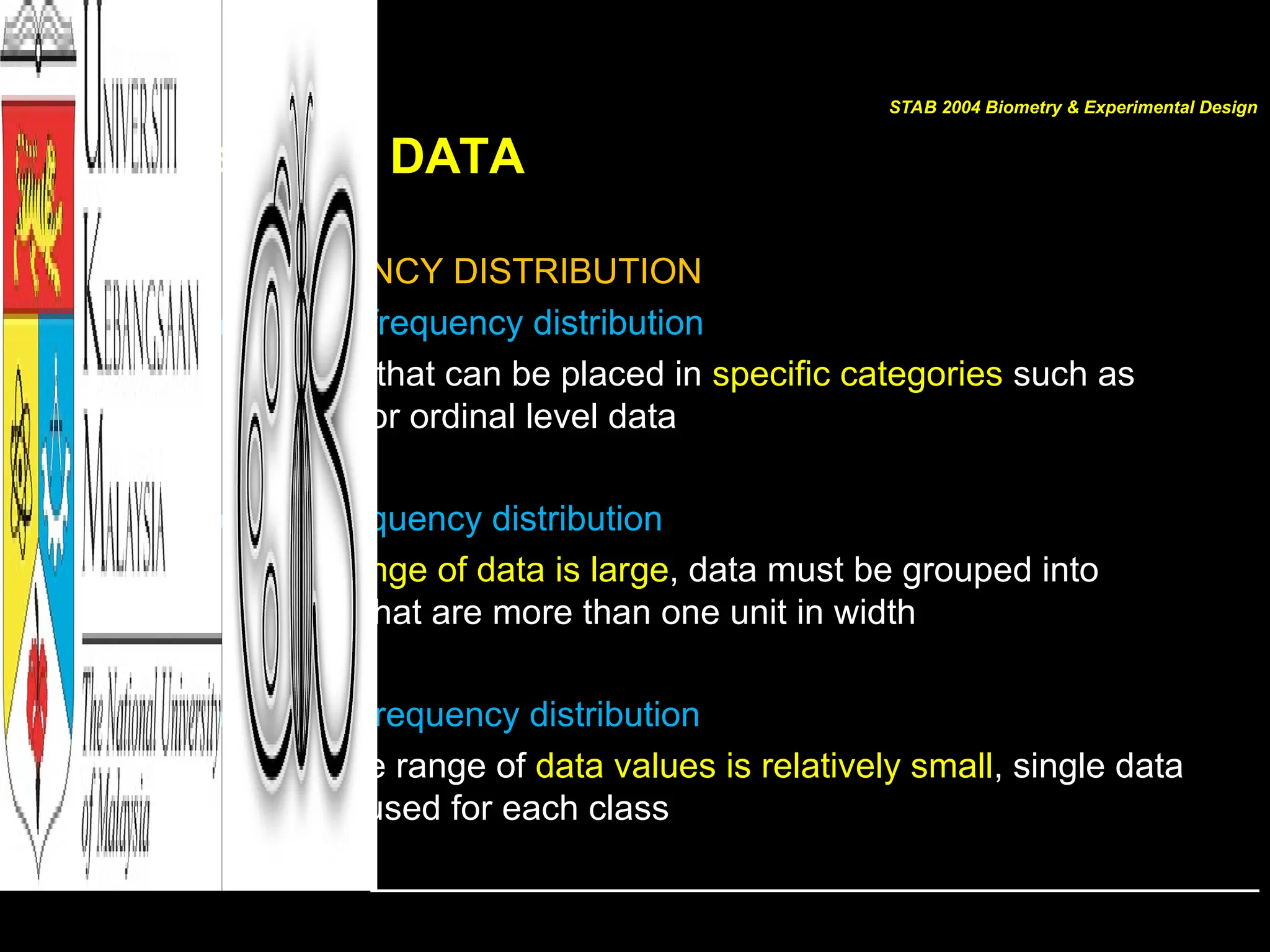
Types ofFREQUENCY DISTRIBUTION
– Categorical frequency distribution
• For data that can be placed in specific categories such as
nominal or ordinal level data
– Grouped frequency distribution
• When range of data is large, data must be grouped into
classes that are more than one unit in width
– Ungrouped frequency distribution
• When the range of data values is relatively small, single data
value is used for each class
STAB 2004 Biometry & Experimental Design
8.
HISTOGRAM
• Most commonform of DATA presentation
• Suitable for large sets of DATA
• For continuous data
– Compare with bar chart/bar graph
• The first step is to construct a FREQUENCY TABLE
STAB 2004 Biometry & Experimental Design
9.
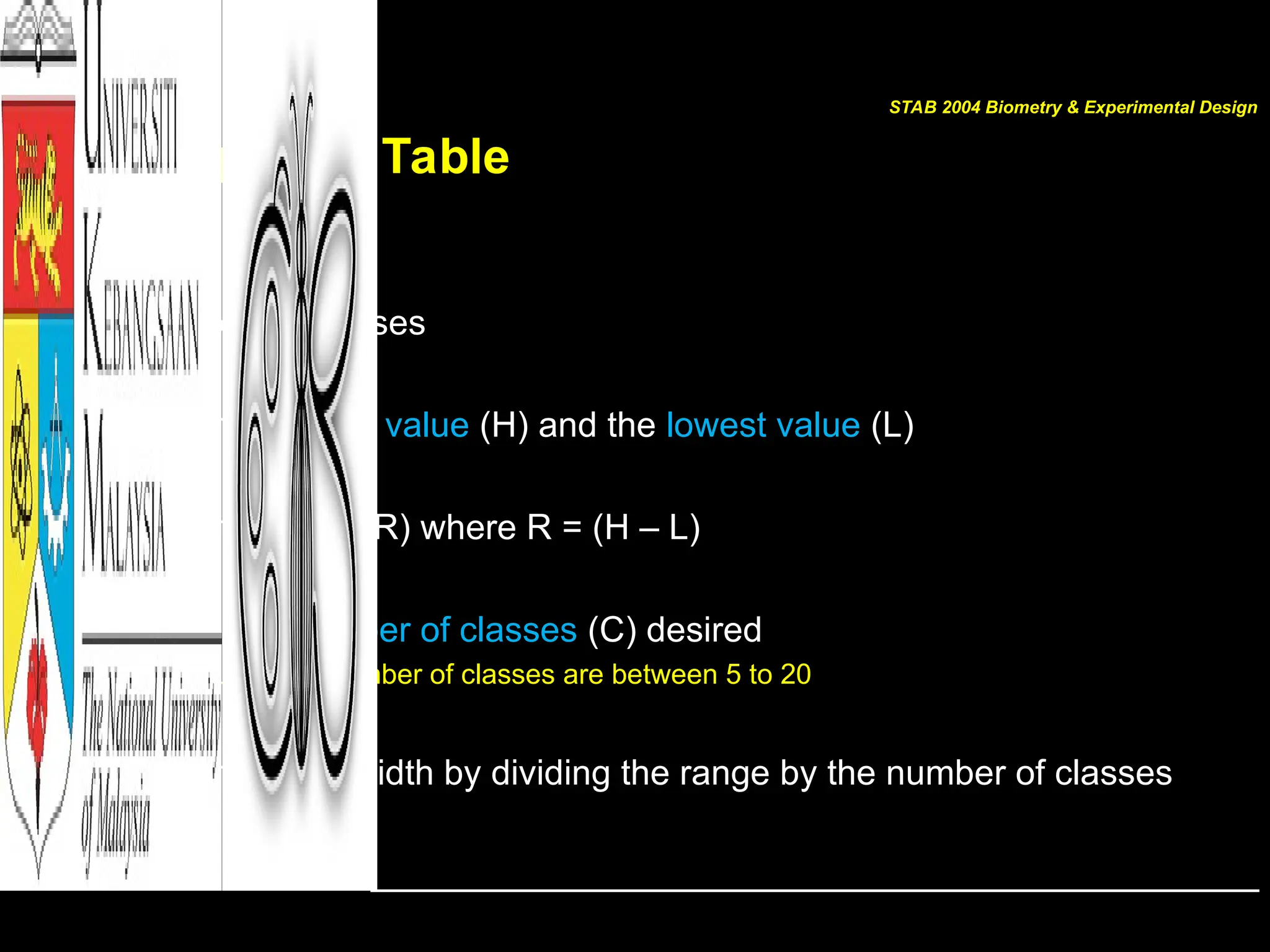
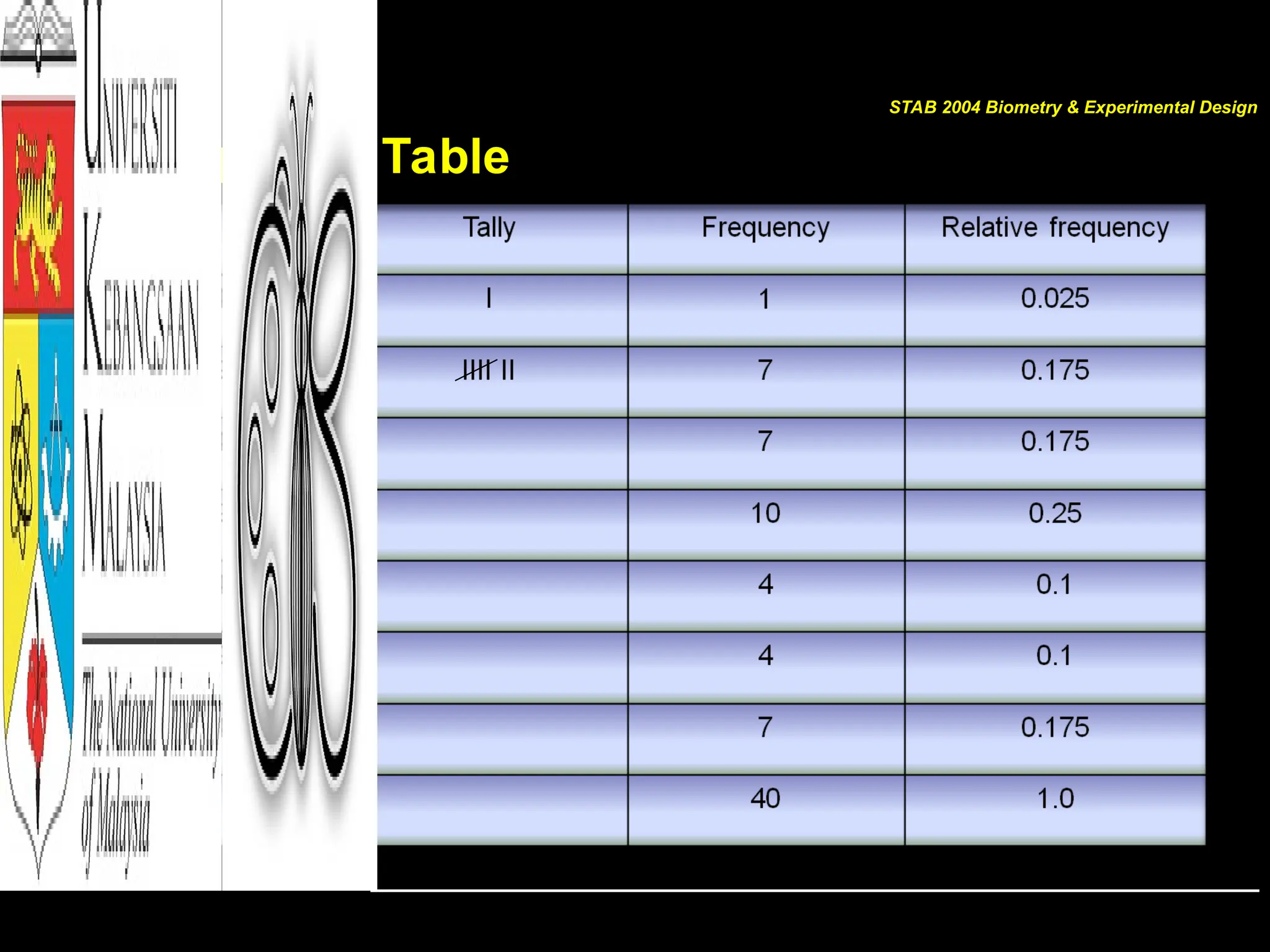
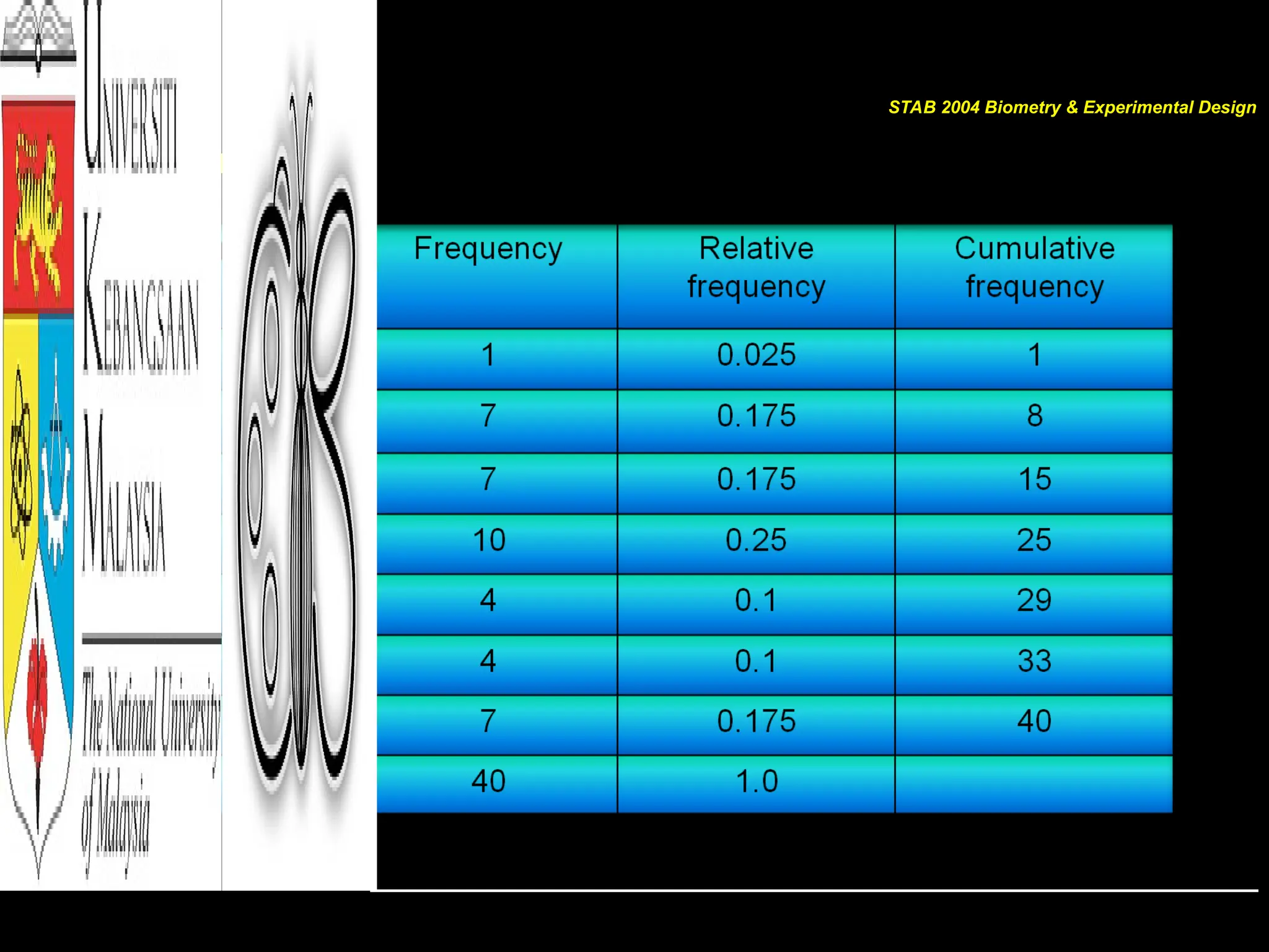
Frequency Table
STEP
Determine theclasses
• Find the highest value (H) and the lowest value (L)
• Find the range (R) where R = (H – L)
• Select the number of classes (C) desired
– Usually the number of classes are between 5 to 20
• Find the class width by dividing the range by the number of classes
STAB 2004 Biometry & Experimental Design
10.
Frequency Table
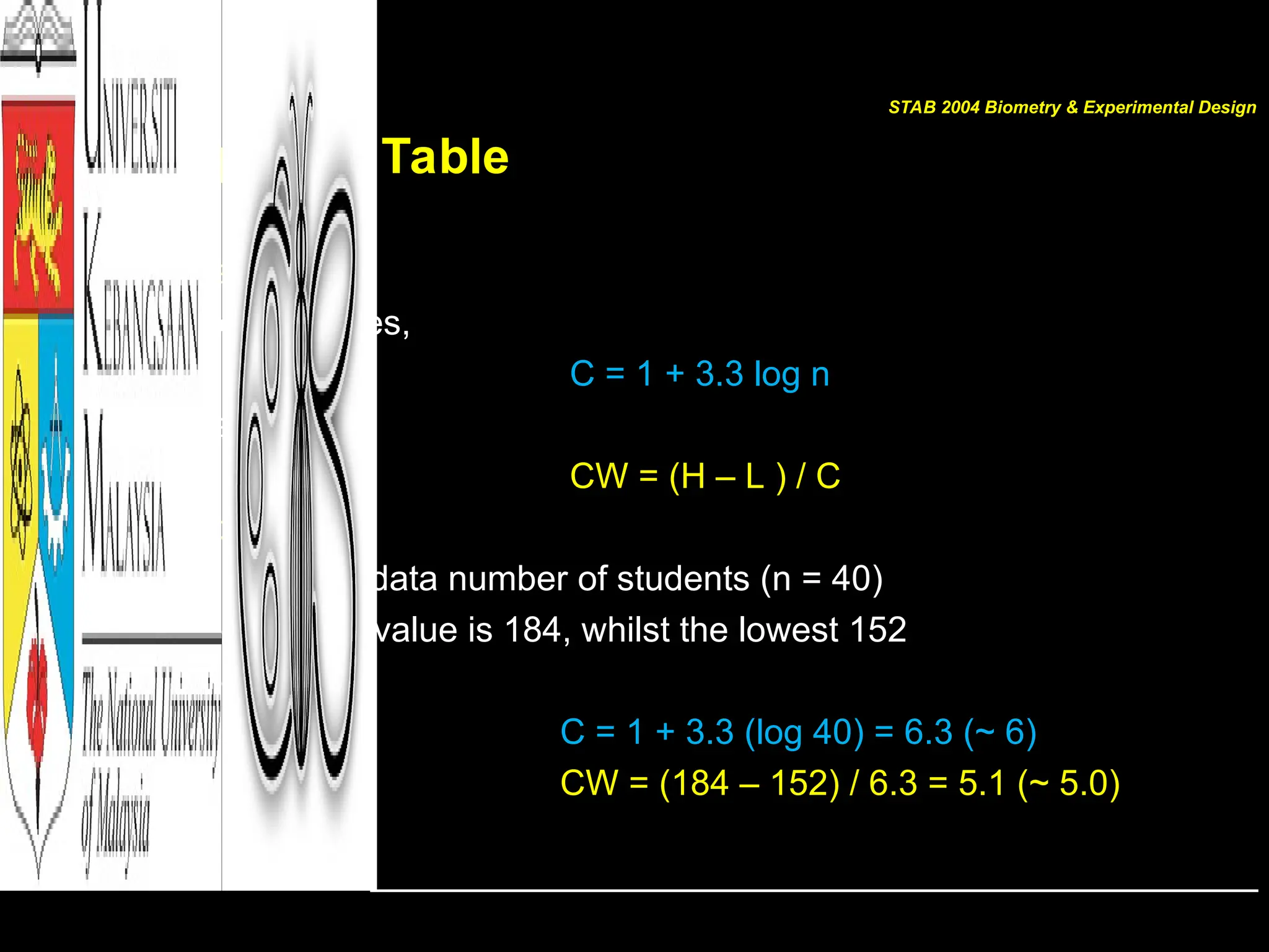
• Estimate
–No. of classes,
C = 1 + 3.3 log n
– Class width
CW = (H – L ) / C
• Example:
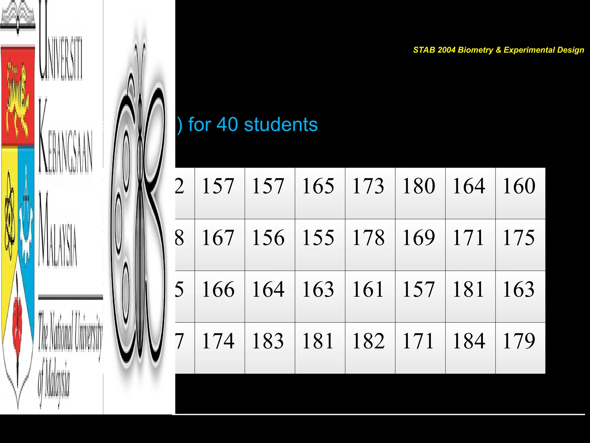
– For our raw data number of students (n = 40)
– The highest value is 184, whilst the lowest 152
– Therefore,
C = 1 + 3.3 (log 40) = 6.3 (~ 6)
CW = (184 – 152) / 6.3 = 5.1 (~ 5.0)
STAB 2004 Biometry & Experimental Design
For Grouped FrequencyDistribution
For the data
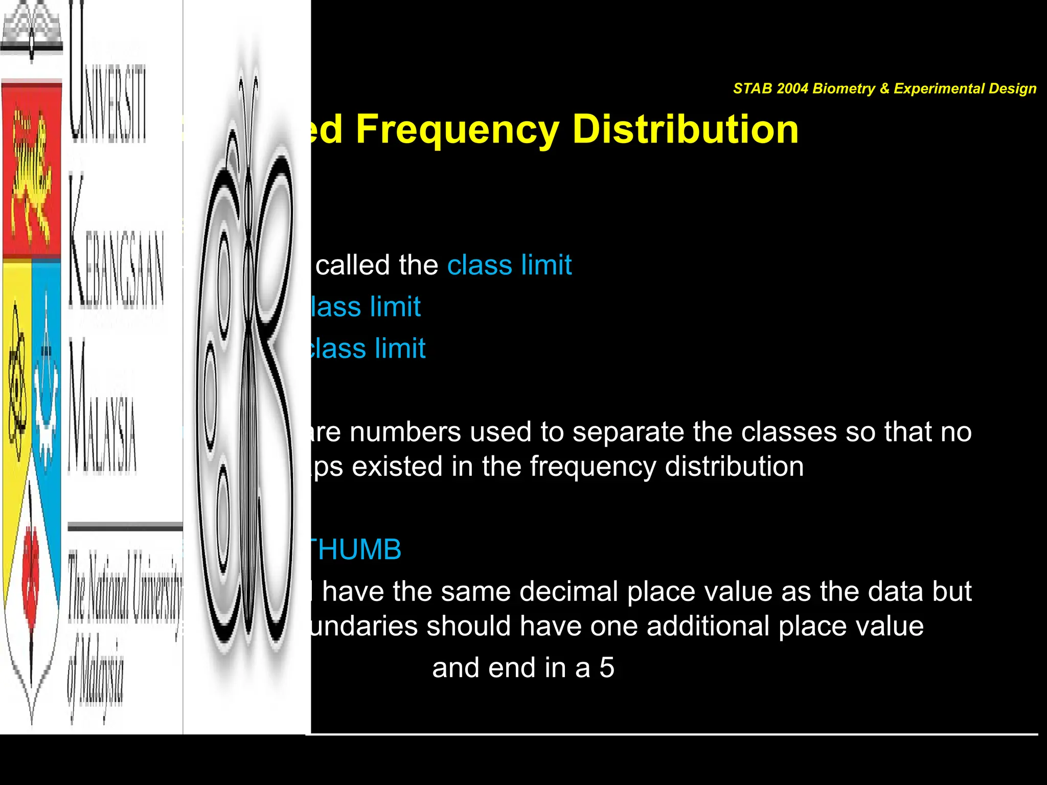
149.5 – 154.5 is called the class limit
149.5 lower class limit
154.5 upper class limit
class boundaries are numbers used to separate the classes so that no
gaps existed in the frequency distribution
THE RULE OF THUMB
Class limits should have the same decimal place value as the data but
the class boundaries should have one additional place value
and end in a 5
STAB 2004 Biometry & Experimental Design
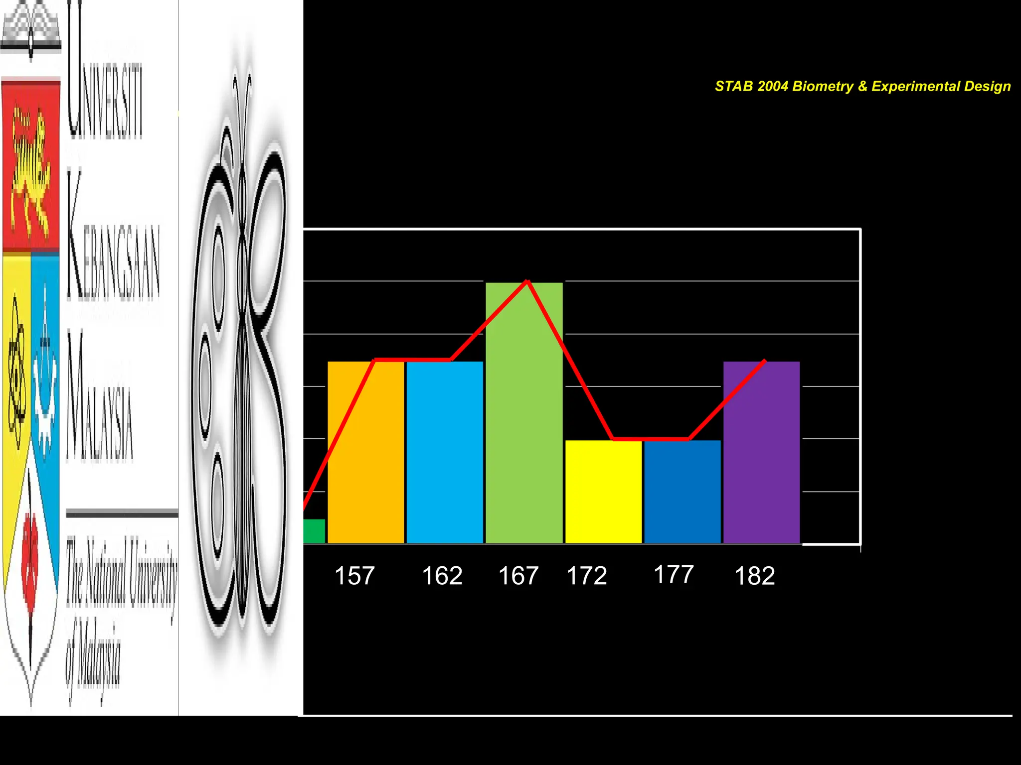
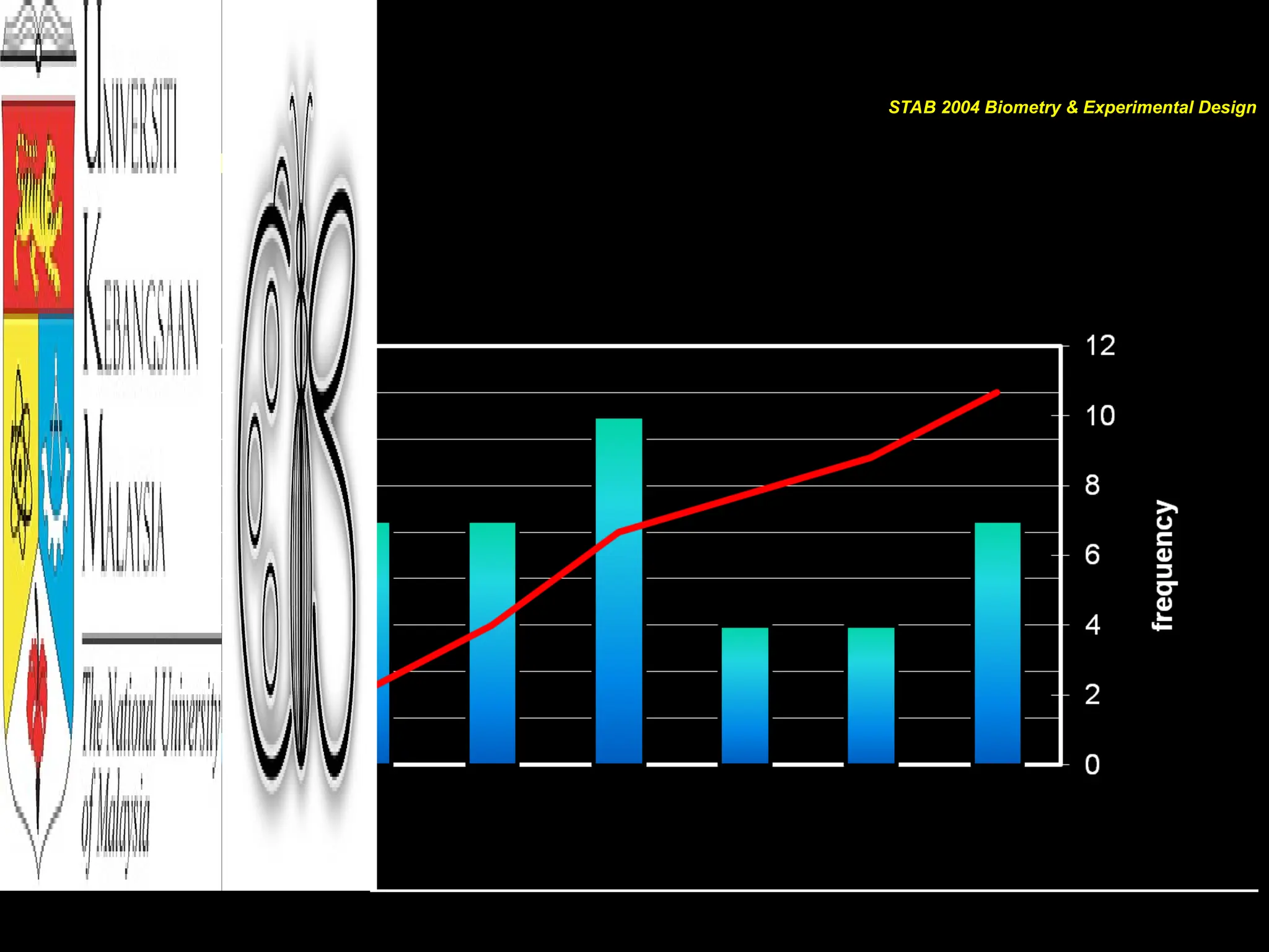
POLYGON
• Join allmiddle values (midpoints) of each bar
• Gives shape of DATA distribution
• If the number of classes are added, class width
gets smaller, therefore smoother line of
polygon will produce a curve
• If the curve is symmetry like a bell-shape, the
data is NORMALLY distributed
STAB 2004 Biometry & Experimental Design
Shapes of DATAdistribution
• Normal/Bell shape
– e.g.: photosynthesis rate in leaves in a day
• Uniform
– e.g.: daily temperature
• Left-skewed
– e.g.: Number of bats captured in a day
• Right-skewed
– e.g.: Number of trees at different size classes
STAB 2004 Biometry & Experimental Design
20.
Shapes of DATAdistribution
• Bimodal
– e.g.: Monthly total rainfall in Malaysia
• Polymodal
– e.g.: Organismal response across environmental gradient
• J-shaped
– e.g.: Plant growth rate
• Reversed J-shaped
– e.g.: Abundance of insect in forest from common to rare species
STAB 2004 Biometry & Experimental Design
Other Graphs: BarGraphs
• Bar Graphs
– Represents data by using vertical or horizontal bars
– The heights or lengths of the bars represent the frequencies of
the data
– Data are qualitative or categorical
STAB 2004 Biometry & Experimental Design
23.
Other Graphs: ParetoCharts
• Pareto Charts
– Represents a frequency distribution for a categorical variable;
– Frequencies are displayed by the heights of vertical bars
arranged in order from highest to lowest
– Variable displayed on the horizontal axis is qualitative or
categorical
– When you analyze a Pareto chart, make comparisons by looking
at the heights of the bar
STAB 2004 Biometry & Experimental Design
24.
Other Graphs: ParetoCharts
• Constructing a Pareto chart
1. Make the bars the same width
2. Arrange the data from largest to smallest according to frequency
3. Make the units that are used for the frequency EQUAL IN SIZE*
STAB 2004 Biometry & Experimental Design
25.
Other Graphs: TimeSeries Graph
• Time Series Graph
– Represents data that occur over a specific period of time
– Often represented by lines instead of bars
– When you analyze a time series graph, look for trend or pattern
that occurs over the time period
– Two data sets can be compared on the same graph called
compound time series graph
STAB 2004 Biometry & Experimental Design
26.
Other Graphs: PieGraph
• Pie Graph
– Is a circle that is divided into sections or wedges according to
the percentage of frequencies in each category
– Since there are 360o
in a circles, the frequency for each class
must be converted into a proportional part of the circle
Degrees = frequency . 360o
sum of frequencies
STAB 2004 Biometry & Experimental Design
27.
Other Graphs: Stemand Leaf Plot
• Stem and Leaf Plot
– Data plot that uses part of the data value as the stem and part of
the data value as the leaf to form groups of classes
– Method of organizing data and is a combination of sorting and
graphing
– Has advantage in retaining the actual data while showing them
in graphical form
STAB 2004 Biometry & Experimental Design
28.
Other Graphs: Stemand Leaf Plot
• Constructing a Stem and Leaf Plot
1. Arrange the data in order
2. Separate the data according to the first digit
3. A display can be made by using the leading digit as the stem
and the trailing digit as the leaf
4. When the data values are in the hundreds the stem cam take
the first two digit
5. Related distribution ca even be compared by using back-to-
back stem and leaf plot
Stem and leaf plots are part of the technique called
exploratory data analysis
STAB 2004 Biometry & Experimental Design
29.
Misleading Graph
• Graphsare visual representation that enables readers to analyze
and interpret easily as compared to looking at numbers
HOWEVER
• Inappropriately drawn graph will lead to false conclusions
• Graph can be misrepresented:
– Truncating scales/axis misinterpretation of large or slight
changes
– Exaggerating one dimensional to two dimension
– Omitting labels or units
– Sources of information are not clear
STAB 2004 Biometry & Experimental Design
30.
Summary
First stepin data presentation is to illustrate the DATA
Use types of frequency distribution to organize DATA
Choose suitable illustrations based on type of DATA
Differentiate between use and misuse of graphs
STAB 2004 Biometry & Experimental Design
![[GOALS]
After completing this chapter, YOU
should be able to:
• Organize DATA using a frequency distribution
• Represent data in frequency distributions graphically using
histograms, frequency polygons and ogives
• Represent data using bar graphs, Pareto charts, time series
graphs, and pie chart
• Draw and interpret a stem and leaf plot
STAB 2004 Biometry & Experimental Design](https://image.slidesharecdn.com/notesstab2004chapter2-250323155913-f950d690/75/Chapter-2-Frequency-Distribution-Illustrations-Graphs-3-2048.jpg)