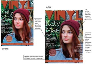
1. The
general
quality of
the photo
has been
enhanced.
The article
titles have
been
spaced out
to prevent
confusion.
Changed the colour and position
of the puff to make it stand out.
I moved the
location of
this
competition
to draw
more
attention to
the right
hand side of
the page
where it
was looking
a bit bare.
Before
After
2. I rearranged
the order of
these photos,
so that they
went in
ascending
order.
I
reduced
the size
of this
line so
that it
every
line was
even.
I signed the editor’s
message with a hand-
written font to make it
look more personal.
Before
After
3. Before
After
I made sure that this
was central, so that
it looked even and
accurate.
I inserted this quote
from the interview
to fill up this bare
space.
I also added an anchor to
this photo, to make it clear
if you were just flicking
through the magazine what
interview was on this page.