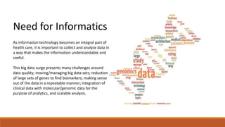
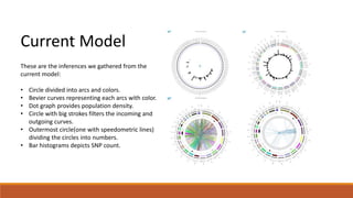
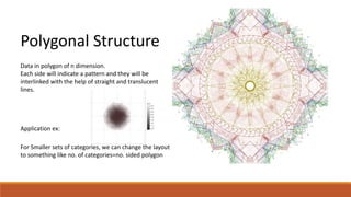
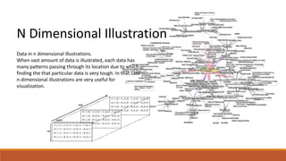
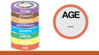
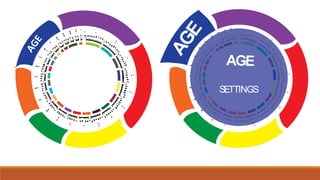
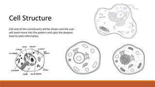
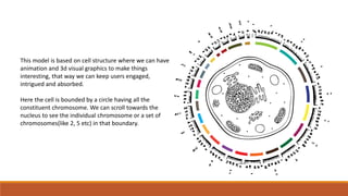
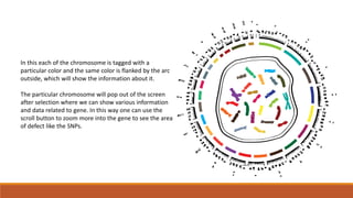
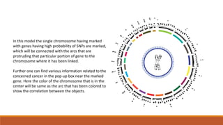
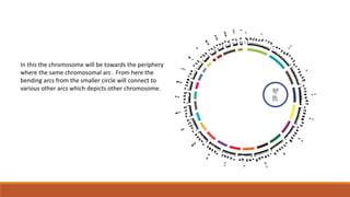
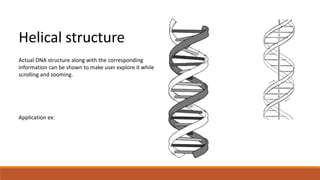
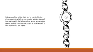
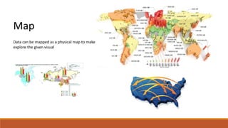
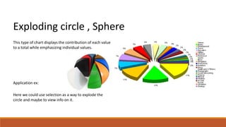
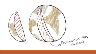
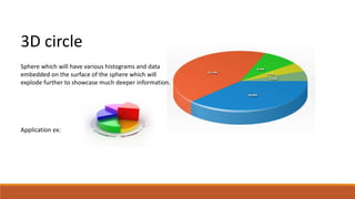
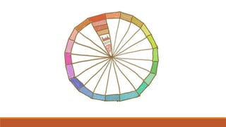
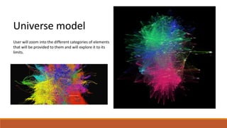
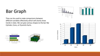
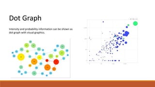
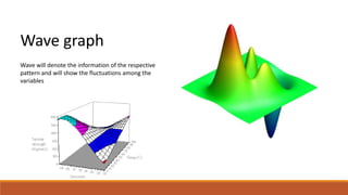
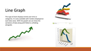
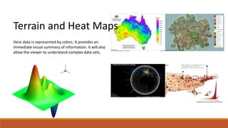
Visual Analytics: An exploration 
Presentation on Ideation of cancer informatics representation 
By – Rupam and linu
Big Data 
It is used to describe a massive 
volume of both structured and 
unstructured data that is so large that 
it's difficult to process using 
traditional database and software 
techniques.
Big Data Analytics 
Big data analytics refers to the process of collecting, 
organizing and analyzing large sets of data to discover 
patterns and other useful information. Enterprises are 
increasingly looking to find actionable insights into their 
data. 
Many big data projects originate from the need to 
answer specific business questions. With the right big 
data analytics platforms in place, an enterprise can boost 
sales, increase efficiency, and improve operations, 
customer service and risk management.
Need for Informatics 
As information technology becomes an integral part of 
health care, it is important to collect and analyze data in 
a way that makes the information understandable and 
useful. 
This big data surge presents many challenges around 
data quality; moving/managing big data sets; reduction 
of large sets of genes to find biomarkers; making sense 
out of the data in a repeatable manner; integration of 
clinical data with molecular/genomic data for the 
purpose of analytics, and scalable analysis.
Current Model 
These are the inferences we gathered from the 
current model: 
• Circle divided into arcs and colors. 
• Bevier curves representing each arcs with color. 
• Dot graph provides population density. 
• Circle with big strokes filters the incoming and 
outgoing curves. 
• Outermost circle(one with speedometric lines) 
dividing the circles into numbers. 
• Bar histograms depicts SNP count.
What more can be done? 
Why not show data relevant to the task at hand? 
Why can’t the data be presented more realistically rather than in abstract format? 
Why shouldn’t the screen layout change rather than keeping it in static circular format (layover, clouds, threads, n 
dimension axis)? 
Why not make it easier for even non researchers, practitioners, doctors and patients to understand? 
Can we make the interaction more intuitive and natural? 
Why not consider touch as mode of interaction ? 
Can we build in ways to filter out specific chromosomes, DNA’s, and base pairs and remove rest of data? 
Can we help convert data to information? Possible to add semantics to the relationships of base pairs? 
Why not enable multimodal search (text, nos., zoom, click etc.) within the data for expert users? 
Facilitate tools to dig data ? 
Navigation and Walkthroughs?
Day dreaming about the setup? 
• Dimensionality of the data: 
• Chromosomal data = 12-15 dimensions 
• Patient data = 5-10 dimensions 
• Researchers data = 5-10 dimensions 
• Diagnostic data = 4-10 dimensions 
We are dealing with 30-50 dimensions of each data node (base pairs) to be presented to a user. 
There has to be facility to search for correlations within 50 dimensions ! 
What’s the way? Human can at best see.. 3 dimensions… OK lets add sound and movement .. 5 dimensions! 
How do we do that? Visualization beyond 3D is not possible.. We will have to be selective in displays at a time.
Data Visualization Patterns and Examples
Polygonal Structure 
Data in polygon of n dimension. 
Each side will indicate a pattern and they will be 
interlinked with the help of straight and translucent 
lines. 
Application ex: 
For Smaller sets of categories, we can change the layout 
to something like no. of categories=no. sided polygon
N Dimensional Illustration 
Data in n dimensional illustrations. 
When vast amount of data is illustrated, each data has 
many patterns passing through its location due to which 
finding the that particular data is very tough. In that case 
n-dimensional illustrations are very useful for 
visualization.
FILTERS AGE 
ETHNICITY 
GENOLOGY 
NATIONALITY 
PATIENTS 
DISEASE 
GENDER 
AGE 
SETTINGS
AGE 
AGE 
SETTINGS
Cell Structure 
Cell and all the constituents will be shown and the user 
will zoom more into the pattern and upto the deepest 
level to seek information.
This model is based on cell structure where we can have 
animation and 3d visual graphics to make things 
interesting, that way we can keep users engaged, 
intrigued and absorbed. 
Here the cell is bounded by a circle having all the 
constituent chromosome. We can scroll towards the 
nucleus to see the individual chromosome or a set of 
chromosomes(like 2, 5 etc) in that boundary.
In this each of the chromosome is tagged with a 
particular color and the same color is flanked by the arc 
outside, which will show the information about it. 
The particular chromosome will pop out of the screen 
after selection where we can show various information 
and data related to gene. In this way one can use the 
scroll button to zoom more into the gene to see the area 
of defect like the SNPs.
In this model the single chromosome having marked 
with genes having high probability of SNPs are marked, 
which will be connected with the arcs that are 
protruding that particular portion of gene to the 
chromosome where it has been linked. 
Further one can find various information related to the 
concerned cancer in the pop-up box near the marked 
gene. Here the color of the chromosome that is in the 
center will be same as the arc that has been colored to 
show the correlation between the objects.
In this the chromosome will be towards the periphery 
where the same chromosomal arc . From here the 
bending arcs from the smaller circle will connect to 
various other arcs which depicts other chromosome.
Helical structure 
Actual DNA structure along with the corresponding 
information can be shown to make user explore it while 
scrolling and zooming. 
Application ex:
In this model the whole circle can be inserted in the 
chromosome in which we can provide with the levels of 
information with the help scrolling, where we can zoom 
deeper into the chromosome as well as move along it to 
find high density SNP region.
Map 
Data can be mapped as a physical map to make user 
explore the given visual
Exploding circle , Sphere 
This type of chart displays the contribution of each value 
to a total while emphasizing individual values. 
Application ex: 
Here we could use selection as a way to explode the 
circle and maybe to view info on it.
3D circle 
Sphere which will have various histograms and data 
embedded on the surface of the sphere which will 
explode further to showcase much deeper information. 
Application ex:
Universe model 
User will zoom into the different categories of elements 
that will be provided to them and will explore it to its 
limits.
Bar Graph 
They can be used to make comparisons between 
different variables effectively which will clearly show 
trends in data. We can give various shapes to the bar like 
Cylinder, Cone, or Pyramid charts.
Dot Graph 
Intensity and probability information can be shown as 
dot graph with visual graphics.
Wave graph 
Wave will denote the information of the respective 
pattern and will show the fluctuations among the 
variables
Line Graph 
This type of chart displays trends over time or 
categories. It is also available with markers displayed at 
each data value. With line graphs we can show the 
variations of data along with Patterns unfolding 
alongside.
Terrain and Heat Maps 
Here data is represented by colors. It provides an 
immediate visual summary of information. It will also 
allow the viewer to understand complex data sets.
And Many Many More…….

Cancer genomics first look

  • 1.
    Visual Analytics: Anexploration Presentation on Ideation of cancer informatics representation By – Rupam and linu
  • 2.
    Big Data Itis used to describe a massive volume of both structured and unstructured data that is so large that it's difficult to process using traditional database and software techniques.
  • 3.
    Big Data Analytics Big data analytics refers to the process of collecting, organizing and analyzing large sets of data to discover patterns and other useful information. Enterprises are increasingly looking to find actionable insights into their data. Many big data projects originate from the need to answer specific business questions. With the right big data analytics platforms in place, an enterprise can boost sales, increase efficiency, and improve operations, customer service and risk management.
  • 4.
    Need for Informatics As information technology becomes an integral part of health care, it is important to collect and analyze data in a way that makes the information understandable and useful. This big data surge presents many challenges around data quality; moving/managing big data sets; reduction of large sets of genes to find biomarkers; making sense out of the data in a repeatable manner; integration of clinical data with molecular/genomic data for the purpose of analytics, and scalable analysis.
  • 5.
    Current Model Theseare the inferences we gathered from the current model: • Circle divided into arcs and colors. • Bevier curves representing each arcs with color. • Dot graph provides population density. • Circle with big strokes filters the incoming and outgoing curves. • Outermost circle(one with speedometric lines) dividing the circles into numbers. • Bar histograms depicts SNP count.
  • 6.
    What more canbe done? Why not show data relevant to the task at hand? Why can’t the data be presented more realistically rather than in abstract format? Why shouldn’t the screen layout change rather than keeping it in static circular format (layover, clouds, threads, n dimension axis)? Why not make it easier for even non researchers, practitioners, doctors and patients to understand? Can we make the interaction more intuitive and natural? Why not consider touch as mode of interaction ? Can we build in ways to filter out specific chromosomes, DNA’s, and base pairs and remove rest of data? Can we help convert data to information? Possible to add semantics to the relationships of base pairs? Why not enable multimodal search (text, nos., zoom, click etc.) within the data for expert users? Facilitate tools to dig data ? Navigation and Walkthroughs?
  • 7.
    Day dreaming aboutthe setup? • Dimensionality of the data: • Chromosomal data = 12-15 dimensions • Patient data = 5-10 dimensions • Researchers data = 5-10 dimensions • Diagnostic data = 4-10 dimensions We are dealing with 30-50 dimensions of each data node (base pairs) to be presented to a user. There has to be facility to search for correlations within 50 dimensions ! What’s the way? Human can at best see.. 3 dimensions… OK lets add sound and movement .. 5 dimensions! How do we do that? Visualization beyond 3D is not possible.. We will have to be selective in displays at a time.
  • 9.
  • 10.
    Polygonal Structure Datain polygon of n dimension. Each side will indicate a pattern and they will be interlinked with the help of straight and translucent lines. Application ex: For Smaller sets of categories, we can change the layout to something like no. of categories=no. sided polygon
  • 12.
    N Dimensional Illustration Data in n dimensional illustrations. When vast amount of data is illustrated, each data has many patterns passing through its location due to which finding the that particular data is very tough. In that case n-dimensional illustrations are very useful for visualization.
  • 13.
    FILTERS AGE ETHNICITY GENOLOGY NATIONALITY PATIENTS DISEASE GENDER AGE SETTINGS
  • 14.
  • 15.
    Cell Structure Celland all the constituents will be shown and the user will zoom more into the pattern and upto the deepest level to seek information.
  • 16.
    This model isbased on cell structure where we can have animation and 3d visual graphics to make things interesting, that way we can keep users engaged, intrigued and absorbed. Here the cell is bounded by a circle having all the constituent chromosome. We can scroll towards the nucleus to see the individual chromosome or a set of chromosomes(like 2, 5 etc) in that boundary.
  • 17.
    In this eachof the chromosome is tagged with a particular color and the same color is flanked by the arc outside, which will show the information about it. The particular chromosome will pop out of the screen after selection where we can show various information and data related to gene. In this way one can use the scroll button to zoom more into the gene to see the area of defect like the SNPs.
  • 18.
    In this modelthe single chromosome having marked with genes having high probability of SNPs are marked, which will be connected with the arcs that are protruding that particular portion of gene to the chromosome where it has been linked. Further one can find various information related to the concerned cancer in the pop-up box near the marked gene. Here the color of the chromosome that is in the center will be same as the arc that has been colored to show the correlation between the objects.
  • 19.
    In this thechromosome will be towards the periphery where the same chromosomal arc . From here the bending arcs from the smaller circle will connect to various other arcs which depicts other chromosome.
  • 20.
    Helical structure ActualDNA structure along with the corresponding information can be shown to make user explore it while scrolling and zooming. Application ex:
  • 21.
    In this modelthe whole circle can be inserted in the chromosome in which we can provide with the levels of information with the help scrolling, where we can zoom deeper into the chromosome as well as move along it to find high density SNP region.
  • 22.
    Map Data canbe mapped as a physical map to make user explore the given visual
  • 24.
    Exploding circle ,Sphere This type of chart displays the contribution of each value to a total while emphasizing individual values. Application ex: Here we could use selection as a way to explode the circle and maybe to view info on it.
  • 26.
    3D circle Spherewhich will have various histograms and data embedded on the surface of the sphere which will explode further to showcase much deeper information. Application ex:
  • 28.
    Universe model Userwill zoom into the different categories of elements that will be provided to them and will explore it to its limits.
  • 30.
    Bar Graph Theycan be used to make comparisons between different variables effectively which will clearly show trends in data. We can give various shapes to the bar like Cylinder, Cone, or Pyramid charts.
  • 31.
    Dot Graph Intensityand probability information can be shown as dot graph with visual graphics.
  • 32.
    Wave graph Wavewill denote the information of the respective pattern and will show the fluctuations among the variables
  • 33.
    Line Graph Thistype of chart displays trends over time or categories. It is also available with markers displayed at each data value. With line graphs we can show the variations of data along with Patterns unfolding alongside.
  • 34.
    Terrain and HeatMaps Here data is represented by colors. It provides an immediate visual summary of information. It will also allow the viewer to understand complex data sets.
  • 35.
    And Many ManyMore…….