Download to read offline

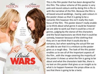
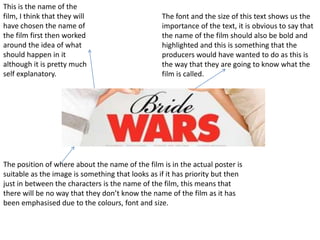

This document analyzes a film poster that depicts two characters in wedding dresses with their hands on their hips. The pale color scheme suggests a romantic genre, though the characters' poses imply potential comedy or conflict. While no text reveals the plot, props in the characters' hands hint at a twist after the wedding. The symmetrical shot and matching heights show the characters as equals with authority at weddings. The film's name is prominently displayed between the characters to ensure viewers know its title.


