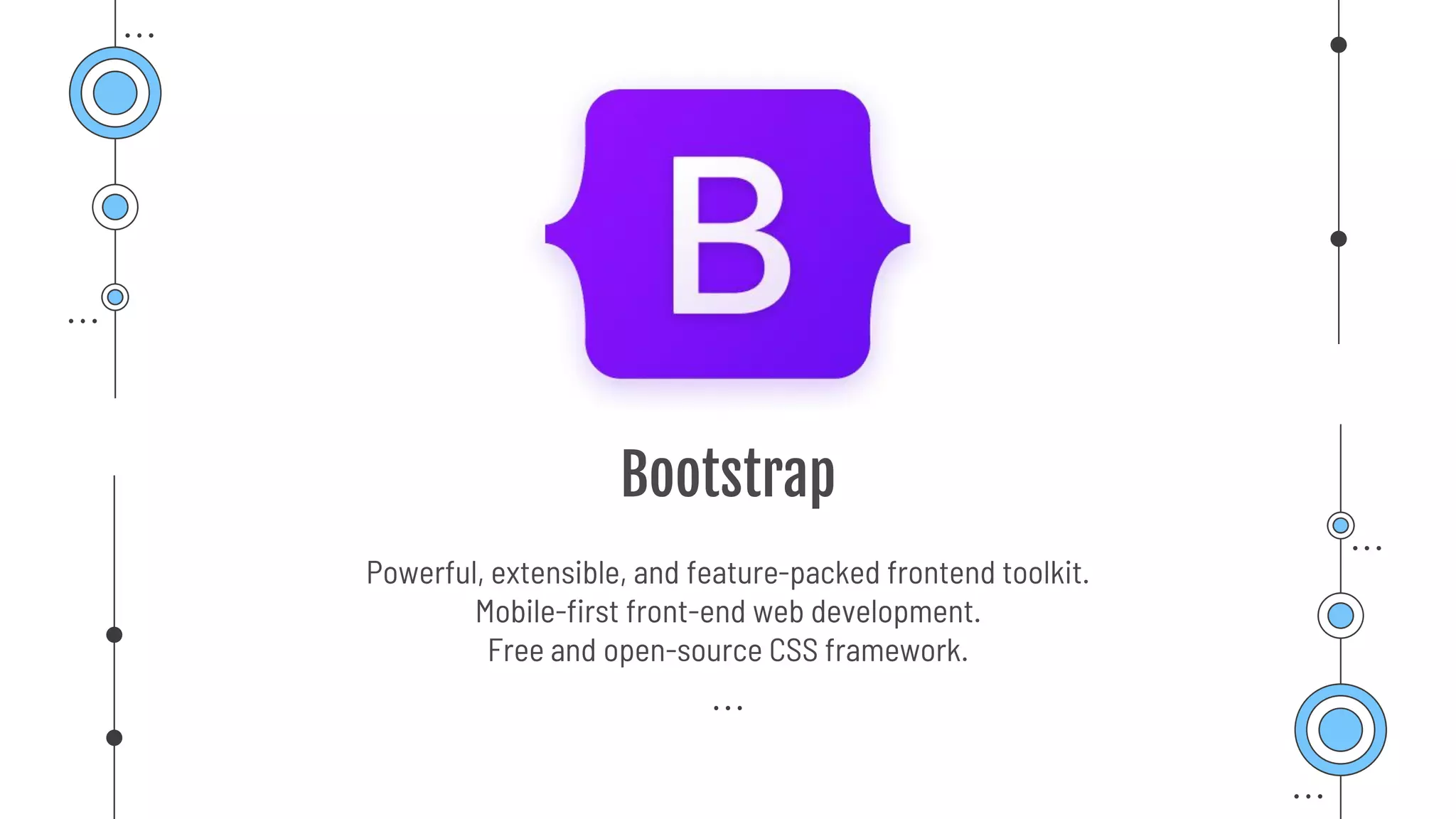
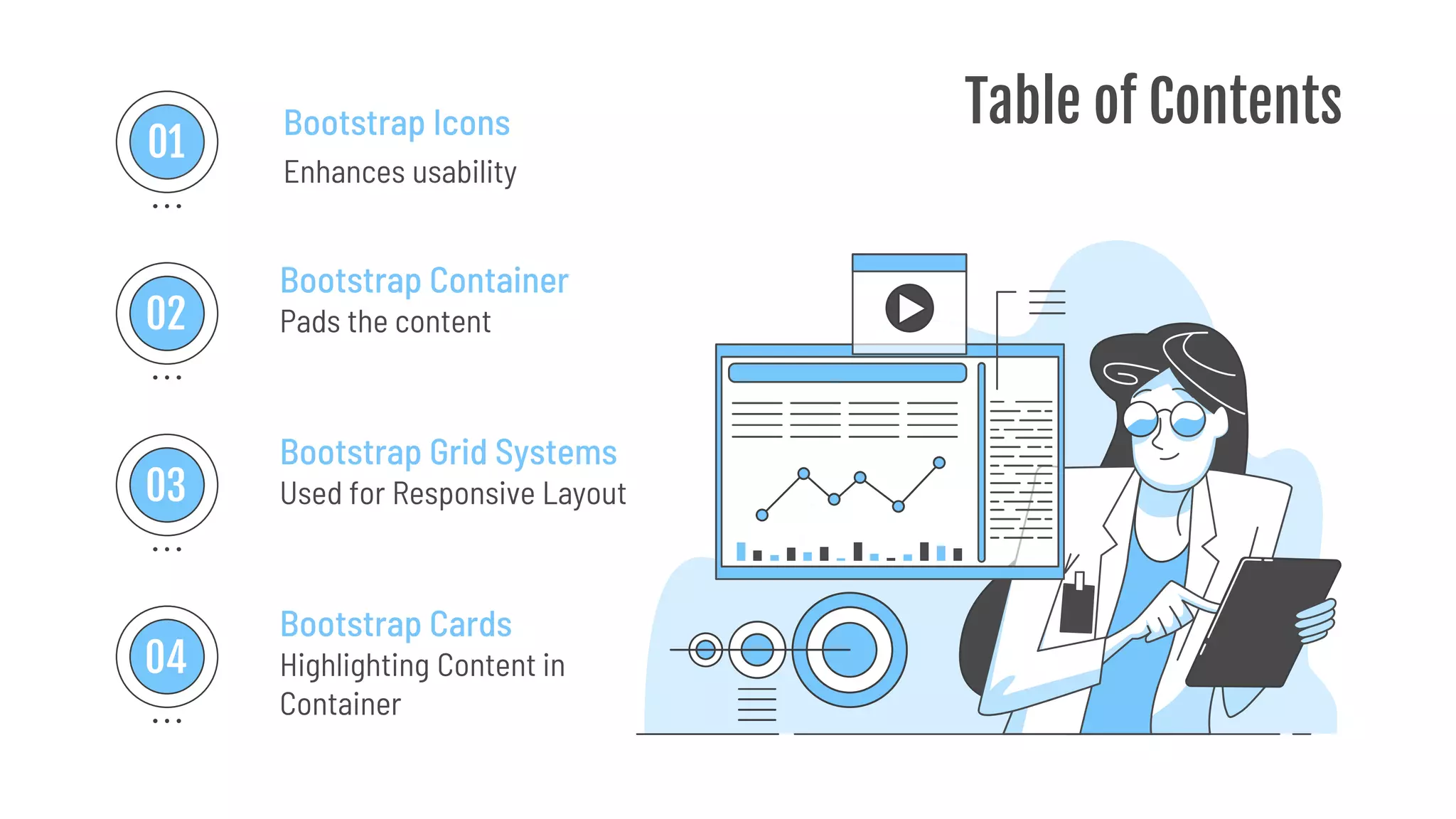
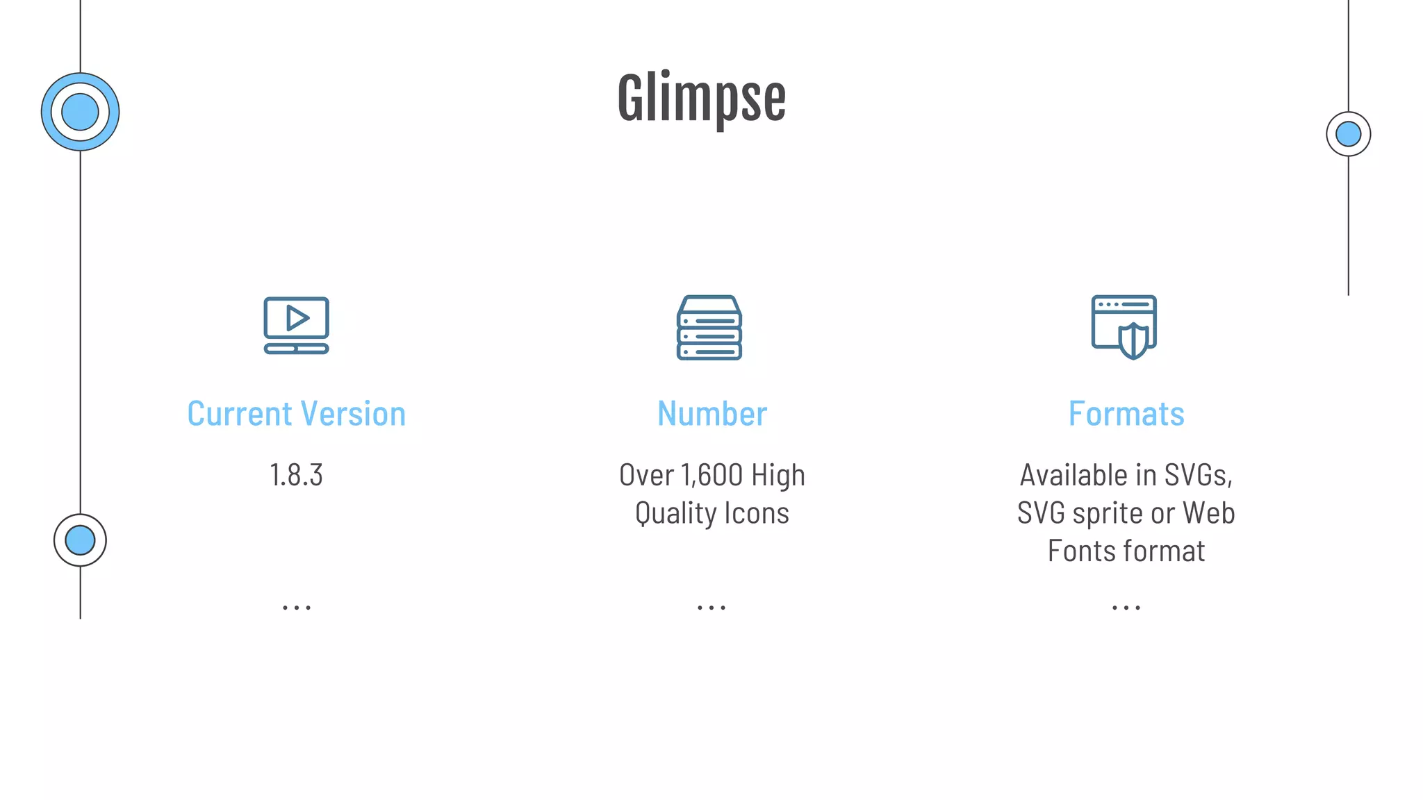
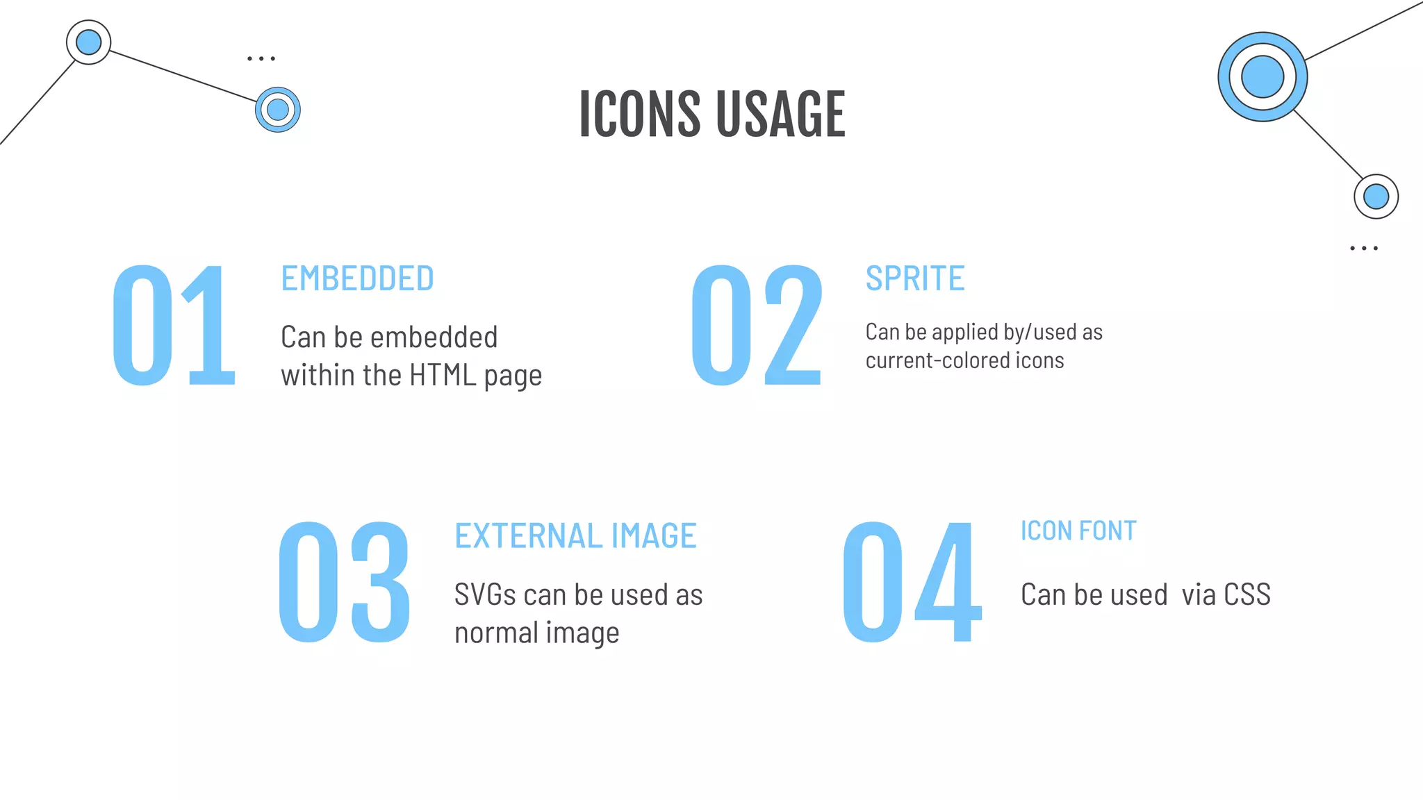
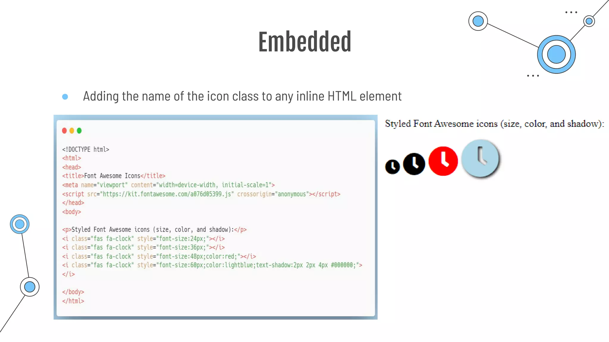
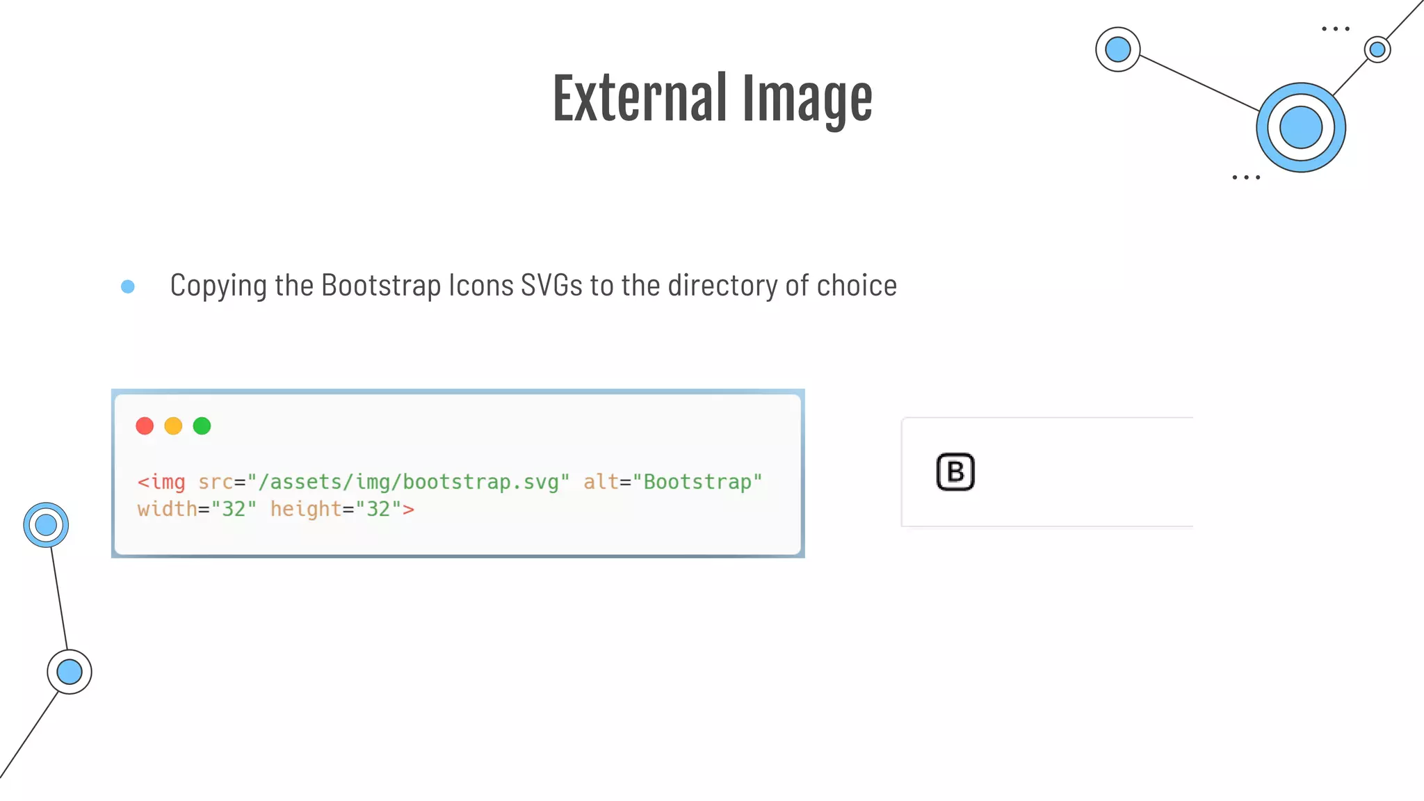
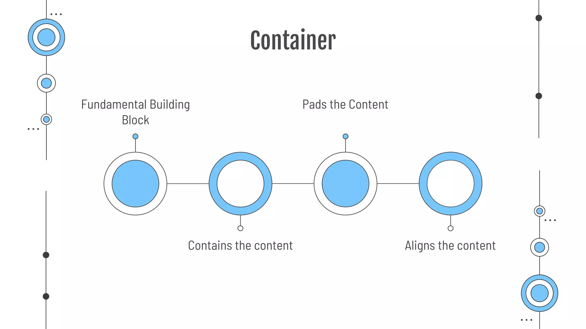
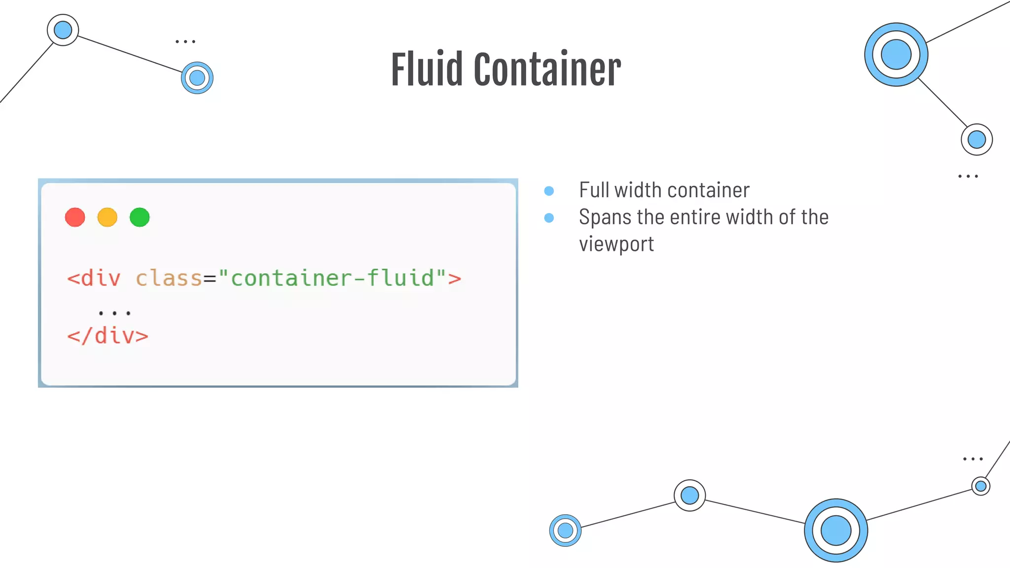
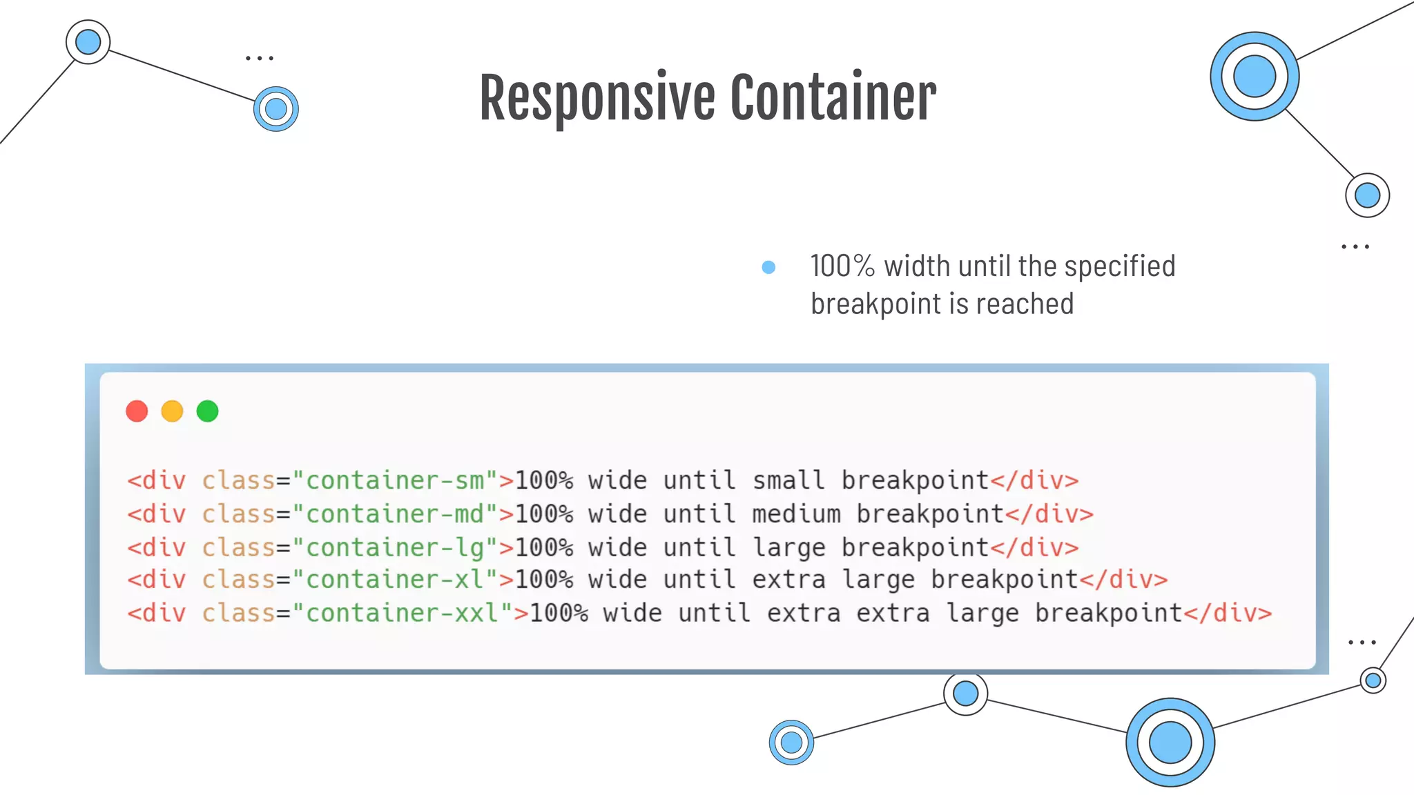
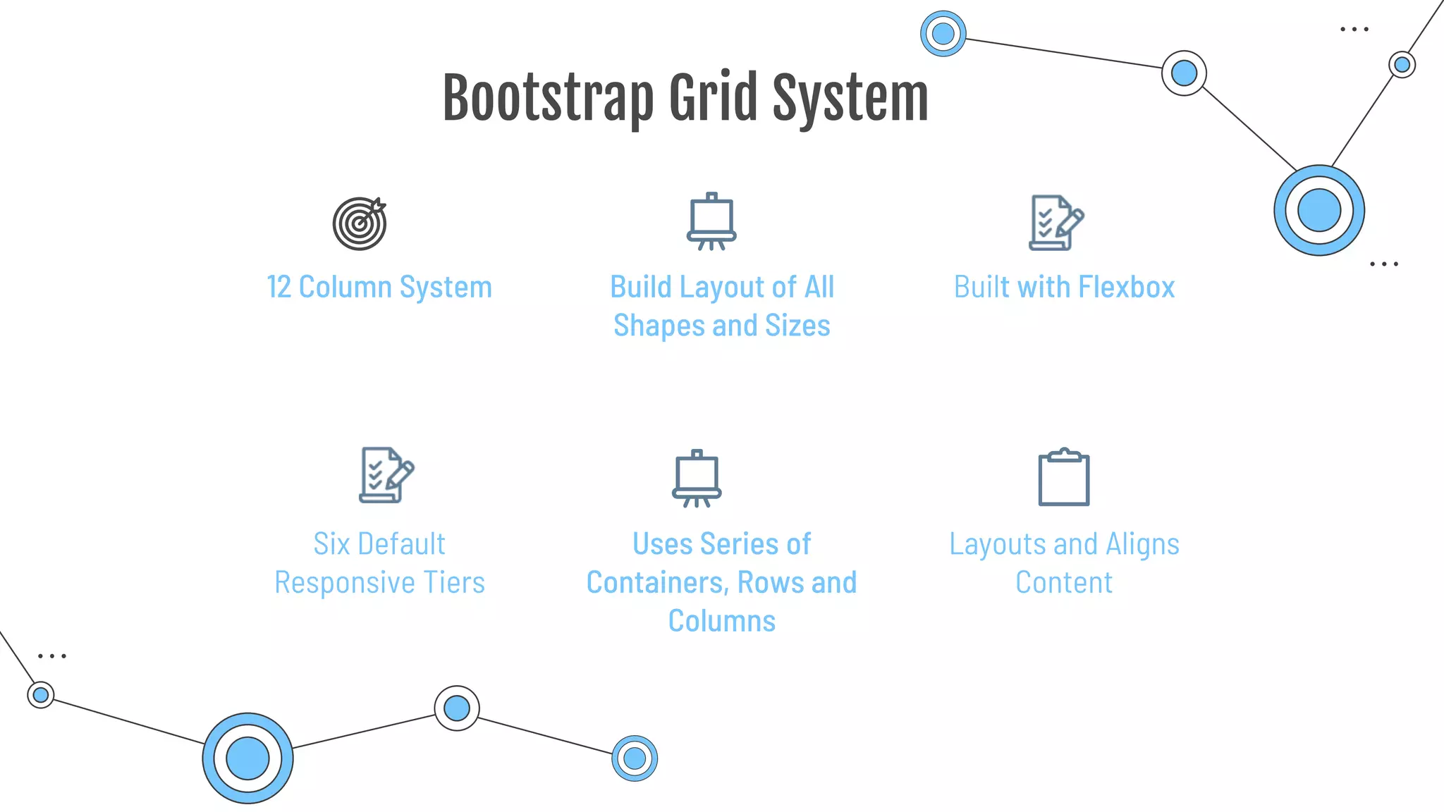
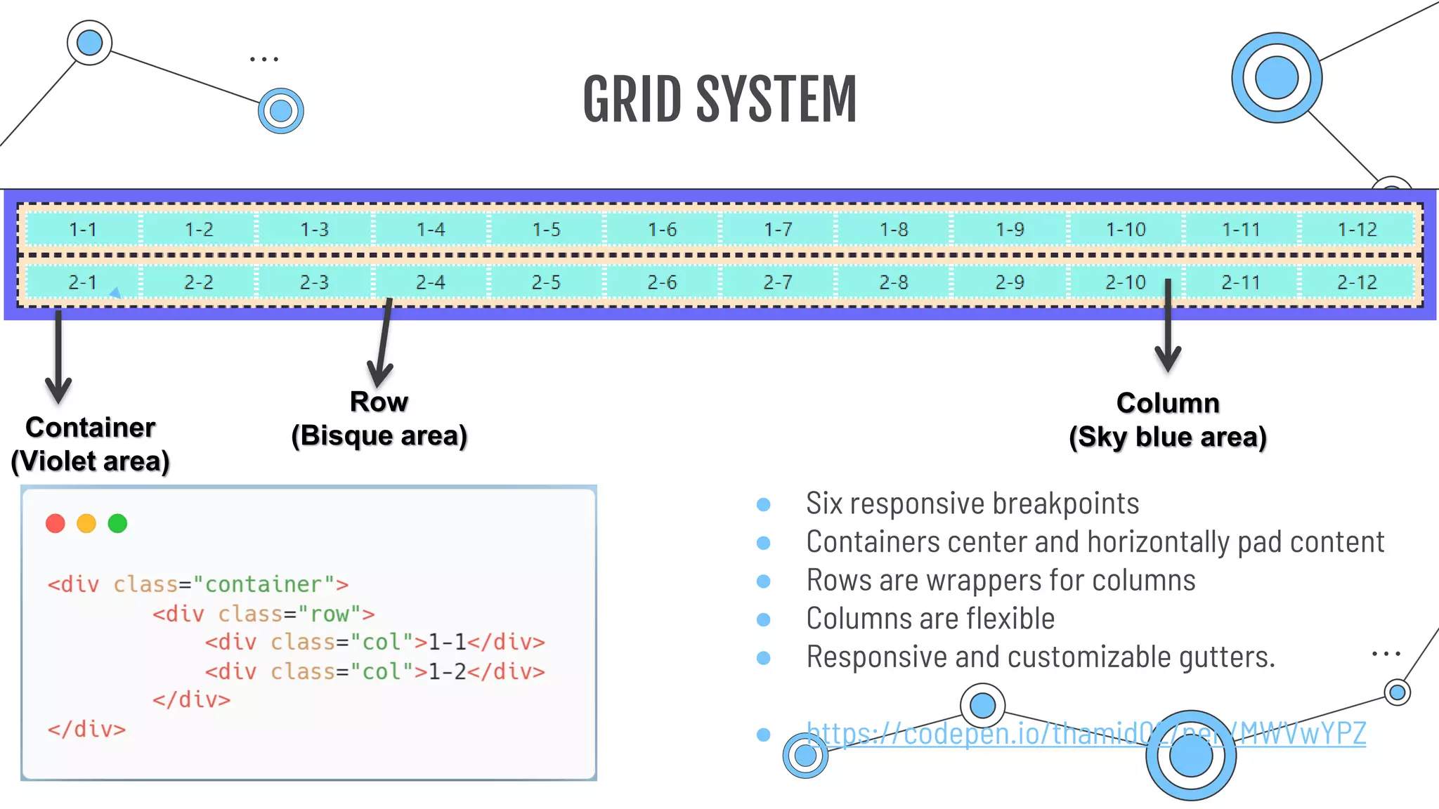
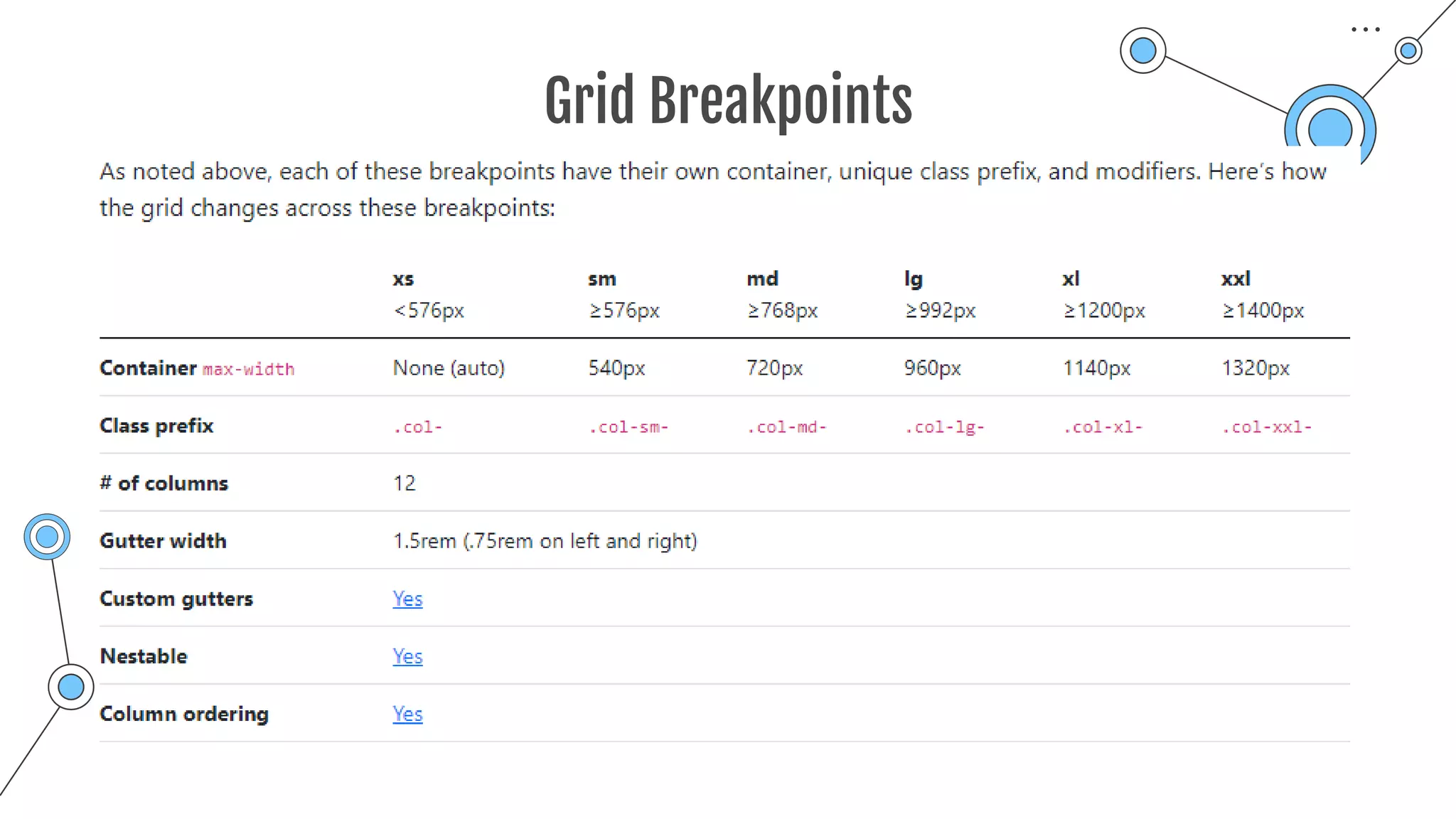
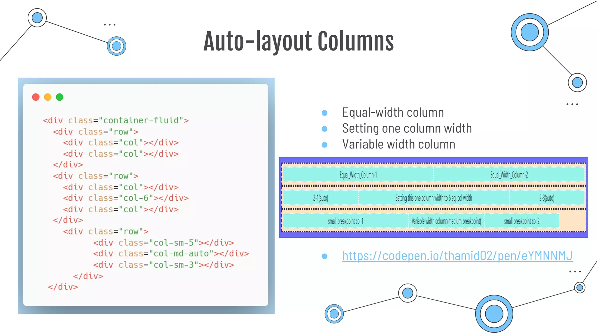
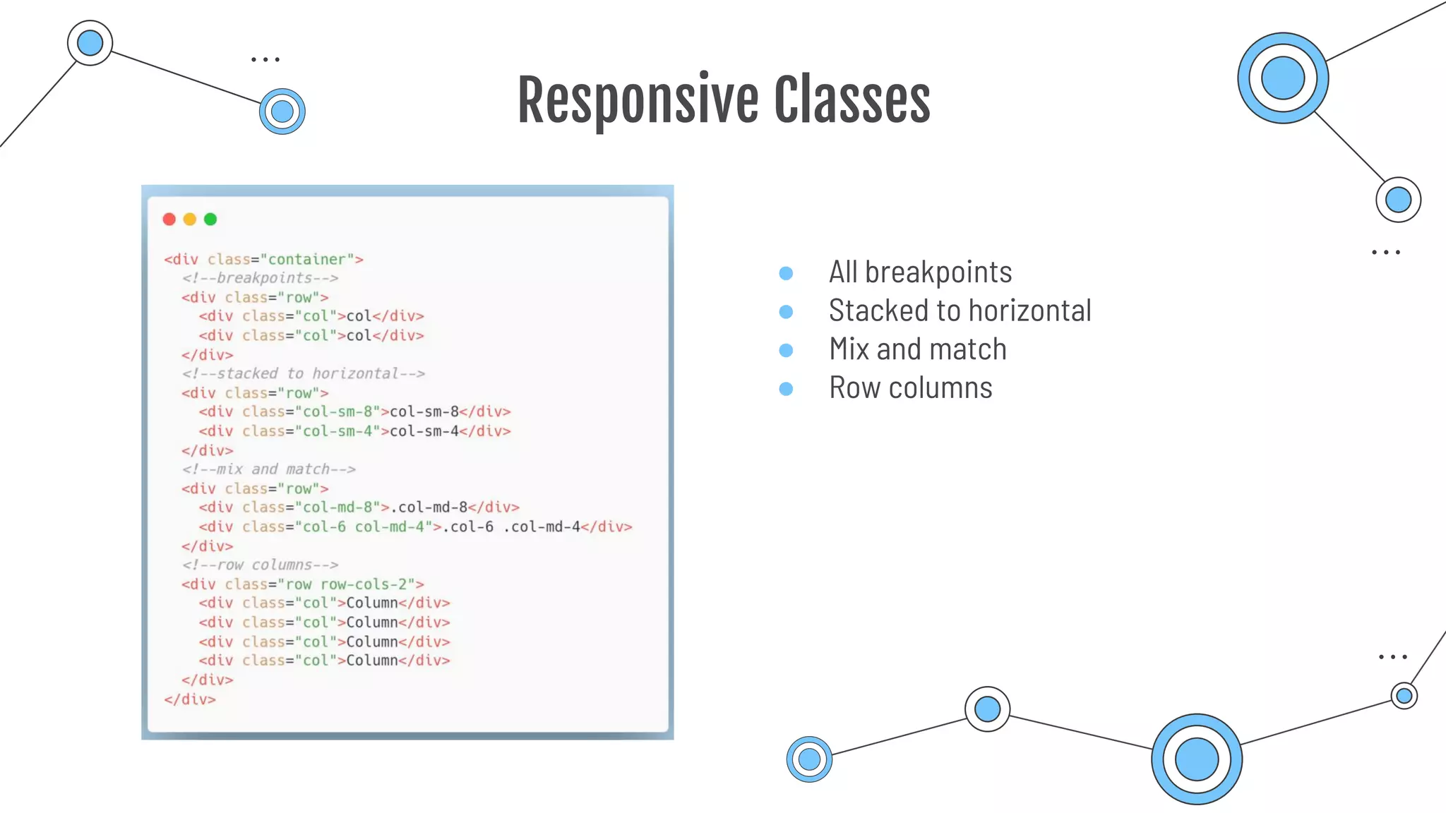
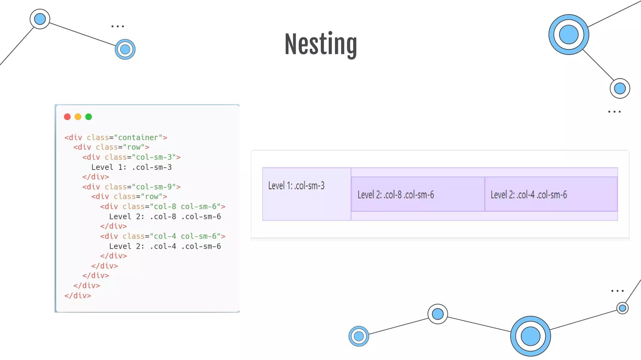
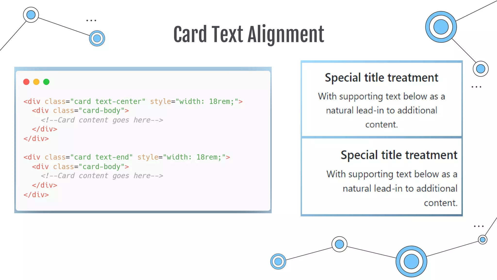
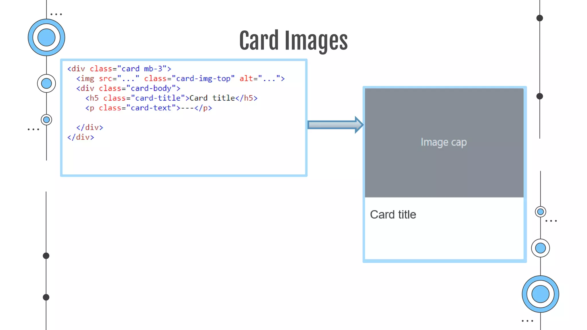
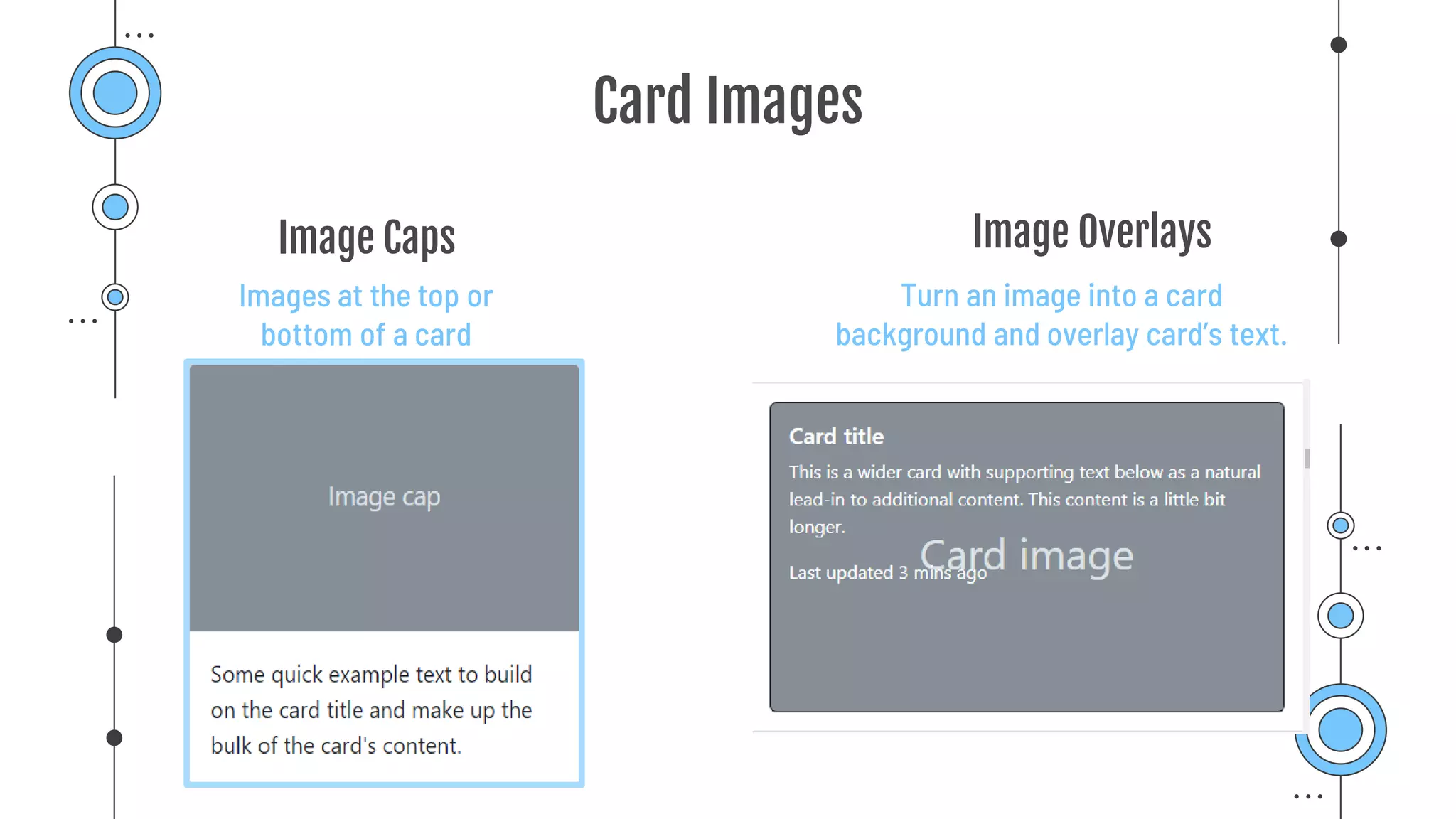
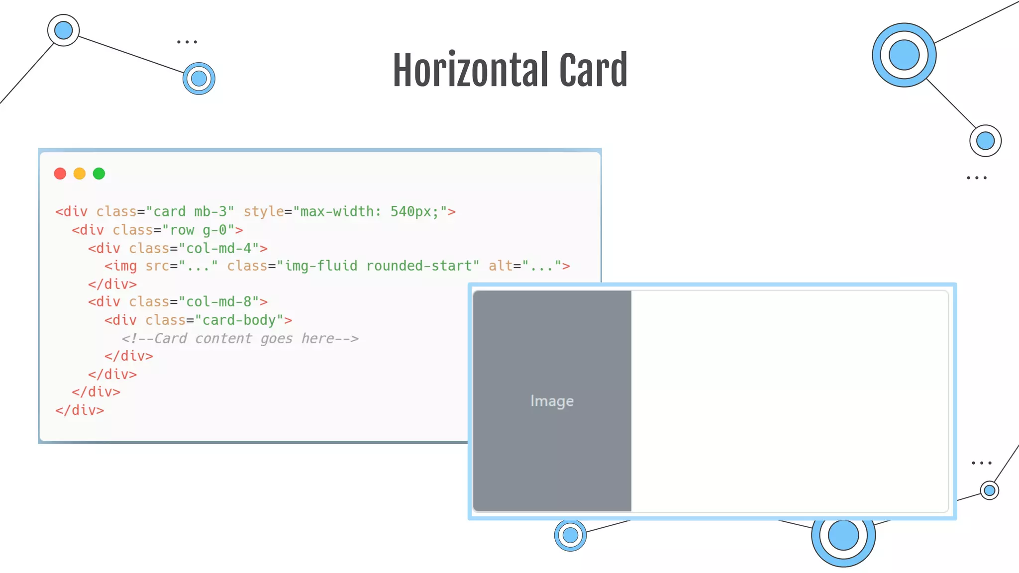
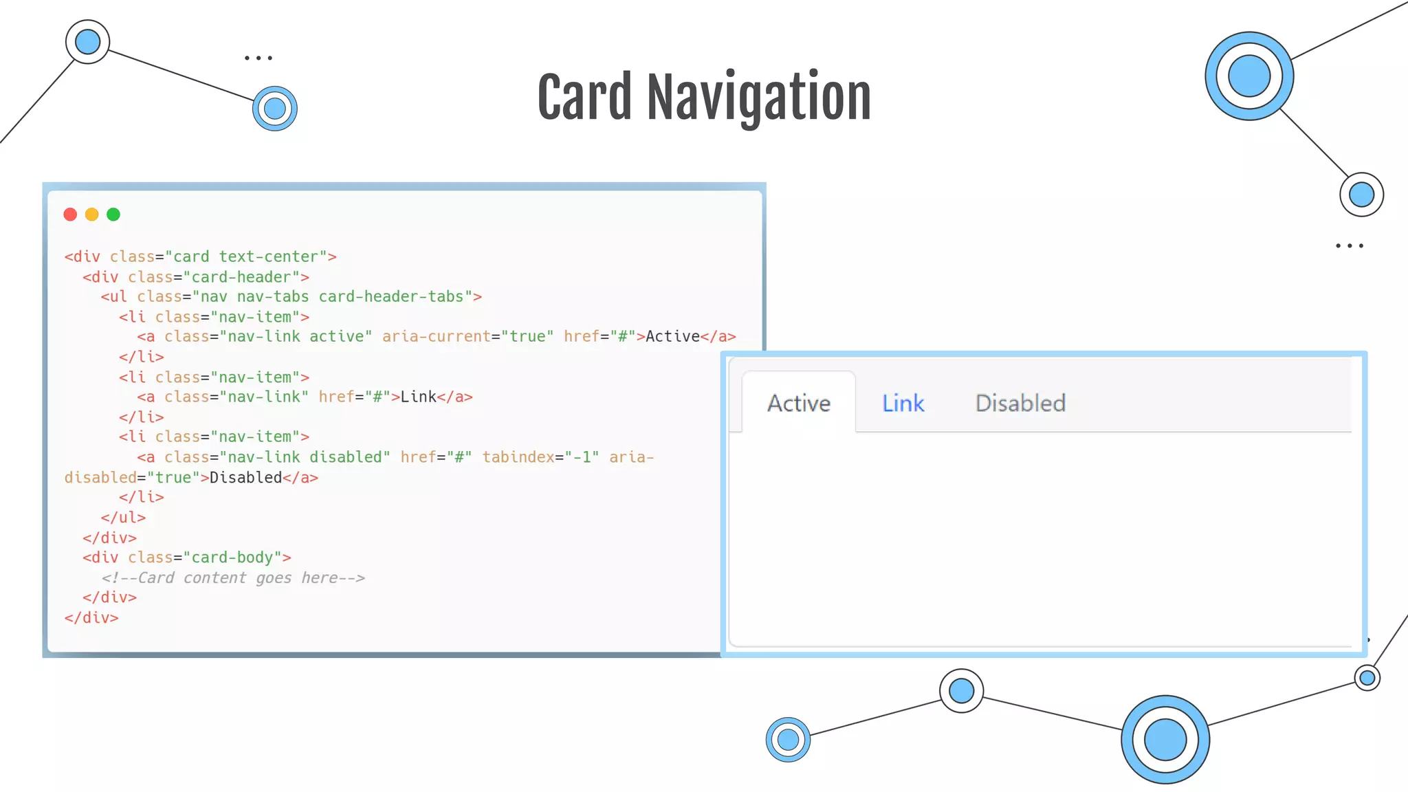
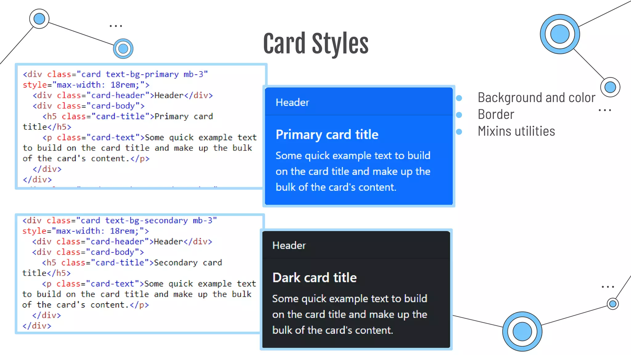
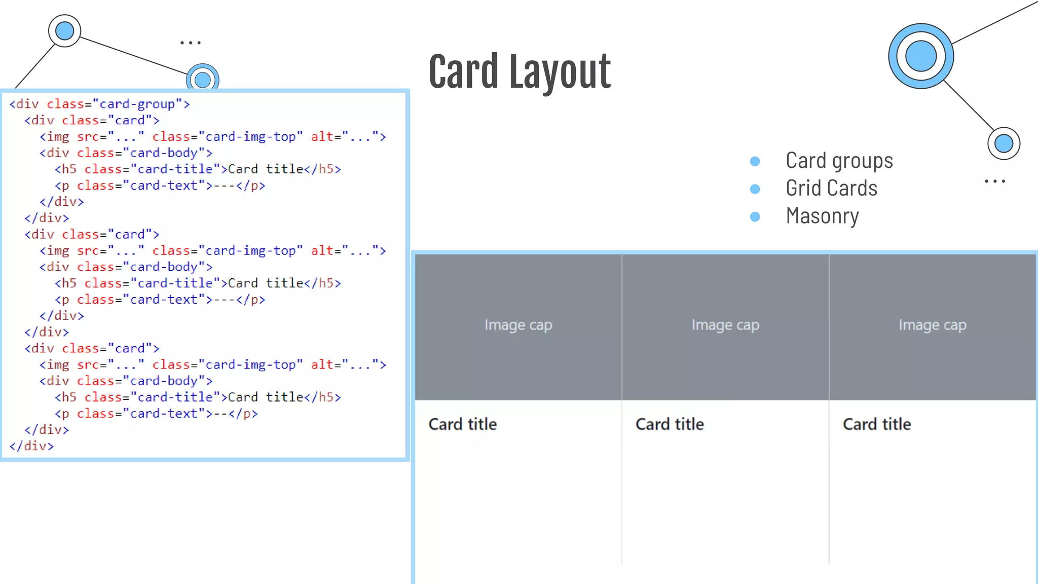
Presentation
on
Bootstrap
Things aren’t always #000000 and #FFFFFF
Tasnima Hamid
Presented By
ID: 1901043, Internet of Things Program, Department of ICT
Bangabandhu Sheikh Mujibur Rahman Digital University, Bangladesh
Bootstrap
Powerful, extensible, and feature-packed frontend toolkit.
Mobile-first front-end web development.
Free and open-source CSS framework.
Table of Contents
Enhances usability
Bootstrap Icons
Bootstrap Container
Pads the content
Bootstrap Grid Systems
Used for Responsive Layout
Bootstrap Cards
Highlighting Content in
Container
01
02
03
04
Bootstrap Icons
01
Glimpse
Number
Current Version Formats
Over 1,600 High
Quality Icons
1.8.3 Available in SVGs,
SVG sprite or Web
Fonts format
Installation
npm ZIP
CDN
ICONS USAGE
EMBEDDED
Can be embedded
within the HTML page
SPRITE
Can be applied by/used as
current-colored icons
EXTERNAL IMAGE
SVGs can be used as
normal image
ICON FONT
Can be used via CSS
01
03 04
02
Embedded
● Adding the name of the icon class to any inline HTML element
SVG Sprite
● Using the SVG icon through the <use> element
● Icon’s filename is used as fragment identifier
External Image
● Copying the Bootstrap Icons SVGs to the directory of choice
Bootstrap Container
02
Container
Fundamental Building
Block
Pads the Content
Contains the content Aligns the content
.container
.container-fluid
.container-{breakpoints}
Working Method
● Responsive
● Fixed-width Container
● Max-width changes at each
breakpoint
Default Container
Fluid Container
● Full width container
● Spans the entire width of the
viewport
Responsive Container
● 100% width until the specified
breakpoint is reached
Container Breakpoints
Bootstrap Grid System
03
Built with Flexbox
12 Column System Build Layout of All
Shapes and Sizes
Bootstrap Grid System
Six Default
Responsive Tiers
Uses Series of
Containers, Rows and
Columns
Layouts and Aligns
Content
● Six responsive breakpoints
● Containers center and horizontally pad content
● Rows are wrappers for columns
● Columns are flexible
● Responsive and customizable gutters.
● https://codepen.io/thamid02/pen/MWVwYPZ
GRID SYSTEM
Container
(Violet area)
Row
(Bisque area)
Column
(Sky blue area)
Grid Breakpoints
Auto-layout Columns
● Equal-width column
● Setting one column width
● Variable width column
● https://codepen.io/thamid02/pen/eYMNNMJ
Responsive Classes
● All breakpoints
● Stacked to horizontal
● Mix and match
● Row columns
Nesting
Bootstrap Cards
04
Bootstrap Cards
Flexible and extensible content
container
Built with flexbox
Offers easy alignment
Mix well with other Bootstrap
components
Have no Margin by default
Card Content Type
● Body
● Titles, text, links
● Images
● List groups
● Kitchen sink
● Header and footer
Card Sizing
● Grid markup
● Utilities
● Custom CSS
Card Text Alignment
Card Images
Card Images
Turn an image into a card
background and overlay card’s text.
Images at the top or
bottom of a card
Image Caps Image Overlays
Horizontal Card
Card Navigation
Card Styles
● Background and color
● Border
● Mixins utilities
Card Layout
● Card groups
● Grid Cards
● Masonry
Thank you
“There are three responses to a piece of design — yes, no, and
WOW! Wow is the one to aim for.”
“A designer knows he has achieved perfection not when there is
nothing left to add, but when there is nothing left to take away.”

Bootstrap_Icon_Container_Grid_Card.pdf