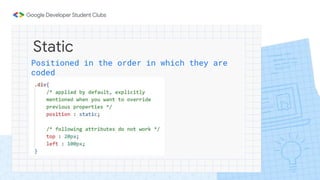
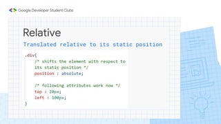
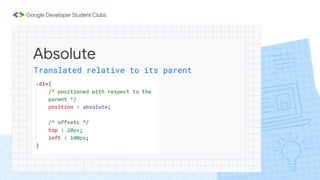
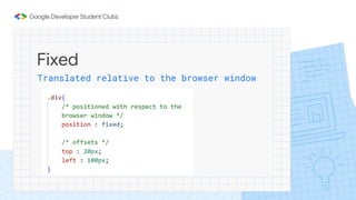
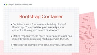
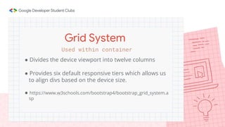
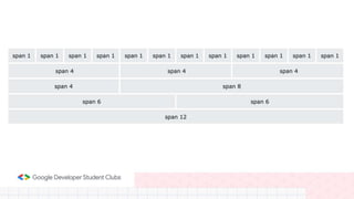
Further CSS and Intro
to Bootstrap
Subhajeet Lahiri
Vikas Kalyanapuram
Web Campaign Session 2
CSS Position Attribute
Static
Positioned in the order in which they are
coded
Relative
Translated relative to its static position
Absolute
Translated relative to its parent
Fixed
Translated relative to the browser window
Emmet’s cool
Display Attributes
The former takes up the entire available
width and tolerates no elements beside
it. The latter is displayed on the same
line
Block and Inline elements
❏flex-direction : column , row-reverse …
❏flex-wrap : wrap, nowrap …
❏justify-content : flex-start, center, flex-end …
(main axis)
❏align-items : flex-start, center, flex-end …
(cross axis)
Flex
Comes with a lot of perks
• Add some keyframes, the
ones in between are
added automatically
CSS Animations
Responsiveness
and
Media Queries
● A responsive web page is a web page that looks good
on all screen sizes.
● A responsive web design will automatically adjust for
different screen sizes and view ports.
● Responsive web design is very essential for creating
a positive experience for users.
What is Responsiveness?
● Media Queries allow you to apply CSS Styles
depending on a specific property of the device, such
as screen size.
● Therefore, Media Queries allow you to change the
entire layout of a website based on the screen size.
Media Queries
❏Viewport Units :
100vh is equivalent to 100% of the screen height.
❏Percentage Measure :
Attribute value is specified as a fraction of the parent’s value.
❏em and rem
The former to set attributes of an element wrt to that of its
parent and the latter to set them wrt to that of the root
element
Relative Units
Bootstrap
● Free and Open Source CSS Framework that helps in
building responsive web pages without writing too
much code.
● It provides certain class names which when added to
html elements, causes them to be styled and/or
positioned in a certain way.
Bootstrap
https://getbootstrap.com/
https://getbootstrap.com/docs/5.3/getting-started/introduction/
Documentation !!!!!!!
● Containers are a fundamental building block of
Bootstrap . They contain, pad, and align your
content within a given device or viewport.
● Makes responsiveness much easier as container has
inbuilt breakpoints (using media query) in the CSS.
● https://getbootstrap.com/docs/5.0/layout/containers
/
Bootstrap Container
● Divides the device viewport into twelve columns
● Provides six default responsive tiers which allows us
to align divs based on the device size.
● https://www.w3schools.com/bootstrap4/bootstrap_grid_system.a
sp
Grid System
Used within container
Time to Put what We’ve
Learnt to the Test !!
Thank You For Attending
Link to the Code :
https://github.com/LieutPaul/GDSC-Web-Session2

Web Campaign 2.pptx

  • 1.
    Further CSS andIntro to Bootstrap Subhajeet Lahiri Vikas Kalyanapuram Web Campaign Session 2
  • 2.
  • 3.
    Static Positioned in theorder in which they are coded
  • 4.
  • 5.
  • 6.
    Fixed Translated relative tothe browser window
  • 7.
  • 8.
  • 9.
    The former takesup the entire available width and tolerates no elements beside it. The latter is displayed on the same line Block and Inline elements
  • 10.
    ❏flex-direction : column, row-reverse … ❏flex-wrap : wrap, nowrap … ❏justify-content : flex-start, center, flex-end … (main axis) ❏align-items : flex-start, center, flex-end … (cross axis) Flex Comes with a lot of perks
  • 11.
    • Add somekeyframes, the ones in between are added automatically CSS Animations
  • 12.
  • 13.
    ● A responsiveweb page is a web page that looks good on all screen sizes. ● A responsive web design will automatically adjust for different screen sizes and view ports. ● Responsive web design is very essential for creating a positive experience for users. What is Responsiveness?
  • 14.
    ● Media Queriesallow you to apply CSS Styles depending on a specific property of the device, such as screen size. ● Therefore, Media Queries allow you to change the entire layout of a website based on the screen size. Media Queries
  • 15.
    ❏Viewport Units : 100vhis equivalent to 100% of the screen height. ❏Percentage Measure : Attribute value is specified as a fraction of the parent’s value. ❏em and rem The former to set attributes of an element wrt to that of its parent and the latter to set them wrt to that of the root element Relative Units
  • 17.
  • 18.
    ● Free andOpen Source CSS Framework that helps in building responsive web pages without writing too much code. ● It provides certain class names which when added to html elements, causes them to be styled and/or positioned in a certain way. Bootstrap
  • 19.
  • 20.
    ● Containers area fundamental building block of Bootstrap . They contain, pad, and align your content within a given device or viewport. ● Makes responsiveness much easier as container has inbuilt breakpoints (using media query) in the CSS. ● https://getbootstrap.com/docs/5.0/layout/containers / Bootstrap Container
  • 21.
    ● Divides thedevice viewport into twelve columns ● Provides six default responsive tiers which allows us to align divs based on the device size. ● https://www.w3schools.com/bootstrap4/bootstrap_grid_system.a sp Grid System Used within container
  • 23.
    Time to Putwhat We’ve Learnt to the Test !!
  • 24.
    Thank You ForAttending Link to the Code : https://github.com/LieutPaul/GDSC-Web-Session2