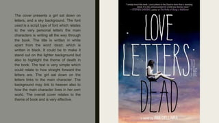
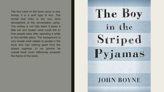
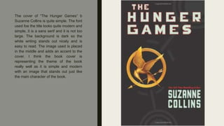
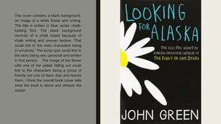
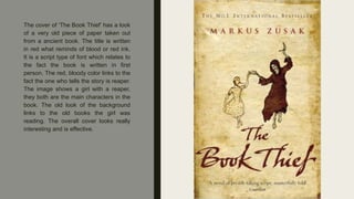
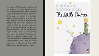
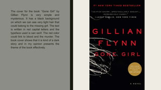
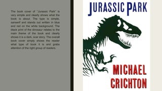
BOOK COVER
RESEARCH
By Gabriela Sokol
The cover presents a girl sat down on
letters, and a sky background. The font
used is a script type of font which relates
to the very personal letters the main
characters is writing all the way through
the book. The title is written in white
apart from the word ‘dead; which is
written in black. It could be to make it
stand out on the lighter background but
also to highlight the theme of death in
the book. The text is very simple which
could relate to how straight forward the
letters are. The girl sat down on the
letters links to the main character. The
background may link to heaven also to
how the main character lives in her own
world. The overall cover relates to the
theme of book and is very effective.
The font used on the book cover is very
formal, it is a serif type of font. The
formal look links to the very strict
atmosphere at the concertation camp.
The writing is not fully black it looks a
little old and broken what could link to
how people were after spending a while
at this terrible place. The background is
very simple what relates to people in the
book who had nothing apart from the
striped pyjamas. In my opinion he
overall book cover effectively presents
the theme of the book.
The book cover is very dark which link to
dark story and the theme of murder in
the book. The blurry image on the cover
presents a train in move. The title seems
like it is moving along with the train
because of its blurry look. The font used
is very simple and sans serif to make it
easy to read and clear as it is blurry and
placed on a blurry dark background. The
overall cover links very well to theme of
trains which is the main subject in the
book.
The book cover of “Forgive me, Leonard
Peacock” really stands out. It is strongly
based on typography as there is no
images, only text. The large text could
link to the thoughts that fill up the main
characters mind. The text is written in
three different colors to break down the
text and make it stand out more. The
font used is quite simple and sans serif.
The red color with some darker patches
of the background could link to the
suicide, blood and the gun in the book. I
think the book cover shows the theme of
the book very well and in my it attracts
the reader effectively.
The cover of “The Hunger Games“ b
Suzanne Collins is quite simple. The font
used foe the title looks quite modern and
simple, it is a sans serif and it is not too
large. The background is dark so the
white writing stands out nicely and is
easy to read. The image used is placed
in the middle and adds an accent to the
cover. I think the book cover is
representing the theme of the book
really well as it is simple and modern
with an image that stands out just like
the main character of the book.
The cover contains a black background,
an image of a white flower and writing.
The title is written in blue, script, chalk-
looking font. The black background
reminds of a chalk board because of
chalk writing and uneven texture. That
could link to the main characters being
in university. The script type could link to
the story being very personal and written
in first person. The image of the flower
with one of the petals falling out could
link to the characters being a group of
friends but one of them dies and leaves
them. I think the overall book cover tells
what the book is about and attracts the
reader.
The cover of ‘The Book Thief’ has a look
of a very old piece of paper taken out
from a ancient book. The title is written
in red what reminds of blood or red ink.
It is a script type of font which relates to
the fact the book is written in first
person. The red, bloody color links to the
fact the one who tells the story is reaper.
The image shows a girl with a reaper,
they both are the main characters in the
book. The old look of the background
links to the old books the girl was
reading. The overall cover looks really
interesting and is effective.
The cover of little prince contains text
and images. The title is written in script
font that looks very neat and is written in
a style that reminds of school. The name
of the author is written in a typeface
different from the title. It is a san serif,
large font and the text is written in very
light grey so it is not too visible as it is
mainly a book for children and since
children are the audience the author is
not that important. The title is the boldest
object on the cover as the drawings
have a very thin outline. The images are
drew in a sketchy childish style. The
white background is different from all the
colorful children books. I think the overall
book cover is effective as it is a little
different from and it is also very clear.
The cover for the book ‘’Gone Girl’’ by
Gillian Flynn is very simple and
mysterious. It has a black background
on which we can see very light hair that
could belong to the missing girl. The text
is written in red capital letters and the
typeface used is san serif. The red color
could link to blood and the murder. The
book cover shows that it is kind of a dark
story and in my opinion presents the
theme of the book effectively.
The book cover of ‘’Jurassic Park‘’ is
very simple and clearly shows what the
book is about. The type is simple,
sanserif and stands out written in blue
and red on the white background. The
black print of the dinosaur relates to the
main theme of the book and clearly
shows it is a dark, scar story. The overall
book cover simply shows the reader
what type of book it is and grabs
attention of the right group of readers.

Book cover research

  • 1.
  • 2.
    The cover presentsa girl sat down on letters, and a sky background. The font used is a script type of font which relates to the very personal letters the main characters is writing all the way through the book. The title is written in white apart from the word ‘dead; which is written in black. It could be to make it stand out on the lighter background but also to highlight the theme of death in the book. The text is very simple which could relate to how straight forward the letters are. The girl sat down on the letters links to the main character. The background may link to heaven also to how the main character lives in her own world. The overall cover relates to the theme of book and is very effective.
  • 3.
    The font usedon the book cover is very formal, it is a serif type of font. The formal look links to the very strict atmosphere at the concertation camp. The writing is not fully black it looks a little old and broken what could link to how people were after spending a while at this terrible place. The background is very simple what relates to people in the book who had nothing apart from the striped pyjamas. In my opinion he overall book cover effectively presents the theme of the book.
  • 4.
    The book coveris very dark which link to dark story and the theme of murder in the book. The blurry image on the cover presents a train in move. The title seems like it is moving along with the train because of its blurry look. The font used is very simple and sans serif to make it easy to read and clear as it is blurry and placed on a blurry dark background. The overall cover links very well to theme of trains which is the main subject in the book.
  • 5.
    The book coverof “Forgive me, Leonard Peacock” really stands out. It is strongly based on typography as there is no images, only text. The large text could link to the thoughts that fill up the main characters mind. The text is written in three different colors to break down the text and make it stand out more. The font used is quite simple and sans serif. The red color with some darker patches of the background could link to the suicide, blood and the gun in the book. I think the book cover shows the theme of the book very well and in my it attracts the reader effectively.
  • 6.
    The cover of“The Hunger Games“ b Suzanne Collins is quite simple. The font used foe the title looks quite modern and simple, it is a sans serif and it is not too large. The background is dark so the white writing stands out nicely and is easy to read. The image used is placed in the middle and adds an accent to the cover. I think the book cover is representing the theme of the book really well as it is simple and modern with an image that stands out just like the main character of the book.
  • 7.
    The cover containsa black background, an image of a white flower and writing. The title is written in blue, script, chalk- looking font. The black background reminds of a chalk board because of chalk writing and uneven texture. That could link to the main characters being in university. The script type could link to the story being very personal and written in first person. The image of the flower with one of the petals falling out could link to the characters being a group of friends but one of them dies and leaves them. I think the overall book cover tells what the book is about and attracts the reader.
  • 8.
    The cover of‘The Book Thief’ has a look of a very old piece of paper taken out from a ancient book. The title is written in red what reminds of blood or red ink. It is a script type of font which relates to the fact the book is written in first person. The red, bloody color links to the fact the one who tells the story is reaper. The image shows a girl with a reaper, they both are the main characters in the book. The old look of the background links to the old books the girl was reading. The overall cover looks really interesting and is effective.
  • 9.
    The cover oflittle prince contains text and images. The title is written in script font that looks very neat and is written in a style that reminds of school. The name of the author is written in a typeface different from the title. It is a san serif, large font and the text is written in very light grey so it is not too visible as it is mainly a book for children and since children are the audience the author is not that important. The title is the boldest object on the cover as the drawings have a very thin outline. The images are drew in a sketchy childish style. The white background is different from all the colorful children books. I think the overall book cover is effective as it is a little different from and it is also very clear.
  • 10.
    The cover forthe book ‘’Gone Girl’’ by Gillian Flynn is very simple and mysterious. It has a black background on which we can see very light hair that could belong to the missing girl. The text is written in red capital letters and the typeface used is san serif. The red color could link to blood and the murder. The book cover shows that it is kind of a dark story and in my opinion presents the theme of the book effectively.
  • 11.
    The book coverof ‘’Jurassic Park‘’ is very simple and clearly shows what the book is about. The type is simple, sanserif and stands out written in blue and red on the white background. The black print of the dinosaur relates to the main theme of the book and clearly shows it is a dark, scar story. The overall book cover simply shows the reader what type of book it is and grabs attention of the right group of readers.