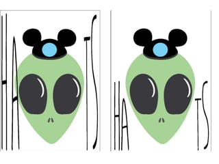
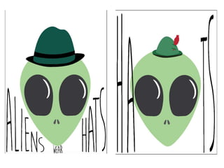
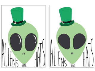
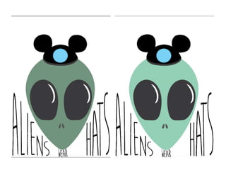
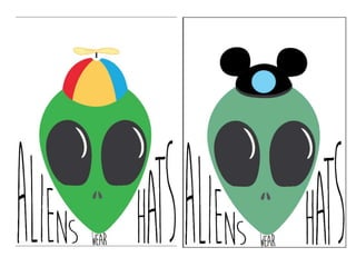
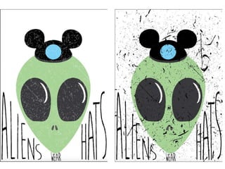
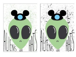
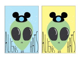
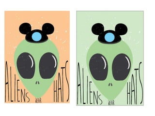
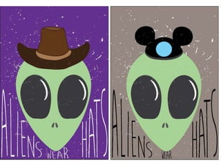
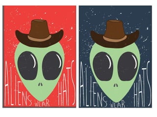
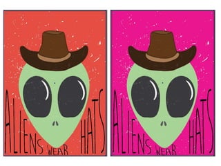
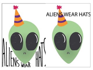
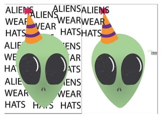
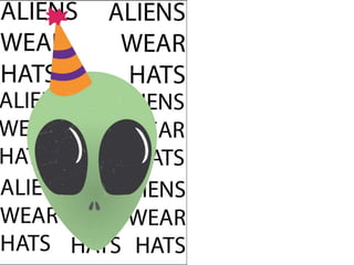
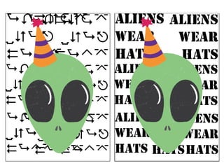
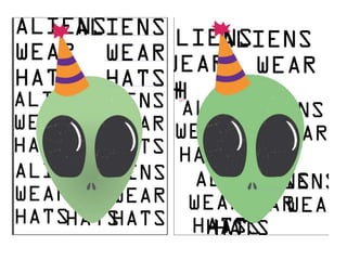
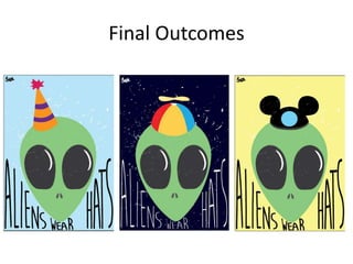
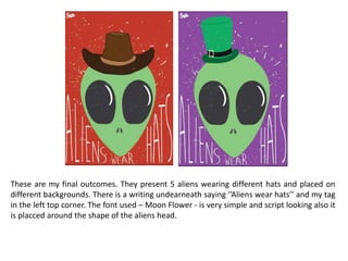
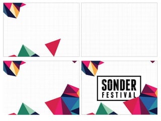
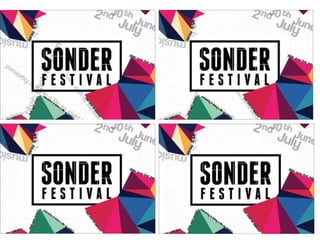
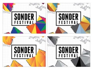
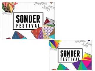
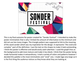
Final Outcome Evaluation
By Gabriela Sokol
Explanation of final outcome
The message behind my poster which presents
aliens wearing hats is that not everything is as
people would expect. With aliens we would not
expect them to wear hats, however it is just an
assumption that can be wrong. That links to a
deeper message which relates to life on Earth
where people are not always meeting your
expectations. With saying aliens wear hats I am
trying to tell people that their assumptions on other
lives are not always correct and people can be
different from what we expect them to be and so
can aliens.
Development
This is the development of my poster. It shows
different stages of the process of creating the
poster and variations of different outcomes and
ideas which include using different textures,
font, texts, composition, colors, backgrounds
etc. I also created different hats to see which
ones fit the best.
What I intended to do
I intended to create a funny looking series of
posters presenting aliens wearing different hats.
I wanted them all vary as they are suppsoed to
represnt being different from the expectations
people have for us.
Techniques & Media used
I created the whole thing digitally as I found it
easier to get straight into creating the final piece
also the shapes used are pretty simple and the
lines can be easily adjusted on the computer. It
also gave me a possibilty to try a variaty of
versions, colours etc. In a very quick way. I think
this method was very effective as it allowed me
to produce high quality desgings in a short
period of time.
Inspiration
My inspiration comes from a movie titled ’’Paul’’
which presents an alien in a very extaroridnary
way that is different from what we would
usually see on the screens. He acts very human
alike and is rather friendly unlike the aliens
presented as dangerous creatures. I thought it
could be a good way to put a message across as
aliens are a popular and recognizable aspect of
pop culture.
Audience
It is aimed at young adults and teenagers to
encourage them to be what they want no
matter what other expect from them and to
show that the assumptions others make on
them are not always right. Also to show them
that they shouldn’t make wrong assumpsions on
others.
Tools (software)
The software I used to create my design is
Adobe Illustrator. I chose to use Adobe
Illustrator to create it as it gives me the most
control over my lines and I can easily adjust
them to make the shape I want. Also the live
paint tool allows me to color in the shapes what
allowed me to change the colors very easily.
Final Outcomes
These are my final outcomes. They present 5 aliens wearing different hats and placed on
different backgrounds. There is a writing undearneath saying ’’Aliens wear hats’’ and my tag
in the left top corner. The font used – Moon Flower - is very simple and script looking also it
is placced around the shape of the aliens head.
Is it effective
I think my final design is effective as it is eye-
catching. The message behind is not straight
forward which allows the audience to interpet it
in their own way they could relate to, also for
those who are not looking for the meaning
behind the artwork it is a fun, nice looking
design that would make the surrounding more
memorable and colorful.
SONDER POSTER
This is my final outcome for poster created for ‘’Sonder Festival’’. I intended to make the
poster minimalistic that is why I limited the amount of information to the minimum and
did not use too many images. The triangle pattern was supposed to link to the meaning
of the word sonder which was my inspiration for the design. It represents ‘’the vivid and
complex’’ part of the definition. I put the text on the shapes to make it look outstanding.
I think this poster is effective and would easily catch attention. I used the graph lines as
the background to add more texture and make it less blank. I think that the poster being
made horizontal makes it extraordinary. I tried a variety of colors and patterns however I
decided this palette is the most minimalistic and ‘’vivid’’ one. I made logo very large so it
is the first thing the audience notices so they know what they are looking at.

Final outcome development

  • 1.
  • 2.
    Explanation of finaloutcome The message behind my poster which presents aliens wearing hats is that not everything is as people would expect. With aliens we would not expect them to wear hats, however it is just an assumption that can be wrong. That links to a deeper message which relates to life on Earth where people are not always meeting your expectations. With saying aliens wear hats I am trying to tell people that their assumptions on other lives are not always correct and people can be different from what we expect them to be and so can aliens.
  • 3.
    Development This is thedevelopment of my poster. It shows different stages of the process of creating the poster and variations of different outcomes and ideas which include using different textures, font, texts, composition, colors, backgrounds etc. I also created different hats to see which ones fit the best.
  • 24.
    What I intendedto do I intended to create a funny looking series of posters presenting aliens wearing different hats. I wanted them all vary as they are suppsoed to represnt being different from the expectations people have for us.
  • 25.
    Techniques & Mediaused I created the whole thing digitally as I found it easier to get straight into creating the final piece also the shapes used are pretty simple and the lines can be easily adjusted on the computer. It also gave me a possibilty to try a variaty of versions, colours etc. In a very quick way. I think this method was very effective as it allowed me to produce high quality desgings in a short period of time.
  • 26.
    Inspiration My inspiration comesfrom a movie titled ’’Paul’’ which presents an alien in a very extaroridnary way that is different from what we would usually see on the screens. He acts very human alike and is rather friendly unlike the aliens presented as dangerous creatures. I thought it could be a good way to put a message across as aliens are a popular and recognizable aspect of pop culture.
  • 27.
    Audience It is aimedat young adults and teenagers to encourage them to be what they want no matter what other expect from them and to show that the assumptions others make on them are not always right. Also to show them that they shouldn’t make wrong assumpsions on others.
  • 28.
    Tools (software) The softwareI used to create my design is Adobe Illustrator. I chose to use Adobe Illustrator to create it as it gives me the most control over my lines and I can easily adjust them to make the shape I want. Also the live paint tool allows me to color in the shapes what allowed me to change the colors very easily.
  • 29.
  • 30.
    These are myfinal outcomes. They present 5 aliens wearing different hats and placed on different backgrounds. There is a writing undearneath saying ’’Aliens wear hats’’ and my tag in the left top corner. The font used – Moon Flower - is very simple and script looking also it is placced around the shape of the aliens head.
  • 31.
    Is it effective Ithink my final design is effective as it is eye- catching. The message behind is not straight forward which allows the audience to interpet it in their own way they could relate to, also for those who are not looking for the meaning behind the artwork it is a fun, nice looking design that would make the surrounding more memorable and colorful.
  • 32.
  • 37.
    This is myfinal outcome for poster created for ‘’Sonder Festival’’. I intended to make the poster minimalistic that is why I limited the amount of information to the minimum and did not use too many images. The triangle pattern was supposed to link to the meaning of the word sonder which was my inspiration for the design. It represents ‘’the vivid and complex’’ part of the definition. I put the text on the shapes to make it look outstanding. I think this poster is effective and would easily catch attention. I used the graph lines as the background to add more texture and make it less blank. I think that the poster being made horizontal makes it extraordinary. I tried a variety of colors and patterns however I decided this palette is the most minimalistic and ‘’vivid’’ one. I made logo very large so it is the first thing the audience notices so they know what they are looking at.