This document outlines strategies for effective presentations, emphasizing the importance of audience engagement and the thoughtful use of visuals. It discusses tips for effective bullet points, design principles, and the significance of data visualization in conveying meaning. Additionally, it provides resources and recommendations for creating impactful presentations.


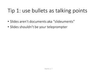


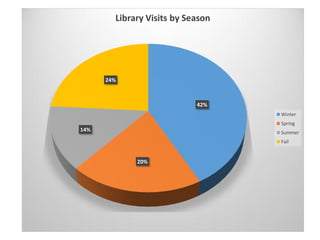
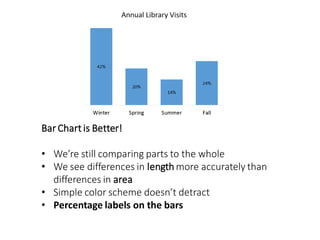
![[CELLRANGE]
[CELLRANGE]
[CELLRANGE]
[CELLRANGE]
Winter Spring Summer Fall
Library Visits by Season](https://image.slidesharecdn.com/beyondbullets6-22-160622151149/85/Beyond-Bullets-Creating-Presentations-That-Engage-38-320.jpg)
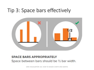
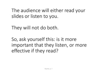
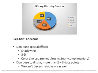
![[CELLRANGE]
[CELLRANGE]
[CELLRANGE]
[CELLRANGE]
Winter Spring Summer Fall
Library Visits by Season](https://image.slidesharecdn.com/beyondbullets6-22-160622151149/85/Beyond-Bullets-Creating-Presentations-That-Engage-41-320.jpg)