Download to read offline
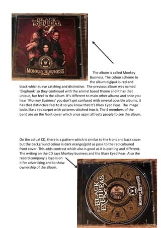

The album is called Monkey Business by the Black Eyed Peas. It has a red and black color scheme throughout the digipak packaging to make it eye-catching and distinctive. The album cover features the four band members against a red carpet background continuing the animal theme from their previous album "Elephunk". Images and patterns of monkeys are used throughout the packaging to reinforce the album's title of Monkey Business.


![Vibe productions headed_paper[1]](https://cdn.slidesharecdn.com/ss_thumbnails/vibeproductionsheadedpaper1-121218091720-phpapp01-thumbnail.jpg?width=640&height=640&fit=bounds)


