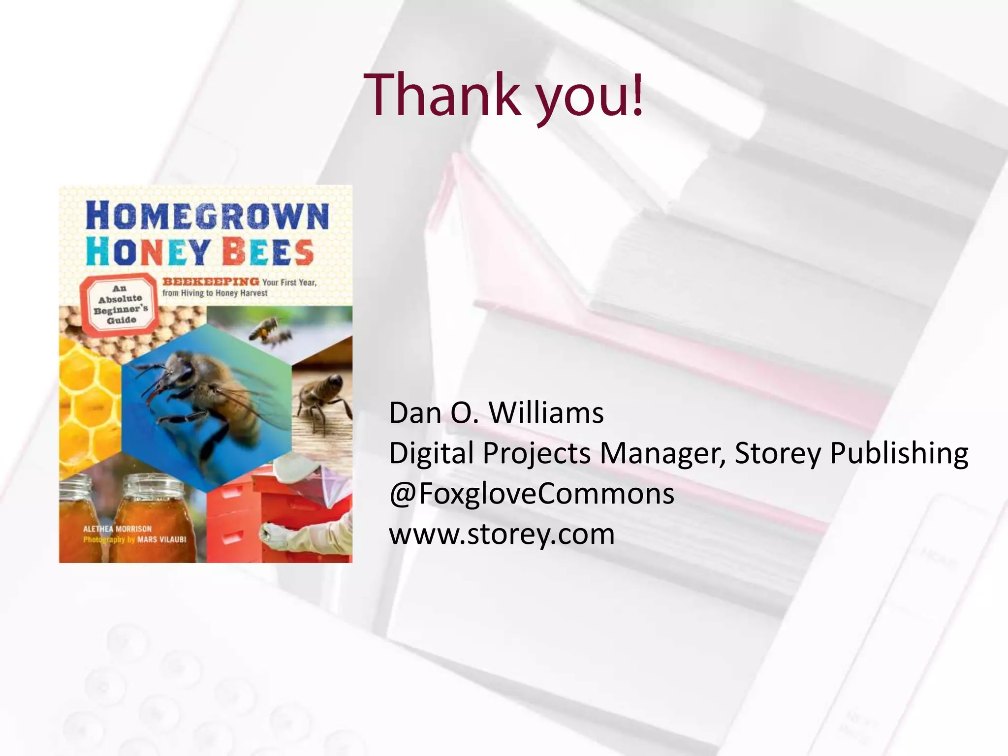
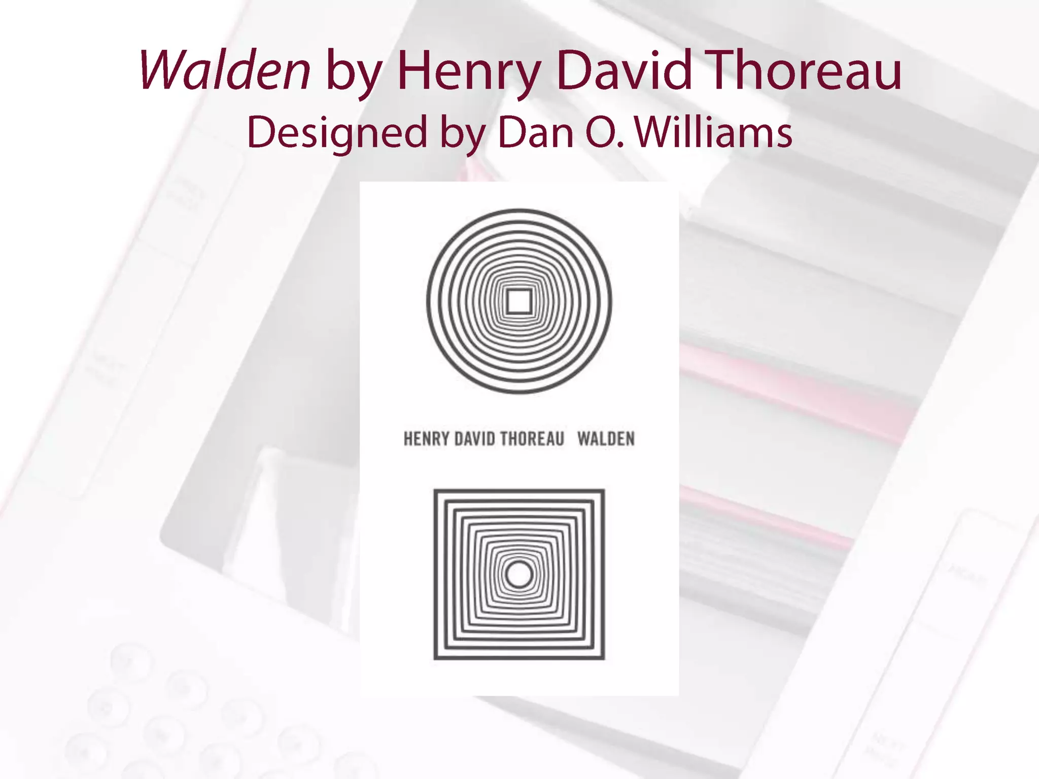
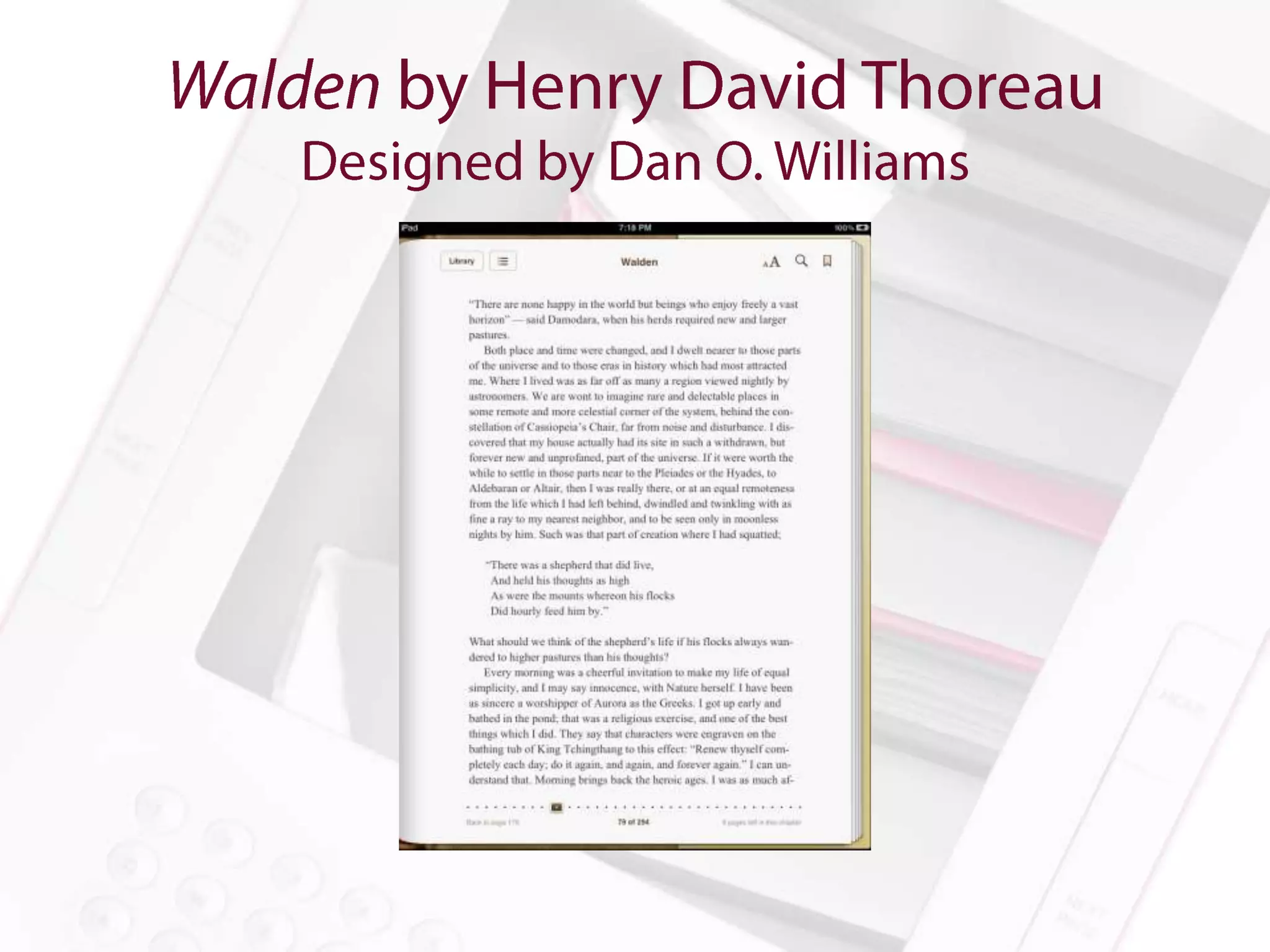
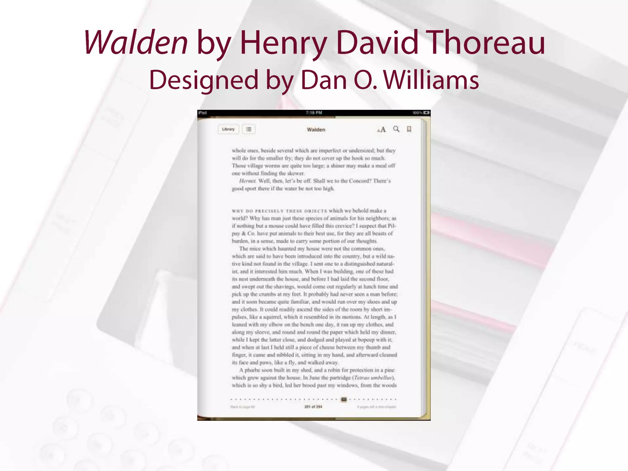
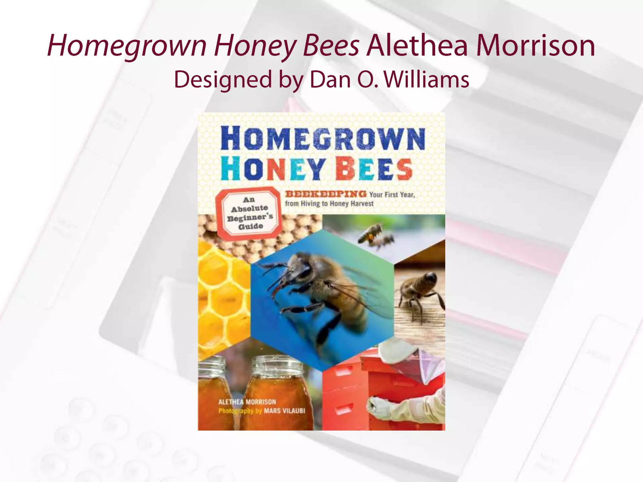
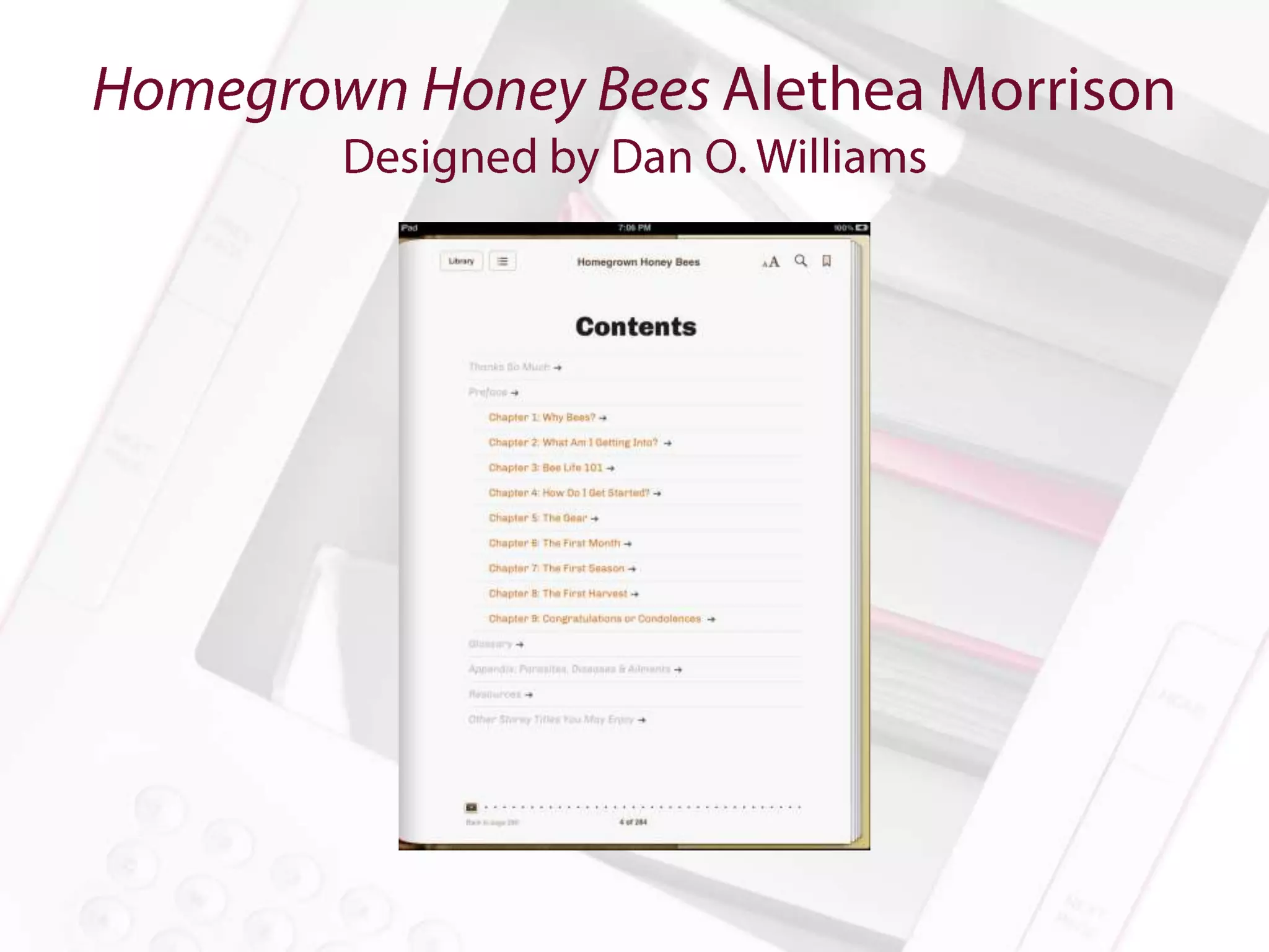
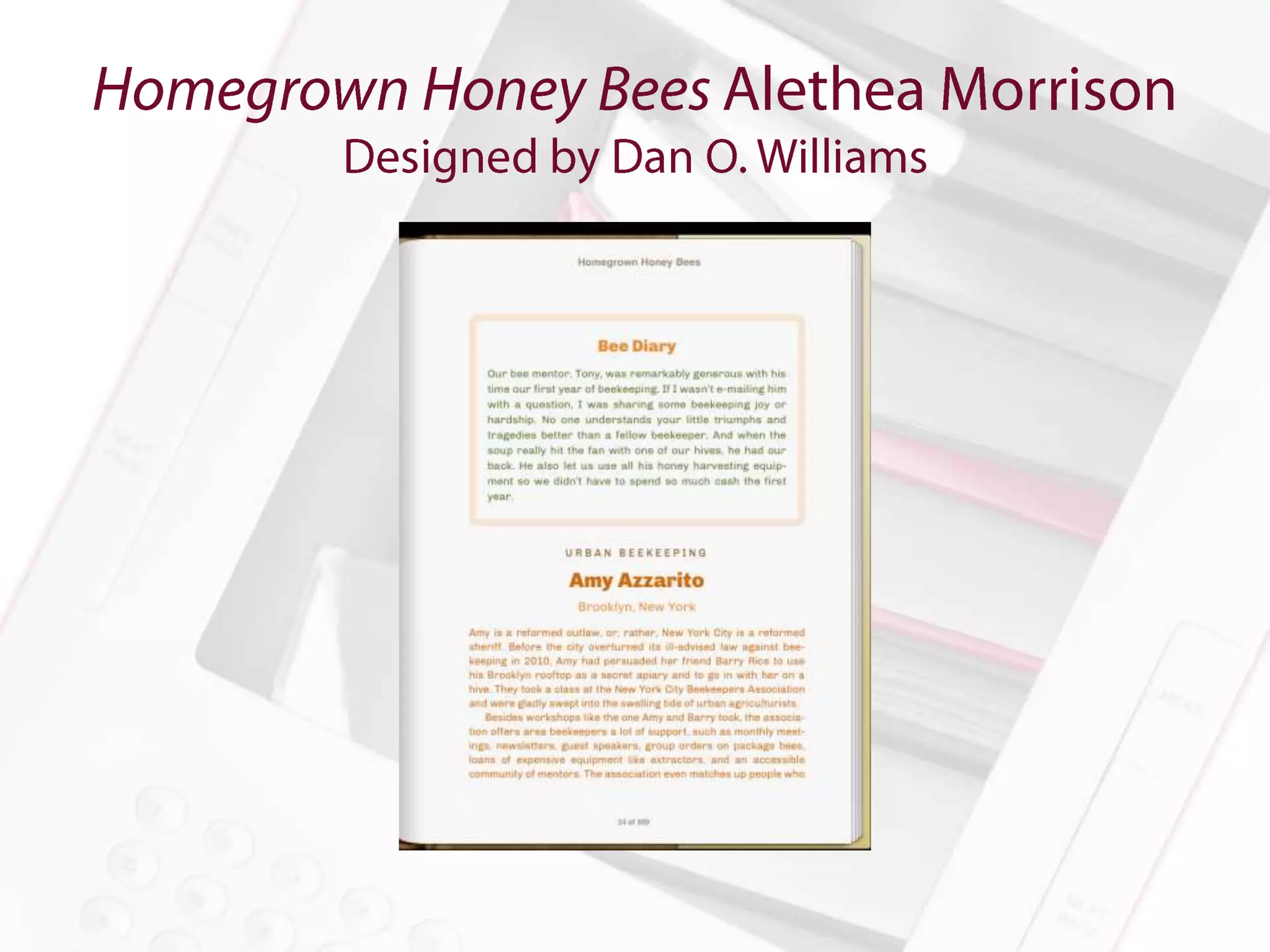
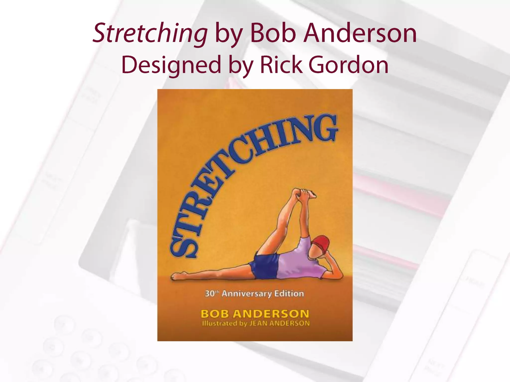
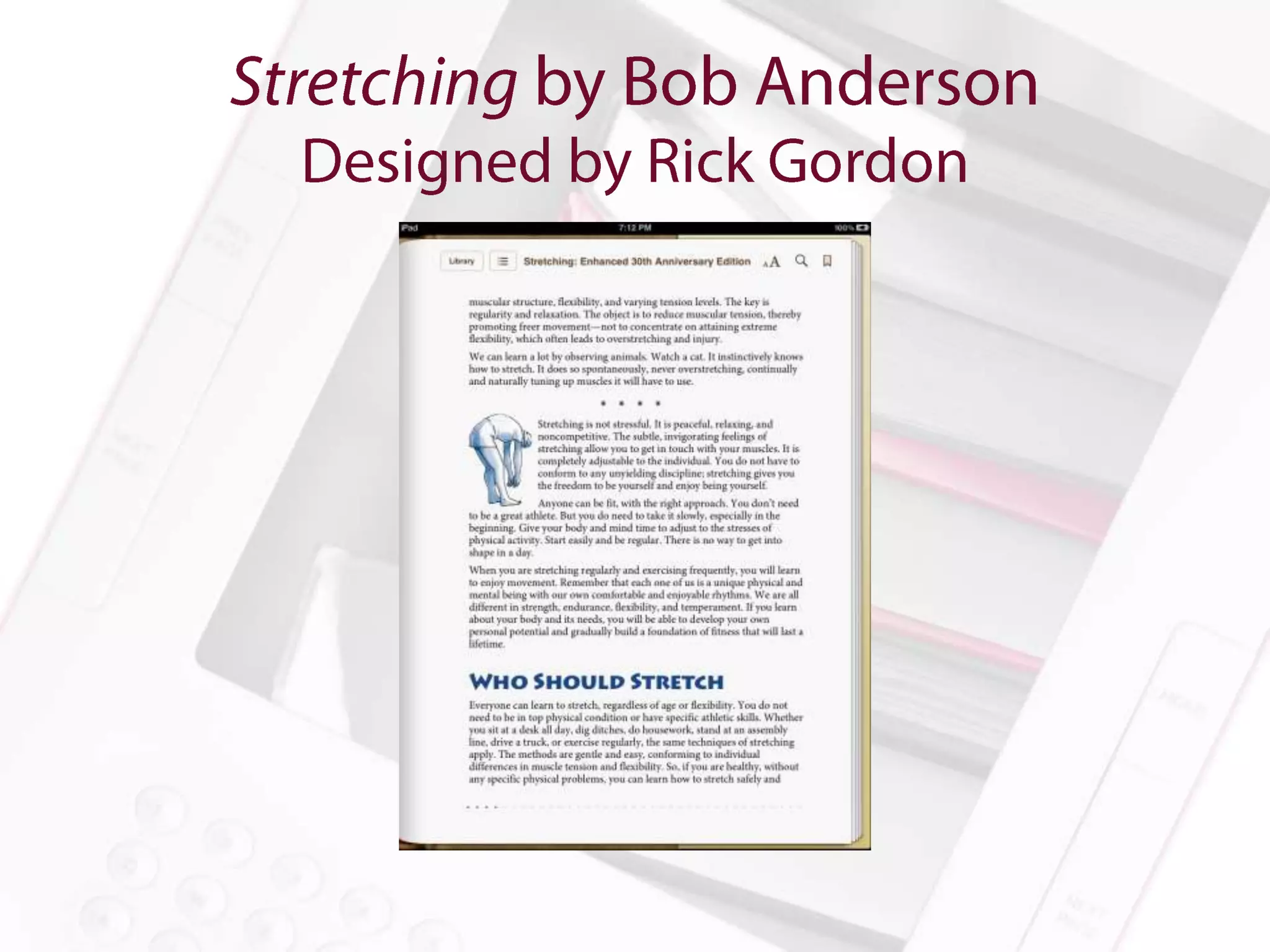
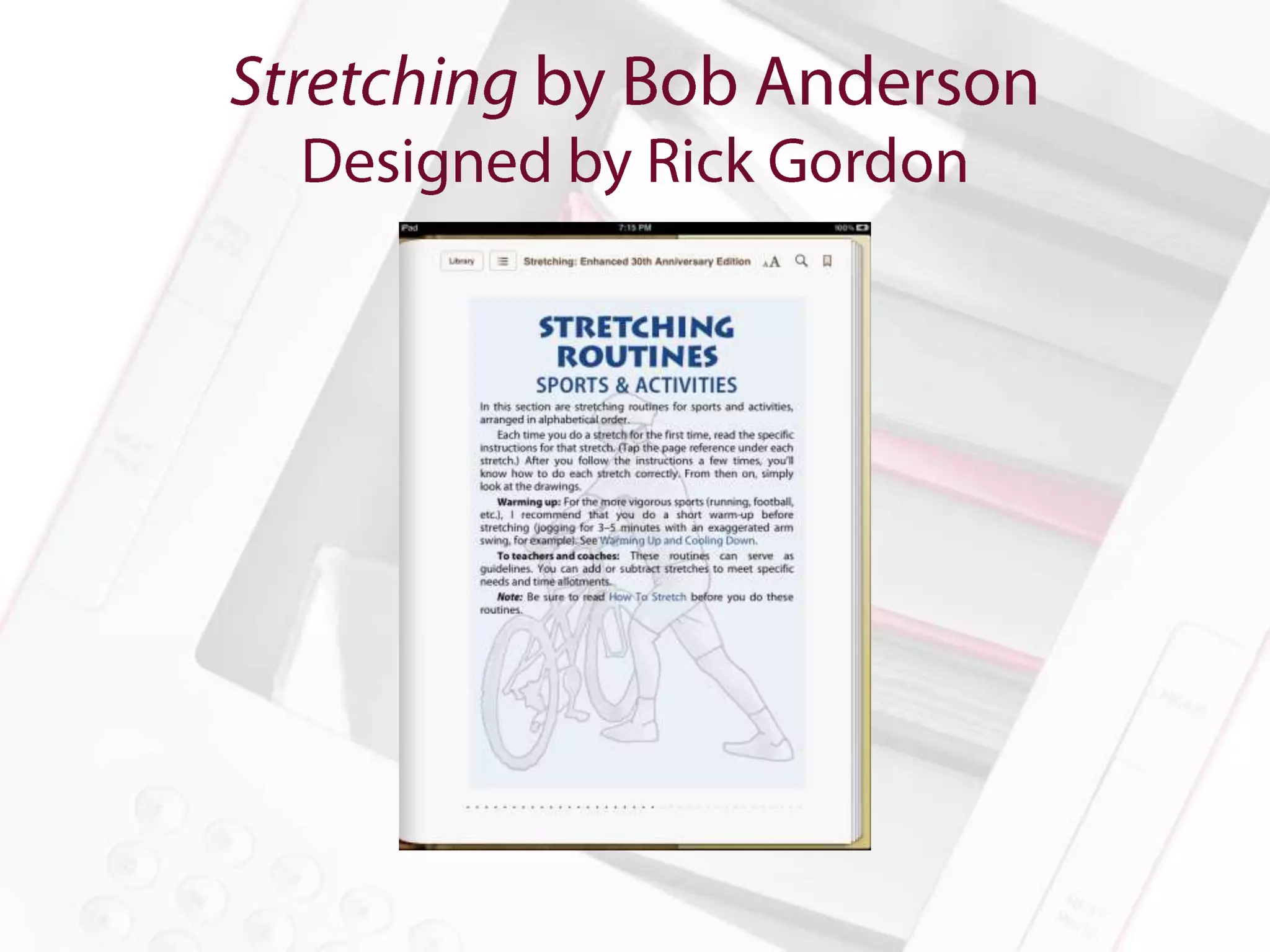
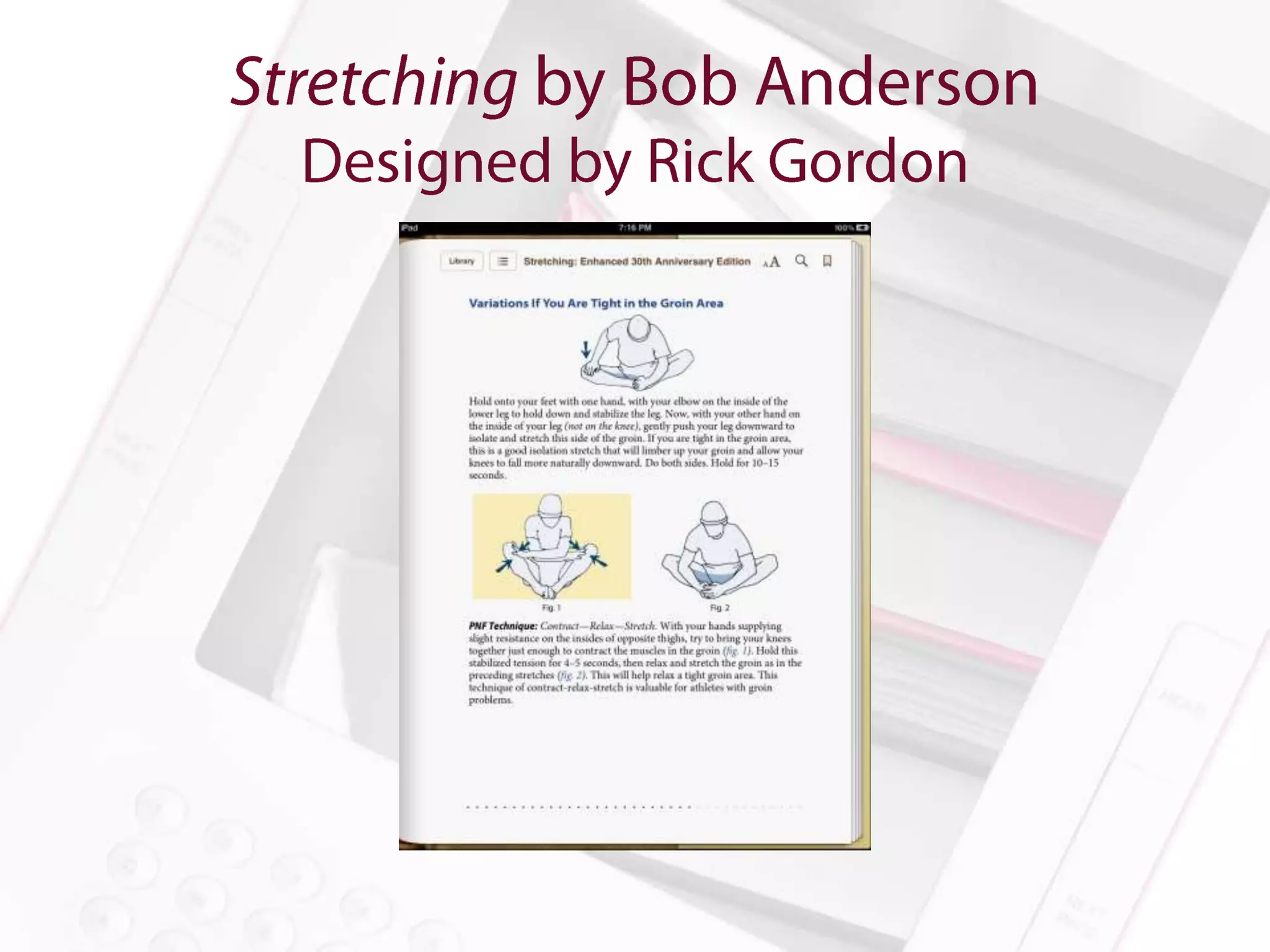
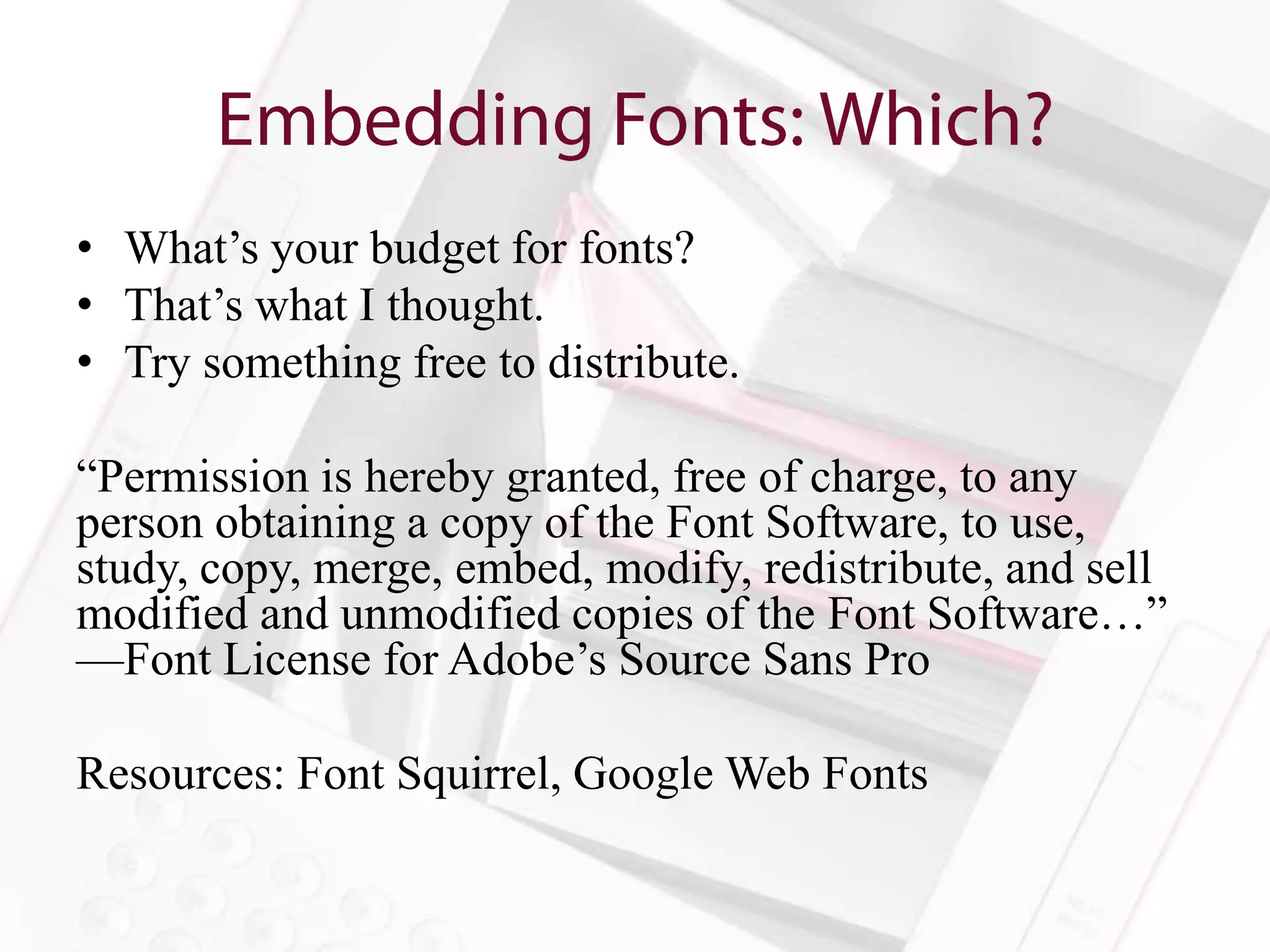
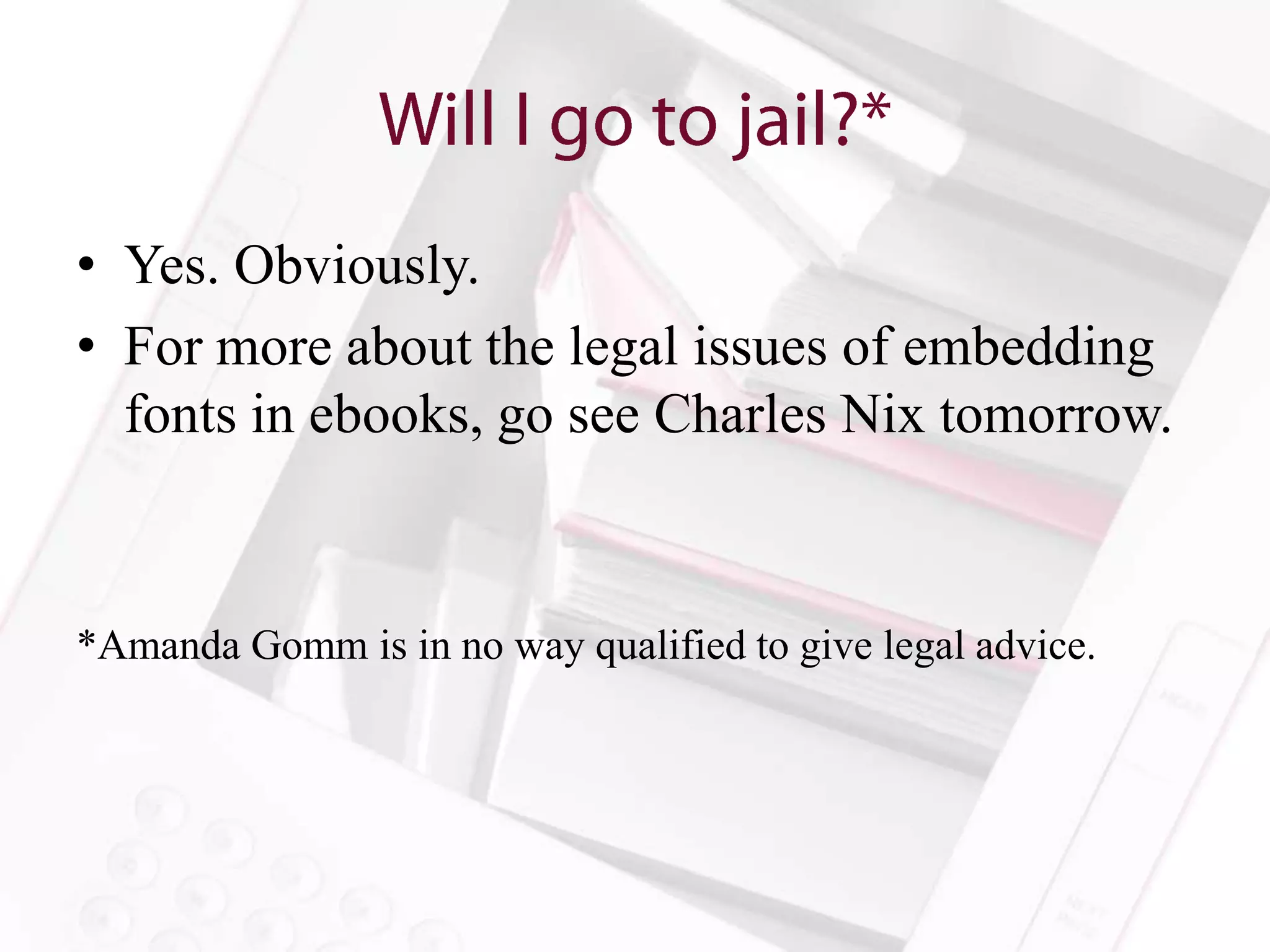
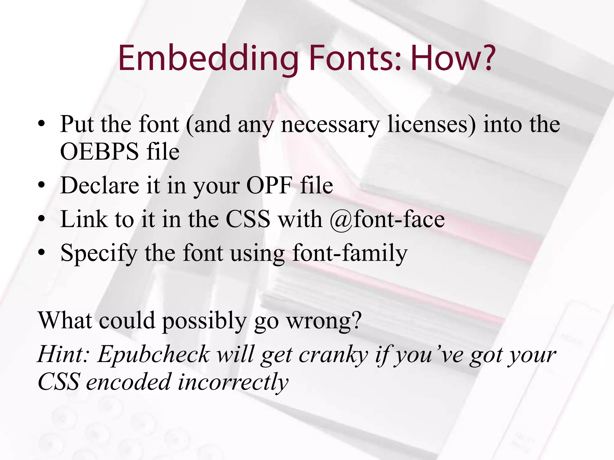
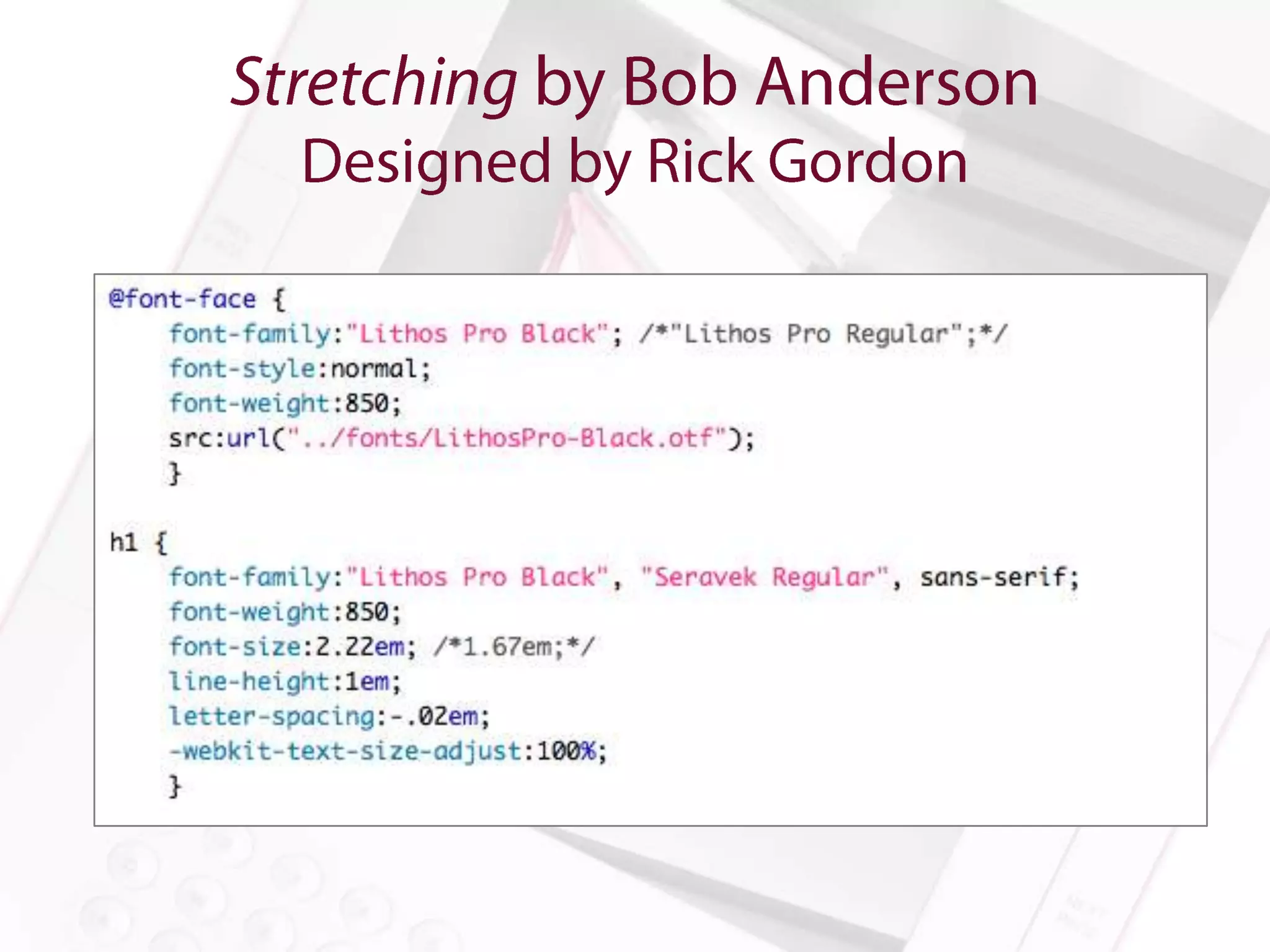
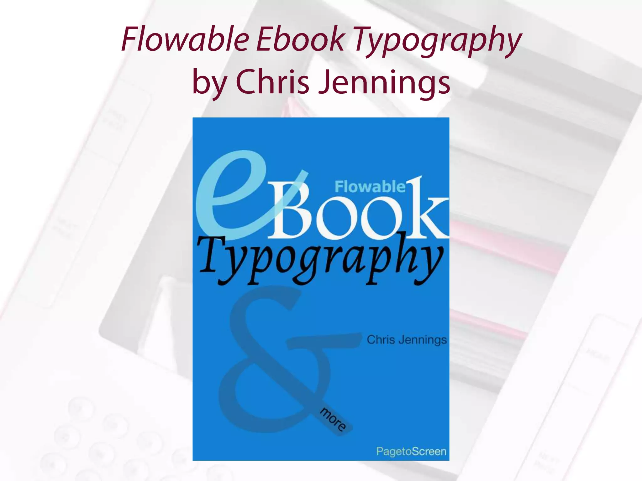
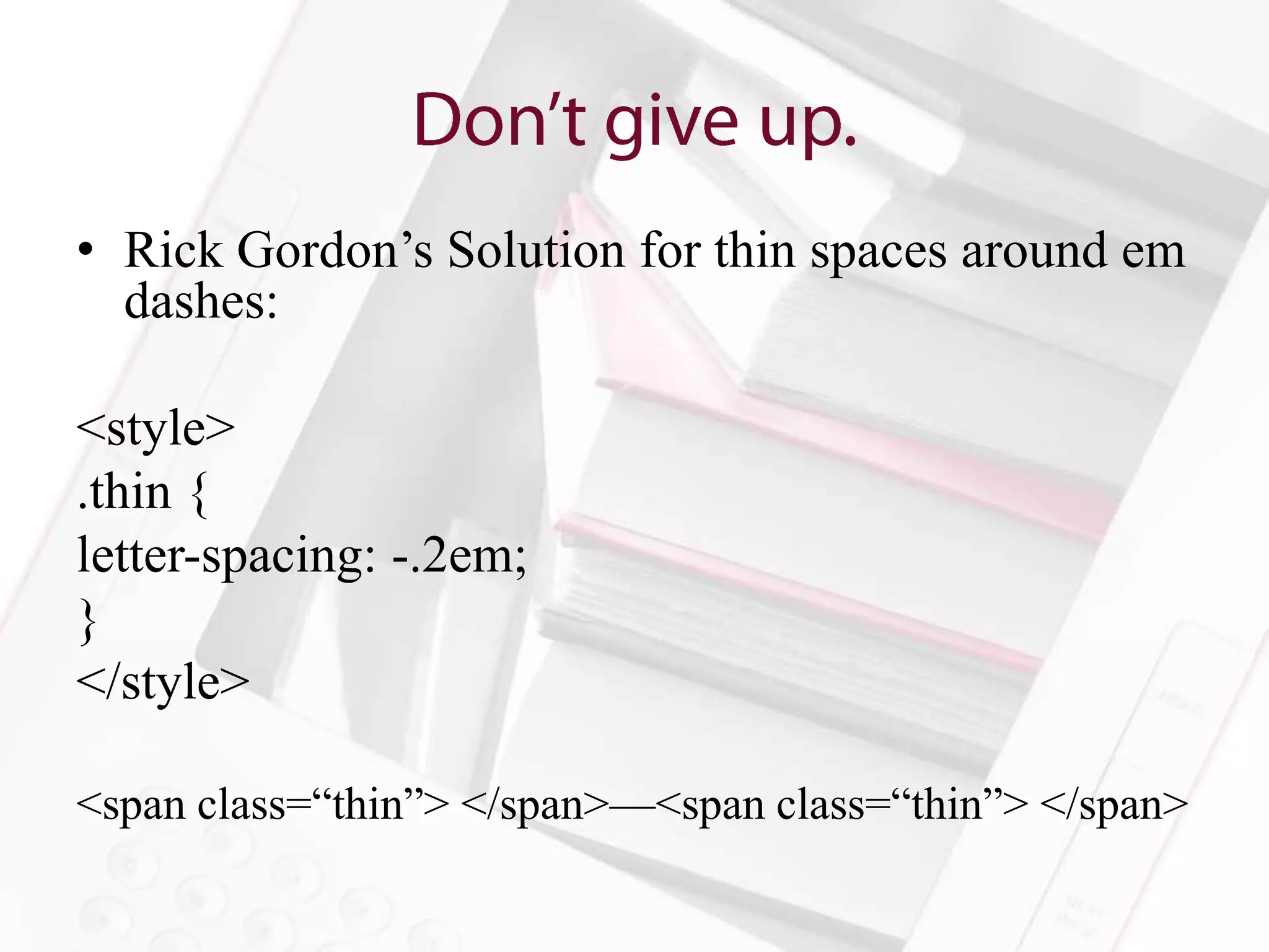
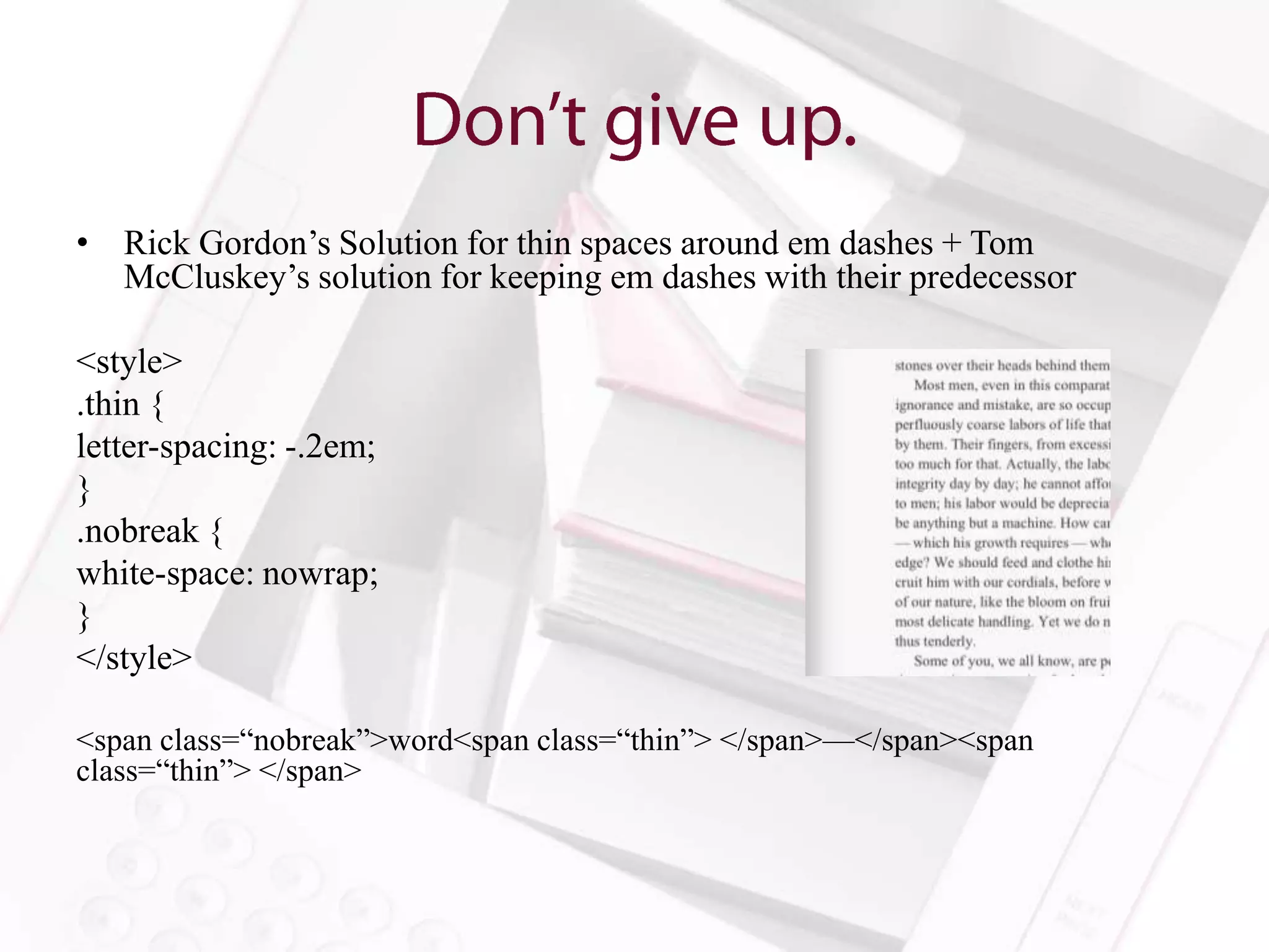
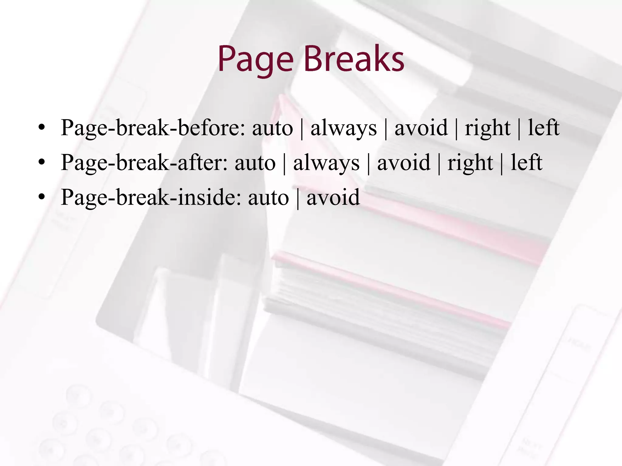
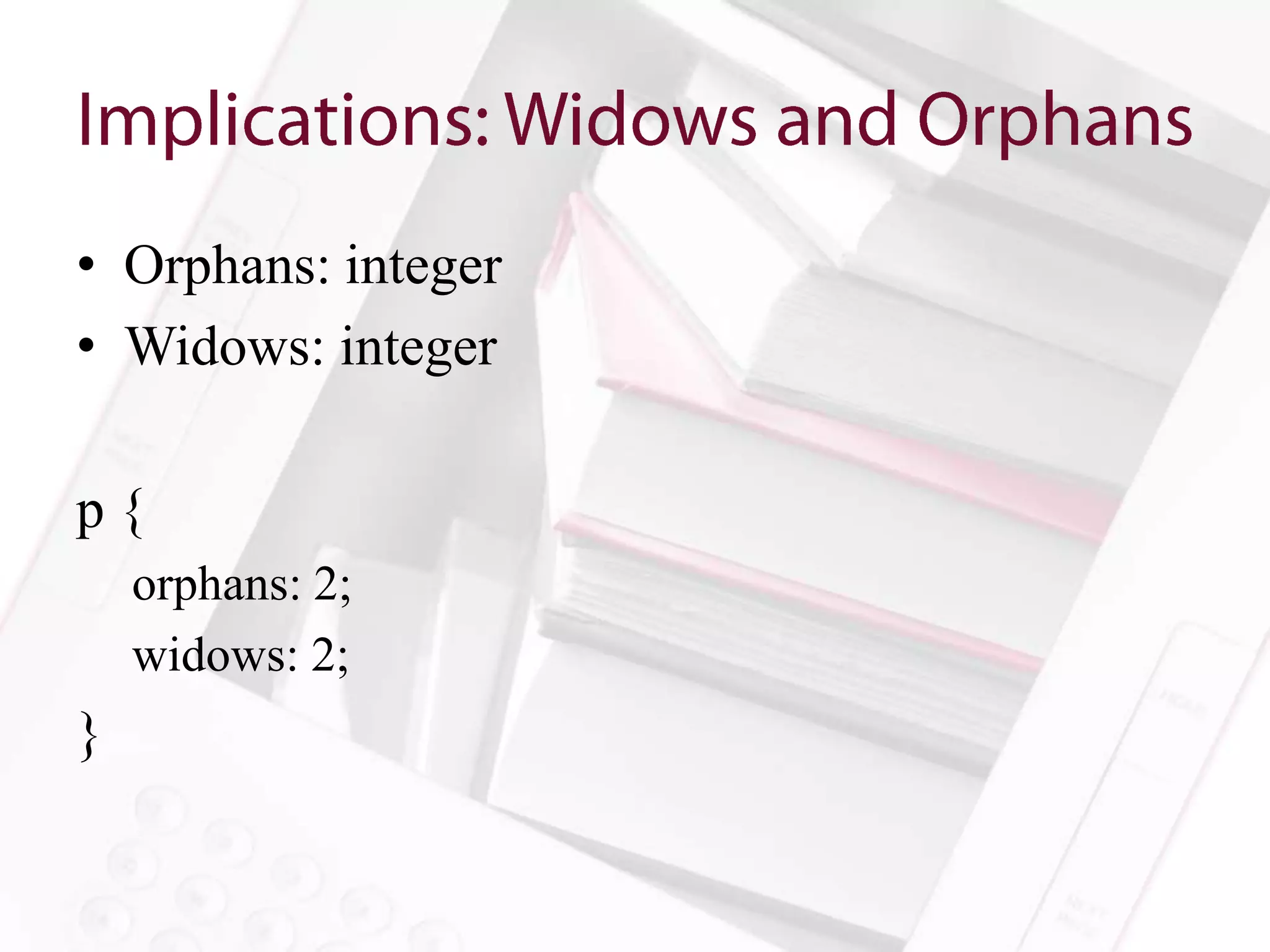
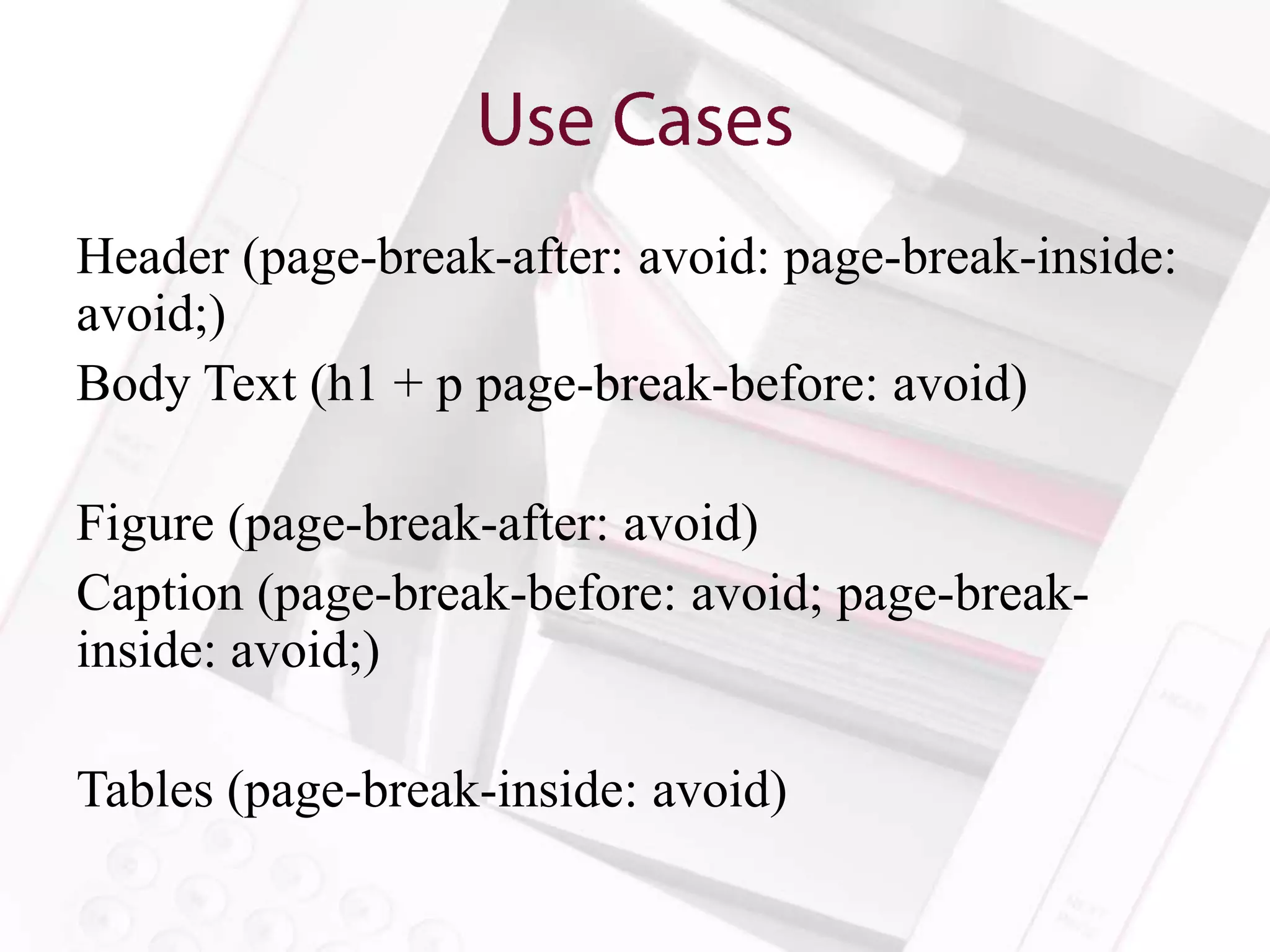
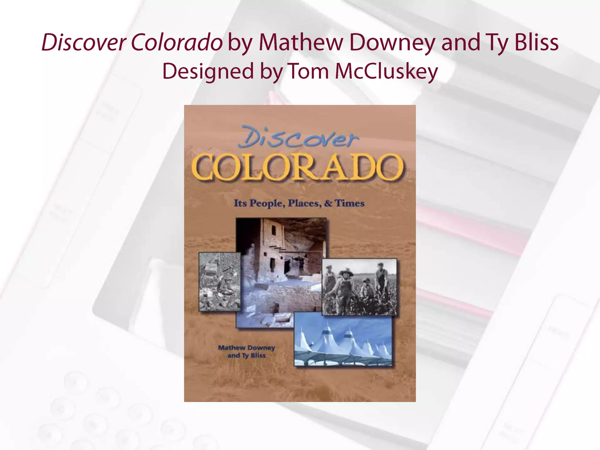
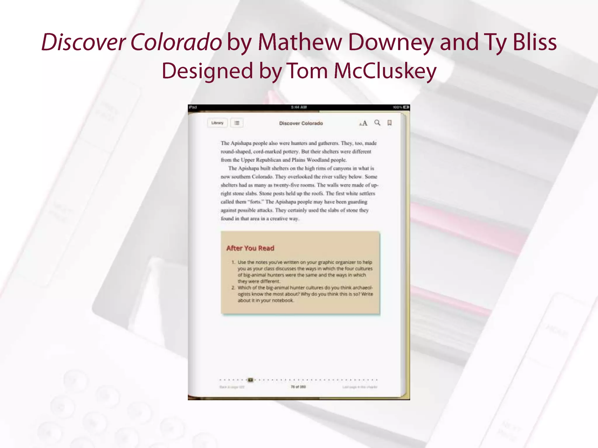
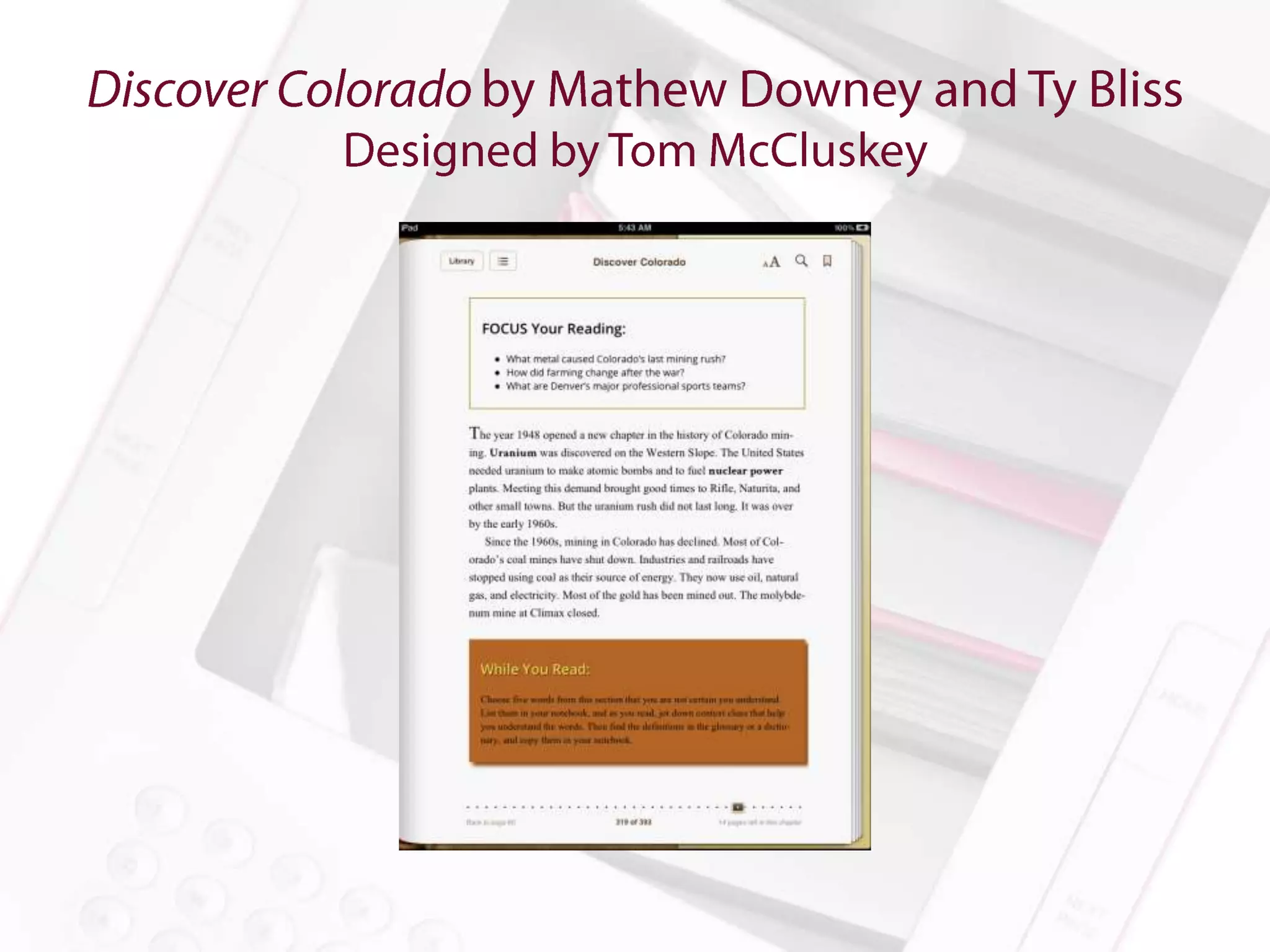
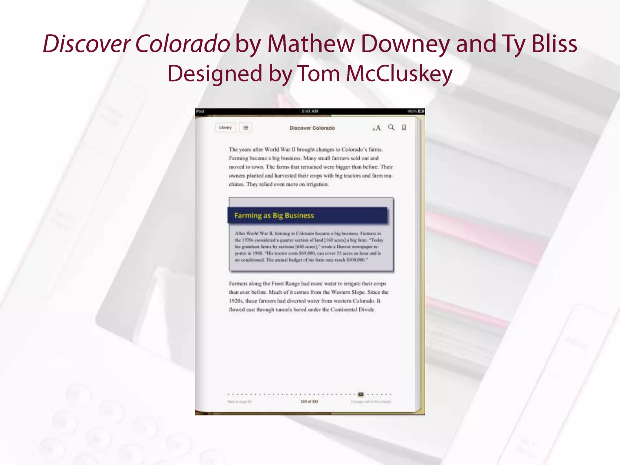
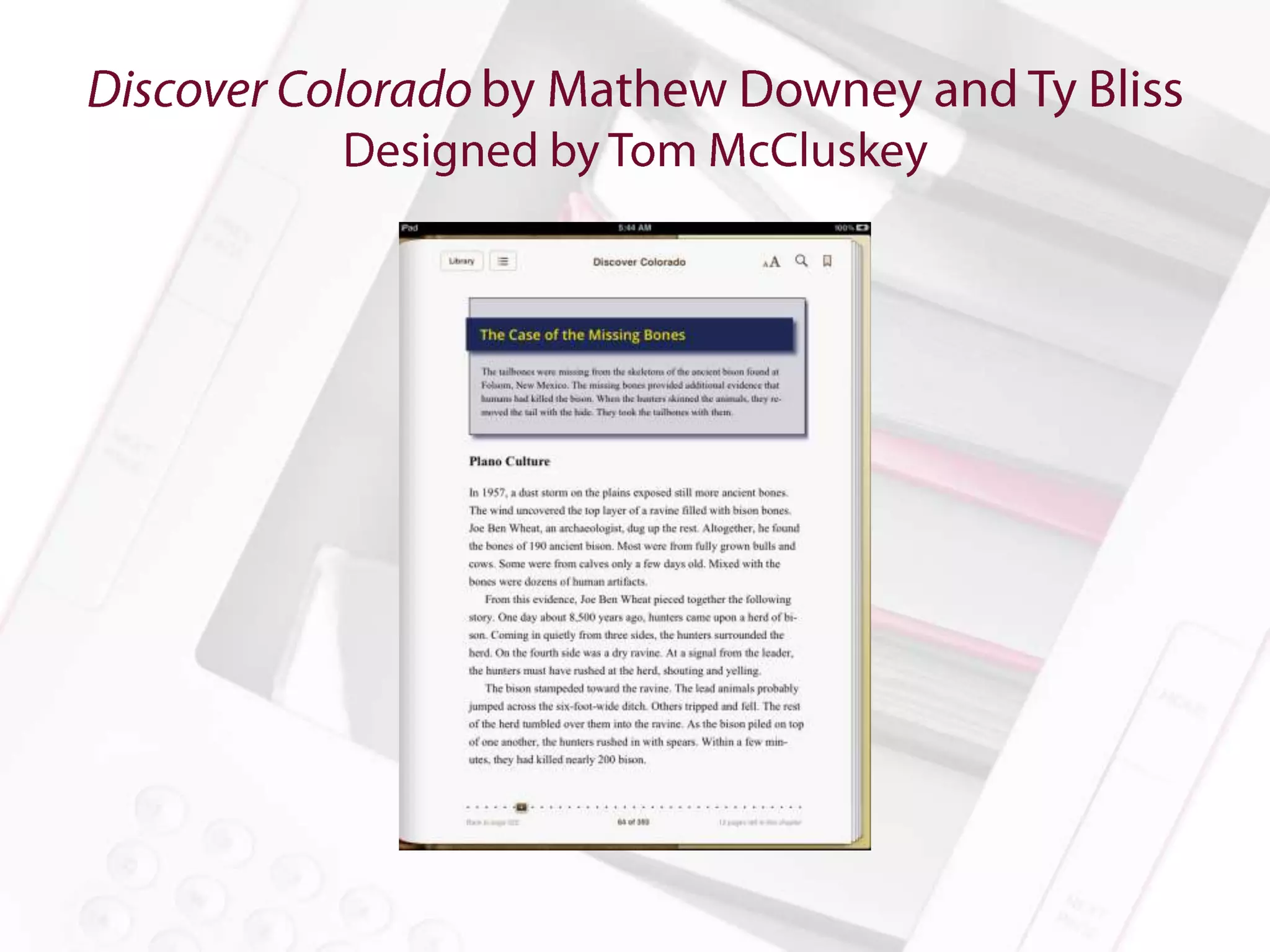
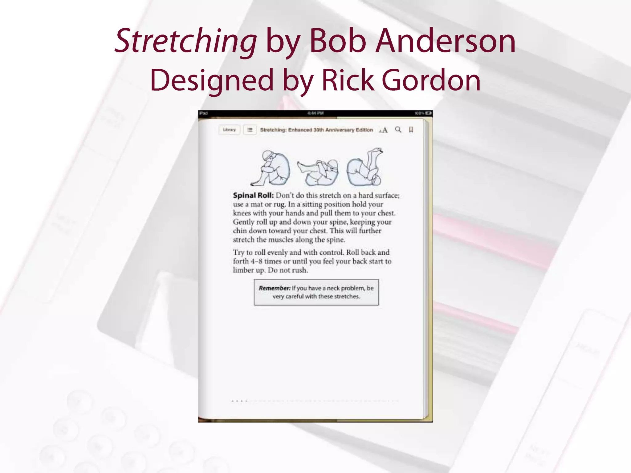
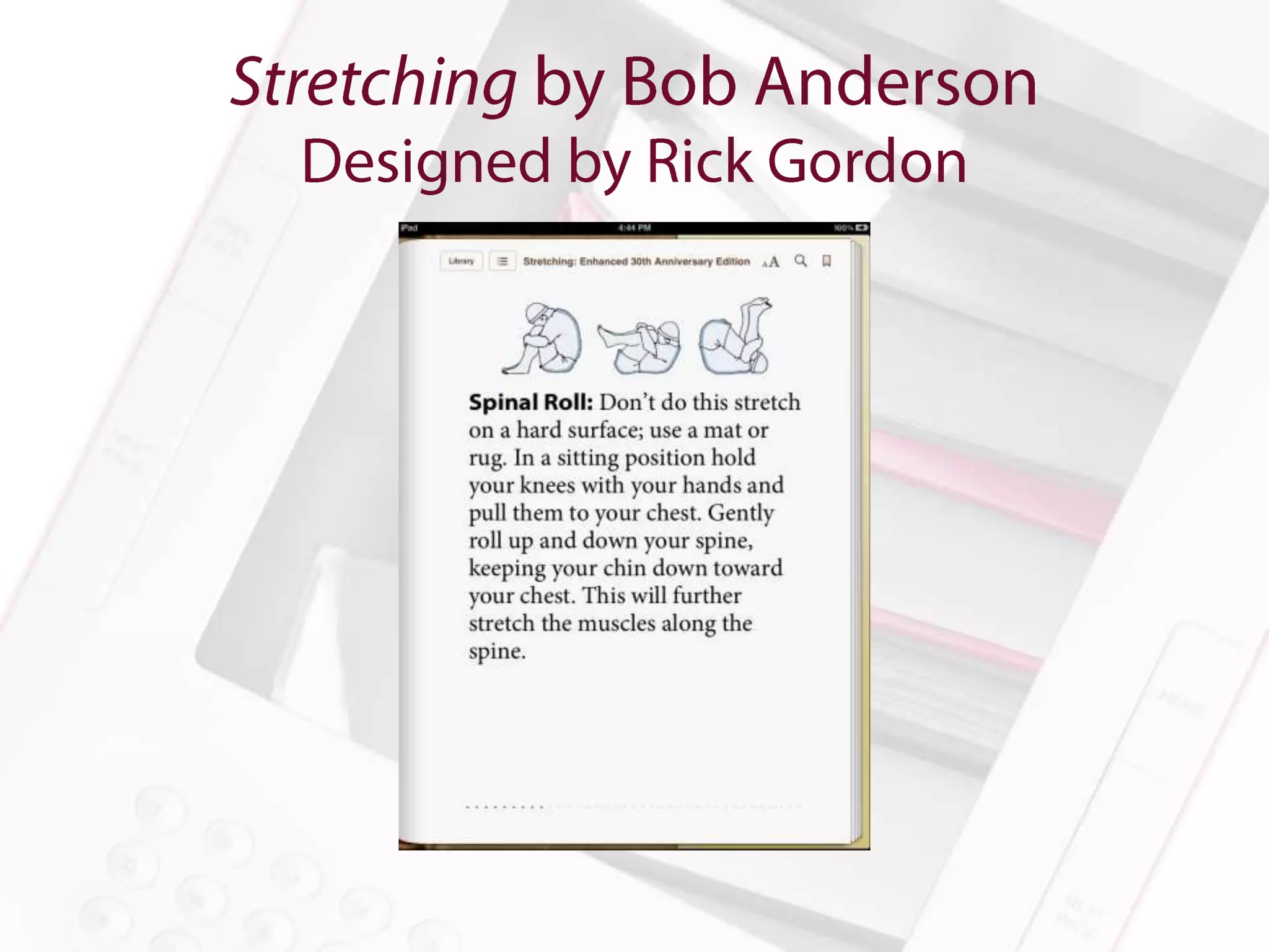
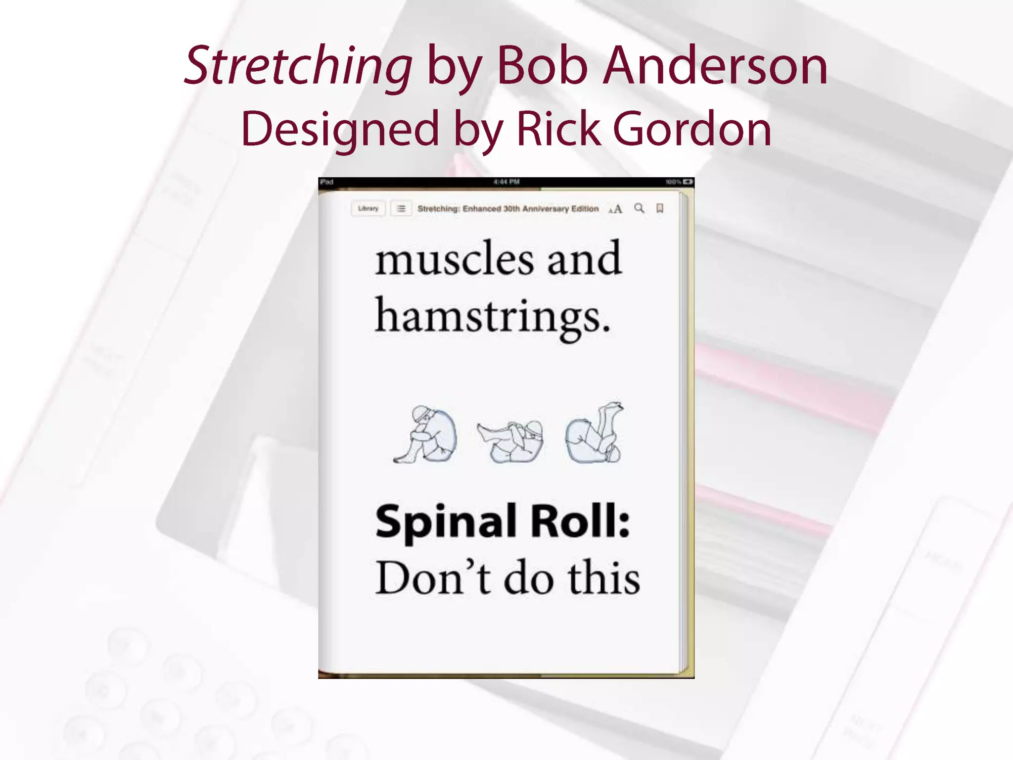
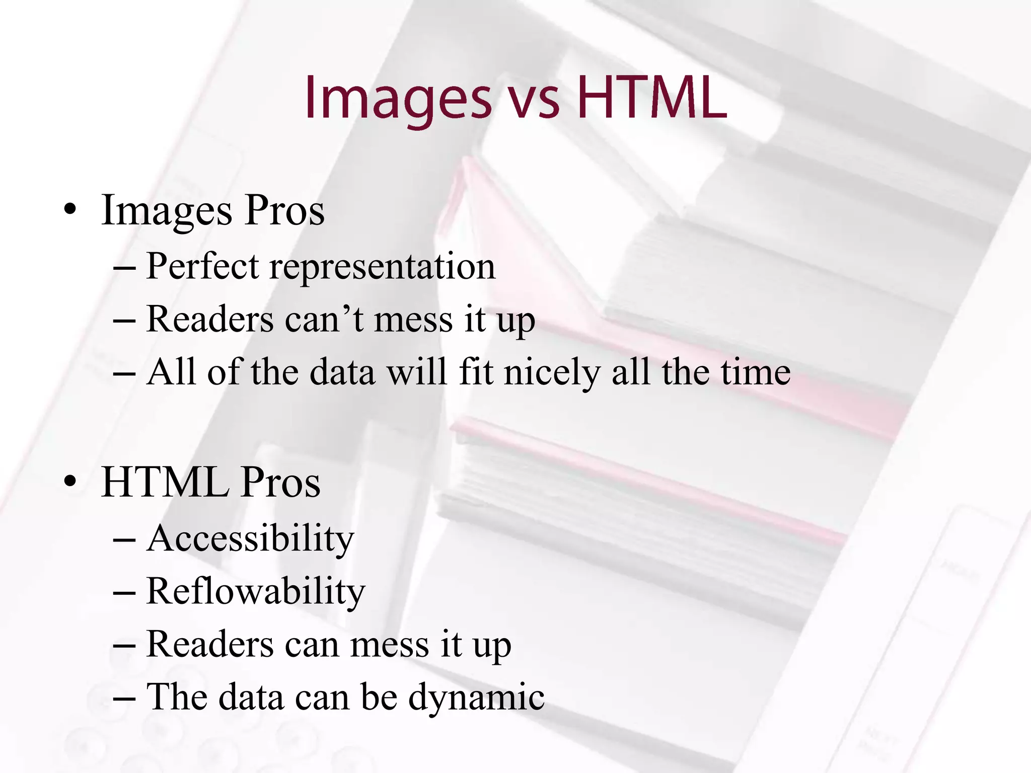
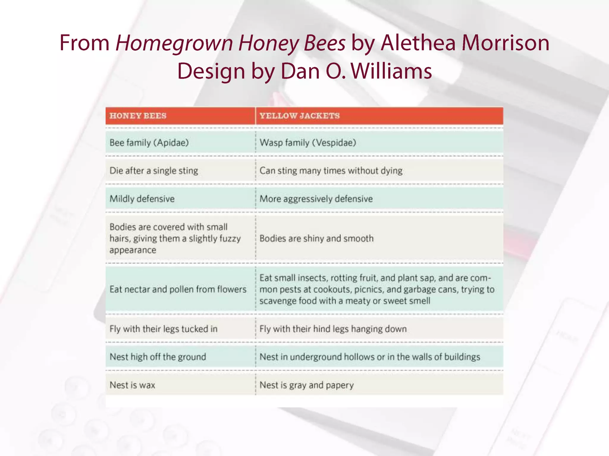
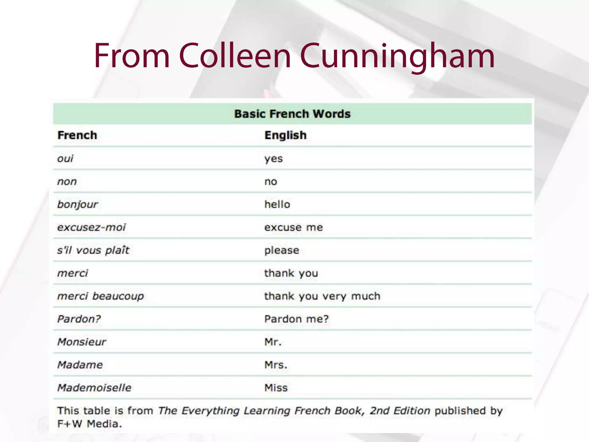
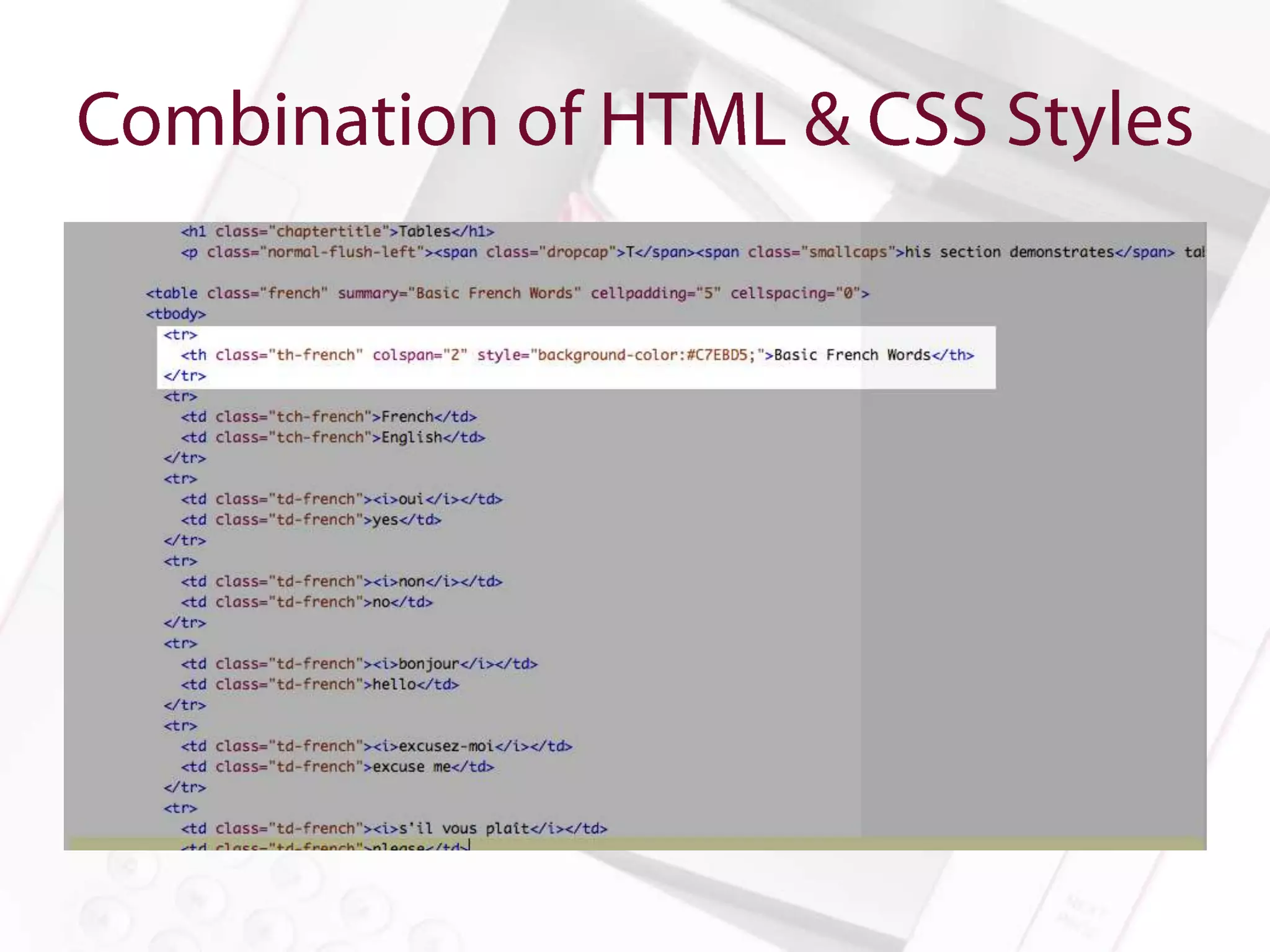
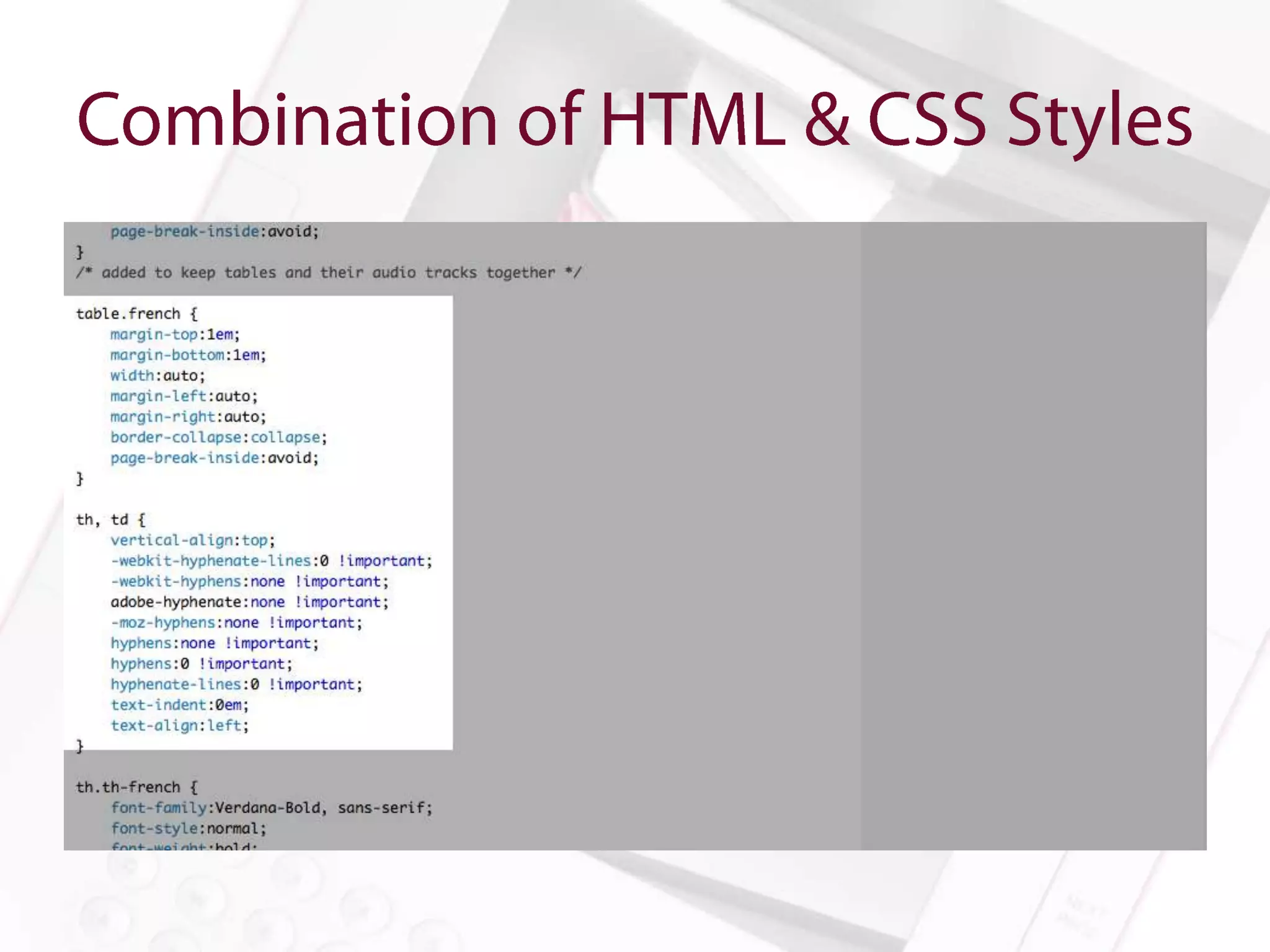
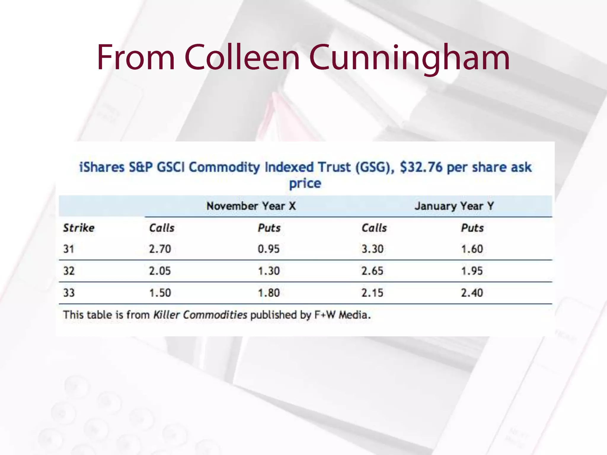
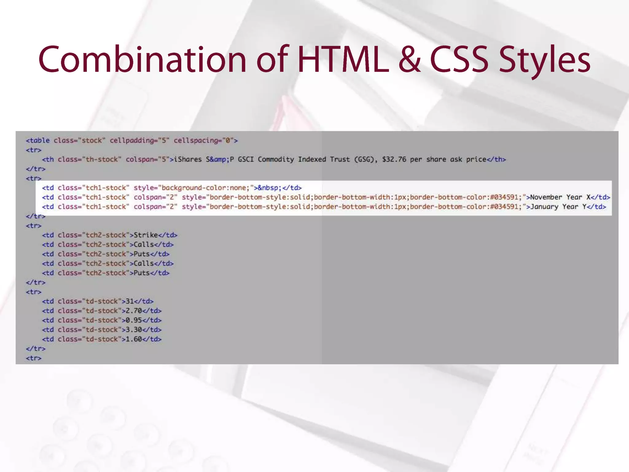
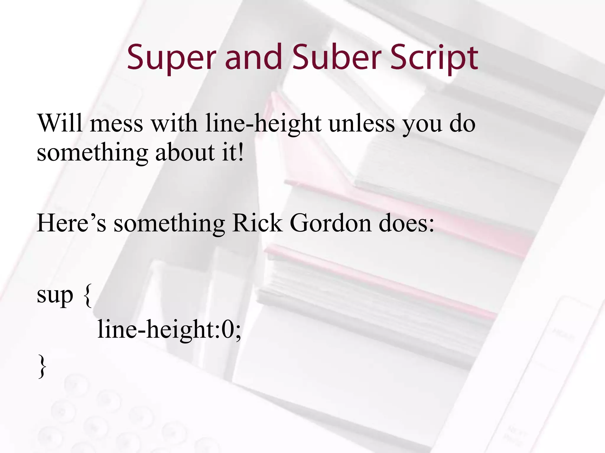
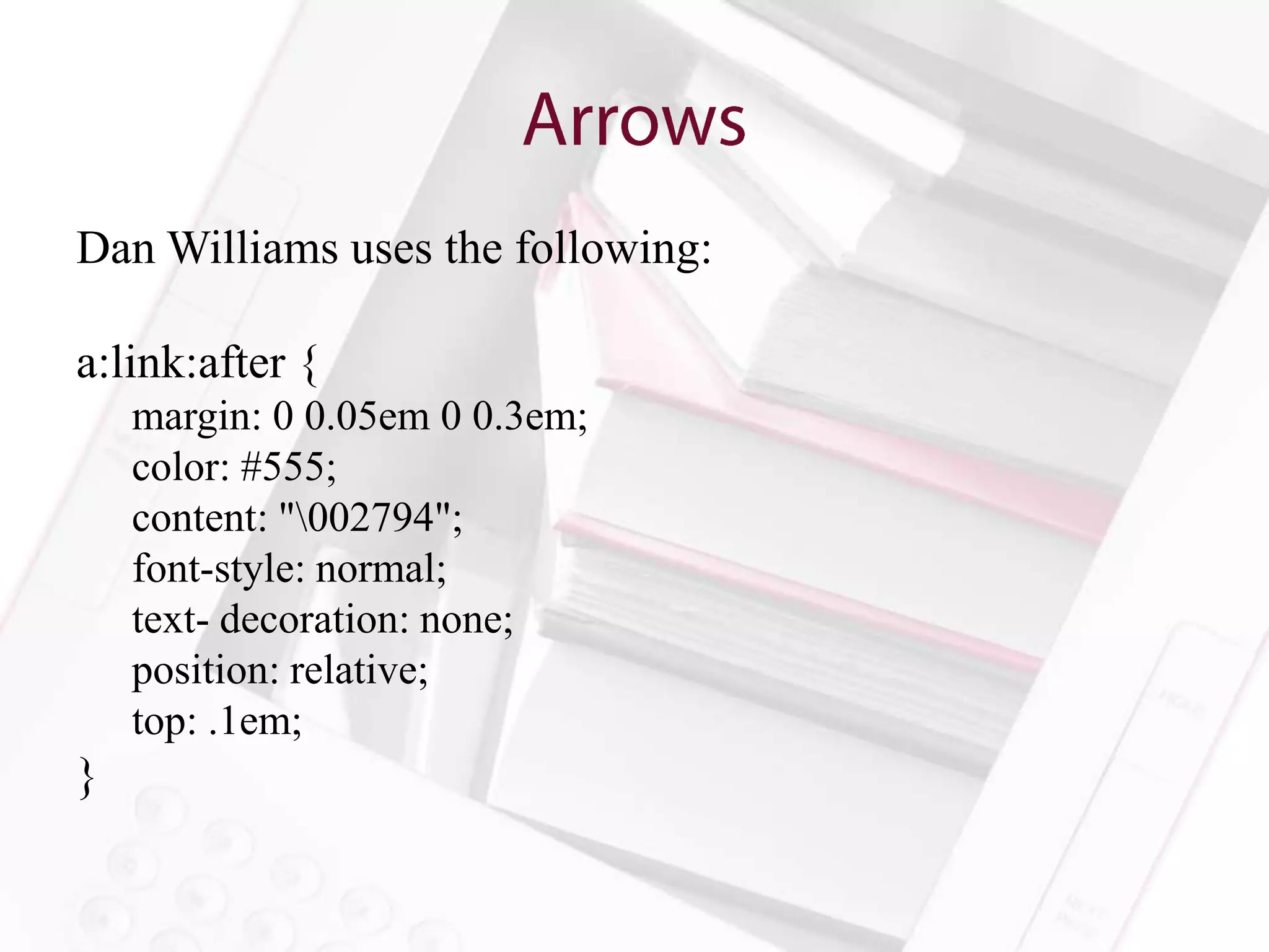
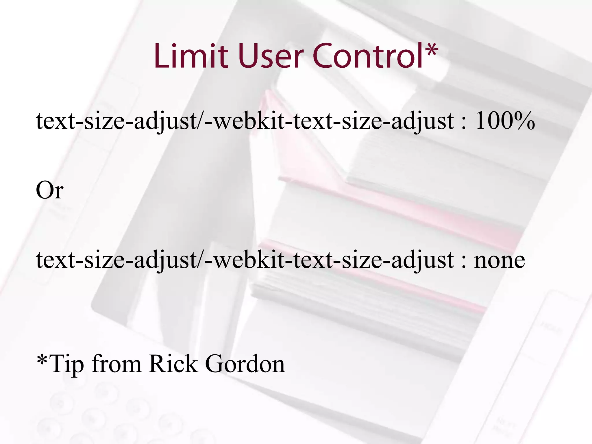
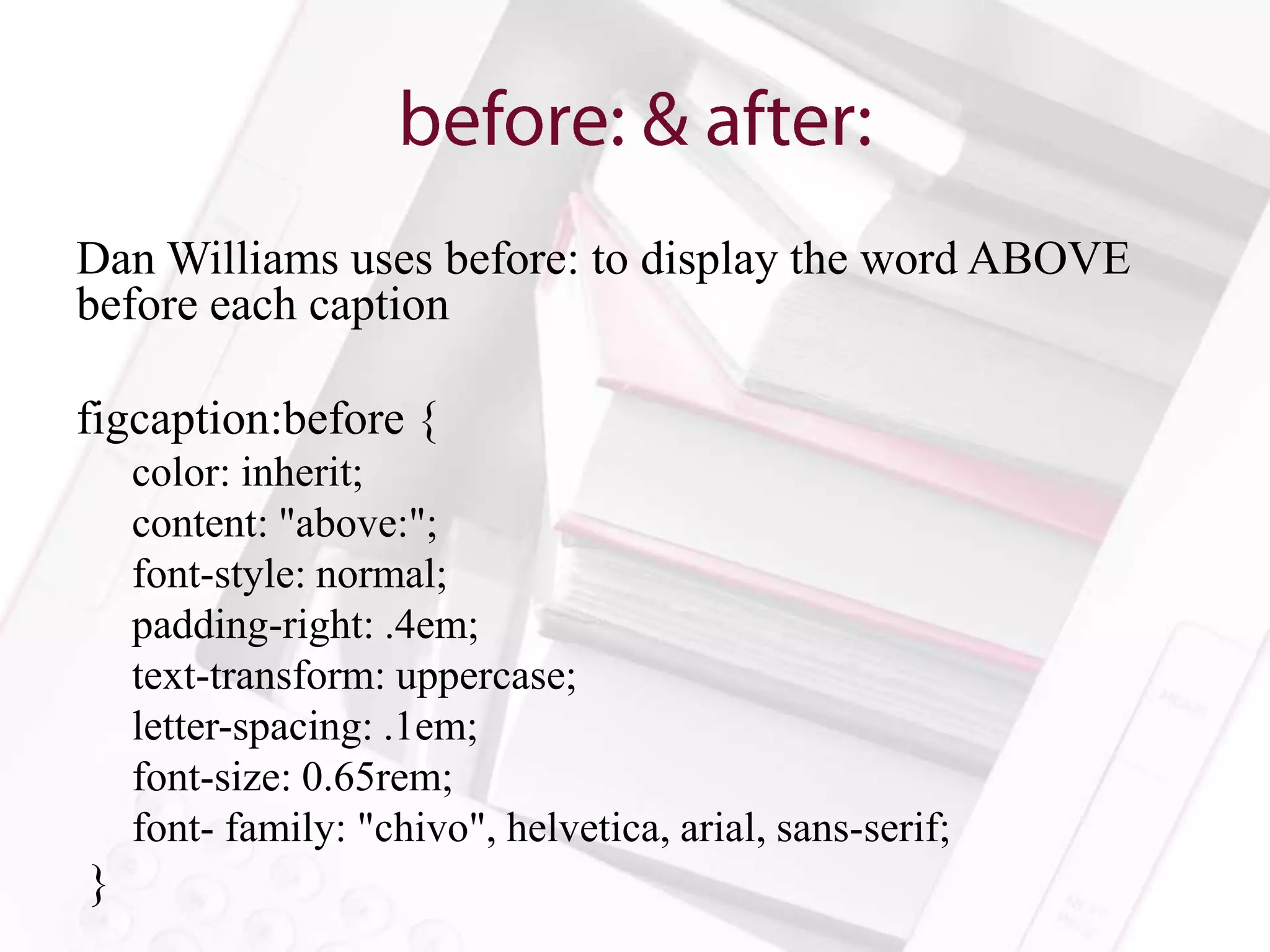
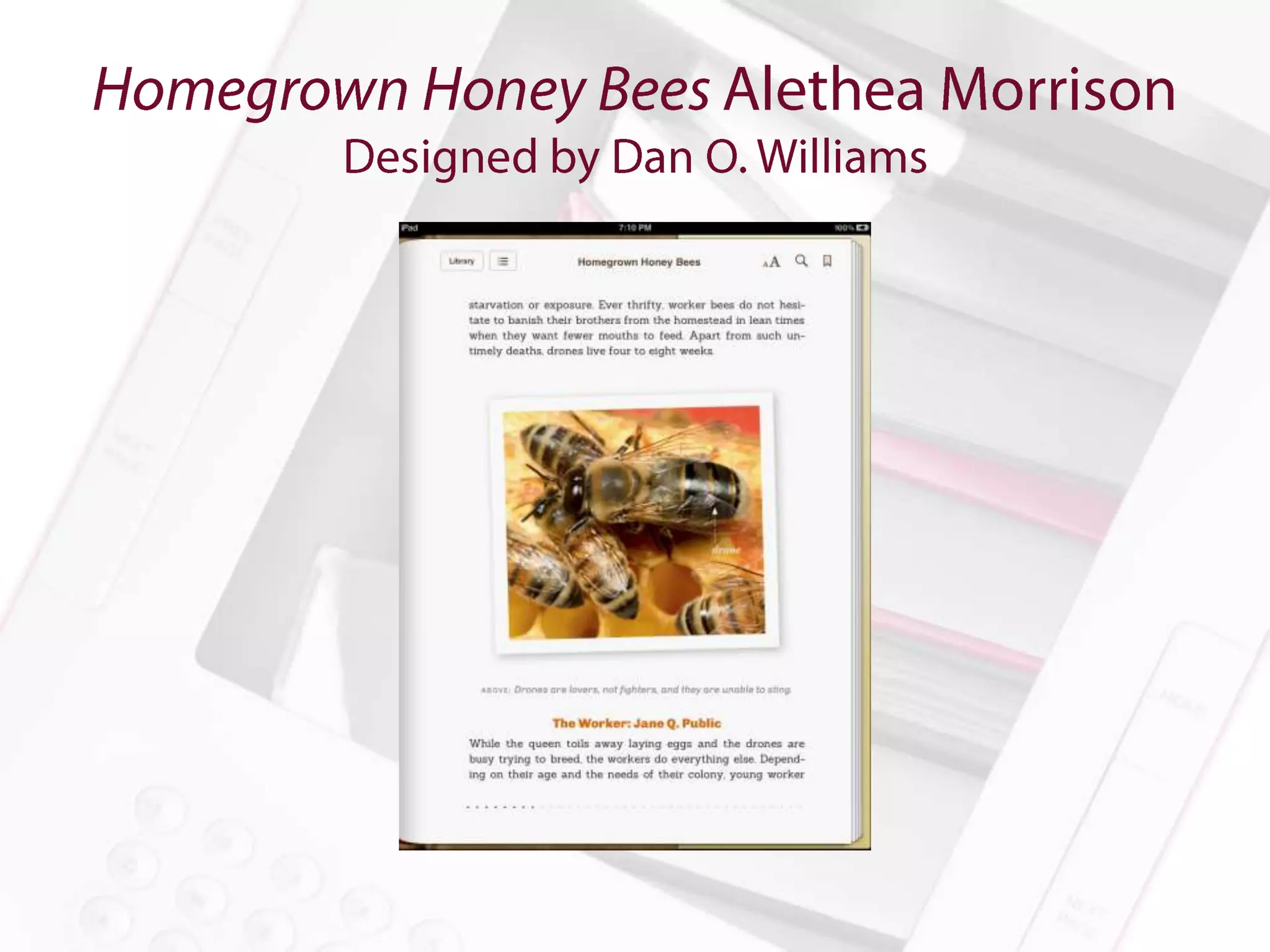
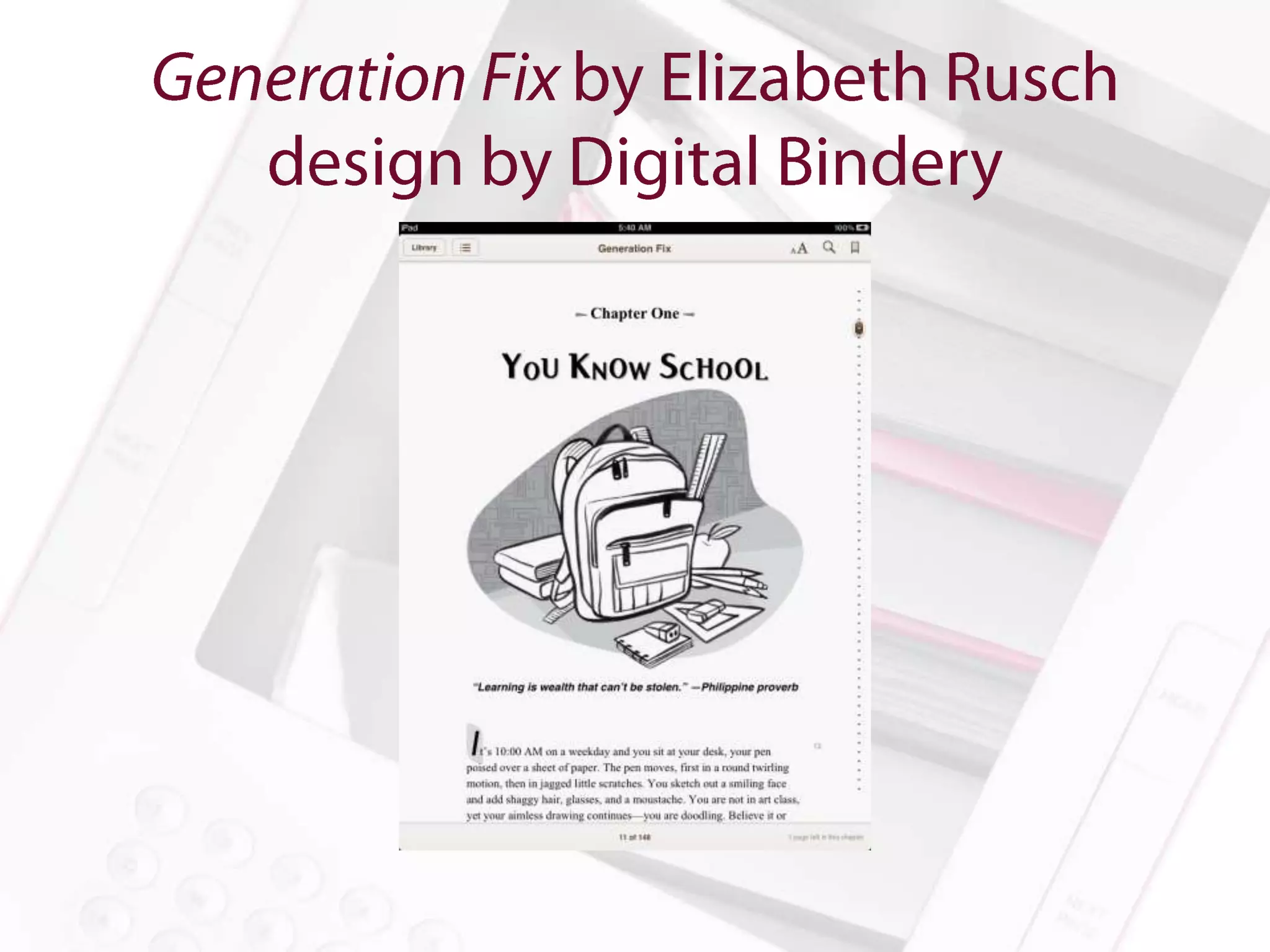
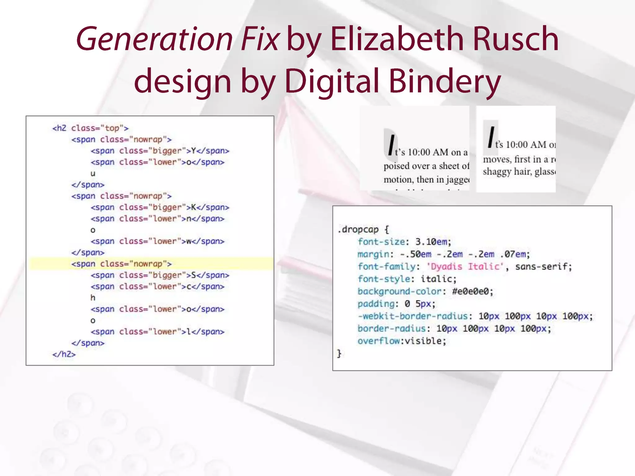
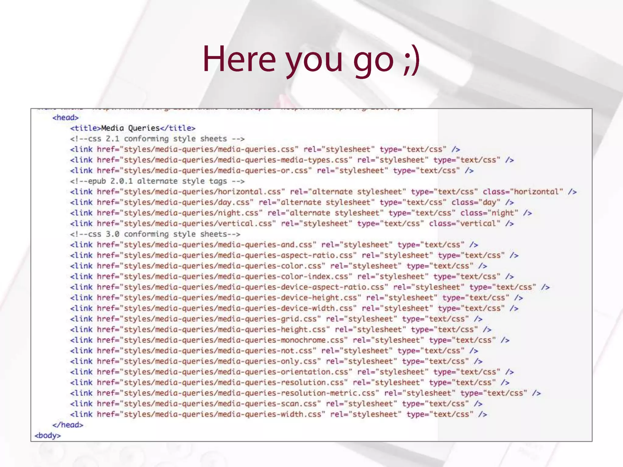
Amanda Gomm
       @agomm
amanda@digitalbindery.com
  www.digitalbindery.com
Anne-Marie Concepción
President, Seneca Design & Training
@amarie
senecadesign.com
Colleen Cunningham
F&W Publications
@BookDesignGirl
thebookstudio.wordpress.com
Dan O. Williams
Digital Projects Manager, Storey Publishing
@FoxgloveCommons
www.storey.com
Dan O. Williams
Digital Projects Manager, Storey Publishing
@FoxgloveCommons
www.storey.com
Rick Gordon
Shelter Publications
@rcgordon
www.shelterpub.com
Tom McCluskey
Digital Bindery
@TomMcCluskey
www.digitalbindery.com
Show and Tell
• The digital typography tool chest
• The Why, How, & Which of embedding fonts.
• “But will I go to jail?”
account for
• user intervention
• reading system fail
• backwards compatibility
•   Semantic Markup
•   Responsive Measurements
•   Graceful Degradation
•   Progressive Enhancement
•   Font Stacks
• Font Basics
   –   Font-family
   –   Font-size
   –   Font-style
   –   Font-variant
   –   Font-weight
   –   Text-transform
• Advanced Font Manipulation
   –   Font-size-adjust
   –   Font-stretch
   –   Word-spacing
   –   Hanging-punctuation
   –   Punctuation-trim
• Because the option is the “Whatever
  Approach” to font selection.
• Because we can.
• Because life in Caecilia all the time is not a
  life worth living.
• If you really don’t know why, I am going to go
  to your house and remove all your fonts except
  Papyrus. Then the rest of us will go have a
  whiskey.
• What’s your budget for fonts?
• That’s what I thought.
• Try something free to distribute.

“Permission is hereby granted, free of charge, to any
person obtaining a copy of the Font Software, to use,
study, copy, merge, embed, modify, redistribute, and sell
modified and unmodified copies of the Font Software…”
—Font License for Adobe’s Source Sans Pro

Resources: Font Squirrel, Google Web Fonts
• Yes. Obviously.
• For more about the legal issues of embedding
  fonts in ebooks, go see Charles Nix tomorrow.


*Amanda Gomm is in no way qualified to give legal advice.
• Put the font (and any necessary licenses) into the
  OEBPS file
• Declare it in your OPF file
• Link to it in the CSS with @font-face
• Specify the font using font-family

What could possibly go wrong?
Hint: Epubcheck will get cranky if you’ve got your
CSS encoded incorrectly
Just because we’re doing things digitally
 doesn’t mean we get to lose our minds.
• Character Size
• Baseline Grid
• Line Length
• Typical font sizes for print will be too small
  for reading devices
• Setting explicit sizes can anger some readers
  and retailers
• Font-size: medium and font-size: 1.00em will
  size the font to default
• We can scale from there
• Line-height is not leading
• Make it relative (1.50em for example)
• Remember to add bottom margins to headers,
  images, etc.
• Remember that line-height and margin relative
  sizes are inherited from the parent element

Resource: 24ways.org/2006/compose-to-a-vertical-rhythm/
• Be mindful of how your typeface and font-size
  affects line length
• In normal scenarios, lines that are too long are
  rarely a problem
• Just in case: p { max-width: 66em; }
• Lines are likely to be too short for larger fonts
  if relative margins are used
No more ladders, no more rivers…
   a girl can dream. Can’t she?
•   hyphens: none | auto | manual
•   -webkit-hyphens: none | auto | manual
•   -moz-hyphens: none | auto | manual
•   adobe-hyphenate: none | auto | explicit
• Set hyphens via ­ (soft hyphen)
•   hyphenate-after: auto | integer
•   hyphenate-before: auto | integer
•   hyphenate-character: auto | string (e.g. "2112”)
•   hyphenate-lines: auto | integer
• Tip from Rick Gordon: bold and italic spans don’t
  always inherit the hyphenation rules.

em {
       font-style:italic;
       font-weight:inherit;
       -webkit-hyphens:inherit;
       hyphens:inherit;
}
Be creative and persistent.
      Raise the bar.
• Rick Gordon’s Solution for thin spaces around em
  dashes:

<style>
.thin {
letter-spacing: -.2em;
}
</style>

<span class=“thin”> </span>—<span class=“thin”> </span>
• Rick Gordon’s Solution for thin spaces around em dashes + Tom
  McCluskey’s solution for keeping em dashes with their predecessor

<style>
.thin {
letter-spacing: -.2em;
}
.nobreak {
white-space: nowrap;
}
</style>

<span class=“nobreak”>word<span class=“thin”> </span>—</span><span
class=“thin”> </span>
All your space are belong to us.
• Page-break-before: auto | always | avoid | right | left
• Page-break-after: auto | always | avoid | right | left
• Page-break-inside: auto | avoid
• Orphans: integer
• Widows: integer

p{
    orphans: 2;
    widows: 2;
}
Header (page-break-after: avoid: page-break-inside:
avoid;)
Body Text (h1 + p page-break-before: avoid)

Figure (page-break-after: avoid)
Caption (page-break-before: avoid; page-break-
inside: avoid;)

Tables (page-break-inside: avoid)
Show and Tell
(that look great)
• Images Pros
  – Perfect representation
  – Readers can’t mess it up
  – All of the data will fit nicely all the time

• HTML Pros
  – Accessibility
  – Reflowability
  – Readers can mess it up
  – The data can be dynamic
Show and Tell
Will mess with line-height unless you do
something about it!

Here’s something Rick Gordon does:

sup {
        line-height:0;
}
Dan Williams uses the following:

a:link:after {
    margin: 0 0.05em 0 0.3em;
    color: #555;
    content: "002794";
    font-style: normal;
    text- decoration: none;
    position: relative;
    top: .1em;
}
text-size-adjust/-webkit-text-size-adjust : 100%

Or

text-size-adjust/-webkit-text-size-adjust : none


*Tip from Rick Gordon
Dan Williams uses before: to display the word ABOVE
before each caption

figcaption:before {
    color: inherit;
    content: "above:";
    font-style: normal;
    padding-right: .4em;
    text-transform: uppercase;
    letter-spacing: .1em;
    font-size: 0.65rem;
    font- family: "chivo", helvetica, arial, sans-serif;
}
Media Queries are Rad
• The solution you ask?
•   Anne-Marie Concepción (@amarie)
•   Colleen Cunningham (@BookDesignGirl)
•   Dan O. Williams (@FoxgloveCommons)
•   Rick Gordon (@rcgordon)
•   Tom McCluskey (@TomMcCluskey
Homegrown Honey Bees by Alethea Morrison

Stretching: Enhanced 30th Anniversary Edition by Bob Anderson

Discover Colorado by Mathew Downey and Ty Bliss

The Everything Learning French Book 2nd Edition published by F&W
Media

Waldon (as designed by Dan O. Williams) by Henry David Thoreau

Killer Commodities published by F&W Media

eBook Typography by Chris Jennings
Amanda Gomm
       @agomm
amanda@digitalbindery.com
  www.digitalbindery.com

Achieving Beautiful Typography in eBooks

  • 1.
    Amanda Gomm @agomm amanda@digitalbindery.com www.digitalbindery.com
  • 2.
    Anne-Marie Concepción President, SenecaDesign & Training @amarie senecadesign.com
  • 3.
  • 4.
    Dan O. Williams DigitalProjects Manager, Storey Publishing @FoxgloveCommons www.storey.com
  • 5.
    Dan O. Williams DigitalProjects Manager, Storey Publishing @FoxgloveCommons www.storey.com
  • 6.
  • 7.
  • 8.
  • 22.
    • The digitaltypography tool chest • The Why, How, & Which of embedding fonts. • “But will I go to jail?”
  • 23.
    account for • userintervention • reading system fail • backwards compatibility
  • 24.
    Semantic Markup • Responsive Measurements • Graceful Degradation • Progressive Enhancement • Font Stacks
  • 25.
    • Font Basics – Font-family – Font-size – Font-style – Font-variant – Font-weight – Text-transform • Advanced Font Manipulation – Font-size-adjust – Font-stretch – Word-spacing – Hanging-punctuation – Punctuation-trim
  • 26.
    • Because theoption is the “Whatever Approach” to font selection. • Because we can. • Because life in Caecilia all the time is not a life worth living. • If you really don’t know why, I am going to go to your house and remove all your fonts except Papyrus. Then the rest of us will go have a whiskey.
  • 27.
    • What’s yourbudget for fonts? • That’s what I thought. • Try something free to distribute. “Permission is hereby granted, free of charge, to any person obtaining a copy of the Font Software, to use, study, copy, merge, embed, modify, redistribute, and sell modified and unmodified copies of the Font Software…” —Font License for Adobe’s Source Sans Pro Resources: Font Squirrel, Google Web Fonts
  • 28.
    • Yes. Obviously. •For more about the legal issues of embedding fonts in ebooks, go see Charles Nix tomorrow. *Amanda Gomm is in no way qualified to give legal advice.
  • 29.
    • Put thefont (and any necessary licenses) into the OEBPS file • Declare it in your OPF file • Link to it in the CSS with @font-face • Specify the font using font-family What could possibly go wrong? Hint: Epubcheck will get cranky if you’ve got your CSS encoded incorrectly
  • 33.
    Just because we’redoing things digitally doesn’t mean we get to lose our minds.
  • 34.
    • Character Size •Baseline Grid • Line Length
  • 35.
    • Typical fontsizes for print will be too small for reading devices • Setting explicit sizes can anger some readers and retailers • Font-size: medium and font-size: 1.00em will size the font to default • We can scale from there
  • 36.
    • Line-height isnot leading • Make it relative (1.50em for example) • Remember to add bottom margins to headers, images, etc. • Remember that line-height and margin relative sizes are inherited from the parent element Resource: 24ways.org/2006/compose-to-a-vertical-rhythm/
  • 37.
    • Be mindfulof how your typeface and font-size affects line length • In normal scenarios, lines that are too long are rarely a problem • Just in case: p { max-width: 66em; } • Lines are likely to be too short for larger fonts if relative margins are used
  • 38.
    No more ladders,no more rivers… a girl can dream. Can’t she?
  • 39.
    hyphens: none | auto | manual • -webkit-hyphens: none | auto | manual • -moz-hyphens: none | auto | manual • adobe-hyphenate: none | auto | explicit
  • 40.
    • Set hyphensvia &shy; (soft hyphen)
  • 41.
    hyphenate-after: auto | integer • hyphenate-before: auto | integer • hyphenate-character: auto | string (e.g. "2112”) • hyphenate-lines: auto | integer
  • 42.
    • Tip fromRick Gordon: bold and italic spans don’t always inherit the hyphenation rules. em { font-style:italic; font-weight:inherit; -webkit-hyphens:inherit; hyphens:inherit; }
  • 43.
    Be creative andpersistent. Raise the bar.
  • 44.
    • Rick Gordon’sSolution for thin spaces around em dashes: <style> .thin { letter-spacing: -.2em; } </style> <span class=“thin”> </span>—<span class=“thin”> </span>
  • 45.
    • Rick Gordon’sSolution for thin spaces around em dashes + Tom McCluskey’s solution for keeping em dashes with their predecessor <style> .thin { letter-spacing: -.2em; } .nobreak { white-space: nowrap; } </style> <span class=“nobreak”>word<span class=“thin”> </span>—</span><span class=“thin”> </span>
  • 46.
    All your spaceare belong to us.
  • 47.
    • Page-break-before: auto| always | avoid | right | left • Page-break-after: auto | always | avoid | right | left • Page-break-inside: auto | avoid
  • 48.
    • Orphans: integer •Widows: integer p{ orphans: 2; widows: 2; }
  • 49.
    Header (page-break-after: avoid:page-break-inside: avoid;) Body Text (h1 + p page-break-before: avoid) Figure (page-break-after: avoid) Caption (page-break-before: avoid; page-break- inside: avoid;) Tables (page-break-inside: avoid)
  • 56.
  • 63.
  • 64.
    • Images Pros – Perfect representation – Readers can’t mess it up – All of the data will fit nicely all the time • HTML Pros – Accessibility – Reflowability – Readers can mess it up – The data can be dynamic
  • 65.
  • 74.
    Will mess withline-height unless you do something about it! Here’s something Rick Gordon does: sup { line-height:0; }
  • 75.
    Dan Williams usesthe following: a:link:after { margin: 0 0.05em 0 0.3em; color: #555; content: "002794"; font-style: normal; text- decoration: none; position: relative; top: .1em; }
  • 77.
  • 78.
    Dan Williams usesbefore: to display the word ABOVE before each caption figcaption:before { color: inherit; content: "above:"; font-style: normal; padding-right: .4em; text-transform: uppercase; letter-spacing: .1em; font-size: 0.65rem; font- family: "chivo", helvetica, arial, sans-serif; }
  • 82.
  • 83.
  • 86.
    Anne-Marie Concepción (@amarie) • Colleen Cunningham (@BookDesignGirl) • Dan O. Williams (@FoxgloveCommons) • Rick Gordon (@rcgordon) • Tom McCluskey (@TomMcCluskey
  • 87.
    Homegrown Honey Beesby Alethea Morrison Stretching: Enhanced 30th Anniversary Edition by Bob Anderson Discover Colorado by Mathew Downey and Ty Bliss The Everything Learning French Book 2nd Edition published by F&W Media Waldon (as designed by Dan O. Williams) by Henry David Thoreau Killer Commodities published by F&W Media eBook Typography by Chris Jennings
  • 88.
    Amanda Gomm @agomm amanda@digitalbindery.com www.digitalbindery.com

Editor's Notes

  • #24 The most robust typography planReaders will change sizeReading systems won’t be able to embed fontsSomebody will read your book on a Kindle 1
  • #25 The most robust typography plan accounts for user intervention, reading system fail, and backwards compatibility.
  • #26 Other thing in our tool chest: ability to manipulate fontJust like print, these can be powerful tools easily over used.
  • #27 Would you go to the printer and ask them to just go ahead and throw whatever font they have on their system into the book. Sure, you designed it in Caslon, but you know, bodoni, or bauhaus, or whatever. That’s fine.
  • #29 Probably not.* But you may get in big trouble—meaning embarrassment and cash settlements.
  • #34 Do you need to go back and read Bringhurst to remind you of the noble tradition from whence we come?
  • #37 so if you set your headers to a bigger font, you’ll need to scale your bottom margin accordingly to retain the grid
  • #38 Javascript can deal with characters per line so for reading systems that support scripting, that’s an option.
  • #46 Zero-width joiners are also an option but we’ve run into some problems with certain default fonts on certain reading systems that present the zwj’s as boxes.