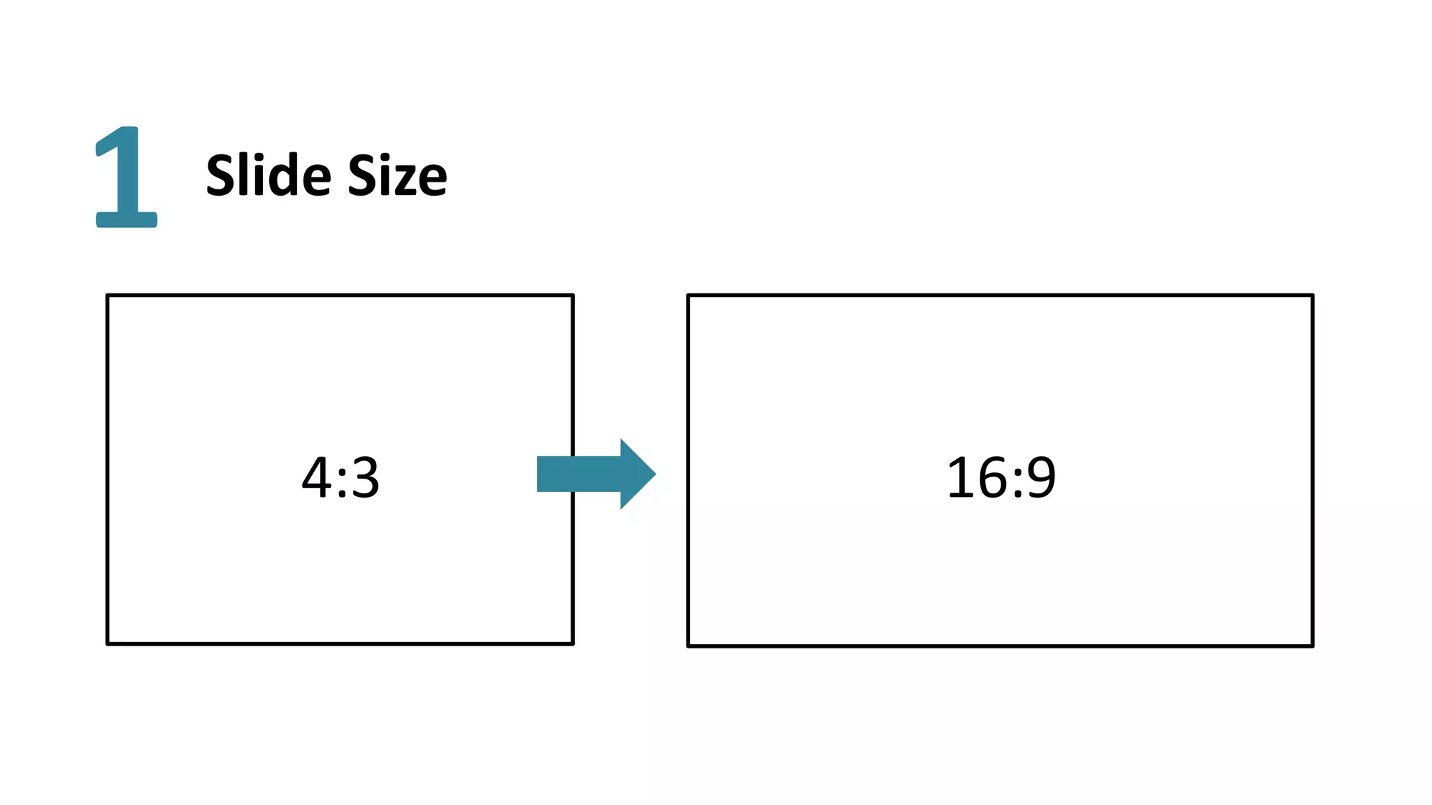
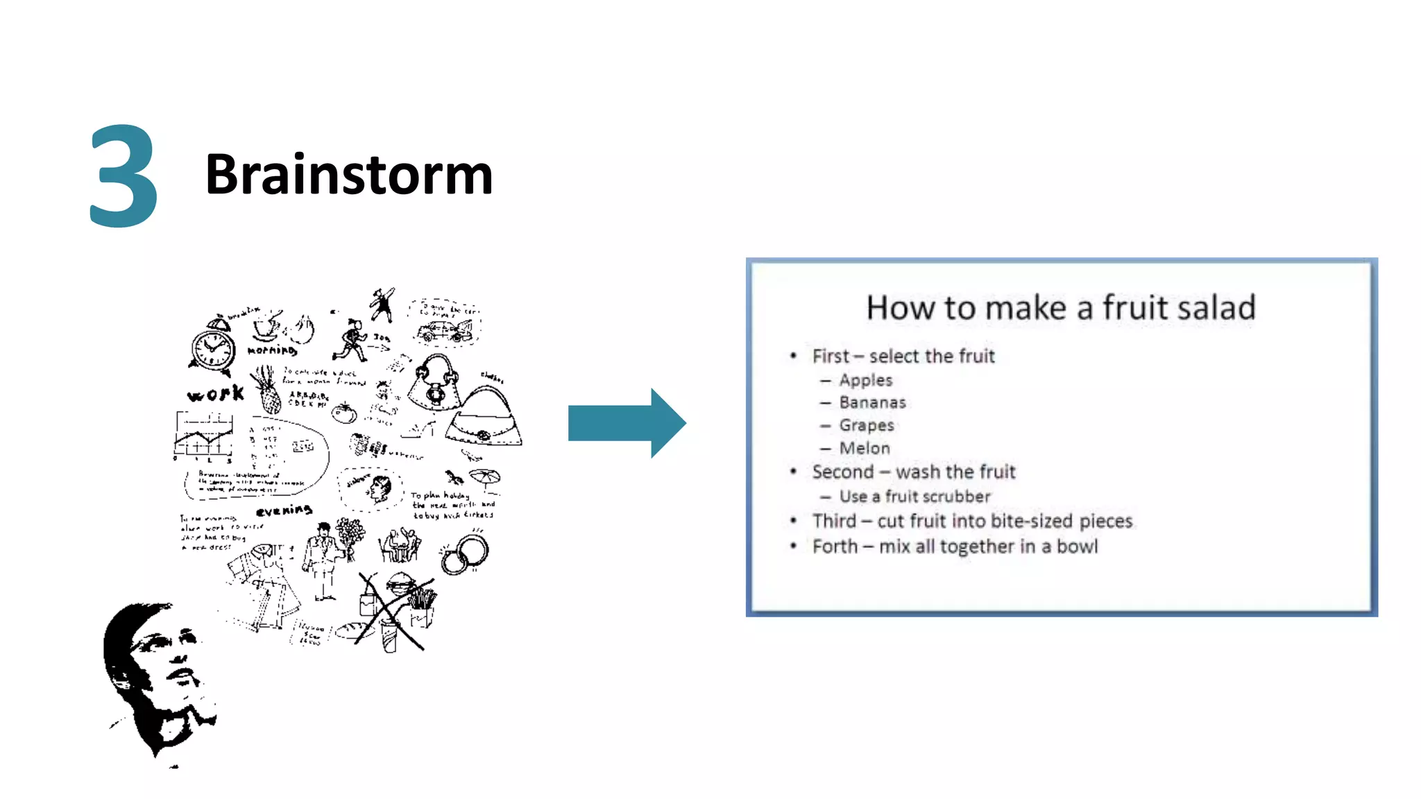
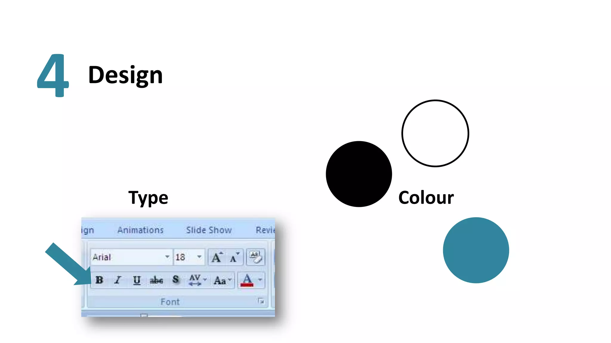
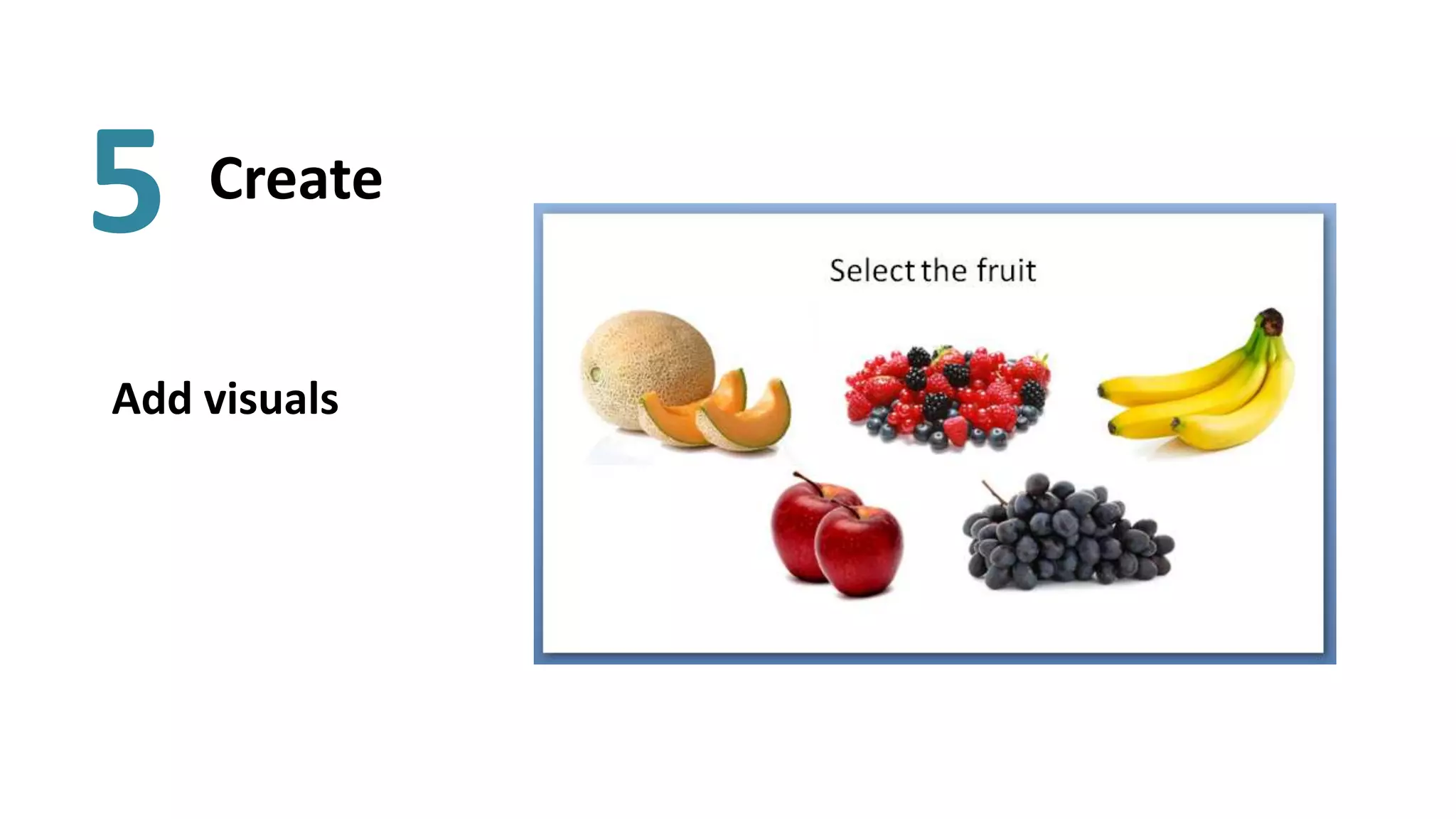
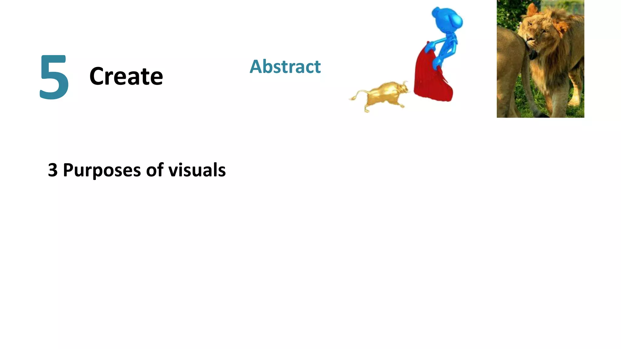
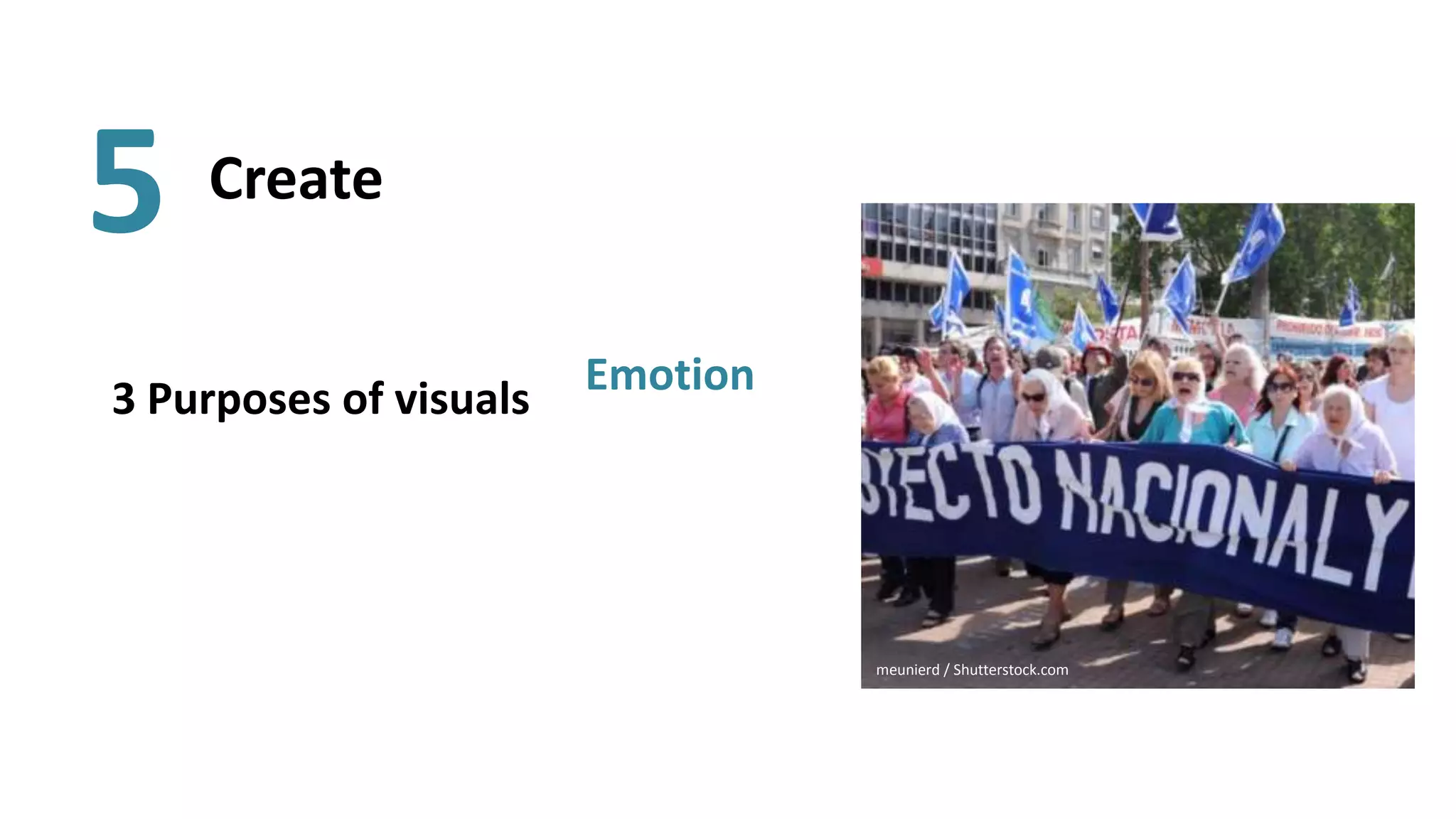
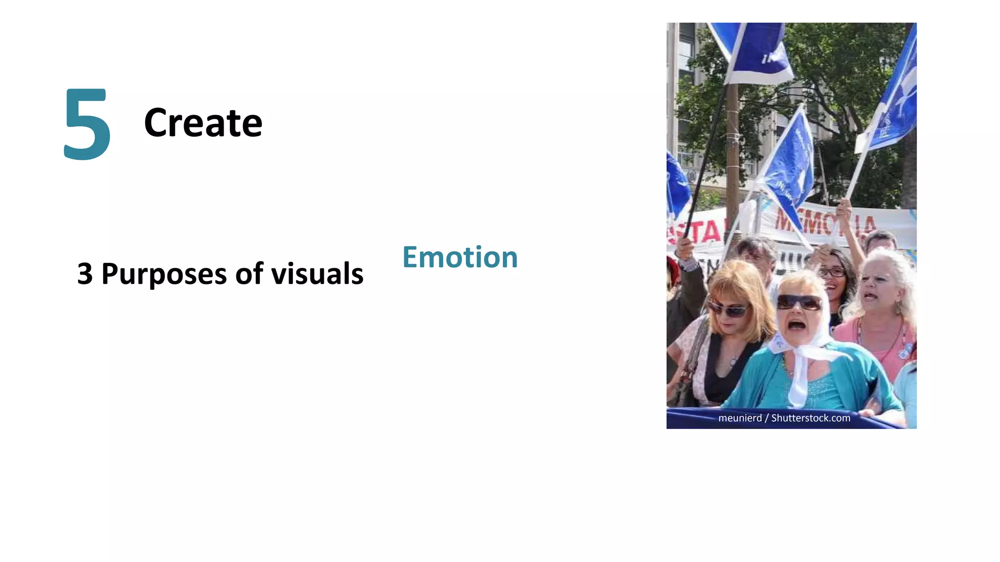
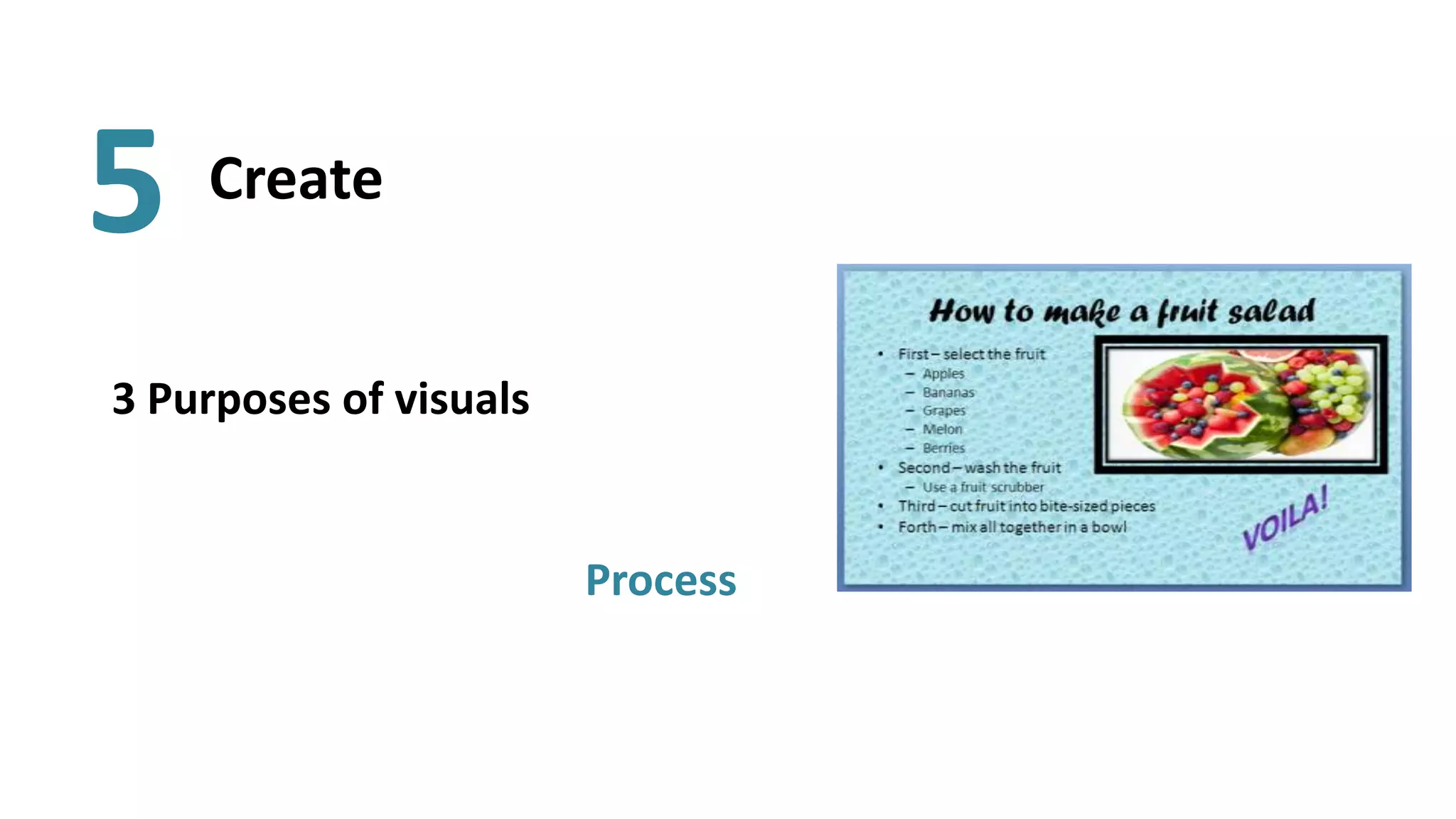
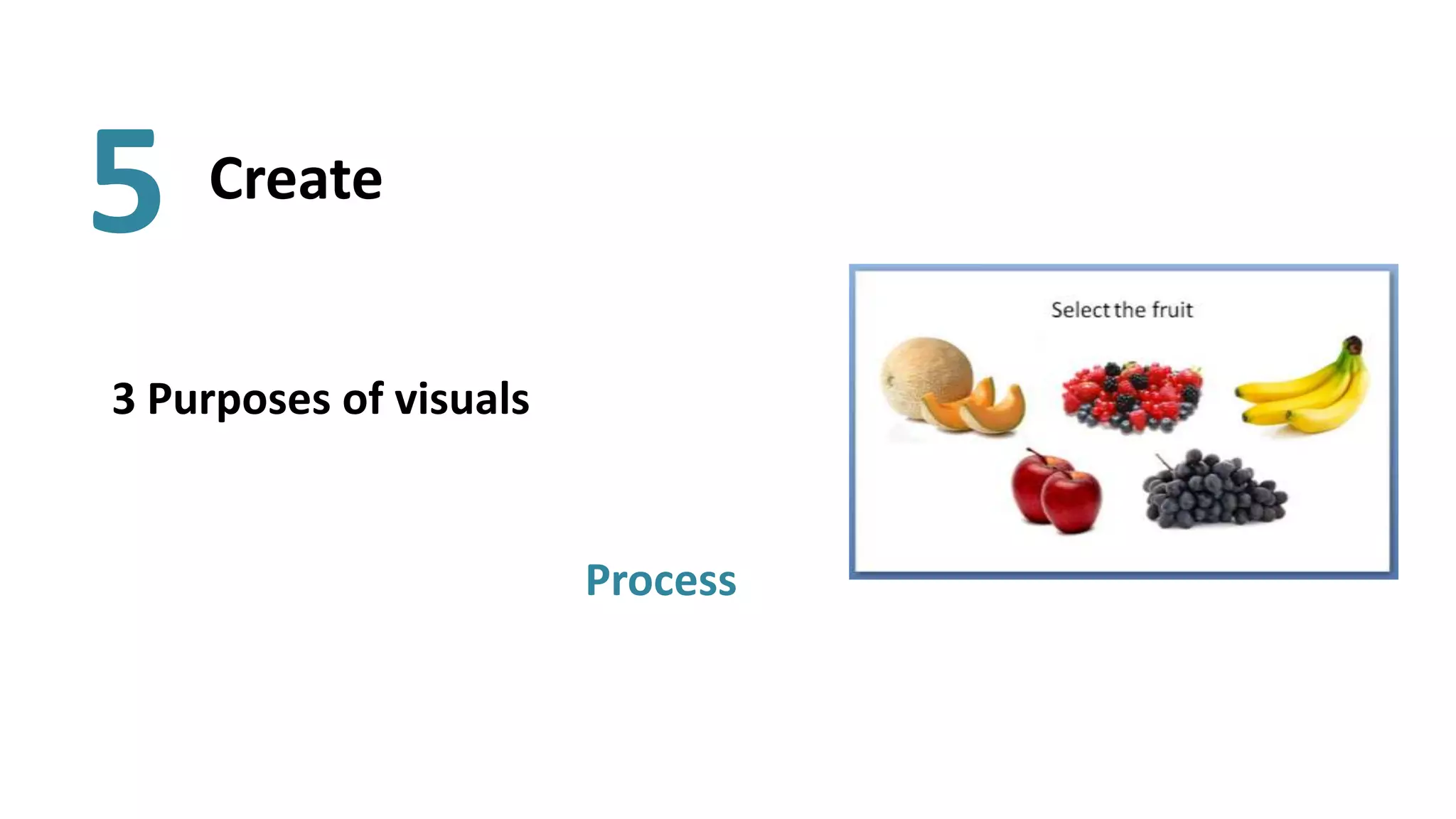
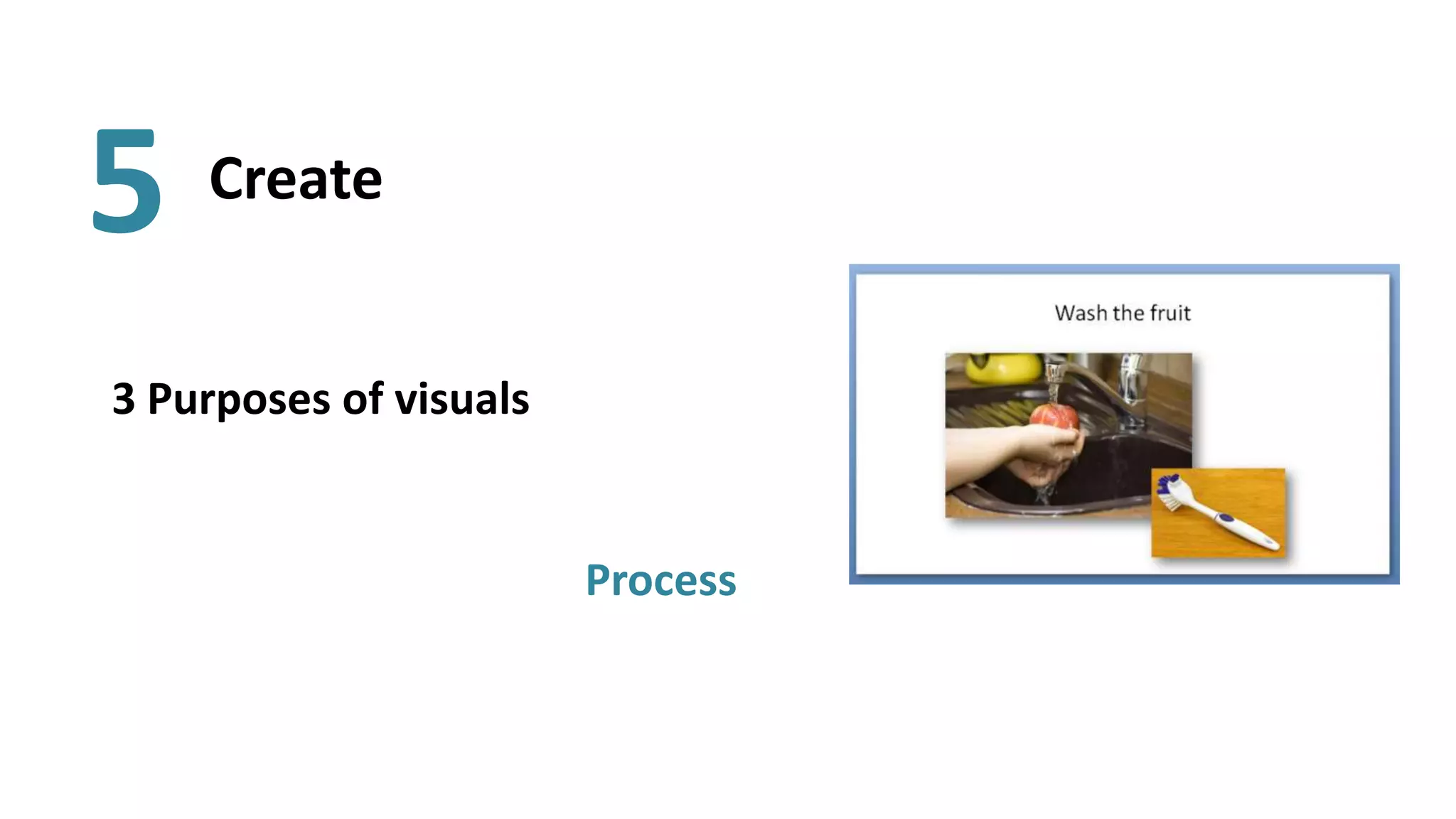
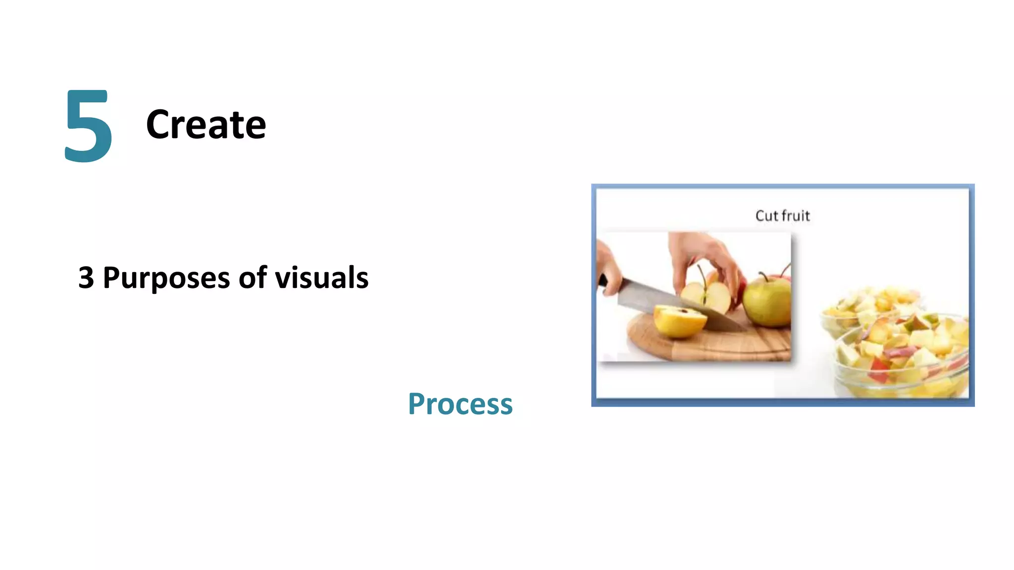
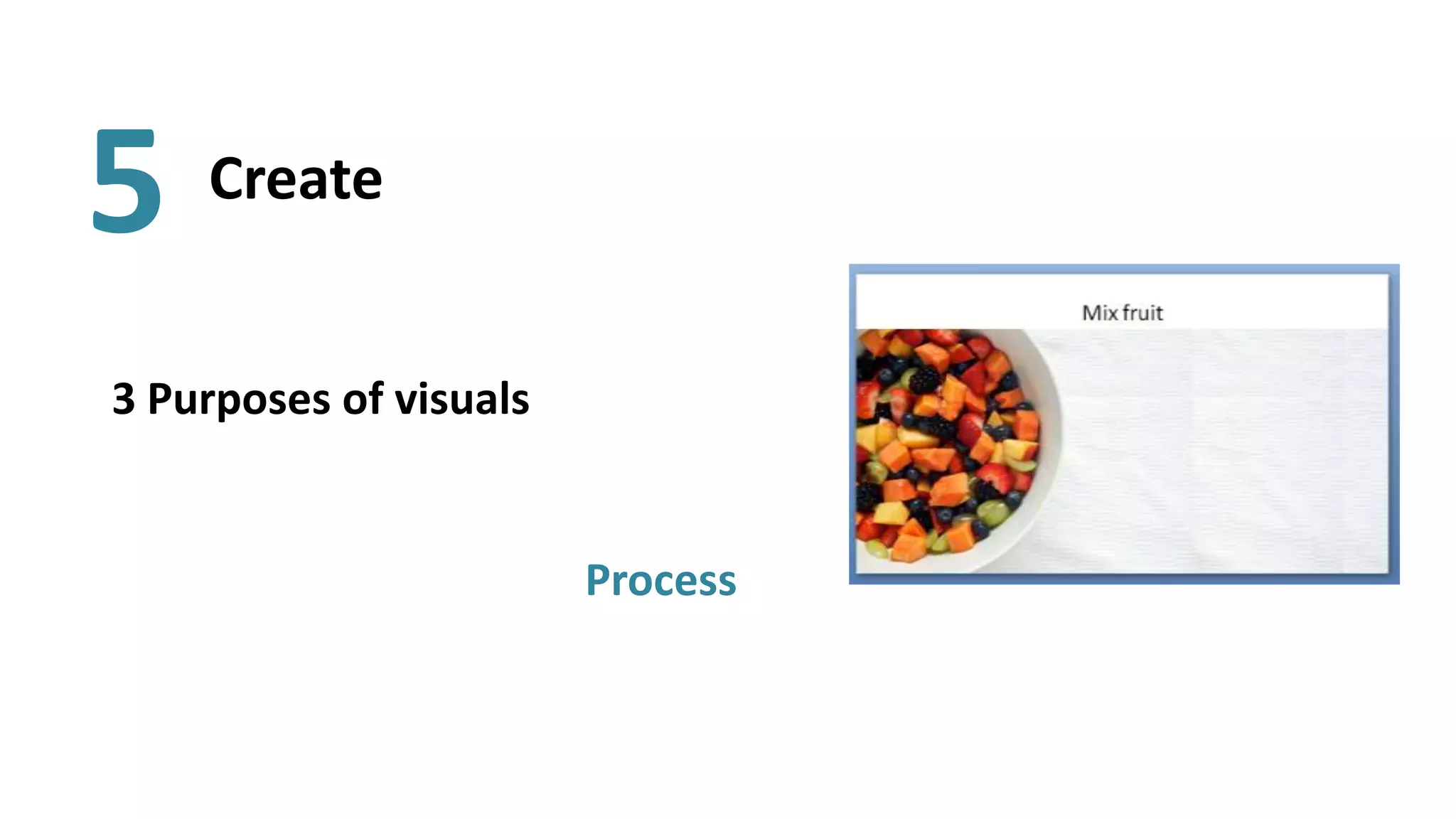
As part of the Media Development Project, we work with instructors on visual thinking and design for educational purposes. This introduces the basics of using visuals in PowerPoint.
This document provides tips for creating effective PowerPoint presentations. It discusses avoiding too much information by limiting content to 5 bullets, words, or thoughts per slide. It also discusses preparing and filming video lectures, including planning content, rehearsing, body language, voice, and eye contact. Additional tips include using visual information like pictures as metaphors, emphasizing aesthetic qualities, using different fonts but keeping the same font family, avoiding centering objects, using the whole slide area, and creating an unbalanced rhythm.
The document provides information about an upcoming film workshop and film festival competition called Jump Cuts. Students will work in small groups to plan, film, and submit a 2-5 minute short film that fits the horror or thriller genre and addresses the theme of "prey". They will need to complete pre-production by the end of the next week and finish filming by mid-December, requiring work outside of class time. The document outlines submission requirements and rules for the competition, and provides examples of previous years' winning entries.
This document provides tips for creating great presentations. It recommends including essential elements like content, layout, and drama. For content, the presentation should have a clear purpose and idea. For layout, the slides should use a combination of fonts, images, and limited word count per slide with one concept per slide. Great presentations also use visual elements like large, well-chosen pictures and consistent design across slides while varying the layout.
http://www.skillshare.com/How-to-Create-a-TED-Worthy-Presentation/698156887/1007905343
ABOUT THE PRESENTATION:
We are living in a world where Steve Jobs was a modern-day hero, Al Gore won an Oscar for his Inconvenient Truth presentation and the TED conference is the place everyone wants to be each year. Thanks to this leadership style, the bar for presentations that convey world changing ideas is set incredibly high. This class is designed to help you clear that high bar with confidence, grace and skill.
Creating meaningful presentations can be tricky, time consuming and nerve wracking, but by focusing on the key elements in this class, you too can give a TED worthy presentation.
This class is designed to cover the following topics:
Audience: understanding your audience
Stickiness: creating unique messaging that sticks
Authenticity: remaining authentic so your audience trusts you
Tools: using the right tools - both offline and online
Deck: 3 steps to building your presentation - preparation, design, delivery
Follow up: sending the right materials as a follow up (and it's not just your noteless deck!)
By the end of the class, you will have everything you need to create a strong presentation that is simple, easy to understand, exciting and visually stimulating.
ABOUT THE PRESENTER:
Brooke spoke at TEDxBKK, was a speaker coach for TEDxPhnom Penh, TEDxMission, and is the Director of Communications for an NGO that was the result of a TED prize - hence the name InSTEDD. Before InSTEDD, Brooke worked on Public Relations at Kiva, Social Innovation Design at Lovely Day, Business Development at All Day Buffet, & Project Coordination at Change Fusion Bangkok. Brooke is a frequent public speaker and has spoken at events in Thailand, Nepal, Europe and the US, including Stanford, Berkeley and Northwestern.
The document provides tips for creating effective PowerPoint presentations. It advises including an introduction slide with your name and organization, aiming for about one slide per two minutes of speaking time, and using bullet points as prompts rather than full scripts. Images should be relevant and properly resized without distortion. Animations and transitions should be limited, and slides should not be skipped or backtracked through. Fonts should be easily readable like Arial or Times New Roman. Presentations should include contact details and be shared after use.
This document provides instructions for running a group exercise called "Cover Story" where students imagine the best case scenario for a production they are working on. It details having students work in groups to populate templates with categories like "Cover", "Headlines", "Sidebars" to document their imagined successful production. The groups then present their stories to each other and reflect on what they learned from the creative envisioning process.
The Ender's Game production schedule outlines 6 steps for developing ideas for the film's design: 1) Create an annotated feedback analysis sheet, 2) Take feedback to further develop ideas, 3) Write up steps using screenshots, 4) Create a color palette showing colors used and why, 5) Create a sheet showing fonts and pick a final one, 6) Finish the final design with screenshots of the thought process.
Digital commerce is one of the nine elements of digital citizenship and refers to the buying and selling of goods online. It is important to digital citizenship because it allows people to purchase items they need online, including those who do not get out often. When performing digital commerce, people must do so respectfully and responsibly, using it appropriately and avoiding sites that could steal their information or money.
The document discusses using visualizations to convey information more effectively than text alone. It provides examples of different visualization techniques, such as semantic maps, virtual reality, ubiquitous computing, and 3D interactive visualizations. The author argues that visualizations can improve interfaces by leveraging human perception and more clearly conveying information to support tasks like knowledge sharing and information discovery.
This document discusses the use of PowerPoint for presentations and includes examples and advice. It provides a brief history of PowerPoint, discusses using external media like images, video and web links, and gives tips for downloading content from YouTube. It also includes an imagined example presentation about artist Jeremy Deller that incorporates different media formats.
This activity can be useful to improve your students' vocabulary. Think outside the box not to work just vocabulary on fruits, and create other texts to work other topics, i.e. furniture.
The document discusses how perception affects business communications. It begins by defining perception as using the senses to become aware of something, and communication as conveying information. There are different types of perception including self-perception, environmental perception, learned perception, physical perception, and cultural perception, which are shaped by factors like personality, culture, experiences, and physical senses. Perception affects communication through things like dress, eye contact, tone of voice, and past experiences. Differences in perception based on age, gender, culture, or experiences can negatively impact communication if not properly understood. Overall, the document examines how our perceptions are formed and how varying perceptions between individuals can introduce barriers in effective business communication.
What's Your Perception Strategy? (Why It's NOT All About Content)Stephen Anderson
If we focus too much on content, we ignore what we know about how our associative brain comes to makes sense new information. Think about how many people respond before reading past the first sentence of an email, or how a magazine article doesn't get the same reaction when displayed in HTML. Or consider how knowing the author of a publication influences your judgement of that content.
Picking up from the session Stephen P. Anderson gave last year on "The Stories We Construct" (a biological look at the narratives that influence behavior), this session focuses on how we come to perceive—and respond to— information. From phantom limbs to magicians fooling our senses, Stephen proposes a model that makes sense of how we truly experience information. Practical? You'll leave with a deep understanding of everything UX is about and an awareness of common practices that don't account for this knowledge.
This document appears to be a presentation on visual management. It discusses the concepts of visual management and the 5S methodology for organizing the workplace. The 5S methodology involves sorting, stabilizing, shining, standardizing, and sustaining the work environment. Tools of visual management like displays and controls are highlighted to guide staff actions. Benefits of visual management include improved information sharing, worker autonomy, and continuous improvement. Checklists are provided to audit conformance to 5S principles and identify areas needing attention.
Difference perception and their effect on communicationVijay Vasani
This document discusses the difference between perception and communication and how they affect each other. It defines communication as conveying information between people to create understanding, and perception as how people interpret sensory information to form views of the world. Communication and perception are interrelated - a message can be perceived differently depending on factors like culture, environment, and self-perception. The document also describes different types of perception like self-perception, learned perception, environmental perception, cultural perception, and physical perception. Finally, it discusses how perception affects communication, as people perceive things differently, and the role of communication is to convey messages to build desired perceptions.
This document discusses perception, attitude, values and their impact on communication. It begins by defining perception as the organization, identification and interpretation of sensory information to understand one's environment. There are four steps in the perception process: selection, organization, interpretation and negotiation. The role of perception in communication is that the sender's perception impacts what is sent and the receiver's perception impacts what is received. There are different types of perception including self, environmental, learned and physical/cultural. The document also discusses attitudes, defining them as mental predispositions that are expressed through favorability or unfavorability. Attitudes can be positive or negative. Finally, the document defines values as preferences for certain modes of conduct or end states. It
The document provides tips for creating effective PowerPoint presentations and video lectures. It discusses preparing for a video lecture by considering clothing, hair, makeup, content planning, writing, rehearsing, body language, voice, eye contact, and virtual interaction. Postproduction topics include storyboarding, editing, transcoding, and publishing. Usage addresses implementing recordings in courses through testing, tasks. Additional tips include using visuals like pictures as metaphors with affective and cognitive appeal emphasizing beauty, size, speed and colorfulness. The document recommends an unbalanced layout that makes rhythm, using available area without centering objects, and choosing fonts and colors carefully. It prompts remembering which bullets and images stood out and provides examples of presentation design tools.
This document provides tips for creating effective PowerPoint presentations. It begins with an introduction of the presenter and outlines some general and corporate uses of PowerPoint. It then discusses the importance of having a clear purpose, understanding your audience, and preparing for your presentation. The bulk of the document focuses on five tips: look for quality in fonts, images and design; keep things simple with limited text and clear visuals; use visuals wisely; hold some information back rather than putting everything on slides; and prepare thoroughly instead of just winging it. Examples of good, bad and ugly PowerPoint slides are also briefly presented.
This document provides guidance on creating effective posters for presenting research. It discusses including a brief title, introduction, materials and methods, results, and conclusions sections. Visual elements should be used extensively, with minimal text. Images and graphics should have labels and scales. Consistent formatting and high contrast between text and background is advised. Effective use of color and layout is also covered. The document emphasizes practicing the poster presentation to feel comfortable speaking about the research. Contact information should be clearly displayed.
This document provides tips and tools for creating and using visuals effectively in presentations. It discusses finding and using existing visuals such as photos, graphics and videos. It also provides tips for creating visuals using tools like online chart builders and photo editors. Guidelines are given for designing visuals with considerations for layout, color, font and keeping the visuals simple and clear. The document also discusses using visuals appropriately for different audiences and topics. Overall presentation tips are provided such as including an agenda, title slide and contact information.
This document provides an overview of key features and best practices for using Microsoft PowerPoint 2010, including how to organize presentations, view and display slides, format text for readability, insert graphics and images, use shapes and SmartArt, and search the web directly from PowerPoint. The document recommends keeping presentations concise by following the "6x6 rule" of 6 words per line and 6 lines per slide, and using the "KISS principle" to keep content short and simple.
This document provides planning details for a makeup tutorial video on creating a "burnt victim" look. It includes potential makeup looks, a storyline, equipment and location needs, software, props, health and safety considerations, and a production schedule. The looks discussed include burn victims, assault victims, and zombie bites. A black, red, and white color scheme and scary fonts are chosen to match the grim theme.
Wps module 1. how to deal with nerves and control anxietyPeter Dhu
This document outlines an online program for winning presentation skills taught over 5 webinars. The program agenda covers how to control nerves and anxiety, structure effective speeches, connect with audiences, use nonverbal communication skills, and leverage tools like PowerPoint. The first module focuses on managing nerves and anxiety. It discusses recognizing nerves as a sign you care about the presentation. It also provides techniques like preparation, relaxation, immersion, monitoring performance, and expanding comfort zones to help speakers overcome fear through the PRIME method.
Presentations - It Ain't All About The PowerPointAdam Polansky
This presentation was given at the Big (D)esign Conference in Dallas. Someone titled the session "Presenting in Politically Charged Environments" I don't know who did that but it sounded kind of dangerous so I didn't complain to anyone.
This document provides guidance on planning and delivering effective oral presentations. It discusses determining the purpose and audience for the presentation. When planning, the content, organization and style should be tailored to the audience. Presentations should be well-organized with an introduction, body and conclusion. The body should cover the main points in a logical sequence. Rehearsal is important to ensure fluency and timing. When delivering, use vocal variety, maintain eye contact and use visual aids to engage the audience. Non-verbal communication such as body language is also important.
The document provides tips for designing effective posters, including using design software like Photoshop and InDesign, considering size limitations, choosing complementary fonts and font sizes, using colors effectively, including images, leaving white space, and doing sketches and proofs before finalizing the design. Key recommendations are to focus on one main idea, draw the viewer's attention, and make images easier to absorb than text. Effective use of color, font, white space and images are emphasized.
Susan Joy Schleef of Presentations With Results, Inc. explains 3 reasons why most presentations fail to achieve the intended results, including neuromarketing principles to make your presentations more successful. Please add a comment and share this presentation with friends. Thank you!
Power Point Creating Well Designed Presentationsbthat
The document provides guidelines for creating effective PowerPoint presentations, including:
- Designing slides for clarity and simplicity, balancing text and visuals, and grabbing audience attention.
- Choosing consistent templates and backgrounds that support readability and do not distract from content.
- Using fonts, formatting, colors and visuals like images and graphs to emphasize key points and aid recall.
- Incorporating visuals strategically to enhance understanding when they clearly support the content.
This document provides a checklist for making effective presentations. It outlines four key stages: 1) Understanding the context by defining goals and audience; 2) Planning content by writing main points and adding an agenda/summary; 3) Designing slides with one point per slide, visuals, and large readable fonts; 4) Delivering with practice, engaging the audience, and avoiding common mistakes like reading slides. The checklist is designed to help presenters plan, design, and deliver presentations that achieve their goals.
The document provides guidance for new video producers on the production process. It outlines the key phases of pre-production including identifying the destination or topic, researching the subject, determining the target audience, choosing a format, and developing a treatment, script, or storyboard. It also discusses important considerations for production logistics and emphasizes that proper planning prevents poor production. Production tips are provided on camera angles, shots, and DOLCHE guidelines for an effective 3-5 minute video.
The document provides guidance on blogging, including why it is important for bringing website traffic and demonstrating authority. It discusses who blogs are for and common problems with blogging like generating ideas and time pressures. It then presents a three-step process for generating blog post ideas, using the topics of industry news, reviews, how-to guides, and jobs. Specific examples are given around a copywriter generating ideas about their role. Finally, it discusses allocating time for blogging and basic post structure.
Are you a public speaker? Are you a corporate trainer? Are you a sales professional? If your profession or job requires you to make PowerPoint presentations, this deck will help you.
The document provides tips for creating engaging PowerPoint presentations that avoid "Death By PowerPoint". It recommends using simple, free templates with one main point per slide. Additional tips include using one or two fonts in one or two colors, making text large and readable, and adding illustrations, photos, and videos to make the presentation more interesting.
The document provides information about creating effective PowerPoint presentations. It discusses various slide design techniques including using placeholders on background pictures, pictures on slide borders and corners, and animated auto shapes. It also covers choosing fonts and colors, structuring presentations with a beginning, middle and end, and using tools like imagery, text boxes and tables to give slides structure. The document demonstrates different animation techniques and recommends tricks like using large fonts, compressing images to prevent crashes, and providing reading glasses. It concludes with reminding the reader to include photo credits. The overall document aims to teach best practices for designing visually appealing and engaging PowerPoint presentations.
Producing Powerful and Effective PresentationsHenry Osborne
Do you remember that presenter/lecturer whose presentation you slept through?
These guidelines will help to ensure that doesn't happen when you do a presentation.
Similar to Basics to Highly Visual PPT Presentations (20)
How to Download & Install Module From the Odoo App Store in Odoo 17Celine George
Custom modules offer the flexibility to extend Odoo's capabilities, address unique requirements, and optimize workflows to align seamlessly with your organization's processes. By leveraging custom modules, businesses can unlock greater efficiency, productivity, and innovation, empowering them to stay competitive in today's dynamic market landscape. In this tutorial, we'll guide you step by step on how to easily download and install modules from the Odoo App Store.
Level 3 NCEA - NZ: A Nation In the Making 1872 - 1900 SML.pptHenry Hollis
The History of NZ 1870-1900.
Making of a Nation.
From the NZ Wars to Liberals,
Richard Seddon, George Grey,
Social Laboratory, New Zealand,
Confiscations, Kotahitanga, Kingitanga, Parliament, Suffrage, Repudiation, Economic Change, Agriculture, Gold Mining, Timber, Flax, Sheep, Dairying,
A Free 200-Page eBook ~ Brain and Mind Exercise.pptxOH TEIK BIN
(A Free eBook comprising 3 Sets of Presentation of a selection of Puzzles, Brain Teasers and Thinking Problems to exercise both the mind and the Right and Left Brain. To help keep the mind and brain fit and healthy. Good for both the young and old alike.
Answers are given for all the puzzles and problems.)
With Metta,
Bro. Oh Teik Bin 🙏🤓🤔🥰
6. How to make a fruit salad
• First – select the fruit
– Apples
– Bananas
– Grapes
– Melon
– Berries
• Second – wash the fruit
– Use a fruit scrubber
• Third – cut fruit into bite-sized pieces
• Forth – mix all together in a bowl