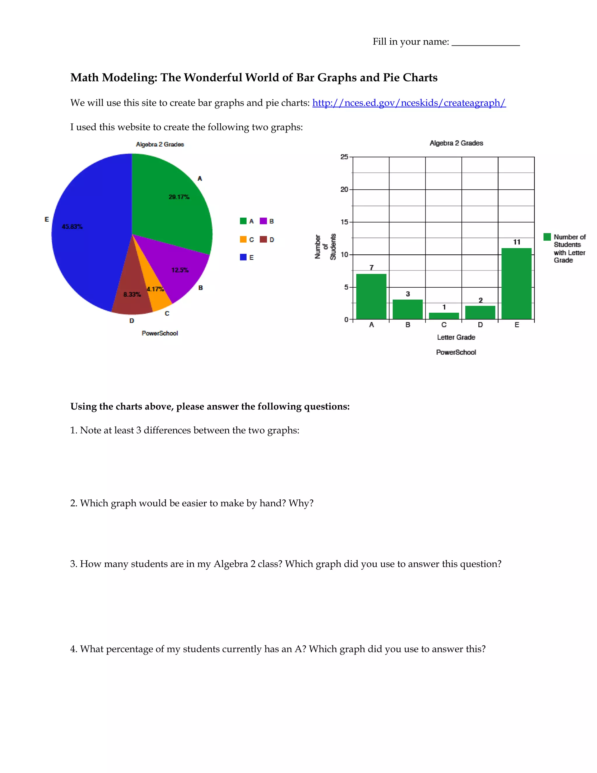
This document discusses using bar graphs and pie charts to represent data. It provides examples of a bar graph showing the number of students in different high schools and a pie chart showing the percentage of students with different grades. The document prompts the user to create their own graphs from sample data on high school enrollment and asks questions about interpreting and choosing the appropriate graph type to represent different datasets.