This document discusses various CSS techniques including:
1. CSS resets to reduce browser inconsistencies in default styles.
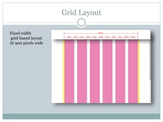
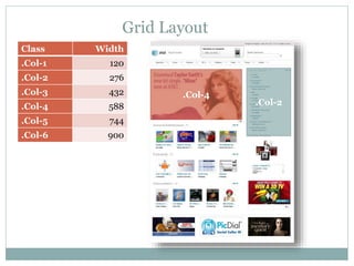
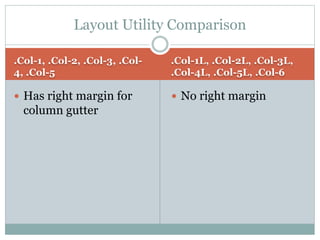
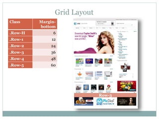
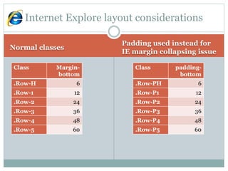
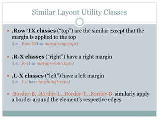
2. Grid layouts and responsive column classes to create fixed-width grid-based layouts.
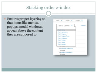
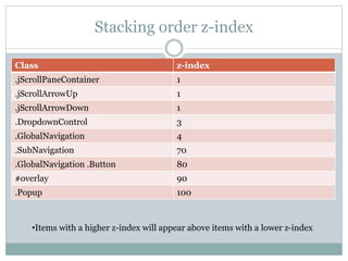
3. The CSS "z-index" property and techniques for proper layering of elements like menus and modals.
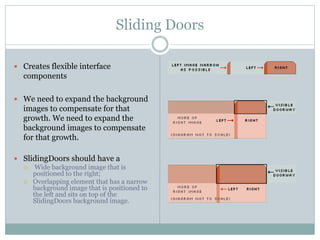
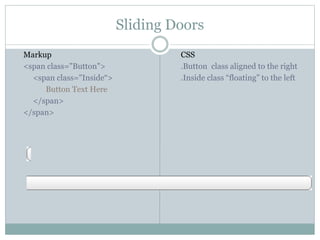
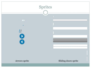
4. The "sliding doors" technique for wrapping dynamic content using background images.
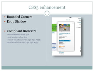
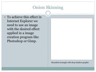
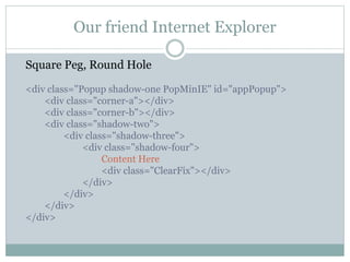
5. CSS enhancements like rounded corners and drop shadows, and fallback techniques for older browsers.
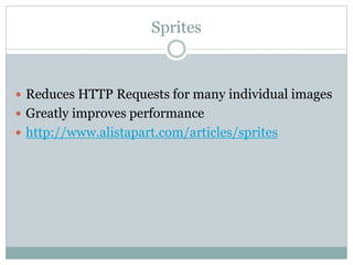
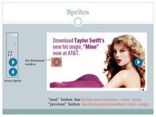
6. Image sprites to reduce HTTP requests and optimize common graphics.