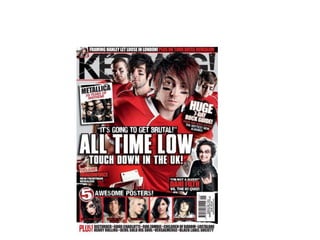
Analysis of Kerrang front cover
Emma Watson
The music genre is rock. You can tell this by the
use of colours and images such as the little
man in the corner holding up a rock sign. You
can also tell this is a rock magazine because
the main image on the magazine is a photo of
All Time Low a famous American pop punk
band. You can also tell this is a rock magazine
by the fact the front cover has a photo of
Metallica on a famous rock band.
The main image is a photo of All Time Low
this relates to the genre as All Time Low is a
famous American pop punk band they are
most well known for the songs “Dear Maria”
and “Weightless”. The image also relates the
genre as they have very serious facial
expressions which is more associated with
rock as rock is more rebellious music where as
if it was a pop magazine they would more
likely be smiling.
In the main image the band are wearing red
football jerseys. This is not traditional
clothing of rock music. However, red is a
common colour worn by people who listen
pop punk music. The only make-up they are
wearing is stripes across their faces this also
relates to the theme of the photoshoot as
commonly in American Football , footballers
paint stripes of the teams colours on their
faces. Seeing as black is the most common
colour worn by people who listen to rock
music it’s an indirect way of saying they’re
team rock/pop punk.
I think that the target audience is 16 above as
the main band on the front, All Time low,
target audience is 16 + due to the nature of
their songs and the language used. I also think
that the target audience 16 and above because
Kerrang radio is aimed at older listeners .
The audience would be attracted to the magazine because of the large photo All Time Low , a
popular pop punk band from America who’s most famous for the song Dear Maria. Also, the
bright colours of the outfits make it eye catching as a result people are more likely buy it in a
store as their eye would be drawn to it .
The image is framed in a way so that the lead singer, Alex
Gaskarth , is nearest the front. They have done this as most
will know who he is therefore they are more likely to buy the
magazine. Next is lead guitarist Jack Barrat he has been put
next as he is second most likely to be known. Then at the back
is drummer, Rian Dawson and peaking out at the back is
bassist Zack Merric. They have put the two most famous
members at the front because people are more likely to know
them and buy the magazine where as the less famous
members are at the back as true fans would know them but
people who still like the band but aren’t that obsessed won’t.
Also, by having Alex very close and Rian and Zack at the back
gives depth of field and makes the magazine more interesting.
Also by having Alex very close to the camera it gives an
intimidating effect like he’s towering over you as a result
you’re more likely to buy the magazine as it has the effect that
the band is directly staring at you. The image is mainly the
band and has very minimal background this creates a more
interesting front cover as people care about the band more
than the background. The image has been taken so that you
mainly see the red jerseys but there are also little details such
as Alex’s tattoo and the helmet Alex is carrying and other little
props that fit with the American football theme.
The main colours that have
been used are red and
white. By having red the
prominent colour it gives
the photo a powerful
mood. A powerful mood is
created because of the
connotations of red. Red is
associated with danger,
war and strength. By
using red as the main
colour it helps emulate
the idea that they are a
rock/pop punk band.
However, the white
creates a contrast as it
represents purity and
peace this shows that rock
isn’t all about violence and
corruption.
The magazine is called Kerrang. Kerrang
is an English radio station most well
known for playing alternative music.
This shows that the magazines main
content will mainly be information
about rock/alternative music. Because
they mainly play rock/alternative music
their target audience is 15+ as rock
music is normally explicit as a result it is
normally not listened to by people
younger than 15.
The main typeface used is Helvetica. This has been
used as it has very mechanical lines and is modern
looking. It is also bold which means that it stands out
as a result a consumer is more likely to see it on a
shelf and buy it.
The main text has been placed left
centre of the front cover of the
magazine this has been done as it the
article that is most likely going to make
people buy the magazine therefore it
has been put it in an obvious place. It’s
large enough so that it’s noticable
however it’s not so large that it covers
the most of the front cover.
The main colours that have been used are red ,
white and black. They all have different
connotations. Red has contations of anger, danger
and war but also love and passion ; this is clever as
All Time Low have a famous song called “Love like
war”. Also, the colour red is commonly associated
with rock music. Also, red, white and black are
complementing but contrasting colours as a result
the magazine would stand out on a shelf in a shop
as a result more people are likely to buy it.
In the kicker it says “Touchdown in the UK”. The
word “touchdown” has a double meaning of they’ve
landed in the Uk but also touchdown is scoring a
goal in American football this links with the main
image as they’re in American Football Jerseys. It also
has the word “Huge” emphasised in the puff they
have done this as it would grab peoples attention in
a supermarket.

Atl analysis

  • 1.
    Analysis of Kerrangfront cover Emma Watson
  • 3.
    The music genreis rock. You can tell this by the use of colours and images such as the little man in the corner holding up a rock sign. You can also tell this is a rock magazine because the main image on the magazine is a photo of All Time Low a famous American pop punk band. You can also tell this is a rock magazine by the fact the front cover has a photo of Metallica on a famous rock band. The main image is a photo of All Time Low this relates to the genre as All Time Low is a famous American pop punk band they are most well known for the songs “Dear Maria” and “Weightless”. The image also relates the genre as they have very serious facial expressions which is more associated with rock as rock is more rebellious music where as if it was a pop magazine they would more likely be smiling. In the main image the band are wearing red football jerseys. This is not traditional clothing of rock music. However, red is a common colour worn by people who listen pop punk music. The only make-up they are wearing is stripes across their faces this also relates to the theme of the photoshoot as commonly in American Football , footballers paint stripes of the teams colours on their faces. Seeing as black is the most common colour worn by people who listen to rock music it’s an indirect way of saying they’re team rock/pop punk. I think that the target audience is 16 above as the main band on the front, All Time low, target audience is 16 + due to the nature of their songs and the language used. I also think that the target audience 16 and above because Kerrang radio is aimed at older listeners . The audience would be attracted to the magazine because of the large photo All Time Low , a popular pop punk band from America who’s most famous for the song Dear Maria. Also, the bright colours of the outfits make it eye catching as a result people are more likely buy it in a store as their eye would be drawn to it .
  • 4.
    The image isframed in a way so that the lead singer, Alex Gaskarth , is nearest the front. They have done this as most will know who he is therefore they are more likely to buy the magazine. Next is lead guitarist Jack Barrat he has been put next as he is second most likely to be known. Then at the back is drummer, Rian Dawson and peaking out at the back is bassist Zack Merric. They have put the two most famous members at the front because people are more likely to know them and buy the magazine where as the less famous members are at the back as true fans would know them but people who still like the band but aren’t that obsessed won’t. Also, by having Alex very close and Rian and Zack at the back gives depth of field and makes the magazine more interesting. Also by having Alex very close to the camera it gives an intimidating effect like he’s towering over you as a result you’re more likely to buy the magazine as it has the effect that the band is directly staring at you. The image is mainly the band and has very minimal background this creates a more interesting front cover as people care about the band more than the background. The image has been taken so that you mainly see the red jerseys but there are also little details such as Alex’s tattoo and the helmet Alex is carrying and other little props that fit with the American football theme. The main colours that have been used are red and white. By having red the prominent colour it gives the photo a powerful mood. A powerful mood is created because of the connotations of red. Red is associated with danger, war and strength. By using red as the main colour it helps emulate the idea that they are a rock/pop punk band. However, the white creates a contrast as it represents purity and peace this shows that rock isn’t all about violence and corruption.
  • 5.
    The magazine iscalled Kerrang. Kerrang is an English radio station most well known for playing alternative music. This shows that the magazines main content will mainly be information about rock/alternative music. Because they mainly play rock/alternative music their target audience is 15+ as rock music is normally explicit as a result it is normally not listened to by people younger than 15. The main typeface used is Helvetica. This has been used as it has very mechanical lines and is modern looking. It is also bold which means that it stands out as a result a consumer is more likely to see it on a shelf and buy it. The main text has been placed left centre of the front cover of the magazine this has been done as it the article that is most likely going to make people buy the magazine therefore it has been put it in an obvious place. It’s large enough so that it’s noticable however it’s not so large that it covers the most of the front cover. The main colours that have been used are red , white and black. They all have different connotations. Red has contations of anger, danger and war but also love and passion ; this is clever as All Time Low have a famous song called “Love like war”. Also, the colour red is commonly associated with rock music. Also, red, white and black are complementing but contrasting colours as a result the magazine would stand out on a shelf in a shop as a result more people are likely to buy it. In the kicker it says “Touchdown in the UK”. The word “touchdown” has a double meaning of they’ve landed in the Uk but also touchdown is scoring a goal in American football this links with the main image as they’re in American Football Jerseys. It also has the word “Huge” emphasised in the puff they have done this as it would grab peoples attention in a supermarket.