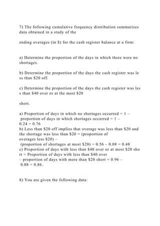
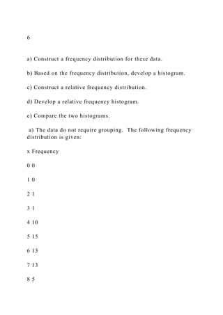
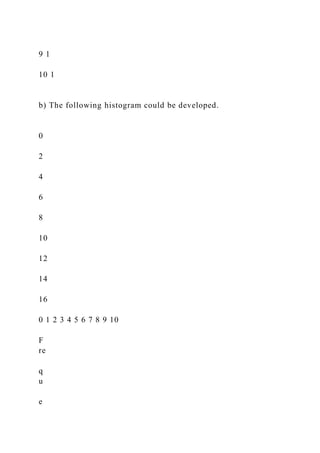
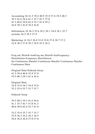
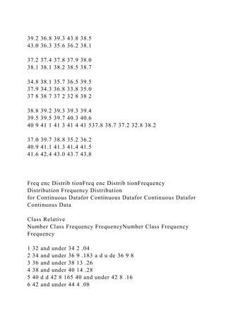
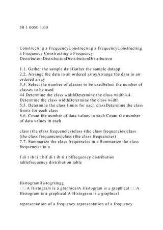
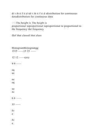
The document outlines the requirements for a statistics assignment due by June 30th, focusing on chapters related to data types, measurement levels, and analysis methods. Students can work individually or in teams, submitting detailed solutions to various exercises about data categorization and visual representation. The document also includes annotations on statistical concepts and objectives for understanding statistics in business contexts.
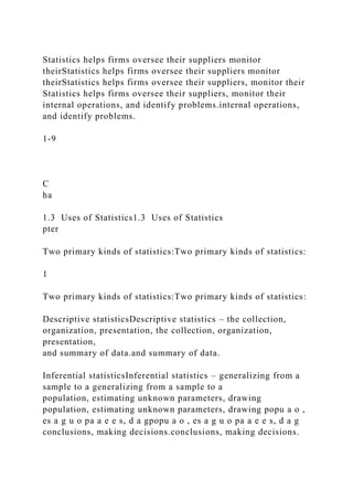
![following, indicate
whether the data are crosswhether the data are cross--sectional
or sectional or
time series:time series:time series:time series:
teUnemployment rates by state
data for aEmployment satisfaction data for a Employment
satisfaction data for a
companycompany
Example 7Example 7
each of the following variables,
indicate the level of data measurement:indicate the level of data
measurement:
excellent, 2 = good, 3 Product rating
[1 = excellent, 2 = good, 3
= fair, 4 = poor, 5 = very poor]= fair, 4 = poor, 5 = very poor]
rent, other]
tal status [single, married, divorced,Marital status
[single, married, divorced,Marital status [single, married,
divorced, Marital status [single, married, divorced,
other]other]](https://image.slidesharecdn.com/assignmentweek1-221031130720-287bb465/85/Assignment-Week-1-docDue-by-11pm-June-30th-Chapter-1-docx-89-320.jpg)