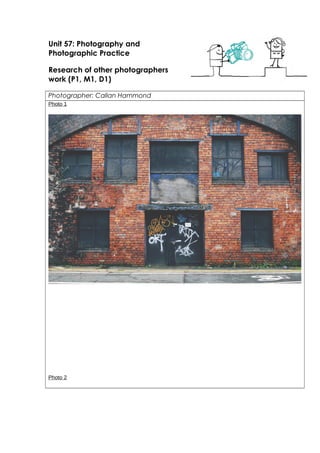
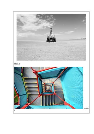
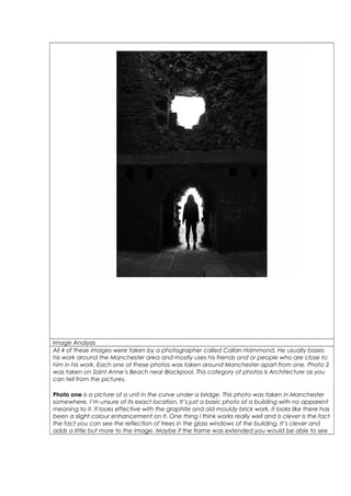
Unit 57: Photography and 
Photographic Practice 
Research of other photographers 
work (P1, M1, D1) 
Photographer: Callan Hammond 
Photo 1 
Photo 2
Photo 3 
Photo 
4
Image Analysis 
All 4 of these images were taken by a photographer called Callan Hammond. He usually bases 
his work around the Manchester area and mostly uses his friends and or people who are close to 
him in his work. Each one of these photos was taken around Manchester apart from one. Photo 2 
was taken on Saint Anne’s Beach near Blackpool. This category of photos is Architecture as you 
can tell from the pictures. 
Photo one is a picture of a unit in the curve under a bridge. This photo was taken in Manchester 
somewhere, I’m unsure of its exact location. It’s just a basic photo of a building with no apparent 
meaning to it. It looks effective with the graphite and old mouldy brick work. It looks like there has 
been a slight colour enhancement on it. One thing I think works really well and is clever is the fact 
the fact you can see the reflection of trees in the glass windows of the building. It’s clever and 
adds a little but more to the image. Maybe if the frame was extended you would be able to see
a little more but maybe that just adds to the mystery of the photo. Because the building does 
look discarded and unused. 
Photo 2 like i mentioned above is in Blackpool. It’s clever because its apparent that in Callans 
pictures he prefers them to be dull and usually features cloudy and miserable sky’s. But, in this 
photo you can see that it must have been sunny when he took it. When you look at the sky you 
can see there are clouds and the sky’s so it would’ve been a very bright day but because of the 
effects he has used you wouldn’t really know. Also, the field of depth is good in this image. Even 
the main feature of the image is quite far into the distance considering and you can see the land 
very slightly in the background which is miles away. So you can see a lot going on within this 
image and yet it looks so simple, this is why I like it. 
The next photo (photo 3) is a shot taken in the Manchester area a couple of month ago. It’s a 
colourful metal staircase. But the photo is taken perfectly central and looks perfect composition 
wise. It shows so much within the image. The depth is incredible how it you can see straight down 
the middle to the floor. It sort of almost makes the photo seem as though it doesn’t have one 
main focus. Because the centre of the picture is the middle of the stairwell however there is a lot 
of attention drawn to the sides of the picture where you can see the actual stairs. They’re closer 
to the camera so you would almost think that they are the main feature but really it all 
contributes and make one whole piece. Another thing is the colours. I love how bright they are 
and the contrast between them. Unlike other pictures Callan has done this one is a lot brighter 
and more in your face. It stands out more so I definitely see that as a strength. I like the way that 
Callan must have taken this picture. He must have had to of hung over the stairwell to get the 
picture perfectly central. 
Then the last picture (photo 4), I’m unsure of the exact location, When it was taken and who it is 
that actually features within the image. It’s again quite a mysterious one. But that’s what makes it 
good; it’s a huge strength in my opinion when it has a certain mystery about it. Similar to a lot of 
Callan’s work this image has a black and white filter on it. It’s apparent what it is, an old building 
which isn’t obviously in use anymore. I like how the figure of the person stood in the arch way 
can’t really be seen. She looks like a silhouette due to her stood in front of the strong light. One 
thing I do think could’ve been improved with this image is the exposure. I know that is the point 
to add to the mystery. However where the light shines through both of the gaps it just looks 
slightly over exposed. I do think that a bit of this is due to the filter used. Maybe it wouldn’t seem 
as bad if the sky way blue, but then it wouldn’t be the same at all! It’s almost reminds me of like a 
superhero photo. The person stood there looks heroic by the way their stood and posed. The way 
positioning of where Callan must have took the photo is good as well. It was taken from what 
looks like a fair distance and quite a high angle rather than low. Makes it better that way though. 
I do feel that if this photo had shown anymore than what it already does it wouldnbt looks as 
good. It would be too dark the darkness would defiantly overpower the light. I would look too 
bland that way so it’s done more or less perfectly. 
I would say with all of these images that Rule Of thirds was taken Into consideration. Rule of Thirds 
can help you get the photo central and get the focus points of the image In the correct area 
where you want it. So for example in the centre of all of these images is the main focus of the 
image so it works well.

Architecture work sheet

  • 1.
    Unit 57: Photographyand Photographic Practice Research of other photographers work (P1, M1, D1) Photographer: Callan Hammond Photo 1 Photo 2
  • 2.
  • 3.
    Image Analysis All4 of these images were taken by a photographer called Callan Hammond. He usually bases his work around the Manchester area and mostly uses his friends and or people who are close to him in his work. Each one of these photos was taken around Manchester apart from one. Photo 2 was taken on Saint Anne’s Beach near Blackpool. This category of photos is Architecture as you can tell from the pictures. Photo one is a picture of a unit in the curve under a bridge. This photo was taken in Manchester somewhere, I’m unsure of its exact location. It’s just a basic photo of a building with no apparent meaning to it. It looks effective with the graphite and old mouldy brick work. It looks like there has been a slight colour enhancement on it. One thing I think works really well and is clever is the fact the fact you can see the reflection of trees in the glass windows of the building. It’s clever and adds a little but more to the image. Maybe if the frame was extended you would be able to see
  • 4.
    a little morebut maybe that just adds to the mystery of the photo. Because the building does look discarded and unused. Photo 2 like i mentioned above is in Blackpool. It’s clever because its apparent that in Callans pictures he prefers them to be dull and usually features cloudy and miserable sky’s. But, in this photo you can see that it must have been sunny when he took it. When you look at the sky you can see there are clouds and the sky’s so it would’ve been a very bright day but because of the effects he has used you wouldn’t really know. Also, the field of depth is good in this image. Even the main feature of the image is quite far into the distance considering and you can see the land very slightly in the background which is miles away. So you can see a lot going on within this image and yet it looks so simple, this is why I like it. The next photo (photo 3) is a shot taken in the Manchester area a couple of month ago. It’s a colourful metal staircase. But the photo is taken perfectly central and looks perfect composition wise. It shows so much within the image. The depth is incredible how it you can see straight down the middle to the floor. It sort of almost makes the photo seem as though it doesn’t have one main focus. Because the centre of the picture is the middle of the stairwell however there is a lot of attention drawn to the sides of the picture where you can see the actual stairs. They’re closer to the camera so you would almost think that they are the main feature but really it all contributes and make one whole piece. Another thing is the colours. I love how bright they are and the contrast between them. Unlike other pictures Callan has done this one is a lot brighter and more in your face. It stands out more so I definitely see that as a strength. I like the way that Callan must have taken this picture. He must have had to of hung over the stairwell to get the picture perfectly central. Then the last picture (photo 4), I’m unsure of the exact location, When it was taken and who it is that actually features within the image. It’s again quite a mysterious one. But that’s what makes it good; it’s a huge strength in my opinion when it has a certain mystery about it. Similar to a lot of Callan’s work this image has a black and white filter on it. It’s apparent what it is, an old building which isn’t obviously in use anymore. I like how the figure of the person stood in the arch way can’t really be seen. She looks like a silhouette due to her stood in front of the strong light. One thing I do think could’ve been improved with this image is the exposure. I know that is the point to add to the mystery. However where the light shines through both of the gaps it just looks slightly over exposed. I do think that a bit of this is due to the filter used. Maybe it wouldn’t seem as bad if the sky way blue, but then it wouldn’t be the same at all! It’s almost reminds me of like a superhero photo. The person stood there looks heroic by the way their stood and posed. The way positioning of where Callan must have took the photo is good as well. It was taken from what looks like a fair distance and quite a high angle rather than low. Makes it better that way though. I do feel that if this photo had shown anymore than what it already does it wouldnbt looks as good. It would be too dark the darkness would defiantly overpower the light. I would look too bland that way so it’s done more or less perfectly. I would say with all of these images that Rule Of thirds was taken Into consideration. Rule of Thirds can help you get the photo central and get the focus points of the image In the correct area where you want it. So for example in the centre of all of these images is the main focus of the image so it works well.