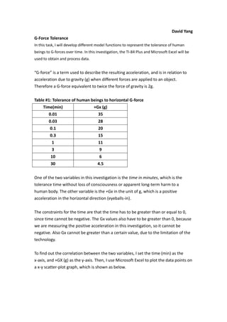
1. David Yang<br />G-Force Tolerance<br />In this task, I will develop different model functions to represent the tolerance of human beings to G-forces over time. In this investigation, the TI-84 Plus and Microsoft Excel will be used to obtain and process data.<br />“G-force” is a term used to describe the resulting acceleration, and is in relation to acceleration due to gravity (g) when different forces are applied to an object. Therefore a G-force equivalent to twice the force of gravity is 2g. <br />Table #1: Tolerance of human beings to horizontal G-force<br />Time(min)+Gx (g)0.01350.03280.1200.31511139106304.5<br />One of the two variables in this investigation is the time in minutes, which is the tolerance time without loss of consciousness or apparent long-term harm to a human body. The other variable is the +Gx in the unit of g, which is a positive acceleration in the horizontal direction (eyeballs-in).<br />The constraints for the time are that the time has to be greater than or equal to 0, since time cannot be negative. The Gx values also have to be greater than 0, because we are measuring the positive acceleration in this investigation, so it cannot be negative. Also Gx cannot be greater than a certain value, due to the limitation of the technology. <br />To find out the correlation between the two variables, I set the time (min) as the x-axis, and +GX (g) as the y-axis. Then, I use Microsoft Excel to plot the data points on a x-y scatter-plot graph, which is shown as below. <br />Graph #1: +Gx against time<br />As seen from the graph above, as time increases, the value of +Gx decreases. Therefore the general trend is likely to be modeled by an exponential function, y=ae-kx, where y is the variable of +Gx (g), and x is the variable of time (min). The parameters in this function are a and k, where a is the initial +Gx, when the time, <br />x = 0 min. k is the growth factor. In this function, the negative sign in front of k refers to the decay factor as the graph shows a decreasing pattern. <br />In order to define the two parameters, a and k, I chose two sets of data (0.3, 15) and (1, 11) from the graph, which are the two middle points on the graph, which can reduce the error. <br />First, substitute x=0.3, y=15 into the function, y=ae-kx<br />15=ae-0.3k (1)<br />Then substitute x= 1, y=11 into the function, y=ae-kx<br />11=ae-k (2)<br />Equation (2) divided by equation (1) <br />1115= e-0.7k<br />Take natural log, ln on both sides of the equation. <br /> ln1115=lne-0.7k <br />ln1115 = -0.7k<br />On both sides of the equation, divided by -0.7<br />k = ln1115-0.7 = 0.443078469<br />substitute k = 0.443078469 into the equation (2), 11=ae-k<br />11=ae-0.443078469 <br />Divided by e-0.443078469 on both sides on the equation. <br />a= 11e-0.443078469 = 17.13243999<br />Therefore, the exponential function is y=17.13243999e-0.443078469x<br />On a new set of axes, I drew my model function and the original data points, the curve in red is the exponential function is y=17.13243999e-0.443078469x, while the data points in blue are the original data points. <br />Graph #2: Comparison of original data plot and exponential function<br />As seen from graph#2, 6 points from the original data (out of 8 sets) are far away from my exponential curve. Therefore, my exponential model does not fit the original data very well. So revision of my model is necessary. <br />As seen from graph#1, I realized that the power function y= kxp might also fit the original data. I will try this equation to see whether there is any improvement. <br />In the function y= kxp , y is the variable of +Gx (g), and x is the variable of time (min). The parameters in this function are p and k, where p is the power of the variable x. k is the coefficient of (1 xp). <br />In order to define the two parameters, p and k, I chose two sets of data (0.3, 15) and (1, 11) from the graph, which are the two middle points on the graph, which can reduce the error. <br />First, substitute x=0.3, y=15 into the function, y= kxp<br />15=k0.3p (1)<br />Then substitute x= 1, y=11 into the function, y= kxp<br />11=k1p (2)<br />Simplify equation (2), k = 11<br />Substitute k = 11 into equation (1)<br />15=110.3p <br />Multiply 0.3p on both sides of the equation.<br />15(0.3p)= 11<br />Divided by 15 on both sides of the equation.<br />0.3p = 1115<br />Take common log, log on both sides of the equation. <br /> log0.3p=log1115 <br />p (log 0.3) = log1115<br />divided by (log 0.3) on both sides<br />p= log1115log 0.3 = 0.2576<br />Therefore, the power function is y= 11x0.2576<br />On a new set of axes, I drew my model function y= 11x0.2576 and the original data points, the curve in red is the power function is y= 11x0.2576, while the data points in blue are the original data points. <br />Graph #3: Comparison of original data plot and power function<br />As seen from graph#3, almost all of the points from the original data (blue dots) are really close or exactly on my power function curve. Therefore, my power function model fits the original data nearly perfectly. <br />The implication of my power function, y= 11x0.2576 , is that as the positive acceleration in the horizontal direction i.e. eyeballs-in increases from 4.5 g up to 9 g, the time in minutes that human body can tolerate would rapidly decrease. However, as the positive acceleration in the horizontal direction i.e. eyeballs-in increases from 11 g up to 35 g, the time in minutes that human body can tolerate would decrease slowly.<br />Next, I will use technology to find another function that models the data. <br />I set the time (min) as the x-axis, and +GX (g) as the y-axis. Then, I use Microsoft Excel to plot the data points on a x-y scatter-plot graph. On the x-y scatter-plot graph, I used “add a trend line”. In the window prompt, I ticked “power function”, “show equation” and “show r2”. The following is the graph and the function model generated from Microsoft Excel. <br />Graph# 4: Microsoft Excel generated Math Model for the original data<br />As seen from graph#4, all of the points from the original data set (blue points) are on the curve of the power function, y = 11.087x-0.257 , with a coefficient of determination of 0.9977. As R2 is very close to 1, it suggests that the function model fits the data very well. <br />On a new set of axes, I drew my model function,y= 11x0.2576 and the function I found using technology, y= 11.087x-0.257 .<br />Figure # 5: Comparison of my model function and the function I found using technology.<br />As seen from figure #5, the curve of my model function overlaps with the curve of the function I found using technology. My power function, y= 11x0.2576 can also be written y= 11x-0.2576 , which is very close to the function I found using technology, <br />y= 11.087x-0.257 . The difference in k (one is 11, and the other is 11.087) and the difference in p (one is -0.2576, the other is -0.257) are not significant.<br />Hereby, I have found a model, y= 11x0.2576, which fits the tolerance of human beings to horizontal G-force very well. Further, I will test how well my model fits the tolerance of human beings to vertical G-forces. The table below shows the data on the tolerance in minutes and the vertical G-force measured in g. +Gz represents a positive acceleration in the vertical direction, or blood towards feet.<br />Table #2: The tolerance of human beings to vertical G-forces.<br />Time(min)+Gz (g)0.01180.03140.1110.391736104.5303.5<br />To find out the correlation between the two variables, I set the time (min) as the x-axis, and +GX (g) as the y-axis. Then, I use Microsoft Excel to plot the data points on a x-y scatter-plot graph, which is shown as below. <br />Figure # 6: Comparison of my model function and the scatter plot of the data on the tolerance and the vertical G-force<br />As seen from the graph, the curve (in red) which represents the power function, y= 11x0.2576, does not pass through all the points that represent the time and +Gz as shown in the data table. This suggests that my previous model does not fit the new data. Therefore, so I need to change the parameters k and p in order to make the model fit the new data better. <br />In order to define the two parameters, p and k, I chose two sets of data (0.3, 9) and (1, 7) from the new data, which are the two middle points on the data table, which can reduce the error. <br />First, substitute x=0.3, y=9 into the function, y= kxp<br />9=k0.3p (1)<br />Then substitute x= 1, y=7 into the function, y= kxp<br />7=k1p (2)<br />Simplify equation (2), k = 7<br />Substitute k = 7 into equation (1)<br />9=70.3p <br />Multiply 0.3p on both sides of the equation.<br />9(0.3p)= 7<br />Divided by 9 on both sides of the equation.<br />0.3p = 79<br />Take common log, log on both sides of the equation. <br /> log0.3p=log79 <br />p (log 0.3) = log79<br />divided by (log 0.3) on both sides<br />p= log79log 0.3 = 0.2087<br />Therefore, the power function is y= 7x0.2087<br />On a new set of axes, I drew my model function y= 7x0.2087 and the original data points, the curve in red is the power function is y= 7x0.2087, while the data points in blue are the original data points. <br />Figure # 7: Comparison of my model function y= 7x0.2087 and the scatter plot of the data on the tolerance and the vertical G-force<br />As seen from graph#7, almost all of the points from the original data (blue dots) are really close or exactly on the curve of my model, y= 7x0.2087. Therefore, my power function model fits the new data nearly perfectly. <br />The implication of my power function, y= 7x0.2087 , is that as the positive acceleration in the vertical direction, i.e. blood towards feet, increases from 3.5 g up to 6 g, the time in minutes that human body can tolerate would rapidly decrease. However, as the positive acceleration in the vertical direction, i.e., blood towards feet, increases from 7 g up to 18 g, the time in minutes that human body can tolerate would decrease slowly.<br />Next, I will use technology to find another function that models the data. <br />I set the time (min) as the x-axis, and +Gz (g) as the y-axis. Then, I use Microsoft Excel to plot the data points on a x-y scatter-plot graph. On the x-y scatter-plot graph, I used “add a trend line”. In the window prompt, I ticked “power function”, “show equation” and “show r2”. The following is the graph and the function model generated from Microsoft Excel. <br />Figure # 8: Microsoft Excel generated Math Model for the new data<br />As seen from graph#8, all of the points from the new data set (blue points) are on the curve of the power function, y = 7.082x-0.199, with a coefficient of determination of 0.9979. As R2 is very close to 1, it suggests that the function model fits the data very well. This function can also be written as y= 7.082x0.199 , which is very close to my model, y= 7x0.2087. <br />Some limitations include that the data is only valid to predict the G-force at the range of 0.01 minute to 30 minutes. This is because when the range is too big, it is unethical to experience it on humans, as it might lead to death. <br />Another limitation is that there are only eight data points, which might lead to inaccuracy of the model functions that I created. <br />“I, the undersigned, hereby declare that the following assignment is all my own work and that I worked independently on it.” <br />________________________<br />“In this assignment, I used Microsoft Excel to draw my graphs and TI-84 Plus calculator to obtain my functions.” <br />