1. ECS to Excel: A Software Seminar
Step 1: Gather Data in ECS
a. Open the “Remote Desktop Connection” to ECSview.
b. Select an operational parameter you want to capture, right-click it and choose point trend.
c. A graph of the variable should appear, with a time frame of only an hour.
d. To adjust the time frame, use the X-axis reset zoom button.
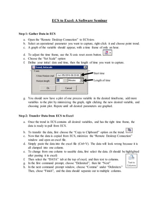
e. Choose the “Set Scale” option
f. Define your initial date and time, then the length of time you want to capture.
Start time
Length of time
g. You should now have a plot of one process variable in the desired timeframe, add more
variables to the plot by minimizing the graph, right clicking the new desired variable, and
choosing point plot. Repete until all desired parameters are graphed.
Step 2: Transfer Data from ECS to Excel
a. Once the trend in ECS contains all desired variables, and has the right time frame, the
data is ready to pull from ECS.
b. To transfer the data, first choose the “Copy to Clipboard” option on the trend.
c. Now that the data is copied from ECS, minimize the “Remote Desktop Connection”
window and open an excel file.
d. Simply paste the data into the excel file (Ctrl+V). The data will look wrong because it is
all clumped into one column.
e. To change from one column to useable data, first select the data. (It should be highlighted
after pasting it in excel)
f. Then select the “DATA” tab at the top of excel, and then text to columns.
g. In the first command prompt, choose “Delimited”, then hit “Next”
h. In the next command prompt window, choose “Comma” under “Delimiters”
Then, chose “Finish”, and the data should separate out to multiple columns.
2. Step 3: Making the Plot
a. Now that the data has been spread out across the columns, it will be easier to handle. The
next step is to remove the four header lines which automatically come with the ECS data.
b. As you remove the four header lines, add a simple description for each parameter.
c. Now that each column has only one header line, select the date column (choose the whole
column at once by clicking “A”), then the one variable we want to plot in time.
d. With the two columns highlighted, under the “INSERT” tab and choose “Recommended
Charts” for this example, use the scatterplot.
e. To easily make more graphs, select the original, copy and paste it. On the copied graph,
click on any data in the graph area, a purple, blue, and red box should appear around the
X data, Y data, and title. Simply “grab” the blue Y data and move it horizontally to
another column you want to graph.
Step 4: Data Cleaning
a. Now that the data is plotted in excel, it is easy to visualize and notice if anything is
wrong. More often than not the data will need to be cleaned.
b. “Cleaning” data simply means removing the data which does not apply to our situation.
For example, if we are trying to find an operating target for any parameter in the raw
mill, we will only be looking at data when the mill is online. Including the offline data
will skew the results.
c. TYPICALLY data cleaning mean two things, removing the downtime, and removing any
sampling errors (like the Kiln Back End O2 jumping up to 10.4%). To do this, format the
data as a table and organize it so the low tonnage data is all in one place, then set a cut-
off point. (anything under X t.p.h. will be considered mill offline). Delete all data past
this cut-off point, and mention this limitation when giving the final results.
Step 5: Interpreting It
a. First, we need to create a line of “best fit” for our data. To do this, right click on any data
point in the chart area, and select “Add Trendline”, a dotted best fit line will appear.
b. Now that we have a linear model, we need to define it. When the trendline was created, a
menu should have opened called “Format Trendline” at the very bottom of this menu are
options for “Display Equation on chart” and “Display R-squared value on chart” select
both of these check boxes.
c. Now, we should have a y = mx+b trendline, with an R2 value between 0 and 1.
The Y= mX+b gives us the general relationship (as one increases the other _____ ) while
the R2 value gives us the strength of the relationship, or how reliable/dependable it is.
d. The value of “m” or the slope of the line, tells us the type of relationship. A negative
number in front of x means it is an inverse relationship, as one variable increases the
other decreases (More coffee -> less yawns). A Positive slope indicates a direct
relationship, as one variable increases so does the other (More coffee -> more happiness).
3. Step 6: Targets
Now, we have taken data from ECS, imported it to Excel, created a plot and have done some
basic interpreting of what the graph means. Let’s take it to the next level of analysis.
Phil approaches you and says “Hey, I know you took that excel courseand I
am just too swamped to work on this. Could you workout how many l/min of
table waterI should average to achieve 15 kWh/t on the Raw Mill?”
What do you tell him?
First step is to pull the necessary data from ECS (kWh/t, l/min table water, and a feed tph for
selecting only mill online data.) (pull for 30 days from 5/30/16 0:00)
Then, moving both l/min and kWh/t data from ECS to Excel, and making a plot, is the next step.
This way, it is easy to see the relationship between the two parameters.
Using the best fit equation;
Y=0.203*X +2.714
kWh/t = 0.203*l/min + 2.714
15 = 0.203*l/min + 2.714
l/min = 60.5 l/min
Our final value for table water is 60.5, but this is not the final answer for Phil, this is the final
answer of our analysis. Now we need to explain how trustworthy our analysis really is. Our
measure for reliability is the R2 value, the closer to 1 the better the relationship (do not bet on
anything below 0.5). We also need to tell Phil the limitations of the analysis (What was our
timeline, what parameters, normal operation?, any data cleaning?). Our final answer should be:
“Phil, you should target at or below 60.5 l/min to achieve a max of 15kWh/t. This
is a strong relationship (R2 = 0.74), but our timeframe is limited to 30 days, we
only looked at a few parameters, and correlation is NOT causation.”
The end result is a possible action, not a definite solution