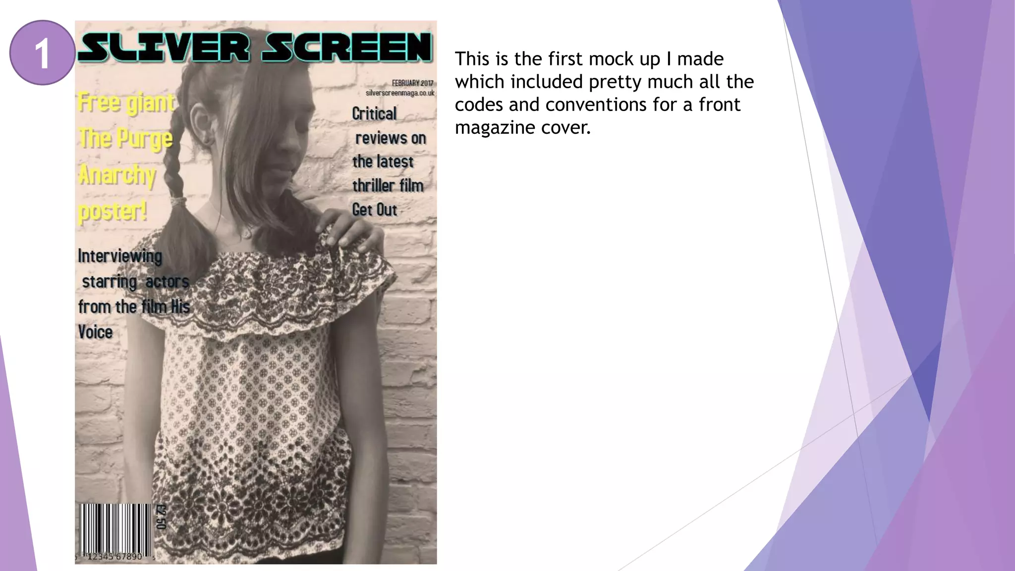
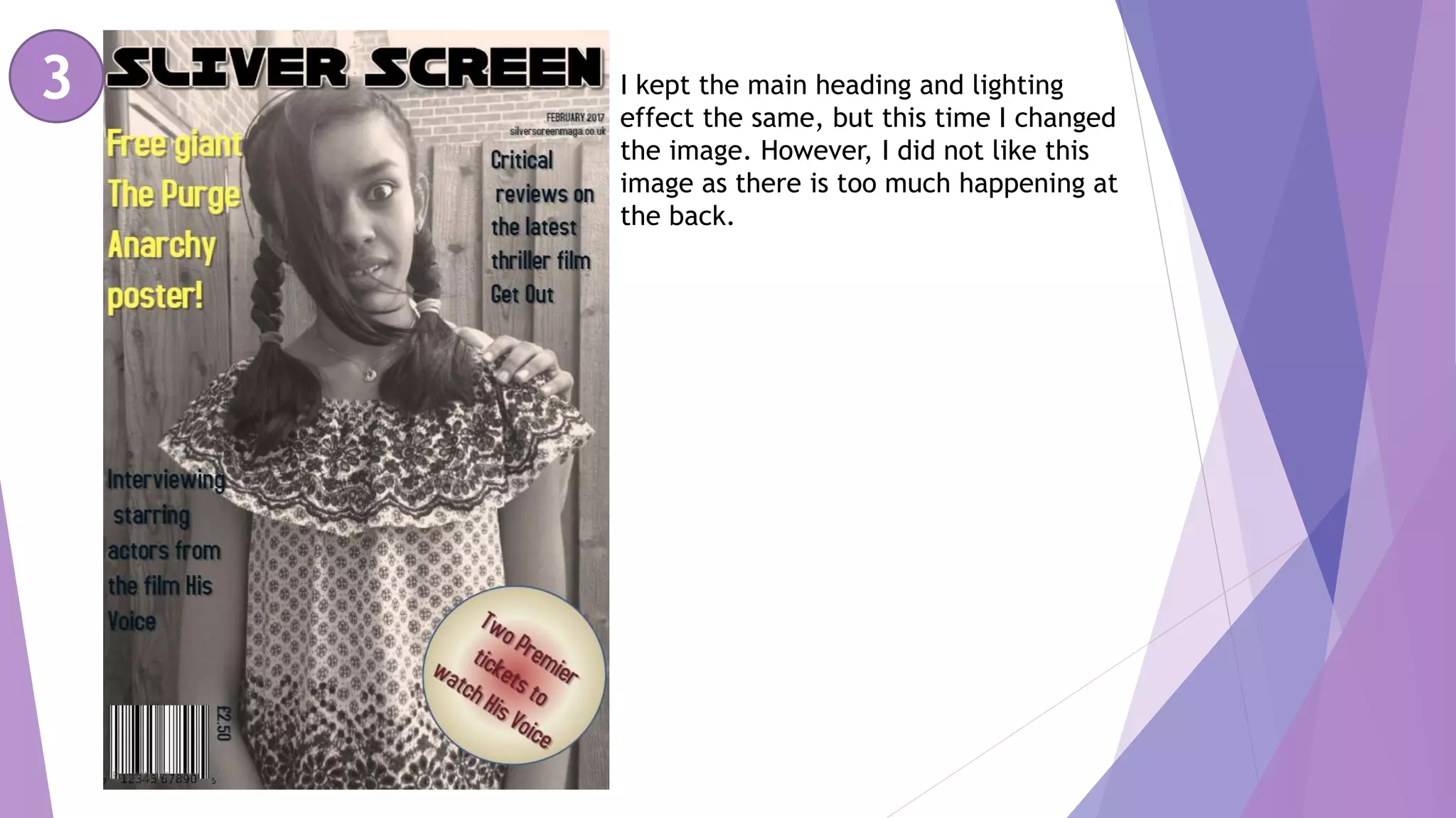
This document discusses multiple drafts of a magazine cover created by the author. The first draft included the basic conventions but had issues with visibility of text colors. The second draft changed the image but it had too much background activity. The third draft addressed feedback by making text more visible with different colors and a simpler sticker. Further feedback noted the bottom was boring so the final draft incorporated all feedback to create a cover that stood out more.


![Presentation1 cover[1]](https://cdn.slidesharecdn.com/ss_thumbnails/presentation1cover1-111111091923-phpapp02-thumbnail.jpg?width=640&height=640&fit=bounds)


