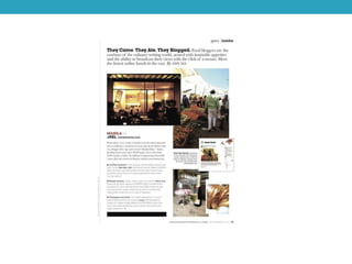
ANALYSIS OF REGIONAL
MAGAZINES
FEATURE PAGE
The word ‘discovering’ in
the heading, gives the
impression that this
article will reveal to the
audience new and
interesting information
about this particular area.
This will intrigue the
audience into finding out
more.
The font used is very sophisticated and stylish
which may reflect the tastes of the target
audience and the article will therefore appel to
them. This may also establish the texts
ideology,
The colour scheme is very simplistic, with
there only being white and black used. This
establishes the house style. It will also
appeal to an upmarket target audience.
There are several
images used in this
article, this allows the
reader to gain more
insight into the subject
and therefore become
more intrigued. The
photographs used are
flattering towards the
area and visually
engaging and will
therefore help
persuade readers
along with the article.
This feature page would be considered a
common convention of a regional magazine. This
is because many regional magazines include a
feature page which focuses on a local area.
The images included in the article help break up
the pages. They also help the reader visualise
the article, rather than just text. This makes it
more interesting and visually appealing to the
audience and therefore will attract more readers.
This article is very
informative which
shows the reader
It successful in
providing
information. This
links to the uses and
gratifications theory
of the idea of
‘surveillance’ as the
audience can gain
information about
Barcelona by
reading the article.
The use of alliteration as
well as it being the
largest piece of text in
the article draws more
attention to the heading.
There is also an
emphasis on ‘Barcelona’
as it is the only text
which is in blue and
therefore grabs the
attention of the reader
so that they are
immediately aware on
what the article is about.
This article is a common
convention for regional
magazines as it is
focusing on a local area.
The images used are
visually appealing as they
are bright, colourful and
help the article stand out.
They give the impression
that Barcelona is a vibrant
and exciting place, this will
appeal to the target
audience.
There is no clear colour scheme for this article as a range of colours are used,
white, black, blue, red and orange. This is an unusual convention for a
magazine, however may attract an audience as it is intriguing. It may also
reflect the house style of this magazine and their target audience. The red and
orange subheadings stand out against the white background, creating a clear
layout for the reader.
The images are spread across both pages and overlap each other. This
particular layout appears visually appealing and may therefore appeal to the
target audience of the magazine.
The article
focuses on
exciting events
taking place in the
area. This will
appeal to the
target audience as
it will help them
gain information
on a particular
area. The
information
provided by the
article creates a
sense of authority
over the reader as
the magazine is
knowledgeable
about information
the reader may
not be.
A simple and
conventional layout
has been used for this
feature page with
images in the first row
and text in the
second. This will
appeal to the target
audience as it will be
easy to read and
follow.
The majority of the
colours used are
natural as there is
mainly blue and green
used. This relates to
the theme of the
magazine as it
focuses on subjects
such as the
countryside and
therefore develops
the house style.
The images help
make the article
look more visually
appealing to the
audience rather
than there being
just text and helps
capture the
attention of the
reader. The images
used here also help
the reader develop
their understanding
of the article as
they share a strong
link as the article is
to do with the
countryside.
The pull quote is in
blue, which is the
only piece of blue
text in the article.
This helps it stand
out and will give the
reader insight into
the article. The pull
quote is used to
intrigue the reader to
what to find out more
information towards
the article.
The font used is in italics and gives an sophisticated appearance. This will appel
to the target audience as it will reflect their taste. The font may also establish the
texts ideology.
The article provides information on everyday activities to take part in, in the countryside. This
will appeal to the target audience as they are aiming to find out this particular information. This
relates to the uses and gratifications theory of ‘surveillance’ as the audience are able to gain
information they may have not been able to themselves.
Analysis of regional magazines features

Analysis of regional magazines features

  • 1.
  • 2.
    The word ‘discovering’in the heading, gives the impression that this article will reveal to the audience new and interesting information about this particular area. This will intrigue the audience into finding out more. The font used is very sophisticated and stylish which may reflect the tastes of the target audience and the article will therefore appel to them. This may also establish the texts ideology, The colour scheme is very simplistic, with there only being white and black used. This establishes the house style. It will also appeal to an upmarket target audience. There are several images used in this article, this allows the reader to gain more insight into the subject and therefore become more intrigued. The photographs used are flattering towards the area and visually engaging and will therefore help persuade readers along with the article. This feature page would be considered a common convention of a regional magazine. This is because many regional magazines include a feature page which focuses on a local area. The images included in the article help break up the pages. They also help the reader visualise the article, rather than just text. This makes it more interesting and visually appealing to the audience and therefore will attract more readers. This article is very informative which shows the reader It successful in providing information. This links to the uses and gratifications theory of the idea of ‘surveillance’ as the audience can gain information about Barcelona by reading the article.
  • 3.
    The use ofalliteration as well as it being the largest piece of text in the article draws more attention to the heading. There is also an emphasis on ‘Barcelona’ as it is the only text which is in blue and therefore grabs the attention of the reader so that they are immediately aware on what the article is about. This article is a common convention for regional magazines as it is focusing on a local area. The images used are visually appealing as they are bright, colourful and help the article stand out. They give the impression that Barcelona is a vibrant and exciting place, this will appeal to the target audience. There is no clear colour scheme for this article as a range of colours are used, white, black, blue, red and orange. This is an unusual convention for a magazine, however may attract an audience as it is intriguing. It may also reflect the house style of this magazine and their target audience. The red and orange subheadings stand out against the white background, creating a clear layout for the reader. The images are spread across both pages and overlap each other. This particular layout appears visually appealing and may therefore appeal to the target audience of the magazine. The article focuses on exciting events taking place in the area. This will appeal to the target audience as it will help them gain information on a particular area. The information provided by the article creates a sense of authority over the reader as the magazine is knowledgeable about information the reader may not be.
  • 4.
    A simple and conventionallayout has been used for this feature page with images in the first row and text in the second. This will appeal to the target audience as it will be easy to read and follow. The majority of the colours used are natural as there is mainly blue and green used. This relates to the theme of the magazine as it focuses on subjects such as the countryside and therefore develops the house style. The images help make the article look more visually appealing to the audience rather than there being just text and helps capture the attention of the reader. The images used here also help the reader develop their understanding of the article as they share a strong link as the article is to do with the countryside. The pull quote is in blue, which is the only piece of blue text in the article. This helps it stand out and will give the reader insight into the article. The pull quote is used to intrigue the reader to what to find out more information towards the article. The font used is in italics and gives an sophisticated appearance. This will appel to the target audience as it will reflect their taste. The font may also establish the texts ideology. The article provides information on everyday activities to take part in, in the countryside. This will appeal to the target audience as they are aiming to find out this particular information. This relates to the uses and gratifications theory of ‘surveillance’ as the audience are able to gain information they may have not been able to themselves.