Analysis of horror film poster
•Download as PPTX, PDF•
0 likes•151 views
I have analysed a film poster from the horror genre which is the genre we will be doing for our trailer, poster and magazine cover.
Report
Share
Report
Share

Recommended
The Blair Witch Project
The document discusses the marketing techniques used for the movie The Blair Witch Project in 1999. Both the trailer and movie poster featured an image of a crying girl to indicate frightening scenes and used the found footage genre to make the film seem realistic. The unique selling point was that little detail was given about the film, creating ambiguity about whether it was real or fictional that effectively scared audiences and promoted the horror genre. Dark colors and lighting were used in the posters to imply fear and confusion.
Poster Analysis
This document analyzes two movie posters - Buried and Drag Me To Hell. For the Buried poster, it notes that the logo uses yellow tones to represent the limited light from a lighter, while patches of brown represent the mud the character is buried in. It leaves the audience unsure if the character will survive. For the Drag Me To Hell poster, the title stands out against a dark background with fire at the bottom to represent hell. It shows a female character being pulled down in the center to engage the audience about why she is being dragged to hell. Both posters provide just enough information to intrigue audiences without revealing too much of the plot.
The blair witch project
The document analyzes three posters created for the 1999 horror film The Blair Witch Project. Each poster uses different visual elements and designs to promote key aspects of the film's plot, which involves three student filmmakers who go missing in a forest. Poster 1 features a frightened protagonist's face and tagline hinting at the film's "found footage" premise. Poster 2 focuses more on the ominous forest setting and includes a critic quote. Poster 3 depicts the missing students and uses a "MISSING" header to directly reference the film's narrative. Though with varying visual styles, the posters maintained consistent fonts and colors to clearly link them as part of the same promotional campaign for the low-budget film.
Horror films
This poster summary analyzes a horror film poster:
1) The ripped effect on the faces creates intrigue while hinting at the film's theme.
2) The tagline "I dare you to watch until our movie is done" directly addresses the audience and implies danger from the characters.
3) The poster challenges conventions by using a happy couple image contradicted by the ripped effect.
Question 1a
This document evaluates a horror film poster the author created for an A2 media production in relation to genre and representation. The poster uses dark colors and imagery like leaves and a deserted setting to represent the horror genre and draw in the target audience. It features a young girl's face in bright colors against the dark background to disorient the viewer, challenging expectations through difference and repetition. The poster also challenges stereotypes by representing a young female as the villain rather than the usual male antagonist, keeping the audience interested through unexpected representations while still providing familiar genre conventions.
Posters
The document discusses the design process for a movie poster. It describes two concepts that were developed:
1) The first poster featured the main protagonist Eve looking up at the trees with her tattoo visible, challenging conventions by not depicting her in distress. However, it lacked clear horror elements.
2) The second poster incorporated more horror conventions by including a large hand grabbing towards the viewer, alluding to threats in the woods shown in the trailer. User testing found this second poster was preferred by most participants as fitting better with the horror genre.
Media presentation
The document discusses and analyzes three horror movie posters. All three posters use dark colors and shadows to create a scary and ominous atmosphere. Poster 1 uses red to highlight danger and skulls above the Eiffel Tower to indicate it is a horror film. Poster 2 uses an all-black background and shadows to appear creepy, while the woman's uneasy expression suggests she will die. Poster 3 features a possessed-looking boy which intrigues viewers about the plot. Overall, the posters employ dark tones and lighting to signal danger and death without any other context.
Horror Poster analysis
This document analyzes the conventions used in a horror movie poster. It discusses the bold main image which is intended to shock audiences. Natural colors are used that contrast with the unnatural image. Serif fonts are used for the title and other text. The layout places the main image center with text at the top and bottom following the natural viewing path. Close-up shots are used to draw the audience in. Overall, the poster follows conventions of the horror genre to intrigue audiences and leave them wanting more information.
Evaluation part 2.
The student created a poster and magazine cover to advertise their horror trailer called "The Demented" as part of a marketing campaign. The poster featured a grainy, blood-splattered background with an off-center image from their photoshoot of a "dead girl" holding a doll to give it a psychological feel. Text on the poster included the title "The Demented" and tagline "The Body of a Women, The Soul of a Psychopath" in red to emphasize the horror elements.
Inspiraiton for poster and magazine
This document discusses the selection of horror movie posters to inspire the creation of a poster for a film called "Perception" about psychiatric horror. Several posters are described that incorporate hidden images or symbols relating to themes of control, breaking free, and dual personalities. These posters provide ideas for demonstrating themes of perception and a changing villain through a split or unzipping image. Consistency of visuals, fonts, and angles across the poster and other marketing materials is discussed to clearly connect the products and enhance the scare factor.
Colour scheme
The group has chosen a color scheme of red, black and white for their horror film poster. Black will be used for the background as it connotes fear, death and mystery. Red stands out against black and white, and is often used in horror to represent danger and blood. White text will make the title stand out over the black background and contrast the purity it represents with the dark storyline. To maintain consistency, the same color scheme will be used for the magazine, though some gold may be added to distinguish it from the poster.
Horror film posters analysis
This document analyzes several horror film posters and discusses their design elements and how they effectively promote fear and intrigue in viewers. It notes that posters often mention previous successful films to boost credibility. It also discusses how limited color palettes, ominous imagery, short attention-grabbing slogans, and characters' indirect poses can create unease in audiences and make them want to learn more. Font choices, simple shapes, and subtle details are emphasized as important techniques to convey eeriness while grabbing attention.
Woman in-black
The poster for the film The Woman in Black uses a close-up image of the main character that follows the rule of thirds. His serious, distant expression and the blue in his eye convey feelings of coldness and sadness. The grey tones and lack of color create a ghostly, negative atmosphere that reflects the film's Victorian era setting and horror genre. Text on the poster stands out in white, further emphasizing the ghostly theme. Through these visual and textual elements, the poster effectively establishes the paranormal and mysterious themes of the film.
Promotional Package Analysis
This document analyzes the promotional package for the film "The Conjuring 2". It discusses the imagery, typography, colors, and mise-en-scene used in the film poster and trailer. The imagery is dark and ominous, using low key lighting to convey fear and suspense. Serif fonts give the package a mystical feel, while dark colors highlight the horror genre. Both the poster and trailer use mise-en-scene symbolic of horror, like an isolated house and ragged clothing, to engage the target audience and brand the film appropriately.
Poster analysis
The document analyzes the conventions used in a horror movie poster. It discusses the bold main image as shocking and confusing to audiences. The layout places the image prominently at the center with text at the top and bottom to follow the natural flow of eyes. Typography uses large dramatic text for the title and smaller text for other information. Color contrasts the natural skin tones with the unnatural hands on the face. Overall, the poster follows conventions of the horror genre to attract audiences and create intrigue through its use of images, colors, typography and layout.
Poster analysis
This document discusses film posters, including what they are, their purpose, and different types. It analyzes key elements that make film posters successful at attracting audiences, such as iconography, imagery, colors, and fonts that relate to the genre. Teaser posters are meant to hype audiences without revealing much information, while main posters reveal more like the release date and characters. Successful horror movie posters analyzed convey a sense of mystery through foggy lighting, isolated settings, and disturbing images or faces that provoke fear without explaining the full story. The use of color, composition, and subtle hints keep audiences intrigued to learn more.
'Freakonomics' Print Analysis
The documentary Freakonomics: The Movie is based on the book of the same name. It was directed by several filmmakers including Morgan Spurlock of Supersize Me fame. The documentary applies economic theory to diverse non-traditional topics. The movie poster features an image of an apple cut open to reveal an orange inside, representing the "hidden side" of everything. Key information like the directors, release date, and production companies are included at the bottom.
Ancillary task two
The document discusses the development of a film poster for a horror film called "Contagion" about the spreading of a virus. The poster aims to use symbolic imagery rather than starring personas. It shows someone lighting tissues on fire to represent the spreading infection, drawing from the film's trailer song "Ring Around the Roses." Testing different images, the poster depicts tissues ablaze in a forest setting with the film title in bold red letters at the bottom against a dark background. Feedback on taglines preferred "BLESS YOU!" as it implies the viewer may already be infected.
Analysing posters
This poster is for a film adaptation of Little Red Riding Hood. It features the main character alone in a dark forest background. The tagline "Believe the legend. Beware of the wolf" indicates it is based on the fairy tale and will include danger. The costume identifies the character as Red Riding Hood. It is aimed at teenagers and young adults interested in romance and horror genres. Including "From the director of Twilight" suggests it will attract fans of those films. The simple design with limited text and focus on the character's ominous situation creates intrigue about the narrative.
Zombieland Poster Analysis
The document summarizes key elements of a film poster's design and purpose. A film poster's goal is to generate awareness and hype for an upcoming movie in a visually engaging way. Effective posters prominently display the film's title and stars to attract audience interest. They also provide clues about the film's genre and tone through images, colors, and short taglines, but avoid revealing too much of the plot. Well-designed posters balance promotional and artistic elements to successfully advertise the film.
Ancillary Task Two - Film Poster
The document discusses the development of a film poster for a horror film called "Contagion" about the spreading of a virus. The poster aims to symbolize the theme through the image of burning tissues to represent danger and death, alluding to the film's plot and trailer. Test images were taken of burning tissues and smoke among trees. The final poster design features a darkened mystical image of the forest location with emboldened red to make it unsettling, along with the film title and tagline "Bless You!" which received more positive feedback than the alternative "It's Coming to Get You."
leanne greens evaluation
1) The document discusses how the filmmakers created their brand image for a supernatural horror film by taking inspiration from similar films like Paranormal Activity 2 and The Last Exorcism in terms of color grading, lighting, and use of the color red.
2) They chose a font that related well to the horror genre and used it consistently on the poster, magazine, and other products to make their audience recognize the film.
3) Elements like the logo, font, color, and costumes in the trailer were used to emphasize the supernatural brand image and target the intended audience.
Promotion Kj
The marketing campaign for the movie The Descent coincided with the London bombings in July 2005. The distributor recalled posters that contained the word "terror" and re-released posters without that word. Having a 18 rating could have been a promotional technique, as people may have seen it as a challenge to watch a scary movie with such a rating. The movie's website featured a trailer, synopsis, cast list, gallery, message board, and "experience" section to generate excitement around the film.
Evaluation q1
The media product is a drama/thriller about a homeless black teenage boy in London after he covers up his drug-addicted mother's death. It aims to realistically portray the lives of homeless youth in the UK and challenge stereotypical media representations of London teenagers. When deciding the genre, research found thrillers and horror were most popular, especially with teenagers, so the product combines these genres with drama for broad appeal and realism. It uses conventions like ominous opening titles and low-key natural lighting to conform to thriller conventions while working with a low budget.
As Media Film Comparison 1
This is the film comparison between the opening of our product and a real media text- The Woman in Black.
Thriller films research
The document analyzes thriller film posters for the movies Taken, Inception, and Shutter Island. All three posters use dark, muted colors and imagery to reflect the thrilling nature of the films. They also prominently feature the film title and lead actors' names to attract audience attention. Taglines are included to give viewers an idea of the films' plots and draw them in. Together, these design elements in the posters effectively advertise the films and invite audiences to experience the suspense, mystery and intrigue.
Q1 eveluation
The document discusses the design of marketing materials for a horror film. It describes how the magazine and poster were designed to incorporate typical horror conventions like red and black color schemes to clearly communicate the genre. Direct eye contact with the main character in the magazine and names of recognizable actors were used to intrigue audiences. While the poster featured atypical conventions by showing the character from behind to create mystery and suspense. Synergy between the magazine, poster and trailer was ensured to consistently market the film across different media.
Paranormal activity 2 poster analysis
The document discusses the marketing strategy for a horror/thriller film sequel. It analyzes the film's distributors, graphics, font, color scheme, title, and main poster image. The poster image shows a baby and dog looking at an open door, with the baby not reflected in the mirror, to highlight the paranormal theme. The marketing elements are designed to attract the target horror/thriller audience by clearly conveying the film's genre and themes.
Poster Analysis
The poster uses unusual colors of yellow and orange for a horror genre to tie into the film's theme of "dawn". It shows distorted bodies facing the front with their silhouettes covered in black, representing that there is no escape and only death for the characters. The blood dripping from their feet onto the white background aims to create fear in the audience.
The typography is in bold capital letters to convey seriousness, using thick straight lines like military style. There is no release date, leaving the audience on edge as they await the film. The tagline suggests the zombies seen are coming from hell to increase the fear felt while watching. The title contrasts "dawn" with "dead" to make the comfort
Horror Movie Poster Analysis
The document summarizes techniques used in an effective horror movie poster that the author intends to replicate for their own poster. Some of the techniques discussed include: placing the title at the bottom so it is in shadow of the main image; including previous films by the director to appeal to fans; using a single large unnerving main image to set the tone; limiting additional text to avoid revealing too much of the plot; and using a color palette of black and white with subtle red to emphasize mystery and danger. The author analyzes how these techniques appeal to horror movie audiences and effectively advertise the intended tone and content of the film without revealing too much.
More Related Content
What's hot
Evaluation part 2.
The student created a poster and magazine cover to advertise their horror trailer called "The Demented" as part of a marketing campaign. The poster featured a grainy, blood-splattered background with an off-center image from their photoshoot of a "dead girl" holding a doll to give it a psychological feel. Text on the poster included the title "The Demented" and tagline "The Body of a Women, The Soul of a Psychopath" in red to emphasize the horror elements.
Inspiraiton for poster and magazine
This document discusses the selection of horror movie posters to inspire the creation of a poster for a film called "Perception" about psychiatric horror. Several posters are described that incorporate hidden images or symbols relating to themes of control, breaking free, and dual personalities. These posters provide ideas for demonstrating themes of perception and a changing villain through a split or unzipping image. Consistency of visuals, fonts, and angles across the poster and other marketing materials is discussed to clearly connect the products and enhance the scare factor.
Colour scheme
The group has chosen a color scheme of red, black and white for their horror film poster. Black will be used for the background as it connotes fear, death and mystery. Red stands out against black and white, and is often used in horror to represent danger and blood. White text will make the title stand out over the black background and contrast the purity it represents with the dark storyline. To maintain consistency, the same color scheme will be used for the magazine, though some gold may be added to distinguish it from the poster.
Horror film posters analysis
This document analyzes several horror film posters and discusses their design elements and how they effectively promote fear and intrigue in viewers. It notes that posters often mention previous successful films to boost credibility. It also discusses how limited color palettes, ominous imagery, short attention-grabbing slogans, and characters' indirect poses can create unease in audiences and make them want to learn more. Font choices, simple shapes, and subtle details are emphasized as important techniques to convey eeriness while grabbing attention.
Woman in-black
The poster for the film The Woman in Black uses a close-up image of the main character that follows the rule of thirds. His serious, distant expression and the blue in his eye convey feelings of coldness and sadness. The grey tones and lack of color create a ghostly, negative atmosphere that reflects the film's Victorian era setting and horror genre. Text on the poster stands out in white, further emphasizing the ghostly theme. Through these visual and textual elements, the poster effectively establishes the paranormal and mysterious themes of the film.
Promotional Package Analysis
This document analyzes the promotional package for the film "The Conjuring 2". It discusses the imagery, typography, colors, and mise-en-scene used in the film poster and trailer. The imagery is dark and ominous, using low key lighting to convey fear and suspense. Serif fonts give the package a mystical feel, while dark colors highlight the horror genre. Both the poster and trailer use mise-en-scene symbolic of horror, like an isolated house and ragged clothing, to engage the target audience and brand the film appropriately.
Poster analysis
The document analyzes the conventions used in a horror movie poster. It discusses the bold main image as shocking and confusing to audiences. The layout places the image prominently at the center with text at the top and bottom to follow the natural flow of eyes. Typography uses large dramatic text for the title and smaller text for other information. Color contrasts the natural skin tones with the unnatural hands on the face. Overall, the poster follows conventions of the horror genre to attract audiences and create intrigue through its use of images, colors, typography and layout.
Poster analysis
This document discusses film posters, including what they are, their purpose, and different types. It analyzes key elements that make film posters successful at attracting audiences, such as iconography, imagery, colors, and fonts that relate to the genre. Teaser posters are meant to hype audiences without revealing much information, while main posters reveal more like the release date and characters. Successful horror movie posters analyzed convey a sense of mystery through foggy lighting, isolated settings, and disturbing images or faces that provoke fear without explaining the full story. The use of color, composition, and subtle hints keep audiences intrigued to learn more.
'Freakonomics' Print Analysis
The documentary Freakonomics: The Movie is based on the book of the same name. It was directed by several filmmakers including Morgan Spurlock of Supersize Me fame. The documentary applies economic theory to diverse non-traditional topics. The movie poster features an image of an apple cut open to reveal an orange inside, representing the "hidden side" of everything. Key information like the directors, release date, and production companies are included at the bottom.
Ancillary task two
The document discusses the development of a film poster for a horror film called "Contagion" about the spreading of a virus. The poster aims to use symbolic imagery rather than starring personas. It shows someone lighting tissues on fire to represent the spreading infection, drawing from the film's trailer song "Ring Around the Roses." Testing different images, the poster depicts tissues ablaze in a forest setting with the film title in bold red letters at the bottom against a dark background. Feedback on taglines preferred "BLESS YOU!" as it implies the viewer may already be infected.
Analysing posters
This poster is for a film adaptation of Little Red Riding Hood. It features the main character alone in a dark forest background. The tagline "Believe the legend. Beware of the wolf" indicates it is based on the fairy tale and will include danger. The costume identifies the character as Red Riding Hood. It is aimed at teenagers and young adults interested in romance and horror genres. Including "From the director of Twilight" suggests it will attract fans of those films. The simple design with limited text and focus on the character's ominous situation creates intrigue about the narrative.
Zombieland Poster Analysis
The document summarizes key elements of a film poster's design and purpose. A film poster's goal is to generate awareness and hype for an upcoming movie in a visually engaging way. Effective posters prominently display the film's title and stars to attract audience interest. They also provide clues about the film's genre and tone through images, colors, and short taglines, but avoid revealing too much of the plot. Well-designed posters balance promotional and artistic elements to successfully advertise the film.
Ancillary Task Two - Film Poster
The document discusses the development of a film poster for a horror film called "Contagion" about the spreading of a virus. The poster aims to symbolize the theme through the image of burning tissues to represent danger and death, alluding to the film's plot and trailer. Test images were taken of burning tissues and smoke among trees. The final poster design features a darkened mystical image of the forest location with emboldened red to make it unsettling, along with the film title and tagline "Bless You!" which received more positive feedback than the alternative "It's Coming to Get You."
leanne greens evaluation
1) The document discusses how the filmmakers created their brand image for a supernatural horror film by taking inspiration from similar films like Paranormal Activity 2 and The Last Exorcism in terms of color grading, lighting, and use of the color red.
2) They chose a font that related well to the horror genre and used it consistently on the poster, magazine, and other products to make their audience recognize the film.
3) Elements like the logo, font, color, and costumes in the trailer were used to emphasize the supernatural brand image and target the intended audience.
Promotion Kj
The marketing campaign for the movie The Descent coincided with the London bombings in July 2005. The distributor recalled posters that contained the word "terror" and re-released posters without that word. Having a 18 rating could have been a promotional technique, as people may have seen it as a challenge to watch a scary movie with such a rating. The movie's website featured a trailer, synopsis, cast list, gallery, message board, and "experience" section to generate excitement around the film.
Evaluation q1
The media product is a drama/thriller about a homeless black teenage boy in London after he covers up his drug-addicted mother's death. It aims to realistically portray the lives of homeless youth in the UK and challenge stereotypical media representations of London teenagers. When deciding the genre, research found thrillers and horror were most popular, especially with teenagers, so the product combines these genres with drama for broad appeal and realism. It uses conventions like ominous opening titles and low-key natural lighting to conform to thriller conventions while working with a low budget.
As Media Film Comparison 1
This is the film comparison between the opening of our product and a real media text- The Woman in Black.
Thriller films research
The document analyzes thriller film posters for the movies Taken, Inception, and Shutter Island. All three posters use dark, muted colors and imagery to reflect the thrilling nature of the films. They also prominently feature the film title and lead actors' names to attract audience attention. Taglines are included to give viewers an idea of the films' plots and draw them in. Together, these design elements in the posters effectively advertise the films and invite audiences to experience the suspense, mystery and intrigue.
Q1 eveluation
The document discusses the design of marketing materials for a horror film. It describes how the magazine and poster were designed to incorporate typical horror conventions like red and black color schemes to clearly communicate the genre. Direct eye contact with the main character in the magazine and names of recognizable actors were used to intrigue audiences. While the poster featured atypical conventions by showing the character from behind to create mystery and suspense. Synergy between the magazine, poster and trailer was ensured to consistently market the film across different media.
Paranormal activity 2 poster analysis
The document discusses the marketing strategy for a horror/thriller film sequel. It analyzes the film's distributors, graphics, font, color scheme, title, and main poster image. The poster image shows a baby and dog looking at an open door, with the baby not reflected in the mirror, to highlight the paranormal theme. The marketing elements are designed to attract the target horror/thriller audience by clearly conveying the film's genre and themes.
What's hot (20)
Similar to Analysis of horror film poster
Poster Analysis
The poster uses unusual colors of yellow and orange for a horror genre to tie into the film's theme of "dawn". It shows distorted bodies facing the front with their silhouettes covered in black, representing that there is no escape and only death for the characters. The blood dripping from their feet onto the white background aims to create fear in the audience.
The typography is in bold capital letters to convey seriousness, using thick straight lines like military style. There is no release date, leaving the audience on edge as they await the film. The tagline suggests the zombies seen are coming from hell to increase the fear felt while watching. The title contrasts "dawn" with "dead" to make the comfort
Horror Movie Poster Analysis
The document summarizes techniques used in an effective horror movie poster that the author intends to replicate for their own poster. Some of the techniques discussed include: placing the title at the bottom so it is in shadow of the main image; including previous films by the director to appeal to fans; using a single large unnerving main image to set the tone; limiting additional text to avoid revealing too much of the plot; and using a color palette of black and white with subtle red to emphasize mystery and danger. The author analyzes how these techniques appeal to horror movie audiences and effectively advertise the intended tone and content of the film without revealing too much.
a level media film poster analysis
The poster uses an extreme close-up of the female protagonist's face to emphasize her scared expression and create mystery for the audience. Her blue eyes stand out against the black and white backdrop, highlighting her role as the victim. A hand covers her mouth, signifying that she is being attacked or silenced. Together, these visual elements establish the horror genre and suspenseful tone through her vulnerable depiction and the threatening force obscuring her. Additional text provides context about the film's plot focusing on murder, director, and release date to promote the movie to its targeted horror film audience.
Horror Poster Analysis
This film poster analysis discusses the poster for the 2007 horror film "Dead Silence". The poster features a close-up shot of a porcelain puppet with wrinkled hands, green eyes, and a red bow tie and lips against a dark background. These visual elements are meant to provoke fear in the audience and relate to the film's story of a murdered ventriloquist's ghost. The title uses blurred, white text on a red background, foreshadowing death and creating an unsettling mood. The poster accomplishes its goal of attracting a young adult horror film audience through its use of lighting, composition, and symbolic colors and imagery.
Poster Analysis Two
This poster promotes the psychological horror film "The Silence of the Lambs". It depicts the main character Clarice with a moth covering her mouth, representing the film's title. The use of orange, black and white establishes it as a psychological horror. While it follows conventions like image dominance and institutional information placement, it breaks conventions by lacking a tagline. The poster attracts audiences through Clarice's mysterious expression and color scheme, enticing them to learn more about the deeper narrative hinted at but not fully revealed.
Movie poster analysis
The document discusses conventions commonly used in horror film posters. It notes that isolating the focal image against a black background and using prominent actors are techniques that draw attention to the storyline rather than the actors. Typical visual elements that imply fear include diseased-looking skin, open mouths used as eyes, and red text suggesting blood or gore. Overall, the document analyzes how horror poster design evokes terror through disturbing imagery and isolation of threatening focal points.
Poster analyses
This document analyzes and summarizes several horror movie posters. It discusses conventions used in the posters, such as employing more images than text to attract audiences. Specific elements of the Insidious 2, The Conjuring, and The Devil Inside posters are examined, including colors, characters, taglines and how they relate to the films' narratives and genres. The analysis provides examples for the student to consider when designing their own horror movie poster.
Homework paranormal activity
The trailer, posters, and website for Paranormal Activity: The Marked Ones use many conventional horror film techniques to appeal to audiences and generate interest. Dark colors, ghostly figures, and a simple aesthetic create an eerie tone. Fonts and imagery match across materials, building brand recognition. Key elements like a whispering voiceover and handheld "found footage" style aim to make viewers believe the events could truly happen. Overall the marketing employs classic scare tactics and mystery to draw people in to the film and franchise.
Poster Analysis Two
This poster analyzes the poster for the psychological horror film "The Silence of the Lambs". It summarizes that the poster depicts Jodie Foster's character Clarice with a moth covering her mouth, suggesting she has a secret. Through the use of colors like red and black, as well as lighting and Clarice's eyes, the poster conveys a creepy and mysterious atmosphere. It also effectively draws in audiences by hinting at the deeper narrative without revealing too much, making viewers want to learn more by watching the film.
Poster analysis
This document discusses film posters, including what they are, their purpose, and different types. It analyzes key elements that make film posters successful at attracting audiences, such as iconography, imagery, colors, and fonts that relate to the genre. Teaser posters are meant to hype audiences without revealing much information, while main posters reveal more like the release date and characters. Successful horror movie posters analyzed convey mystery through empty or isolated backgrounds, dull lighting, and a focus on a disturbing central image like a doll's face to provoke fear and suspense without explaining the full story.
Poster analysis 3
This document analyzes the poster for the horror film "The Devil Inside". It notes that the title stands out in white text against a red backdrop, suggesting religious and sinister themes. The poster features a nun whose corrupted soul is meant to terrify viewers. Red, black, and white are used conventionally to represent blood, death, and innocence. Scuffed visual effects and a red glow enhance the dark and scary tone. The tagline "No soul is safe" relates to the theme of possession and corruption. Mention of the film being based on true events adds realism to attract audiences. The analysis will inspire the design of the responder's own horror film poster and trailer.
Paranormal Activity Poster Textual Analysis
The Paranormal Activity movie poster uses imagery and text to effectively advertise the horror film genre. The poster features two main characters in a grainy bedroom setting pointing towards a mysterious figure at the door. Black, white, red and blue colors are used to convey a chilling atmosphere. Bold text stands out against the dark background, with the title in blurred red and language questioning what happens at night to intrigue viewers. Positive critic reviews and a demand service encourage audiences to experience the "scariest movie."
Horror Film Poster Analysis
The poster depicts an old woman sitting alone in a dark, dingy room holding a creepy doll. Details like scratches on the walls, shadows on the floor, and the woman's posture imply something supernatural or terrifying has occurred. The poster uses conventions like a dark color scheme, isolated central image, and taglines to promote the film as a supernatural horror and attract audiences interested in the genre.
Blair Witch Project Advertising Campaign Analysis
The document discusses the marketing campaign for the 1999 horror film The Blair Witch Project. It began with creating an elaborate website and distributing missing posters that fueled rumors the film was real. Low-budget advertising targeted universities. Trailers were short and ominous, revealing little. This grassroots approach combined with the film being one of the first "found footage" movies led many viewers to believe the unknown actors and film were real, creating significant buzz around the film's release.
Powerpoint
The document discusses the design elements of a movie poster and magazine cover created to promote a horror film. For the poster, the designer uses a red and white color palette and includes the film title in dripping red font, credits at the bottom, and a close-up shot of the villainous doll at the center. The magazine cover continues the red, white, and green color scheme and features the main character with green eyes and blood, the film title, cover lines about content inside, and the publication masthead. Both the poster and magazine cover aim to attract their target teenage audience and effectively link to scenes and characters shown in the film's trailer and marketing online.
a level film poster analysis
The main image is a close-up of the protagonist's face showing an expression of pain and fear, with an eye visible in her open mouth. This extreme image dominates the poster and conveys the supernatural horror genre. Production company logos and the title are kept small and informal while the tagline promises this installment will be the "scariest chapter yet." Dark lighting and a black background create an ominous, nightmarish atmosphere reinforced by the protagonist's vulnerable, abnormal appearance.
Ancillary research 2.1
The document provides an analysis of film poster conventions based on research of four horror movie posters. Key conventions discussed include:
- Using close-up images of characters that relate to the film's story or theme.
- Placing the film title prominently in a contrasting color to stand out.
- Including taglines or subtitles that provide additional context or intrigue audiences.
- Featuring the release date in red to draw attention.
The analyses of individual posters examines how they convey their horror genre and would appeal to the target teenage/young adult demographic through creative use of images and text following common conventions. The research informs the creation of the student's own teaser poster.
Poster analysis 2
1) The poster promotes the horror film "The Devil Inside" about a woman who is possessed by an evil spirit.
2) It uses an image of a possessed nun with unnatural white eyes and a sinister smile to represent the film's theme of possession.
3) The black and red colors symbolize evil and death and help the image stand out, drawing the audience's attention to convey the battle between good and evil in the film's narrative.
Evaluation advanced portfolio
The document discusses the evaluation of a horror promotional package including a trailer, poster, and magazine. It describes how the package uses conventions of real media products in the horror genre. Color, imagery, text, and layout were employed to effectively convey horror and tension. Feedback from the target audience confirmed the package was generally successful in attracting their attention and interest through its use of scary imagery and a consistent symbolic link between pieces. Minor revisions to the trailer and a date on the poster were suggested based on audience responses.
Film poster analysis
The poster promotes a horror film by featuring a bloody image of a woman dragging her hand along a wall, implying a demonic presence. It includes the film's title in a sinister font and the tagline "Once you see him, nothing can save you", creating intrigue around the demon face drawn on the wall. The desaturated colors, emphasis on blood, and minimalist style amplify the horror elements to attract audiences to the gruesome yet mysterious film.
Similar to Analysis of horror film poster (20)
Recently uploaded
RPMS TEMPLATE FOR SCHOOL YEAR 2023-2024 FOR TEACHER 1 TO TEACHER 3
RPMS Template 2023-2024 by: Irene S. Rueco
Pollock and Snow "DEIA in the Scholarly Landscape, Session One: Setting Expec...
Pollock and Snow "DEIA in the Scholarly Landscape, Session One: Setting Expec...National Information Standards Organization (NISO)
This presentation was provided by Steph Pollock of The American Psychological Association’s Journals Program, and Damita Snow, of The American Society of Civil Engineers (ASCE), for the initial session of NISO's 2024 Training Series "DEIA in the Scholarly Landscape." Session One: 'Setting Expectations: a DEIA Primer,' was held June 6, 2024.BBR 2024 Summer Sessions Interview Training
Qualitative research interview training by Professor Katrina Pritchard and Dr Helen Williams
Advanced Java[Extra Concepts, Not Difficult].docx
This is part 2 of my Java Learning Journey. This contains Hashing, ArrayList, LinkedList, Date and Time Classes, Calendar Class and more.
How to Build a Module in Odoo 17 Using the Scaffold Method
Odoo provides an option for creating a module by using a single line command. By using this command the user can make a whole structure of a module. It is very easy for a beginner to make a module. There is no need to make each file manually. This slide will show how to create a module using the scaffold method.
Main Java[All of the Base Concepts}.docx
This is part 1 of my Java Learning Journey. This Contains Custom methods, classes, constructors, packages, multithreading , try- catch block, finally block and more.
Exploiting Artificial Intelligence for Empowering Researchers and Faculty, In...
Exploiting Artificial Intelligence for Empowering Researchers and Faculty, In...Dr. Vinod Kumar Kanvaria
Exploiting Artificial Intelligence for Empowering Researchers and Faculty,
International FDP on Fundamentals of Research in Social Sciences
at Integral University, Lucknow, 06.06.2024
By Dr. Vinod Kumar Kanvariaclinical examination of hip joint (1).pdf
described clinical examination all orthopeadic conditions .
Executive Directors Chat Leveraging AI for Diversity, Equity, and Inclusion
Let’s explore the intersection of technology and equity in the final session of our DEI series. Discover how AI tools, like ChatGPT, can be used to support and enhance your nonprofit's DEI initiatives. Participants will gain insights into practical AI applications and get tips for leveraging technology to advance their DEI goals.
What is Digital Literacy? A guest blog from Andy McLaughlin, University of Ab...
What is Digital Literacy? A guest blog from Andy McLaughlin, University of Aberdeen
The Diamonds of 2023-2024 in the IGRA collection
A review of the growth of the Israel Genealogy Research Association Database Collection for the last 12 months. Our collection is now passed the 3 million mark and still growing. See which archives have contributed the most. See the different types of records we have, and which years have had records added. You can also see what we have for the future.
Community pharmacy- Social and preventive pharmacy UNIT 5
Covered community pharmacy topic of the subject Social and preventive pharmacy for Diploma and Bachelor of pharmacy
Hindi varnamala | hindi alphabet PPT.pdf
हिंदी वर्णमाला पीपीटी, hindi alphabet PPT presentation, hindi varnamala PPT, Hindi Varnamala pdf, हिंदी स्वर, हिंदी व्यंजन, sikhiye hindi varnmala, dr. mulla adam ali, hindi language and literature, hindi alphabet with drawing, hindi alphabet pdf, hindi varnamala for childrens, hindi language, hindi varnamala practice for kids, https://www.drmullaadamali.com
Digital Artifact 1 - 10VCD Environments Unit
Digital Artifact 1 - 10VCD Environments Unit - NGV Pavilion Concept Design
Natural birth techniques - Mrs.Akanksha Trivedi Rama University
Natural birth techniques - Mrs.Akanksha Trivedi Rama UniversityAkanksha trivedi rama nursing college kanpur.
Natural birth techniques are various type such as/ water birth , alexender method, hypnosis, bradley method, lamaze method etcAzure Interview Questions and Answers PDF By ScholarHat
Azure Interview Questions and Answers PDF By ScholarHat
Recently uploaded (20)
RPMS TEMPLATE FOR SCHOOL YEAR 2023-2024 FOR TEACHER 1 TO TEACHER 3
RPMS TEMPLATE FOR SCHOOL YEAR 2023-2024 FOR TEACHER 1 TO TEACHER 3
Pollock and Snow "DEIA in the Scholarly Landscape, Session One: Setting Expec...
Pollock and Snow "DEIA in the Scholarly Landscape, Session One: Setting Expec...
How to Build a Module in Odoo 17 Using the Scaffold Method
How to Build a Module in Odoo 17 Using the Scaffold Method
Exploiting Artificial Intelligence for Empowering Researchers and Faculty, In...
Exploiting Artificial Intelligence for Empowering Researchers and Faculty, In...
Digital Artefact 1 - Tiny Home Environmental Design
Digital Artefact 1 - Tiny Home Environmental Design
Executive Directors Chat Leveraging AI for Diversity, Equity, and Inclusion
Executive Directors Chat Leveraging AI for Diversity, Equity, and Inclusion
What is Digital Literacy? A guest blog from Andy McLaughlin, University of Ab...
What is Digital Literacy? A guest blog from Andy McLaughlin, University of Ab...
Community pharmacy- Social and preventive pharmacy UNIT 5
Community pharmacy- Social and preventive pharmacy UNIT 5
Natural birth techniques - Mrs.Akanksha Trivedi Rama University
Natural birth techniques - Mrs.Akanksha Trivedi Rama University
Azure Interview Questions and Answers PDF By ScholarHat
Azure Interview Questions and Answers PDF By ScholarHat
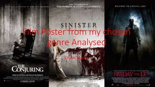
Analysis of horror film poster
- 1. Film Poster from my chosen genre Analysed Chynia Teixeira
- 2. The title, “Dead Silence” reveals to the audience that a death may occur in the film and the word silence links with the main image of the finger in that position that is associated with being quiet. The affect on the title creates a ghostly and eerie effect, also makes the title appear disorientated. The main image straight away creates fear within an audience because the use of the doll would relate to childhood as would the position of the finger that indicated silence, however the skin would change this relation to childhood and innocence and creates a sinister feel to it, also the eyes on the doll look as though the doll is looking straight at you. The doll is wearing a ref bow and has red lips, this connotates danger and blood which is a common theme within horror films. Referring to another film that has the same director and film writers, is a common convention within horror film posters as it creates expectation and suspense within the audience. The tagline “You scream. You die”, reveals that death may occur within the film and it is talking to the audience which would create fear within them. The use of red writing relates to the connotation the red is associated with danger and blood which also reveals something bad is going to happen The background for this poster is black, this means that the audience is drawn straight to the puppet and the finger. Which allows them that the main focus is going to be the doll and that there may be some kind of demon involved within due to the skin and cuts of the hand. The simplicity is of the poster is what creates the most fear as it does not reveal too much about the film and also the use of low key lighting also creates the most fear because it reveals to the audience that this is the character is evil.
- 3. What have I learnt? From analysing this horror film poster I have developed new ideas for the ways in which my group could create a horror film posters. The main ways would be a black background the use of low-key lighting and the use of the colour red to connotate danger and create fear within our audience. Another way we could create a successful film poster is by keeping it simple and just including the doll this way we don’t reveal too much about the film.