Downloaded 172 times
![Review Copy. Do not redistribute! 1999-12-01 22:15
Chapter 5. Widget Configuration
Backwards Compatibility
Chapter 5. Widget Configuration Keyword arguments were introduced in Python 1.3. Before that, options were passed to the
widget constructors and configure methods using ordinary Python dictionaries. The source
To control the appearance of a widget, you usually use options rather than method calls. code could then look something like this:
Typical options include text and color, size, command callbacks, etc. To deal with options, all
core widgets implement the same configuration interface: self.button = Button(frame, {"text": "QUIT", "fg": "red", "command": frame.quit})
self.button.pack({"side": LEFT})
Configuration Interface The keyword argument syntax is of course much more elegant, and less error prone. However,
for compatibility with existing code, Tkinter still supports the older syntax. You shouldn't use
widgetclass(master, option=value, ...) ⇒ widget this syntax in new programs, even if it might be tempting in some cases. For example, if you
Create an instance of this widget class, as a child to the given master, and using the given create a custom widget which needs to pass configuration options along to its parent class, you
options. All options have default values, so in the simplest case, you only have to specify may come up with something like:
the master. You can even leave that out if you really want; Tkinter then uses the most
def __init__(self, master, **kw):
recently created root window as master. Note that the name option can only be set when
Canvas.__init__(self, master, kw) # kw is a dictionary
the widget is created.
This works just fine with the current version of Tkinter, but it may not work with future
cget(option) ⇒ string
versions. A more general approach is to use the apply function:
Return the current value of an option. Both the option name, and the returned value, are
strings. To get the name option, use str(widget) instead. def __init__(self, master, **kw):
apply(Canvas.__init__, (self, master), kw)
configure(option=value, ...)
The apply function takes a function (an unbound method, in this case), a tuple with arguments
config(option=value, ...)
(which must include self since we're calling an unbound method), and optionally, a dictionary
Set one or more options (given as keyword arguments). which provides the keyword arguments.
Note that some options have names that are reserved words in Python (class, from, ...). To use
these as keyword arguments, simply append an underscore to the option name (class_, from_,
...). Note that you cannot set the name option using this method; it can only be set when the
widget is created.
For convenience, the widgets also implement a partial dictionary interface. The __setitem__
method maps to configure, while __getitem__ maps to cget. As a result, you can use the
following syntax to set and query options:
value = widget[option]
widget[option] = value
Note that each assignment results in one call to Tk. If you wish to change multiple options, it is
usually a better idea to change them with a single call to config or configure (personally, I
prefer to always change options in that fashion).
The following dictionary method also works for widgets:
keys() ⇒ list
Return a list of all options that can be set for this widget. The name option is not included
in this list (it cannot be queried or modified through the dictionary interface anyway, so
this doesn't really matter).
11 12
Copyright (c) 1999 by Fredrik Lundh](https://image.slidesharecdn.com/an-introduction-to-tkinter-120417003817-phpapp02/85/An-introduction-to-tkinter-13-320.jpg)
![Review Copy. Do not redistribute! 1999-12-01 22:15
Chapter 6. Widget Styling
Tk also supports the forms “#RGB” and “#RRRRGGGGBBBB” to specify each value with 16 and
65536 levels, respectively.
Chapter 6. Widget Styling You can use the winfo_rgb widget method to translate a color string (either a name or an RGB
specification) to a 3-tuple:
All Tkinter standard widgets provide a basic set of “styling” options, which allow you to modify
things like colors, fonts, and other visual aspects of each widget. rgb = widget.winfo_rgb("red")
red, green, blue = rgb[0]/256, rgb[1]/256, rgb[2]/256
Colors Note that winfo_rgb returns 16-bit RGB values, ranging from 0 to 65535. To map them into the
more common 0-255 range, you must divide each value by 256 (or shift them 8 bits to the
Most widgets allow you to specify the widget and text colors, using the background and right).
foreground options. To specify a color, you can either use a color name, or explicitly specify the
red, green, and blue (RGB) color components.
Fonts
Color Names Widgets that allow you to display text in one way or another also allows you to specify which
Tkinter includes a color database which maps color names to the corresponding RGB values. font to use. All widgets provide reasonable default values, and you seldom have to specify the
This database includes common names like Red, Green, Blue, Yellow, and LightBlue, but also font for simpler elements like labels and buttons.
more exotic things like Moccasin, PeachPuff, etc. Fonts are usually specifed using the font widget option. Tkinter supports a number of different
On an X window system, the color names are defined by the X server. You might be able to font descriptor types:
locate a file named xrgb.txt which contains a list of color names and the corresponding RGB • Font descriptors
values. On Windows and Macintosh systems, the color name table is built into Tk.
• User-defined font names
Under Windows, you can also use the Windows system colors (these can be changed by the
• System fonts
user via the control panel):
SystemActiveBorder, SystemActiveCaption, SystemAppWorkspace, SystemBackground,
• X font descriptors
SystemButtonFace, SystemButtonHighlight, SystemButtonShadow, SystemButtonText, With Tk versions before 8.0, only X font descriptors are supported (see below).
SystemCaptionText, SystemDisabledText, SystemHighlight, SystemHighlightText,
SystemInactiveBorder, SystemInactiveCaption, SystemInactiveCaptionText, SystemMenu,
SystemMenuText, SystemScrollbar, SystemWindow, SystemWindowFrame, SystemWindowText.
Font descriptors
On the Macintosh, the following system colors are available: Starting with Tk 8.0, Tkinter supports platform independent font descriptors. You can specify a
font as tuple containing a family name, a height in points, and optionally a string with one or
SystemButtonFace, SystemButtonFrame, SystemButtonText, SystemHighlight,
SystemHighlightText, SystemMenu, SystemMenuActive, SystemMenuActiveText,
more styles. Examples:
SystemMenuDisabled, SystemMenuText, SystemWindowBody.
("Times", 10, "bold")
Color names are case insensitive. Many (but not all) color names are also available with or ("Helvetica", 10, "bold italic")
without spaces between the words. For example, “lightblue”, “light blue”, and “Light Blue” all ("Symbol", 8)
specify the same color.
To get the default size and style, you can give the font name as a single string. If the family
name doesn't include spaces, you can also add size and styles to the string itself:
RGB Specifications
"Times 10 bold"
If you need to explicitly specify a color, you can use a string with the following format:
"Helvetica 10 bold italic"
"Symbol 8"
#RRGGBB
Here are some families available on most Windows platforms:
RR, GG, BB are hexadecimal representations of the red, green and blue values, respectively.
The following sample shows how you can convert a color 3-tuple to a Tk color specification: Arial (corresponds to Helvetica), Courier New (Courier), Comic Sans MS, Fixedsys, MS Sans
Serif, MS Serif, Symbol, System, Times New Roman (Times), and Verdana:
tk_rgb = "#%02x%02x%02x" % (128, 192, 200)
13 14
Copyright (c) 1999 by Fredrik Lundh](https://image.slidesharecdn.com/an-introduction-to-tkinter-120417003817-phpapp02/85/An-introduction-to-tkinter-14-320.jpg)


![Review Copy. Do not redistribute! 1999-12-01 22:15
Chapter 15. The Canvas Image Item
Option Type Description
Chapter 15. The Canvas Image Item instead of a tuple of strings.
The image item draws an image on the canvas.
photo = PhotoImage(file="sample.gif")
item = canvas.create_image(10, 10, anchor=NW, image=photo)
Methods
The following methods are used to create and configure image items:
create_image(x0, y0, options...) ⇒ id
Create a image item placed relative to the given position. Note that the image itself is given
by the image option.
[FIXME: add note on image ownership]
delete(item)
Delete an image item.
coords
coords(item, x0, y0). Move one or more image items.
itemconfigure
itemconfigure(item, options...). Change the options for one or more image (or other) items.
Options
The image item supports the following options, via the create_image method, and the
itemconfig and itemcget configuration methods.
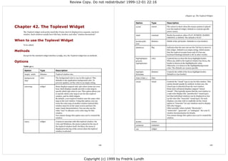
Table 15-1. Canvas Image Options
Option Type Description
image image The image object (a Tkinter PhotoImage or
BitmapImage instance, or instances of the
corresponding Python Imaging Library classes).
anchor constant Specifies which part of the image that should be
placed at the given position. Use one of N, NE, E, SE,
S, SW, W, NW, or CENTER. Default is CENTER.
tags tuple One or more tags to associate with this item. If only a
single tag is to be used, you can use a single string
59 60
Copyright (c) 1999 by Fredrik Lundh](https://image.slidesharecdn.com/an-introduction-to-tkinter-120417003817-phpapp02/85/An-introduction-to-tkinter-37-320.jpg)


![Review Copy. Do not redistribute! 1999-12-01 22:15
Chapter 30. The Listbox Widget
lb = Listbox(selectmode=EXTENDED)
Chapter 30. The Listbox Widget To query the selection, use curselection method. It returns a list of item indexes, but a bug in
Tkinter 1.101 (Python 1.5.1) and earlier versions causes this list to be returned as a list of
strings, instead of integers. This will most likely be fixed in later versions of Tkinter, so you
The Listbox widget is a standard Tkinter widget used to display a list of alternatives. The listbox
should make sure that your code is written to handle either case. Here's one way to do that:
can only contain text items, and all items must have the same font and color. Depending on the
widget configuration, the user can choose one or more alternatives from the list. items = list.curselection()
try:
When to use the Listbox Widget items = map(int, items)
except ValueError: pass
Listboxes are used to select from a group of textual items. Depending on how the listbox is In versions before Python 1.5, use string.atoi of int.
configured, the user can select one or many items from that list.
Use the get method to get the list item corresponding to a given index.
Patterns You can also use a listbox to represent arbitrary Python objects. In the next example, we
assume that the input data is represented as a list of tuples, where the first item in each tuple is
When you first create the listbox, it is empty. The first thing to do is usually to insert one or the string to display in the list. For example, you could display a dictionary by using the items
more lines of text. The insert method takes an index and a string to insert. The index is usually method to get such a list.
an item number (0 for the first item in the list), but you can also use some special indexes,
self.lb.delete(0, END) # clear
including ACTIVE, which refers to the “active” item (set when you click on an item, or by the for key, value in data:
arrow keys), and END, which is used to append items to the list. self.lb.insert(END, key)
self.data = data
listbox = Listbox(master)
When querying the list, simply fetch the items indexed by the selection list:
listbox.insert(END, "a list entry")
items = self.lb.curselection()
for item in ["one", "two", "three", "four"]: try:
listbox.insert(END, item) items = map(string.atoi, items)
except ValueError: pass
To remove items from the list, use the delete method. The most common operation is to delete items = map(lambda i,d=self.data: d[i], items)
all items in the list (something you often need to do when updating the list).
Unfortunately, the listbox doesn't provide a command option allowing you to track changes to
listbox.delete(0, END) the selection. The standard solution is to bind a double-click event to the same callback as the
listbox.insert(END, newitem)
OK (or Select, or whatever) button. This allows the user to either select an alternative as usual,
You can also delete individual items. In the following example, a separate button is used to and click OK to carry out the operation, or to select and carry out the operation in one go by
delete the ACTIVE item from a list. double-clicking on an alternative. This solution works best in BROWSE and EXTENDED modes.
lb.bind("<Double-Button-1>", self.ok)
lb = Listbox(master)
b = Button(master, text="Delete",
If you wish to track arbitrary changes to the selection, you can either rebind the whole bunch of
command=lambda lb=lb: lb.delete(ANCHOR))
selection related events (see the Tk manual pages for a complete list of Listbox event bindings),
The listbox offers four different selection modes through the selectmode option. These are or, much easier, poll the list using a timer:
SINGLE (just a single choice), BROWSE (same, but the selection can be moved using the
def __init__(self, master):
mouse), MULTIPLE (multiple item can be choosen, by clicking at them one at a time), or
self.list = Listbox(selectmode=EXTENDED)
EXTENDED (multiple ranges of items can be chosen, using the Shift and Control keyboard
self.list.pack()
modifiers). The default is BROWSE. Use MULTIPLE to get "checklist" behavior, and EXTENDED self.current = None
when the user would usually pick only one item, but sometimes would like to select one or self.poll() # start polling the list
more ranges of items.
def poll(self):
93 94
Copyright (c) 1999 by Fredrik Lundh](https://image.slidesharecdn.com/an-introduction-to-tkinter-120417003817-phpapp02/85/An-introduction-to-tkinter-54-320.jpg)

![Review Copy. Do not redistribute! 1999-12-01 22:15
Chapter 36. The Place Geometry Manager
w.place(x=5, y=5, relwidth=1, relheight=1, width=-10, height=-10)
Chapter 36. The Place Geometry You can also place a widget outside another widget. For example, why not place two widgets on
top of each other:
Manager w2.place(in_=w1, relx=0.5, y=-2, anchor=S, bordermode="outside")
The Place geometry manager is the simplest of the three general geometry managers provided Note the use of relx and anchor options to center the widgets vertically. You could also use
in Tkinter. It allows you explicitly set the position and size of a window, either in absolute (relx=0, anchor=SW) to get left alignment, or (relx=1, anchor=SE) to get right alignment.
terms, or relative to another window. By the way, why not combine this way to use the packer with the launch button example shown
You can access the place manager through the place method which is available for all standard earlier. The following example places two buttons in the upper right corner of the pane:
widgets.
b1 = DrawnButton(pane, (12, 12), launch_icon, command=self.launch)
b1.place(relx=1, x=-2, y=2, anchor=NE)
When to use the Place Manager b2 = DrawnButton(pane, (12, 12), info_icon, command=self.info)
b2.place(in_=b1, x=-2, anchor=NE, bordermode="outside")
It is usually not a good idea to use place for ordinary window and dialog layouts; its simply to
much work to get things working as they should. Use the pack or grid managers for such Finally, let's look at a piece of code from an imaginary SplitWindow container widget. The
purposes. following piece of code splits frame into two subframes called f1 and f2.
However, place has its uses in more specialized cases. Most importantly, it can be used by f1 = Frame(frame, bd=1, relief=SUNKEN)
compound widget containers to implement various custom geometry managers. Another use is f2 = Frame(frame, bd=1, relief=SUNKEN)
to position control buttons in dialogs. split = 0.5
f1.place(rely=0, relheight=split, relwidth=1)
f2.place(rely=split, relheight=1.0-split, relwidth=1)
Patterns
To change the split point, set split to something suitable, and call the place method again. If
Let's look at some usage patterns. The following command centers a widget in its parent: you haven't changed an option, you don't have to specify it again.
w.place(relx=0.5, rely=0.5, anchor=CENTER) f1.place(relheight=split)
f2.place(rely=split, relheight=1.0-split)
Here's another variant. It packs a Label widget in a frame widget, and then places a Button in
the upper right corner of the frame. The button will overlap the label. You could add a small frame to use as a dragging handle, and add suitable bindings to it, e.g:
pane = Frame(master) f3 = Frame(frame, bd=2, relief=RAISED, width=8, height=8)
Label(pane, text="Pane Title").pack() f3.place(relx=0.9, rely=split, anchor=E)
b = Button(pane, width=12, height=12, f3.bind("<B1-Motion>", self.adjust)
image=launch_icon, command=self.launch)
b.place(relx=1, x=-2, y=2, anchor=NE)
Methods
The following excerpt from a Notepad widget implementation displays a notepad page
(implemented as a Frame) in the notepad body frame. It first loops over the available pages, place(option=value, ...)
calling place_forget for each one of them. Note that it's not an error to “unplace” a widget that place_configure(option=value, ...)
it's not placed in the first case: Place the widget as described by the options (see below).
for w in self.__pages: place_forget()
w.place_forget()
self.__pages[index].place(in_=self.__body, x=bd, y=bd) Remove the widget. The widget is not destroyed, and can be displayed again by place or
any other manager.
You can combine the absolute and relative options. In such cases, the relative option is applied
first, and the absolute value is then added to that position. In the following example, the widget place_info() ⇒ dictionary
w is almost completely covers its parent, except for a 5 pixel border around the widget. Return a dictionary containing the current options.
115 116
Copyright (c) 1999 by Fredrik Lundh](https://image.slidesharecdn.com/an-introduction-to-tkinter-120417003817-phpapp02/85/An-introduction-to-tkinter-65-320.jpg)
![Review Copy. Do not redistribute! 1999-12-01 22:15
Chapter 36. The Place Geometry Manager
place_slaves() ⇒ list
Returns a list of the “slave” widgets managed by this widget. The widgets are returned as
Tkinter widget references. Chapter 37. The Radiobutton Widget
The Radiobutton is a standard Tkinter widget used to implement one-of-many selections.
Options Radiobuttons can contain text or images, and you can associate a Python function or method
with each button. When the button is pressed, Tkinter automatically calls that function or
The following options can be used with the place and place_configure methods: method.
Table 36-1. Place Manager Options The button can only display text in a single font, but the text may span more than one line. In
addition, one of the characters can be underlined, for example to mark a keyboard shortcut. By
Option Type Description default, the Tab key can be used to move to a button widget.
anchor constant Specifies which part of the widget that should be Each group of Radiobutton widgets should be associated with single variable. Each button then
placed at the given position. Valid values are N, NE, E, represents a single value for that variable.
SE, SW, W, NW , or CENTER. Default is NW (the upper
left corner, that is).
When to use the Radiobutton Widget
bordermode constant If INSIDE, the size and position are relative to the
reference widget's inner size, excluding any border. If The radiobutton widget is used to implement one-of-many selections. It's almost always used
OUTSIDE, it's relative to the outer size, including the in groups, where all group members use the same variable.
border. Default is INSIDE .
These constants are not defined in Python 1.5.2 and
earlier. For compatibility, use the strings “inside” and
Patterns
“outside” instead. The Radiobutton widget is very similar to the check button. To get a proper radio behavior,
in (in_) widget Place widget relative to the given widget. You can only make sure to have all buttons in a group point to the same variable, and use the value option to
place a widget relative to its parent, or to any specify what value each button represents:
decendant of its parent. If this option is not given, it
v = IntVar()
defaults to the parent. Note that in is a reserved word Radiobutton(master, text="One", variable=v, value=1).pack(anchor=W)
in Python. To use it as a keyword option, append an Radiobutton(master, text="Two", variable=v, value=2).pack(anchor=W)
underscore (in_).
If you need to get notified when the value changes, attach a command callback to each button.
relwidth, rel- float Size, relative to the reference widget.
height To create a large number of buttons, use a loop:
relx, rely float Position, relative to the reference widget (usually the MODES = [
parent, unless otherwise specified by the in option). ("Monochrome", "1"),
0.0 is the left (upper) edge, 1.0 is the right (lower) ("Grayscale", "L"),
edge. ("True color", "RGB"),
("Color separation", "CMYK"),
width, height integer Size, in pixels. If omitted, it defaults to the widget's ]
“natural” size.
v = StringVar()
x, y integer Absolute position, in pixels. If omitted, defaults to 0. v.set("L") # initialize
for text, mode in MODES:
b = Radiobutton(master, text=text,
variable=v, value=mode)
b.pack(anchor=W)
117 118
Copyright (c) 1999 by Fredrik Lundh](https://image.slidesharecdn.com/an-introduction-to-tkinter-120417003817-phpapp02/85/An-introduction-to-tkinter-66-320.jpg)
![Review Copy. Do not redistribute! 1999-12-01 22:16
Chapter 41. The Text Widget Chapter 41. The Text Widget
FIXME: modify to handle ending linefeed added by text widget insert(index, text)
The index method converts an index given in any of the supported formats to a line/column insert(index, text, tags)
index. Use this if you need to store an “absolute” index. Insert text at the given position (typically INSERT or END). If you provide one or more
tags, they are attached to the new text.
index = text.index(index)
If you insert text on a mark, the mark is moved according to its gravity setting.
However, if you need to keep track of positions in the text even after other text is inserted or
deleted, you should use marks instead. delete(index)
delete(start, stop)
text.mark_set("here", index)
Delete the character (or embedded object) at the given position, or all text in the given
text.mark_unset("here")
range. Any marks within the range are moved to the beginning of the range.
The following function converts any kind of index to a (line, column)-tuple. Note that you can
get(index)
directly compare positions represented by such tuples.
get(start, stop)
def getindex(text, index): Return the character at the given position, or all text in the given range.
return tuple(map(int, string.split(text.index(index), ".")))
dump(index, options...)
if getindex(text, INSERT) < getindex(text, "sentinel"): dump(start, stop, options...)
text.mark_set(INSERT, "sentinel")
Return a list of widget contents at the given position, or for all text in the given range. This
The following example shows how to enumerate all regions in the text that has a given tag. includes tags, marks, and embedded objects. Not implemented in Python 1.5.2 and earlier.
ranges = text.tag_ranges(tag) see(index)
for i in range(0, len(ranges), 2): yview(index)
start = ranges[i]
stop = ranges[i+1] If necessary, scroll the text widget to make sure the text at the given position is visible. The
print tag, repr(text.get(start, stop)) see method scrolls the widget only if the given position isn't visible at all, while yview
always scrolls the widget to move the given position to the top of the window.
The search method allows you to search for text. You can search for an exact match (default),
or use a Tcl-style regular expression (call with the regexp option set to true). index(index)
Return the “line.column” index corresponding to the given index.
text.insert(END, "hello, world")
compare(index1, op, index2)
start = 1.0
while 1: Compare the two positions, and return true if the condition held. The op argument is one
pos = text.search("o", start, stopindex=END) of "<", "<=", "==", ">=", ">", or "!=" (Python's "<>" syntax is not supported).
if not pos:
break
print pos
Methods for Marks
start = pos + "+1c"
The following methods are used to manipulate builtin as well as user-defined marks.
Given an empty text widget, the above example prints 1.4 and 1.8 before it stops. If you omit
mark_set(mark, index)
the stopindex option, the search wraps around if it reaches the end of the text.
Move the mark to the given position. If the mark doesn't exist, it is created (with gravity
To search backwards, set the backwards option to true (to find all occurences, start at END, set
set to RIGHT). You also use this method to move the predefined INSERT and CURRENT
stopindex to 1.0 to avoid wrapping, and use "-1c" to move the start position).
marks.
Methods mark_unset(mark)
Remove the given mark from the widget. You cannot remove the builtin INSERT and
The Text widget supports the standard Tkinter Widget interface, plus the following methods: CURRENT marks.
137 138
Copyright (c) 1999 by Fredrik Lundh](https://image.slidesharecdn.com/an-introduction-to-tkinter-120417003817-phpapp02/85/An-introduction-to-tkinter-76-320.jpg)


![Review Copy. Do not redistribute! 1999-12-01 22:16
Chapter 43. Basic Widget Methods
Event processing
Chapter 43. Basic Widget Methods
mainloop
The following methods are provided by all widgets (including the root window). In the method
mainloop(). Enter Tkinter's main event loop. To leave the event loop, use the quit method.
descriptions, self refer to the widget via which you reached the method.
Event loops can be nested; it's ok to call mainloop from within an event handler.
The root window and other Toplevel windows provide additional methods. See the Window
Methods section for more information. quit
quit(). Leaves Tkinter's main event loop. Note that you can have nested event loops; each call
Configuration to quit terminates the outermost event loop.
config update
config(options...), configure(options...). Change one or more options for self. update(). Process all pending events, call event callbacks, complete any pending geometry
management, redraw widgets as necessary, and call all pending idle tasks. This method should
config be used with care, since it may lead to really nasty race conditions if called from the wrong
place (from within an event callback, for example, or from a function that can in any way be
config(), configure(). Return a dictionary containing the current settings for all widget options.
called from an event callback, etc.)
For each option key in the dictionary, the value is either a five-tuple (option, option database
key, option database class, default value, current value), or a two-tuple (option alias, option).
The latter case is used for aliases like bg (background) and bd (borderwidth).
update_idletasks
Note that the value fields aren't correctly formatted for some option types. See the description update_idletasks(). Call all pending idle tasks, without processing any other events. This can
of the keys method for more information, and a workaround. be used to carry out geometry management and redraw widgets if necessary, without calling
any callbacks.
cget
focus_set
cget(option). Return the current value for the given option.
focus_set(), focus(). Move keyboard focus to self. This means that all keyboard events sent to
Note that option values are always returned as strings (also if you gave a nonstring value when
the application will be routed to self.
you configured the widget). Use int and float where appropriate.
focus_displayof
keys
focus_displayof().
keys(). Return a tuple containing the options available for this widget. You can use cget to get
the corresponding value for each option.
focus_force
Note that the tuple currently include option aliases (like bd, bg, and fg). To avoid this, you can
use config instead. On the other hand, config doesn't return valid option values for some focus_force(). Force keyboard focus to self.
option types (such as font names), so the best way is to use a combination of config and cget: FIXME: what's the difference between "moving" and "forcing"?
for item in w.config():
if len(item) == 5: focus_get
option = item[0]
value = w.cget(option) focus_get().
print option, value
focus_lastfor
focus_lastfor().
151 152
Copyright (c) 1999 by Fredrik Lundh](https://image.slidesharecdn.com/an-introduction-to-tkinter-120417003817-phpapp02/85/An-introduction-to-tkinter-83-320.jpg)


This document provides an introduction and reference to Tkinter, a Python GUI toolkit. It begins with introductory examples and explanations of Tkinter classes and widgets. The remainder of the document consists of reference sections for each Tkinter widget and geometry manager, describing when to use them, common patterns, available methods and options.


