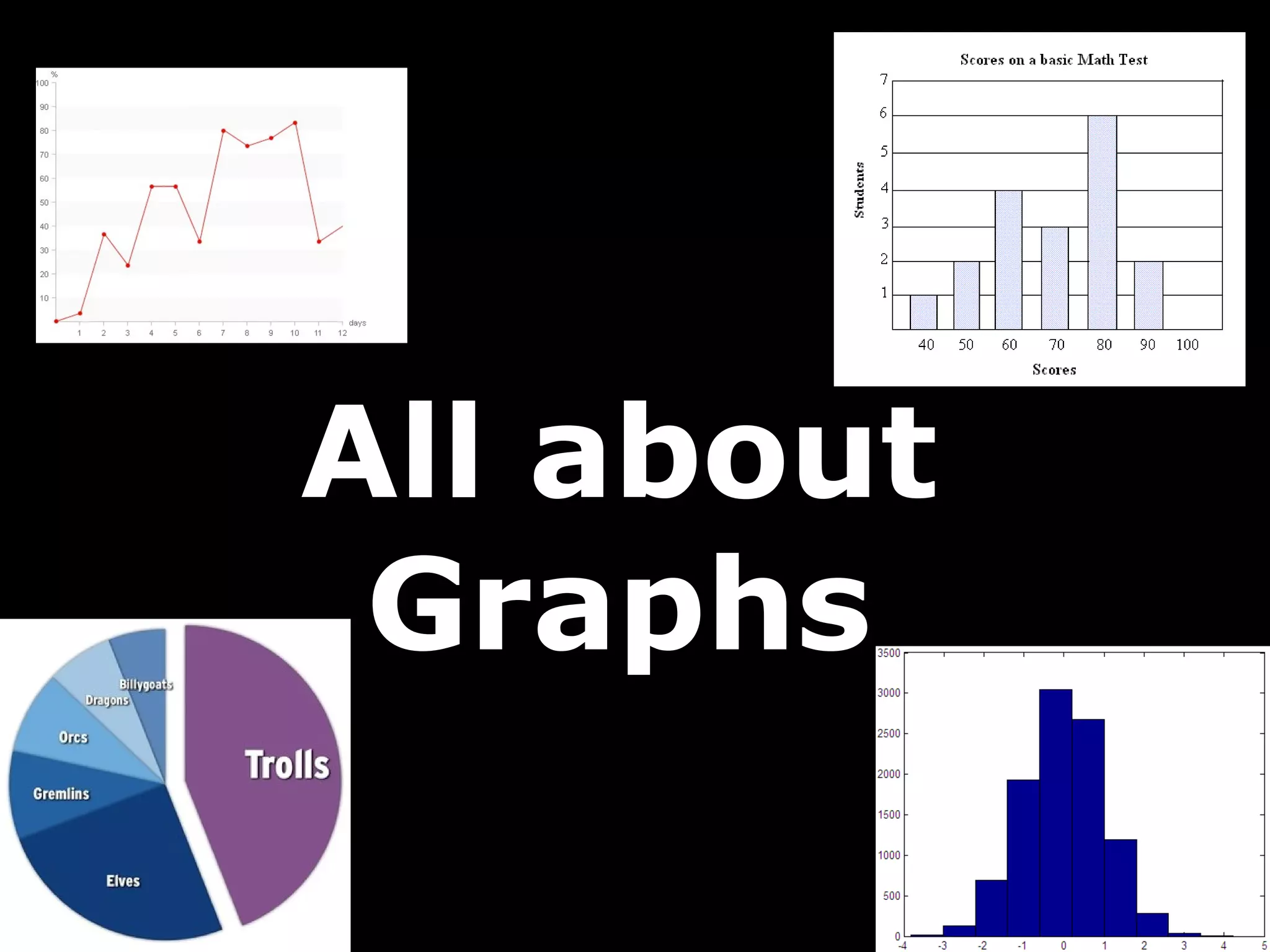
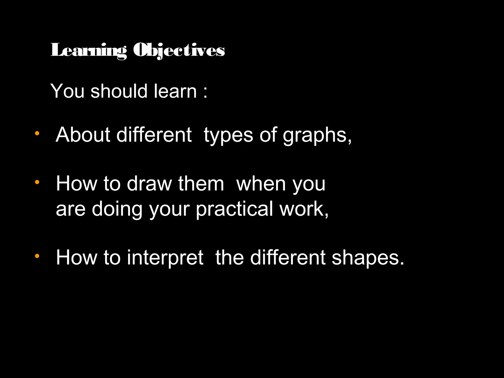
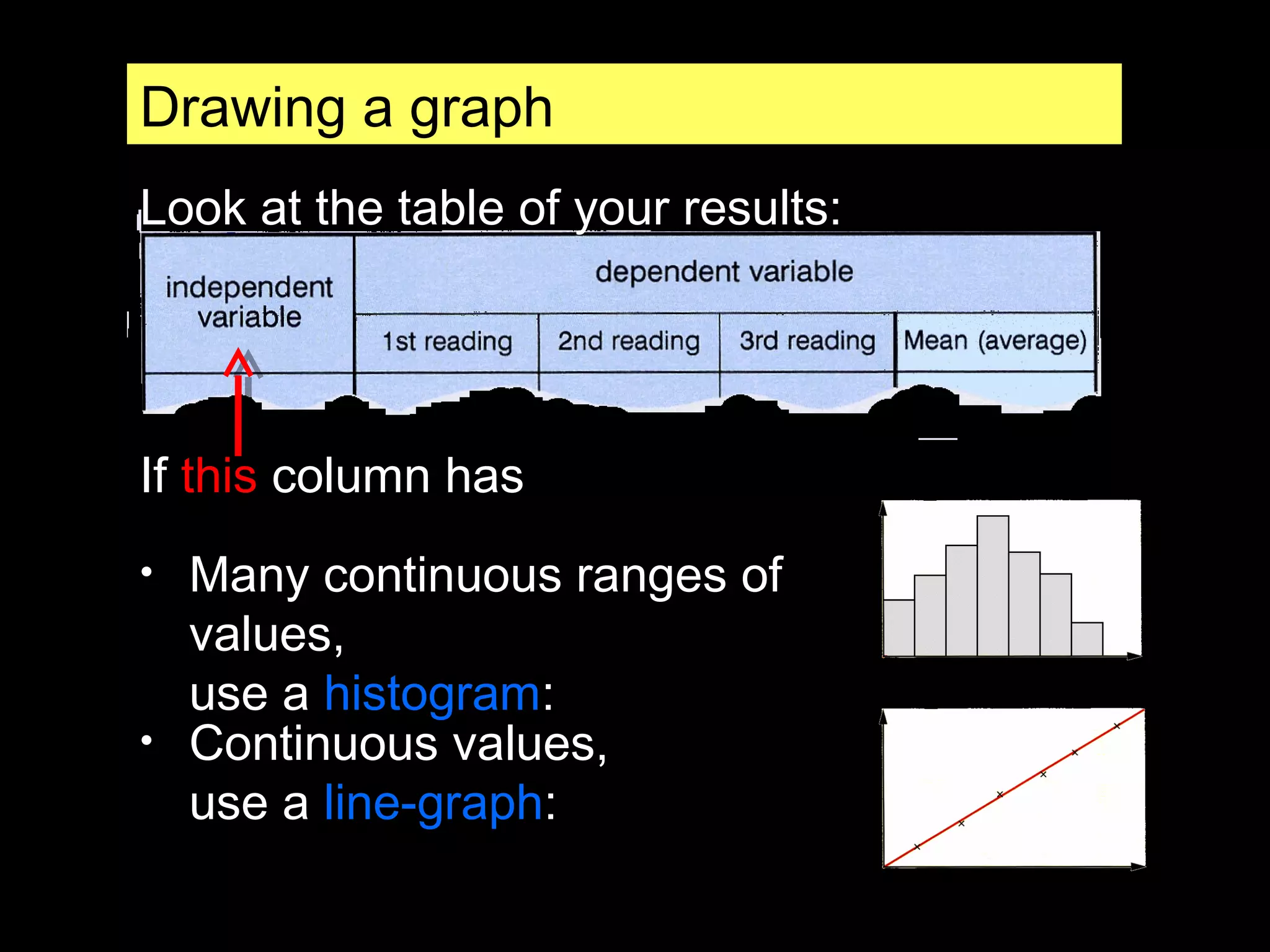
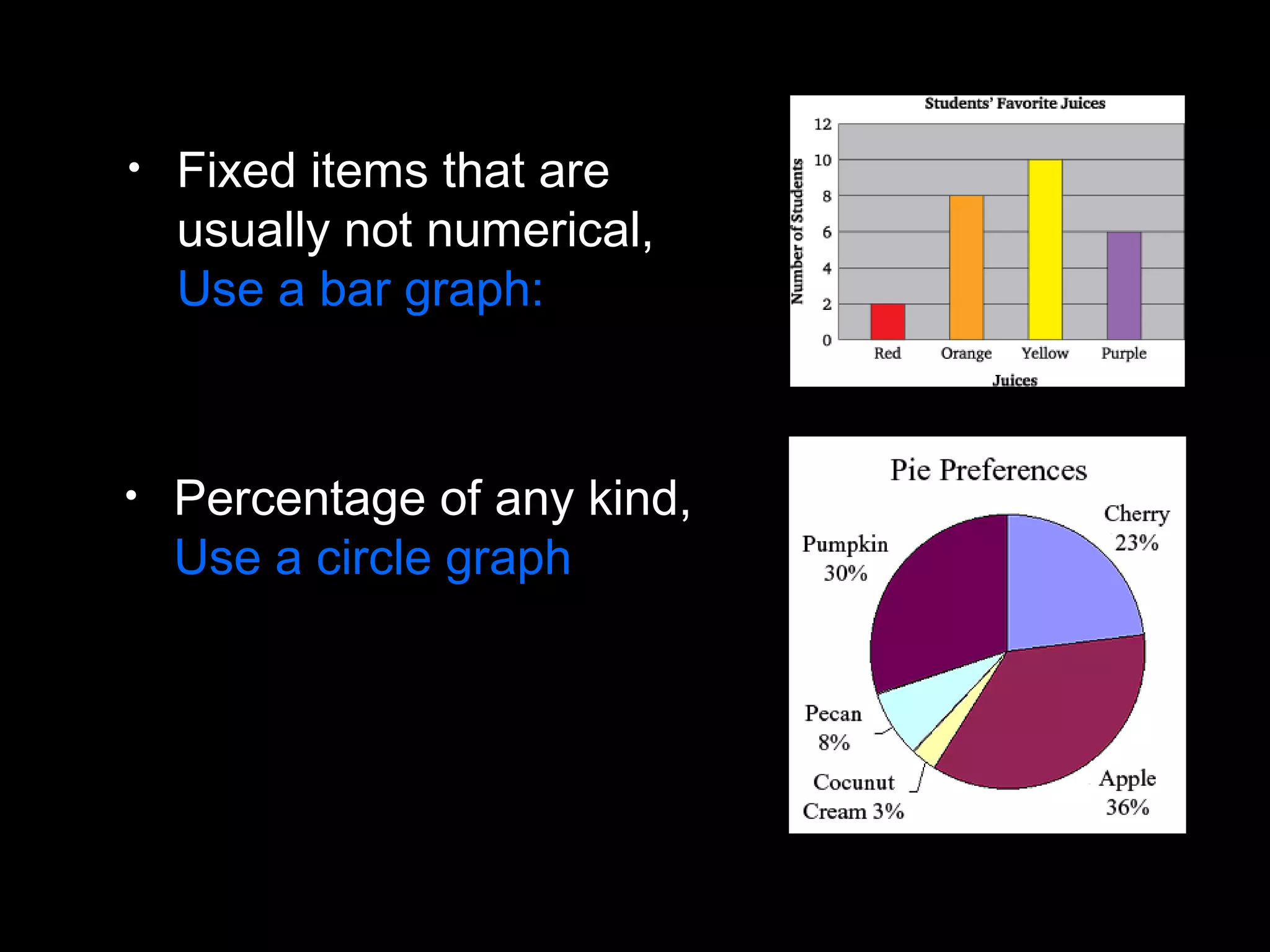
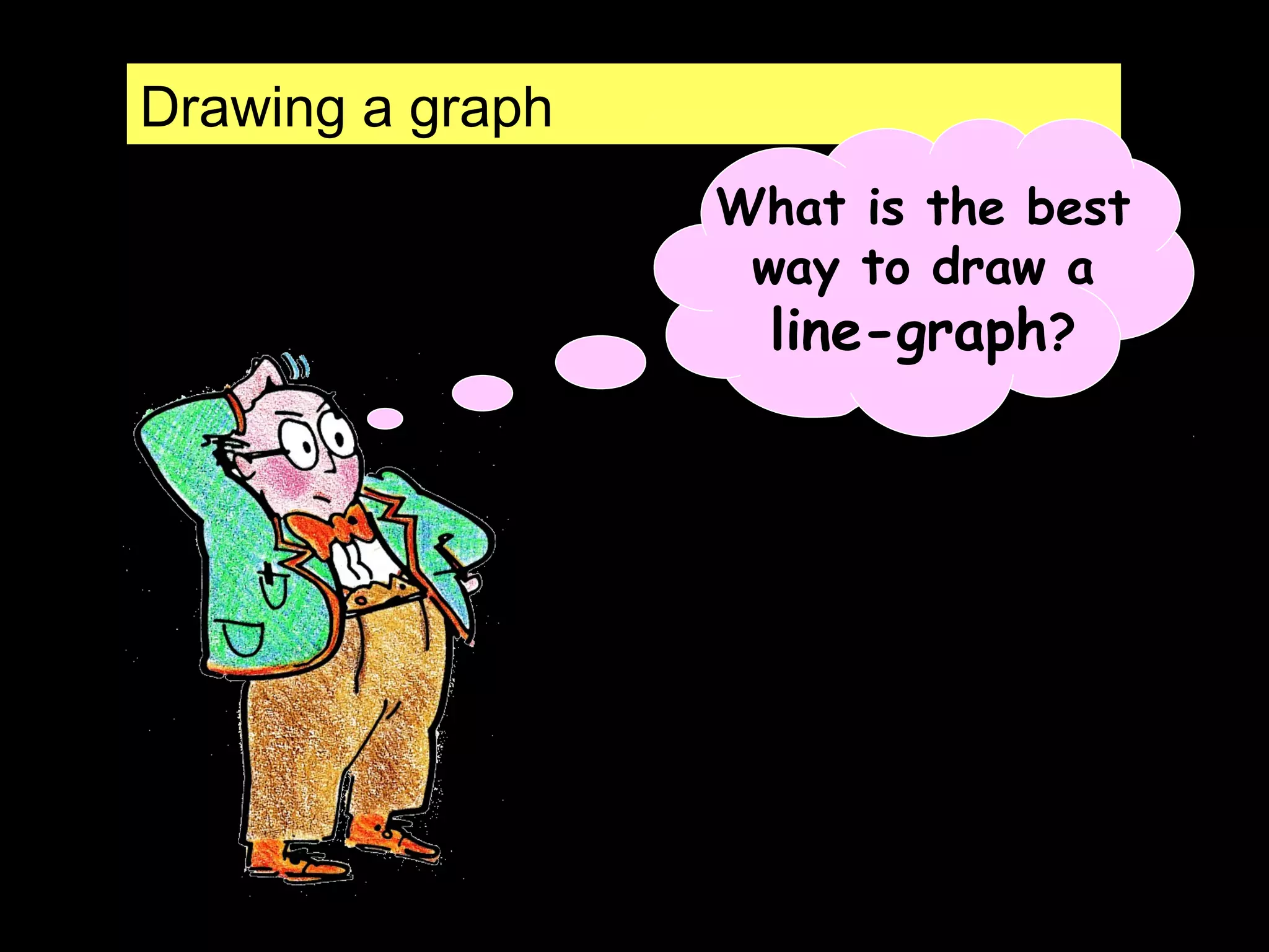
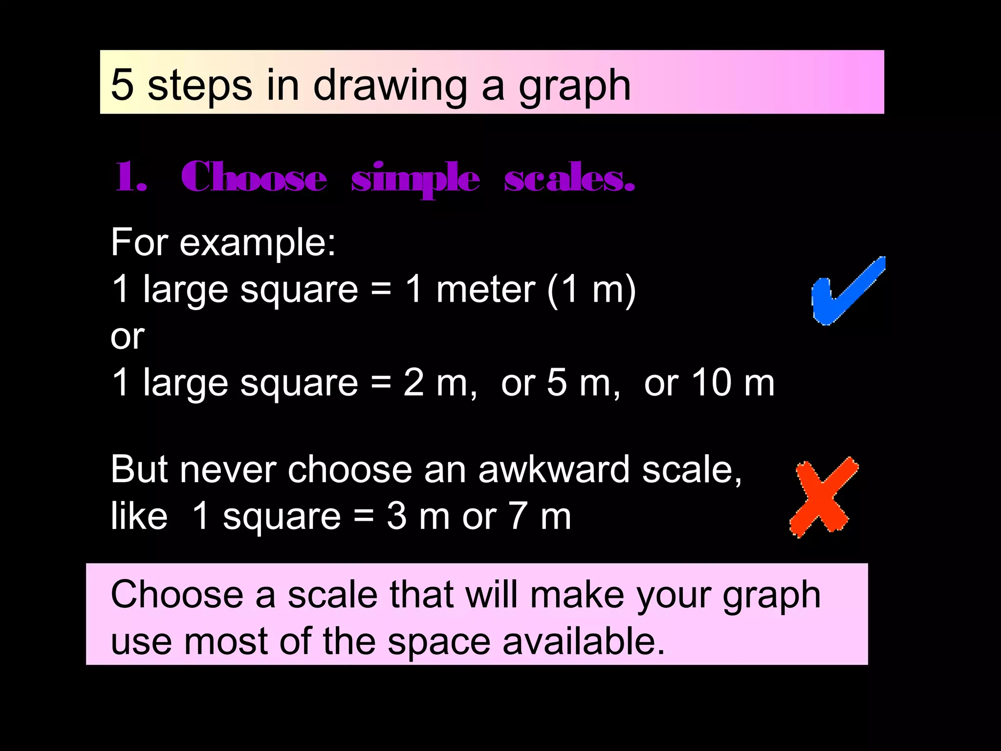
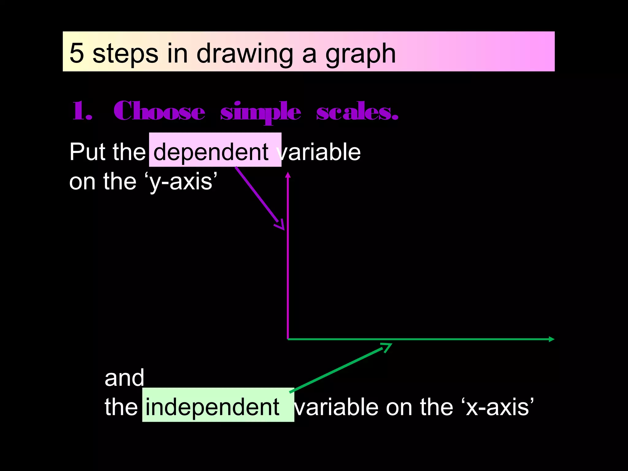
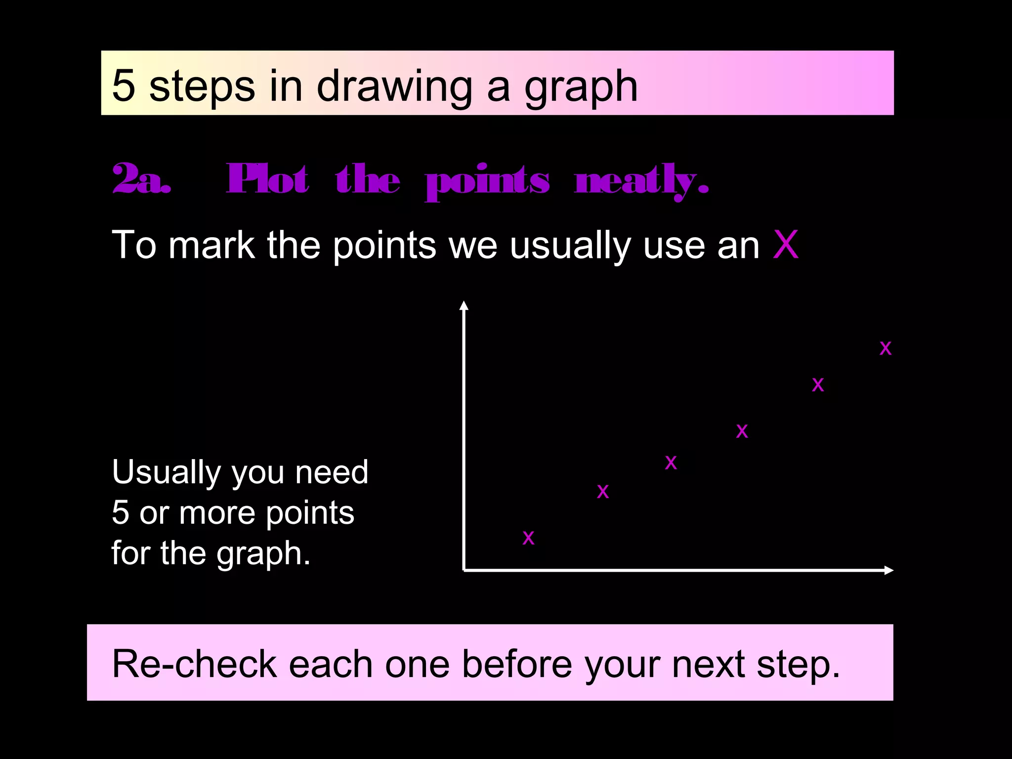
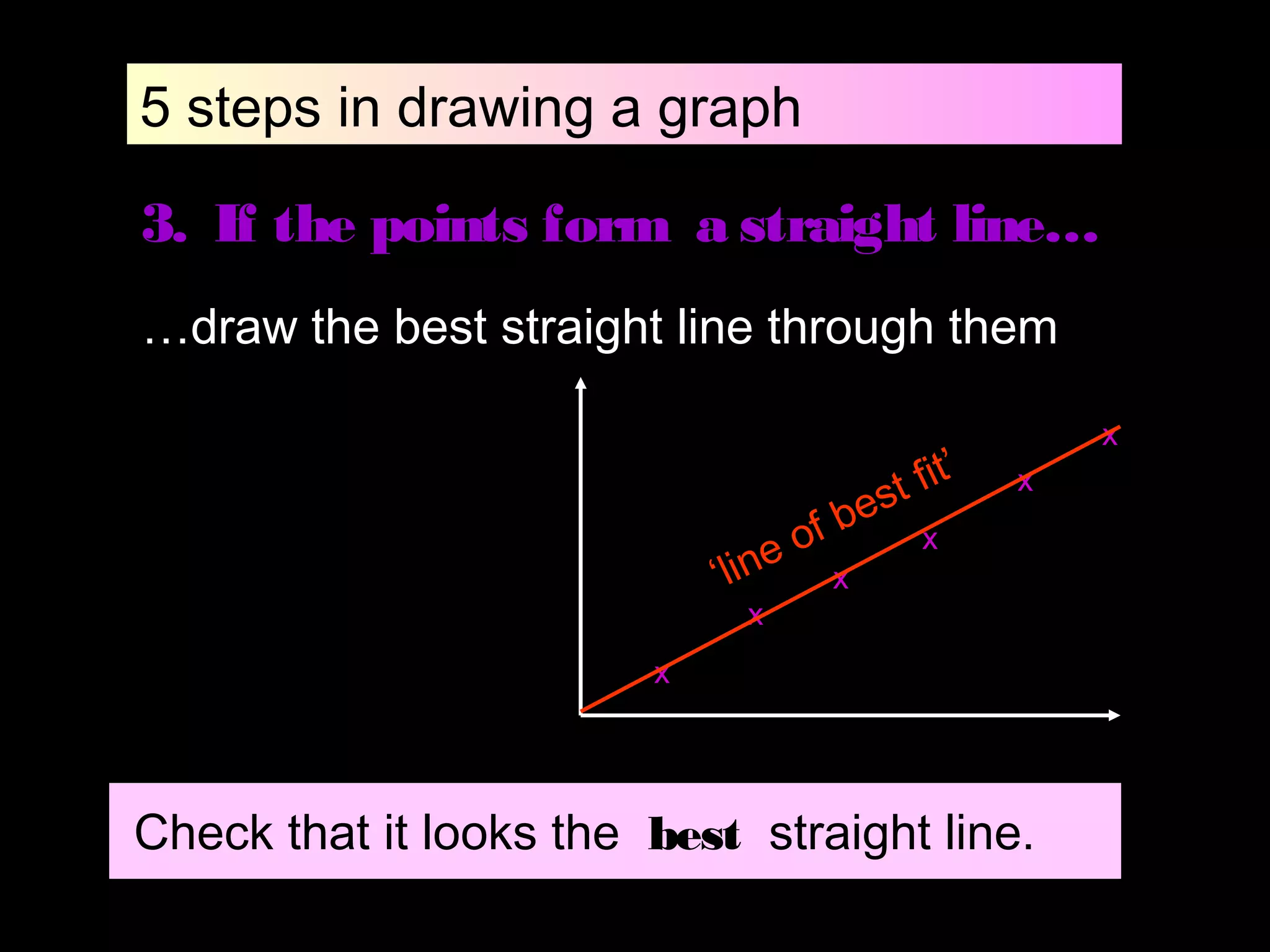
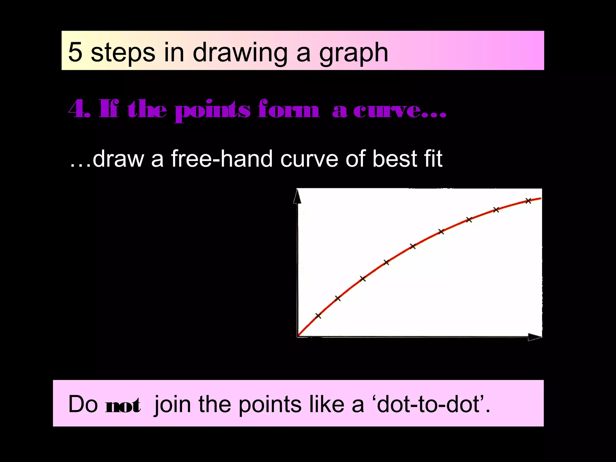
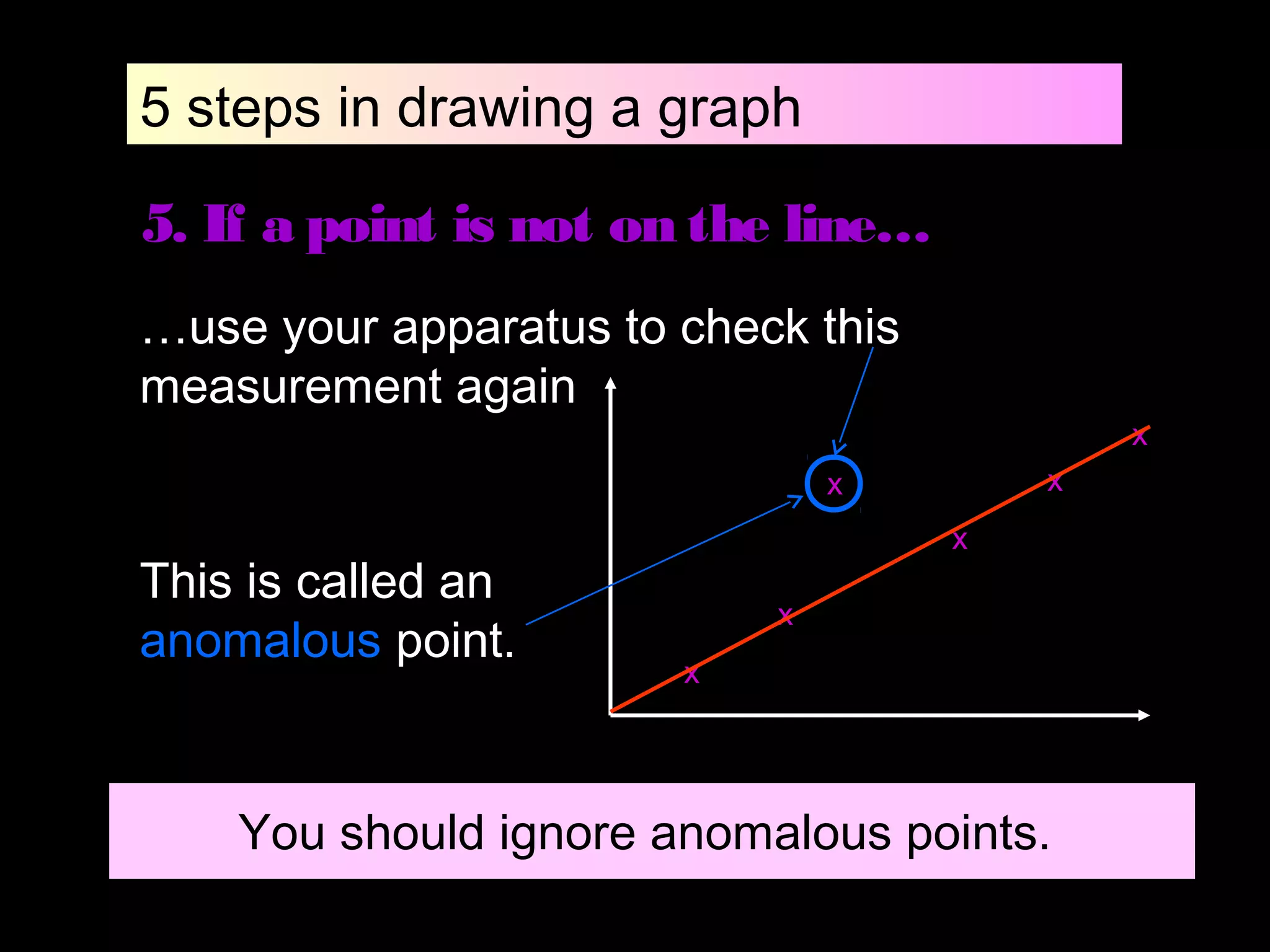
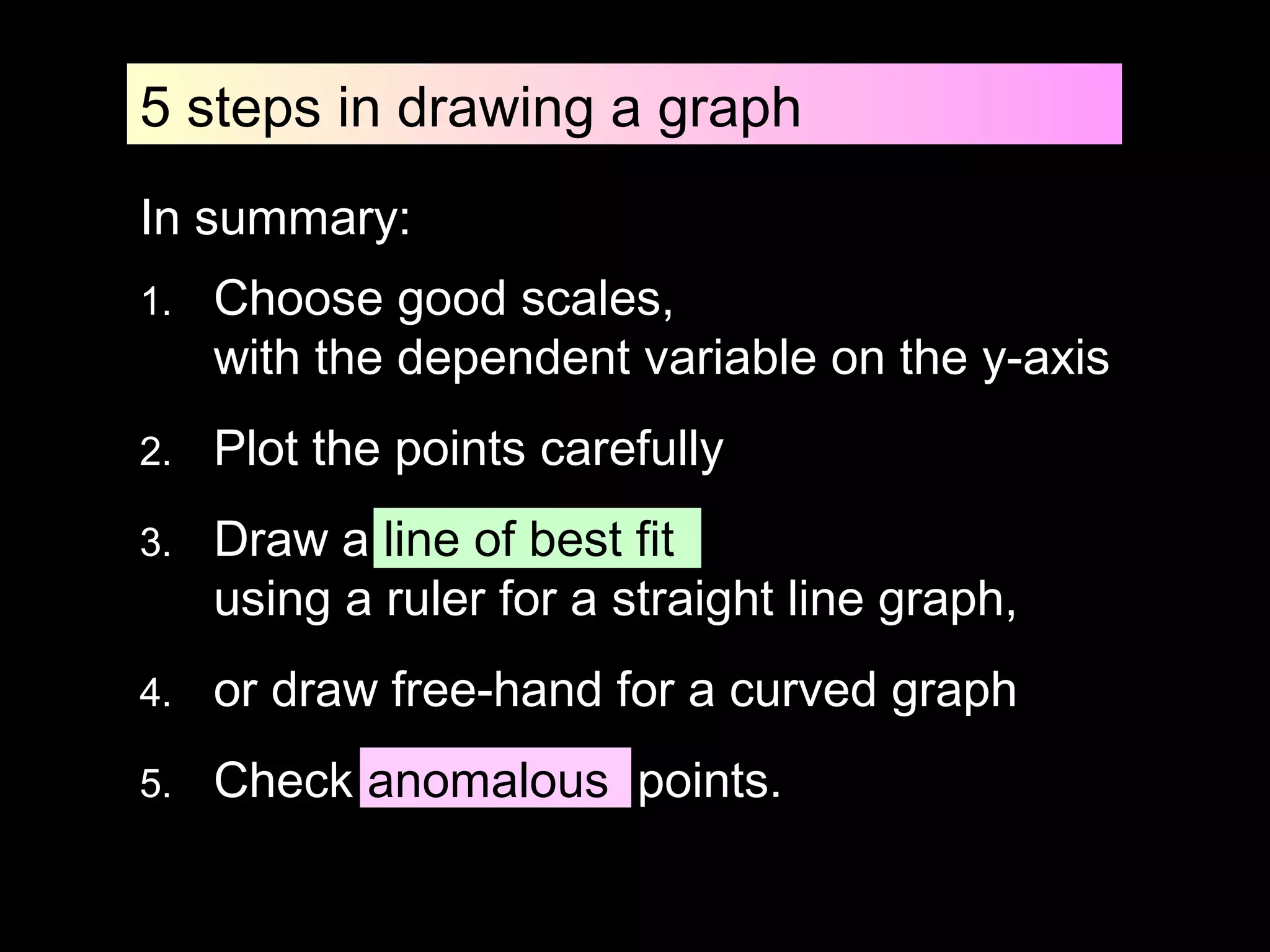
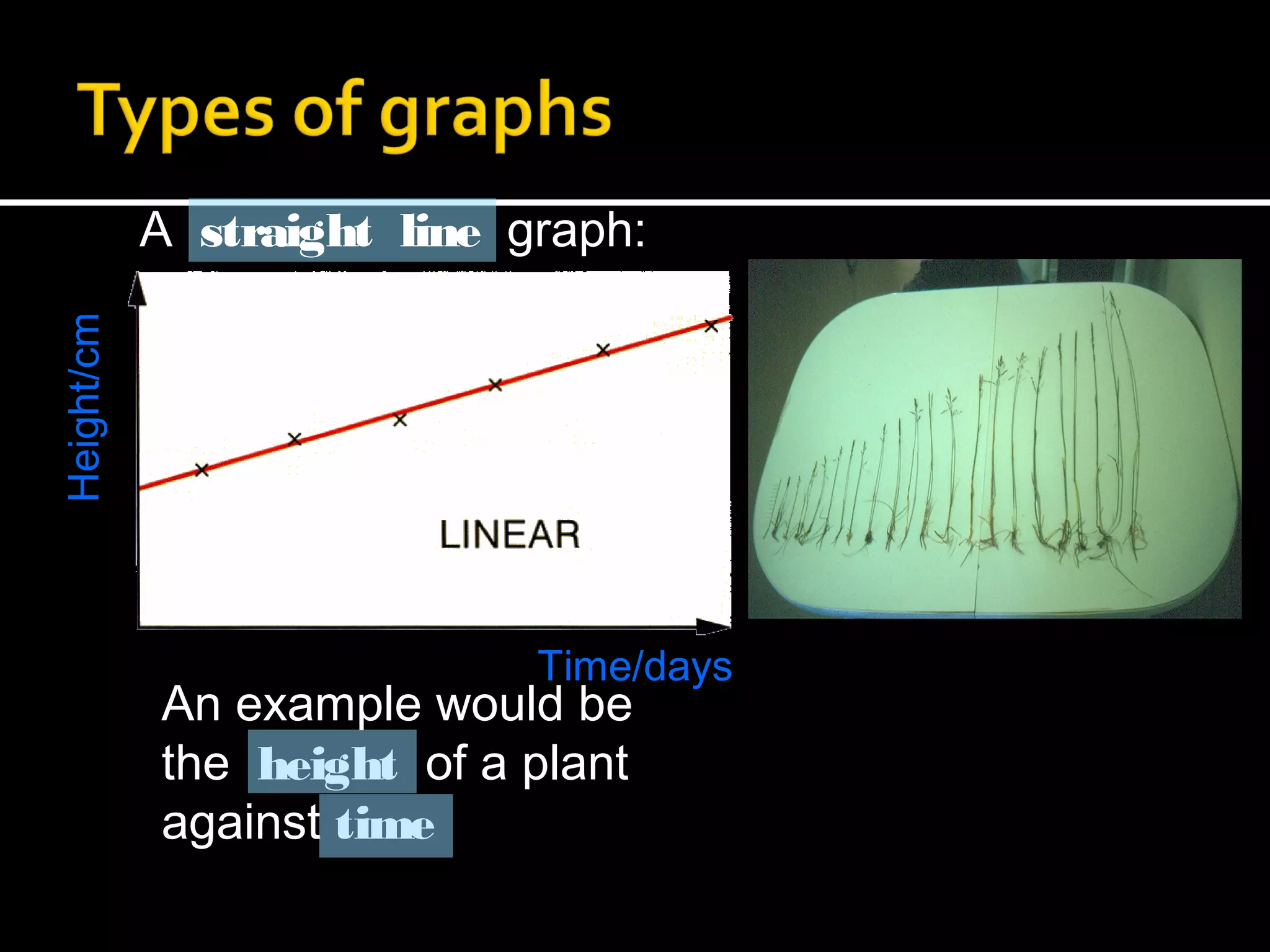
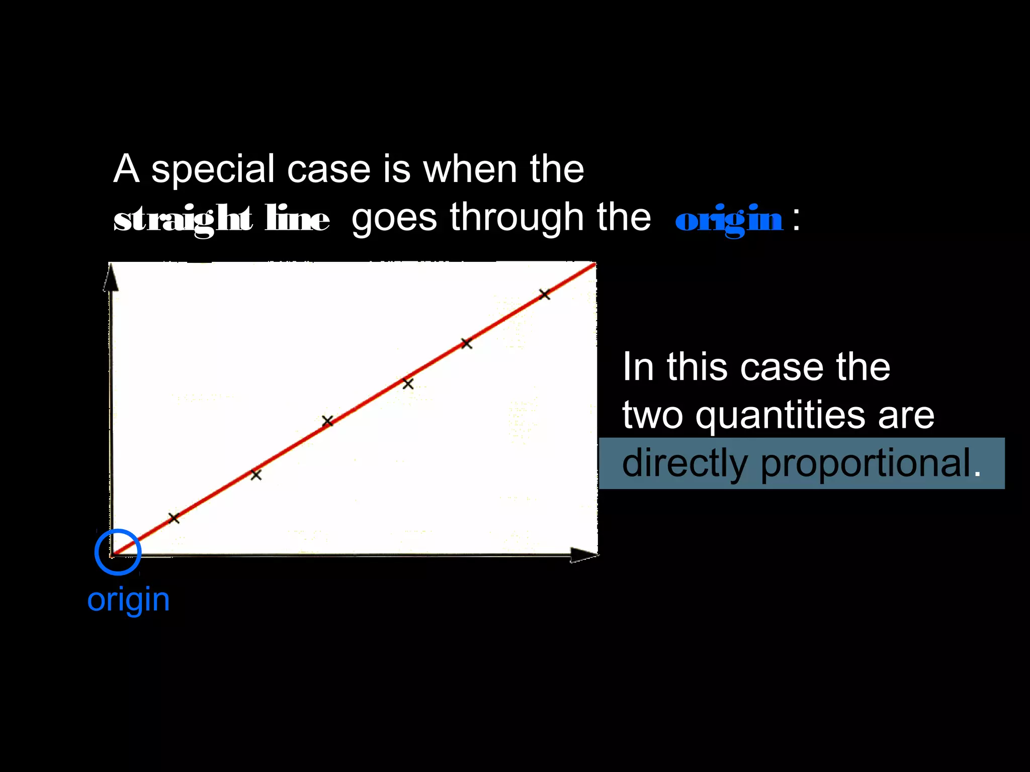
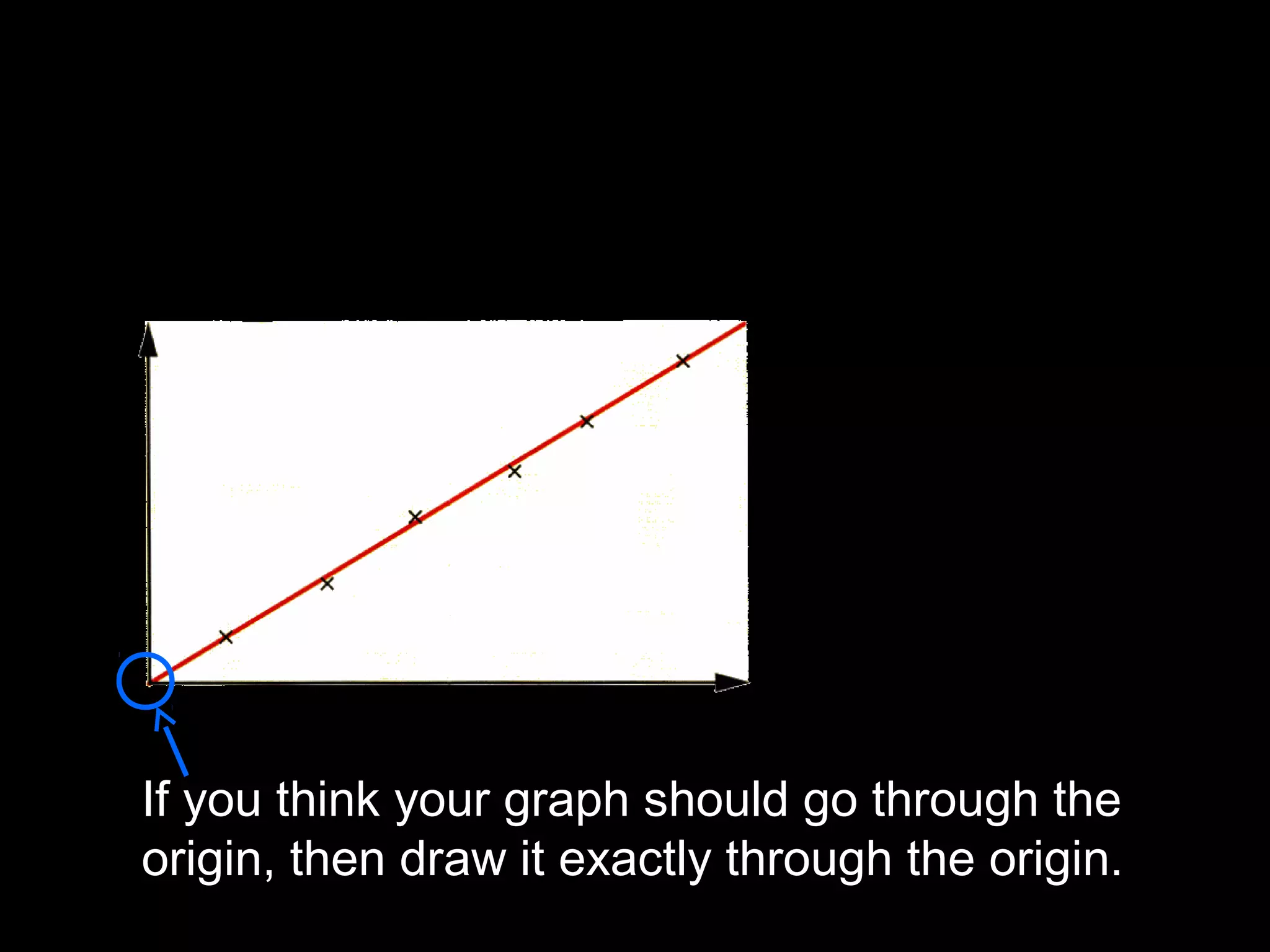
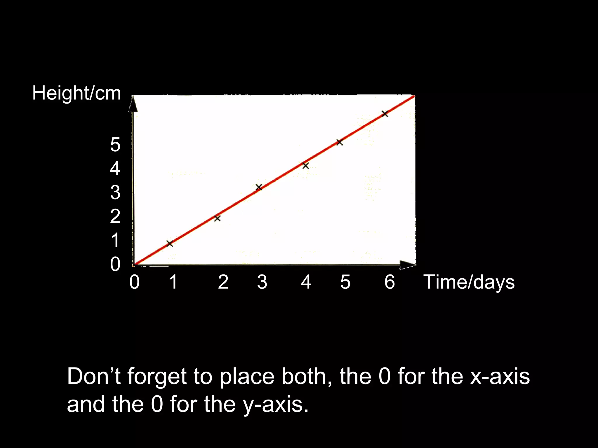
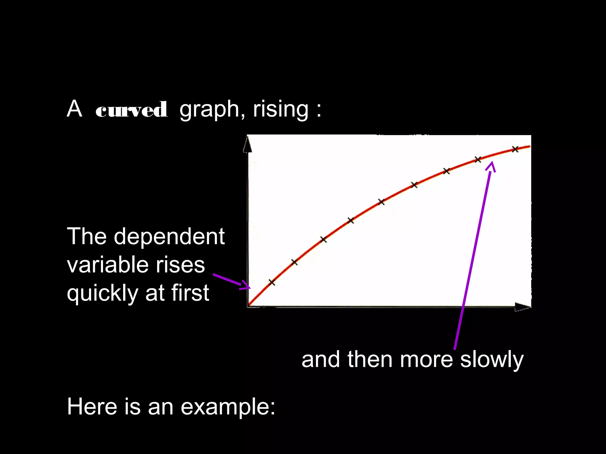
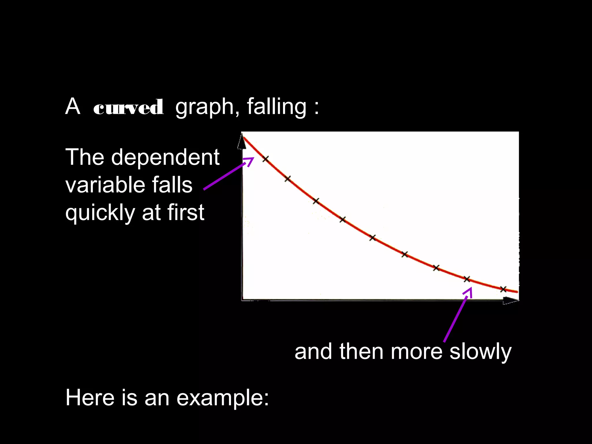
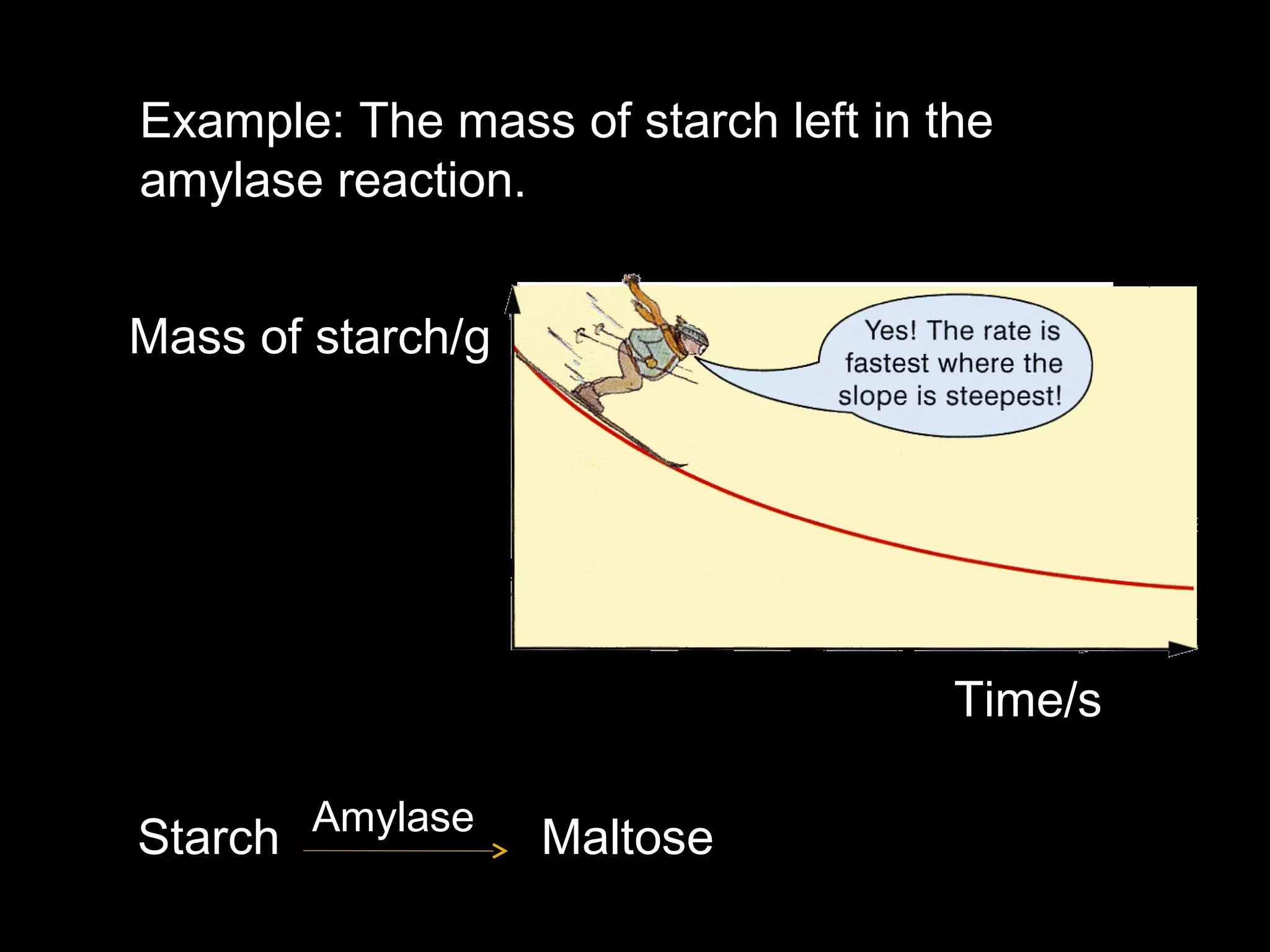
Intro to Graphing Data Powerpoint-7th and 8th GradeBaily OrBust
ย
This document provides instruction on different types of graphs (bar graphs, line graphs, scatter plots) and how to analyze correlations in data represented in graphs. It discusses key features of graphs like titles, labeled axes starting at zero, and using 75% of the axes. Students are prompted to identify independent and dependent variables, observe characteristics of sample scatter plots, and evaluate if a sample graph includes all necessary components. The goal is for students to understand how to choose the best graph type to represent their data and interpret correlations.
The document discusses different types of graphs such as line graphs, bar graphs, pie charts, and pictographs. It explains that graphs show relationships between variables, with the independent variable generally on the x-axis and the dependent variable on the y-axis. Examples are provided of how to construct and interpret different graphs, along with exercises for students to practice graphing and analyzing graphs.
To add and subtract decimals:
1) Line up the decimals by writing zeros in empty decimal places as needed.
2) Add or subtract the numbers as usual, carrying or borrowing across the decimal.
3) The decimal point belongs in the answer in the same column as in the original numbers.
The document discusses converting between metric units of centimeters and meters. It explains that there are 100 centimeters in 1 meter, and provides steps for converting between the units by multiplying or dividing by 100. When dividing by 100 to convert from centimeters to meters, the units move two places to the right. When multiplying by 100 to convert from meters to centimeters, the units move two places to the left. Several examples are shown of performing unit conversions between centimeters and meters.
This document discusses calculating the areas and perimeters of various shapes. It provides examples of finding the perimeter by counting sides and finding the area by counting squares for both regular and irregular shapes. It also introduces calculating the area of rectangles using the formula of length x width and calculating the total area of composite shapes by finding the individual areas and summing them.
A number line is used to represent numbers, with values increasing from left to right. The difference between any two consecutive numbers is 1. Negative numbers are represented on the left side of 0, with the same spacing as positive numbers to the right. Numbers to the left of 0 are called negative numbers and denoted with a negative sign (-), while numbers to the right are positive. Zero is neither positive nor negative. Positive, negative, and zero numbers together are called integers. Integers can be compared using inequality signs like > and <, and integers between two non-consecutive numbers can be identified on the number line.
The metric system is a decimal-based system used widely for measurement. It features prefixes that are multiples of 10, ranging from kilo (1000) to milli (0.001). Common metric units include meters for length, grams for mass, and liters for liquid volume. To convert between units, you multiply or divide by powers of 10 - moving the decimal point right to multiply and left to divide. For example, 1000mm = 100cm or 100cm / 10 = 10dm. The metric system is used internationally, especially in science and engineering.
The document discusses an algebra lesson that reviewed combining like terms to simplify expressions and solve equations, including identifying like terms, using the distributive property, and solving one-step equations by combining like terms. Students are assigned IXL practice skills related to adding, subtracting, and multiplying linear expressions and combining like terms. MAP testing and no live classes the following week are also mentioned.
This document defines and provides examples of different types of lines including vertical, horizontal, diagonal, perpendicular, parallel, and oblique lines. It asks the reader to count the number of each type of line in various shapes to help identify the characteristics of each type of line.
This document discusses different types of graphs used to present scientific data:
- Line graphs are used to show changes in related variables over time or against each other, and can show direct or inverse proportions.
- Bar graphs compare counted data by displaying items on the x-axis and their quantities on the y-axis.
- Circle graphs or pie charts show how a fixed quantity is divided into parts.
The document provides examples of different graphs and how to interpret the relationships between variables displayed in each type of graph.
The document provides information about metric units of length, mass, and volume. It compares metric and English units and provides conversions between units. For length, it states that the meter is the base SI unit and provides conversions such as 1 kilometer = 1000 meters. For mass, it indicates the gram is the base unit and gives conversions like 1 kilogram = 1000 grams. For volume, it notes the liter is the base unit and provides the conversion 1 liter = 1000 milliliters.
To expand expressions with brackets, you multiply the terms within the brackets by the number outside. For example, to expand 3(x + 2), you multiply x + 2 by 3, giving 3x + 6. Similarly, to expand 4(2x - 3), you multiply 2x - 3 by 4, giving 8x - 12. In both cases, this removes the brackets by distributing the number outside the brackets to each term inside.
Making a line plot involves:
1) Plotting data points on a horizontal line with an appropriate scale and intervals;
2) Marking each data point with an X above the corresponding number; and
3) Being able to read information from the line plot such as the minimum, maximum, range, median, and mean.
This document discusses how to use a protractor to measure, draw, and calculate angles. It explains that a protractor should be lined up with the "upside down T" at the vertex of the angle being measured. Angles are read on the protractor starting from 0 degrees and using the inner numbers up to 30 degrees, then switching to the outer 1 degree markings. Calculating angles on a straight line is also covered. The overall objectives are to use a protractor to measure and draw acute and obtuse angles to the nearest degree and to calculate angles on a straight line.
This document discusses different types of graphs and tables used to represent data. It introduces bar graphs, line graphs, circle graphs, and pictographs for visualizing data, as well as frequency tables and line plots for organizing raw numbers. Bar graphs compare data using bar lengths. Line graphs show changes over time by connecting points. Circle graphs represent parts of data as percentages of a whole circle. Pictographs use pictures to compare amounts of data, similar to bar graphs. Frequency tables list how often each item occurs, while line plots show frequencies using X marks.
Friction is a force that opposes the relative motion between two surfaces in contact. There are four main types of friction: sliding friction, which acts when an object slides along a surface; static friction, which prevents stationary objects from moving; fluid friction, which acts on objects moving through fluids like air or water; and rolling friction, which occurs when a round object like a wheel rolls along a surface. Friction can be useful to enable motion like in walking or driving, but it also leads to wasted energy as heat and additional force needed to overcome it. Lubricants are used to reduce friction in machines.
The document introduces key concepts in algebra including variables, constants, types of numbers (counting, integers, rational, irrational, real), graphs, averages, and positive and negative numbers. It provides examples and guidelines for understanding these concepts. Variables represent quantities that can vary, while constants represent fixed values. Different number sets are explained and visualized on a number line. Averages are calculated by adding values and dividing by the total count. Positive numbers are greater than zero, while negative numbers are less than zero.
Measurement of length, volume, weight, temperature, time in laboratory, secon...Mr Lam
ย
This document discusses different units of measurement including length, volume, mass, temperature, and time. It provides details on common units like meters, liters, kilograms, degrees Celsius, and hours. Measurement tools are also outlined, such as meter rules for length, beakers for volume, scales for mass, thermometers for temperature, and clocks or stopwatches for time. Examples are given for conversions between units like centimeters to millimeters, and cubic meters to liters.
The document discusses linear expressions and equations. It provides examples of linear and nonlinear expressions, defines equations as statements of equality involving variables, and describes methods for solving different types of linear equations. These include balancing both sides of an equation, transposing terms between sides, solving equations with variables on one or both sides, and reducing equations to simpler or linear forms. Applications of linear equations to problems involving numbers, ages, and finances are also covered.
This document provides an introduction to graphing simple inequalities with one variable. It defines an inequality as a statement that two expressions are not equal. It explains the symbols used in inequalities like <, >, โค, โฅ and how to graph them correctly by using open or closed circles depending on if it is a < or โค. Examples are provided of graphing different inequalities like x > 3, x < 7, p โค -2, and having the reader practice graphing their own inequalities.
The document discusses position-time graphs and velocity-time graphs. It explains that a flat line on a position graph represents an object that is stopped, a sloping line represents constant speed, and a curved line represents changing speed or acceleration. It provides similar explanations for velocity graphs. The document asks questions about interpreting and constructing graphs, determining speed and velocity from graphs, and calculating displacement from a velocity graph.
The PPT is designed for the Math teacher to teach about the unit system and length as an Individual parameter for standard 3rd to 10th.
First, inspire the curiosity of students by showing images instead of directly introducing the topic.
To make the live presentation better ask various questions to students like
-Where else you see the application of measurements?
-How and who invented it?
-Which unit we use for a particular purpose and where?
and more.
This ppt includes,
Learn unit conversion easily with a smart trick.
Understand the SI unit and Imperial unit system.
The value of each unit as well with practice sum.
Mainly focus on the length and its unit.
The document discusses solving one-step equations. It explains that an equation shows two quantities as equal and any operation on one side must be done to the other. To solve one-step equations, you identify the variable, operation on the variable, and the inverse operation. It provides examples of solving equations by addition, subtraction, multiplication, and division.
Understand what are fractions..... Get hints to understand them understand by 1000 of examples and then practice all of them in last. Easy to understand and easy for children to understand. Resourceful content even it is gonna improve life skills. So go through out the journey and enjoy maths. Best ppt ever pleasse go through this is my 3 days efforts.
The document provides information on different measurement systems and tools used for measurement. It discusses the two primary systems - the US Customary system and the metric system. The metric system is based on powers of 10 and is used globally, while the US Customary system uses various unrelated units. The document then describes various tools for measuring length, volume, weight, and other quantities like rulers, tape measures, calipers, micrometers, gauges, and indicators.
Introduce what are Graphs and explore what happens behind some of the applications (PageRank, Maps, FaceBook etc) using Graph processing. Introduce @ a high level the different frameworks/softwares behind Graph processing.
Slideshare is a platform for sharing presentations, documents and other files online. Users can upload files to share with others or embed slideshows on their own websites. The site allows users to search through millions of presentations on various topics that have been uploaded by its large community of members.
The document discusses domain and range of graphs. It defines domain as all the x-values and range as all the y-values of a graph. It provides examples of determining the domain and range from graphs, describing whether they include or exclude endpoint values and how to write the domain and range in inequality notation.
This document discusses the cataloging of nonbook materials, including definitions, categories, and descriptive cataloging. It outlines the sources of information, access points, areas of description, and rules for transcribing title, edition, publication, physical description, and other areas. Differences from book cataloging include additional material specific details areas and variations in physical description transcription depending on material type. Similarities include punctuation, main/added entries, subject headings, and transcription of some description areas.
This document discusses how to read and summarize graphs and charts. It explains that graphs typically have an introduction stating the topic and timeframe being depicted. Graphs can show trends such as upward, downward, or no movement. They can also vary in degree such as slightly, moderately, or significantly. The document provides examples of describing graphs and their trends over time.
This document discusses how to interpret charts and graphs. It explains that graphics provide information in a compact way compared to text. It identifies the most common types of graphs as line graphs, bar graphs, and pie charts. It also discusses tables and diagrams. The document emphasizes that graphics contain important information that supports the reading material, so readers should take time to carefully analyze charts, graphs, and tables.
This document provides guidance on how to effectively use dictionaries. It discusses the meaning and purpose of dictionaries, how to understand a dictionary's organization and features, and tips for improving vocabulary. Key information includes distinguishing between similar words, looking up word origins and etymologies, and using online dictionaries as references. The document emphasizes using dictionaries to gain a richer understanding of words beyond just their definitions.
Trees. Defining, Creating and Traversing Trees. Traversing the File System
Binary Search Trees. Balanced Trees
Graphs and Graphs Traversal Algorithms
Exercises: Working with Trees and Graphs
The document defines and describes different types of charts, graphs, and tables used to visualize data relationships. It explains that charts like pie charts and bar charts show how data sets relate, graphs use lines or curves, and tables organize data into rows and columns. Trends in data over time are described using verbs for upward, downward, or stable movement as well as adjectives denoting the degree or speed of change.
This PowerPoint presentation is designed to introduce graphs to students based on pages 363-364 of the textbook. It will explain different types of graphs through a series of slides that reveal key points step-by-step. The slides cover drawing line graphs and bar charts, identifying linear and curved graphs, and interpreting the shape and slope of graphs. Students are encouraged to ask questions as each new part is revealed.
This document provides guidance on freehand sketching techniques for isometric projections and sketches. It discusses sketching lines, arcs, circles, curves, and objects from orthographic views. Key steps include locating centers and tangent points, using construction lines, and extruding 2D shapes to add the third dimension. Parallel lines should remain parallel in isometric views. Complex objects can be sketched by combining simple shapes or adding details gradually to the main form.
This document provides an overview of different types of graphs that can be used to present statistical data, including histograms, pie charts, bar charts, line charts, cubic graphs, response surface plots, and contour plots. It discusses the purpose and construction of each graph type, advantages and disadvantages, and provides examples of how and when each type of graph might be used. The overall goal is to help students identify, construct, and properly label different graphs to effectively communicate statistical data.
1. When taking measurements, take multiple readings and average them. Show all raw data and averages in a clear table with proper units and precision.
2. Graph your data neatly, with labeled axes including units. The points should fill at least half the page without awkward scaling.
3. Measure the slope of the best-fit line using at least half the data points. Show your work and report the slope with the appropriate number of significant figures and units.
4. Account for uncertainties in measurements and calculated values. Show error bars on graphs and identify the range permitted by uncertainties. Report results with precision justified by the uncertainty.
This document discusses how to analyze a dataset by creating a graph. It involves plotting age (months) on the x-axis and height (inches) on the y-axis for various data points. A line of best fit is drawn and its equation is determined to be y = 0.65x + 64.7. This line equation allows predictions to be made, such as a height of 103.7 inches at 5 years (60 months). The document provides a step-by-step guide to graphing data, determining the line of best fit equation, and using that equation to make predictions.
1) The document discusses various techniques for freehand sketching including sketching lines, arcs, and circles. It provides guidance on tools, techniques, and recommendations for sketching different geometric shapes and features.
2) The document then covers different types of pictorial projections including axonometric, oblique, and isometric projections. It compares isometric projections to isometric sketches and provides methods for sketching ellipses, arcs, and irregular curves in isometric views.
3) The remainder of the document provides guidance and examples for sketching objects in isometric and oblique views including sketching from orthographic views, modifying objects, and combining simple shapes.
This document provides instructions for beginners on how to use the Geometer's Sketchpad software. It explains how to use the basic tools like selecting objects with the arrow tool, creating points with the point tool, and drawing circles and segments. It then demonstrates how to measure angles by selecting points, how to construct perpendicular lines by placing a point and clicking on a line segment, and how to add pages and graph functions on a coordinate plane. It also shows how to transform figures by selecting sides and translating or reflecting over a line or axis. Quick tips are provided for undoing mistakes, measuring slopes of lines, and changing measurement units and rounding precision.
diagrammatic and graphical representation of dataVarun Prem Varu
ย
This document discusses various types of diagrams and graphs that can be used to summarize statistical data. It describes one-dimensional, two-dimensional, and three-dimensional diagrams, as well as pictograms, cartograms, histograms, frequency polygons, frequency curves, ogives, and Lorenz curves. The key points are that diagrams and graphs make data simple and allow for easy comparison, while saving time over presenting raw numbers or text. Different types of diagrams and graphs are suited for different types of data and purposes. Guidelines are provided for properly constructing different diagrams.
The document describes the characteristics of a good graph, including using a ruler, giving the graph a title, labeling the axes and including units, numbering the axes such that the graph takes up half the page and numbers increase in consistent intervals, and drawing a best fit line rather than connecting data points. It then provides an example of a bad graph that lacks clear labels and spacing and wastes space, and notes issues one could find with it.
This document provides information and instructions for creating mechanical drawings using orthographic projection. It begins by describing how to properly set up drawing tools, materials, and work space. It then explains the different types of lines used in drawings based on weight, construction, and meaning. The document outlines the principles of orthographic projection including the three standard views of front, top, and side. It provides details on how to construct each view by using construction lines and projecting geometric features between the views based on set principles. Sample exercises are included to demonstrate constructing multi-view orthographic drawings from given sketches.
COT-1-QUADRILATERALS THAT ARE PARALLELOGRAM.pptxArgel Dalwampo
ย
1) The document describes a 9th grade mathematics classroom observation on geometry and properties of parallelograms. Students were asked to measure sides and angles of a drawn parallelogram and record their findings.
2) Key properties of parallelograms are reviewed, including opposite sides being congruent and parallel, opposite angles being congruent, and diagonals bisecting each other.
3) For a learning task, students are instructed to draw and measure a parallelogram, then make conjectures about measurements and properties.
- The objectives are to learn geometry tools, and use a four step plan to solve problems involving the perimeter and area of rectangles and parallelograms.
- Key vocabulary includes straightedge, compass, construction, midpoint, perimeter, formula, and area.
This document provides instructions for drawing a site plan from survey measurements taken in the field. It discusses the necessary equipment, including paper, rulers, pencils, and drawing tools. It explains how to orient the plan with North at the top using a protractor. The instructions describe how to start drawing the plan by plotting survey points to scale and joining them to represent features. It also covers techniques for plotting offset and triangulated points measured in the field. Finally, it discusses checking the accuracy of the plan using a measured check distance before inking in the final lines.
Isometric and Orthographic Drawing Powerpoint.pptxKieranSullivan8
ย
The document discusses orthographic and isometric drawings. It explains that orthographic drawings use multiple 2D views to represent a 3D object, including top, bottom, front, back, right and left views. Isometric drawings represent 3D objects at a skewed angle using 3 main rules: horizontal edges are drawn at 30 degrees, vertical edges are drawn vertically, and parallel edges appear parallel. The document provides examples of an isometric cube drawing and instructions for setting up a drawing board and techniques for drawing orthographic and isometric views, including using scales. It assigns two tasks: drawing a cube and smaller scaled cube with a cutout.
1) One point perspective involves drawing a horizon line and placing a single vanishing point on that line to represent the viewer's eye position.
2) To draw a box in one point perspective, the artist first draws a square below the horizon line and connects each corner to the vanishing point with straight lines.
3) These connecting lines, called orthogonals, cause the sides of the box farther from the viewer to appear narrower, mimicking how three dimensional objects appear smaller in the distance.
This document provides guidance on constructing various types of graphs, including bar graphs, line graphs, climate graphs, percentage bar graphs, scatter plots, and pictographs. It explains the key elements that should be included in each graph, such as labeled axes, a title, legend/key, and scale. Examples of properly constructed graphs are also provided for each type to demonstrate how the guidance should be applied.
1) The document provides instructions for drawing an accurate scale plan of a garden site from survey measurements. It lists necessary equipment like paper, rulers, pencils, and protractors and recommends a scale of 1:50 or 1:100 for most gardens.
2) It describes how to orient the paper with North at the top and draw reference lines to indicate the alignment of structures. Features are drawn to scale by plotting measured points and joining them.
3) Offsets and triangulated points are plotted using rulers and protractors. The plan is checked using a measured distance before final inking. Completing the title block finishes the plan.
This document provides instructions for drawing boxes and other solid objects in one point perspective. It explains key concepts like the vanishing point, horizon line, and orthogonal lines. Readers are guided through a series of exercises to practice drawing boxes of different sizes and orientations in relation to the horizon line. These skills are then applied to drawing letters and a house in one point perspective. The goal is to help students learn how to represent 3D space and forms on a 2D surface using one point perspective techniques.
Graphs are a visual tool for expressing numerical relationships. They capture students' attention and convey information efficiently. There are five main types of graphs: bar graphs, pie graphs, line graphs, surface graphs, and column graphs. Bar graphs extend a horizontal scale to show the length of bars. Pie graphs divide a circle into sectors proportional to the data. Line graphs connect plotted points to show trends over time. The document discusses the principles, advantages, and disadvantages of using different types of graphs to represent data.
This document discusses various methods for diagrammatic and graphical representation of statistical data. It describes one-dimensional, two-dimensional, and three-dimensional diagrams as well as pictograms and cartograms. Specific diagram types discussed include line diagrams, bar diagrams, pie charts, and histograms. Graphical representations like line graphs, frequency polygons, frequency curves, and cumulative frequency curves are also covered. The key differences between bar diagrams and histograms are highlighted.
How Barcodes Can Be Leveraged Within Odoo 17Celine George
ย
In this presentation, we will explore how barcodes can be leveraged within Odoo 17 to streamline our manufacturing processes. We will cover the configuration steps, how to utilize barcodes in different manufacturing scenarios, and the overall benefits of implementing this technology.
This presentation was provided by Racquel Jemison, Ph.D., Christina MacLaughlin, Ph.D., and Paulomi Majumder. Ph.D., all of the American Chemical Society, for the second session of NISO's 2024 Training Series "DEIA in the Scholarly Landscape." Session Two: 'Expanding Pathways to Publishing Careers,' was held June 13, 2024.
Philippine Edukasyong Pantahanan at Pangkabuhayan (EPP) CurriculumMJDuyan
ย
(๐๐๐ ๐๐๐) (๐๐๐ฌ๐ฌ๐จ๐ง ๐)-๐๐ซ๐๐ฅ๐ข๐ฆ๐ฌ
๐๐ข๐ฌ๐๐ฎ๐ฌ๐ฌ ๐ญ๐ก๐ ๐๐๐ ๐๐ฎ๐ซ๐ซ๐ข๐๐ฎ๐ฅ๐ฎ๐ฆ ๐ข๐ง ๐ญ๐ก๐ ๐๐ก๐ข๐ฅ๐ข๐ฉ๐ฉ๐ข๐ง๐๐ฌ:
- Understand the goals and objectives of the Edukasyong Pantahanan at Pangkabuhayan (EPP) curriculum, recognizing its importance in fostering practical life skills and values among students. Students will also be able to identify the key components and subjects covered, such as agriculture, home economics, industrial arts, and information and communication technology.
๐๐ฑ๐ฉ๐ฅ๐๐ข๐ง ๐ญ๐ก๐ ๐๐๐ญ๐ฎ๐ซ๐ ๐๐ง๐ ๐๐๐จ๐ฉ๐ ๐จ๐ ๐๐ง ๐๐ง๐ญ๐ซ๐๐ฉ๐ซ๐๐ง๐๐ฎ๐ซ:
-Define entrepreneurship, distinguishing it from general business activities by emphasizing its focus on innovation, risk-taking, and value creation. Students will describe the characteristics and traits of successful entrepreneurs, including their roles and responsibilities, and discuss the broader economic and social impacts of entrepreneurial activities on both local and global scales.
Gender and Mental Health - Counselling and Family Therapy Applications and In...PsychoTech Services
ย
A proprietary approach developed by bringing together the best of learning theories from Psychology, design principles from the world of visualization, and pedagogical methods from over a decade of training experience, that enables you to: Learn better, faster!
Elevate Your Nonprofit's Online Presence_ A Guide to Effective SEO Strategies...TechSoup
ย
Whether you're new to SEO or looking to refine your existing strategies, this webinar will provide you with actionable insights and practical tips to elevate your nonprofit's online presence.
2. โข About different types of graphs,
โข How to draw them when you
are doing your practical work,
โข How to interpret the different shapes.
Learning Objectives
You should learn :
3. Drawing a graph
When should I
draw a
line-graphโฆ?
โฆand when should
I draw a
bar-graphโฆ?
โฆand when
should I draw a
histogram or
circle graph?
4. Drawing a graph
Look at the table of your results:
If this column has
โข Many continuous ranges of
values,
use a histogram:
โข Continuous values,
use a line-graph:
5. โข Fixed items that are
usually not numerical,
Use a bar graph:
โข Percentage of any kind,
Use a circle graph
7. 5 steps in drawing a graph
1. Choose simple scales.
For example:
1 large square = 1 meter (1 m)
or
1 large square = 2 m, or 5 m, or 10 m
But never choose an awkward scale,
like 1 square = 3 m or 7 m
Choose a scale that will make your graph
use most of the space available.
8. 5 steps in drawing a graph
1. Choose simple scales.
Put the dependent variable
on the โy-axisโ
and
the independent variable on the โx-axisโ
9. 5 steps in drawing a graph
2a. Plot the points neatly.
To mark the points we usually use an X
x
x
x
x
x
x
Re-check each one before your next step.
Usually you need
5 or more points
for the graph.
10. 5 steps in drawing a graph
2b. Alternative plotting.
โขTo mark the points we can also use a dot in a circle .
Re-check each one before your next step.
โขMake sure the dot
is very small and
the circle has a
diameter no
greater than 2mm
11. 5 steps in drawing a graph
3. If the points form a straight lineโฆ
โฆdraw the best straight line through them
x
x
x
x
x
x
Check that it looks the best straight line.
โline of best fitโ
12. 5 steps in drawing a graph
4. If the points form a curveโฆ
โฆdraw a free-hand curve of best fit
Do not join the points like a โdot-to-dotโ.
13. 5 steps in drawing a graph
5. If a point is not on the lineโฆ
โฆuse your apparatus to check this
measurement again
You should ignore anomalous points.
This is called an
anomalous point.
x
x
x
x
x
x
14. 5 steps in drawing a graph
In summary:
1. Choose good scales,
with the dependent variable on the y-axis
2. Plot the points carefully
3. Draw a line of best fit
using a ruler for a straight line graph,
4. or draw free-hand for a curved graph
5. Check anomalous points.
15. An example would be
the height of a plant
against time
A straight line graph:
Time/days
Height/cm
16. A special case is when the
straight line goes through the origin :
origin
In this case the
two quantities are
directly proportional.
17. If you think your graph should go through the
origin, then draw it exactly through the origin.
18. Donโt forget to place both, the 0 for the x-axis
and the 0 for the y-axis.
0 1 2 3 4 5 6 Time/days
Height/cm
5
4
3
2
1
0
19. A curved graph, rising :
The dependent
variable rises
quickly at first
and then more slowly
Here is an example:
20. Example : the volume of O2 produced in the
catalase reaction against the time.
VolumeofO2/ml
Time/s
Eventually the reaction will stop producing O2 gas.
21. A curved graph, falling :
The dependent
variable falls
quickly at first
and then more slowly
Here is an example:
22. Example: The mass of starch left in the
amylase reaction.
Mass of starch/g
Time/s
Starch MaltoseAmylase
23. โข Know how to draw a line-graph correctly,
โข Be able to give examples of graphs
with different shapes,
โข Be able to interpret graphs with
different shapes.
Learning Outcomes
You should now: