
Recommended
Recommended
More Related Content
What's hot
What's hot (20)
Similar to Ielts writing task1 samples hocielts
Similar to Ielts writing task1 samples hocielts (18)
Recently uploaded
Recently uploaded (20)
Ielts writing task1 samples hocielts
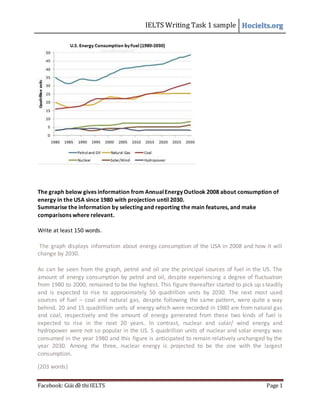
- 1. IELTS Writing Task 1 sample Hocielts.org Facebook: Giải đề thi IELTS Page 1 The graph below gives information from AnnualEnergy Outlook 2008 about consumption of energy in the USA since 1980 with projection until 2030. Summarise the information by selecting and reporting the main features, and make comparisons where relevant. Write at least 150 words. The graph displays information about energy consumption of the USA in 2008 and how it will change by 2030. As can be seen from the graph, petrol and oil are the principal sources of fuel in the US. The amount of energy consumption by petrol and oil, despite experiencing a degree of fluctuation from 1980 to 2000, remained to be the highest. This figure thereafter started to pick up steadily and is expected to rise to approximately 50 quadrillion units by 2030. The next most used sources of fuel – coal and natural gas, despite following the same pattern, were quite a way behind. 20 and 15 quadrillion units of energy which were recorded in 1980 are from natural gas and coal, respectively and the amount of energy generated from these two kinds of fuel is expected to rise in the next 20 years. In contrast, nuclear and solar/ wind energy and hydropower were not so popular in the US. 5 quadrillion units of nuclear and solar energy was consumed in the year 1980 and this figure is anticipated to remain relatively unchanged by the year 2030. Among the three, nuclear energy is projected to be the one with the largest consumption. (203 words)
- 2. IELTS Writing Task 1 sample Hocielts.org Facebook: Giải đề thi IELTS Page 2 The table presents information concerning different tax burdens on a single parent family in 1996. Tax is divided into 3 main types: the 9,491 dollar income, the 18,969 dollar income and the 31,508 dollar income. From an overall view, the higher the income, the higher the tax rate. To be more precise, it ranges from 10.47 % to 12.74 %, depending on how much a person earn. Regarding the first 2 tax types, business taxes account for the biggest proportion. Statistically, business taxes come at 4.76% for the low income and 3.44% for the middle income. Next are consumer sale tax and residential property tax. One remarkable fact to notice in the table is that state income tax is levied at a much greater rate for the high income. However, they are liable to a significantly lower consumer excise tax. Particularly, there is an observable similarity in the other individual taxes for all 3 tax types. (156 words)
- 3. IELTS Writing Task 1 sample Hocielts.org Facebook: Giải đề thi IELTS Page 3 The bar chart demonstrates the information regarding educational attainment in come metropolitan areas in USA in 2010. As can be seen apparently from the chart, few Americans do not receive education or fail to graduate from high school. Also, people with no high school diploma account for less than 15% of the population. Particularly, the state with highest rate of people who do not obtain high school diploma is Greater LA The focus of US Government on education is accurately reflected in the large percentage of high school graduates, college graduates and students completing graduate schools. On average, 60% of the population are granted high school diplomas, 20% finish college and 10% are in graduate schools. Among the states in the survey, Austin, Seattle, Bay Area, Raleigh, Boston and Washington D.C top the chart. In other states including Greater LA, San Diego, Chicago and New York, educational attainment is merely a little bit above the national average. (156 words)
- 4. IELTS Writing Task 1 sample Hocielts.org Facebook: Giải đề thi IELTS Page 4 The two maps below show an island, before and after the construction of some tourist facilities. Summarize the information by selecting and reporting the main features, and make comparisons where relevant. The map displays how that island developed after period of the construction of some tourist facilities. As can be seen from the map, the most obvious difference is that numerous houses buildings for accommodating tourists were erected, along with one big restaurant, one pier and one reception hall which is situated right in the center of the new buildings. Additionally, six of the houses constructed are located on beach side of the island and the opposite site is still quite deserted. What’s more, people have also made roads, which include several footpaths and one vehicle track to connect all the places in the island together and expedite transportation. The pier is linked to the vehicle track that leads to the reception and then eventually to the restaurant. Lastly, people coming to the island can also get easy access from the pier to the beach on foot. In sum, it is clear from the map that tourism has greatly changed the appearance of the island (164 words)
- 5. IELTS Writing Task 1 sample Hocielts.org Facebook: Giải đề thi IELTS Page 5 The table below provides information on rental charges and salaries in three areas of London. Write a report for a university lecturer describing the information shown below. The table shows two sets of related information: the relative cost, in pounds, of renting a property with one, two or three bedrooms in three different suburbs of London and an indication of the kind of annual salary you would need to be earning to rent in these areas. Of the three areas mentioned, Notting Hill is the most expensive with weekly rents starting at £375 and rising to £738 per week for a 3-bedroom property. To afford this, you would be required a salary in the region of £200,000 per annum. Alternatively, Fulham is the cheapest area with rents ranging from £215 per week for a one bedroom property to £600 per week for a 3-bedroom property. To rent in this area, salaries need to be somewhere between £85,000 and £170,000 depending on the number of bedrooms required. For those able to pay in the middle price range for accommodation, Regent's Park might be a more suitable district. (158 words)
- 6. IELTS Writing Task 1 sample Hocielts.org Facebook: Giải đề thi IELTS Page 6 The bar chart provides a glimpse of world GDP history. From an overall view, a large share of world GDP is made up by only 8 countries, namely China, India, Japan, US, France, Germany, Italy and Britain. In the year 1, India constitutes the biggest proportion of world GDP (almost 30%). Besides, the contribution of China in world GDP is also considerable (approximately 25%). However, throughout 2000 years of history, the percentages of both India and China in world GDP experience a period of significant fluctuation. In the same pattern, the most remarkable drop in GDP of 2 countries is seen during the nineteenth century. However, from 1970 to 2008, the two countries’ economy outlooks brighten. Notably, from 1820, the US has gained influence in world’s economy, swaying global economic situations. To demonstrate US’s impressive rise to world power status, there is an unstoppable growth in US’ percentage in world GDP from merely 2% in 1820 to tenfold that figure only 188 years after. To conclude, history has not witnessed many changes in the proportions of other countries in the world GDP. (185 words)
- 7. IELTS Writing Task 1 sample Hocielts.org Facebook: Giải đề thi IELTS Page 7 The table below shows the figures (in thousand) for imprisonment in five countries between 1930 and 1980. Write a report for a university, lecturer describing the information shown below. The given graph gives data on imprisonment in 5 countries namely Great Britain, Australia, New Zealand, USA and Canada from 1930 to 1980. As is observed from the graph, the figures for imprisonment in the five countries mentioned indicate no overall pattern of increase or decrease. In Great Britain, the numbers of people who are put behind bars soared from 30,000 in 1930 to 80,000 in 1980. In contrast, in Australia, and particularly in New Zealand the numbers fell markedly from 1930 to 1940. Since then they have increased gradually, apart from the year 1980 when the figure for New Zealand fell by about 30,000 from the 1970 total. Canada is the only country which recorded the decreased numbers of prisoners over the period 1930 to 1980, although there have been fluctuations in this trend. It is worth mentioning that the United States has the greatest number of people who went to jail, compared to the other four countries but population size needs to be taken into account in this analysis. The prison population in the United States increased rapidly from 1970 to 1980. (185 words)
- 8. IELTS Writing Task 1 sample Hocielts.org Facebook: Giải đề thi IELTS Page 8 The three pie charts give the illustration about world population by age group. From an overall view, there are several discernible changes in the proportions of people in specific age groups. As can be seen apparently, the world population has swelled considerably from 2.5 billion to 6 billion in the last fifty years. It’s is expected to further expand to 9 billion in the coming fifty years. In 2000, people between the age of 20 and 64 account for the biggest share of the population. This is also what had been recorded in 1950 as well as what will be in 2050. What is also worth noticing in the charts is the uninterrupted decrease of the percentage of people under 19 years old as well as the continuing increase in the percentage of people over 65 years old combine to imply that world population is ageing at a rapid pace. (150 words)
- 9. IELTS Writing Task 1 sample Hocielts.org Facebook: Giải đề thi IELTS Page 9 The pie chart shows the amount of money that a children's charity located in the USA spent and received in one year. Summarize the information by selecting and reporting the main features and make comparisons where relevant. Write at least 150 words. The pie charts display how an US children’s charity generated its revenue and spent this amount of money in one year. Overall, this charity received 53,561,580 dollars, which is slightly higher than the amount of money spent in the same year. As can be seen from the first chart, the vast majority of the revenue of that charity was from donated food with a striking 86.86%. The next biggest source of income was community contribution as it constituted 10.4% of the overall revenue. Other sources mentioned in the chart, namely program revenue, investment income and government grants were negligible in significance compared to the two first sources of income. Their share in the revenue was less than 2.2%. Regarding how this charity spent its money, it can be observed that program services accounted for the highest percentage of expenditure with 95.8%. This charity also spent a modest 2.6% and 1.6% of its money on fundraising and management and General, respectively
- 10. IELTS Writing Task 1 sample Hocielts.org Facebook: Giải đề thi IELTS Page 10 (160 words) The bar chart provides information regarding the proportions of people residing in urban areas worldwide and in different regions of the world. Overall, the percentage of urban residents saw an upward trend from 1950 onwards and is projected to continue to rise by 2030. In 1960, only 29% of the world population was living in big and small cities. By 2007, this figure increased significantly by 20%, or nearly twofold. It is then anticipated that by 2030, 60% of the population in the world will be city-dwellers. Additionally, it can be seen from the chart that North America and Europe were the regions with the highest proportions of people living in cities since more than a half of their population settled down in urban areas. By contrast, only 15% and 17% of Asian and African are city dwellers, respectively. Lastly, it is forecast that there will be a considerable 84% of people from Latin America who live in cities, compared to a previous modest 42% recorded in 1950. (168 words)
- 11. IELTS Writing Task 1 sample Hocielts.org Facebook: Giải đề thi IELTS Page 11 For more sample essays, enter http://hocielts.org/ http://giaidethiielts.blogspot.com/ Facebook: Giải đề thi IELTS