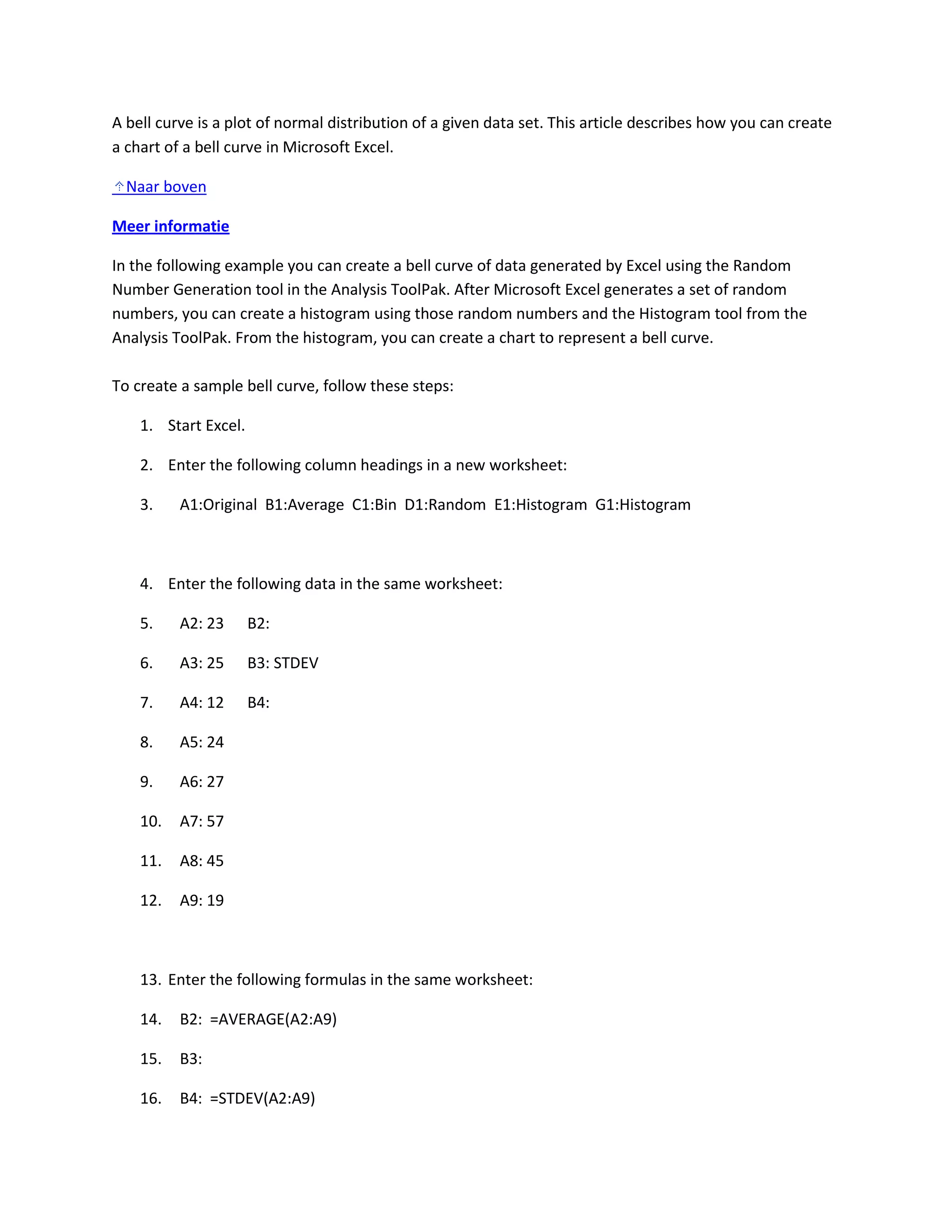
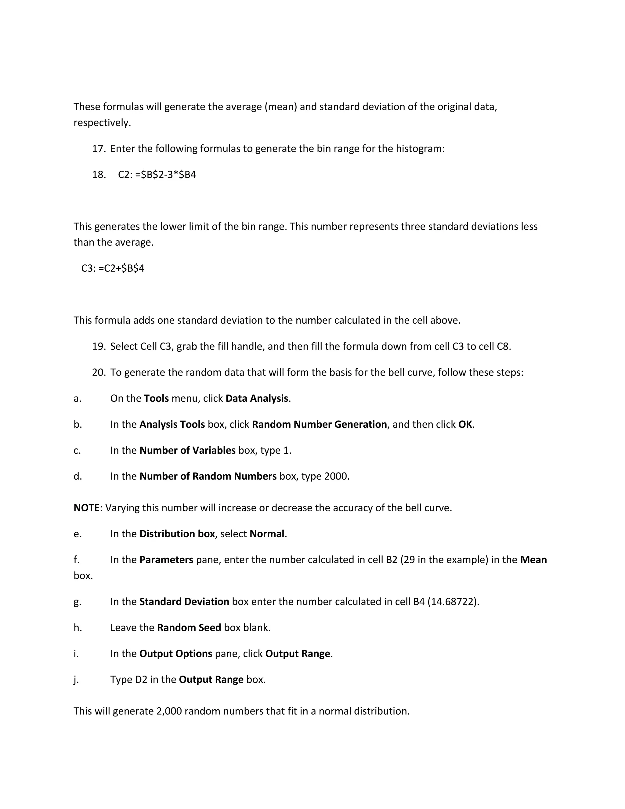
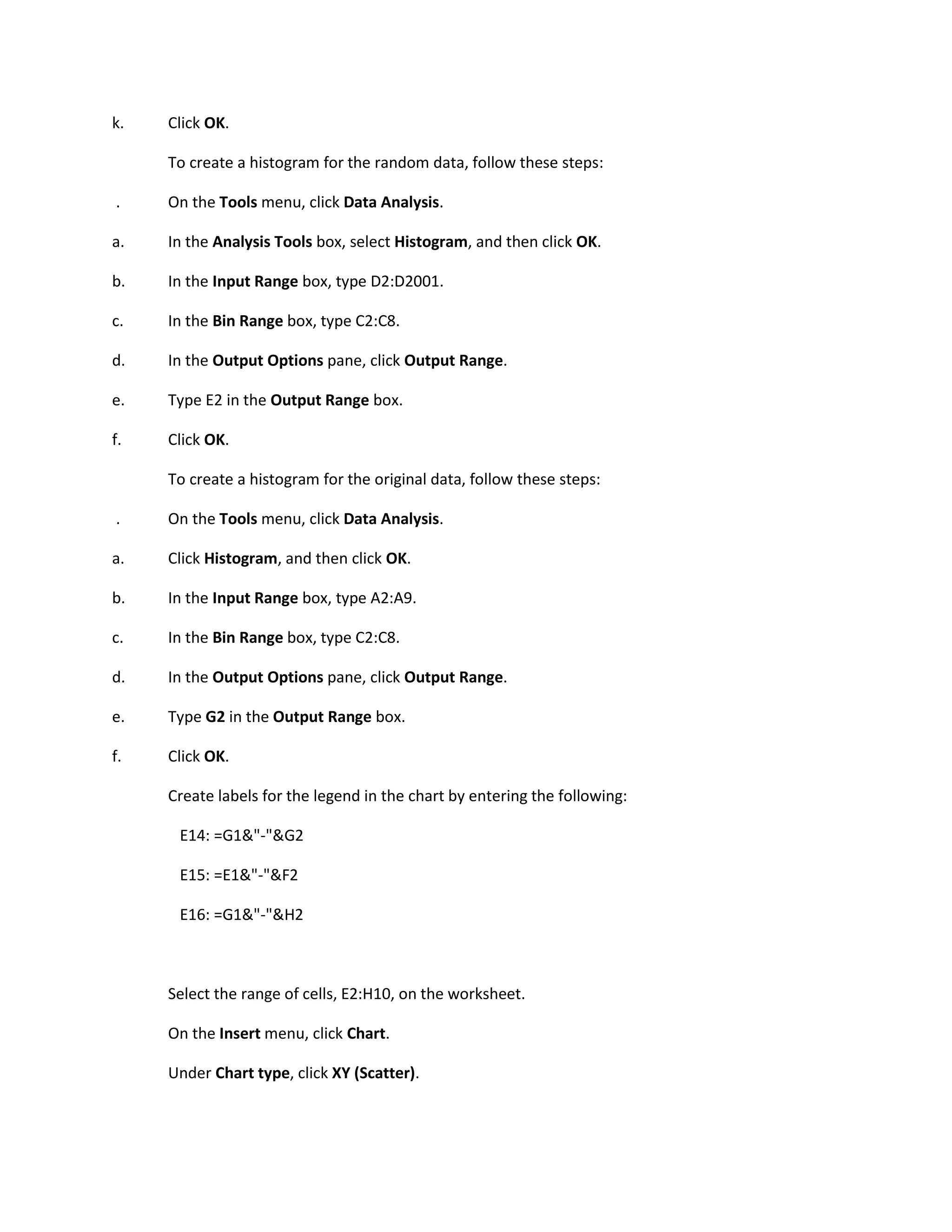
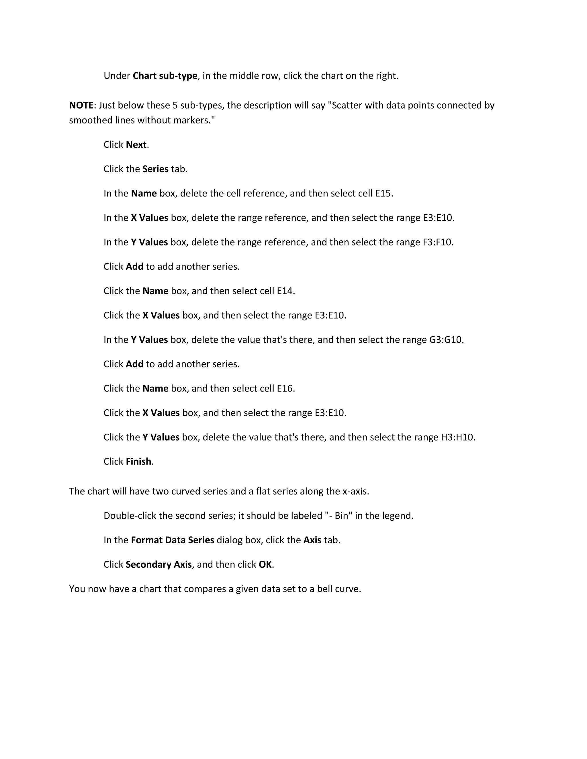
This document provides steps to create a bell curve chart in Microsoft Excel by generating random numbers based on a normal distribution, binning the random numbers to create a histogram, and plotting the original data and histogram on the same chart. The chart compares the original data set to a theoretical bell curve.


