1. Aesthetic Qualities
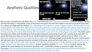
My the poster and backcover look better then what I had previously planned during my experiments with the layout of the text
and how the rating is in the bottom corner of the poster and covers. Also with the shadow in the picture you don’t know what
it’s is all you see a light with the shadow. This is appealing to the audience as causes a mystery to who is the silhouette, and the
contrast between the bright white light and the surrounding darkness is visually eye catching as the contrast draws the eye due
to the difference . The connotations of the images are that they are horror like and also mysterious which allows the audience
to know what they are looking while thinking what the storyline is and what is the shadow figure in the photo. The trailer could
have been done better with the editing of the final piece because its quite clunky in parts and I could’ve done more with the
sound effects because there isn’t any at all, so I would include them to give the trailer more of an horror effect, whilst also
potentially producing a jump scare to signify the horror aspect more. Another strength would be that the colour scheme works
well with each other, for example the white and black of the poster works well with each other, however although the contrast
is good, the image could be made visibly aesthetic if the light was positioned more centrally which would light up the figure
better, making it more appealing to the audience. Another weakness would be the music I used as I could of improve the
quality of the music because it’s not the best sounding music, I could make it louder in sound so it makes more of an
atmosphere. The visual style of the poster and DVD cover match well with the colour scheme staying the same for both of
them, this continuity means that audience makes the connection between the both
2. Audience Appeal
I have appealed to the audience by having jump scares involve in the trailer, this makes the trailer look more like a horror film,
also the backing music's help build the suspense of the trailer. I also made it so it was between 1-3 minutes which is what the
audience wanted it to be in between, making it suitable for the under 18 as there attention span is shorter then older people. I
also put the effects to make the scene look more horror like for example the scene where the person is underneath the stairs the
edit was that it made it a quick scene with my the mask person pulling the girl from underneath the stair, the actually motion of
the scene is very slow, but when I was edit it, the audience wouldn’t want the scene to drag out to long because they would get
bored very easily. I have appeal to the age group of 15+ by including jumps scares and suspense moments from the trailer, this
makes it appeal to the audience more because it has content that are seen in other horror films/trailers, and has a more adult
feel to them which young people enjoy as it makes them feel older and more responsible. The product appeals to male genders
as lots of male enjoy gory films, and the use of the shot including the axe suggests gore within the films. I have appealed to the
psychographic as its aimed to the belongers so by having it in a well oriented place and having based and made in the UK which
would appeal more to them. I have also appeal to the social status by having it made in a community which would help each
other if something like this happen in real life, making it relatable to those in communities usually the middle to lower classes.
4. Feedback 1
• What did you like about the product?
• The trailer was highly terrifying, it had me scared as well as frightened as to
the fact that the mask was the face of a pig, which gives me the creeps.
Otherwise, the whole product is great, the theme is really captivating and
drawing, so powerful that anyone ages 13 and up would want to watch it.
• What improvements could have been made to the product?
• I don’t think any improvements should be made, other than to say
that the blurb could have a different shadow such as a shadow on the
wall for example. It would make it more creepier than ever.
5. Feedback 2
• What did you like about the product?
• I like the music choice and the camera work.
• What improvements could have been made to the product?
• I thought that the sound of the videos could have been silent to make the
atmosphere more creepy.
6. Feedback 3
• What did you like about the product?
• I like the whole atmosphere of the trailer and poster.
• What improvements could have been made to the product?
• I have several problems with this, there aren’t any transitions in the start where the girl
is looking in one direction and then her head jumps to the window a cross fade transition
would have work there. When she is about to stand up you can here a audio que to tell
her to stand up, to remedy this either cut out all audio in the trailer or cut out audio for
that scene. I don’t think 1 piece of ‘creepy’ music works well I think if there was some
other music it would have worked well. If there was some form of indication of the
‘killer’ for the audience that would have been better instead of someone appearing at
the door for all they know it could be a late night pizza delivery guy. When she gets
grabbed by her feet there should be some form of scream unless she’s mute. There is
someone talking at the end that shouldn’t be there. With the poster there shouldn’t be a
coming soon at the bottom as that will be quickly outdated. With the back of the DVD
cover I find that it has empty spaces and around the ‘5 star rating’ there’s a black box.
7. Peer Feedback Summary
• What do you agree with from your peer feedback?
• I agree with the final peer feedback that I needed to add transitions from each scene because there is
only one effect at the beginning. I would make the those changes by getting the footage and re-edit it
all with the transition from each scene. This would benefit the final product because it would make
more professional as it would have a smoother and more put together feel to the trailer instead of
having it jump from each scene, which can be disorientating for audience
• What do you disagree with from your peer feedback?
• I disagree with music needed to be edited because the music was needed to be that loud for the trailer.
Also there wasn’t meant to be any speech in the trailer, so any speech which appeared in the trailer was
editing mistake. I also don’t think there needs to be multiple piece of music as the single piece of music
vary and peaks, to build the suspense which I believe works well. I also disagree with the idea of
removing all music so it totally silent as I feel the music builds the suspense and mystery for the
audience.
8. Peer Feedback Summary
I would edit the voices in the background so you don’t hear people behind the camera, this would make the trailer
a lot better as the voices have no relevance to the plot of the trailer and are just actor prompts. Also I would be put
more effects for the transitions because there is no transitions in the final trailer what so ever which makes it very
basic & very boring to watch during it, also the transition would make more of a professional style of trailer. . I
would do this by having the trailer footage put back into premiere pro to put more transition effects on the clips, to
make more like a trailer, then for the poster and covers I would put back into photoshop to edit the font of the
writing to make it the same as the trailer. On the poster I would use a different picture for the back cover because
it’s the picture for whole poster and DVD covers which makes it very repetitive and boring. So if I change the
picture on the back ,to that of a different angle it would make more interesting to look at whilst also giving an
insight into the film. I would also change the picture for the background cover, this is so it’s not the same as the
front cover. This would benefit my product by making it more appealing to my audience, because it make them look
at the back cover with more interest with a different picture rather than having the same picture just zoom in more
I would also add sound effects to the trailer because it’s just the music which add to the suspense but overall isn’t
very interesting to watch when it’s just music to listen, when using sound effects it make more realistic trailer and it
breaks it up, and could provide a jump scare if I used a scream. I would also improve quality of the pictures because
they aren’t in good quality enough to make you see the shadow, also the light isn’t quite where I wanted it to be as
its more to the side. In addition I would ensure that I had the same font on the trailer with the poster and DVD
covers people would be able to make the link between the two.
Editor's Notes
Does your work look good? Was it creative? What aspects of your game’s visuals do you like? What would you improve? How would you improve it?
Discuss the strengths and weaknesses
Put your final piece(s) in the centre of a page and analyse them
Use text boxes and arrows
How have you appealed to your target audience? What specific bits of content would appeal to your target audience.
Refer to your findings from your questionnaire.
Put your final piece(s) in the centre of a page and analyse them
Use text boxes and arrows
What changes would you make to your product based upon your peer feedback and why?